Whether you’re considering selling your home or designing your forever home, a bathroom renovation is the perfect way to increase the overall value of your abode. See our most dramatic bathroom renovation ideas from your favourite HGTV Canada shows for a little inspiration.
Published May 29, 2013, Updated November 28, 2020
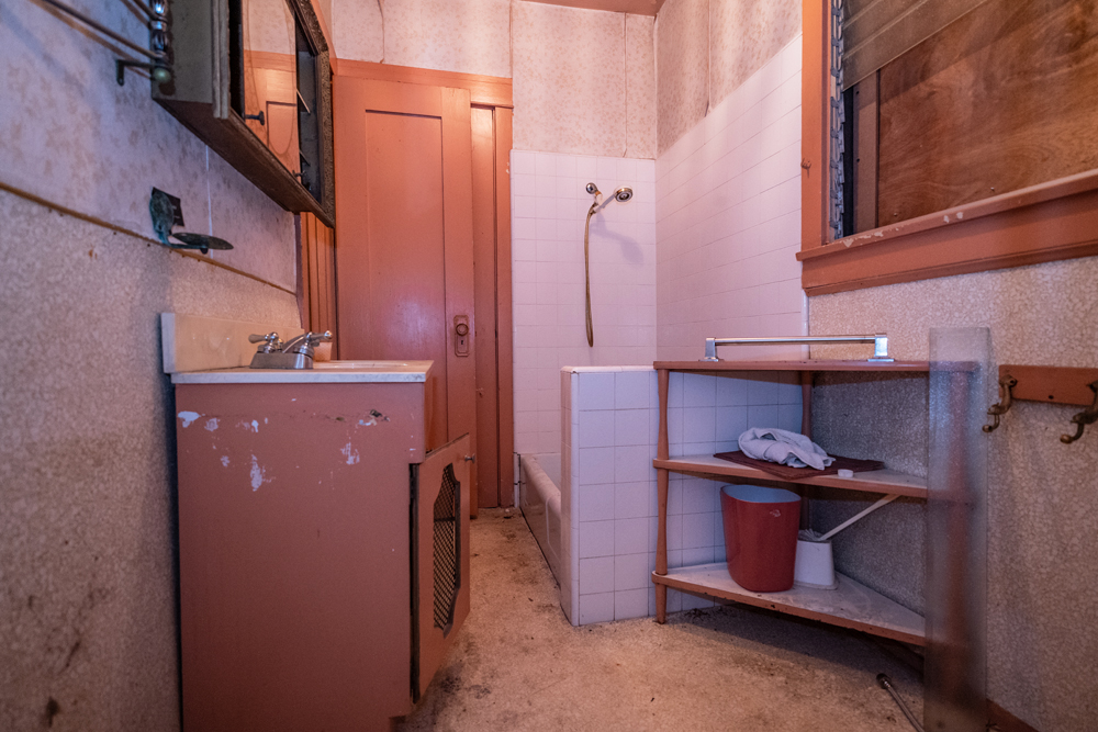
Before: Just Flush it Away
Who doesn’t love a good sibling rivalry? In the latest season of Brother vs. Brother, Drew and Jonathan Scott went head-to-head renovating two cavernous 1920s-era Hollywood mansions. This tight, dilapidated space was the original bathroom on the main floor of Drew’s house.
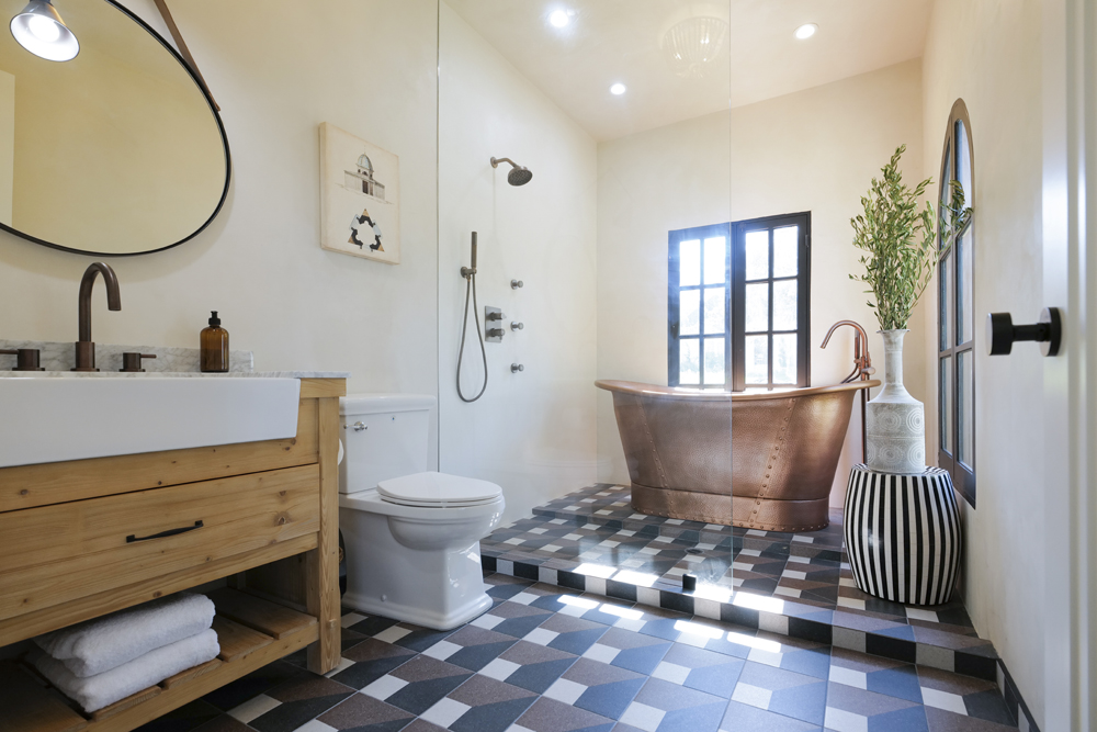
After: Mix and Match Marvel
Not only did Drew punch out a wall to create a more spacious and bright bathroom, but he wasn’t afraid to mix and match patterns and metals either. The bold floor tiles and bronze stand-alone tub give off major Hollywood glamour vibes. Want to see the full reveal? Take a tour of both Hollywood mansions renovated by the Property Brothers – and find out who won each challenge!
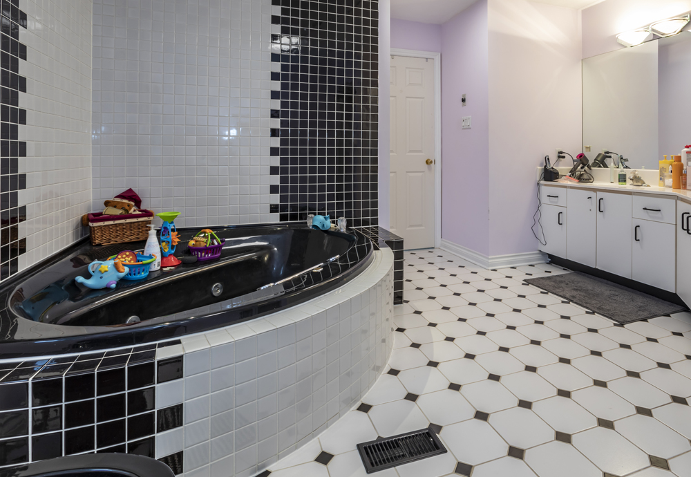
Before: Tiles, Tiles and More Tiles
Save My Reno‘s dynamic duo of Sebastian Clovis and Samantha Pynn had their work cut out for them with this outdated black and white bathroom disaster. From the mismatched checkered tile to the lavender walls, it looks like two bathrooms were squeezed into one. There was definitely a whole lot of clashing visions going on here.
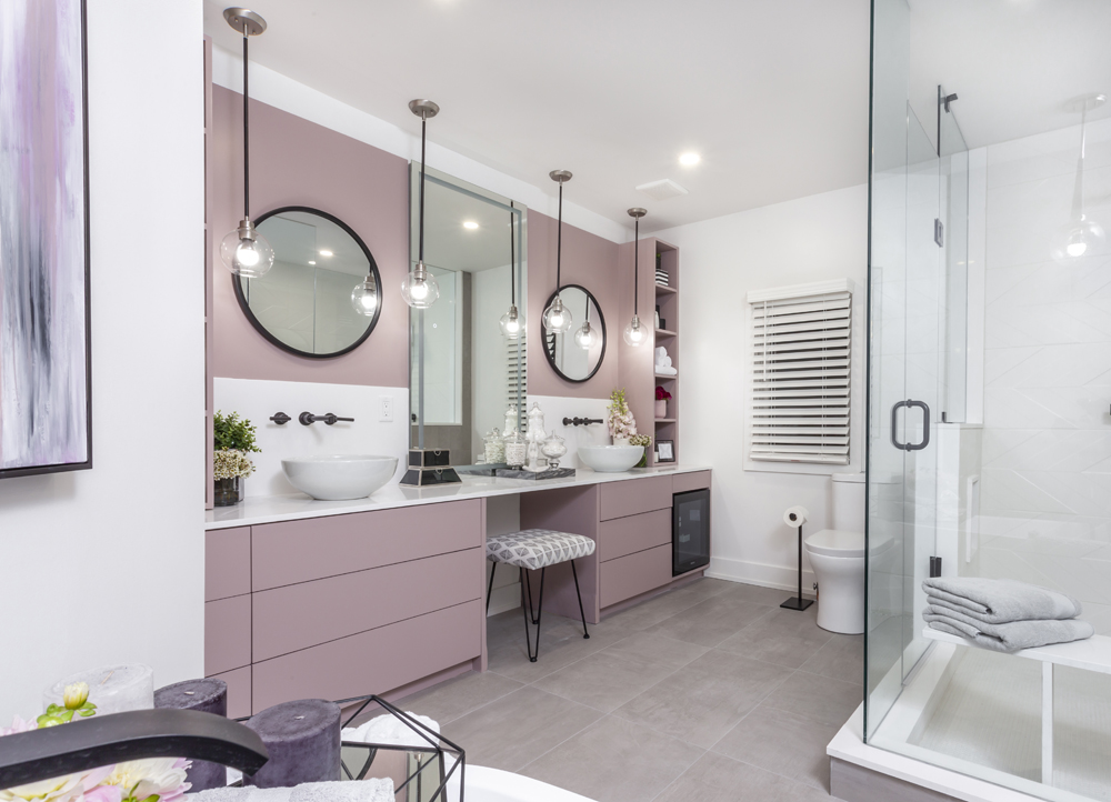
After: Miraculous Refresh
Can you believe this is the same bathroom? Sebastian and Sam kept the lush lavender feel of the original space by adding it to the cabinets instead of the walls. There’s nary a contrasting decor design in sight. Want to see more? Take the full tour of this spa-like bathroom renovation.
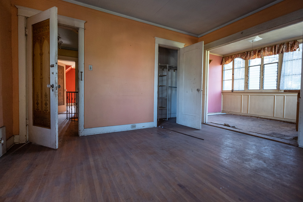
Before: Wasted Space
In this challenge for Brother vs. Brother, Drew Scott had the unenviable task of creating a master bedroom and ensuite bathroom combination out of this oddly shaped room from the Hollywood mansion he was in the midst of renovating. We had complete, faith, though that he’d nail the task at hand.
Related: Property Brothers Bathrooms That Were Transformed From Outdated to Outstanding
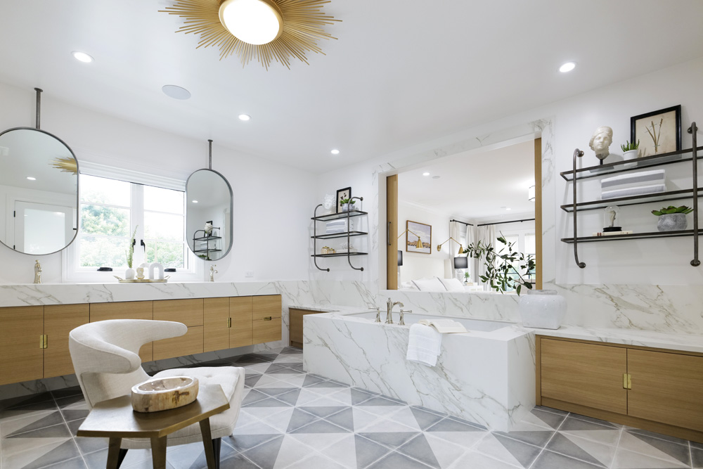
After: Spa Retreat
Our favourite feature of the completed ensuite bathroom? The jaw-dropping addition of a bamboo sliding window above the marble bathroom that allows the soaker to peek into the master bedroom. We’re still picking our jaws up off the floor, thanks.
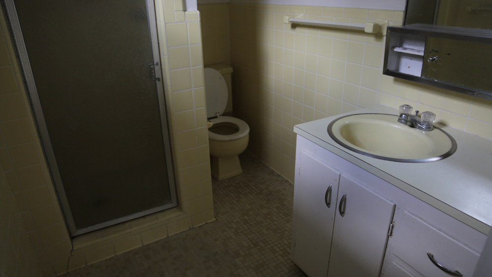
Before: Dark and Dreary
This outdated master bathroom featured on the latest season of Home Town is so dark and dreary, it almost looks haunted. But check out what co-hosts Ben and Erin Napier were able to do with the space.
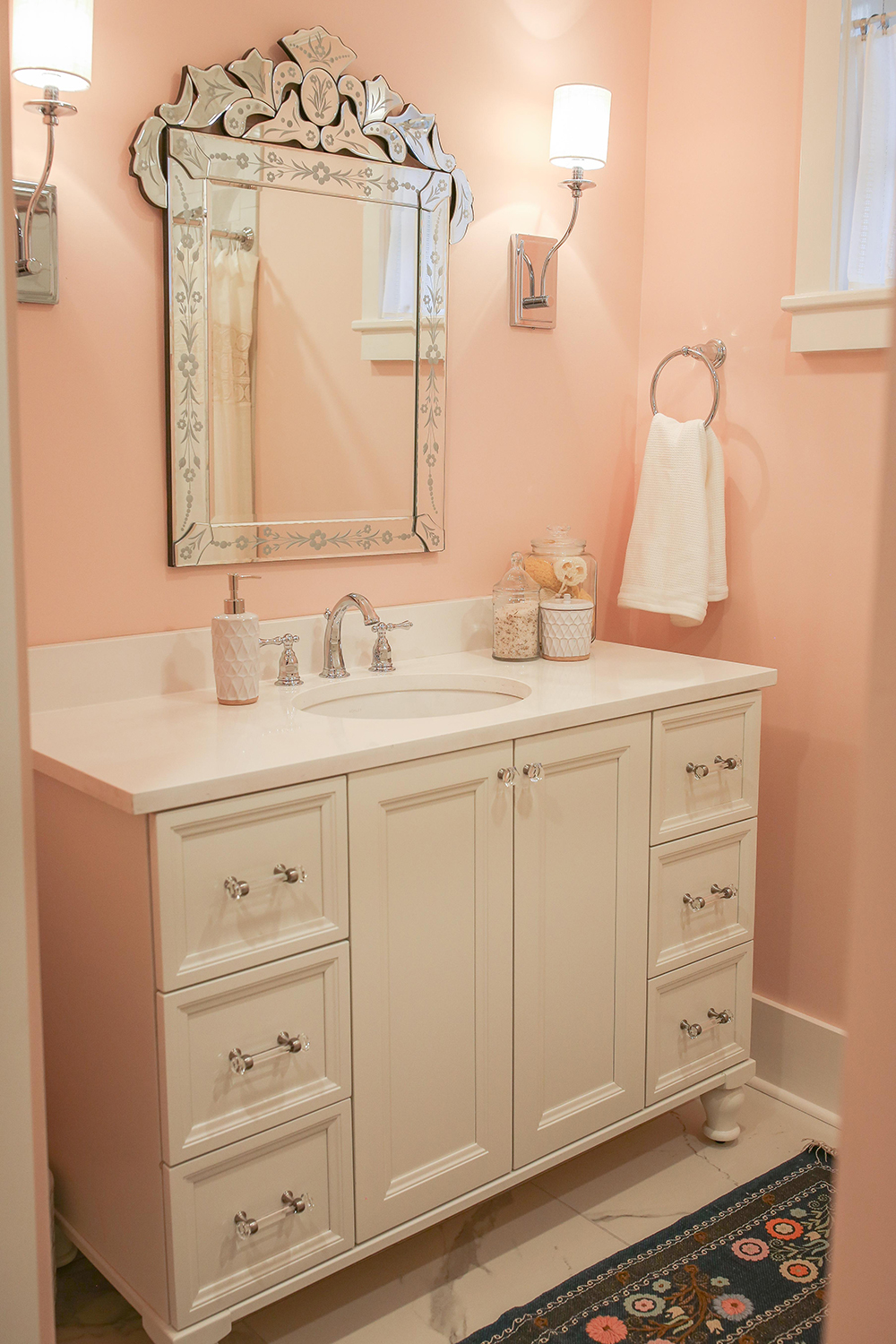
After: Pretty in Pink
The dynamic duo went for a feminine touch by incorporating blush pink into this tiny space that also features porcelain tiles that resemble marble and a decorative mirror that helps the space look a little more open. Want to see more? Check out how Home Town‘s Ben and Erin Napier risked it all on a $65,000 blush pink craftsman bungalow.
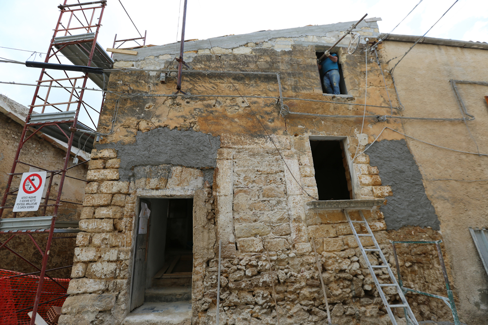
Before: Historic Chaos
If you’re as obsessed with My Big Italian Adventure as we are, then you’ll be gob-smacked by the chic simplicity of the bathroom reno featured on the show. Psst, actress Lorraine Bracco (Goodfellas, The Sopranos) plunked down one measly euro (yes, really!) for this 200-year-old historic home in Sambuca di Sicilia.
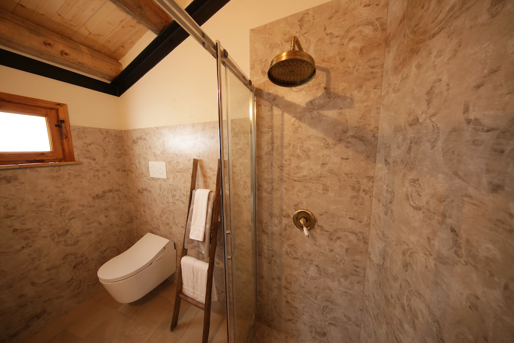
After: European Charm
One of the biggest obstacles the actress faced was the complete lack of bathroom facilities. So she literally had to start from scratch. This ground level charmer may be short on space, but it’s big on European charm. Take the full tour of Lorraine Bracco’s Sicilian dream home!
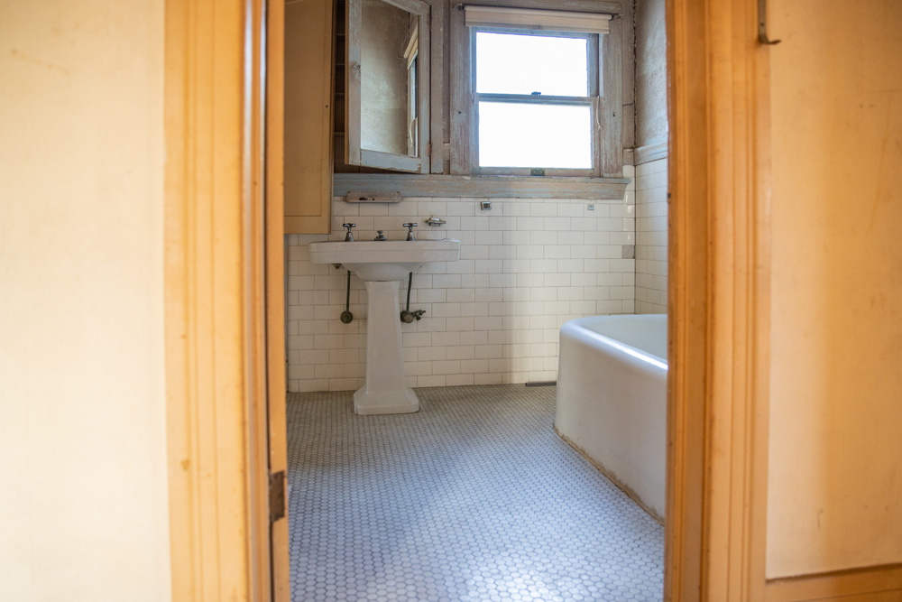
Before: Total Stinker
Nothing about this bathroom on the second level of a Hollywood mansion was worth saving, so Jonathan Scott made the easy decision to gut it from top to bottom during one of his most recent Brother vs. Brother challenges.
Related: 15 House Plants That Help Reduce Humidity in the Bathroom
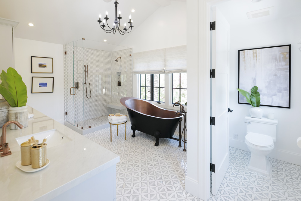
After: Blissed Out
Although our eyes are immediately drawn to that statement black matte claw foot tub, we’re completely slack-jawed over this spacious Spanish-influence retreat. Jonathan 100 per cent outdid himself by adding a double vanity, walk-in standing shower and private toilet nook.
Related: 10 Reasons Why a Bidet is the Life-Changing Bathroom Accessory You Need
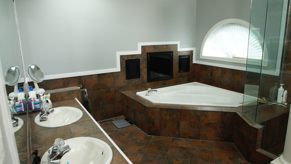
Before: Dark and Unwelcoming
The Save My Reno team definitely had a huge challenge on their hands with this dark and dingy bathroom that was in desperate need of a little TLC.
Related: 13 Bathroom Wallpaper Ideas That’ll Inspire You to Go Bright and Bold
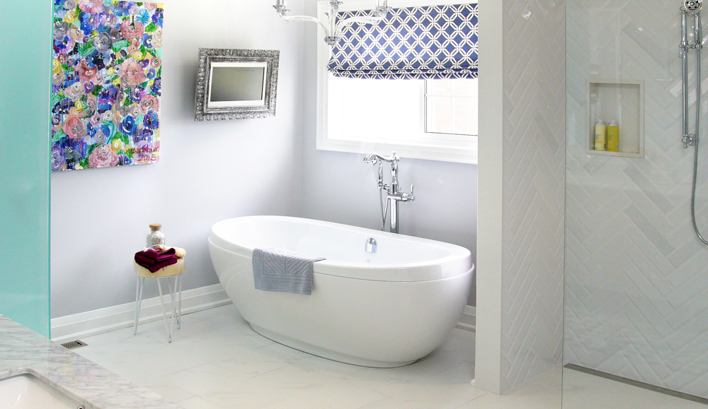
After: Bright and Cheery
Voila! It’s hard to believe this is the same bathroom, right? Light and airy with a pop of colour thanks to the addition of some stylish wall art, the soaking tub is the real star of this spa-like renovation.
Related: 15 Bathroom Ideas That’ll Leave You in a State of Total Bliss
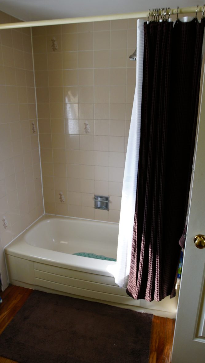
Before: Plain and Beige
This outdated bathroom, complete with shower tiles that date back a few decades, was in dire need of a good refresh. Enter Sebastian and Sam of Save My Reno.
Related: Tackling a Home Reno? These Are the Features You Need in 2021 (and Beyond)
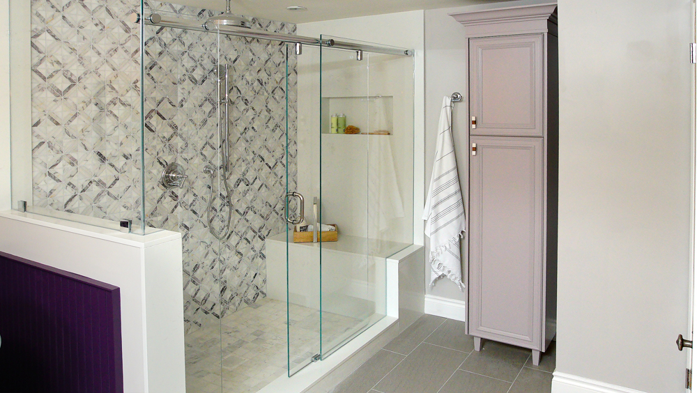
After: Plenty of Space
The itty-bitty shower was replaced entirely with this gorgeous all-glass standing shower. We love the subtle pops of colour in the cabinetry and side tiles.
Related: Trust Us – These Modern Bathroom Design Ideas Have Major Staying Power
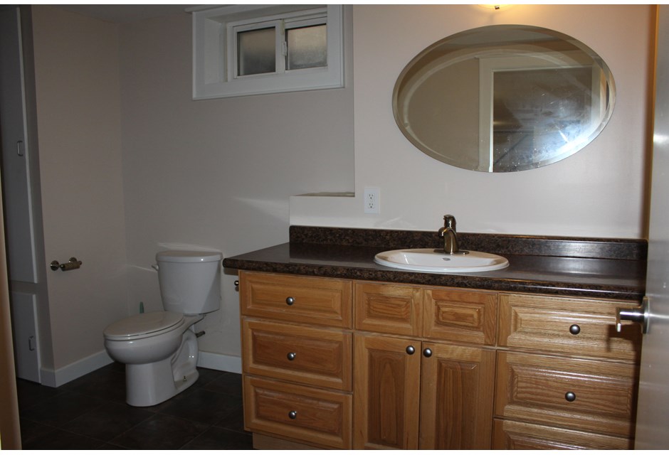
Before: Bungalow Bathroom
Not quite yet rental-ready, Scott McGillivray examines this bathroom, as seen on Income Property, season seven. Catch up on all the full-length episodes of Scott’s Vacation House Rules online now!
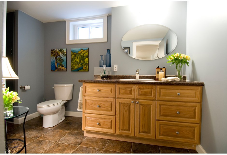
After: Simple Bathroom Updates
Proof that you don’t need to spend a lot of money to upgrade a space: a quick coat of paint and a few decor items gave this basement bathroom a much-needed facelift.
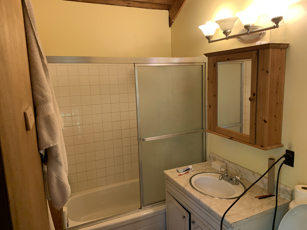
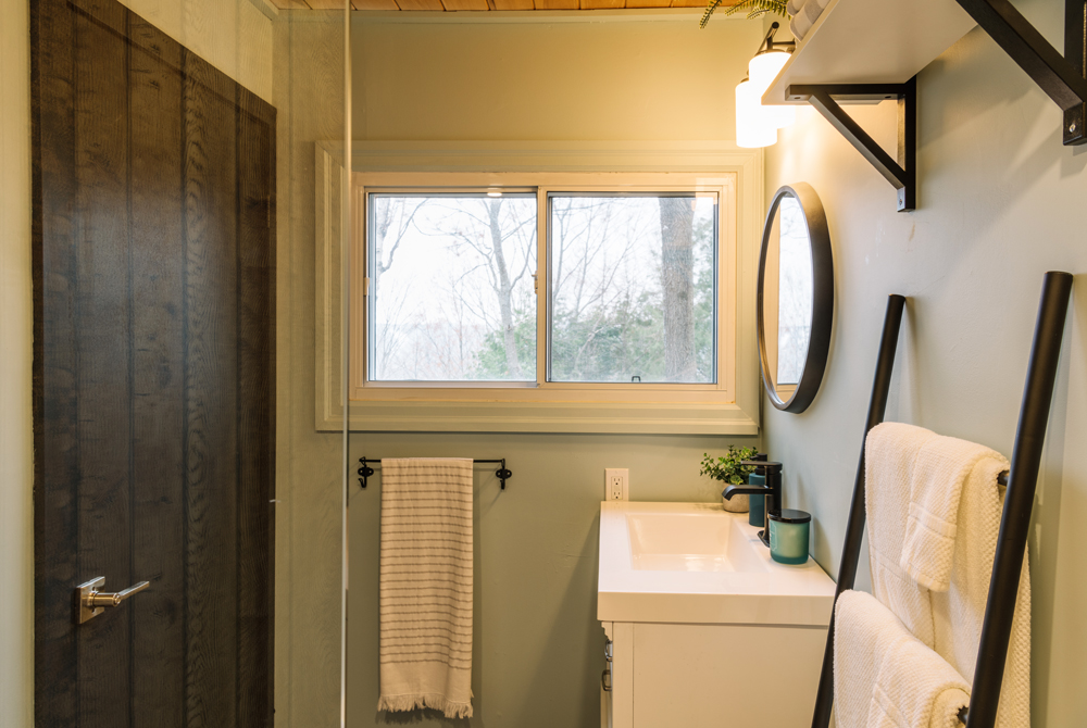
After: Ski Resort Beauty
Looking at it from the angle of the shower, we see Scott McGillivray has added a heavy wood door, the latest sink hardware and some chic decor pieces. See more of how Scott transformed a passé chalet into an adventure-seeker’s paradise.
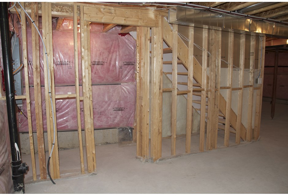
Before: A Basement With Potential
This unfinished basement was prime for primping and got a serious makeover.
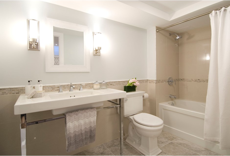
After: Bright and Spacious
You’d never know this bathroom started out as an empty basement. Glamorous hardware and accessories polish it all off.
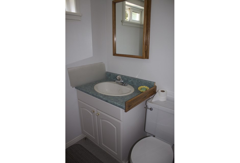
Before: Solid Foundations
This tiny basement powder room had a nice cabinet to work with, but the space needed better lighting and new flooring.
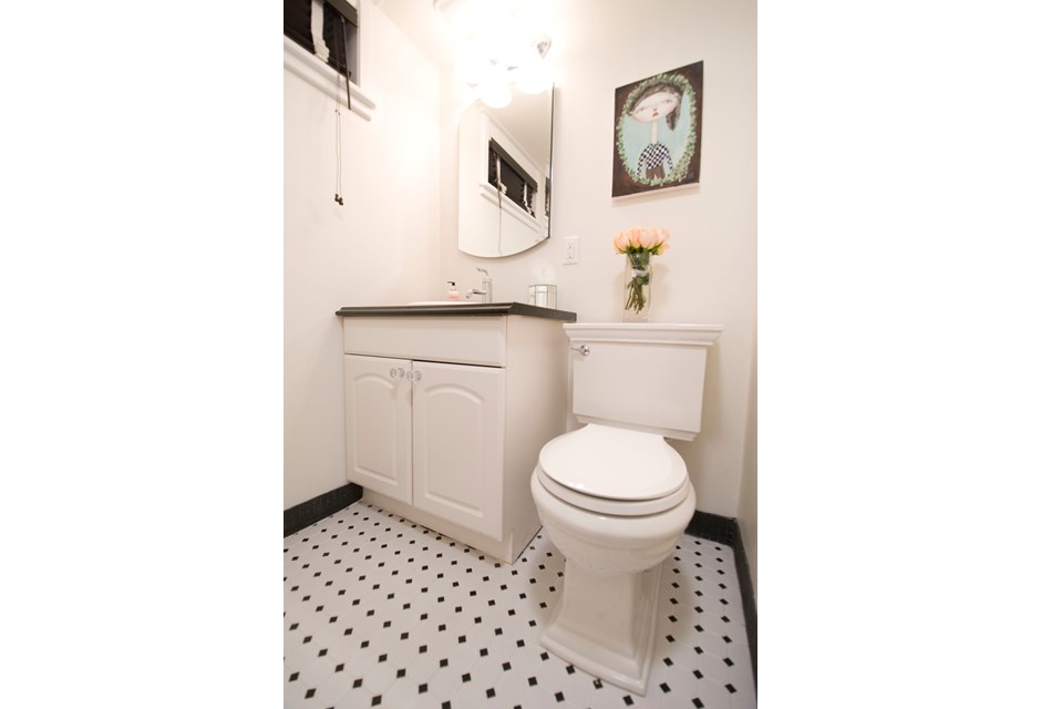
After: A Bathroom with Personality
New, classic black and white tiles and a new countertop gave a basement bathroom a fresh face.
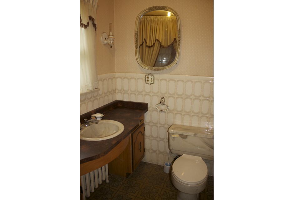
Before: An Awful, Ornate Bathroom
We can’t decide what’s worse: the awful tiles, the marble toilet or the ridiculous curtains.
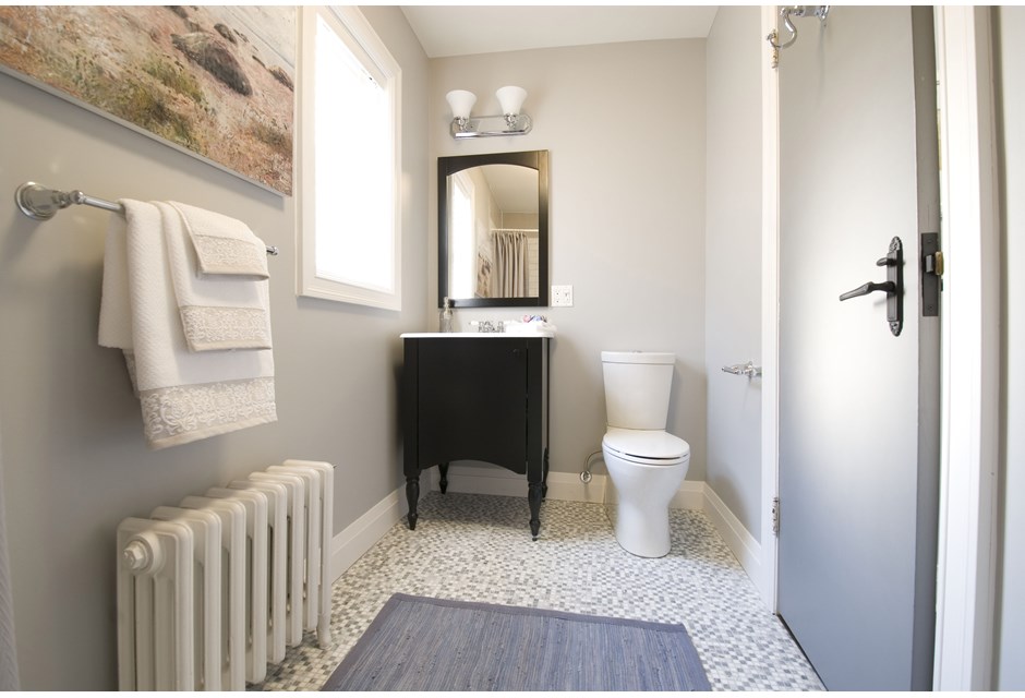
After: Dramatically Different
You’d never believe the transformation of this bathroom, which goes from “granny chic” to “contemporary cool.”
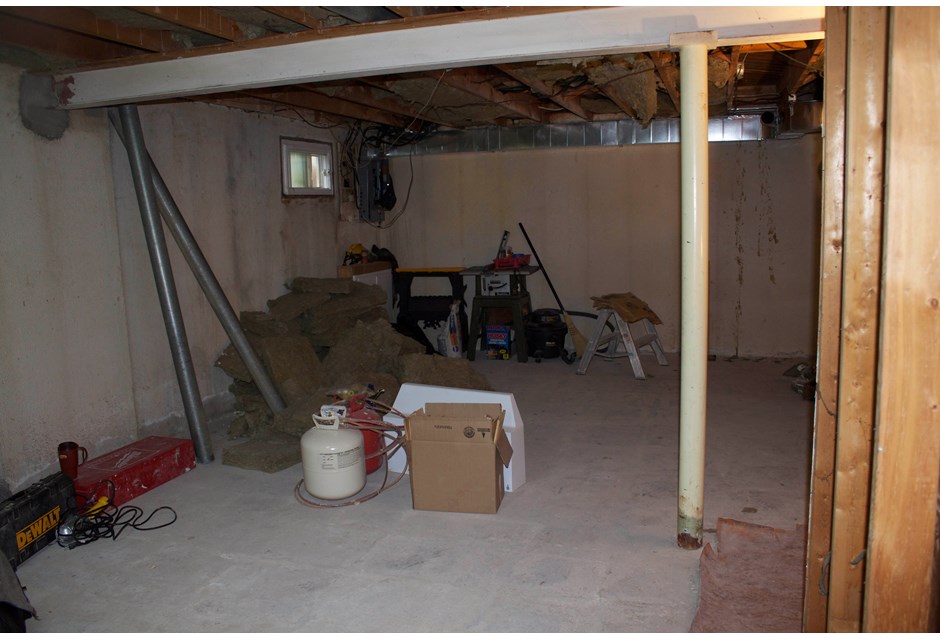
Before: Working With a Blank Slate
This unfinished basement was a disaster, but offered endless design opportunities.
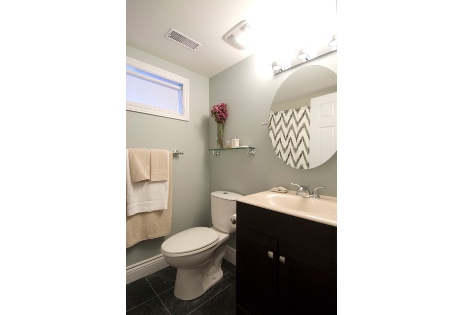
After: Cute and Contemporary
A chevron shower curtain and a calming colour brought personality to these basic appliances.
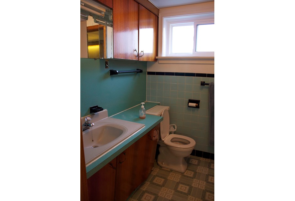
Before: Old and Outdated
Too much turquoise, poor lighting and awful tile – just a few of the many things that had to go in this bathroom.
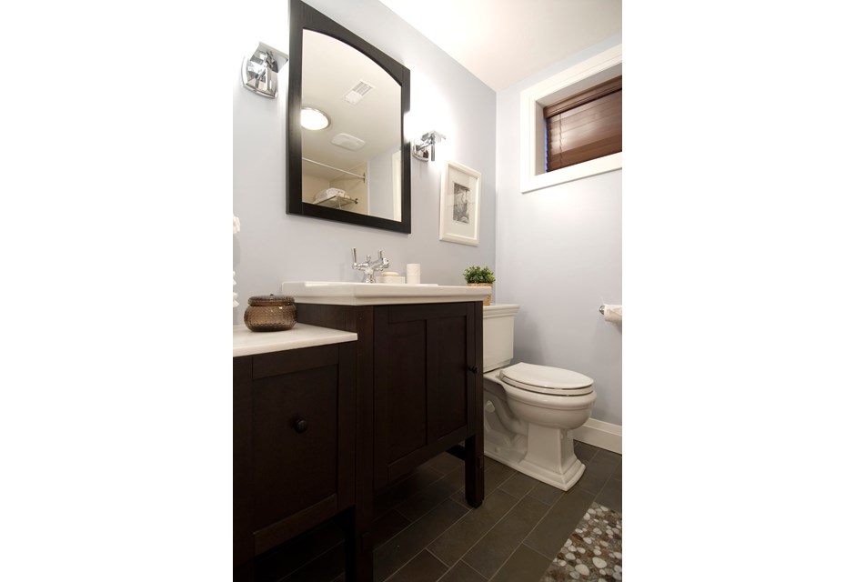
After: Charming Makeover
Classic, serene designs reign supreme in this basement bathroom.
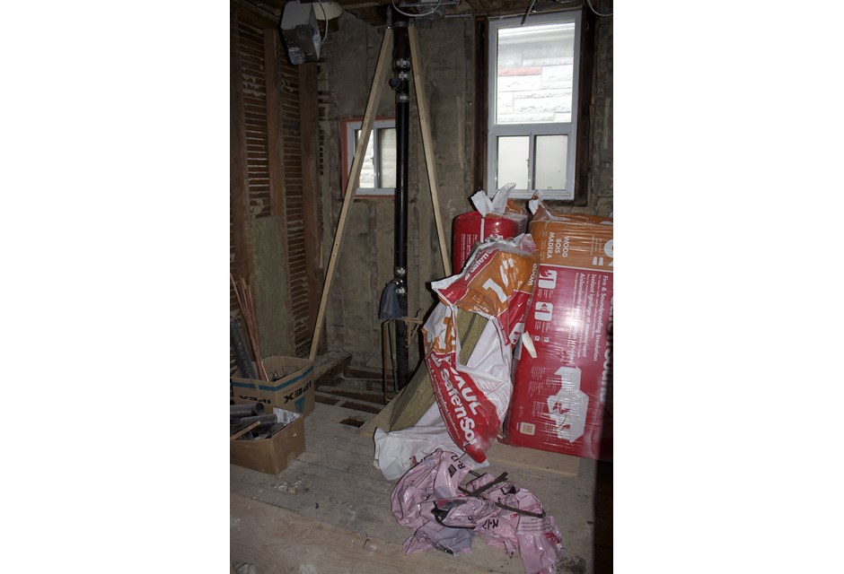
Before: Rough Shape
It’s hard to believe this room had any potential, but a little magic went a long way in transforming it into a gorgeous bathroom.
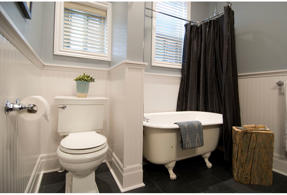
After: Lovely Layout
We love how the claw foot tub was given extra privacy with a new wall separating it from the toilet.
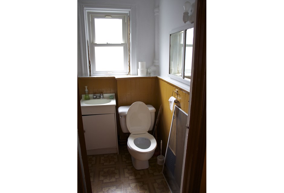
Before: In Need of Repairs
This rustic bathroom was falling to pieces.
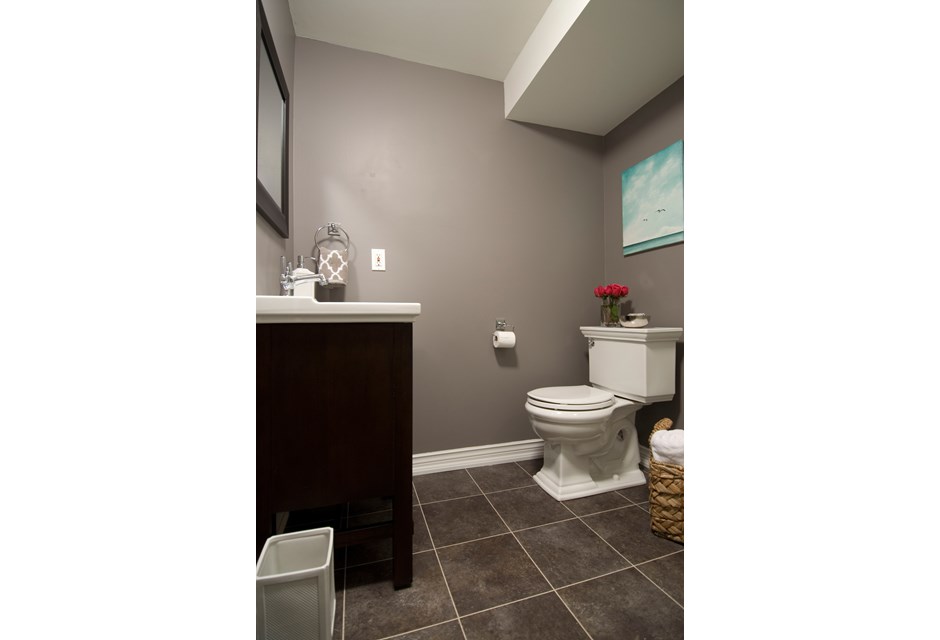
After: Soft Grey Walls
A fresh coat of paint and new tiles gave this bathroom a new, contemporary twist.
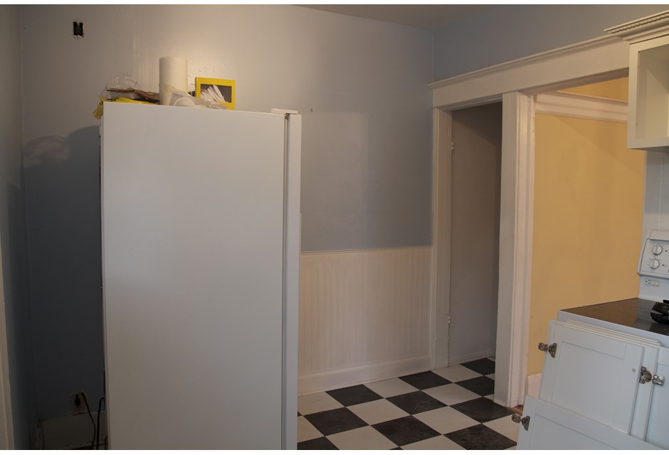
Before: Kitchen-Turned-Bathroom
This kitchen had no idea what was in store, post-reno.
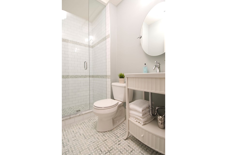
After: Open and Airy
You’d never believe this beautiful bathroom was a dingy kitchen before.
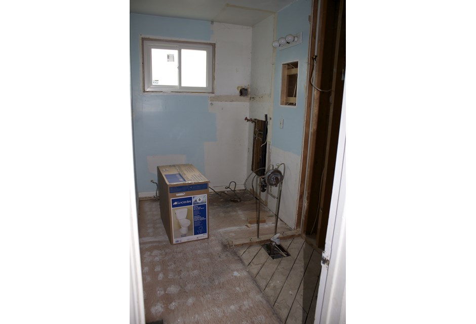
Before: Fixer Upper
This bathroom needed a massive overhaul.
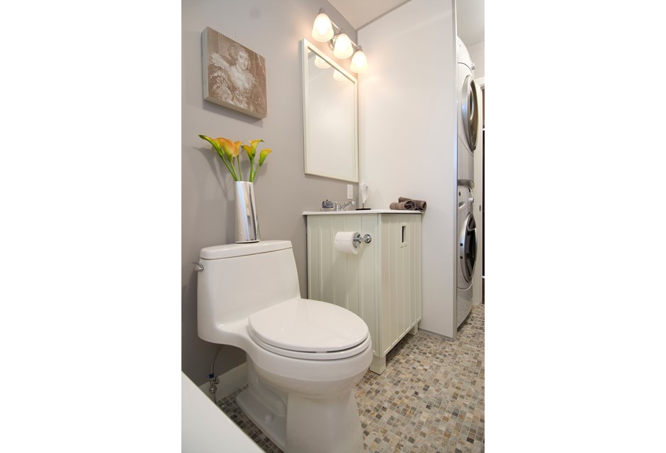
After: Double-Duty
This large bathroom provided the perfect amount of space for a washer and dryer.
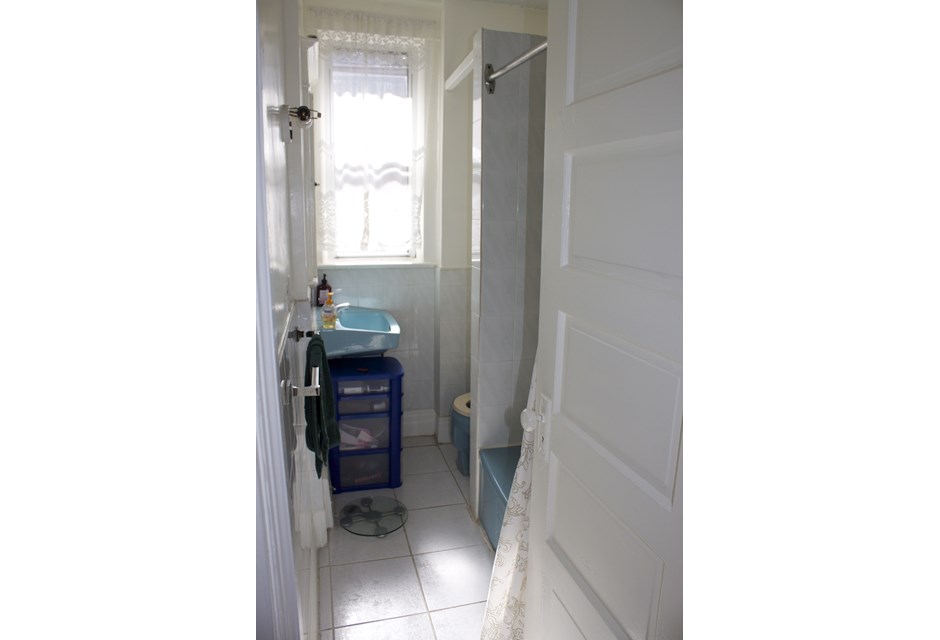
Before: Long and Narrow
This bathroom was small, awkward and offered no storage space.
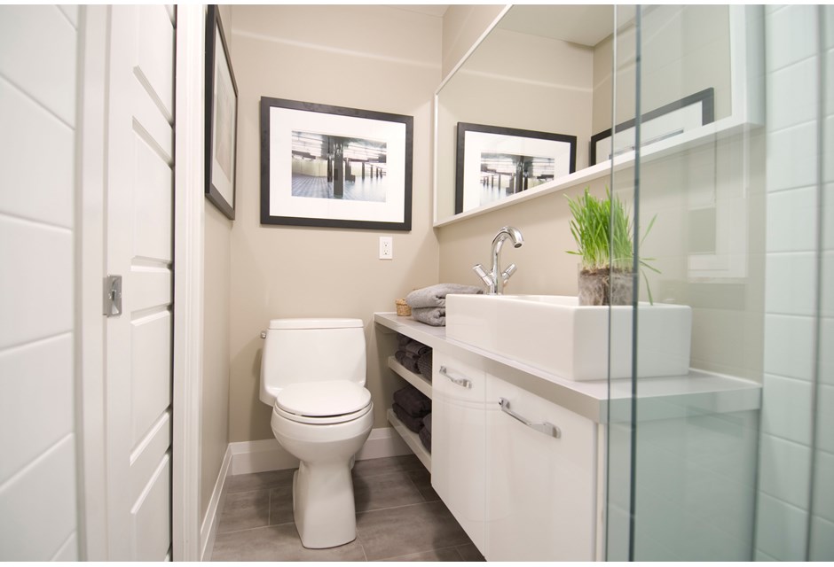
After: Clean and Contemporary
A glass shower and floating vanity with storage opened up the bathroom after this makeover.
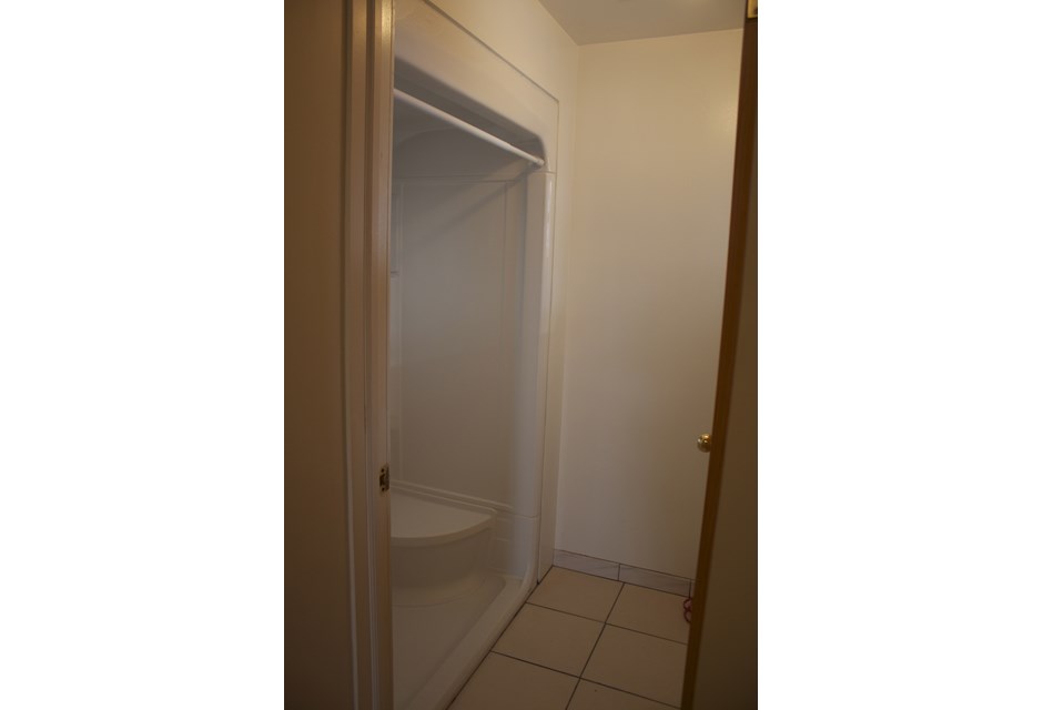
Before: Dark and Drab
This cramped bathroom was beige and boring before the makeover.
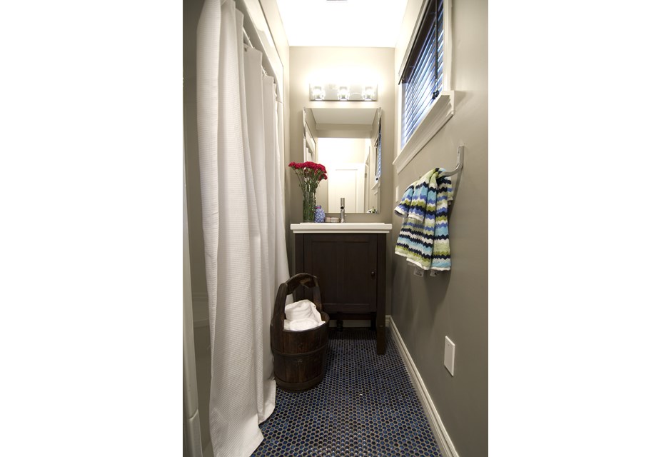
After: Magnificent Mosaic Tiles
These stunning tiny tiles on the bathroom floor create visual interest in an otherwise small, but stylish, basement bathroom.
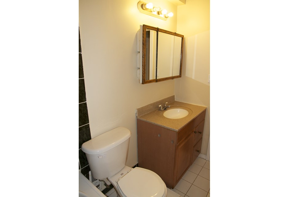
Before: Brutal Lighting
This bathroom was bad all around.
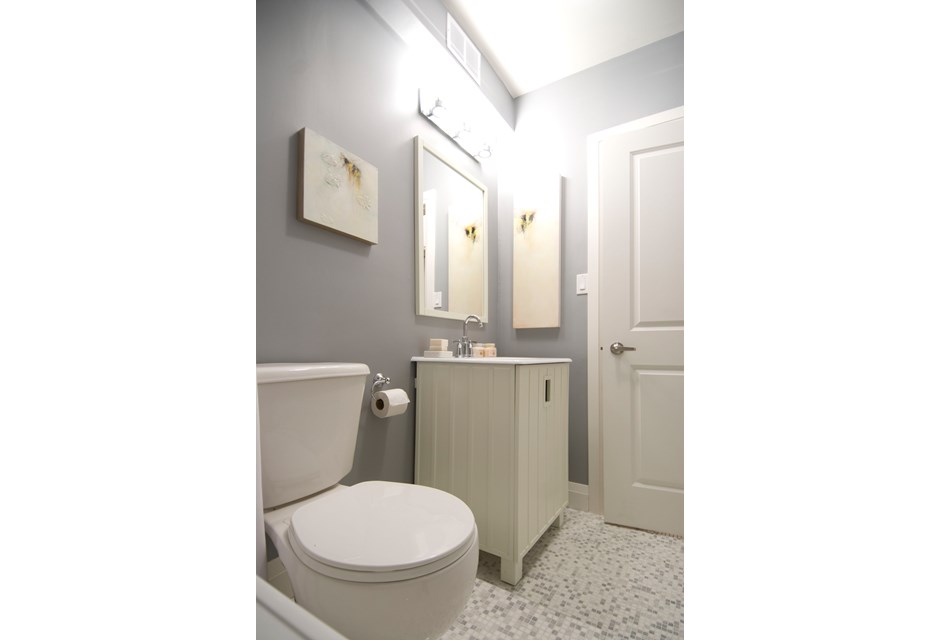
After: Seaside Influence
This bathroom, post-makeover, has a soothing beach vibe.
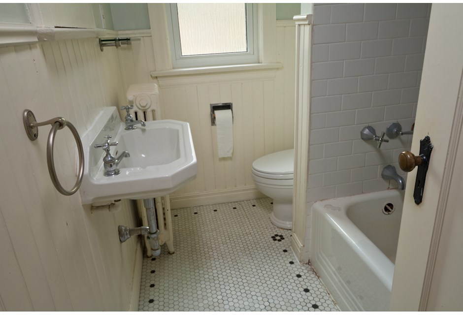
Before: Serious Potential
This bathroom had charming old-school elements, but lacked light and needed new fixtures.
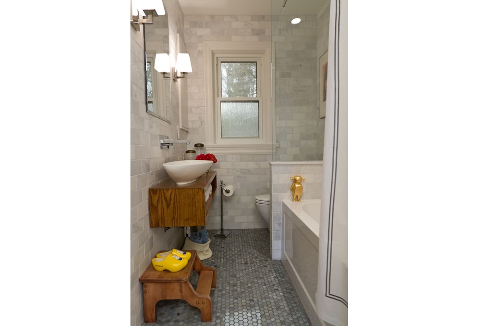
After: Contemporary Chic
Gorgeous new tiles, a floating sink and elegant lighting brought this family bathroom into the 21st century.
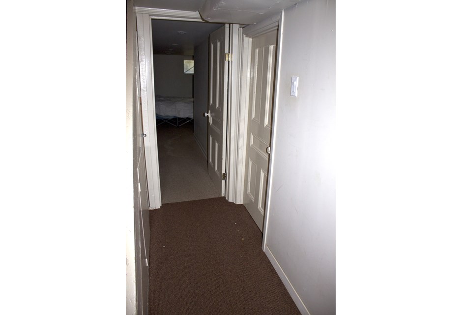
Before: Starting Fresh
This basement needed a bathroom, stat (and that carpet had to go).
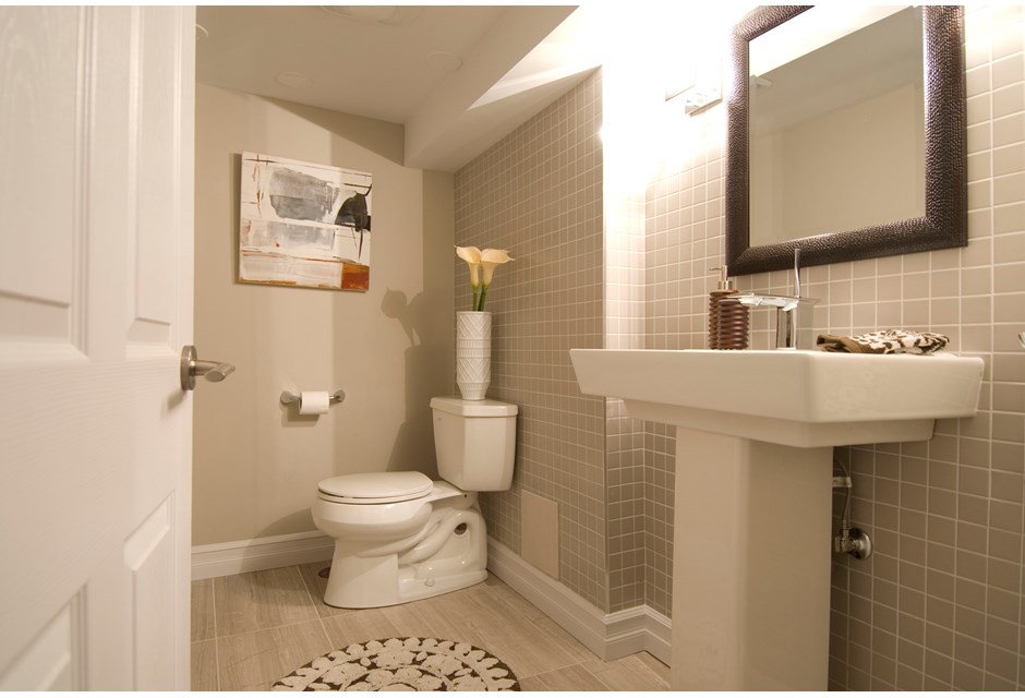
After: Transformed With Tile
This brand-new bathroom was perfect for a basement apartment.
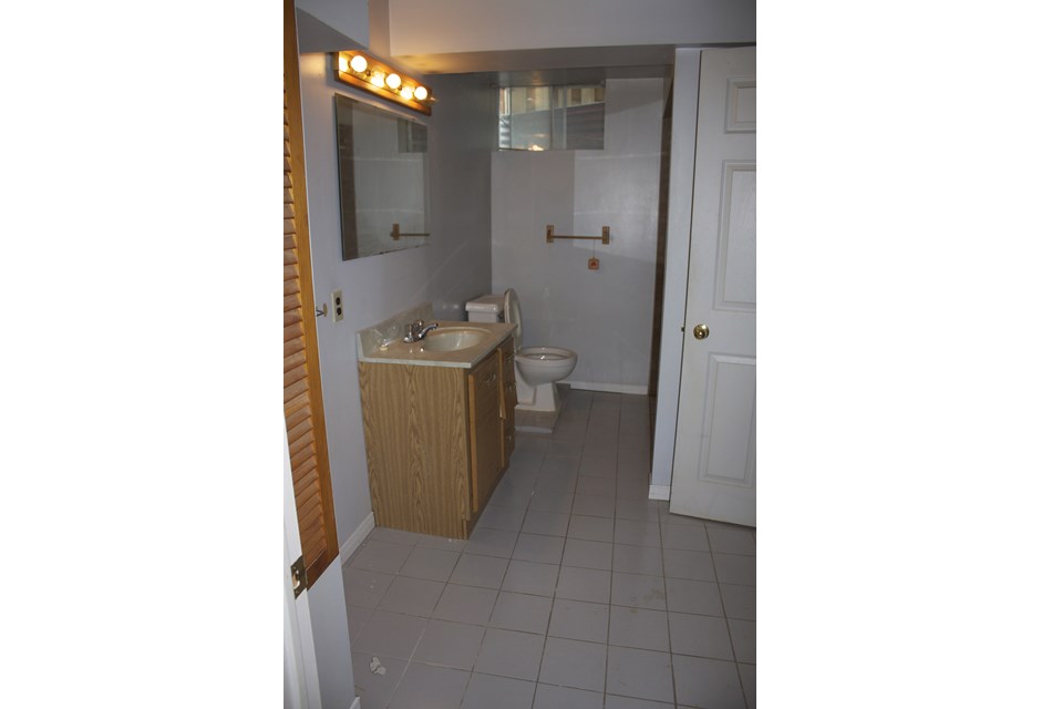
Before: Dark and Dreary
Outdated tile, poor lighting and a sad vanity were crying for a makeover.
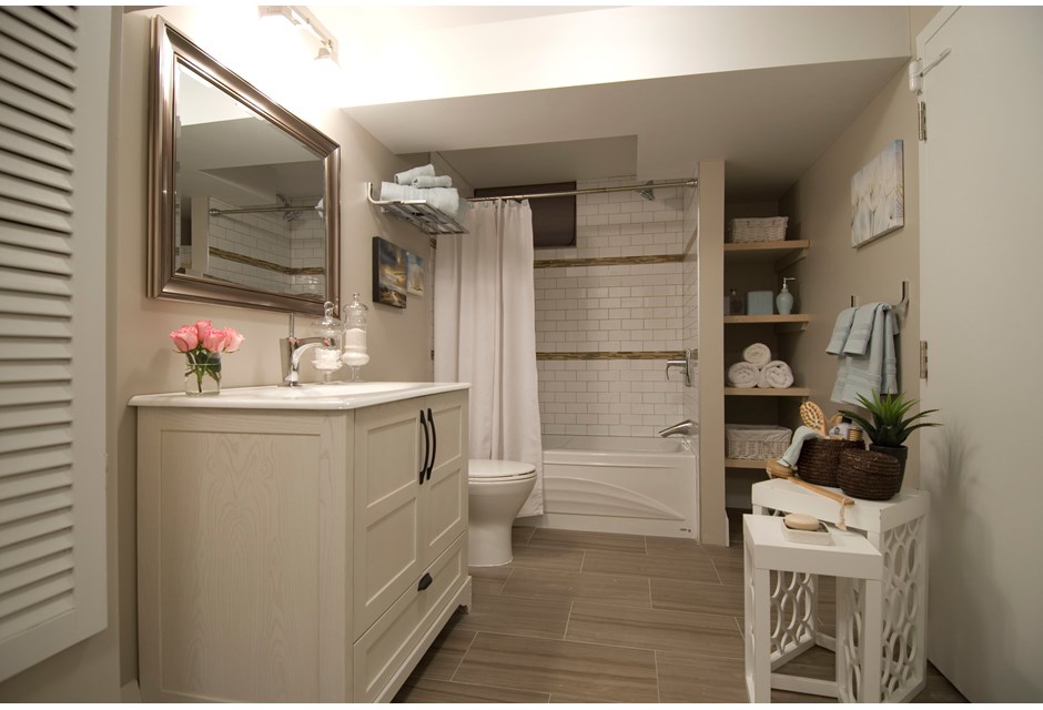
After: Fabulous Storage Solutions
Awkward extra space was made useful with custom shelves for towels and products.
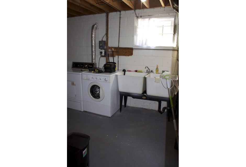
Before: Laundry Room to Bathroom
This dark, damp space was transformed into a full bathroom.
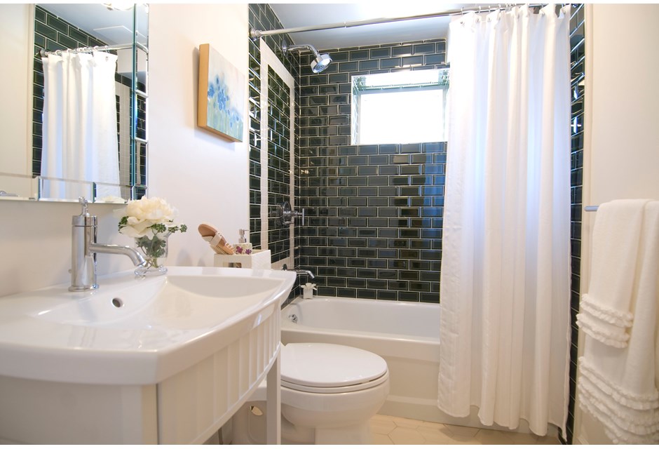
After: Green Glamour
We can’t get enough of this fabulous subway tile, a hot trend for bathrooms.
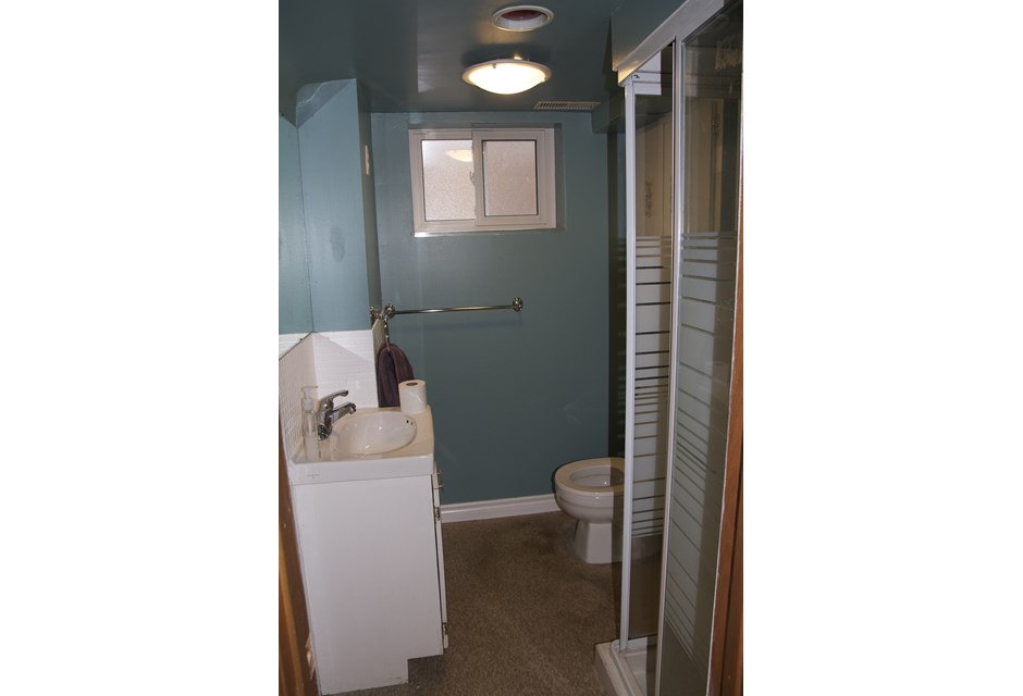
Before: Carpet in the Bathroom
Is there anything worse than bathroom carpeting?
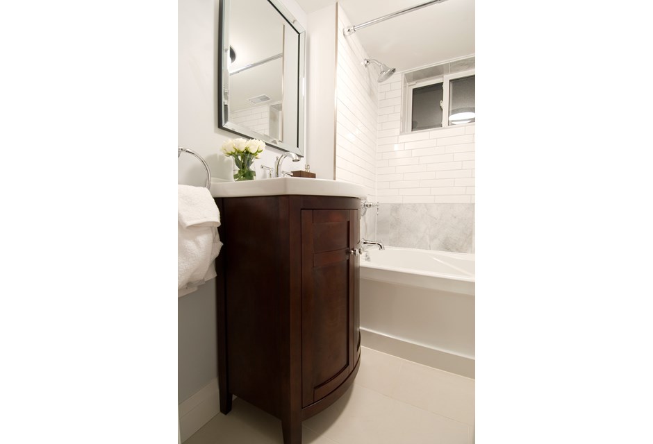
After: Carpet-Be-Gone!
A statement vanity with a classic mirror makes this bathroom look fit for a queen. And look, no more carpet!
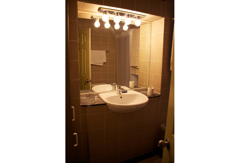
Before: Too Bright
These bulbs were awful in this dark basement bathroom.
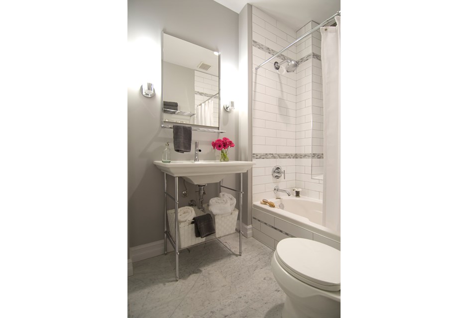
After: The Perfect Pair
When in doubt, white and light grey look clean and luxurious in any bathroom.
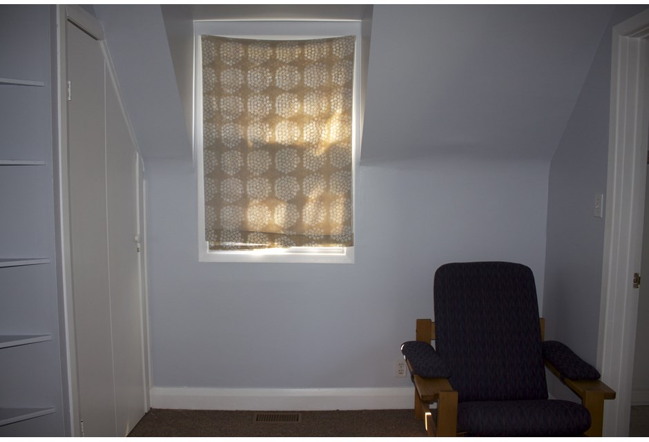
Before: Dark and Gloomy
The entire loft space was transformed and given a gorgeous new bathroom.
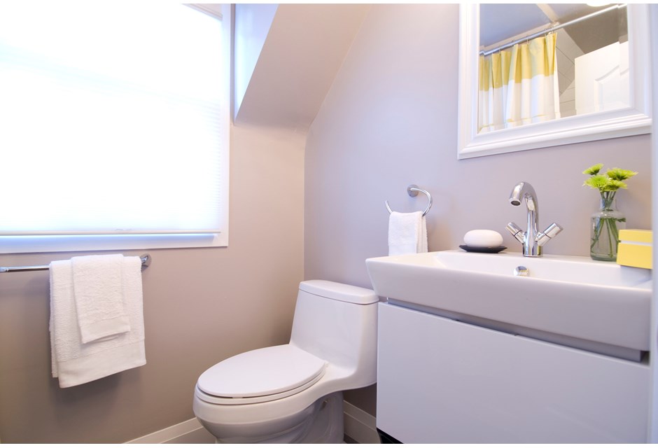
After: Loft Bathroom
This attic loft bathroom made great use of the awkward space and kept the feeling of space with light colours.
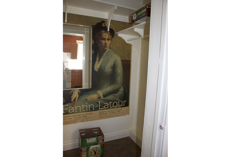
Before: Unfinished Powder Room
From storage room to beautiful bathroom, this is one amazing makeover.
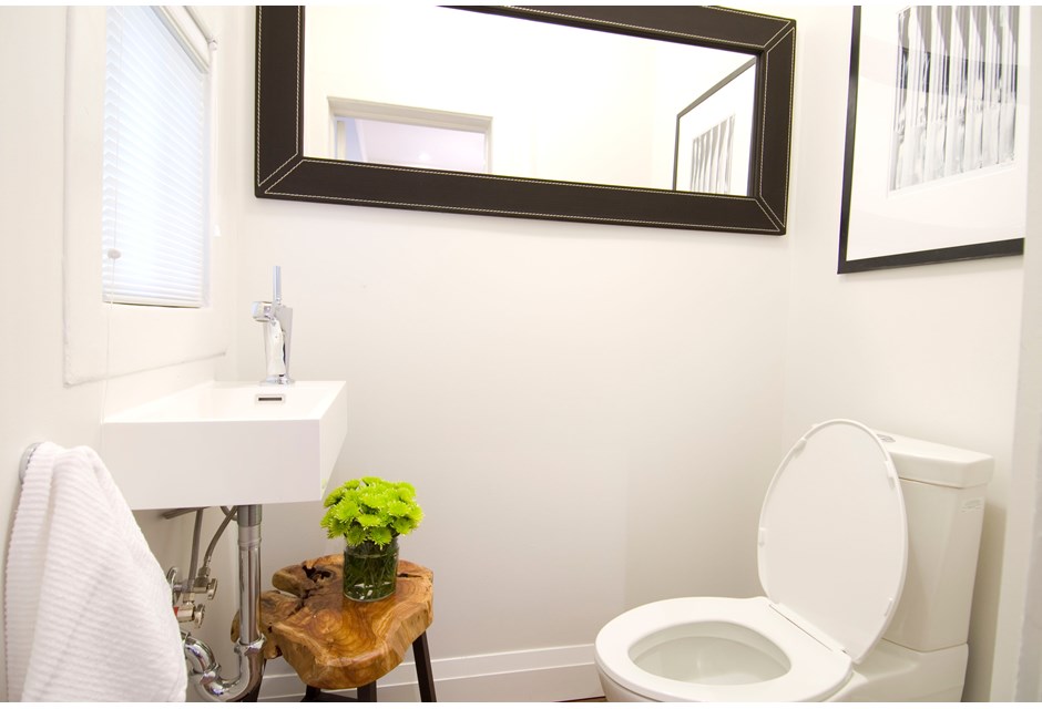
After: Mixed Materials
We love the mix of chic new fixtures with a dash of rustic wood decor for added flair.
HGTV your inbox.
By clicking "SIGN UP” you agree to receive emails from HGTV and accept Corus' Terms of Use and Corus' Privacy Policy.


