It’s time to declutter your life! We’ve all heard that large furniture and dark walls can make a space feel small and crowded, but it’s not as straight-forward as that. There are many other factors that could be giving your home a case of the clutters, from tchotchkes to overgrown plants to improperly sized rugs. Here are a few pointers to a path less cluttered and more inviting.
Brian McCourt is a contractor, design expert and co-host of HGTV Canada’s Backyard Builds.
Published July 2, 2018, Updated December 26, 2021
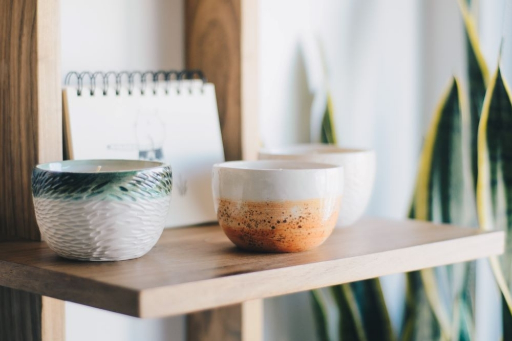
Dust Collectors
Does anyone else get a rush of anxiety when walking into a tchotchke-infested interior? Less is more when it comes to your personal collection of childhood figurines. Open shelving should be used to strategically place collectibles (as pictured here). The eye can only catch a small amount of special in a single gaze. Don’t get me wrong, I love a random conversation starter like a garden gnome in my living room, but there’s a fine line between quirky and cluttered.
Here are more designer secrets for making your living room look collected (not cluttered).
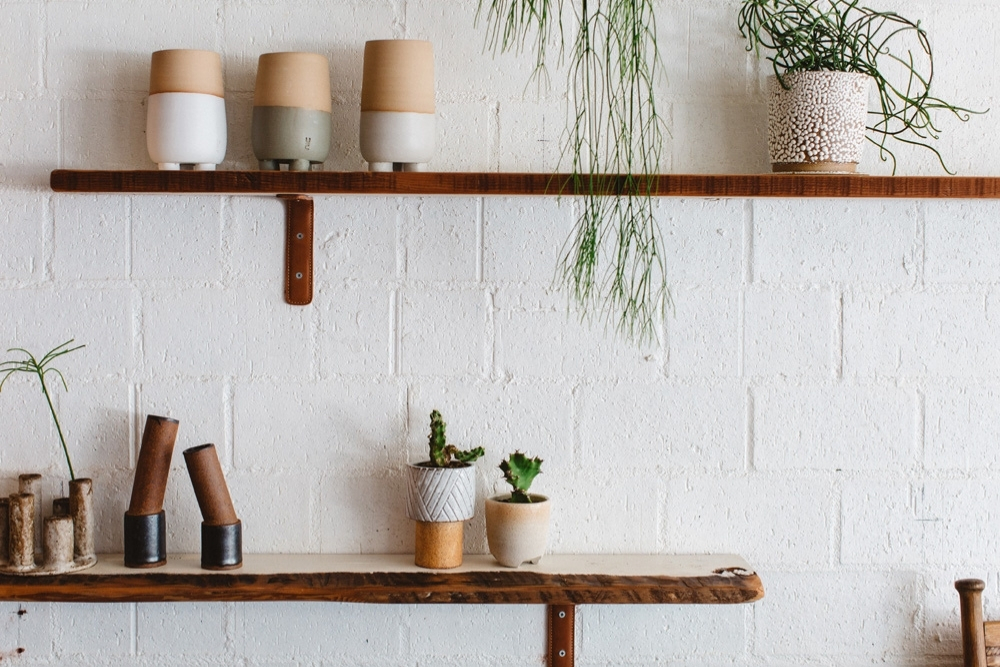
Open Shelving is Not Storage
This is going to sound strange to some people, but open shelving is truly not for storage. Instead, treat it as display space for visually pleasing, meaningful items. If you don’t have enough storage elsewhere in your home, then it might be a good idea to install doors on your open shelves to conceal the mess.
Related: Open Shelving: To Do or Not To Do? Bryan Baeumler Weighs In
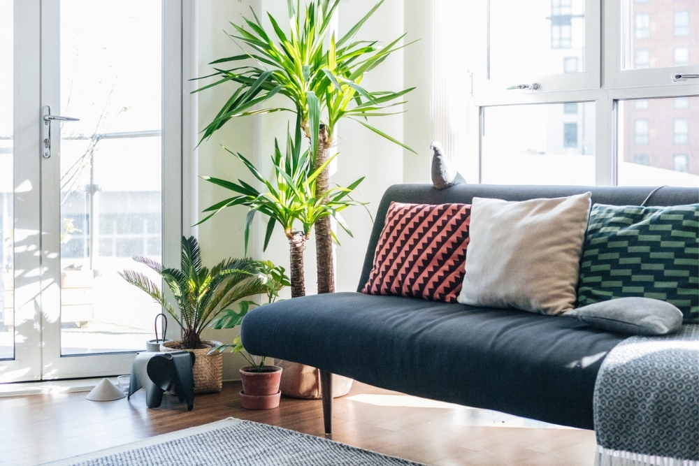
Too Many Throw Pillows
When it comes to trying to declutter your life, I feel like this is a common struggle for couples – right up there with trying to agree on the perfect thermostat temperature. If you don’t have the proper place to store decorative pillows when not in use, then it’s time to reduce. Opt for decorative pillows with washable covers so you can actually use them.
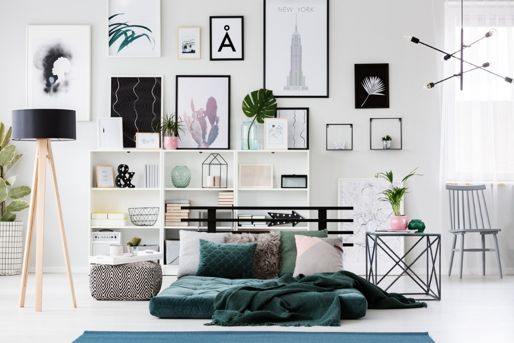
Over-Accessorizing
This is a common rookie mistake when it comes to decluttering your home. Adding too many accessories is a disservice to your living space. Negative space is your friend, which creates the illusion of more square footage. It’s also easier to dust and keep your surroundings clean. Less is more and groupings of two or three items tend to create more impact than larger collections.
Related: How to Give Your Living Room a Makeover For Less Than $100
Welcome to the Jungle
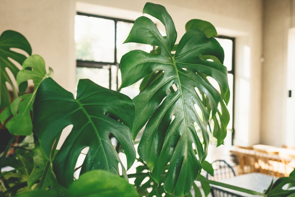
Although plants can help improve the air quality in our home, they can also make things feel cramped if not properly proportioned. Plants look a lot smaller when outside and can be extremely deceiving. If your ceilings are eight feet, then a plant should be no more than six feet tall – measure it before bringing it home. If you’re tight on space, but want a large plant, choose species that don’t bush out too far. My favourite is a single-stemmed fiddle leaf fig tree.
Related: 20 Plants That Are Poisonous for Children, Cats and Dogs
Styling Every Wall
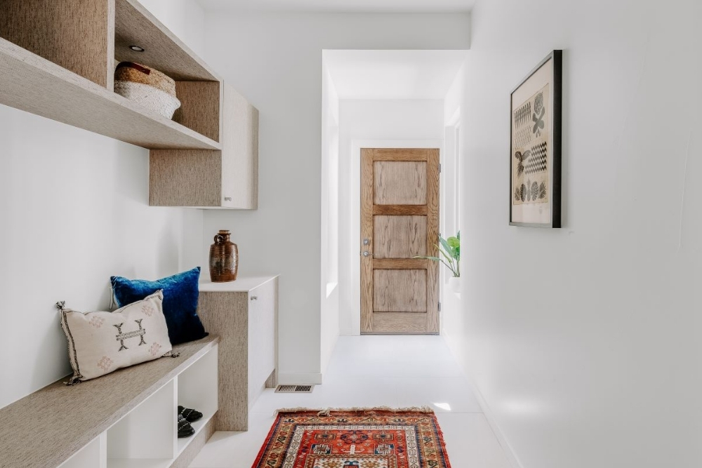
Style large walls that allow the decor to breathe, rather than dressing every piece of drywall you can see. If you’re one of those people (ahem, like me) who gets bored and is continually switching things up, then swap your wall decor seasonally – just resist the urge to add without removing and try to leave the small transition walls alone (the narrow walls between or above doors).
Related: 8 Unexpected Wallpaper Ideas That Don’t Involve Walls
Improperly Sized Rug
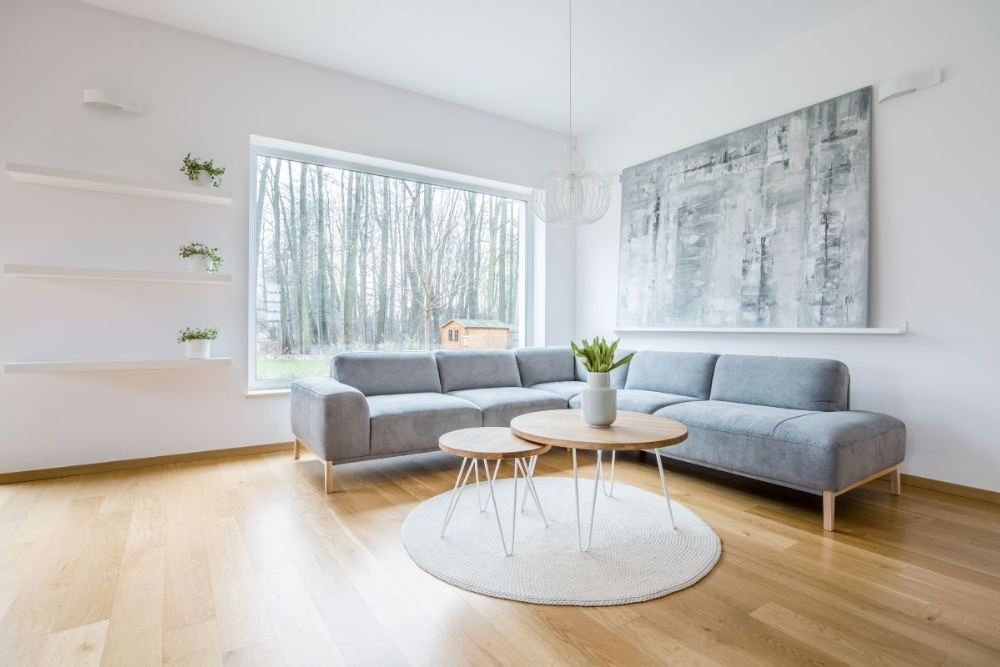
When an area rug is too small, it makes a space feel disjointed. Every piece of conversation furniture should touch the area rug. If your rug is too small and you have to live with it, try layering a complementary rug on top of it at a different angle. This will give the space a contemporary feel and allow the floor coverings to reach each piece of furniture.
Related: 20 Small Living Room Design Ideas You’ll Want to Steal
Multiple Accent Walls in One Space
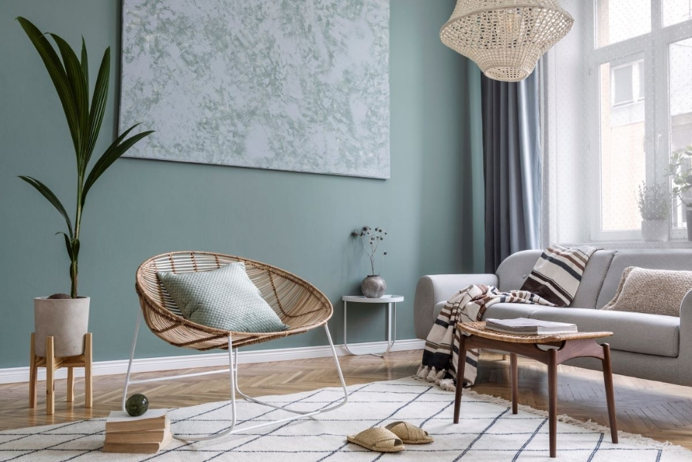
I rarely say the word “don’t,” but I feel strongly about this one. Don’t create two different feature walls in one room. Choose your favourite look and make it killer, but stick to one attention-craving wall. The only exception I will make is if you treat all of the walls the same for an edgy, unified look.
Related: 10 Whimsical Kids’ Room Accent Walls (And How to Score the Look)
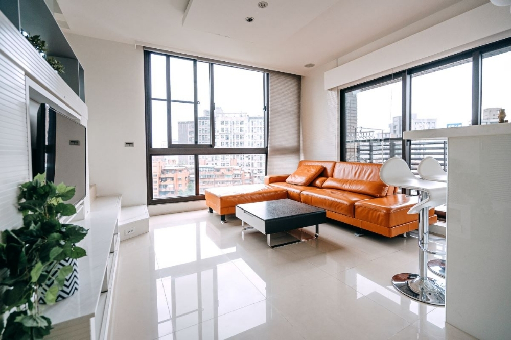
L-Shaped Sofas
Just about everyone loves an L-shaped couch these days. I have to admit, they are a comfy configuration and a great alternative to the traditional three-seater, but they can also limit the flow of a space and make a room feel less functional, depending on the layout. L-shaped sofas are perfect for creating zones in a large open space, but they work against you when the room has a smaller footprint. Instead, check out these sectional sofas that will transform your living room or these ones that are perfect for every type of home.
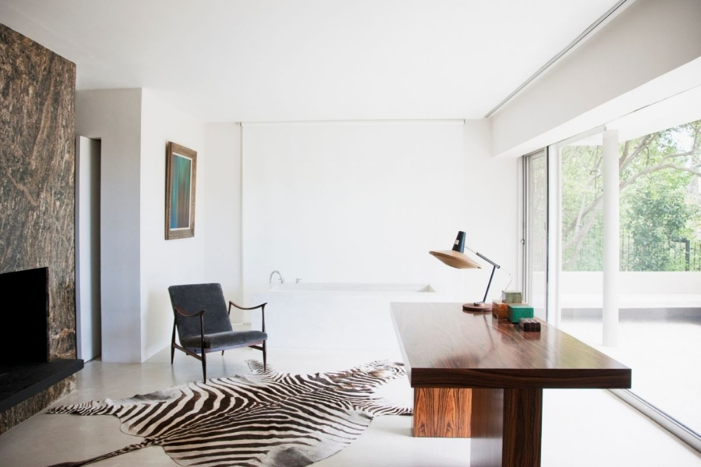
Different Coloured Bulkheads
This design mistake can cause bulkheads to look larger, especially if painted in contrasting hues, which will make the ceilings appear lower than they actually are. Instead, keep things simple and paint bulkheads the same shade as your wall (as pictured here). The best approach is to paint the highest surface the ceiling colour and anything below it the same hue as the walls. For more inspiration, check out these features that will add the most value to your small space.
HGTV your inbox.
By clicking "SIGN UP” you agree to receive emails from HGTV and accept Corus' Terms of Use and Corus' Privacy Policy.


