When Marie Girolamo and her three partners (the forces behind County Curated) came across an 1800-square-foot, two-storey home for sale in the pretty town of Bloomfield, they didn’t hesitate. Some red flags were there: literally, in the form of a gloomy rooms covered in layers of red paint, as well as in a kitchen that couldn’t be salvaged. But a first-floor reno, which created space for a third bedroom and a mostly monochromatic palette transformed it into The Stanley, an in-demand getaway with just the right amount of rustic red.
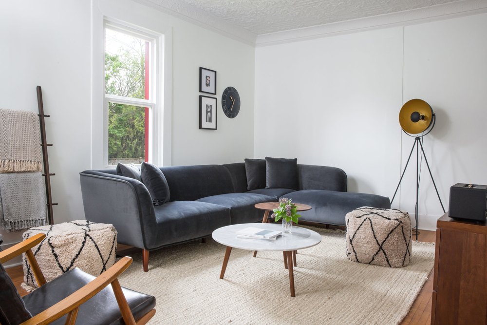
Sitting Pretty
“Who doesn’t love a sectional?” says designer and co-owner Marie Girolamo. She chose this burnished slate beauty for the living room for many reasons; not only does it maximize seating options, it also invites cozy lounging and offers the space to sit back and stretch out in a way a sofa wouldn’t.
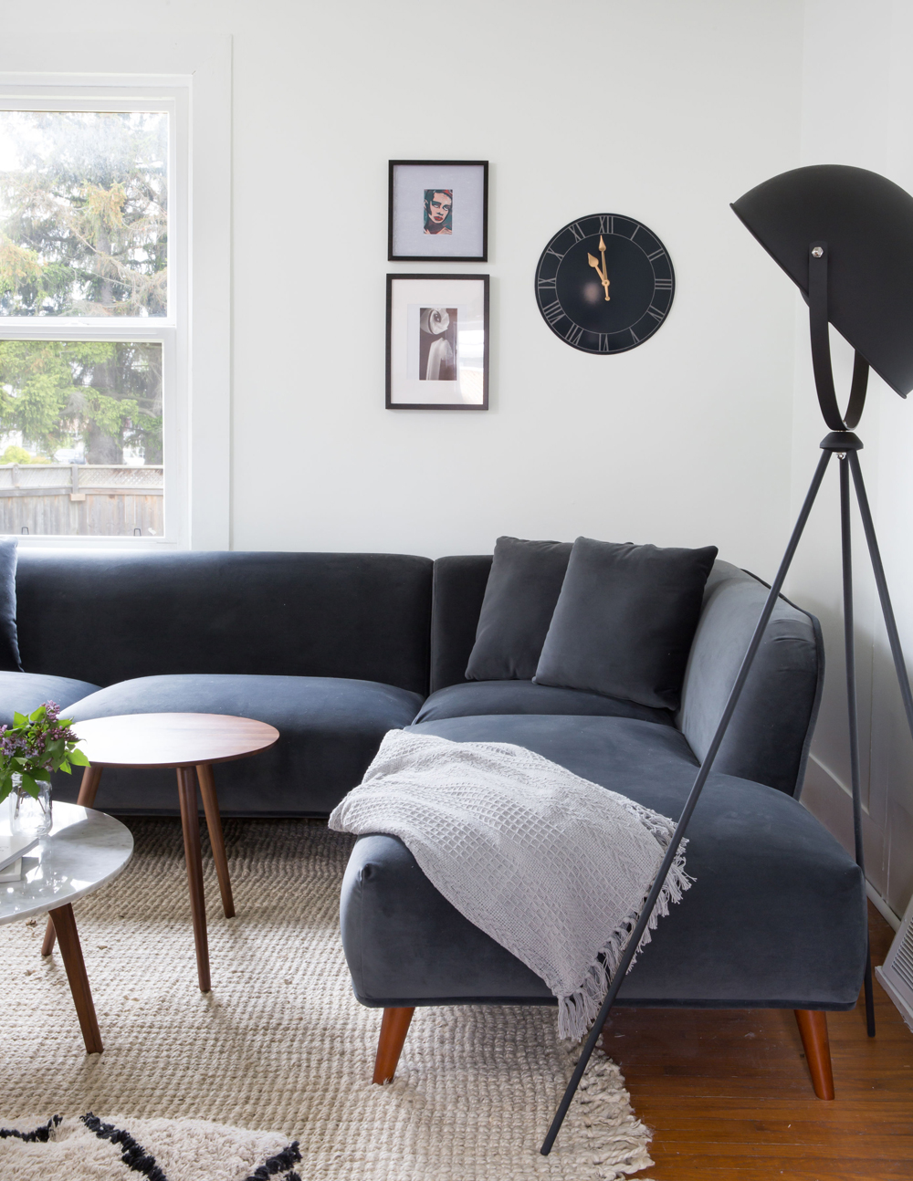
The Light Stuff
A dramatic lamp, like this one from Wayfair, is another easy and budget-friendly way to create visual interest in a room. More mood than task lighting, this showstopper looks just as good day and night and blankets the living room with indirect illumination for a warm and soft glow.
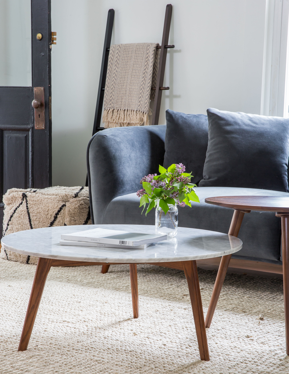
Table Manners
The dimensions of the living room called for a coffee table that would fill the space; rather than one large table, Marie chose two smaller round versions. The mixed heights and materials (walnut and marble) feels edgier than two identical tables and they can also be easily moved around the space for user-friendly practicality.
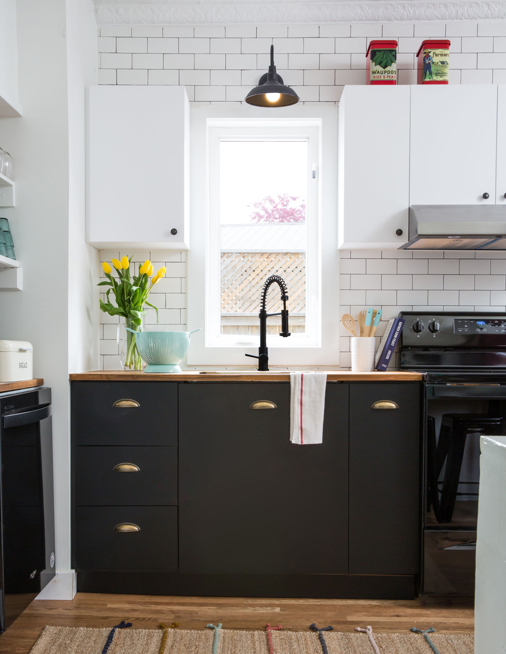
In Black and White
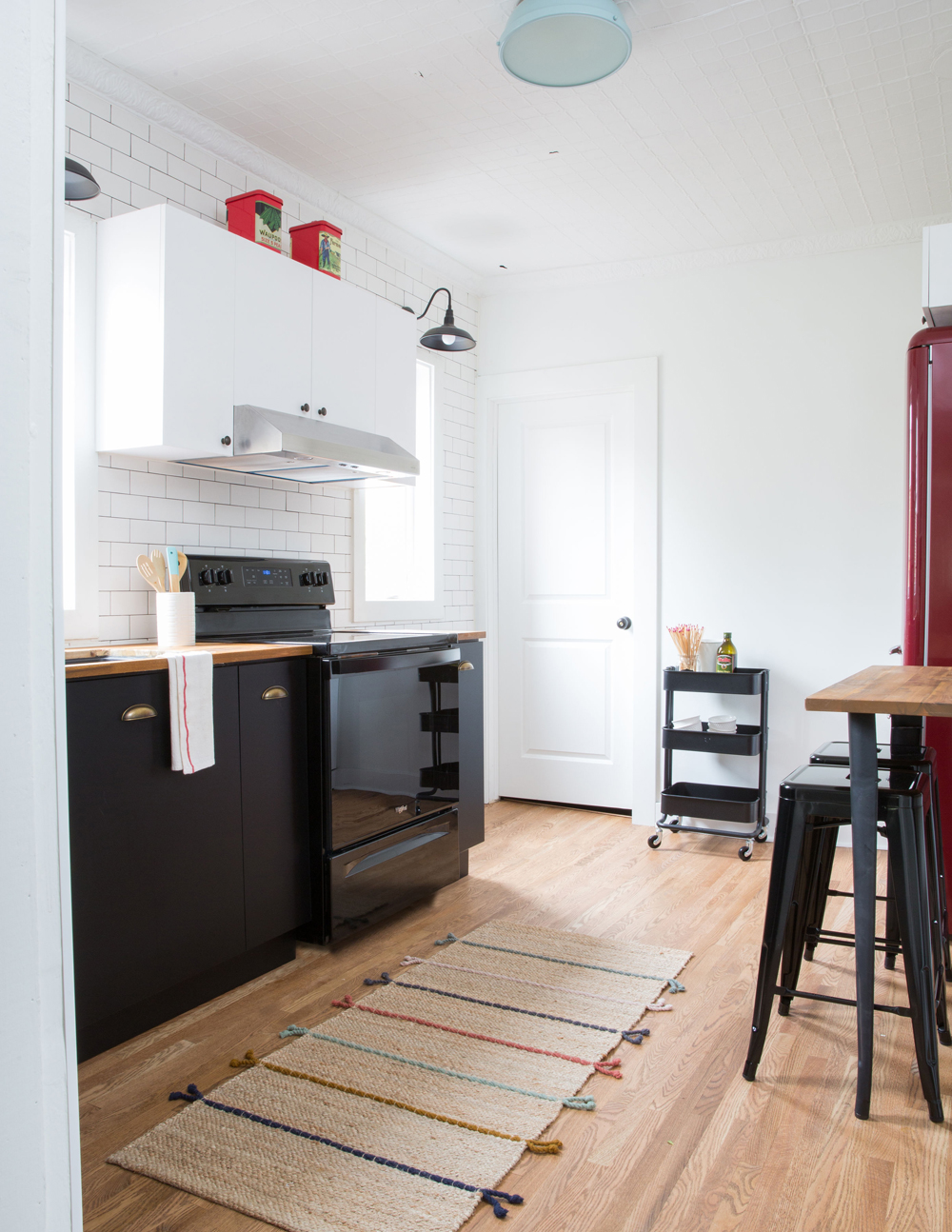
When it came to decorating the kitchen, the owners turned to farmhouse photos for inspiration and saw that contrasting upper and lower cabinetry was often part of the rustic plan. This palette scheme ties in nicely with the rest of the home’s decor and the darker lowers are super-practical, forgivingly hiding dirt and smudges.
A Moveable Feast
Form meets function in the kitchen’s three-tiered cart on wheels. It’s a small accessory that’s big on style (black for decor continuity) and practicality – it offers extra storage surfaces and can easily be pushed over to the stove or bar seating as required.
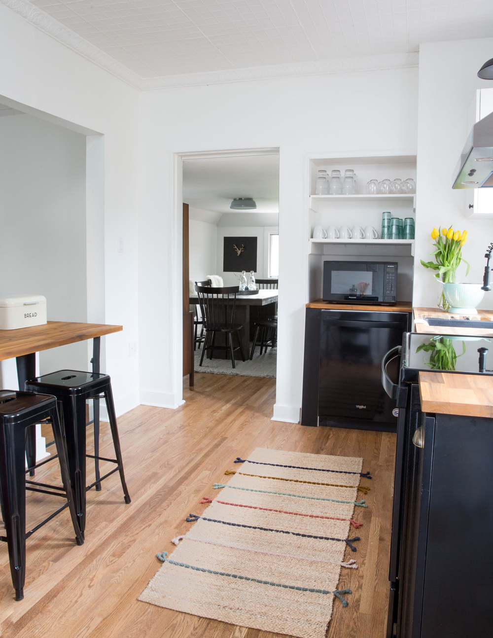
Table Talk
The owners made ingenious use of the butcher’s block that was left over after fitting the kitchen’s countertops. “We added black metal legs to it and created a bar-like table that we accessorized with black stools,” says Marie. The result is a custom look on a DIY budget. A jute runner layers in a bit of texture and pattern underfoot.
The Art of Dining
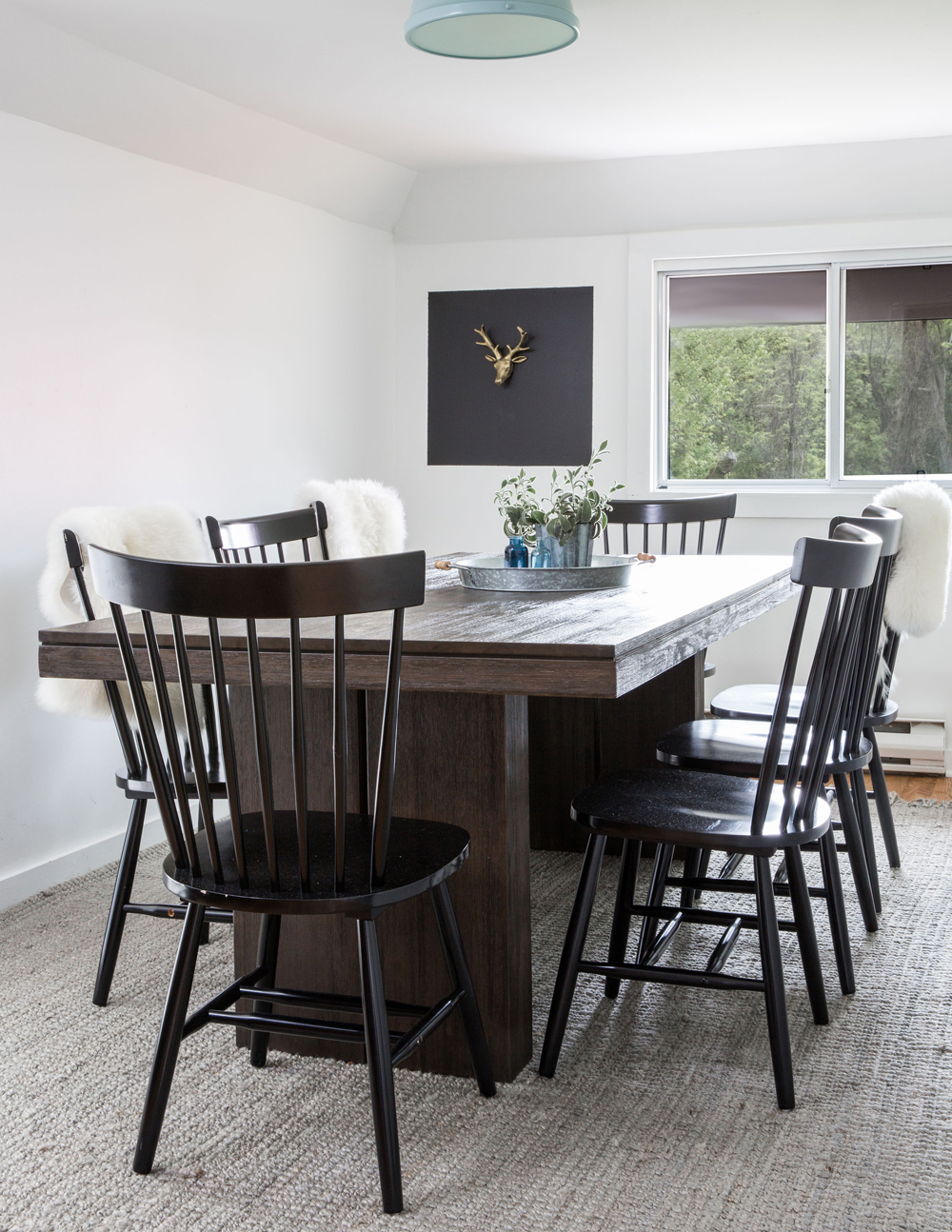
The dining room has many ideas to steal, such as avoiding an all-in-one dining set by pairing a table and chairs from the same big-box store. But our favourite element has to be the extremely creative artwork: a deer’s head which was purchased at a dollar store, painted gold and mounted on a square of black paint. It’s simple, fun and fills in the space with artistic flair.
White Out
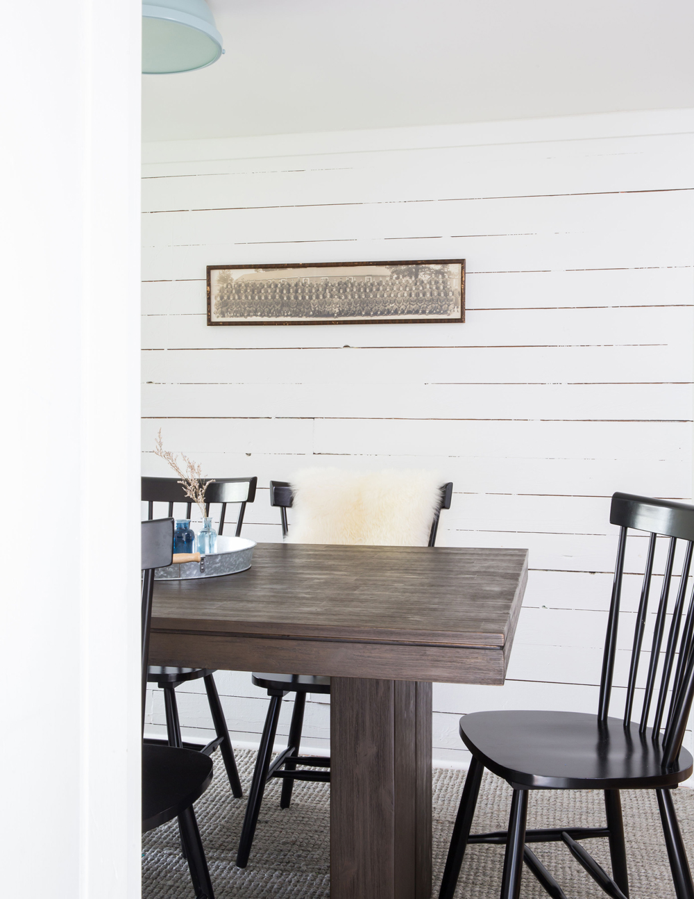
If you think wood shouldn’t be painted, think again! This refreshed wall, while white, is still rustic thanks to the panelling and artwork here: the sepia-tone makes it feel like a country heirloom and its rectangular shape nicely references the table.
Shelfie
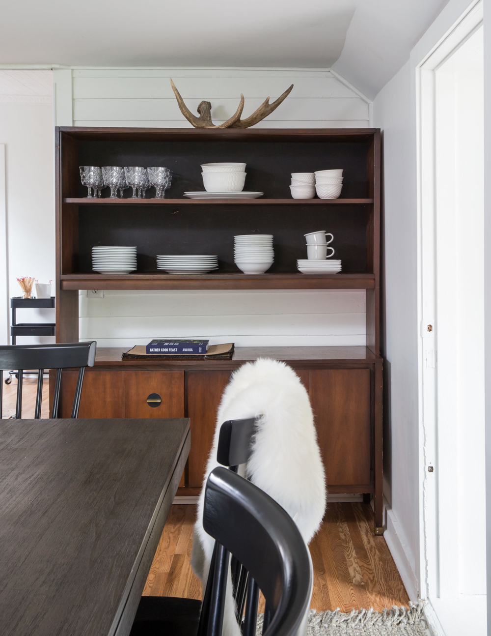
This shelving unit in the dining room came with the house and has taken on a whole new countenance in the now transformed bright, white space. Multiples of white dishes and some pretty cut-glass keep the look cohesive and sleek, while the antler and soft faux throws are a nod to country-house style.
Contrasting View
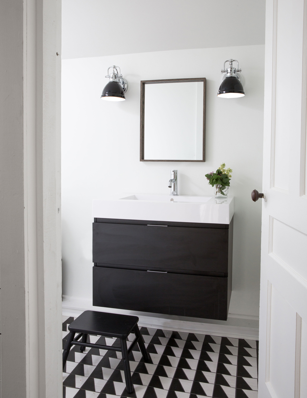
This bathroom’s black and white vanity continues the home’s dynamic palette and informs the rest of the room’s furnishings. The floating fixture lets the floor tiles shine and by sticking to two colours, the overall effect is crisp and graphic – a far cry from the previous gloomy shades of red and teal. We also love the industrial vibe of the sconces, which should always be beside – never above – a bathroom mirror.
To Be Continued
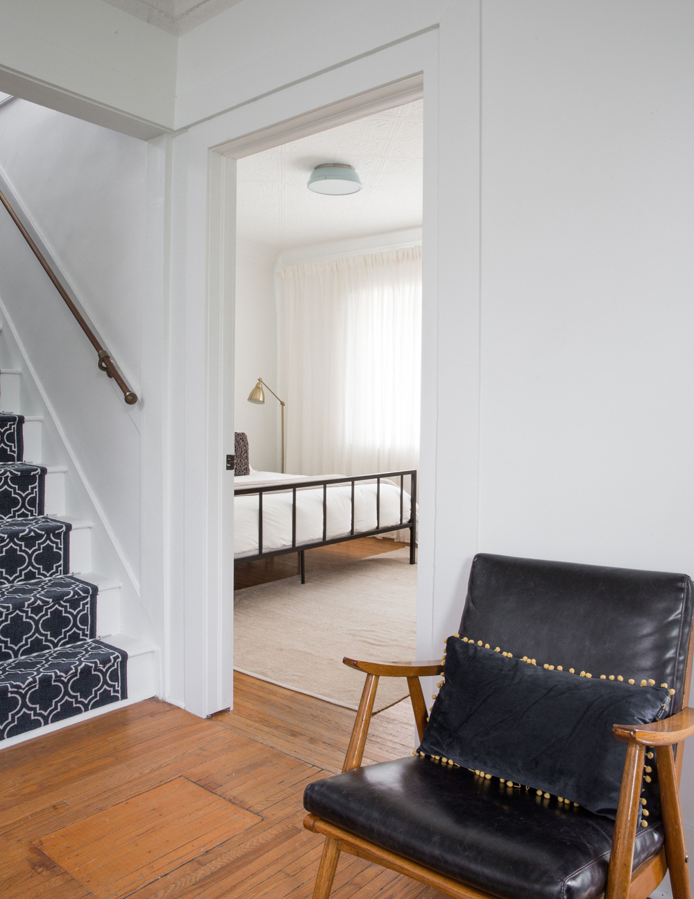
Every aspect and area of this home feels smart thanks to the continuity of a black and white colour scheme. The runner is a fine example of this vision and its graphic pattern helps hide dirt – this is a rental after all. The wood floors and accents maintain a warm vibe.
Dream Catching
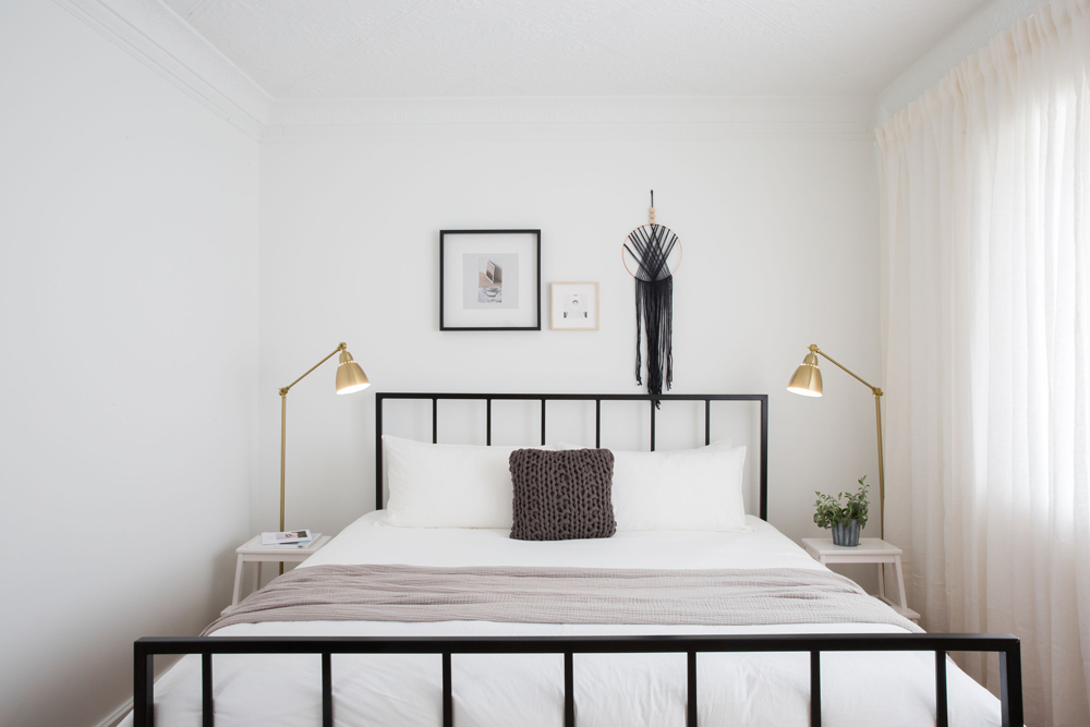
Blanketed in white, this dreamy bedroom is punctuated with thoughtful and budget-friendly accessories, including a black wall hanging that puts a modern spin on a traditional dreamcatcher (it was an Etsy find). The dark accents are given a golden glow by IKEA floor lamps, a smart choice for freeing up space on the bedside tables. Sheer drapery keeps the look fresh and airy and a king-size bed (standard in all three bedrooms) invites sleeping in.
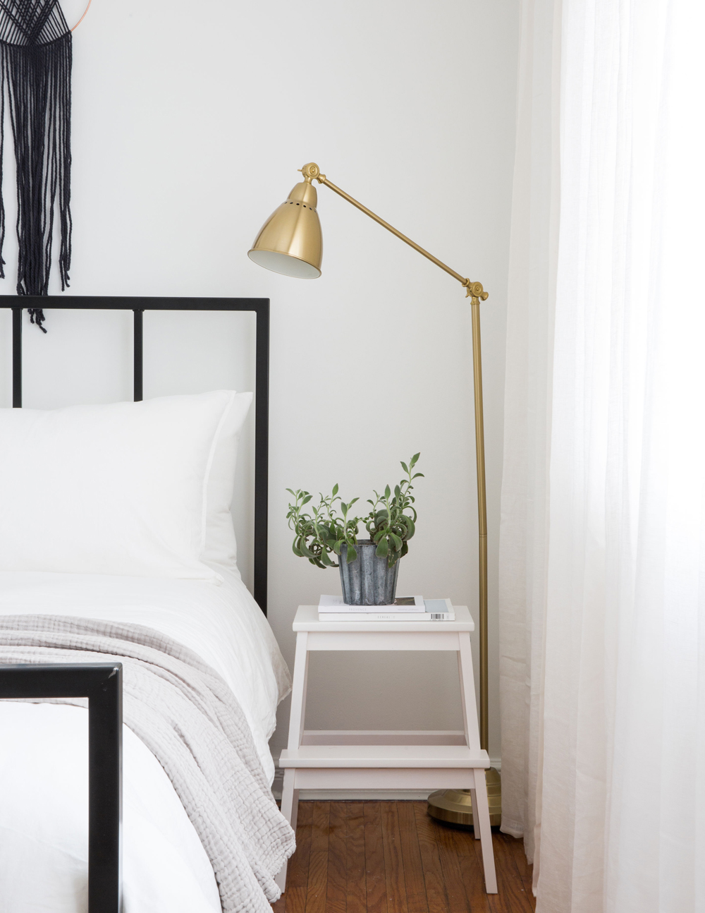
Step Up
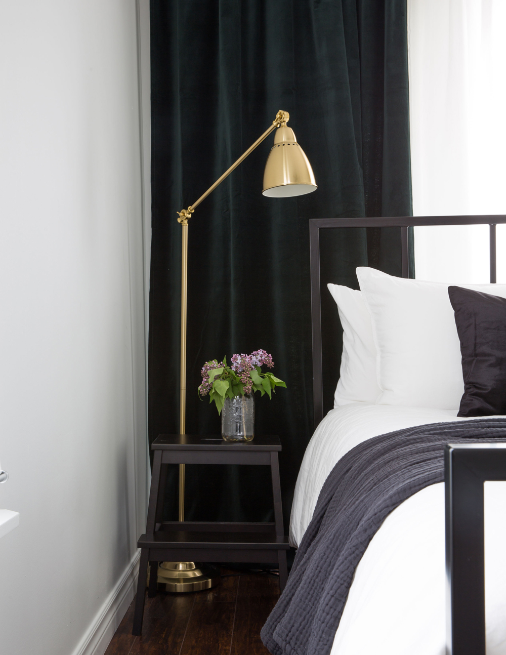
Decorating should never be prescriptive – read: a bedside table doesn’t necessarily have to be a bedside table. Here, a step stool from IKEA does the trick and its open silhouette is both breezy and graphic.
Related: This Adorable Cozy Cottage Near Ottawa is Peak Canadiana
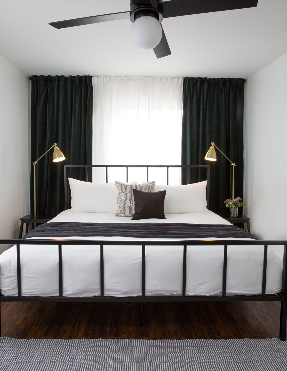
Curtain Call
Curtains are a smart way to add depth and energy to a room that may otherwise lack architectural interest. The choice of darker shades here feels dramatic and provides a sharp backdrop to the brass lamps. The striped runner keeps the look light.
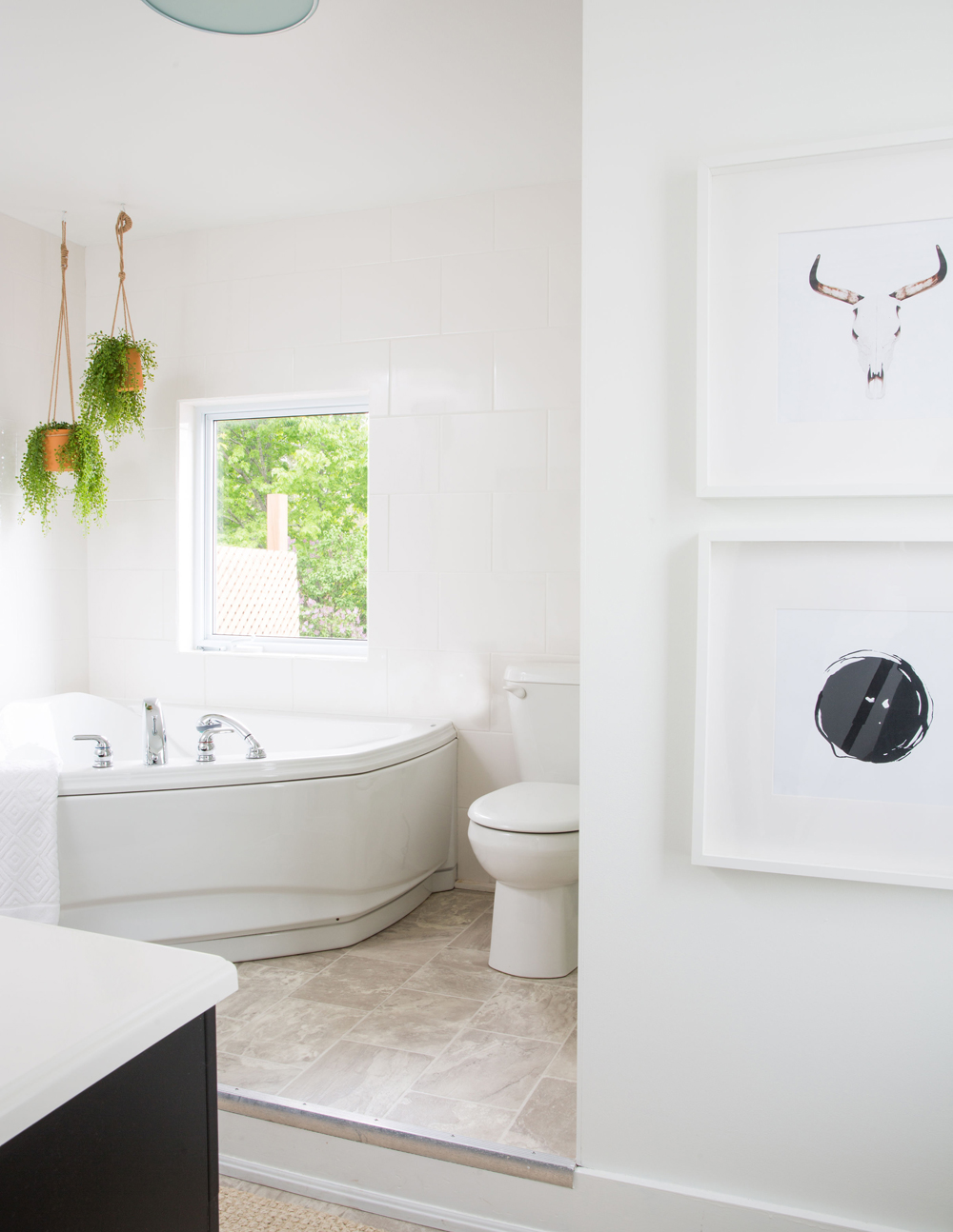
Easy Being Green
Though perfectly functional, the corner tub, fixtures and floor tiles that came with this bathroom are a little outdated. To remedy that, Marie painted the space white, added artwork and introduced hanging plants that draw the eye upward to create a new focal point.
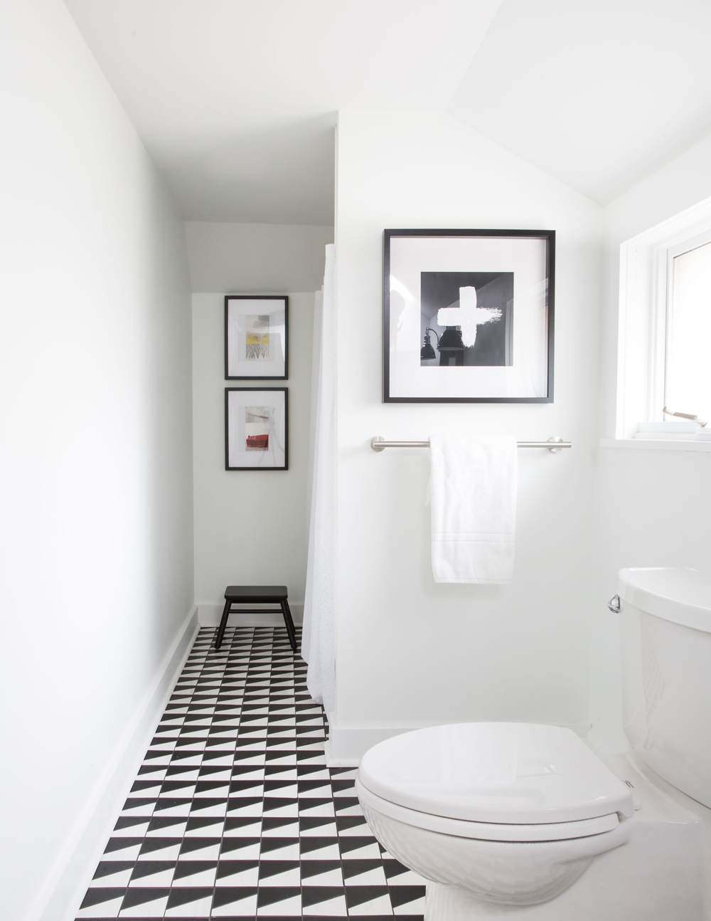
Going Graphic
All-white bathrooms are often crowd-pleasers, but why not inject a bit of graphic oomph with fun floor tiles? These lend pattern and draw the eye to the end of the space making it seem longer. Black-framed artwork completes the effect.
Colour Code
The white IKEA step stools that were repurposed as bedside tables in the previous bedroom are repeated here in black; there’s continuity in the same silhouette and a bit of fun in the different colour choice. The dark cushion and throw nicely finish the bed.
Artful Lodger
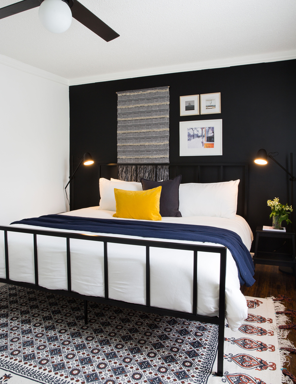
How fab is this bedroom? It’s also a reminder that you can stray from the original design plan. “We had painted this entire bedroom white, then felt it looked too similar to the main floor bedroom,” says Marie. “We decided to switch it up and paint one dark wall for contrast and to better showcase the light art.” A zingy yellow cushion is a cool touch.
Hooked on Classics
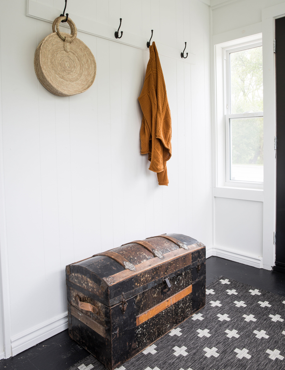
Simple black hooks negate the need for a closet and casually hung items have a carefree country vibe that feels intentional. A vintage trunk amps up the rural mood, while a graphic black and white rugs adds contemporary cool (and hides dirt).
Hit the Patio
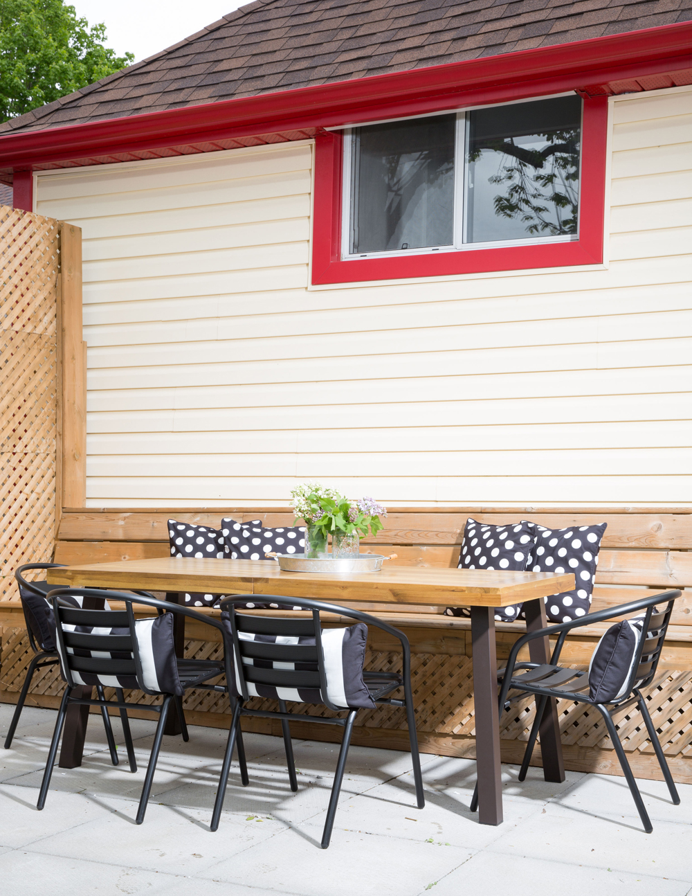
Three words: avoid the set! The key to this inviting outdoor space is in the mix: the table doesn’t match the chairs and additional banquette sitting continues the melange. The choice of black and white, once again, maintains the home’s design brief and echoing indoor colours outside is a great way to keep establish cohesion.
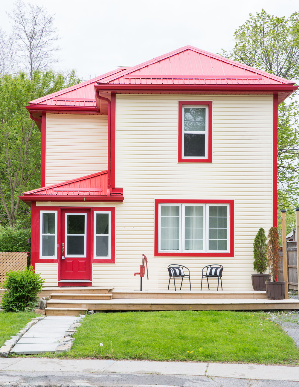
Well Red
“The red trim was definitely a point of discussion among us!” says Marie. While shades of red were overpoweringly everywhere inside (even the toilet paper was red), the owners came to appreciate its effect on the exterior. “It gives the home a kind of schoolhouse vibe which we used as inspiration for the decor and furniture selection.”
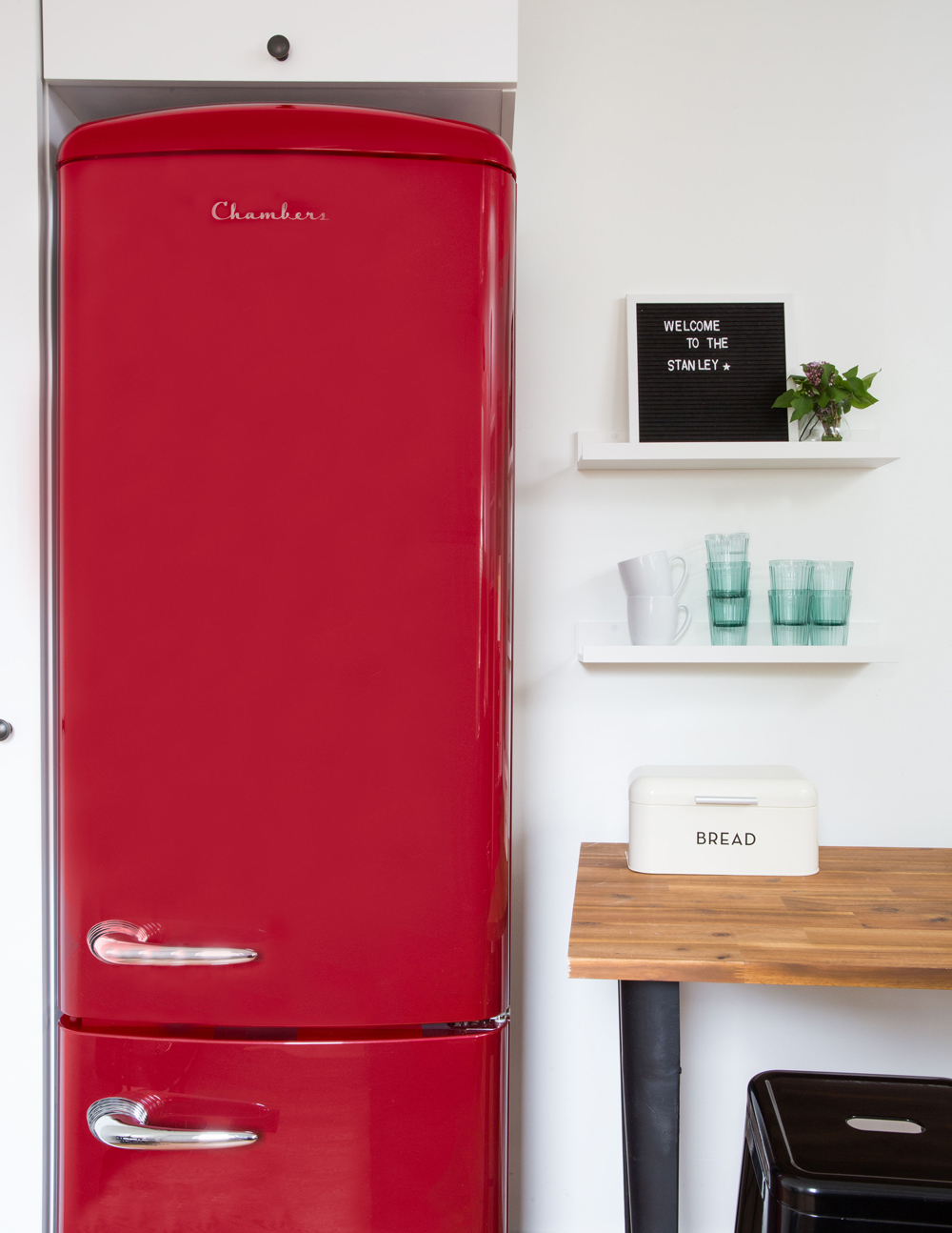
Warm Welcome
Not only does it have a retro feel, the red fridge is a cheery addition to the mostly black and white kitchen. Its rich colour brings the exterior red indoors and echoes The Stanley’s ethos of a cozy getaway that combines supreme comfort with charming panache.
HGTV your inbox.
By clicking "SIGN UP” you agree to receive emails from HGTV and accept Corus' Terms of Use and Corus' Privacy Policy.


