When world-renowned design firm PYR, founded by legendary designer Pierre-Yves Rochon, invites you to preview their latest luxury makeover, you don’t say no. We didn’t and were lucky enough to get a sneak peek of the jaw-droppingly gorgeous St. Regis Rome, a bucket-list hotel, before its unveiling later this year. During an exclusive interview with PYR Senior Project Director Dean Morrison, we got the inside scoop (and fabulous inspiration) for you.
Go Grand
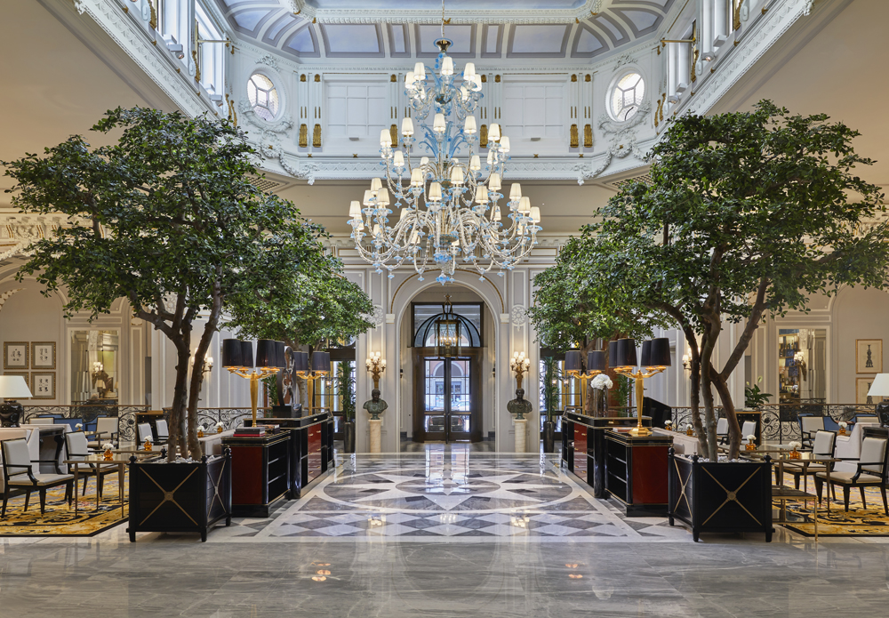
“Light, reflectivity and refinement are the keynotes of the design throughout the hotel, not least in the lobby, which is dominated by a five metre hand-blown Murano glass chandelier,” says Morrison. “The wall and ceiling details are from the original 1894 César Ritz design and were repainted dove grey for a more modern impression. The planters recall that this was once an external courtyard. We wanted a connection with the outside.”
Introduce Rich Textures
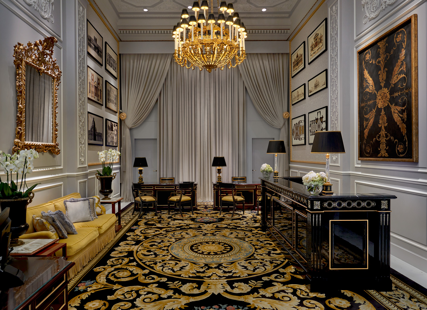
You’d be forgiven for thinking this was a private room rather than the hotel’s check-in desk. “We introduced as many soft elements as possible here, including the hand-tufted inset carpet and the double-height drapery, to create a residential feel,” says Morrison. We love the lengthening effect of the drapes extended to the ceiling and how the design team thought outside the box. “We used seated desks instead of an expected check-in counter.”
Play With Contrast
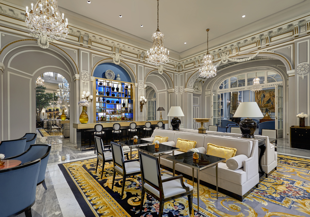
It’s easy to imagine sipping prosecco in the hotel’s stunning Caelum Bar. “Here, we mixed traditional and opulent accessories [those chandeliers!] to reinforce the spirit of the renovation,” says Morrison. “This more contemporary-styled bar contrasts the traditional architectural details and re-energizes the space with modern functionality.” We love the way the gold accents enliven the cool greys.
Get Reflective
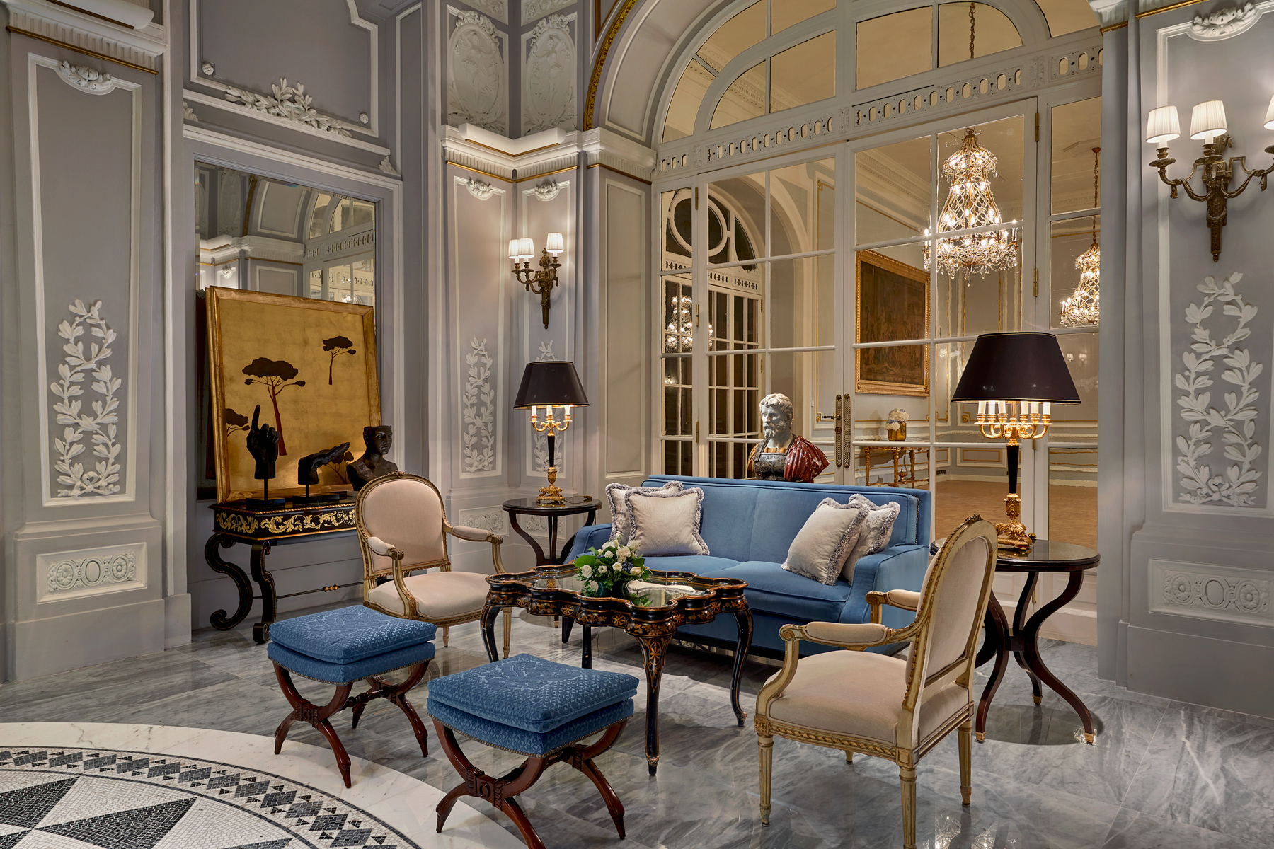
The hotel’s rotunda seating area exemplifies the design power of something as simple as mirror panels. “The mirrors have a light and modern effect that further reinforce the hotel’s seamless blend of history and modernity,” says Morrison. It’s true – imagine this space without them and that sophisticated airiness gets lost.
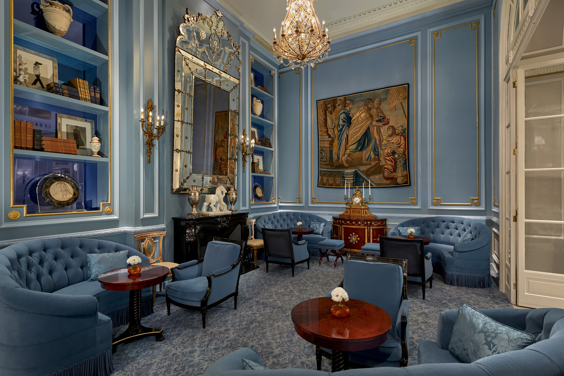
Embrace a Single Shade
The dove grey, deep yellow and powder blue of the bar extend to the hotel’s library. “It’s actually an aristocratic Roman palette,” says Morrison. “Here, the powder blue dominates and ties the space together.” We love the boldness of using one colour for the walls, furniture and carpeting.
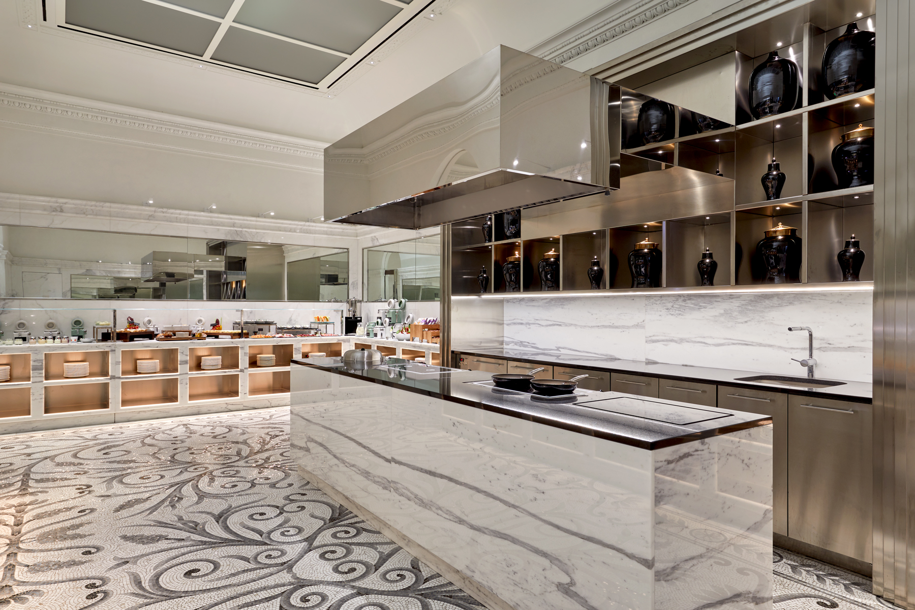
Mix Materials
The kitchen continues the marriage of history and modernity with a dynamic mix of materials, from sleek stainless steel and heavily veined marble to the wonderfully intricate floor. “The mosaic marble is an authentic Roman material and technique,” says Morrison. We love how the grey tones in each material unify the space.
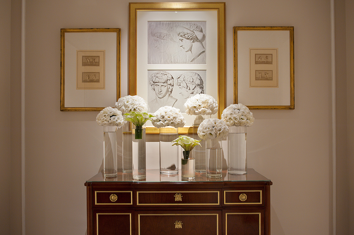
View Accents as Art
Attention to detail can be found everywhere in the hotel. “White fresh flowers extend a sense of luxury even in the corridors, and the arrangements provide visual interest. While the lilies are symbolic of the ‘mind and spirit,’ the roses symbolize ‘love.’ The combination is a visual feast of well being. Gold-framed prints and console details complete the visual harmony.”
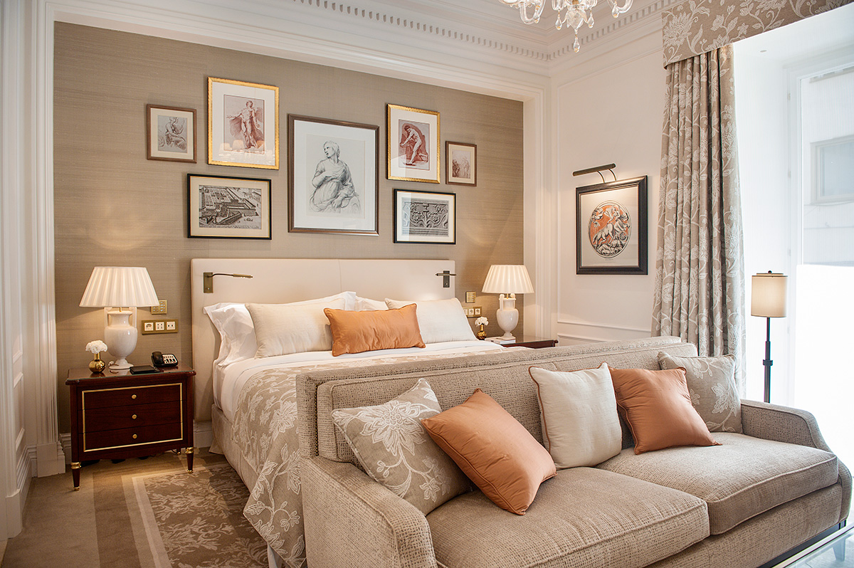
Make a Space Sing With Symmetry
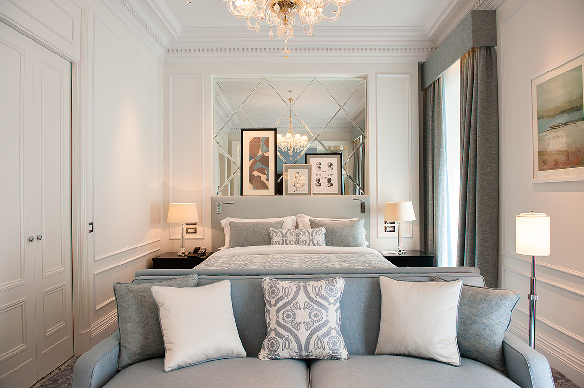
There are so many inspirational design ideas in this guest room that we can’t wait to try at home: the matching curtains, bedding, cushions and rug; the wallpapered gallery wall and the subtle reading sconces positioned ingeniously on the headboard. All work on their own and combined they create a luxurious space that begs to be lingered in.
Go Big in a Small Space
The relatively small square footage of this superior room is maximized with bold scale and thoughtful details. A full-size sofa makes the room feel bigger, intricate molding and wainscoting add visual interest and, once again, a mirrored panel is at play. It feels modern amongst the traditional decor, while visually expanding the room.
Use Tile in New Ways
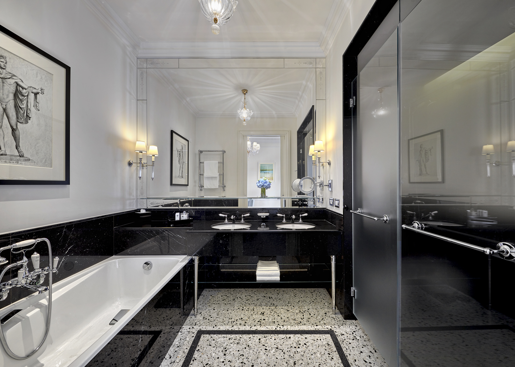
If you’re thinking beyond the all-white bathroom, let this be your inspiration. The floor is traditional Italian terrazzo with an inset mosaic frame, which creates a neat bath mat effect, and the walls are glossy Italian Nero Marquina marble. Timeless and chic, the monochromatic palette feels a bit palatial, which is apropos considering that the St. Regis Rome is just steps from the city’s presidential palace.
HGTV your inbox.
By clicking "SIGN UP” you agree to receive emails from HGTV and accept Corus' Terms of Use and Corus' Privacy Policy.


