When you’re spending more than $100,000 on a renovation, you want to make sure your money is going to all the right places. Kortney and Dave help homeowners do exactly that on Making it Home, taking over renovations and transforming homes into the spaces of family dreams. See how they took this outdated and poorly laid-out bungalow and turned it into an open-concept oasis on a $120,000 budget.
Watch all of your favourite HGTV Canada shows through STACKTV with Amazon Prime Video Channels, or with the new Global TV app when you sign-in with your TV service provider details.
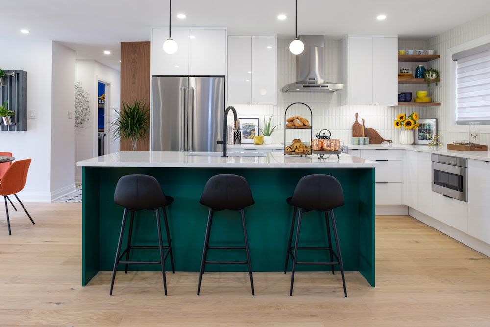
Creating a Functional Yet Contemporary Space
As the parents of two young boys, Ted and Shannon needed an open-concept space where they could keep an eye on their kids while also getting chores-like cooking-done. That meant Dave and Kortney had to create a functional and streamlined space complete with storage and a floorplan that would work for years to come.
Related: 18 Ideas Jillian Harris Uses When Decorating an Open-Concept Space
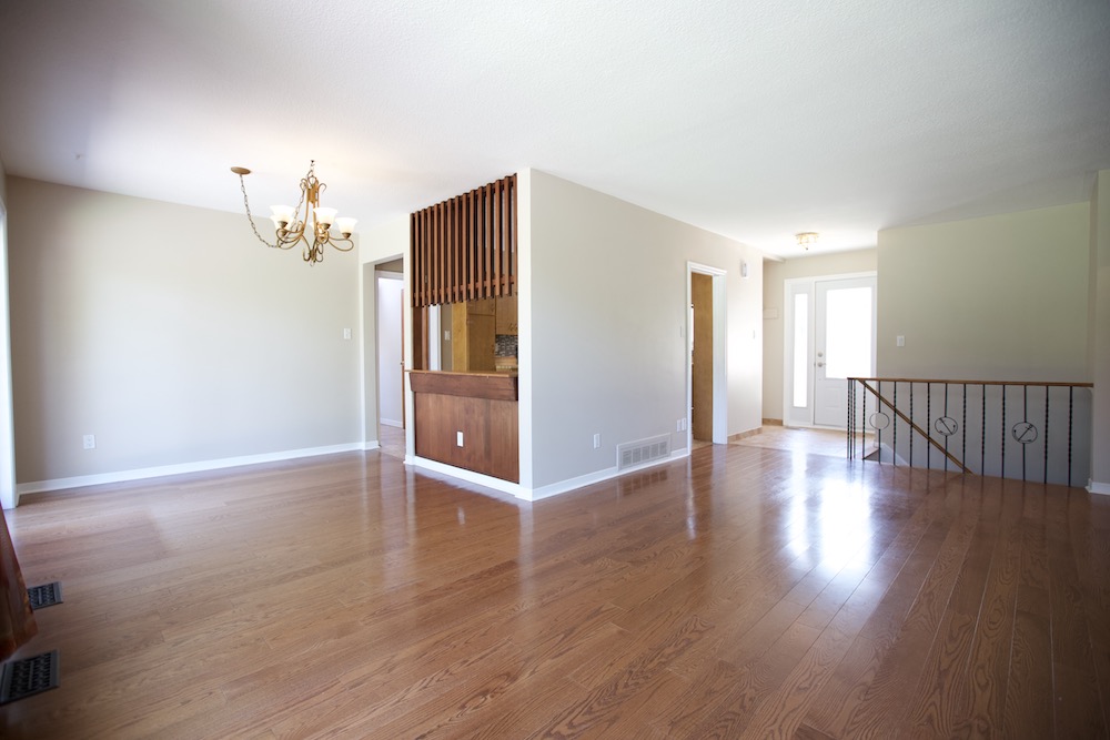
Transforming a Drab Layout
It had been years since this home saw any TLC, as evidenced by the tired finishes and boxed-in kitchen. The problem? That wall is a structural wall, which meant Dave was looking at either building in a bulkhead or incorporating posts right where Kortney wanted the kitchen island to go.
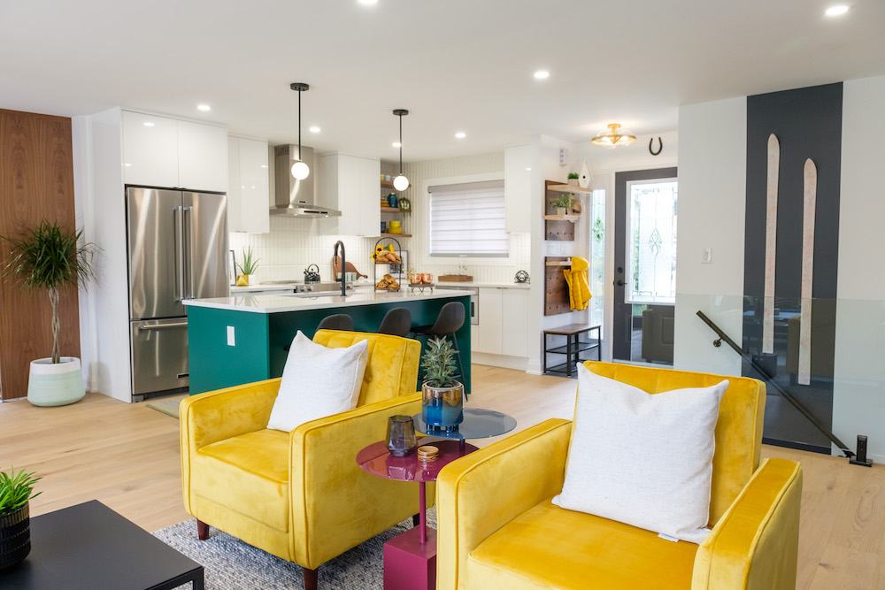
Spending Money Where it Matters
In the end the engineer decided the best way to deal with the support issue was to run a beam across the ceiling, which would give the homeowners a nice, clean line throughout. It was an expensive option to be sure (they even had to cut a hole in the roof to get the beam all the way in), but in the end it was well worth it to have such a streamlined space throughout the kitchen, living room and dining room. Now you can see all the way back to that gorgeous picture window no matter where you’re standing, and it all ties together with a beautiful engineered hardwood floor.
Related: 10 Smart and Stylish Ways to Divide Your Open-Concept Living Space
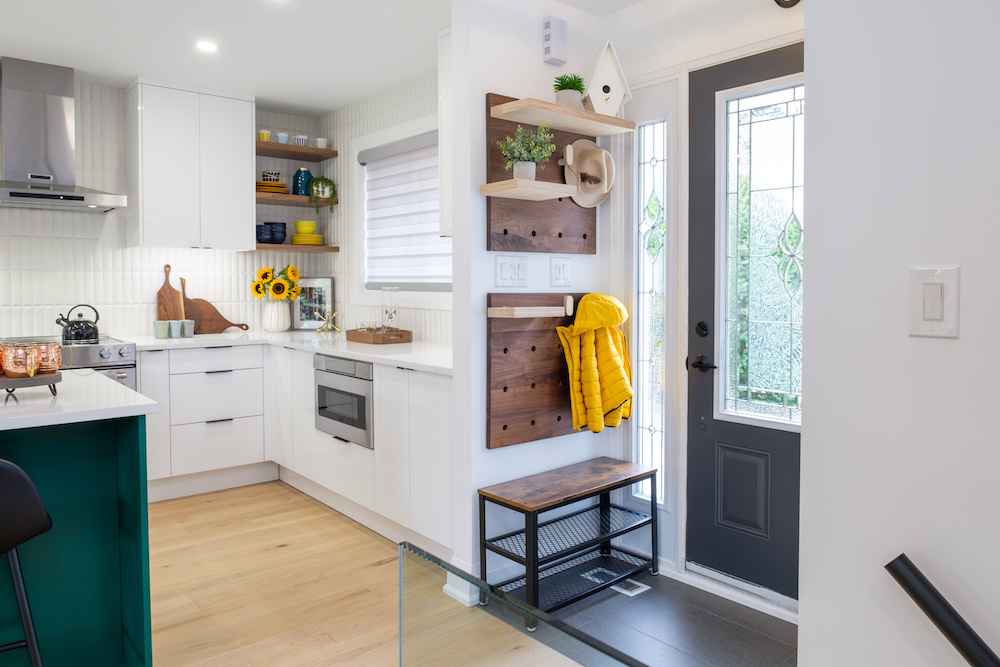
Formulating a Space for Their Needs
The family uses the mudroom to come in and out of the home, but for those times that guests come through the front door Kortney incorporated a small and cost effective entrance with shelves and hooks that can be adjusted depending on current needs. Meanwhile Dave had pot lights installed throughout to give the space plenty of streamlined lighting and keep the house nice and bright.
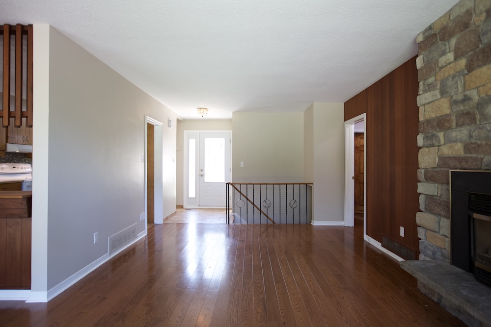
Getting Rid of Unsightly Sightlines
Pre-reno that railing leading to the basement was a bit of an eyesore that made the overall space feel even choppier than it was. Coming off the main entrance it delineated the living room a little too much, taking away from the overall flow.
Related: 10 Genius Ways to Renovate the Space Under Your Stairs
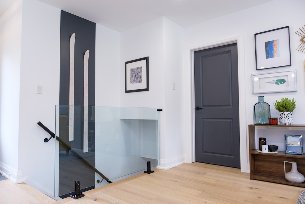
Going for Glass
To help give the area a more modern vibe, Kortney and Dave had a tempered glass wall installed. The design cost more than a traditional rail and posts might have, but the clean, clear look helps to open up the space the moment you walk in the door and really sets the overall tone. Even more importantly, tempered glass is four-to-five times stronger than regular glass and it’s shatterproof. Besides, Kortney saved on design by incorporating the skis people signed at Ted and Shannon’s wedding into the look.
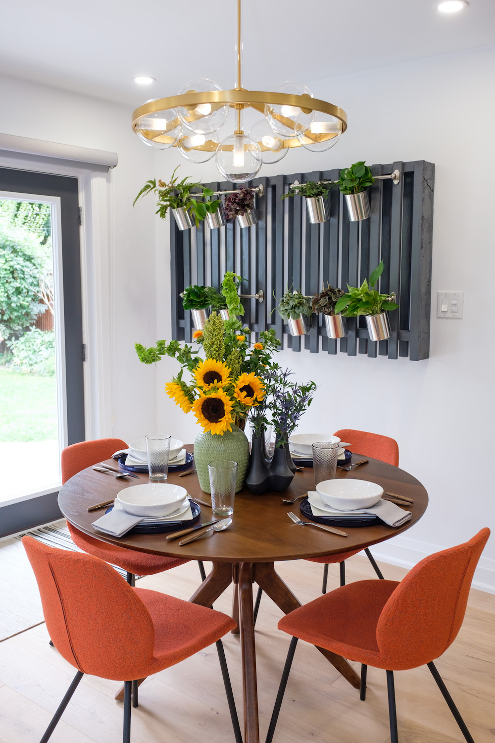
Upcycling the Old
Speaking of recycled art, Kortney also managed to salvage some of the home’s original woodwork to create a cost effective design element in the dining room. By painting the wood black and attaching metal rods to it, she and Dave were able to give the homeowners a beautiful new living wall without dipping deep into the budget.
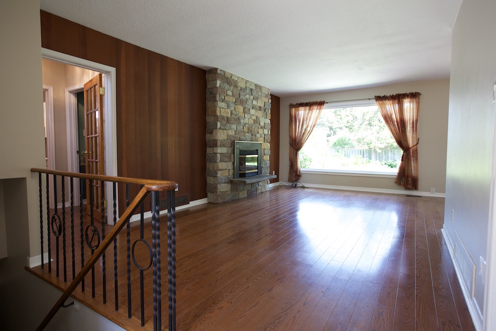
Working With An Existing Fireplace
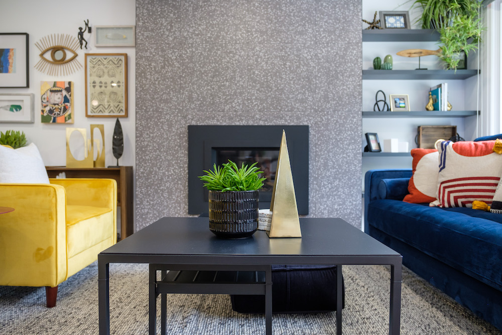
Kortney was the first to admit that the stones on the fireplace weren’t the worst-in another design she may have kept them. But considering the modern feel of the rest of the design and the open-concept layout they were going for, she needed that fireplace and mantel to feel like an important and thought-out part of the design.
An Inexpensive Fix
With young kids running around Kortney knew a gas insert was the best way to integrate the fireplace into the new design. That was another spend in the budget, but it balanced out when Kortney managed to nab porcelain tiles to cover it with. Not only is porcelain more cost-effective overall, but the particular material that the designer chose this time around also happened to be on sale.
Related: 8 Reasons Why You Should Install a Gas Fireplace This Season
A Brand New Mudroom
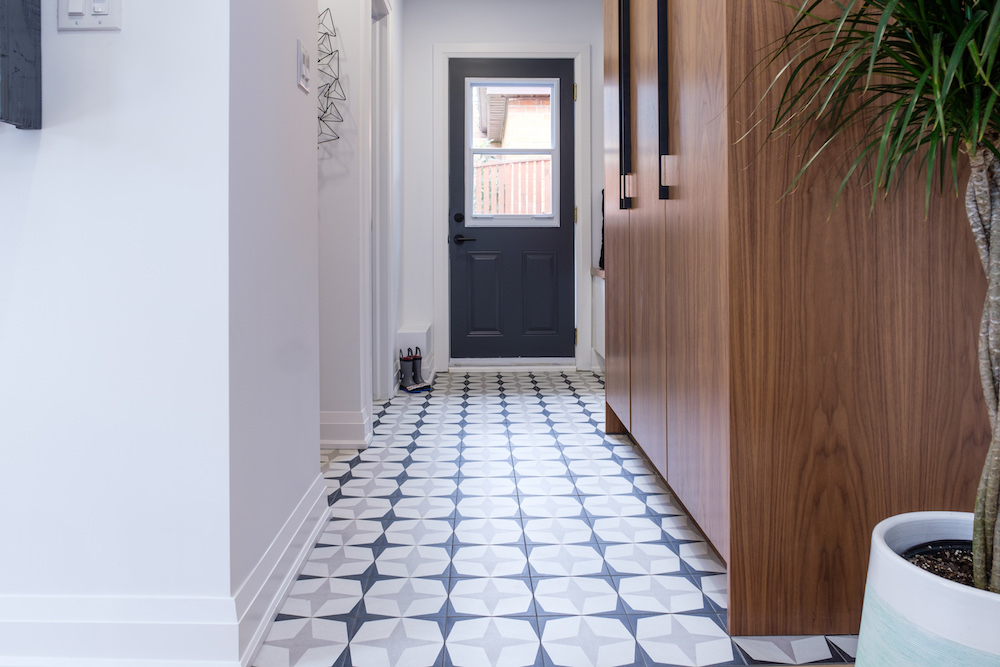
Just behind the kitchen there was a lot going on. A side entrance, a wannabe mudroom, a powder room and a laundry room. In order to give Ted and Shannon as much functionality as possible (and to make the mudroom of their organizational dreams), Kortney and Dave spent the money to move the door over and give the homeowners all of the space they needed. Then Kortney capped it off with simple but stylish tiling and a new pantry for even more storage, transforming this home into a fully functional family space that the young family can enjoy for years to come.
HGTV your inbox.
By clicking "SIGN UP” you agree to receive emails from HGTV and accept Corus' Terms of Use and Corus' Privacy Policy.


