When it comes to refreshed interiors, most of us think of soft hues, shades of cream, white, or grey, and lots of neutral palates. Not Kortney Wilson. When the opportunity arose to flip a rundown house on an already colourful street she ran with it and created a jewel-toned home that would make anyone green (or to be more accurate, blue and purple) with envy. Here are several tips to pulling off the look in your own home. By Amber Dowling
Watch Masters of Flip on Wednesdays at 10pm e/p!
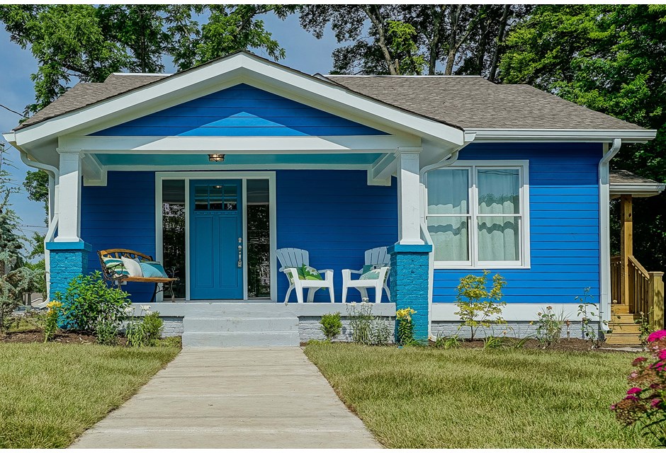
Modern Exterior
This brilliant blue could have been a gamble: paint it on the wrong street and buyers might feel as though they’re walking into Smurf village. But because the street was already full of colours, painting this house the beautiful hue made perfect sense.
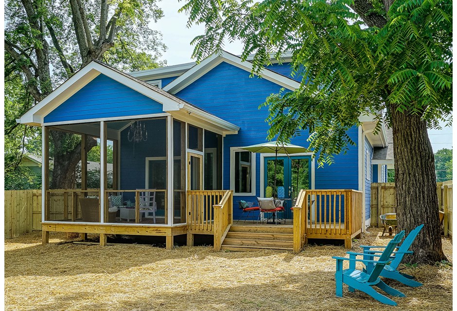
Around the Back
The theme continues towards the back of the house, where a big, sweeping porch and complimentary furniture make the backyard a beautiful blue hangout. Notice the deck itself is kept a neutral, natural colour in order to balance out the look.
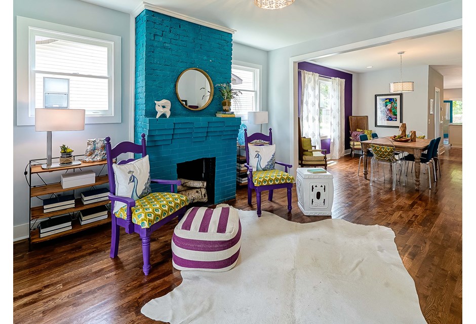
Risky Business
Kortney wanted to create a statement on the inside of the house as well. We’d say she made it with this matching blue fireplace. Because the mantel becomes the focal point of the room, it was important to surround it with neutral furniture so as to not overdo the look.
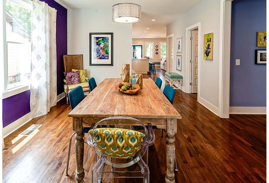
Daring Dining
The dining room’s facelift involved an equally brilliant shade of purple on one wall, which breaks up the blue but keeps with the bold colour theme. Then, in order to not inundate the buyers with colour the room is furnished with neutral wood furniture.
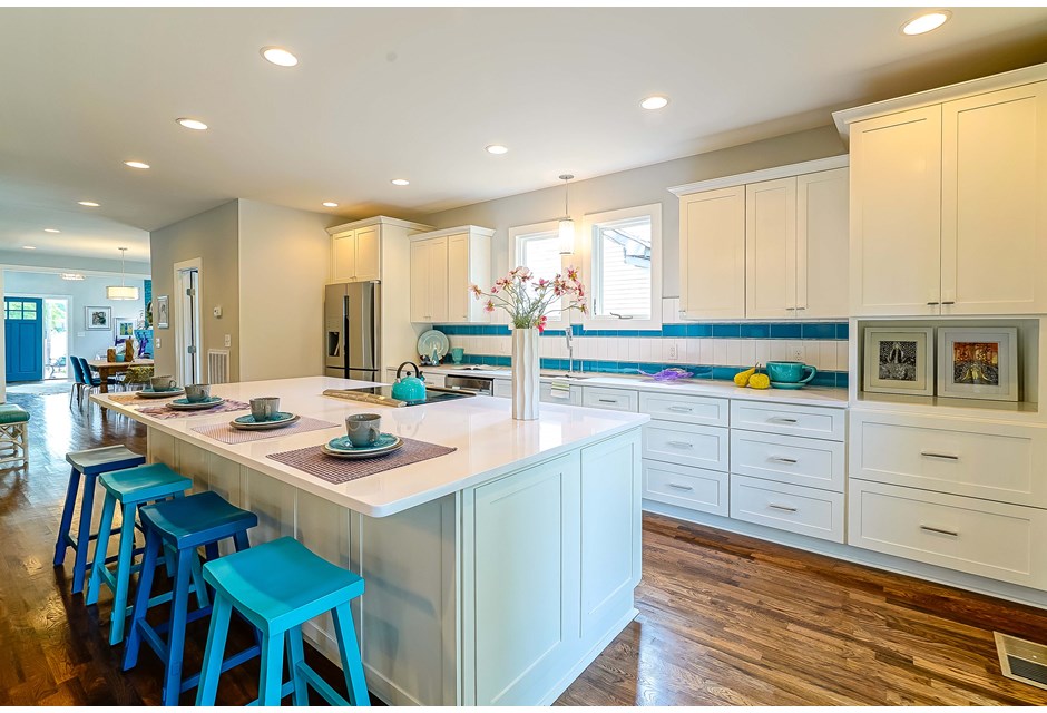
A Crafty Kitchen
Brilliant white cupboards, tiling and a centre island are offset with more blue accents that offer just the right punch of colour to make the space special. Now the entire kitchen feels bright and cheery; a space anyone would want to hang out in.
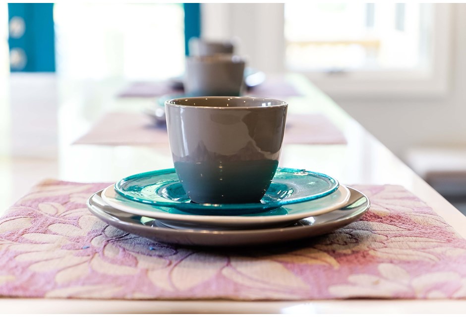
Matching Place Settings
Even the plates compliment the space — these settings kind of make us want to have a tea party or stick around for morning coffee. With blueberry bagels or muffins, of course.
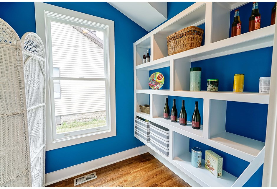
Perfect Pantry
Kortney had a little more fun with the colour scheme in the pantry, where it made sense to splash blue on the actual walls. Coupled with the thick white trim this is a fun but pretty place to store all those canned goods.
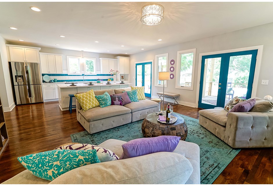
Sitting Back
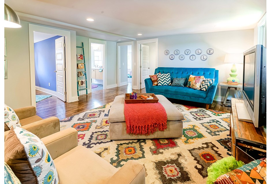
Because every gourmet kitchen needs an entertaining space to go alongside it, this bumped-out area became the living room. To match the kitchen, Kortney left the walls neutral while tying in blues with the area rug, throw pillows and the door trim.
Bonus Room
The upstairs landing, which features another living area, isn’t quite as brilliantly blue. But the decor keeps with those awesome jewel tones to make the house flow. Just look at how bright and pretty that throw blanket is, for example.
Comfy Couch
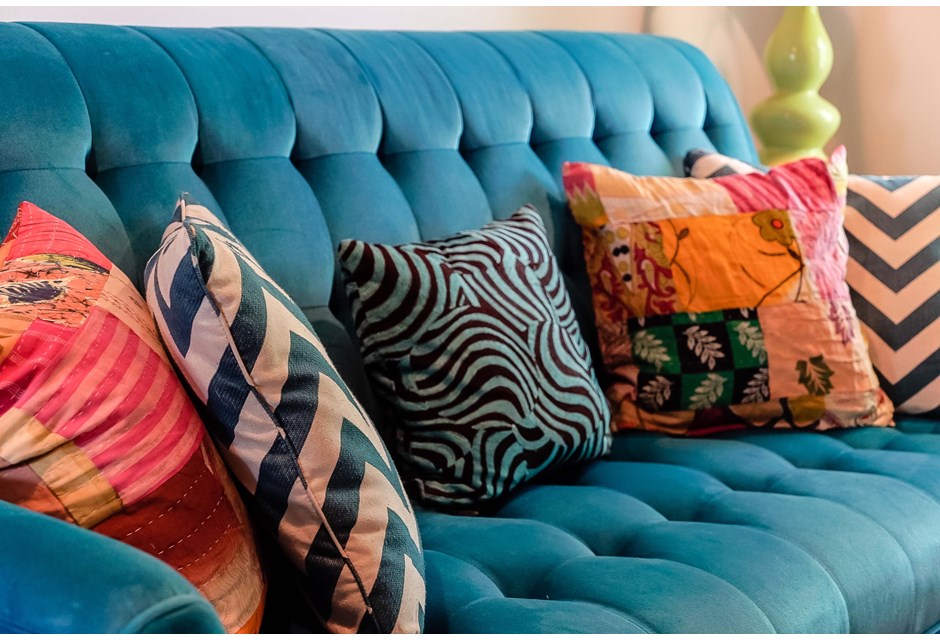
Of course the couch itself had to be blue… the same blue as the main floor’s fireplace, to be exact.
Master of its Domain
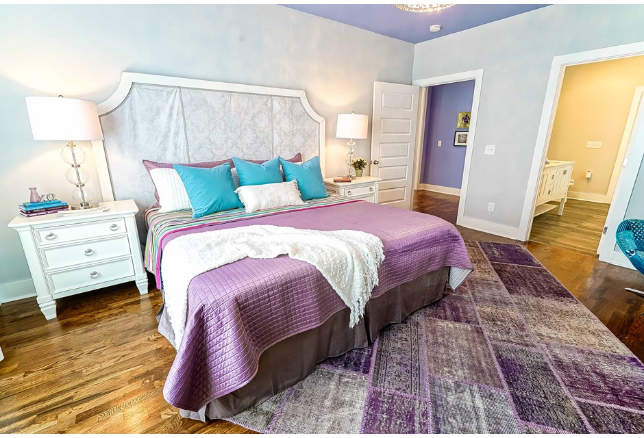
The master is also done in neutral finishes, but thanks to a pretty purple bedspread and blue throw pillows, the space matches the rest of the house. Meanwhile a light lavender ceiling offsets the look and gives it some more personality.
Little Accents
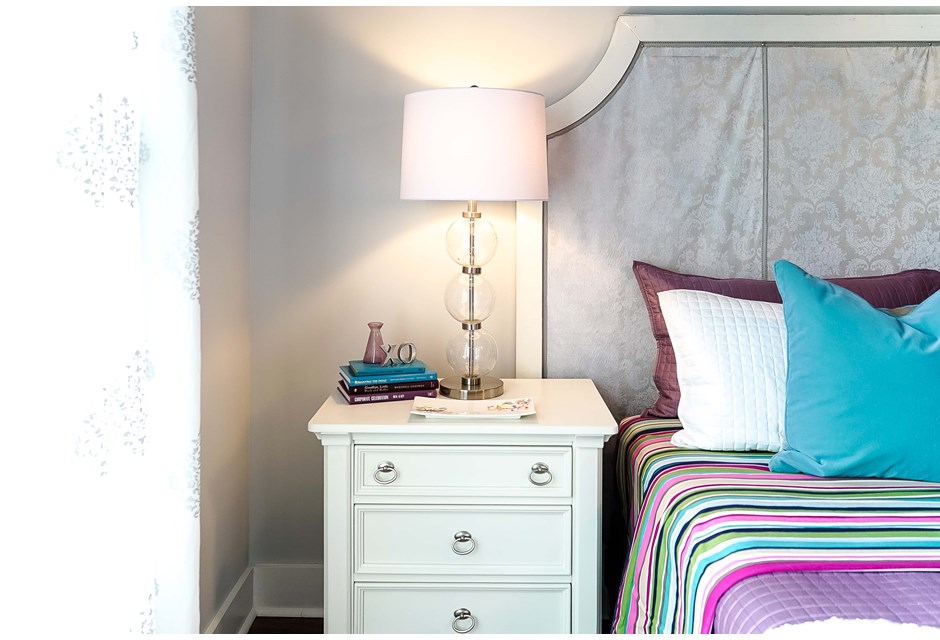
Pulling it all together are small-but-colourful knickknacks like the books and vase on this night table; sometimes it just takes a little creativity to pull off this kind of colour scheme.
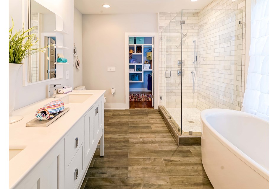
Complimentary Ensuite
Rather than decking out the master ensuite with more jewel tones, Kortney kept it white and bright. Then she added accent touches like hand towels to bring the colours back in a subtle way.
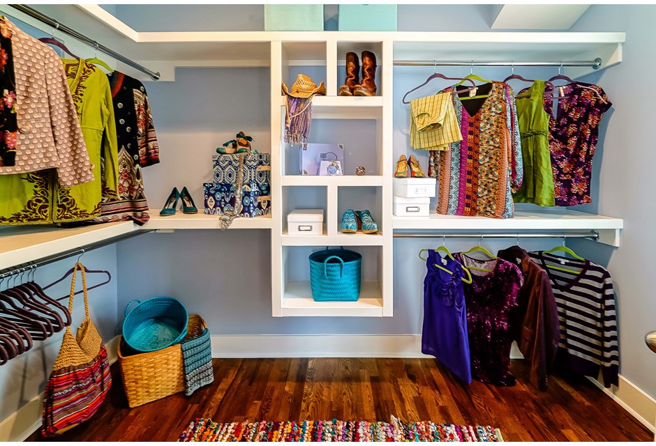
Lavender Love
The softer lavender, which is also featured on that master ceiling, serves as the colour palate for this beautiful walk-in closet. We’d have a lot of fun organizing our things in this kind of space.
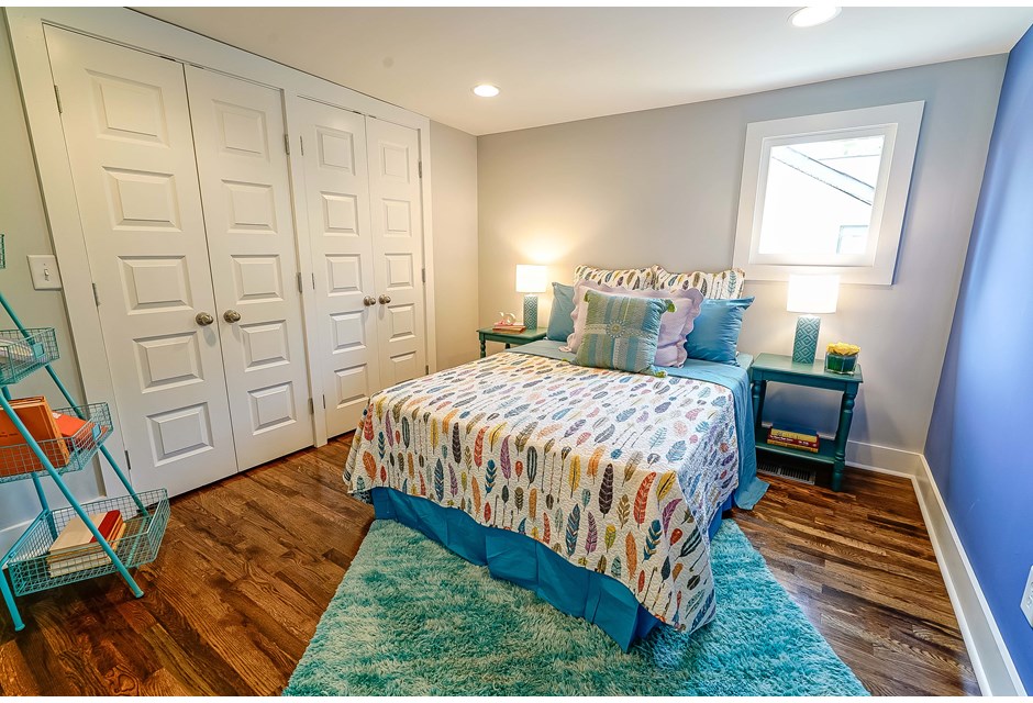
Blue Hues
The soft, grey-blue walls help reflect light and open up this bedroom, while the one bright blue statement wall ties in beautifully with the bright blue bedspread and teal throw rug.
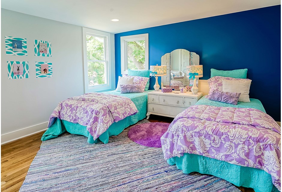
Blue and Bluer
The same three-to-one wall strategy is used here in order to maximize the light while making the space pop, but we love the way Kortney and co. have staged the room with teals and purples to give it an extra feminine touch.
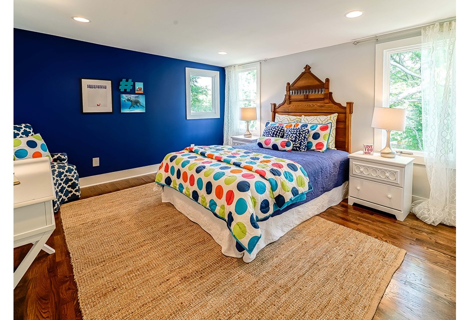
The Polka Dot Room
When you’re playing with bold colours you might as well have some fun with the accents. That’s what makes this polka-dot bedspread so fun. And, a little more masculine than the rest of the rooms if you ask us. That could also be this awesome headboard and the richer blue hue on the wall, however.
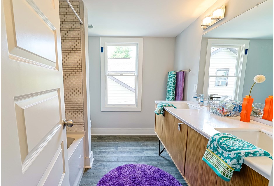
Bathed in Jewels
Teal and purple continue in this bathroom, which has been tastefully redone in otherwise neutral tones. You have to give Kortney lots of bonus points for being able to incorporate these jewel tones into every single room of the house. We weren’t sure it was possible, but this is one personality filled redesign that she definitely pulled off.
HGTV your inbox.
By clicking "SIGN UP” you agree to receive emails from HGTV and accept Corus' Terms of Use and Corus' Privacy Policy.


