When it comes to attracting potential home buyers, one of the biggest keys in a successful sale is making your space feel open and spacious. An open concept plan certainly helps, but according to Drew and Jonathan Scott, a lot of the sale is in the simple details. Here are just a few ways the brothers spruced up a home on a recent episode of Property Brothers: Buying and Selling, driving in the top dollars via not one, not two, but three competing offers. By Amber Dowling
Watch Property Brothers – Buying & Selling on Mondays at 9pm e/p!
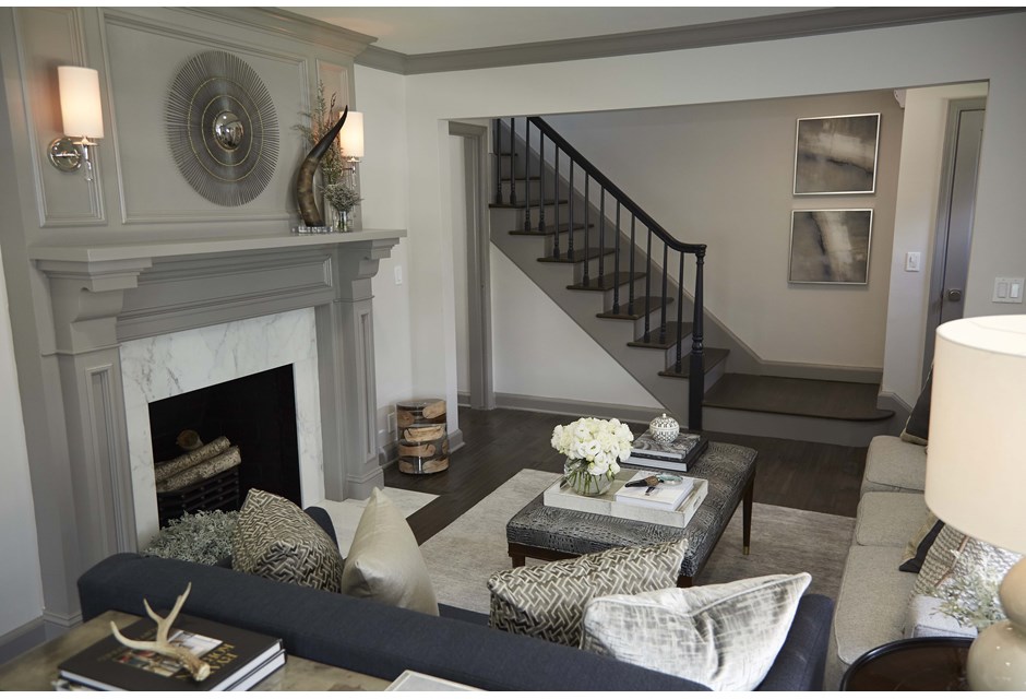
Neutral Tones
Lighter colours automatically open up a space, making it feel bigger than it actually is. If you’re going for the dramatic, add in depth via darker accent colours to finish it all off.
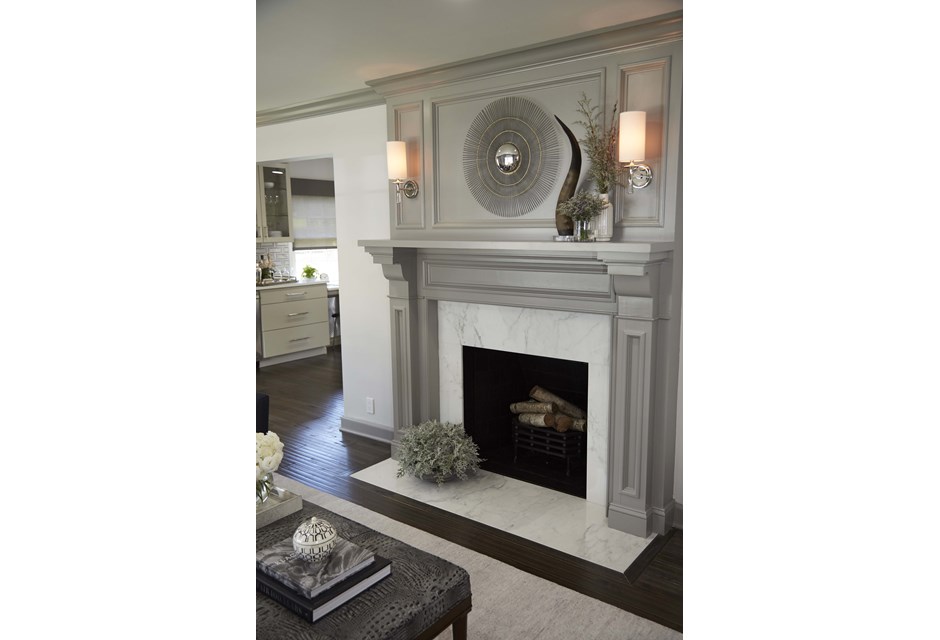
Sleek and Simple
This fireplace is absolutely dramatic, but it’s also elegant and simple. Thanks to clean lines and the neutral colour scheme, it feels like a design element rather than a big, bulky thing to take up space.
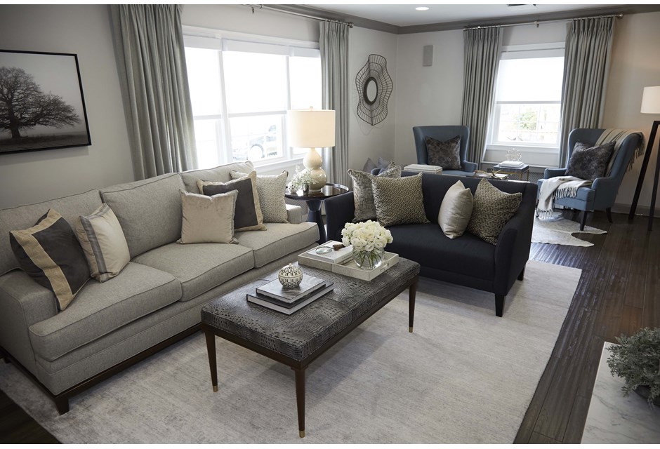
Mix and Match Furniture
It can be tempting to buy matching sets — especially during a sale — but picking pieces that specifically fit your space is a smarter choice. Not only will everything fit better (thereby opening up the space), but it will transform the area into a subtle piece of art, too.
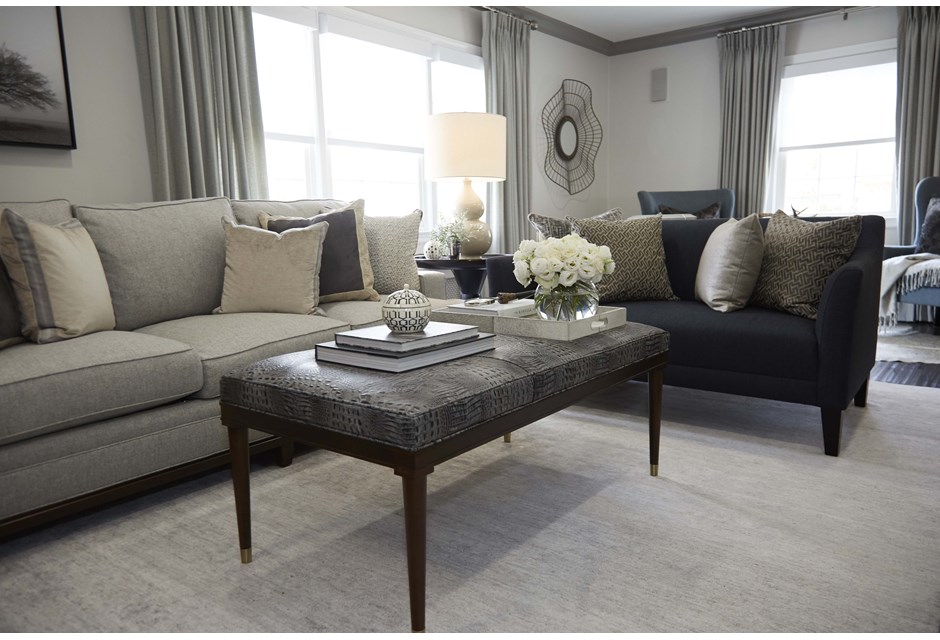
Natural Lighting
Whenever you can showcase a picture window be sure to do so. These sweeping drapes add a dramatic flair that draws the eye, making it seem as though the light is spilling into the room.
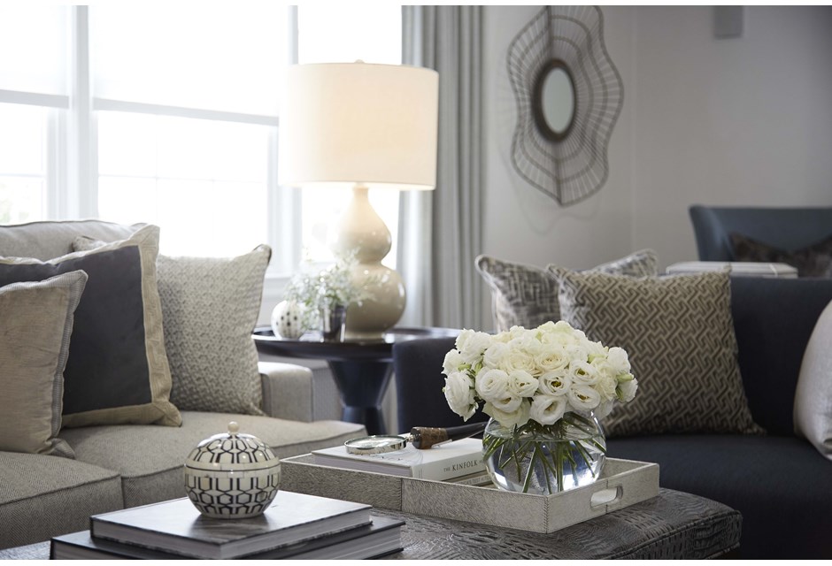
Crafty Corners
A small corner table between two sofas is a great way to maximize unused space while adding some texture and height. The more you can fit in without crowding the space, the more potential buyers will see during their walk through.
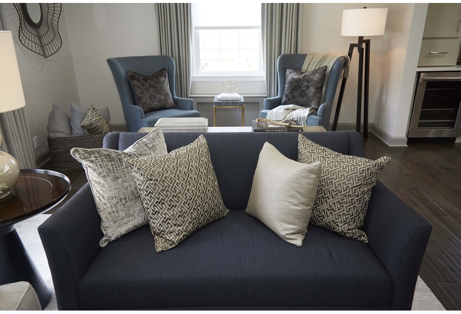
Create Layers
The couch is spruced up by the throw pillows, but buyers can see even more potential thanks to the extra “layer” of seating behind the couch by the window.
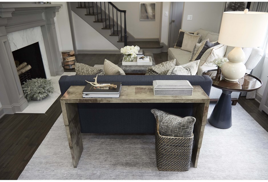
Add a Couch Table
It’s perfect for adding a few knickknacks, some storage space and that aforementioned depth. Opt for a sleek and neutral design that goes no longer than the couch.
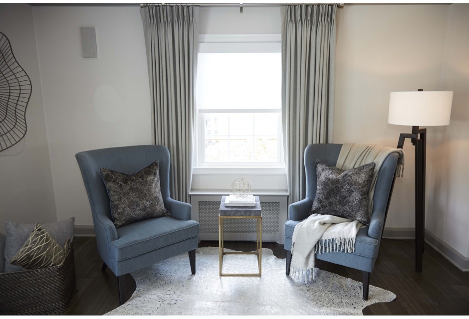
Throw It Around
This uniquely shaped throw rug adds a lot of charm to these armchairs, and works to create a separate space within the living room. It’s easy to picture cozying up with a friend over a cup of tea here.
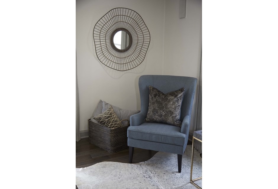
Simple Mirrors
Mirrors are a great way to bounce light and open up a space. When they’re used smartly, like in this wall art design, they can also add to the overall ambiance of the room.
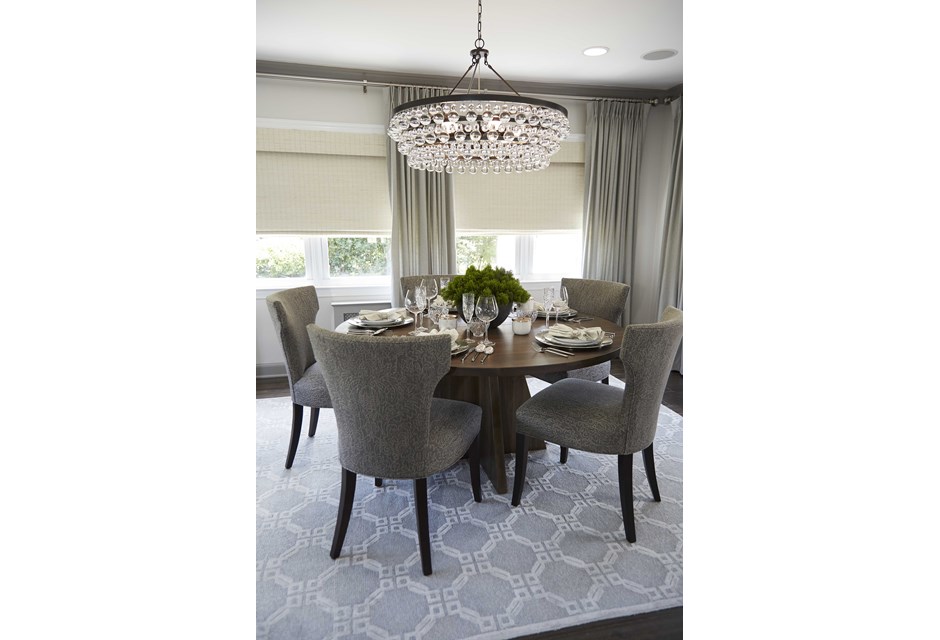
Circular Dining
Who says all dining room tables need to be rectangular? If you have a smaller room, make it seem bigger than it is by going for a smaller table design. Trust us, it packs a bigger punch.
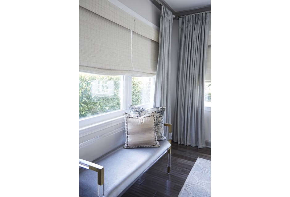
Bench Seating
Adding one to a beautiful window is a great way to showcase extra seating in a cozy way. This one, as featured in the dining room, is a great way to show potential buyers just how much space they’re working with.
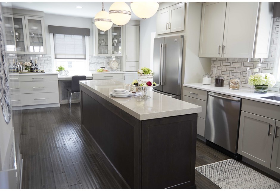
Modern Kitchen
When it comes to kitchens, buyers want modern appliances, updated finishes and enough space to move around in. As such, keep the lines as clean and functional as possible.
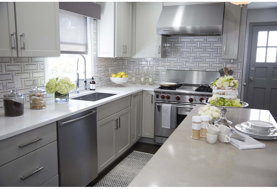
Corner Cupboards
Making sure the cupboards are updated and that there are plenty of them — both above and below — shows buyers that there will be more than enough room to store their things.
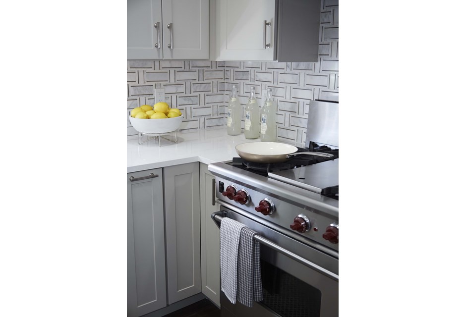
Beautiful Backsplash
Although white is traditionally the way to go, these grey tiles help bring the appliances and cupboards together and actually help open up the space. When picking yours go for something complimentary and clean.
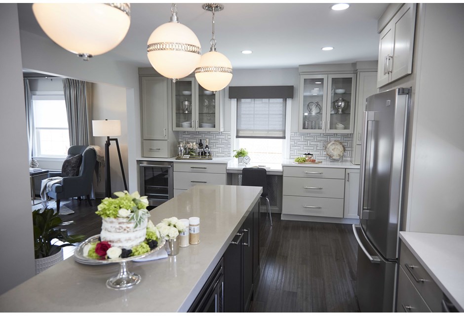
Long and Sleek
If space permits, a long and sleek island helps to define the space, give extra storage and can double as an “eat-in” area if you make it a breakfast bar.
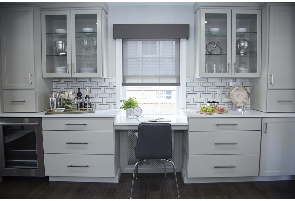
A Built-In Workspace
No office? No problem. If the kitchen is big enough, create one along the wall. It makes for the perfect homework table or command centre.
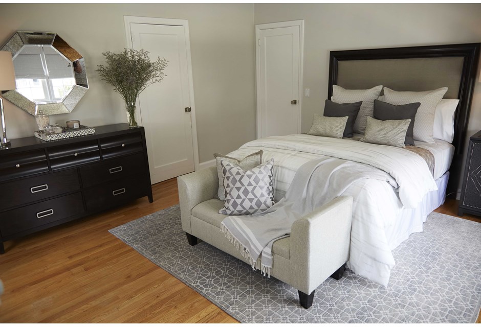
Master Living
Headboards can be a complete waste of space and close off an otherwise spacious bedroom. Opt for a smaller version to add depth, but not bulk.
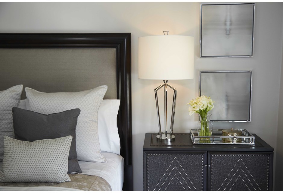
Clean Lines
If adding a night table, go for one that’s equally sleek and small. It should be big enough to hold a lamp and a book or two, but not much else. Any bigger and the room just starts to feel closed in.
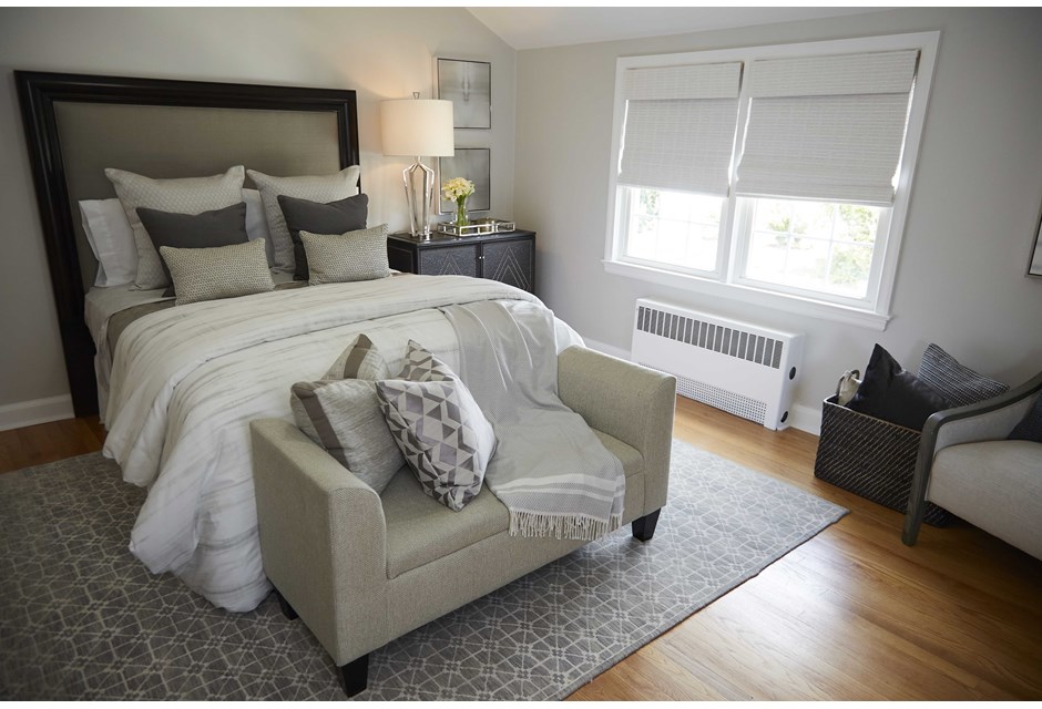
Lounging Around
A chaise lounge at the foot of the bed (space permitting) showcases smart furniture arrangement and infinite room potential.
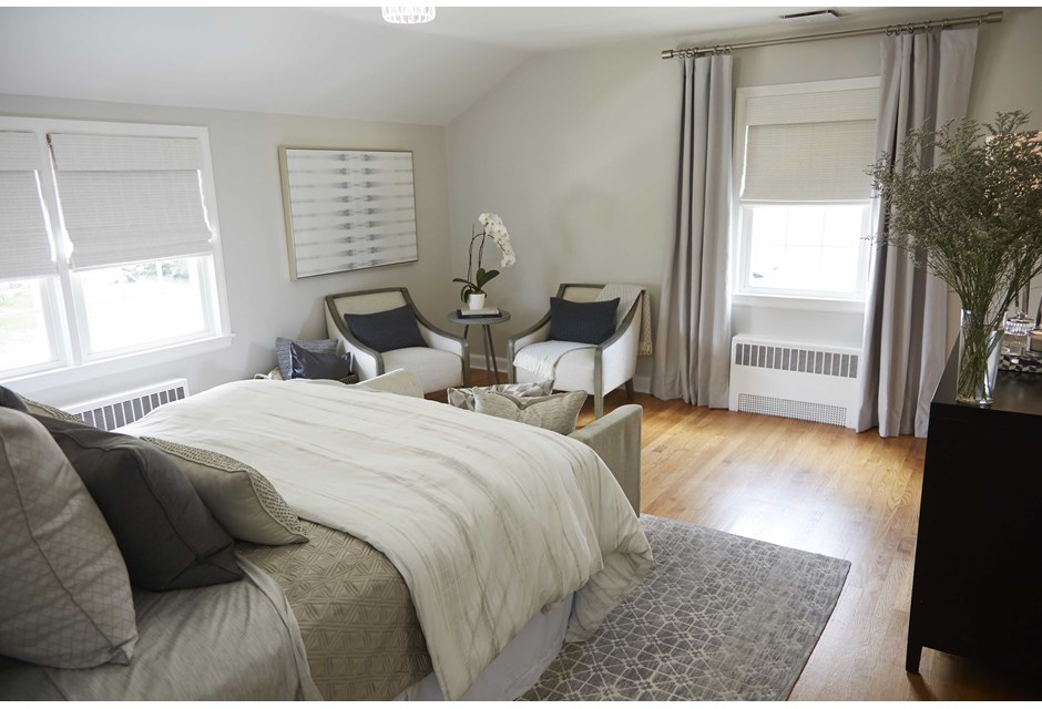
Corner Unit
Rather than bulk up the corner with a dresser or bookshelf, these simple arm chairs create a separate and defined space, making the entire room seem larger than it is.
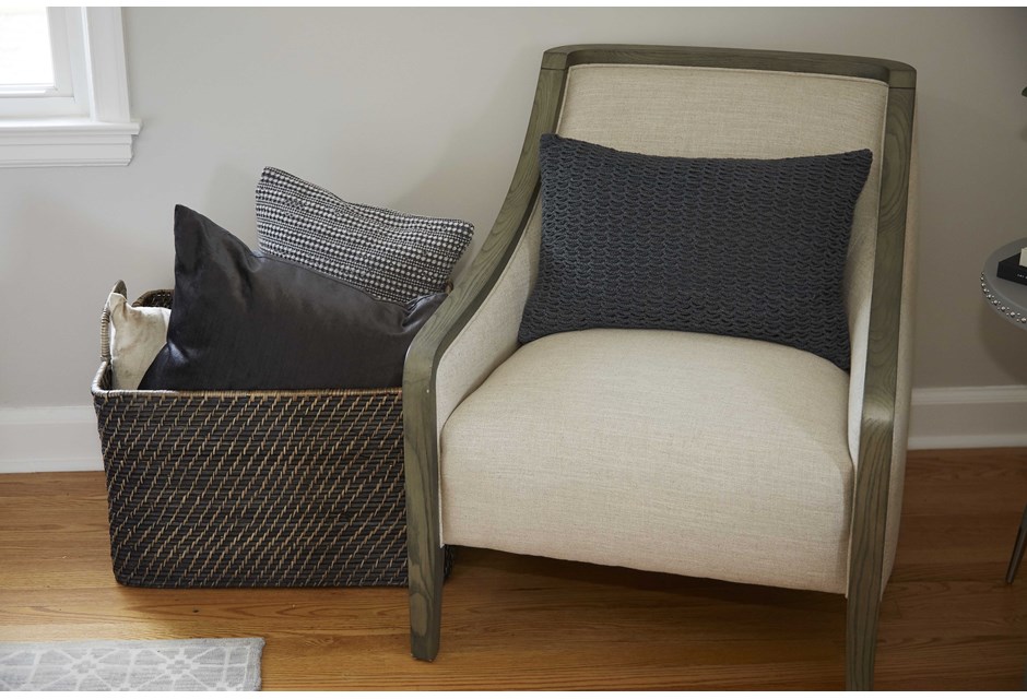
Extra Storage
Finally, a simple basket placed alongside the chair serves as the perfect storage solution, keeping this bedroom open yet cozy.
HGTV your inbox.
By clicking "SIGN UP” you agree to receive emails from HGTV and accept Corus' Terms of Use and Corus' Privacy Policy.


