Interior design is a strange beast. Much like other art forms, there are many theories and philosophies that suggest certain rules can’t be broken. However, some of the most amazing pieces of art, some of the most fascinating buildings and some of the most interesting interiors were born out of broken rules. Here are some of the biggest rules and misconceptions in the design world, that I’ve personally (and proudly) broken!
Sarah Baeumler’s passion for design led her to join husband Bryan Baeumler on the front lines of his real estate and renovations business. She stars in Home to Win, and co-hosts Bryan Inc. alongside Bryan.
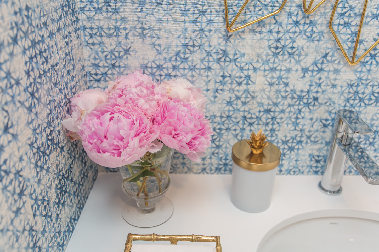
Don’t Mix Metals
So many times I have heard people saying that you can’t mix metals when designing a kitchen or bathroom. This is obviously an opinion, but it is only that: an opinion. Metals can be mixed and it can make for a beautiful effect. Choosing a chrome faucet and gold hardware is perfectly fine, materials are there to create a certain feeling, so do as you please.
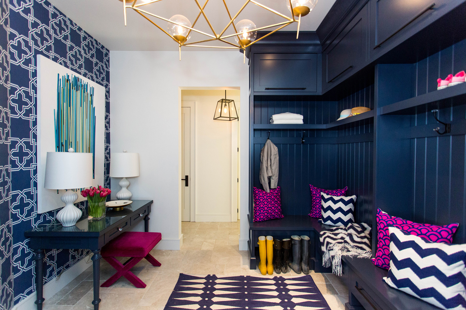
Don’t Use Natural Materials in High Traffic Zones
When designing a room or space, you will often get advice to avoid using natural materials in certain places. For example, when I wanted to use limestone tiles for our hallway floor, people said that it wasn’t a good idea. I thought differently. I wanted to use the tile and I was happy to see it age alongside my family. The limestone will have stories to tell and I want those stories to be visible.
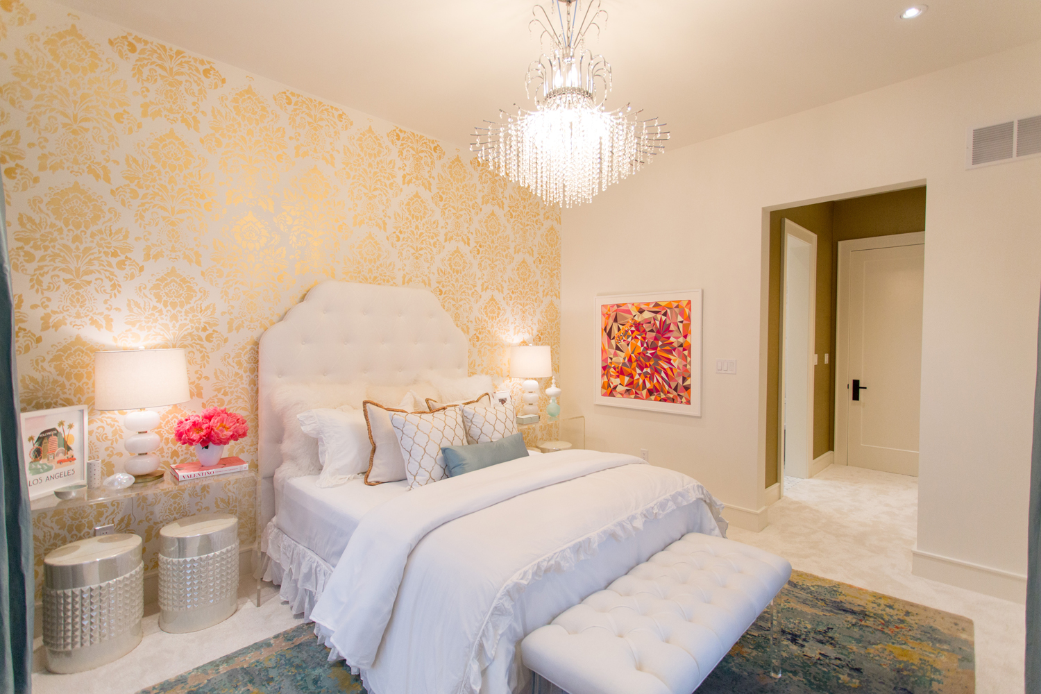
Wallpaper Will Look Outdated Fast
Again, this is not true. There are many wallpaper designs that are classic and can stand the test of any trend or fad. Of course, wallpaper may get worn, tired or drawn on by the kids, but that is the same for paint too. Wallpaper has a stigma attached to it and yet when you take a look at all the different varieties in design and material, you’re guaranteed to find something that suits your room.
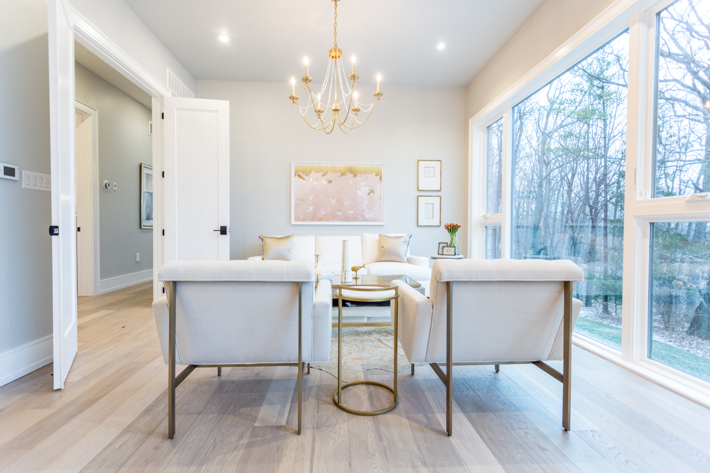
Art Needs to Match Its Surroundings
Choosing artwork is quite a difficult task, we often feel that it has to draw out the colours and design aesthetic of the rest of the space, but this isn’t always true. Sometimes including a piece of art that stands out and is in contrast to the rest of the space it can make for a wonderful design feature. This could mean more than just colour, this could be in terms of style, for example adding an urban piece of artwork in a more classic room can have a very interesting effect.
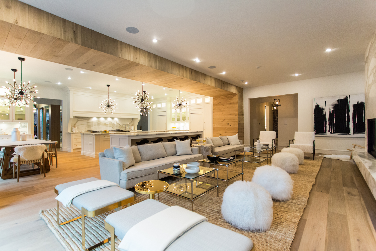
Avoid White in Family Homes
On a regular basis I have people asking how I can keep my home so white when I have four children. But the fact is that if want white furnishings or cabinetry, it can be done, it’s simply a matter of choosing the right materials. Using leather or fabric that is easily washable means that you can use any colour in your living space. It may be more difficult to hide the spills, but if you choose the correct materials and maintain the materials in the proper way, white is absolutely fine.
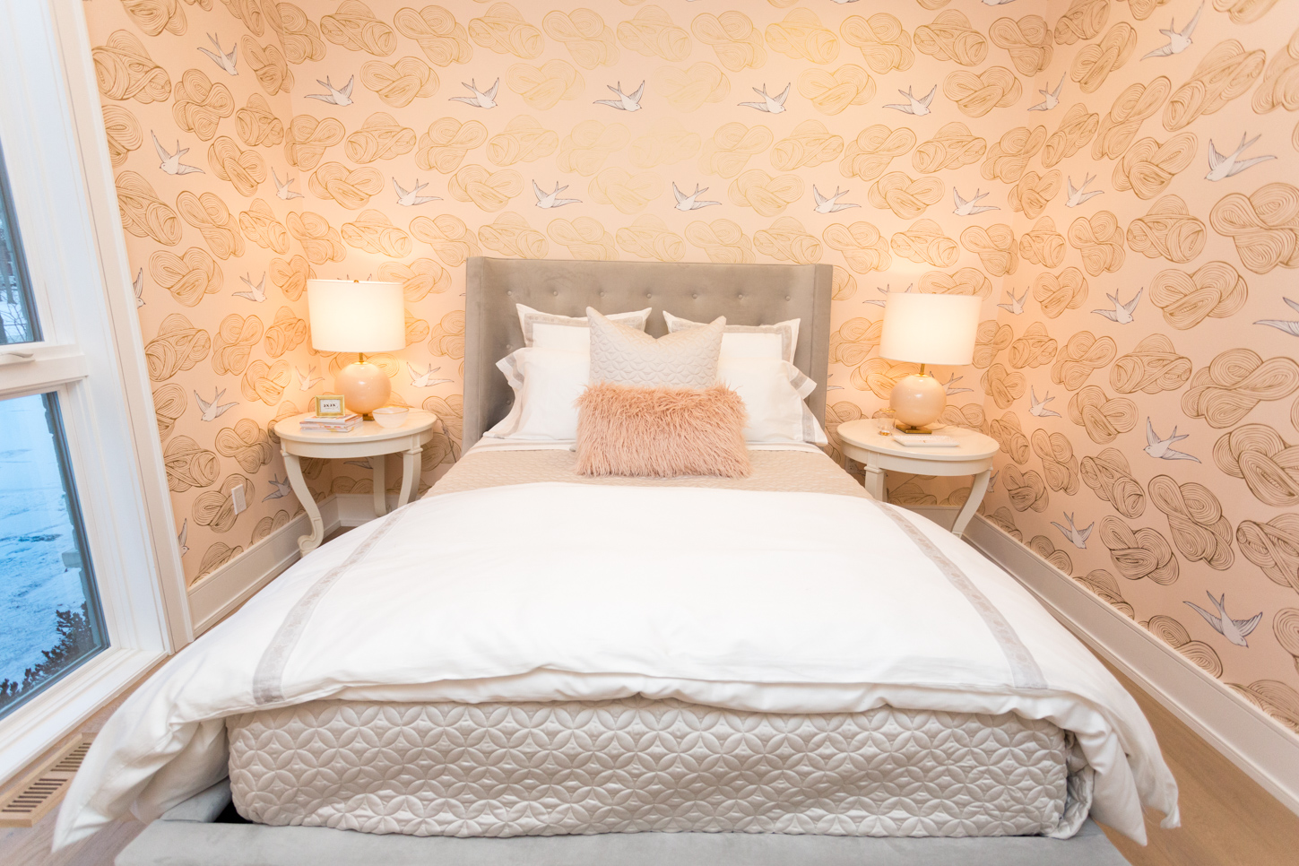
Pot Lights are King
It has become a mythical theory that pot lights are a must for modern homes. I agree that they have positive design features, especially when you don’t want light fixtures filling up a space, but they are by no means your only choice. Lighting is something that often gets overlooked when people renovate, yet it is a very important factor of any design. Using soft lighting from lamps, task lighting or wall sconces can have a great effect on the overall aesthetic of a space, and need to be carefully considered when designing any room.
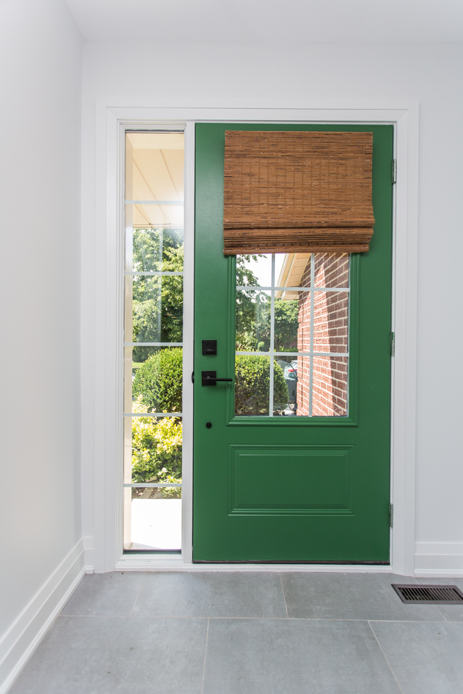
Ceiling, Trim and Doors Should be White
The majority of homes I go into have all white everything. It is a safe and common choice, but it doesn’t have to be that way. Painting or wallpapering a ceiling can completely change a space. I chose to wallpaper our dining space in our current home and I love it, it makes you look up and all around, rather than focusing on eye level features. Painting trim, windows and doors a different colour is getting more and more popular too, and I love it. It can add that pop of colour without allowing it to take over the room. White is not always right.
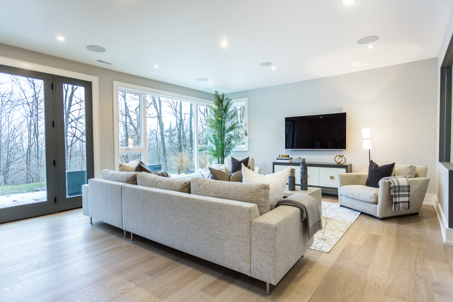
Every Window Needs a Covering
We often spend a lot of time choosing drapes or blinds for our home, but I would argue that it is not always necessary. We spend a lot of money on windows and doors when building homes and sometimes it pains me to see them covered up. There is often times when this needs to happen for privacy reasons, but if you don’t need them then consider not covering your windows at all. Natural light is the best kind of light and so if you can let it in, do so!
Interior design is such a fun and fascinating field that is always changing, so breaking the rules is important. Don’t fall into the traps of age old theories, keep to your vision and find a way to make it work, I promise, there is always a way.
HGTV your inbox.
By clicking "SIGN UP” you agree to receive emails from HGTV and accept Corus' Terms of Use and Corus' Privacy Policy.


