Even though this 5,200-square-foot heritage home in Vancouver’s Southlands neighbourhood was fully renovated, its owners, art and antique collectors with a young family, knew it needed freshening up. They enlisted designers Greer Nelson and Jamie Hamilton of Oliver Simon Design to balance the home’s traditional look with some modern flair. “Working with existing floor plans and collections can be more challenging than starting a project from scratch,” says Jamie. But she and Greer managed beautifully, and the result is a family home that’s both snazzy mod and elegantly trad. Here’s an inside look.
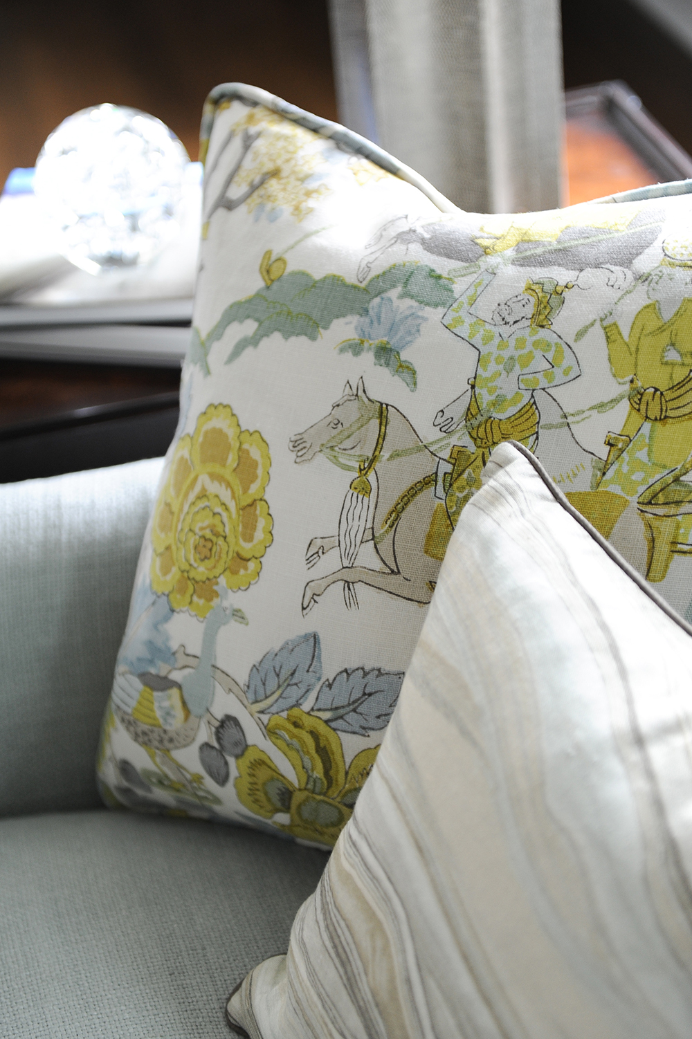
Pillow Talk
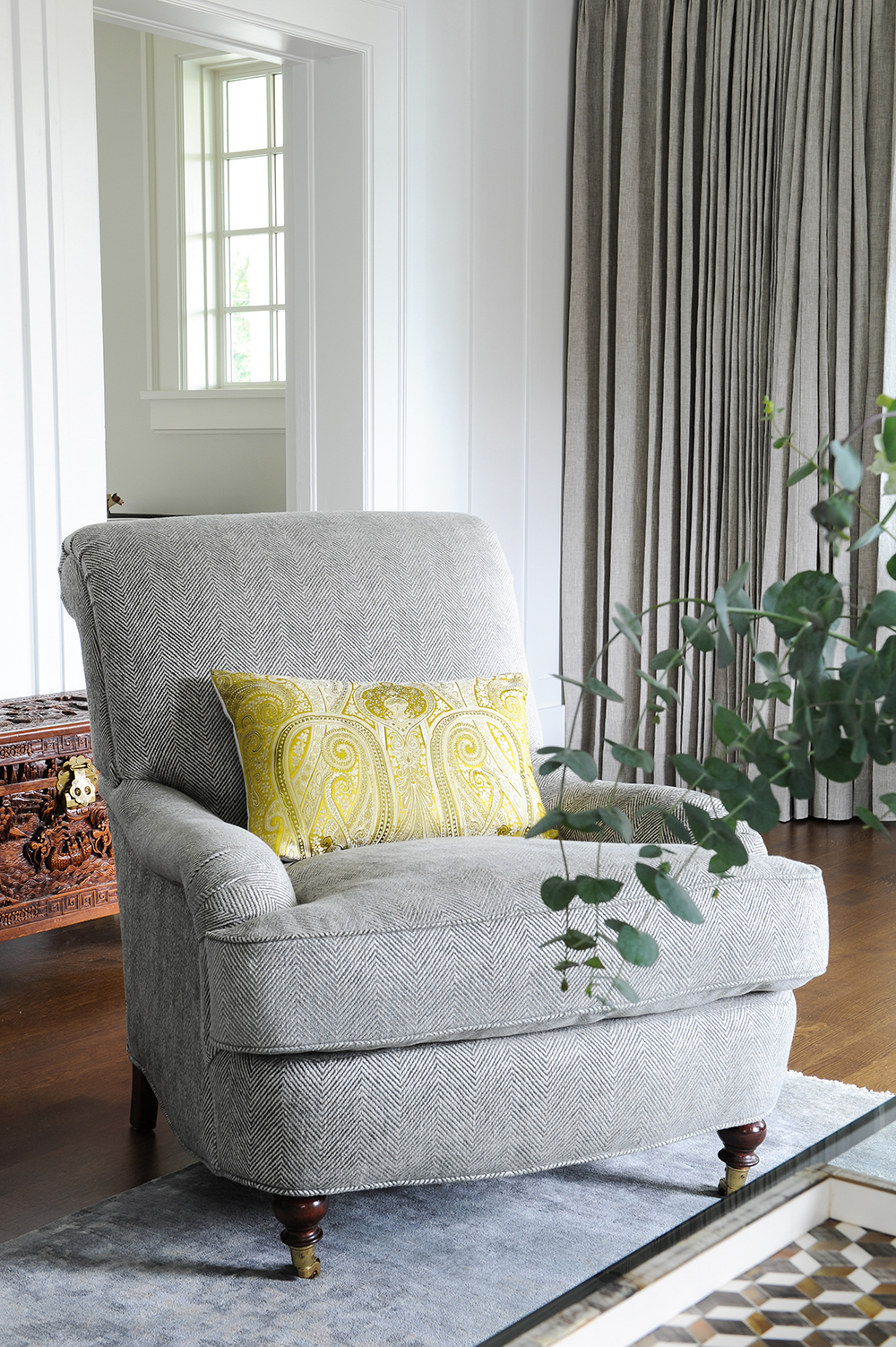
It may seem like an unlikely source for decorating an entire house, but this pillow’s fabric was the jumping-off point for designers Greer Nelson and Jamie Hamilton. “It’s a Schumacher fabric that is meticulously printed by hand using the same 122 blocks that originally made the pattern in the 1900s,” says Jamie. “It was our colour inspiration for the whole home and, while it was a huge splurge, it was so worth it.”
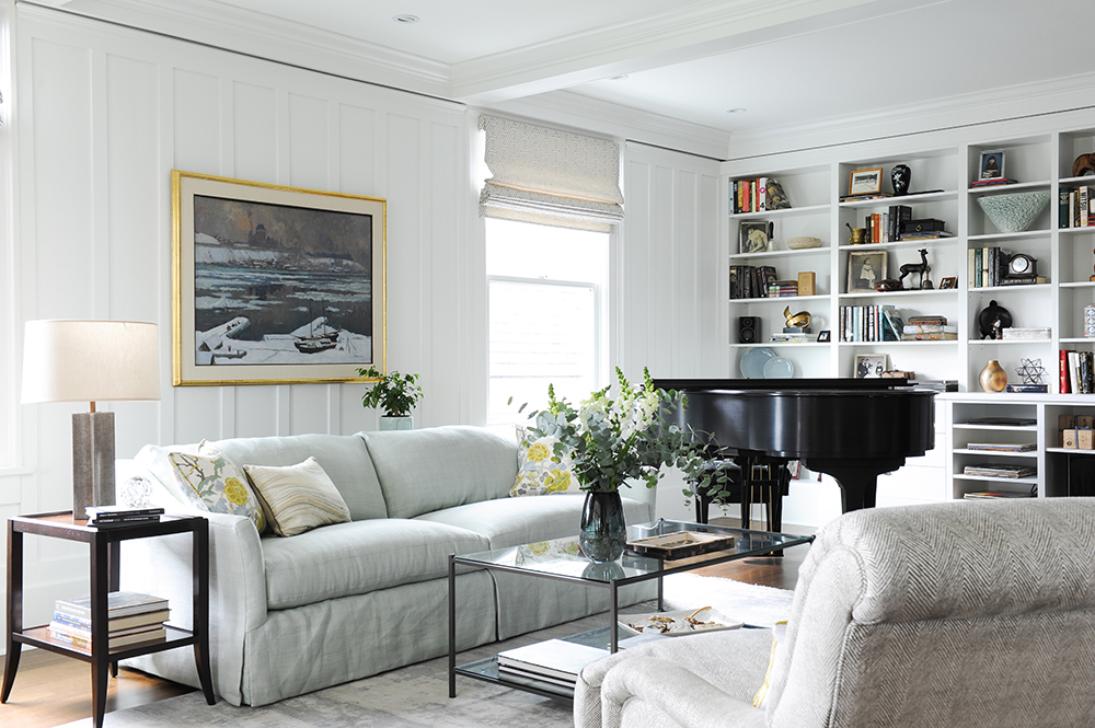
White Now
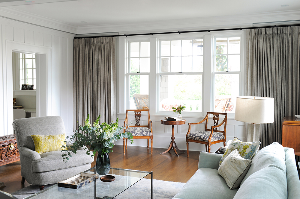
“The living room is very grand, but at the time of purchase it was also very dark,” says Greer. “We painted the original dark-stained walls, ceiling beams and shelves Benjamin Moore’s Oxford White to take the space in an entirely new direction.” The white backdrop also lets the owner’s art collection stand out. The comfy sofa, one of the few new pieces of furniture, is from Lee Industries.
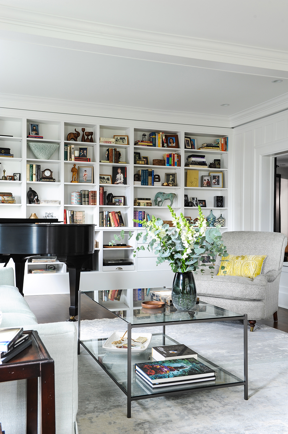
Shelf Life
Before the designers arrived, this wall of shelving featured a designated TV cabinet in its centre. “We removed the wall-mounted TV and the drawers below it and filled in the space with more shelves,” says Jamie. “They create a dramatic focal point in the room and display antique books, family photos and mementoes.” Novice decorators take note: Jamie and Greer said it took them a day of styling to get the shelves just right.
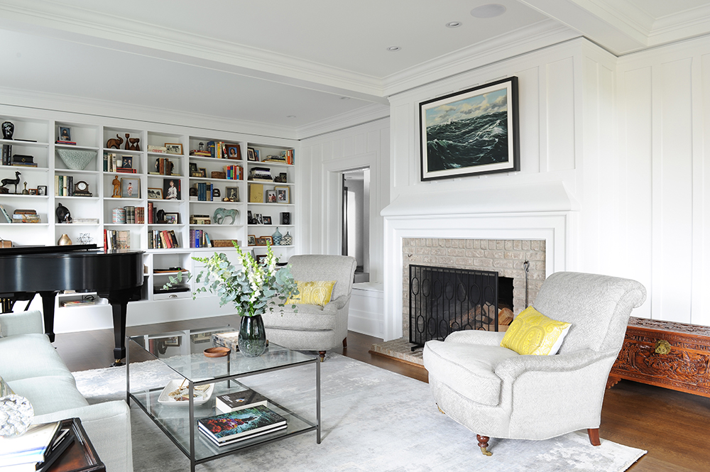
Brick Works
The fireplace’s grey brick facade was one of the features the designers kept in its original state. “We did paint its surround in the same Oxford White as the walls,” says Jamie. “We also added a modern fireplace screen from Crate and Barrel.” It’s a nice foil to the ornate wooden chest, an antique from Japan. Living in a vintage home? Here are 16 ways to keep your home’s original charm.
Chair Lift
The designers revitalized the antique chairs that flank the fireplace with spiffy new fabric. “They used to be covered in dark and dated crewel fabric,” says Greer. “We gave them a facelift with this slate-tone herringbone fabric.” The gold cushion’s warm, burnished hues reference the upholstered catalyst cushions on the sofa.
Something Old
An antique table and chairs, treasured family heirlooms, take pride of place in front of the living room window. The designers juxtaposed them with a new coffee table from Brougham Interiors. “It adds some modernity to the room while maintaining a light, airy feeling,” says Jamie. Custom drapery layers in depth and warmth, and its functionality is a must in this south-facing room. The simple black hardware continues the modern vibe.
Priority Seating
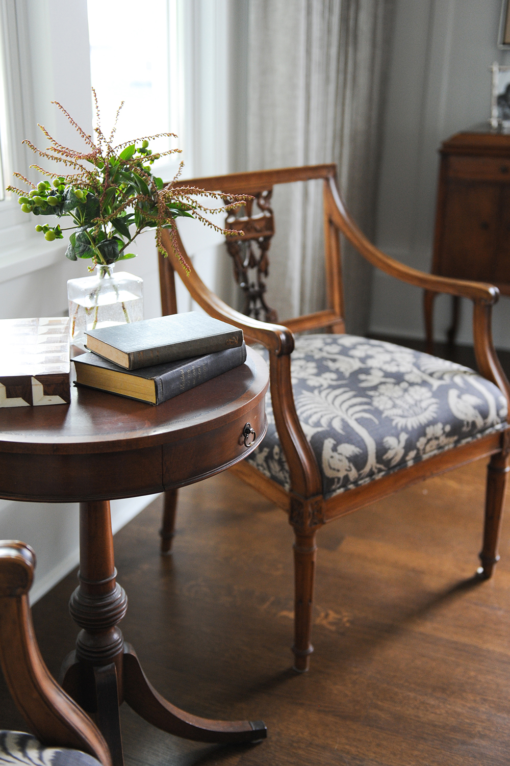
Fabric was once again used to full effect by the designers. “We reupholstered these antique chairs in a traditional yet modern Schumacher fabric,” says Jamie. The steel shade is a cool complement to the warm wooden tones.
Music Box
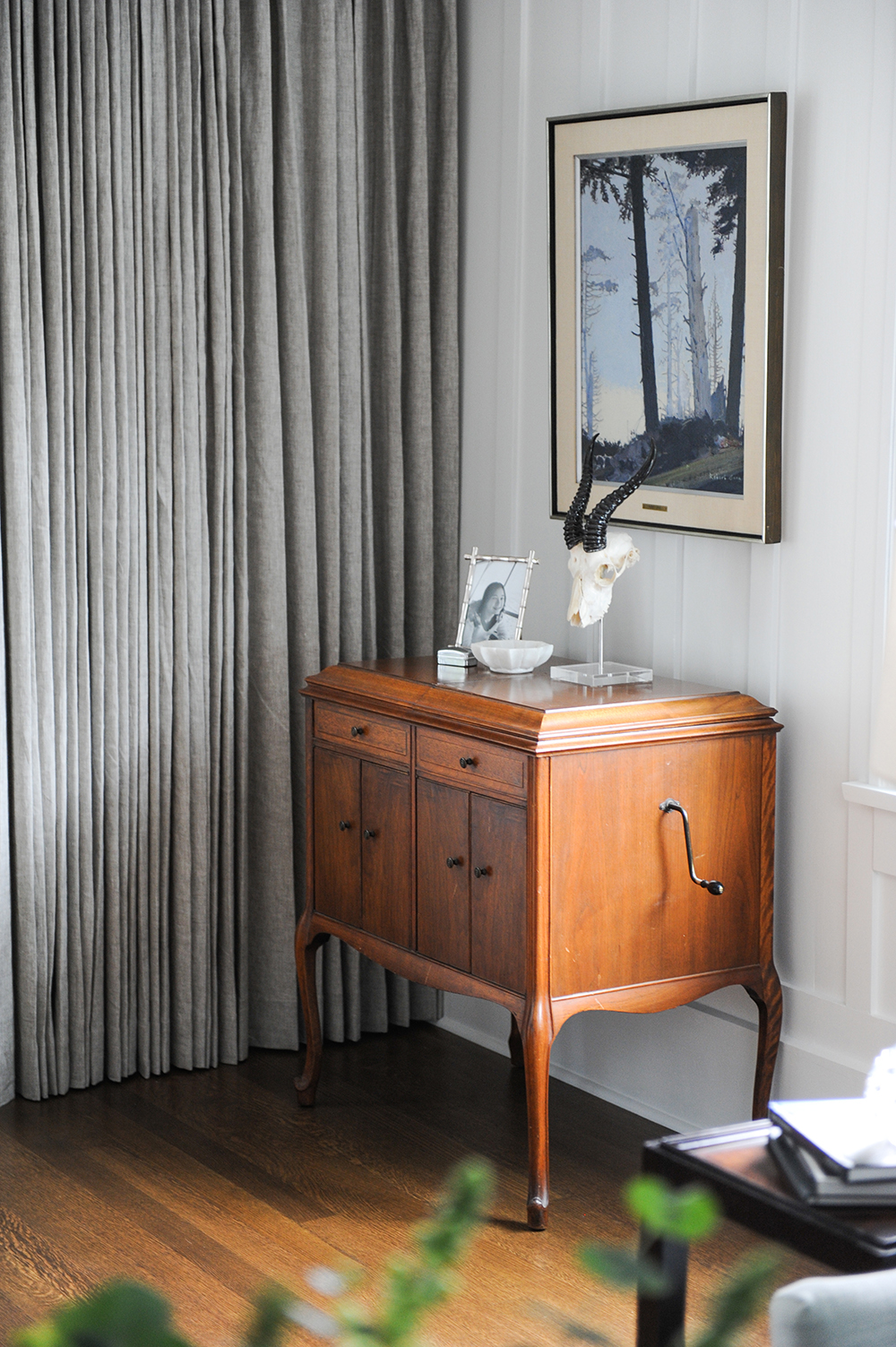
This striking piece is actually a wind-up antique music player. It and the artwork above are part of the homeowners’ large collection of furniture and paintings.
Perch Perfect
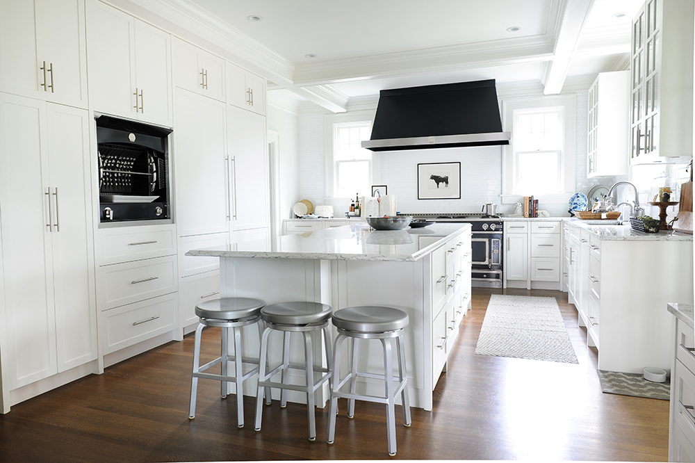
The grand effect of the stunning kitchen and its huge island is softened by an unexpected seating area. “The stools at this end of the island offer a casual perch for a quick bite and add to the functionality of this dream space,” says Greer.
Recipe for Success
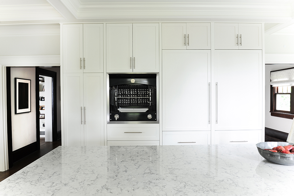
A true cook’s kitchen, this thoughtfully designed space even includes an old-school rotisserie, which was built into this bank of floor-to-ceiling cabinetry. Other design delights include an extra-large fridge that was seamlessly integrated behind cabinetry for uniform effect.
Dreamy Meets Durable
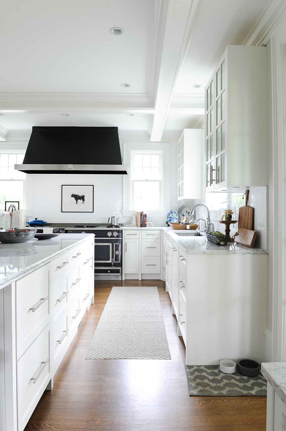
While many of the elements in this kitchen are envy-worthy, including the island’s pull-out fridge drawers and purpose-built recycling compartments, there is one that is easily attainable: this ingenious Örling & Wu runner. “It’s actually made from plastic so it’s super durable and washable,” says Jamie. A bonus in any kitchen.
French Class
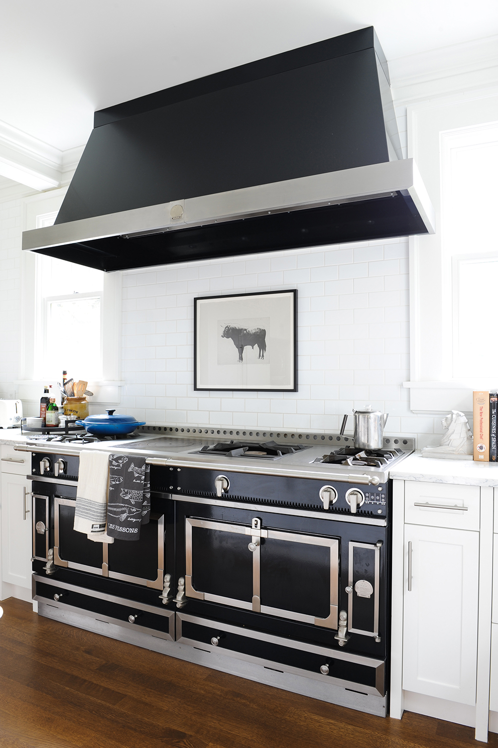
The showpiece La Cornue range and hood are a cook’s dream and speak for themselves. The designers complemented them with an unexpected element. “The bull artwork injects interest and contrast here,” says Greer. It’s drilled directly into the wall and framed in special glass that withstands the range’s heat and resists splatters.
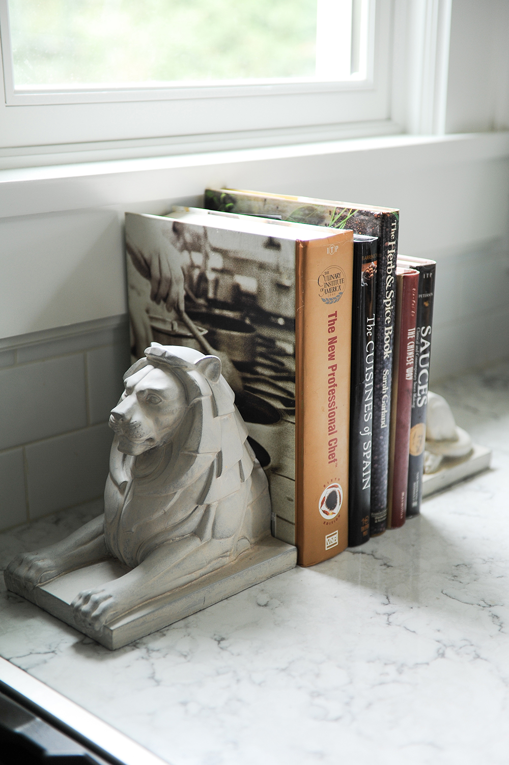
Local Flavour
“These bookends are from Parliament Interiors in the city’s Gastown neighbourhood,” says Jamie. “They reminded us of the entrance sculptures at Vancouver’s Lions Gate Bridge and, bonus, they’re perfect for cookbooks!”
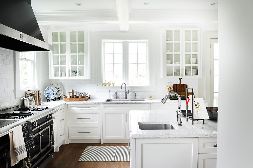
Glass Act
Glass-fronted uppers break up the solid cabinetry and provide a stage to showcase pretty dishware. Jamie and Greer continued that display idea on the countertops. “It was important for us to make this huge, mostly white space feel more organic,” says Greer. “We chose practical accessories like wooden cutting boards, a wicker basket and bowls of fruit to warm the space up a bit.”
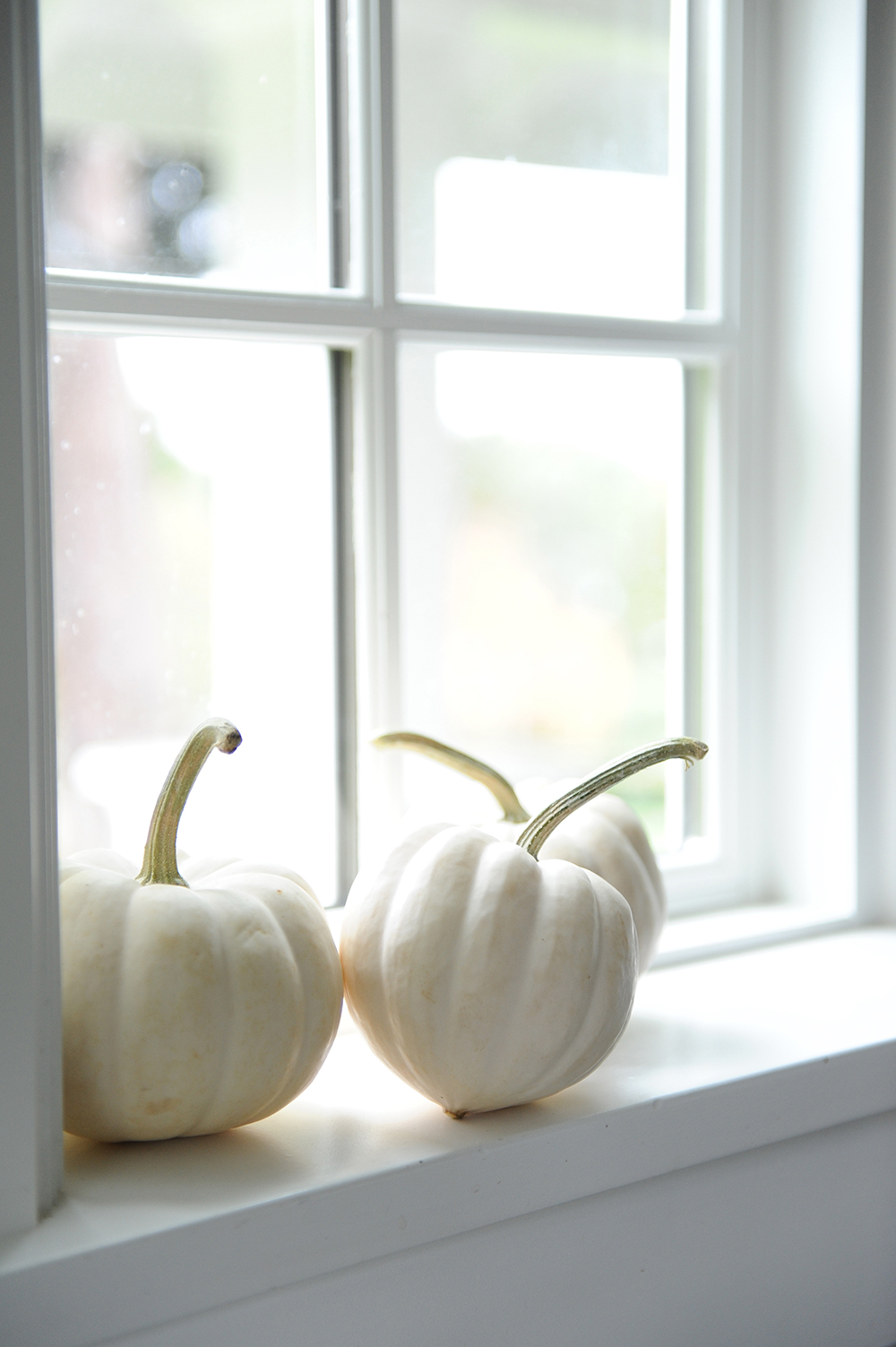
Natural Ingredients
A simple display of white gourds fits the styling brief perfectly: they layer in that organic element the designers craved and their pale hue is stylishly in sync with the kitchen’s palette.
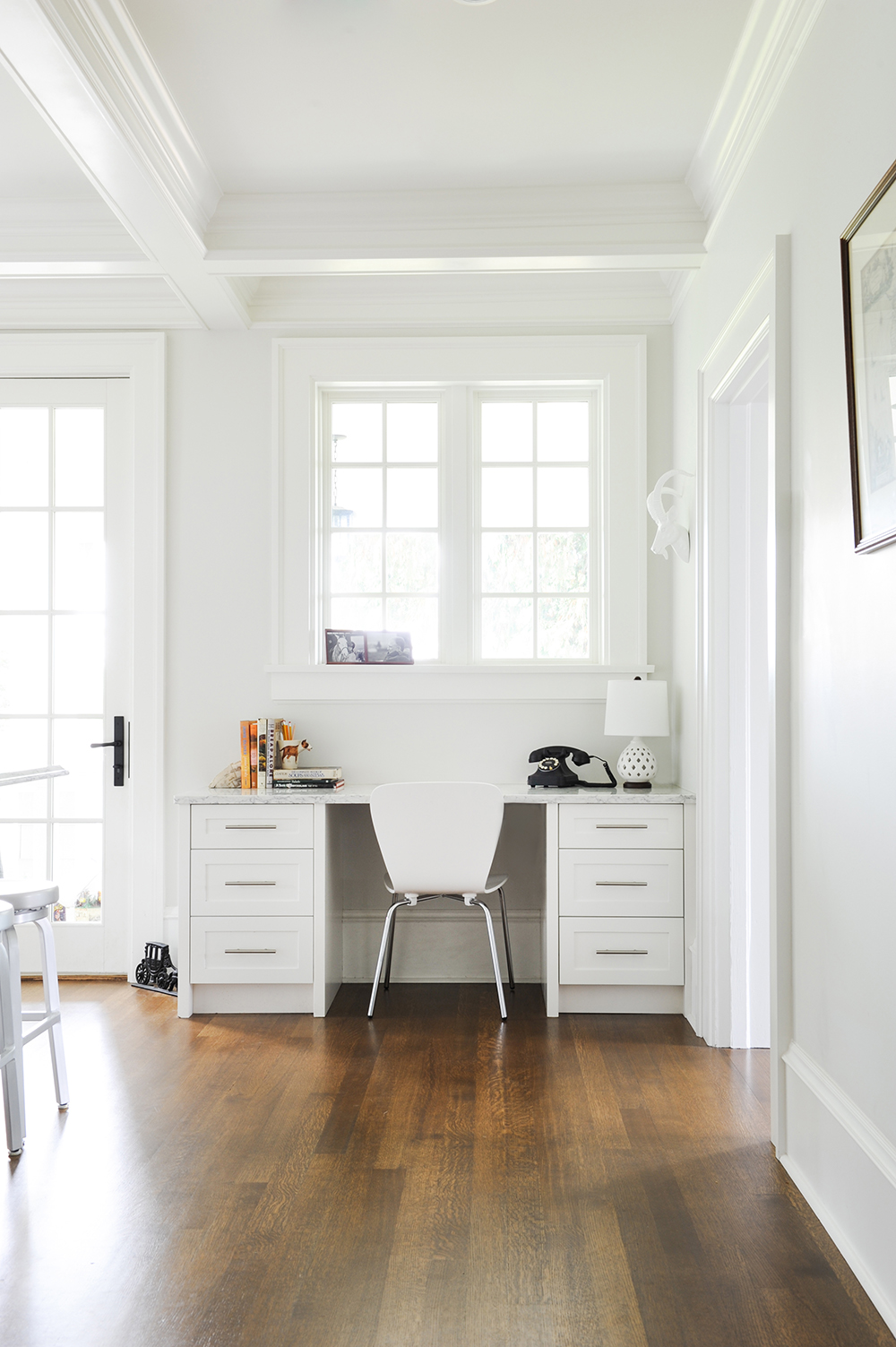
Office Space
The kitchen’s large floor plan afforded space for a chic built-in home office. Jamie says, “The kitchen is usually the hub of the home, so a place to stash mail, keep keys and manage the daily household’s comings and goings is so important. And, we needed a place to showcase the clients’ antique telephone!”
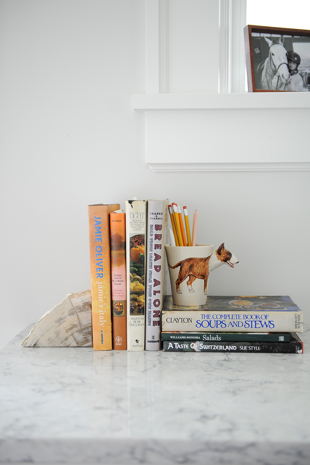
Personal Touch
There’s an irresistible appeal to the worn and torn dust jackets of much-used cookbooks. That highly personalized effect, along with a whimsical mug holding old-school pencils, reinforces that this luxurious kitchen is still very much a family space where meals are prepared and enjoyed.
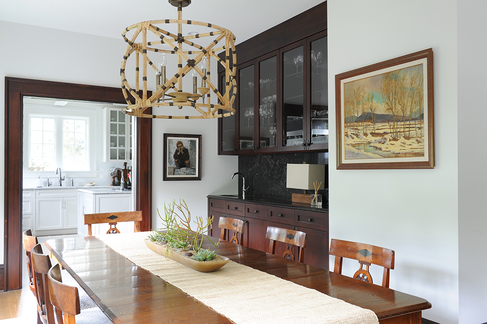
Beachy Glow
The dining room’s quirky chandelier from Currey & Company, with its mix of light wicker and dark accents, is a knockout complement to the different wood tones on display. The dark built-in bar – a covetable feature in any dining room – is original to the home.
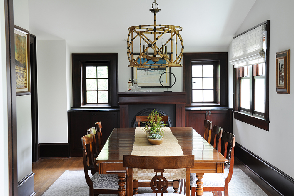
Family Affair
The dining room’s lighter toned table and chairs are family heirlooms and part of the homeowners’ antique inventory.
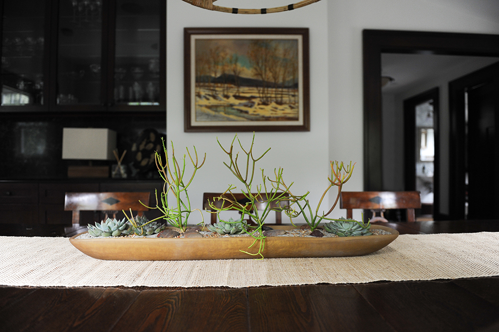
Natural Wonder
“We wanted the dining room table centrepiece to be a little more modern and interesting than the customary vase of flowers,” says Jamie. “We found this beautiful Martha Sturdy bowl and had a local flower shop create this succulent display. They don’t need much upkeep and add an organic heartbeat to the room.”
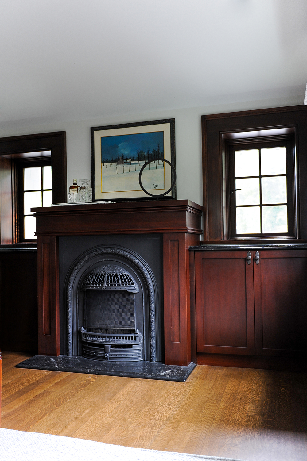
Stain Master
This working fireplace distinguishes the residence as a true heritage home. It is flanked by built-in cabinetry and beautifully crafted windows that were deliberately kept in their original dark stain. The effect is more luxurious and layered than all-white and has a warm formality that is in keeping with a proper dining room.
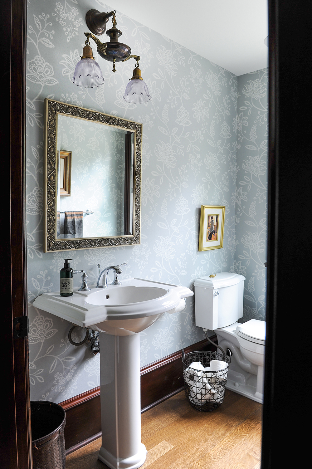
Original Score
Both designers admit that their job was made that much easier thanks to their clients’ vast array of beautiful pieces. In the powder room, a sconce (an original to the home) sits above a dramatic mirror from the homeowners’ collection.
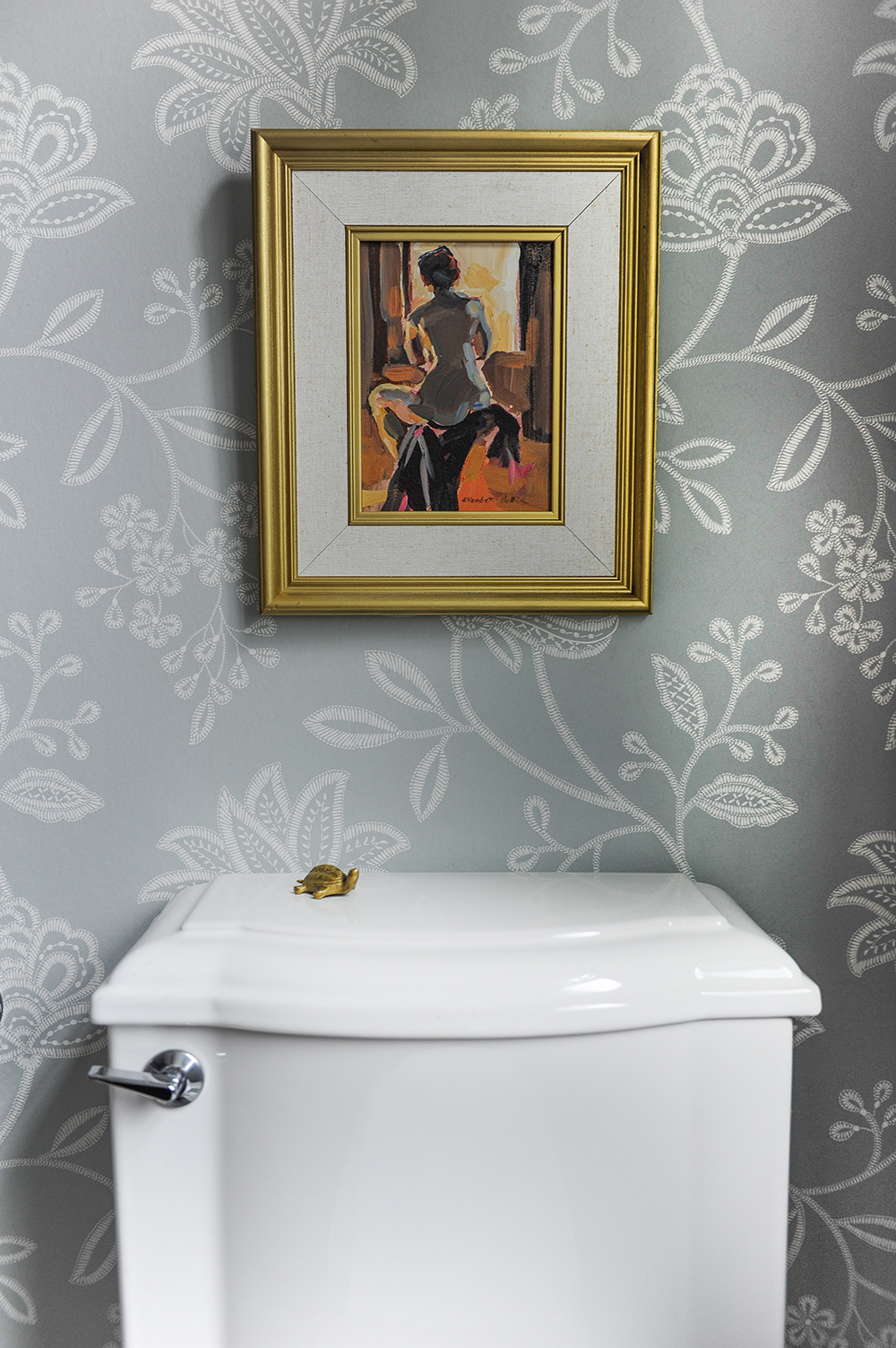
Wall Flower
The designers lavished details on the powder room, from the sumptuous floral wallpaper to unexpected accents like the artwork from the owners’ collection. The gold frame is referenced in the cheeky little turtle below.
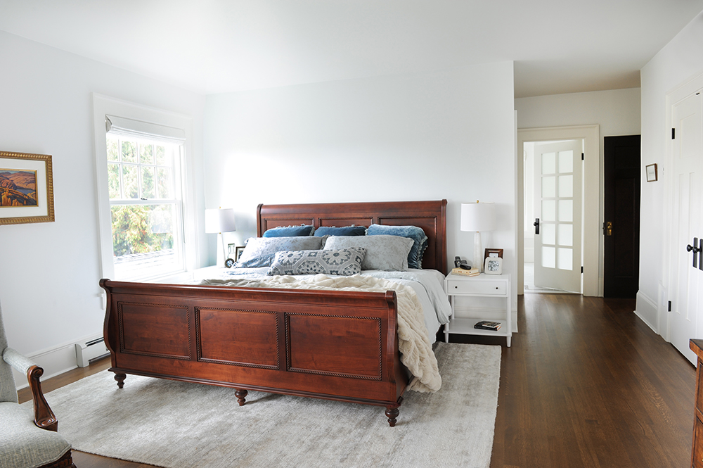
Tread Softly
While the eye is immediately drawn to the beauty of the master bedroom’s burnished wooden bed, there is something just as compelling underfoot. “This Jan Kath area rug is made of recycled sari silk in a pale silvery colour and is unimaginably soft to the touch,” says Greer. Its light and casual quality makes the room feel especially relaxed.
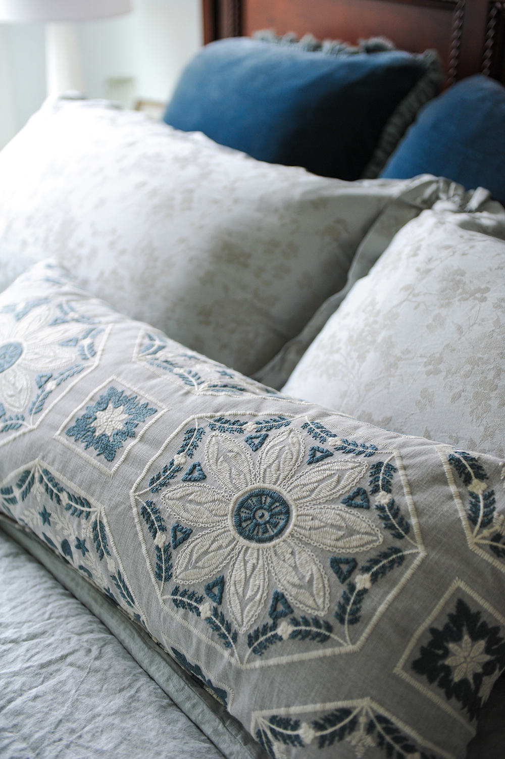
Blue Notes
Splurge alert: the custom Bella Notte Italian bedding was an indulgence worth every penny. “There is a mix of velvet, silk and linen fabrications, all in beautiful muted grey and blue tones. We complemented it with this custom bed pillow in a blue Kravet fabric.”
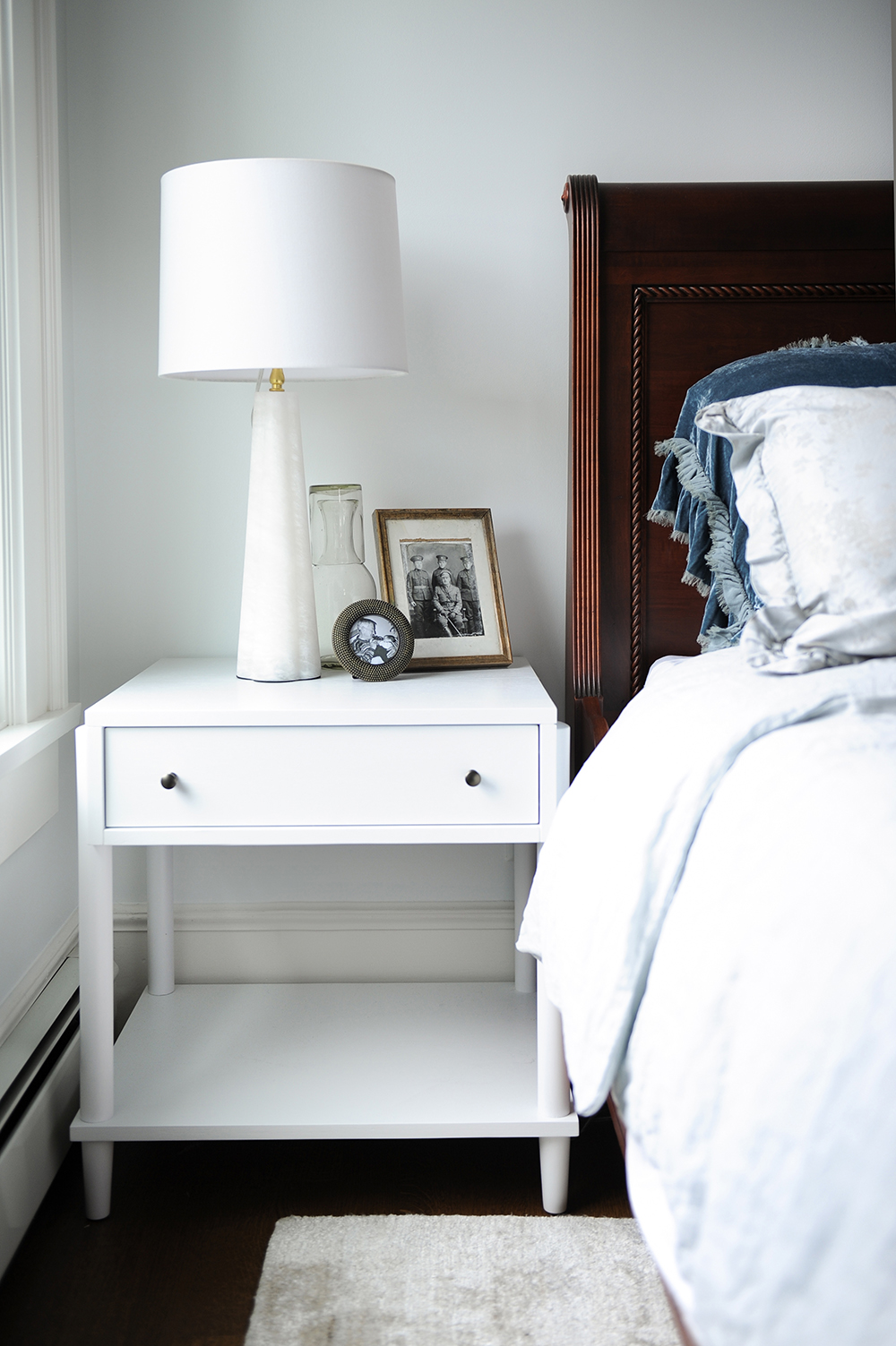
Something New
The designers contrasted the owners’ wooden bed with these white Crate & Barrel nightstands. The crisp tone fends off any heaviness and makes the framed old photos pop. Drawers keep the surfaces clutter-free.
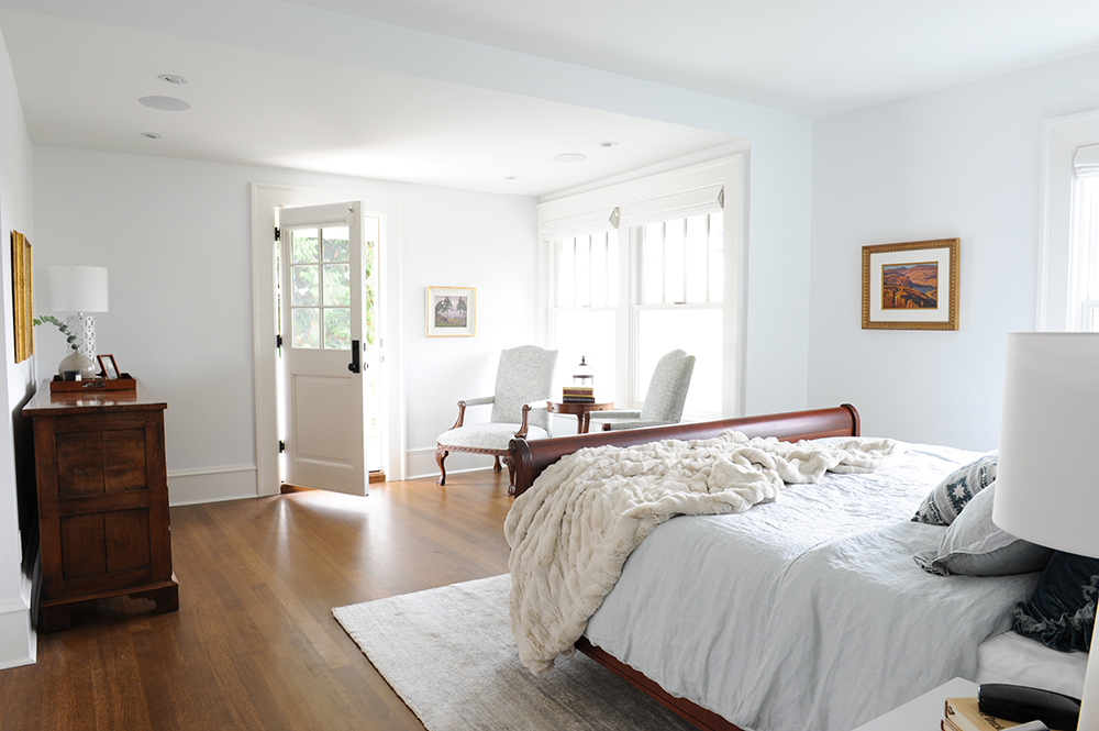
Room With a View
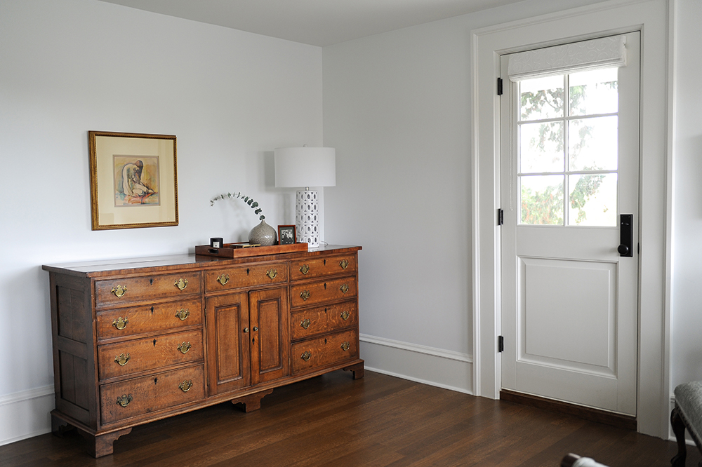
The sun-filled master bedroom becomes even more desirable when seen from this angle. “This door leads to a balcony with a southwest view of old-growth trees and, in the distance, the coast,” says Greer. The designers chose white Roman blinds here that don’t compete with the view.
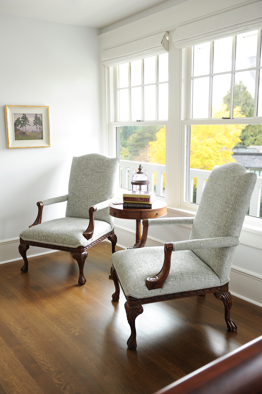
Fabric Softener
A seating area in a master bedroom is a luxurious must, and the designers made sure this one compelled the owners to sit down and enjoy the space. “We reupholstered their existing antique chairs with stunning Schumacher fabric,” says Jamie. “It really softens the seats and all the wood tones.”
Antique Fair
This corner of the master bedroom plays by the same rules of the rest of the house. An antique dresser, part of the owners’ collection, is accessorized with artwork and sprightly touches like a white ceramic lamp. The result is fresh and traditional at the same time.
This Old Thing
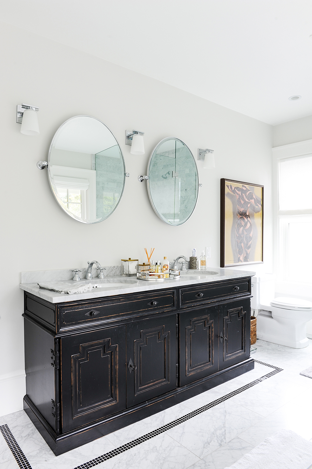
“The master bathroom has modern elements yet still feels like a heritage home,” says Greer. The Restoration Hardware vanity could easily be mistaken for an antique, while black mosaic floor tiles were thoughtfully positioned to crisply frame it. Round mirrors counter all the angles, and artwork makes an appearance in an unlikely spot. Like this look? Here are 10 ways to bring vintage appeal to your basic bathroom.
It’s Customary
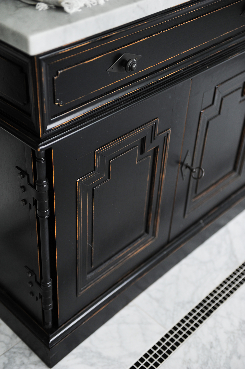
Though the vanity was store-bought, its smart design makes it seem otherwise. “This baseboard detail makes the vanity seem framed in and gives it a custom look,” says Greer.
Fine Balance
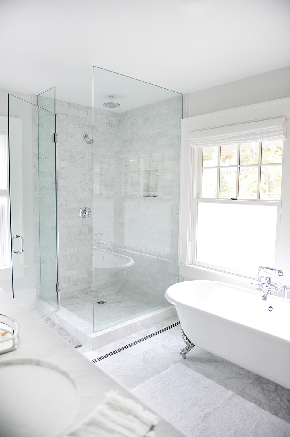
“I love a glass-enclosed shower,” says Jamie. “It has an airiness that’s inviting and modern.” While the shower modernizes the space, the clawfoot tub addresses the home’s traditional aesthetic. Sparkly chrome hardware feels fresh against the rich marble backdrop and even the tub’s feet reference the metallic sheen.
Serenity Now
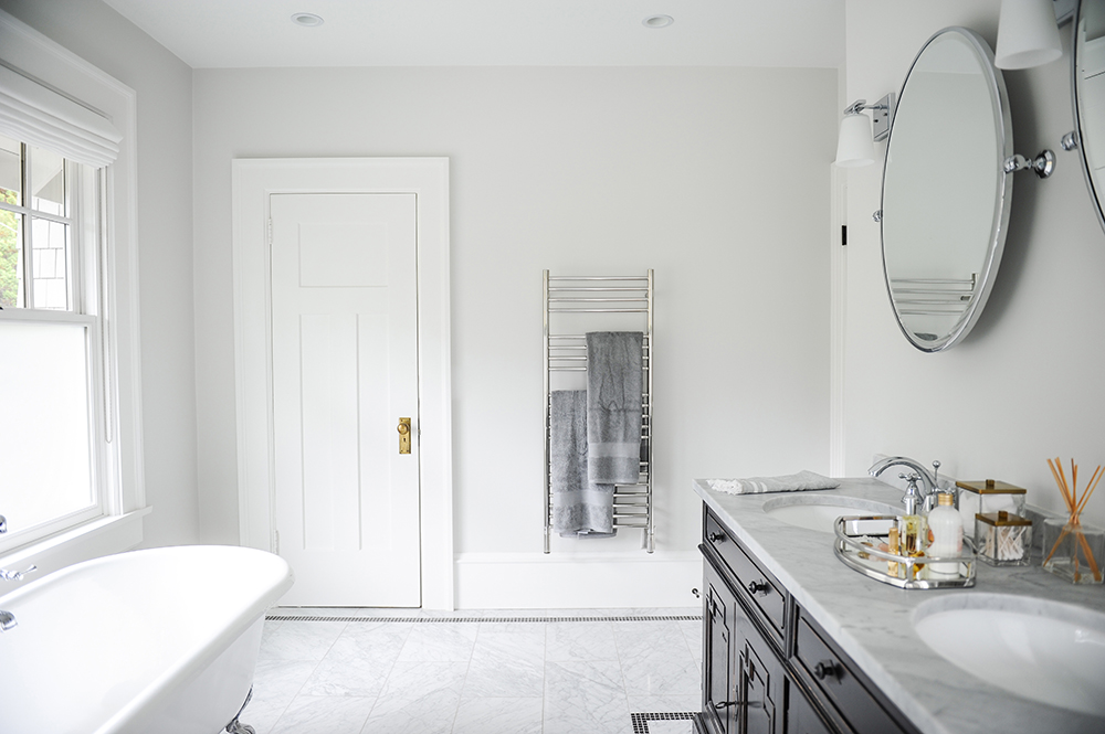
Features like a heated towel holder speak the spa language, but unseen elements are just as crucial for creating that effect. “The vanity’s countertop displays decorative items like pretty fragrance bottles and infusers,” says Greer, “but it’s all the hidden storage in the base that makes the difference. There’s never any clutter, just the wonderful feeling of walking into a hotel spa.”
HGTV your inbox.
By clicking "SIGN UP” you agree to receive emails from HGTV and accept Corus' Terms of Use and Corus' Privacy Policy.


