Toronto-based designer Alana Fletcher sought to infuse a tired, ’70s-build semi with modern verve to suit the family of five that lives there. That meant ripping out 2,220 square feet of old wallpaper, icky cabinets and wonky floors to start fresh. She moved a small kitchen from the middle of the house to the back – to soak up the western sun exposure – then set about crafting a clean-lined home that’s both cool-contemporary and brimming with comfort.
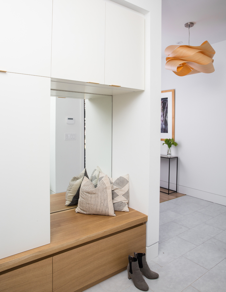
Fix and Flip
The entryway’s built-in bench and storage unit is testament to designer Alana Fletcher’s panache and flexibility with floor plans. “I had originally framed this so the bench was on the other side of this wall in the adjacent living room, where it would act as a reading nook,” she says. “Then I realized how much more use it would get in the front hall.” Positioned here, the nook acts as a dedicated storage space and offers a sleek perch for putting on shoes. Its custom millwork and mix of white and wood tones is also an intimation of what’s to come on the rest of the main floor.
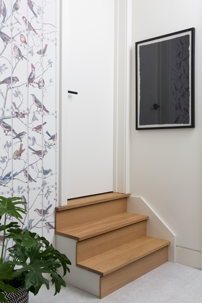
Frugal Framework
These stairs lead to the home’s yoga studio – a must, as one of the homeowners practices daily and teaches yoga classes here. We love how Alana deftly balanced the design budget with investment features like imported designer wallpaper and custom oak stairs alongside art with unexpected provenance. “It’s actually framed paper, which is a great DIY for modern art when you don’t have the budget to invest.”
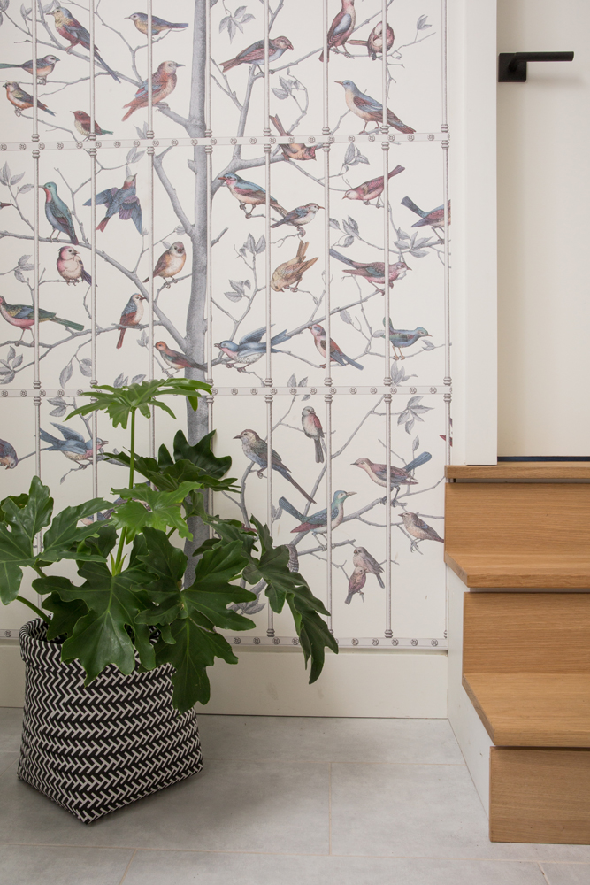
Who’s a Pretty Bird
Wallpaper is a trend that’s taken flight, and this one packs stylish staying power. Originally designed for a luxury hotel in Tuscany, it’s “Uccelli” by Cole & Son. “Birds nestled in a tree are so picturesque and invite the outdoors in,” she says. “The pattern suits all seasons and feels fresh with subtle hues.” A well-positioned plant amplifies the natural effect. Experiment with wallpaper yourself with these 8 unexpected wallpaper ideas that don’t involve walls.
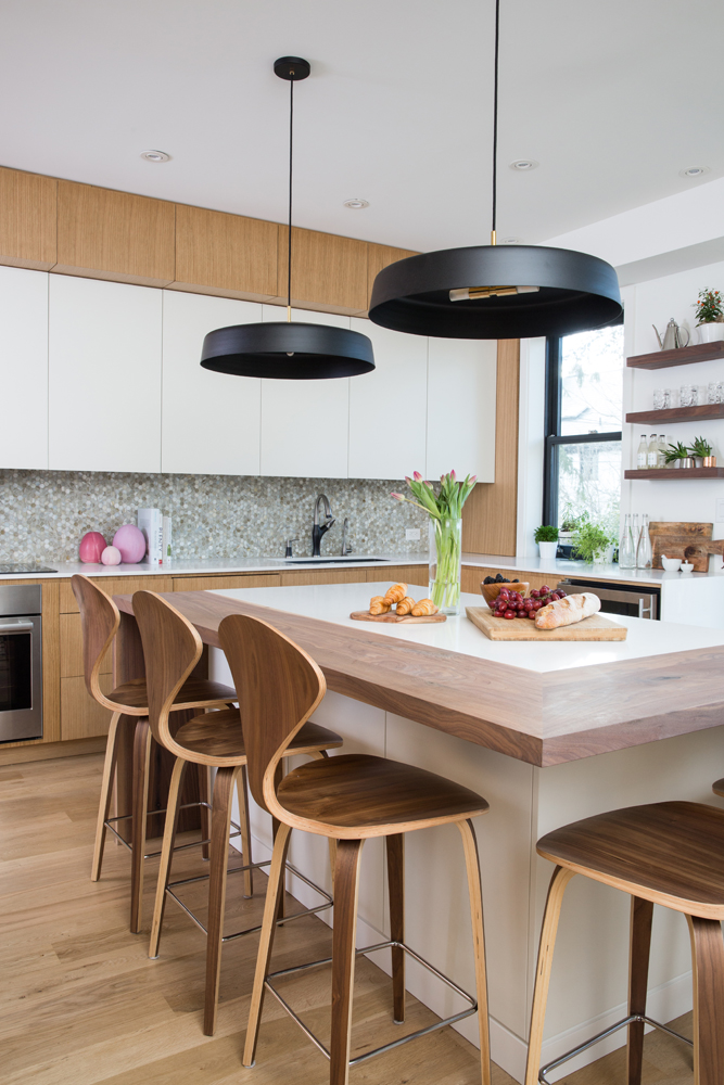
Clean Finish
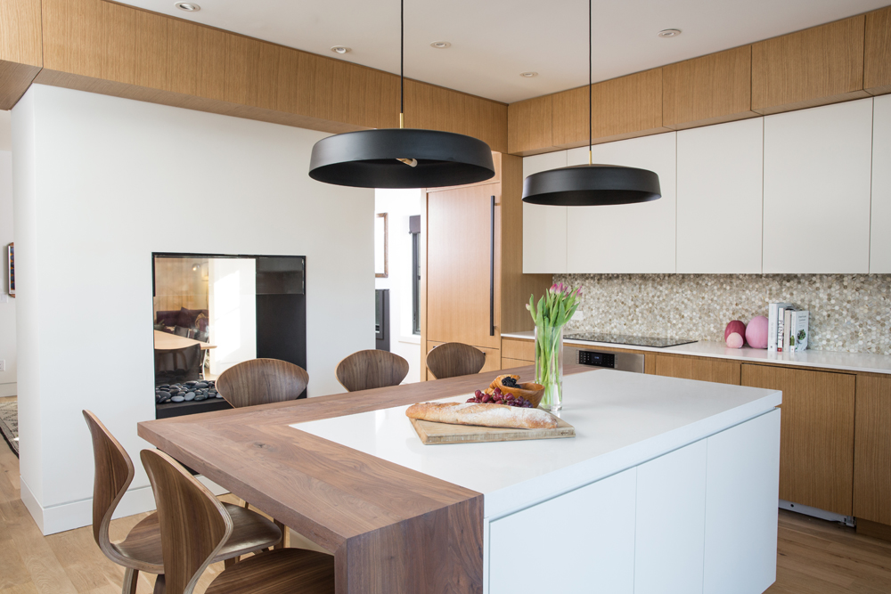
The fact that the kitchen would look just as fantastic with nothing in it speaks to the quality of the design. “I wanted to focus on the materials and keep the lines clean,” says Alana. To do this, she enlisted Nick Day Design to custom make all the cabinetry. The mix of white and wood tones is punctuated by the black Lambert & Fils pendant lights. “They have a low profile, although they’re 24″ wide, so they make a statement without being overwhelming.”
For the “L” of It
When envisioning their new kitchen, the homeowners imagined the island running parallel to the wall of cabinets, but Alana flipped it to be perpendicular. “This opens up the area and pathways around it to maximize space,” she says. Its L-shaped walnut finish, echoed in the stools, subtly references the L-shaped kitchen, smartly delineates the island’s eating area and is a rich contrast to the white and oak cabinetry. It was also custom-made by Nick Day Design. Here are 25 more kitchen islands you’ll want in your home.
Organic Ingredients
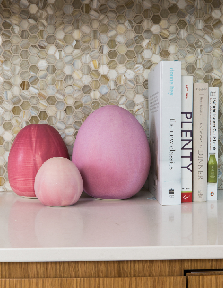
These pink sculptures are by French artist Christiane Perrochon, and Alana chose them specifically for their organic shapes and gorgeous colour. They are a favourite of the homeowners and a curvy foil to the kitchen’s straight lines.
Artful Lodgers
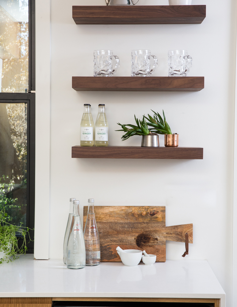
“This spot in the kitchen, between the window and doors to the backyard, was a perfect place for floating shelves,” says Alana. These three are walnut, a nod the island’s finish, and allow a nifty place to display pretty items, both for show and everyday use. Styled with restraint, rather than being overcrowded, they have an artful effect.
Open Case
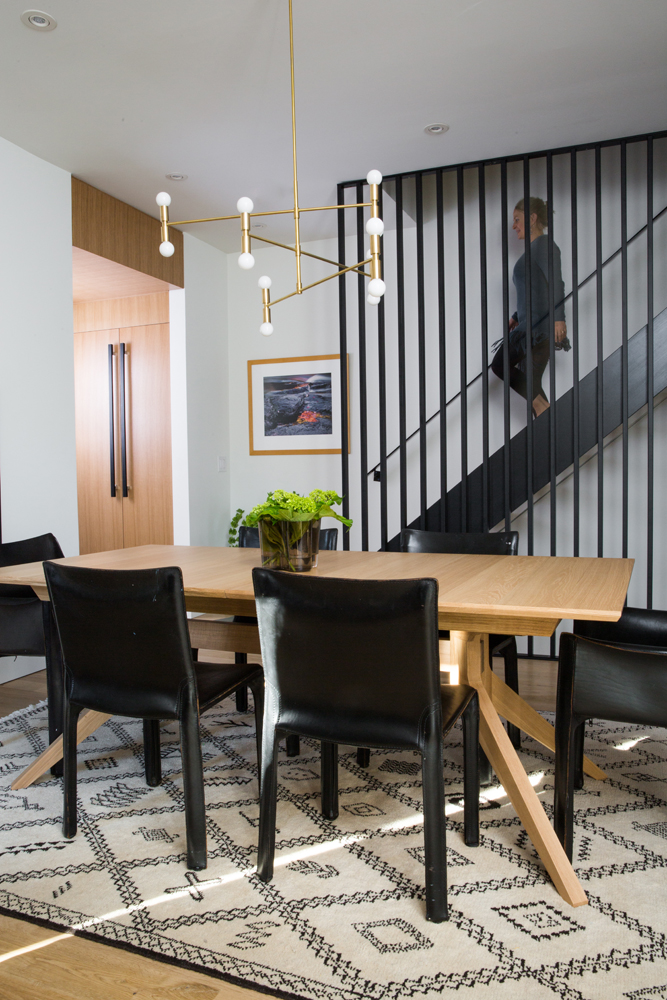
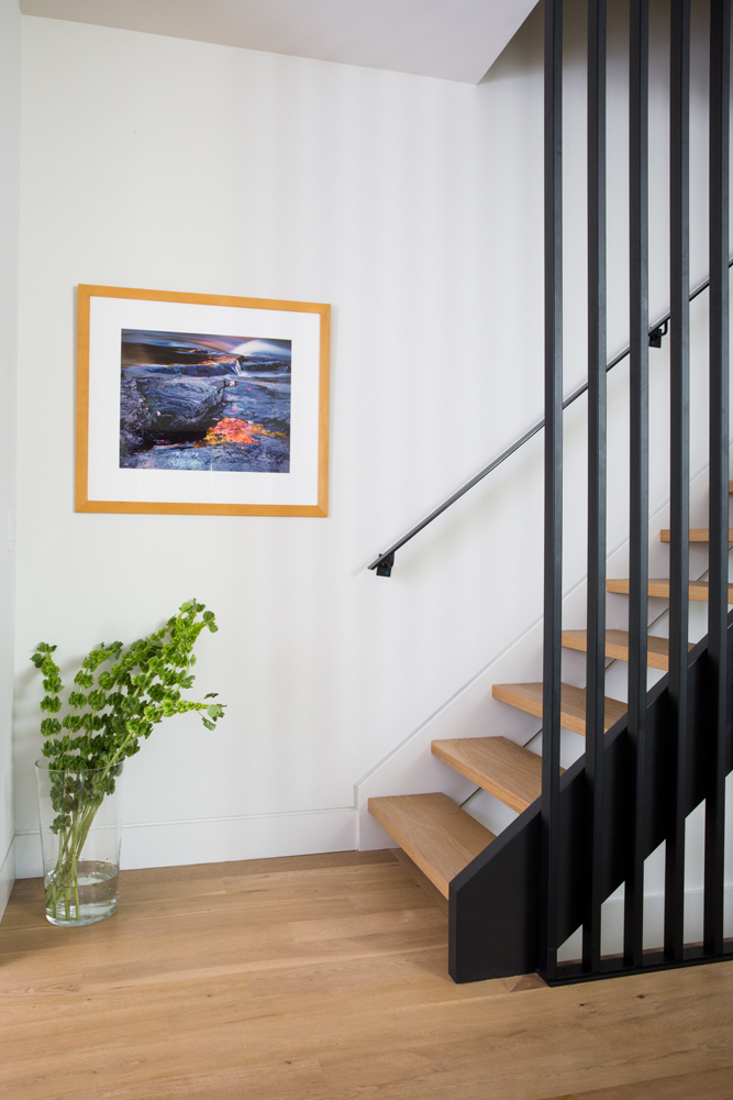
This showstopper staircase is a favourite of Alana’s. “I wanted to move away from a typical glass panel, so designed this steel structure. It doesn’t compete with the other elements, rather helps connect the dining and kitchen areas,” she says. “The rectangular spindles are inviting to touch and conjure up a feeling of vertical height.” We love how the black of the steel is picked up in the vintage Mario Bellini chairs and the pantry cupboards’ handles.
Works of Art
This angle of the staircase highlights its floating treads and the light and airy effect they, and the steel spindles, create. “It was important to keep the space as open as possible because you can see through to the backyard from the front of the house,” says Alana. Real greenery and art enliven the monochromatic area.
The Hex Tiles
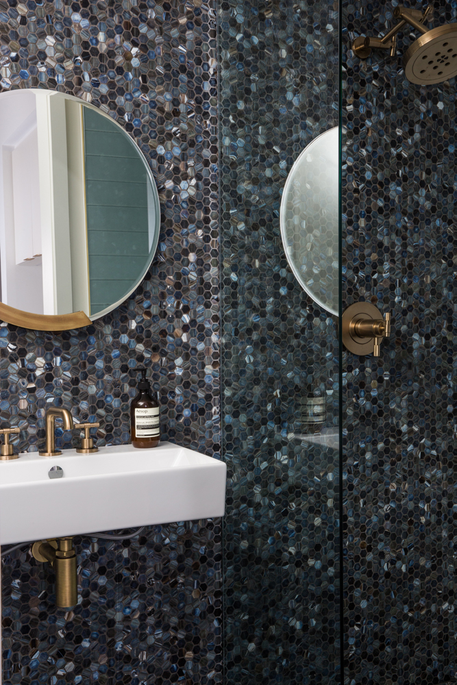
The main-floor powder room, which also features a shower, is a rich departure from standard white. “I repeated the hexagonal tiles from Ceragres throughout the house, but switched up the finish and colour in each application,” says Alana. “I wanted some colour in the home, apart from the neutral tones, and love this ocean-themed palette.”
Well Rounded
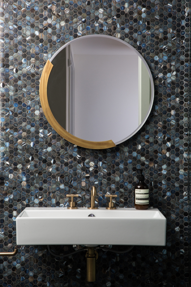
“This mirror from CB2 is asymmetrical, so it keeps the eye moving,” says Alana. It was thoughtfully chosen like the floating sink (from Roman Bath), which frees up floor space and keeps the jewel-like tiles the focal point.
Forward Thinking
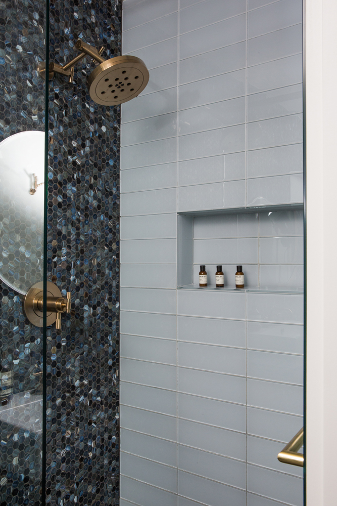
“Glass tiles are so pretty in a shower, and this “Aura Ice” colour is watery and cloud-like.” Alana fit the shower niche to the tiles to avoid waste and off-cuts. The burnished brass hardware from Brizo’s Litze Collection feels fresh, and is an earthy complement to the rich blue tones.
Above Grade, Below Ground
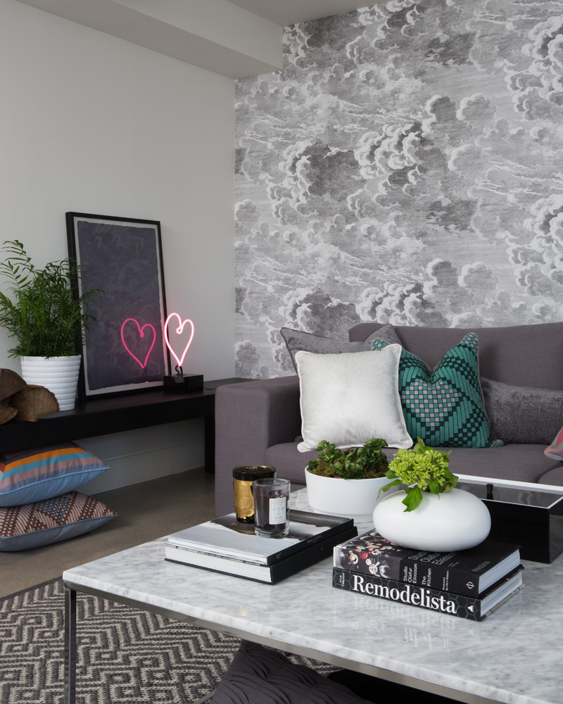
Few would guess that this striking family room is actually in the basement. It exudes warmth (literally) with heated concrete floors, and stylistically with well-chosen furnishings. The custom steel bench against the wall offers extra seating, can act as a table and is a place to display art and accessories. The extra-long Article sofa has ample seating for a family of five, the rug layers in softness and the impact of wallpaper continues.
Wallpaper as Art
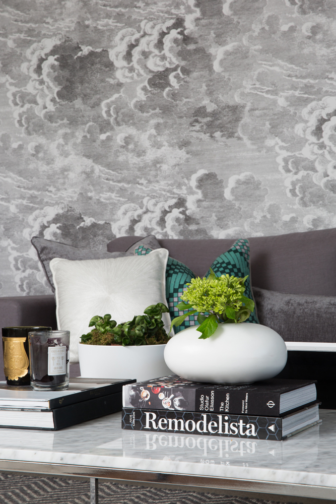
This dreamy cloud-patterned wallpaper (“Nuvolette” from Cole & Son) is artwork in its own right. “It also grounds the room with the subtle hatched line effect of stormy clouds, and all the grey furniture and accents complement its depth.” The Structube coffee table, though sophisticatedly styled, is also the perfect height for resting feet.
Masculine Profile
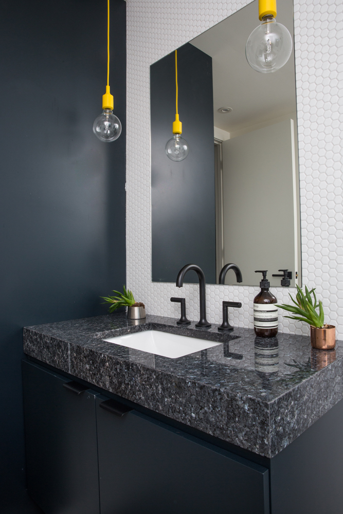
The sons’ second-floor bathroom boasts a handsome melange of masculine tones, including the custom vanity top crafted from granite and featuring a generous four-inch mitered edge. Its pebbly finish is neatly complemented in the hexagonal tiled backsplash. The electric-yellow pendant lights from Muuto add a zing of colour, and the plant holders are repurposed Tom Dixon candle vessels.
Calming Effect
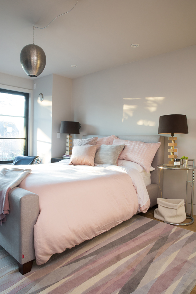
The soft hues of the sun-dappled master bedroom are serene. “We painted the walls, ceiling and trim the same Benjamin Moore shade, but switched from a matte finish on the walls to a satin one for the trim and doors,” says the designer. “The effect is calming on the senses and serves the overall look for the master bedroom well.” The patterned wool rug adds another layer of style and serenity.
His and Hers
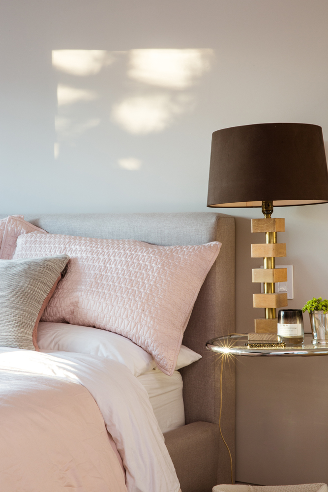
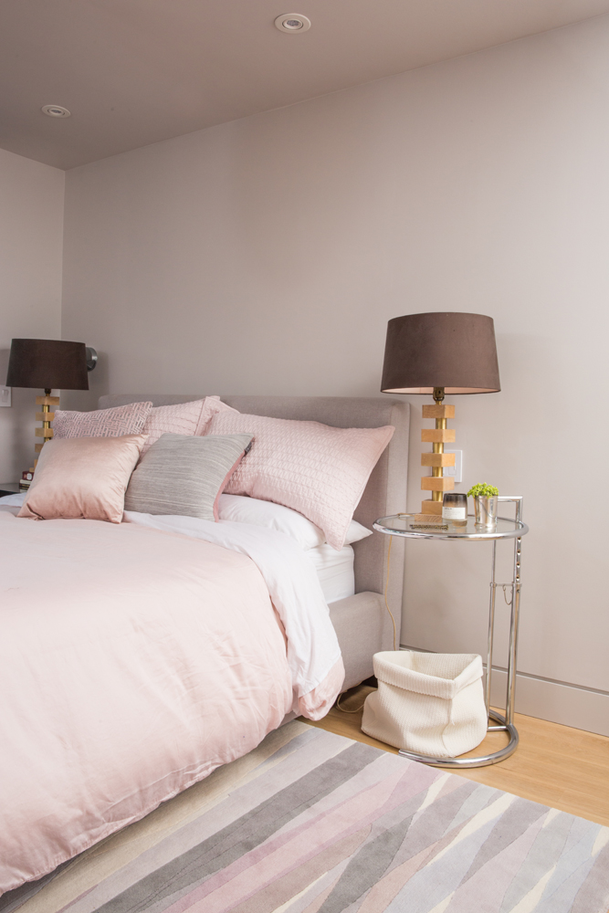
The soft-grey upholstered bed is complemented with pink bedding. “With four men in the house, a little pink is a welcome addition,” says Alana. The wood and brass bedside lamps are a perfect melding of masculine and feminine. “They’re vintage and have custom chocolate-brown shades with a light-pink interior for a soft glow.”
High Low
This sleek chrome piece is an original Eileen Grey side table and is nonchalantly styled with a simple woven basket.
Pretty in Pink
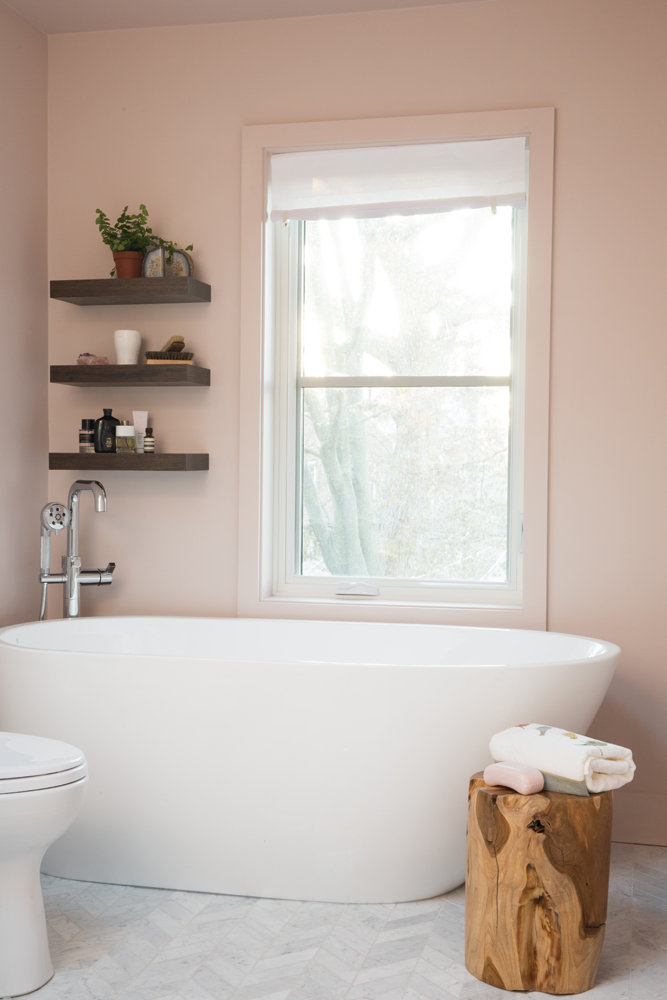
The pink continues in the master ensuite. “I wanted a feminine colour to balance out the marble and darker tones in the vanity (not shown). It complements the bedroom and provides a sanctuary.” The vessel tub is positioned to overlook the leafy backyard, and the tub-filler nestled in the corner keeps the view unimpeded.
Bespoke Bath
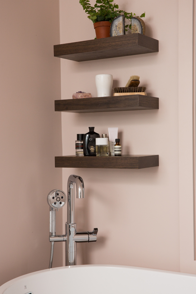
Similar to the three floating shelves in the kitchen, these walnut beauties were custom made and offer a display area for pretty toiletries. We love how Alana painted the bathroom trim the same colour as the walls for an upscale and seamless look. It’s very much in keeping with the clean lines of the rest of the home.
HGTV your inbox.
By clicking "SIGN UP” you agree to receive emails from HGTV and accept Corus' Terms of Use and Corus' Privacy Policy.


