Laura Collins and Kelly Lynn Armstrong of Toronto’s Elsie & Kel Design make styling look like a cinch. Their savvy is evident in this living room that brims with collected pieces, yet looks serene rather then overstuffed. See how they did it and how it will inspire you to do the same.
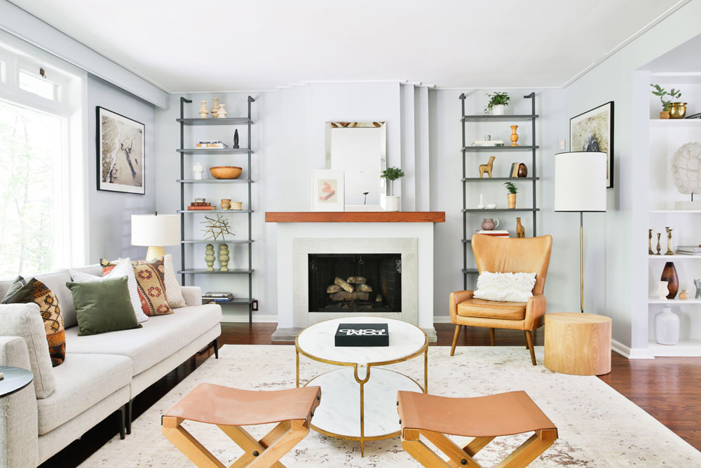
Add Symmetrical Shelving
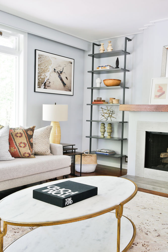
“Shelving is a great way to organize decor,” says Kelly Lynn. The designers love symmetry and wholeheartedly advise it, but Laura does advise against matchy-matchy. “It’s fun to shake up symmetry by not replicating the exact same shelf design on both sides. Playing with balance by using colour and different sizes of decor items helps to create interesting vignettes.”
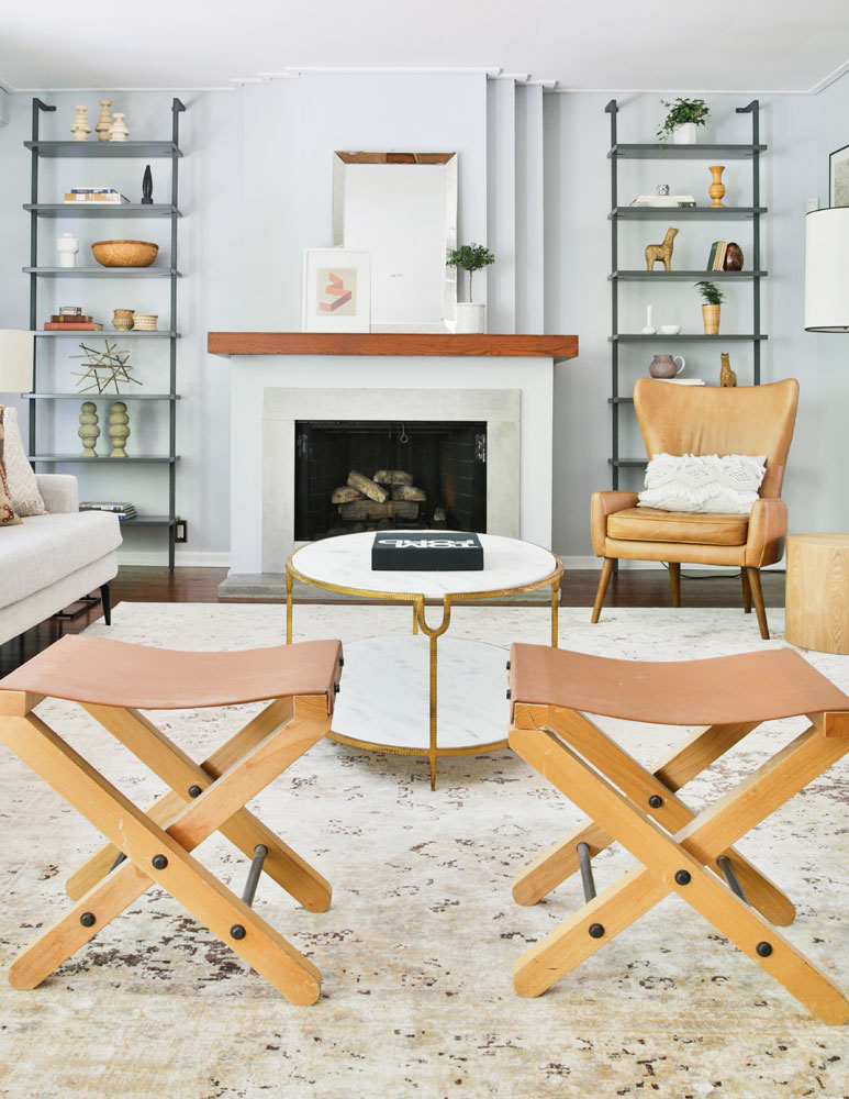
Opt for Easy-to-Move Pieces
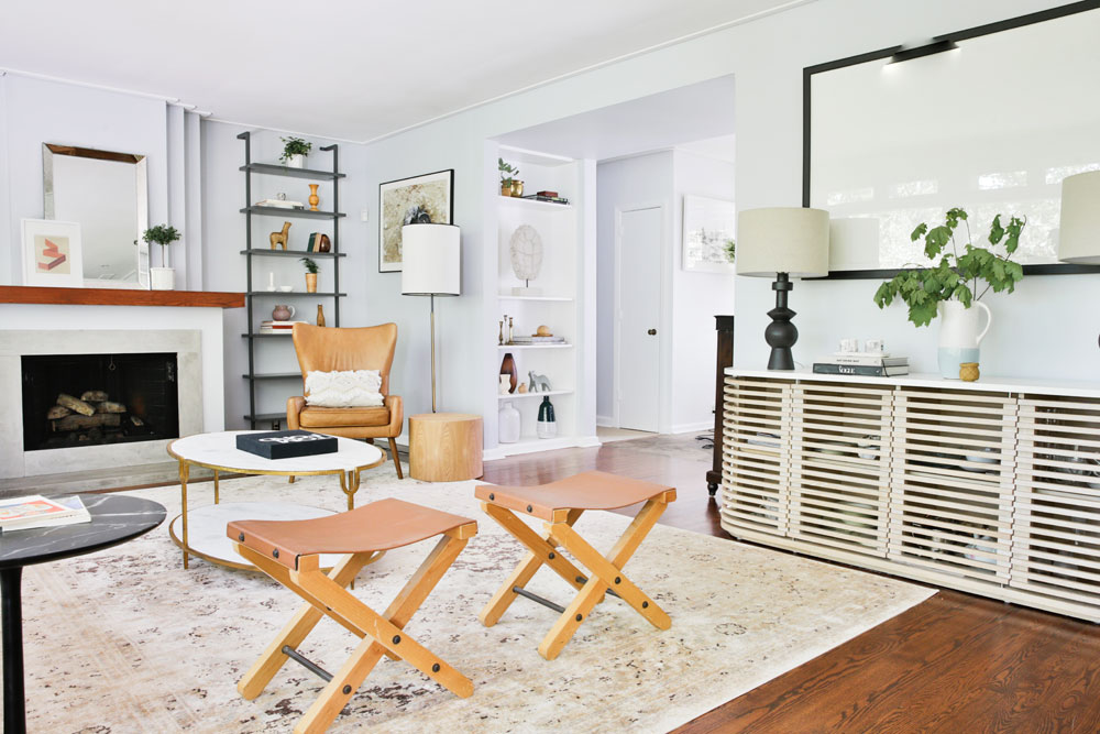
The designers love to play with texture and scale, which is just one of the reasons why they chose these chic stools. “They are easy to move through a space, and typically will only be used when entertaining,” says Laura. “Pieces like this are great to have on hand. They don’t have to be permanent fixtures so there’s no clutter, and they can be placed anywhere they’re needed.”
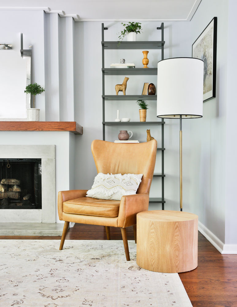
Add a Floor Lamp
“We love to incorporate a floor lamp as it draws the eye upwards and creates an airy feel,” says Kelly Lynn. “It’s also an opportunity to use another silhouette and add more ambience.” The neutral side table is in keeping with the colour palette so it doesn’t feel heavy.
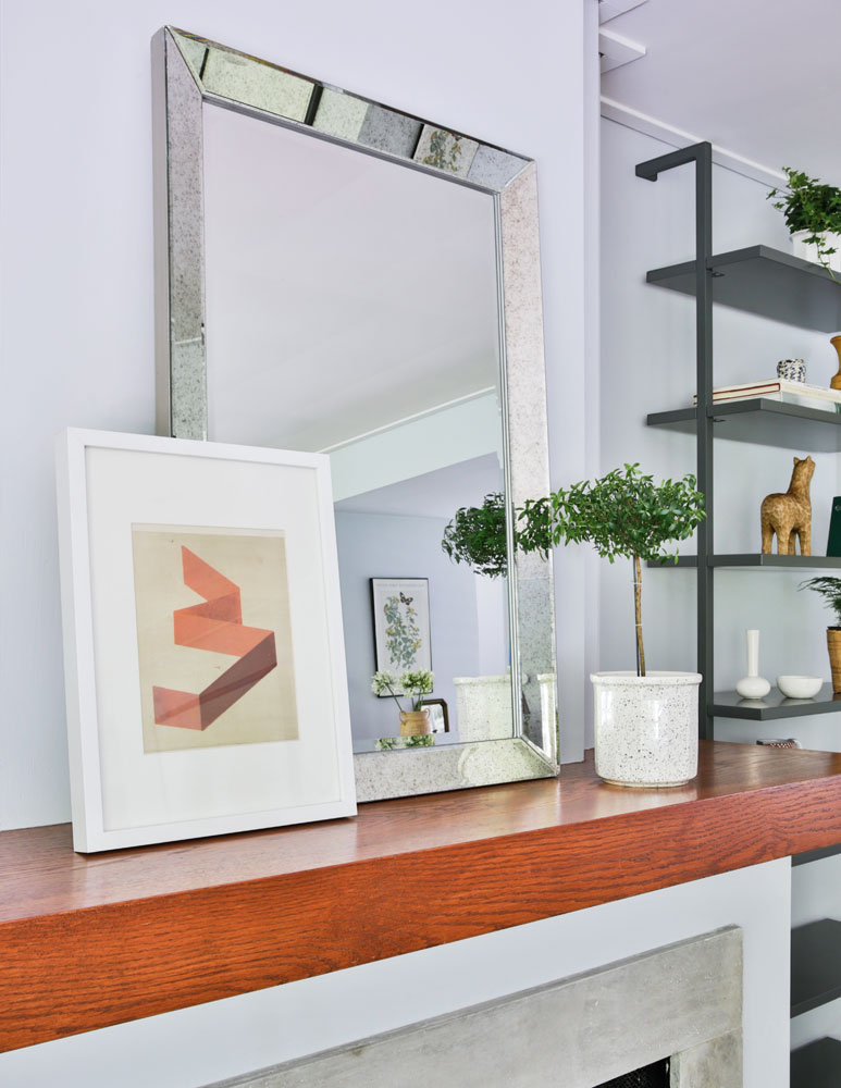
Play with Scale
Accessorizing mantels can be challenging, but the designers have mastered it with a secret weapon: scale. Here, a small framed piece of art propped casually in front of a much larger mirror feels dynamic and has much more presence than multiple pieces in the same size would. The topiary provides some fresh greenery.
Keep Tabletops Simple
The designers let the coffee table dictate its accessories. “We felt it was enough of a statement on its own with its stunning combination of marble and satin brass,” says Laura. “Just like a solitaire diamond, sometimes one accessory is all you need!”
Pick a Theme
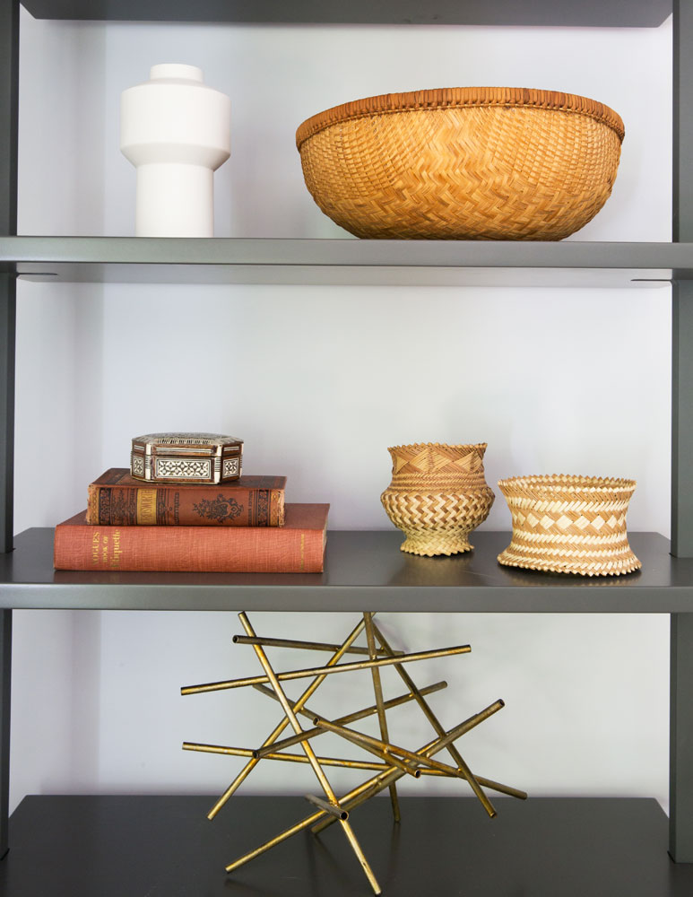
When it comes to styling shelves, Laura and Kelly Lynn advise a cohesive theme. “Don’t be overly literal, but have a focus,” says Kelly Lynn. “We chose nature as our guiding point and used pieces in natural tones, earthy shapes and varying scales. Have fun with it and play around until you achieve a balance you like.”
Layer In an Area Rug
“Area rugs are crucial,” says Kelly Lynn. “Not only when determining how to design the room spatially, but also to help ground the space and tie it all together. There are many rules of design, but we feel like each space and client has different needs. This space required a large neutral rug to help establish the large open-concept space.”
Use Sculptural Accessories
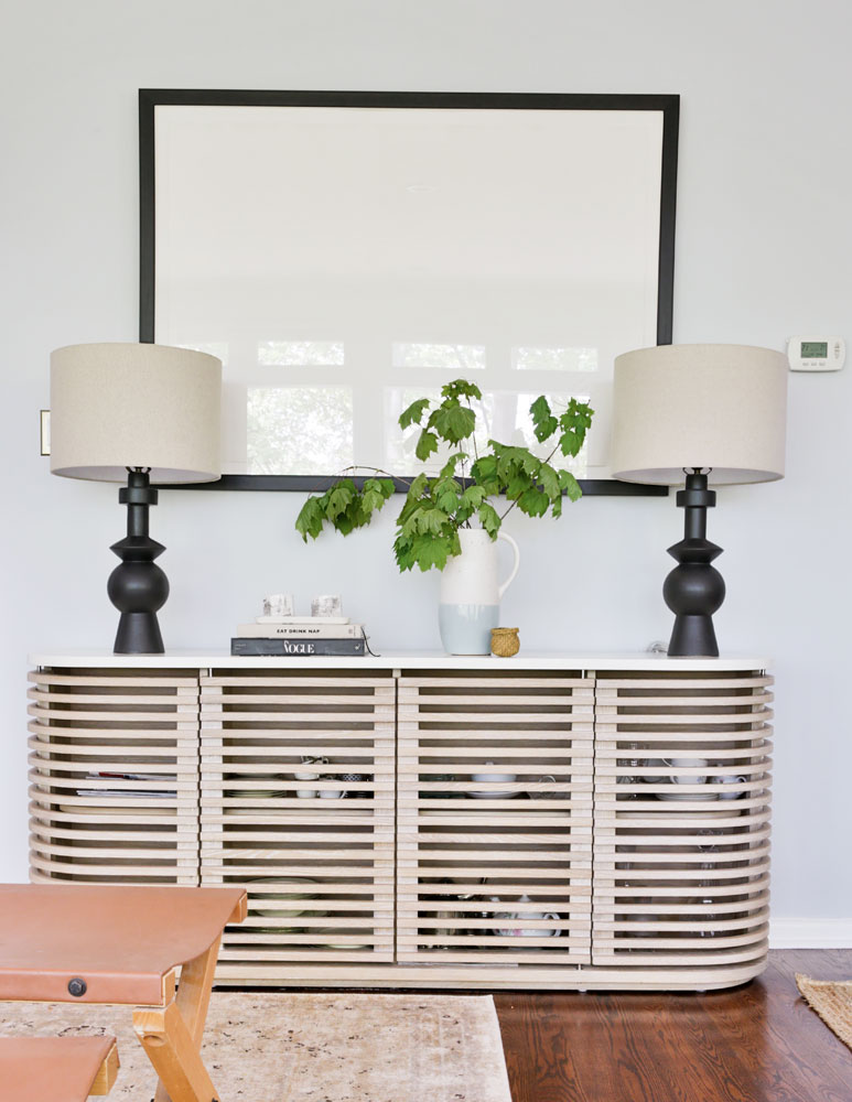
This impressive slat-fronted console demanded equally impressive accessories. “We wanted to flank it with pieces that were more substantial in weight visually,” says Kelly Lynn. “We chose these sculptural lamps because they work with the decor on the shelves and don’t compete with the framed art, which is subtly embossed with imprinted fossils.”
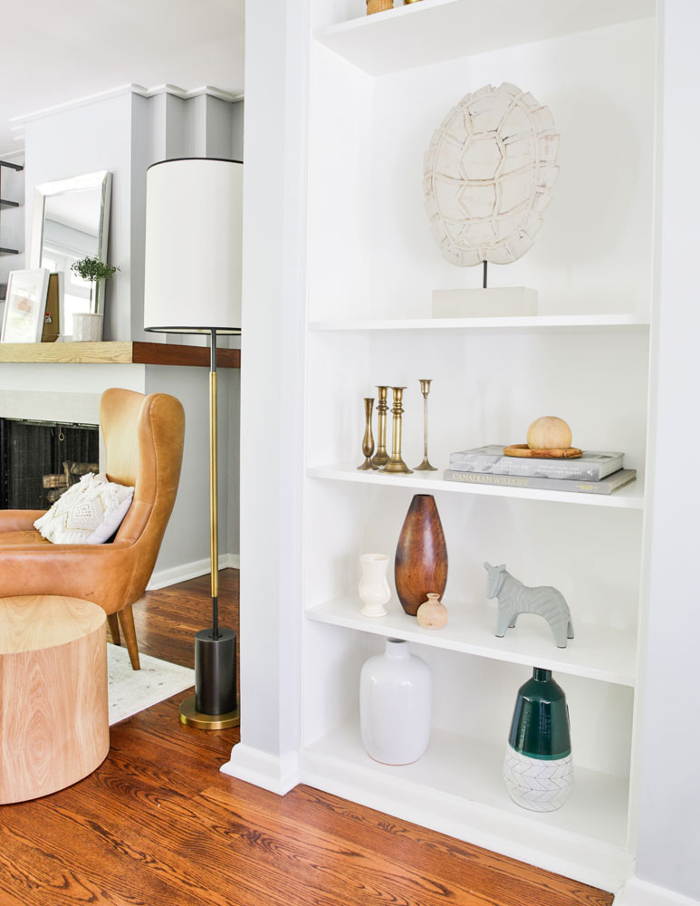
Try a White Backdrop
A white backdrop, like the one offered by this built-in bookcase, brings accessories to light and feels clean and expansive. As for styling them, Laura says, “Use anything that speaks to you, whether it be functional pieces like vases clustered together, or candle holders. If you feel like it looks and feels harmonious, go with it!”
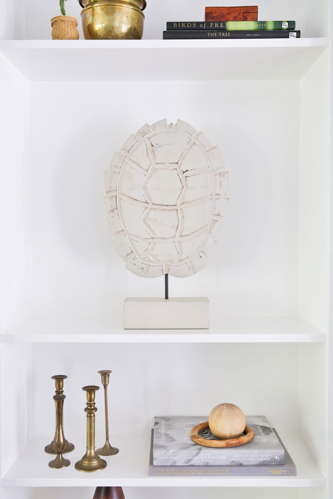
Edit Ruthlessly
“While we are by no means minimalists, it is important to know what to display and what not to,” says Laura. “Just because you own something or have been gifted something does not deem it worthy of being showcased. Use pieces that follow an order or have some context to the design you are working with.”
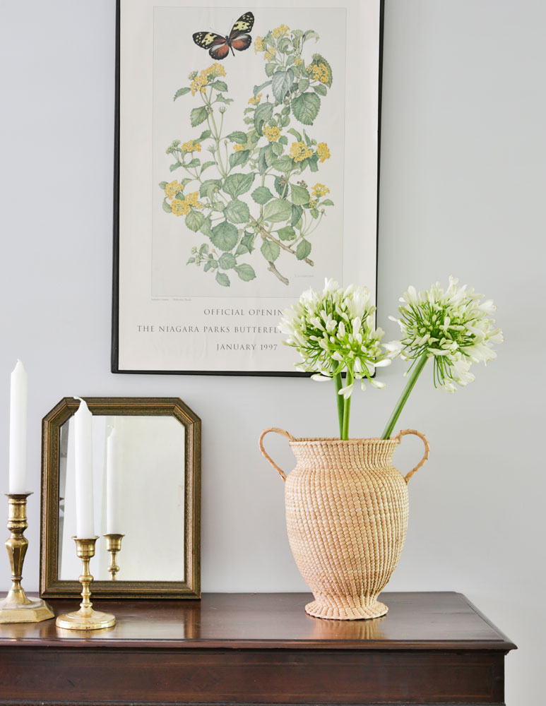
Think Like a Stylist
Subtle prints like this botanical one impart interest without being heavy. “We love to add prints throughout our spaces,” says Laura. “They really reinforce our love of layering, and it’s also very easy to style them with other prints of similar sentiment for a pulled-together look.” We love how, here, they styled it with the real thing: two blooms in a woven vase.
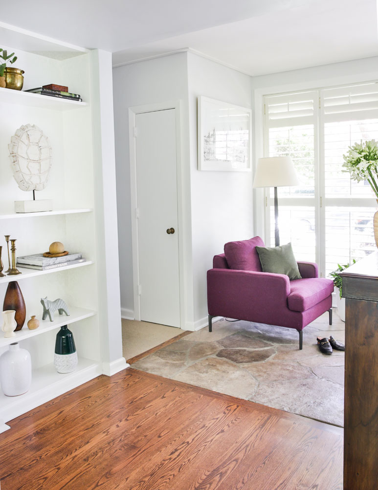
Make a Colourful Statement
The homeowners love purple, so Laura and Kelly Lynn worked it into the space in a wonderfully edited way. “It doesn’t fight with anything else in the entryway and is quite complementary to the home’s rusts and golds,” says Laura. We also like how it enlivens the space without overpowering it.
HGTV your inbox.
By clicking "SIGN UP” you agree to receive emails from HGTV and accept Corus' Terms of Use and Corus' Privacy Policy.


