When a home features an impractical floor plan and bars on its windows (we can’t make this stuff up), it’s not exactly a dream destination. But throw in a central location and a short commute to work, and suddenly staying put becomes all the more appealing. Such was the case on a recent episode of Love it or List it Vancouver, where homeowner Teri desperately wanted to rectify these problem areas, hopeful that his wife Kim and children would then fall in love with the space. So Jillian Harris and her team got to work, giving the entire main floor a gorgeous makeover that both homeowners knew was finally right for them.
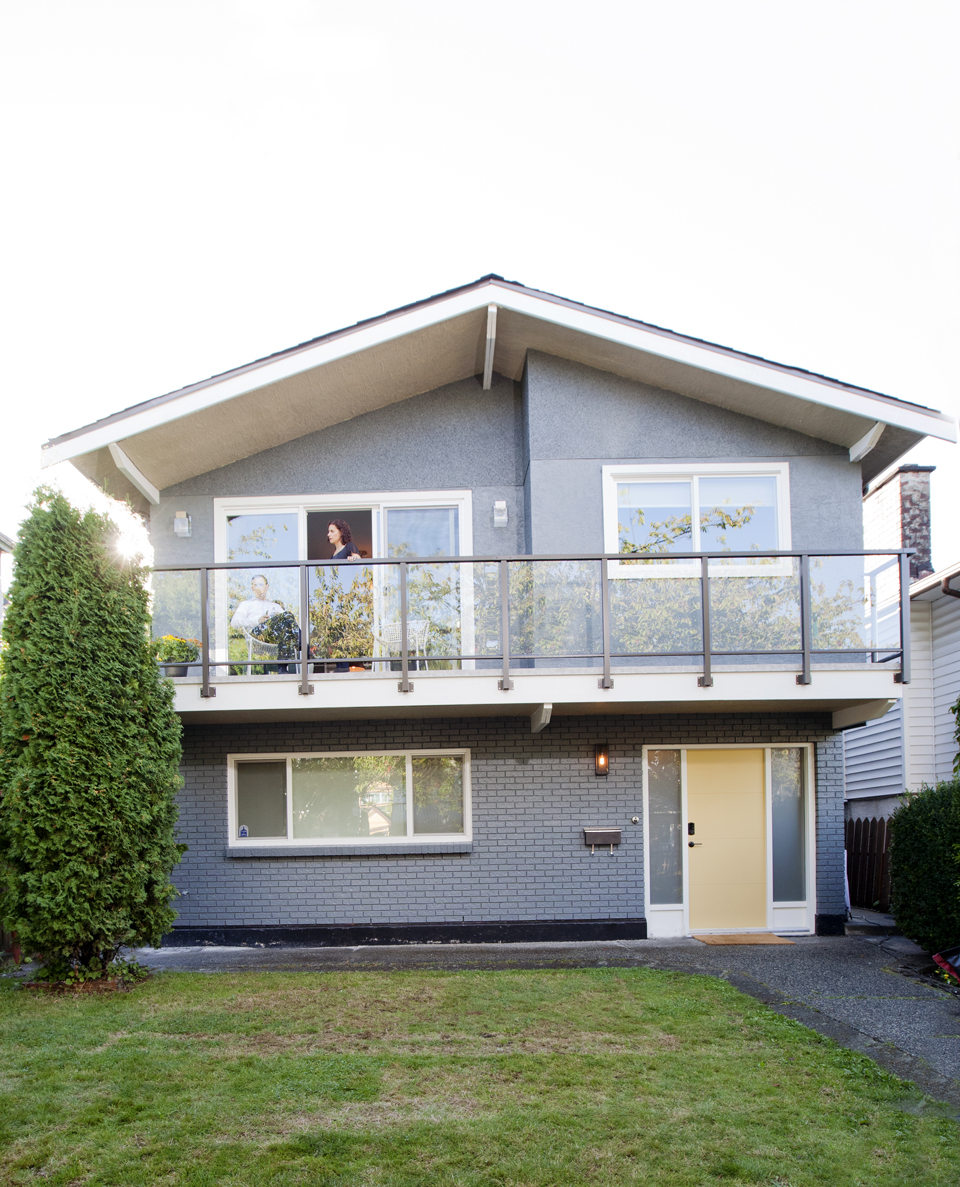
A Better Deck
Goodbye dated windows and hello welcoming new facade. Jillian created an open-concept deck thanks to these glass panels. The outdoor area extends the couple’s overall living space while adding a warm and modern touch to the home’s exterior. Structural appeal and bonus space? We’d take that.
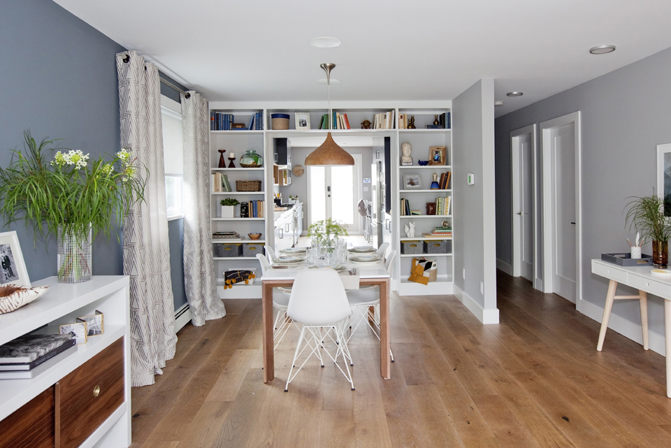
Open-Concept Dining
By tearing down a few walls, Jillian was able to maximize the main floor’s square footage, creating flow from the living room to the dining room to the kitchen. While the designer wasn’t able to remove every wall, she utilized the ones that were left by creating a pretty and practical shelving unit.
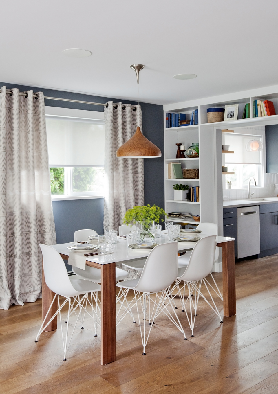
Bright Neutrals
Jillian opted for a soft grey and blue palette, which pairs well with the home’s natural wooden elements. Touches of white via the chairs and tabletop brighten up the room and make it feel polished.
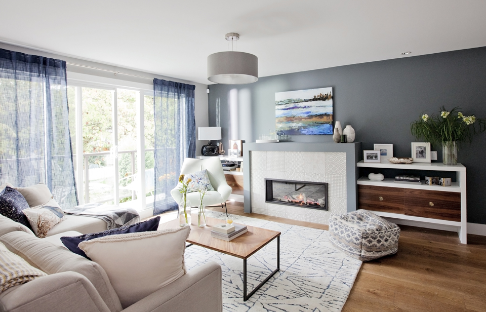
Cozy Living Room
Greys and blues continue in the living room through choice accents like toss cushions, billowy curtains and an artful area rug. Jillian kept the look contemporary thanks to soft wood elements and off-white furniture, adding pops of crisp white through the shelving units and window trim instead.
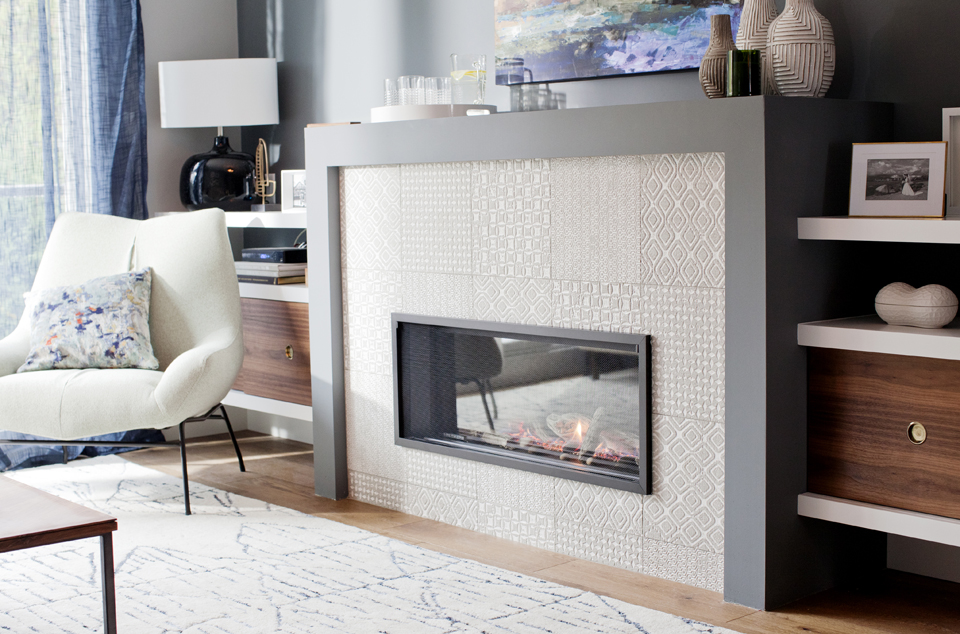
Modern Fireplace
Fireplaces will forever be an admired living room feature, but we especially love the patterned tiles Jillian chose for this display. The look adds texture and depth to the room, especially when paired with the sleek grey waterfall mantel. Not to mention, it’s dreamy enough to inspire anyone to cozy up here all day long.
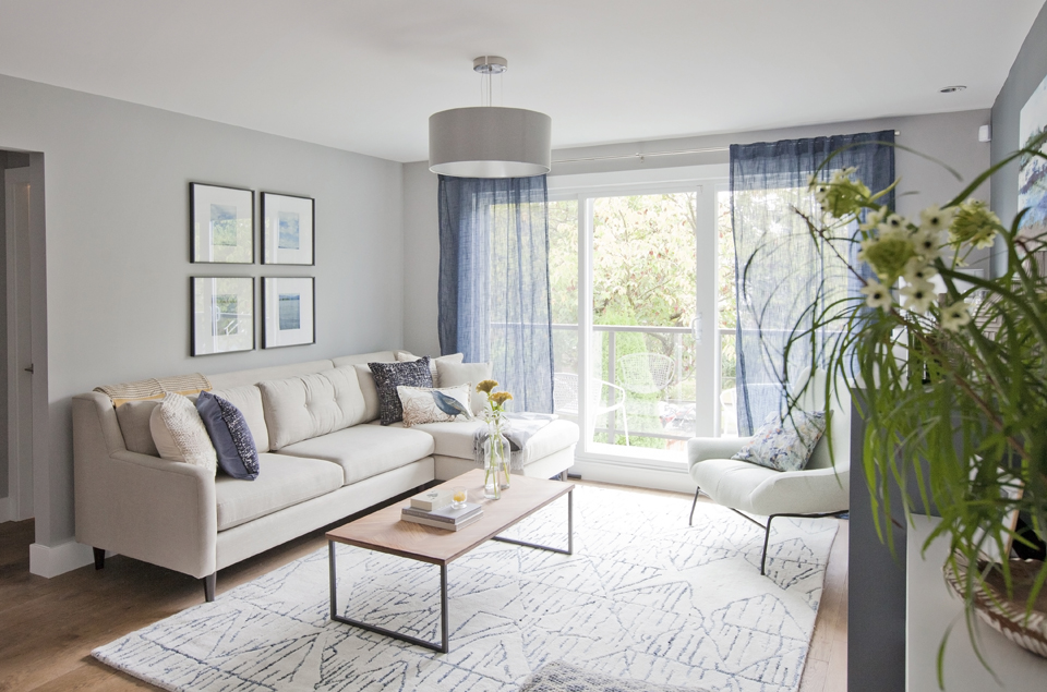
Bright and Cheerful
The floor-to-ceiling windows leading out to the balcony add tons of natural light and help open up the space. The framed artwork on the wall add to the room’s calm vibe and don’t distract from the muted furnishings and accents.
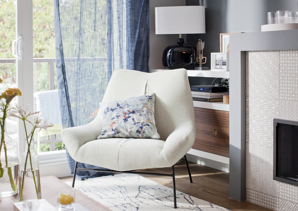
Modern Corner
You can’t go wrong with a statement-making armchair in a living room. This piece feels cool and contemporary thanks to its plush off-white fabric and slender contrasting legs.
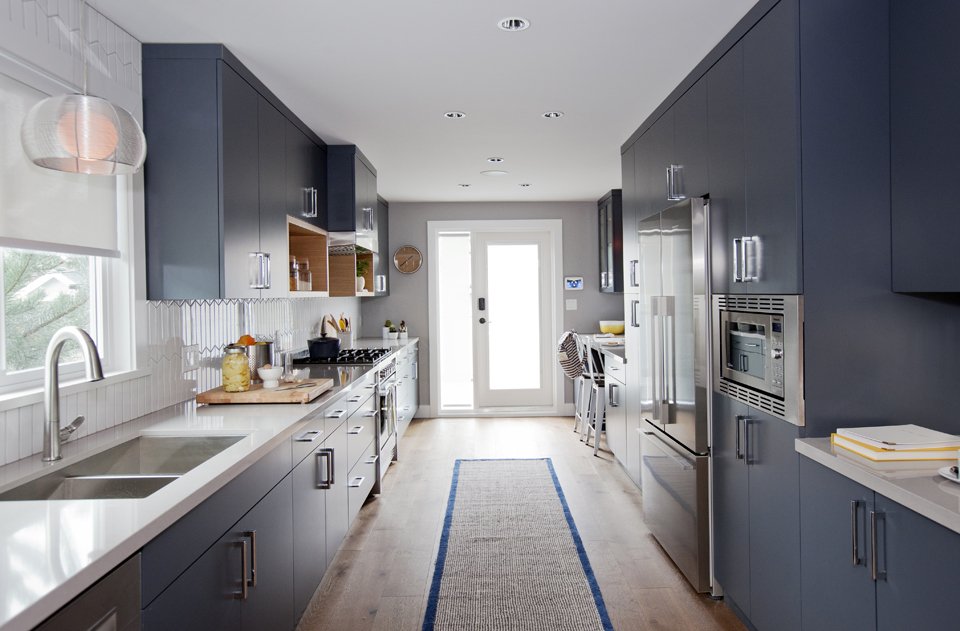
Galley Kitchen
Galley kitchens often run the risk of feeling cramped, but Jillian managed to create an open and airy space that connects to the rest of the home. The magic equation? Elegant blue hues coupled with thoughtful wooden elements and bright shades of white.
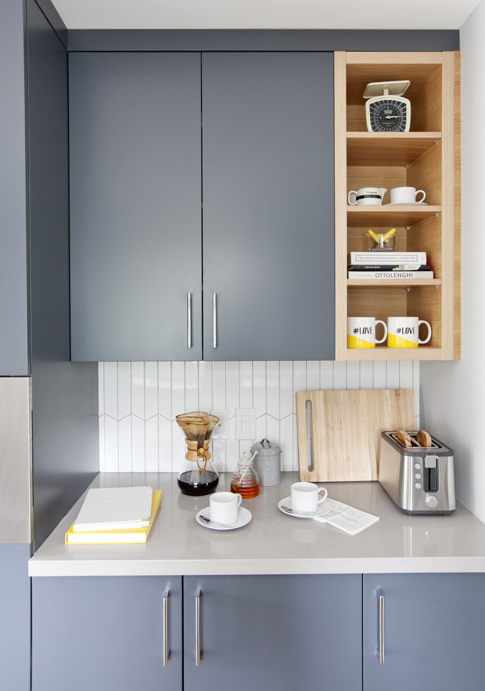
Modern Cabinets
Flat-panelled kitchen cabinetry in a pretty grey-blue shade looks clean and contemporary, especially when paired with sleek chrome pulls. Clever wooden shelving nooks add pockets of personality and break up the gallery look.
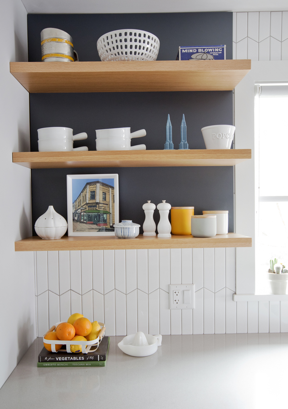
Display Shelves
Floating wood shelves lend a rustic and contemporary feel to the otherwise modern kitchen. The shelves keep the space from feeling boxed in next to the large window, while playing nicely off the textured backsplash below.
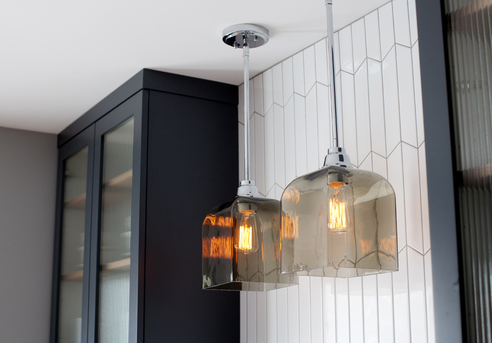
Modern Fixtures
Here, the backsplash extends all the way to the ceiling, breaking up the bank of cabinets and providing more interest. We love the effect it has against these heavy glass lamps, which offer a sleek and slightly eclectic touch.
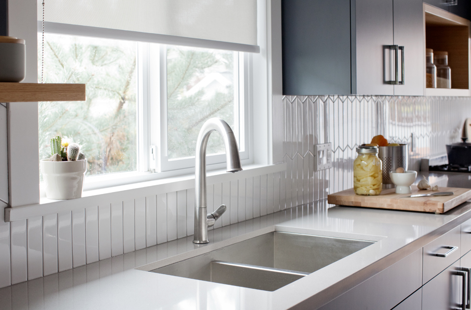
Functional Design
An extra-large double sink is perfect for prep work and multi-tasking, ensuring countertops stay clean and clear of dishes. Meanwhile, the large window lets the natural light flow in and enhances the kitchen’s pretty white finishes.
Main Floor Master
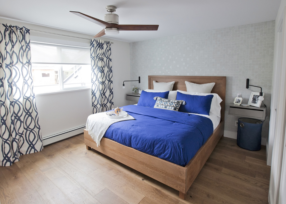
The original master bedroom was cramped and didn’t feel like much of a retreat. But thanks to Jillian’s masterful ways, the refreshed space imparts a tranquil vibe and is spacious enough for two. We also love the room’s thoughtful touches, such as the subtly patterned feature wall that glistens when light catches it.
Floating Night Tables
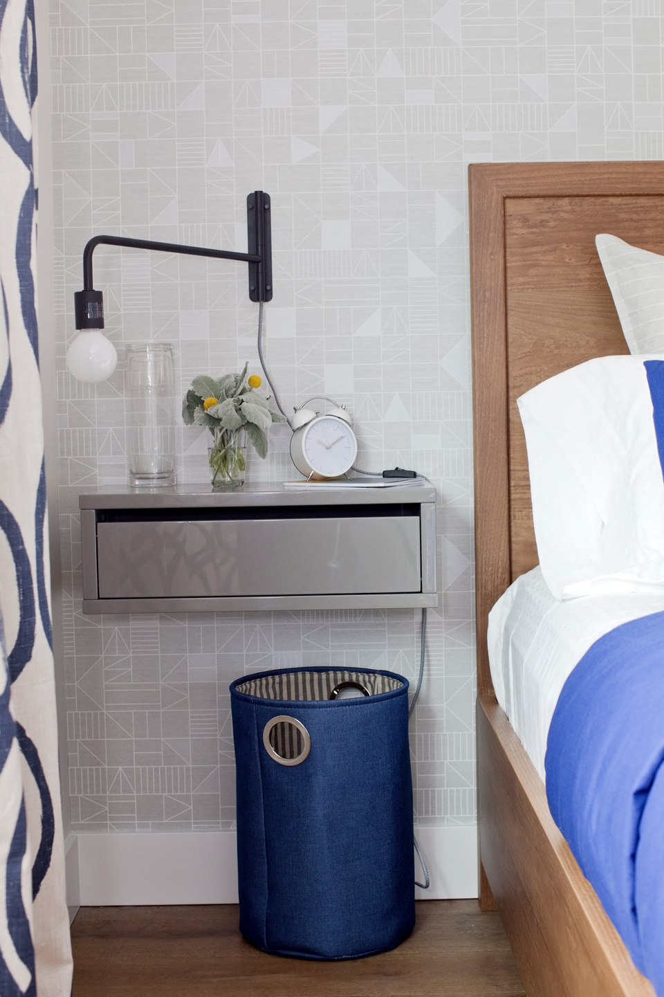
When you’re working with a small space, details matter. To maximize space in the bedroom, Jillian opted for floating nightstands complete with drawers (bulky standing versions would have totally cramped this room’s style).
New Closet
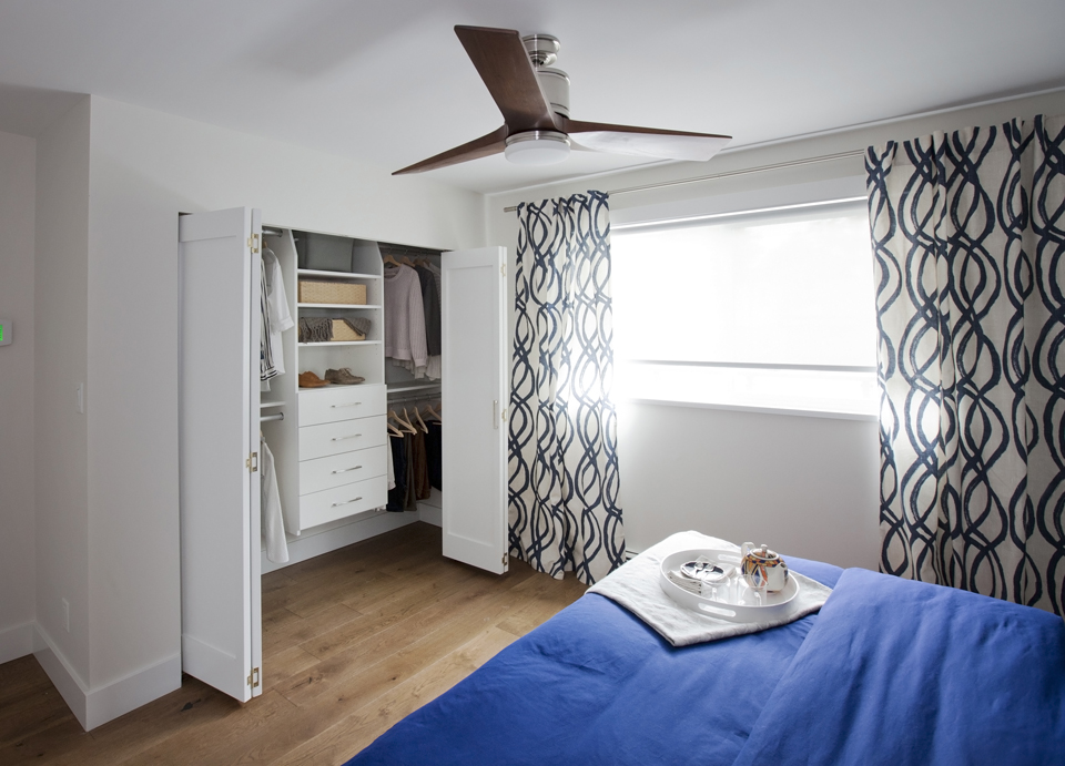
The original bedroom had zero closet space. So naturally, Jillian carved out space for one, and a pretty sizable one at that!
Organized Living
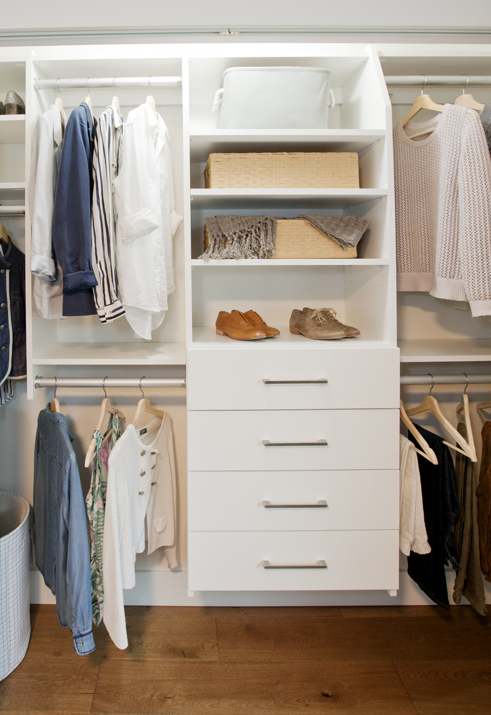
It’s amazing how much space a closet actual has when you add a simple organizer. Jillian not only wowed the homeowners by adding a closet, but she made sure it felt big and organized thanks to this addition.
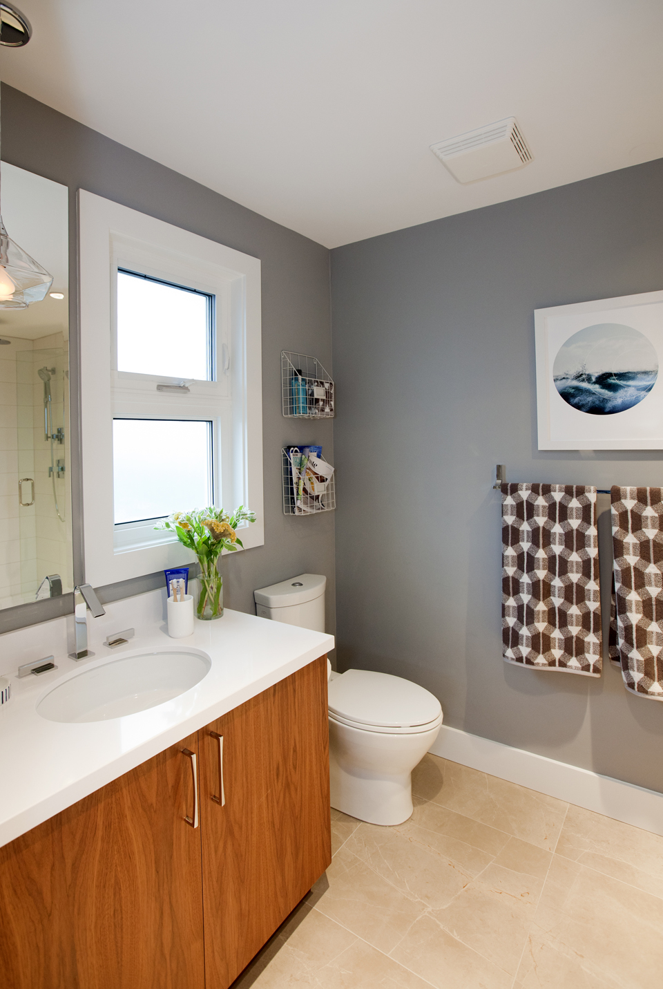
The Master Ensuite
It didn’t take much to transform the master ensuite into an adult oasis: new flooring, a modern vanity and chic accents certainly did the trick. Hanging organizers above the toilet is also a great way to take advantage of awkward wall space.
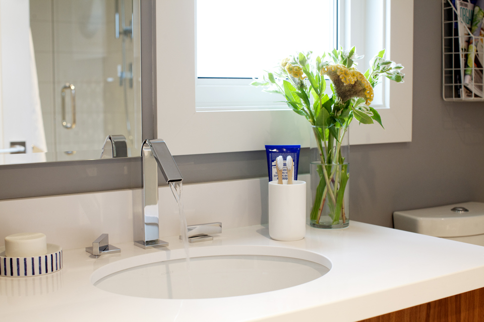
New Vanity
This modern and inexpensive vanity is large enough to hold all of the couple’s necessities. It also allows the pair to be in the space at the same time without getting in each other’s way.
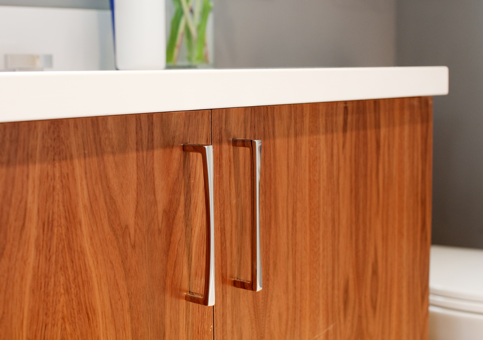
Wood Finishes
The home’s soft rustic elements continue in the master ensuite. The vanity’s bright wood finish lends warmth, while the sleek hardware connects to the other modern fixtures in the space.
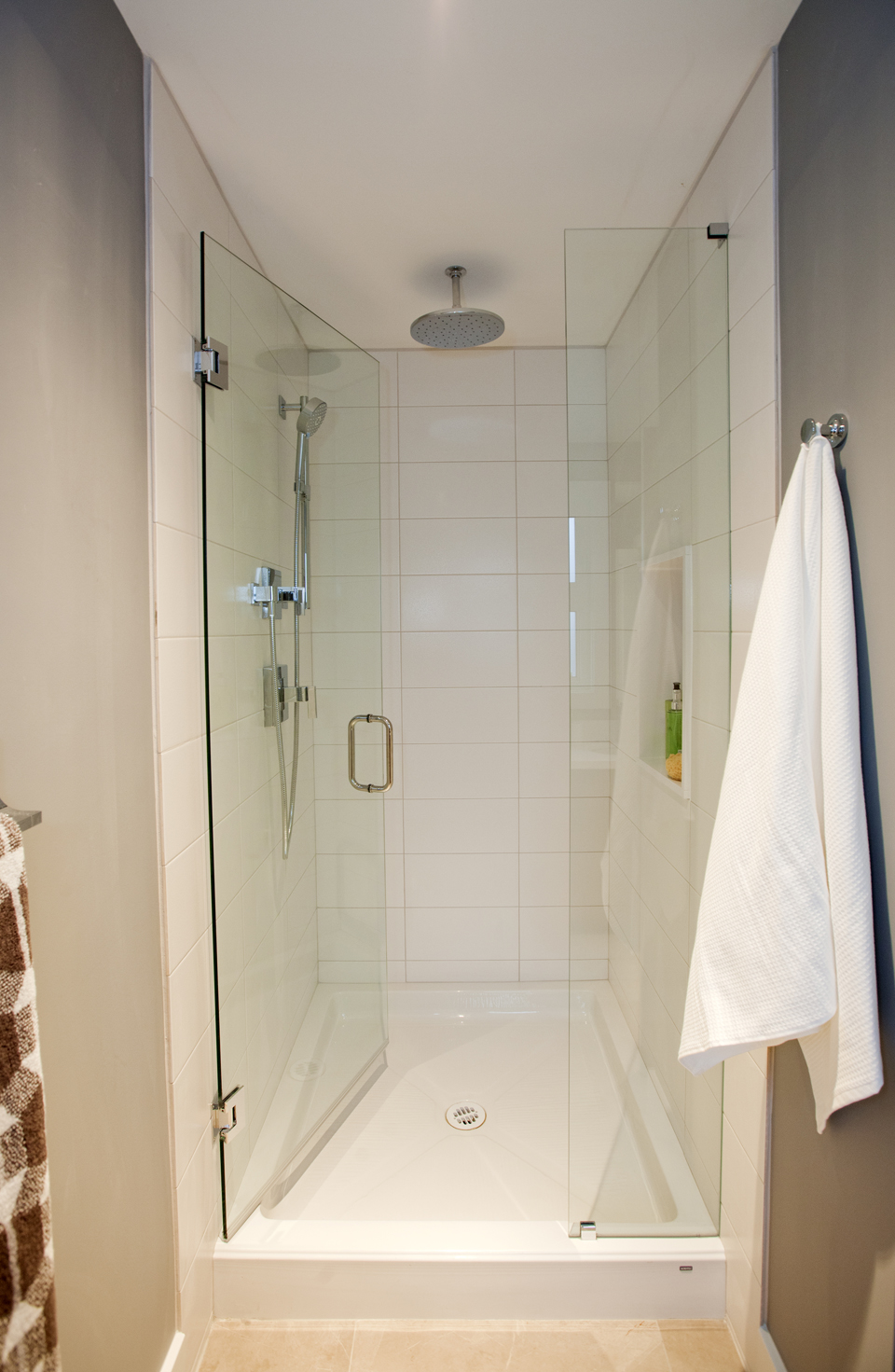
Sleek Shower
When you’re short on space, a standup shower is a great solution. How to make it even better? Install glass doors and brilliant white wall tiles, along with a waterfall showerhead for a touch of modern luxury. With so much to adore about this renovation, it’s no wonder the homeowners made the decision to stay.
HGTV your inbox.
By clicking "SIGN UP” you agree to receive emails from HGTV and accept Corus' Terms of Use and Corus' Privacy Policy.


