When Property Brothers’ Drew and Jonathan Scott decided to help one couple, Mark and Eugenie, graduate from renters to homeowners, they almost bit off more than they could chew. Between the pair’s expensive tastes and desire to be in a waterfront condo in a high-demand area, it took some convincing to get them to budge. In the end, the couple settled on a terrific house that Jonathan was able to transform into a hygienic abode for Eugenie (a self-described germaphobe) with plenty of high-end finishes to please the rest of the family, too.
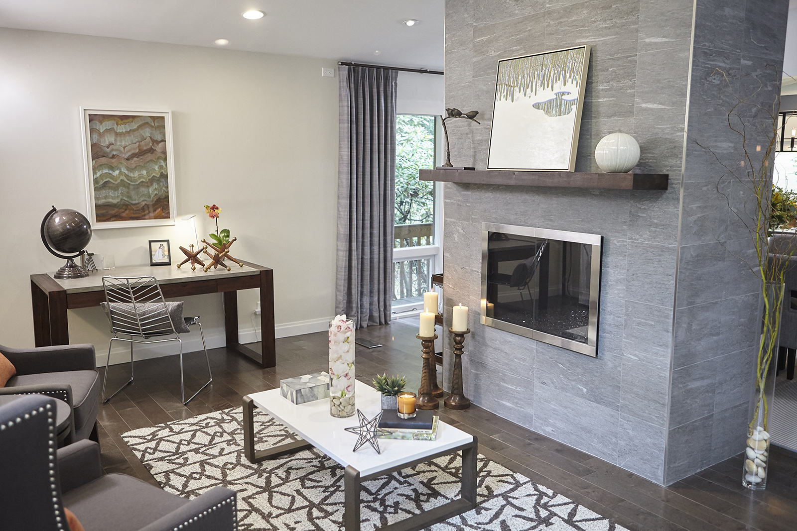
Warm Welcome
When you have a beautiful two-way fireplace, making it the main feature of your floor plan is a no-brainer. While the couple agreed with Jonathan on that point, they couldn’t decide on how to design the fireplace itself. At first, Eugenie was dead set on keeping the original bricks, but then determined they would collect too much dust. Enter these smooth, grey tiles, which tie perfectly into the pre-finished hardwood floors.
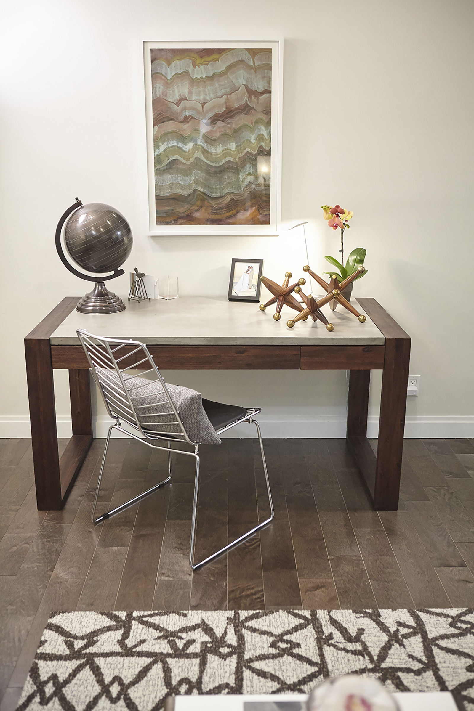
Studio Surroundings
This sturdy desk is a beautiful statement piece for the front room, but it also doubles as a work area whenever the couple needs to sort paperwork or work from home. Chunky knickknacks keep the look masculine and polished, while the open-framed chair leaves sightlines open.
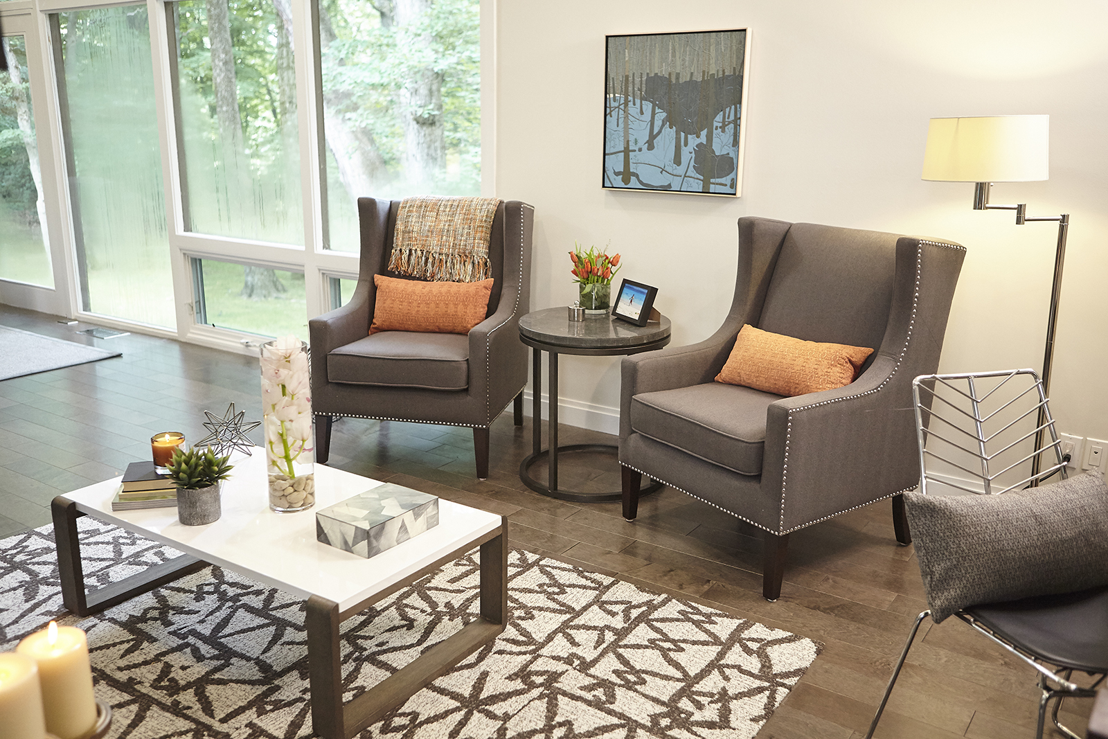
Room For Two
The classic but modern armchairs add a refined feel to the entrance space, creating a relaxed sitting room for when the couple entertains. The burnt orange lumbar cushions lend a fun pop of colour against the contemporary browns and greys, while the area rug offers just the right amount of flair with its fun pattern.
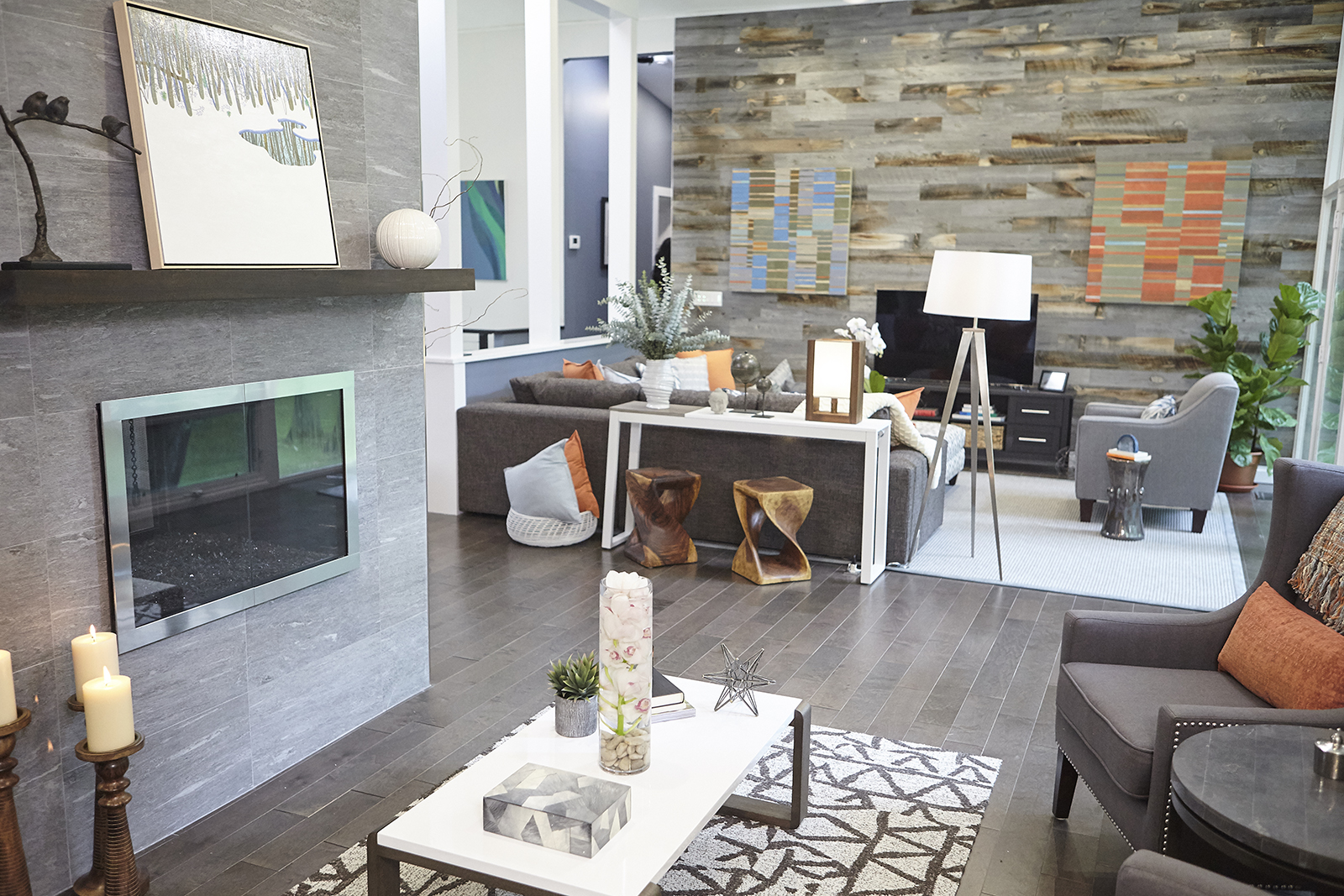
Defined Zones
Thanks to the furniture placement, Jonathan was able to create two separate sitting areas on the main floor – which is exactly what the homeowners requested. This way, guests can spread out and mingle by the fireplace as well as in the den area where the media centre is situated.
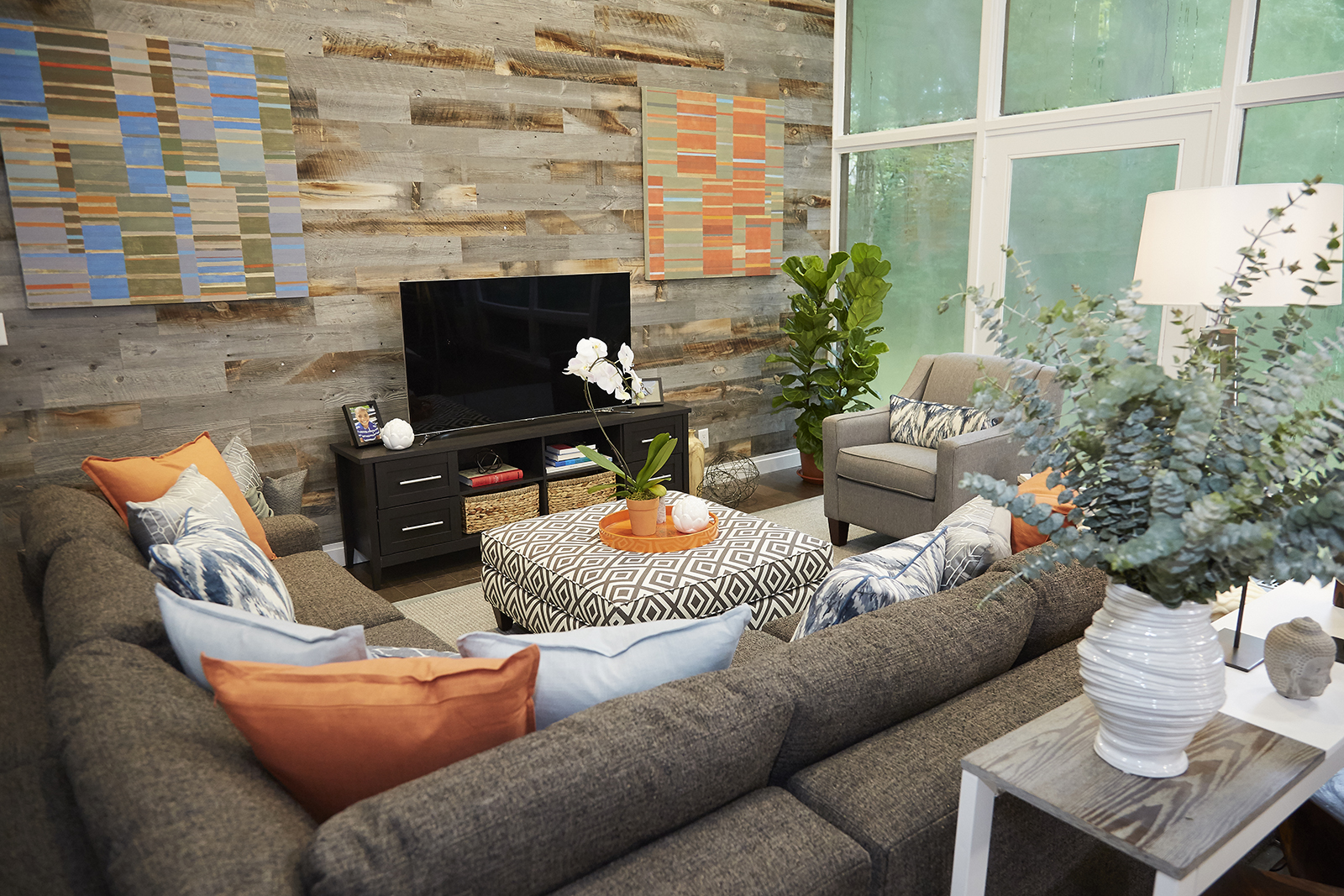
The Feature Wall
The den’s mismatched wood accent wall adds a dramatic but defining effect that feels warm and cozy next to the floor-to-ceiling windows. More pops of orange help create unity throughout the space, while the patterned ottoman doubles as a coffee table.
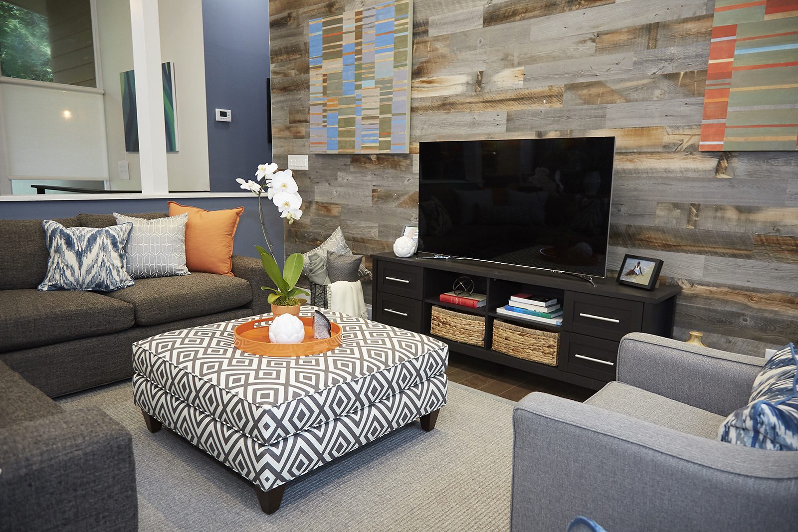
Media Centre
Jonathan proved that you don’t always need a large unit or stacked shelves in order to create an organized look: a smaller media bench with a few drawers and well-placed baskets is the perfect organized solution for any small family.
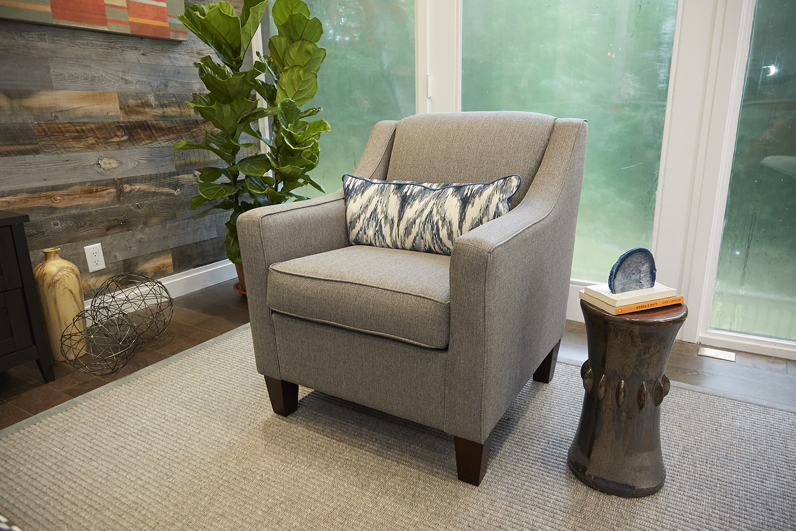
Extra Seating
There’s no shortage of seating in this den. Jonathan gussied up this plush armchair with a fun patterned cushion and enhanced the look further with a sculptural side table. When placed in front of the window, it’s a bright and modern combo that instantly catches the eye.
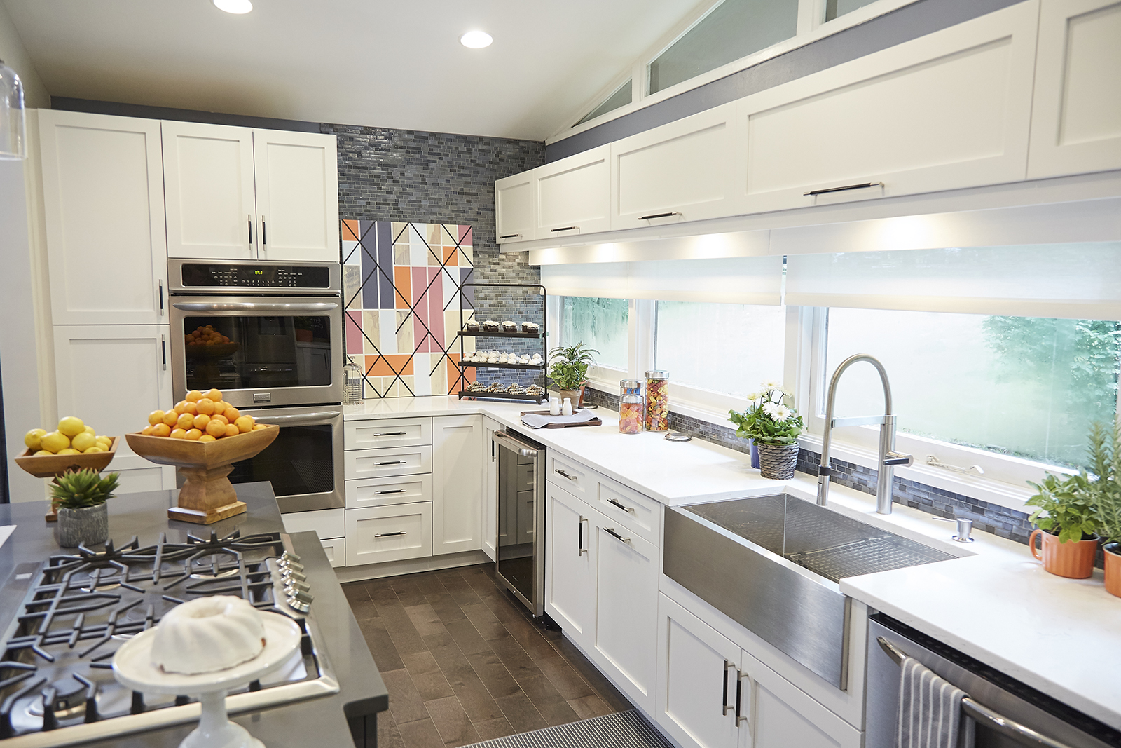
Gourmet Kitchen
A bright white kitchen was exactly what this family required, as Eugenie wanted to ensure no stain would go unnoticed (to help banish all the germs). This spacious offering was the result of that ask, with plenty of white cabinets, natural lighting and stainless-steel finishes.
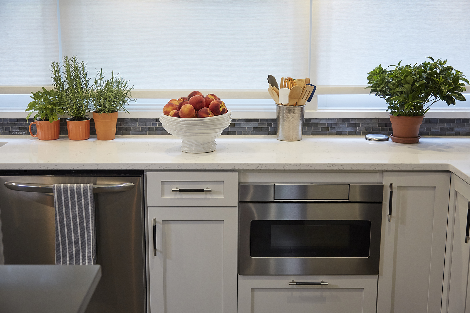
Built-In Function
In coming up with the kitchen design, Jonathan maximized every possible nook and cranny; which meant integrating the appliances into the cabinetry. As a result, there’s lots of extra counter space for Eugenie to use while prepping dinner… and to meticulously tidy up afterwards!
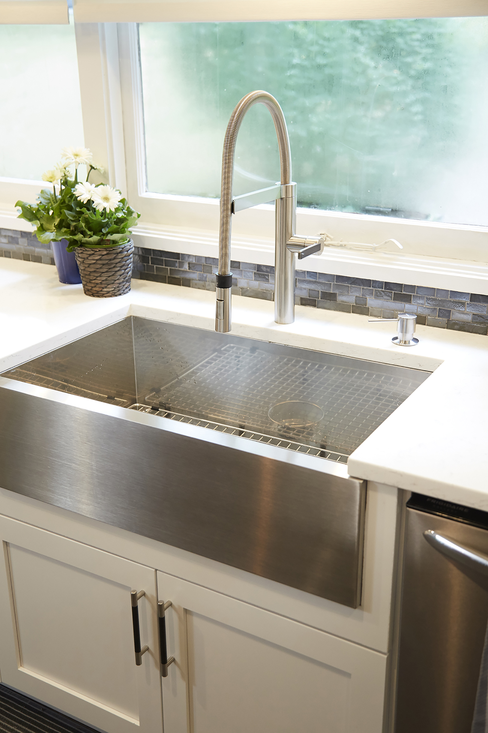
High-End Finishes
We love this stainless-steel farmhouse sink, which essentially serves as a catch-all. Washing dishware or food should be a breeze with this much space, plus it’s just pretty to look at.
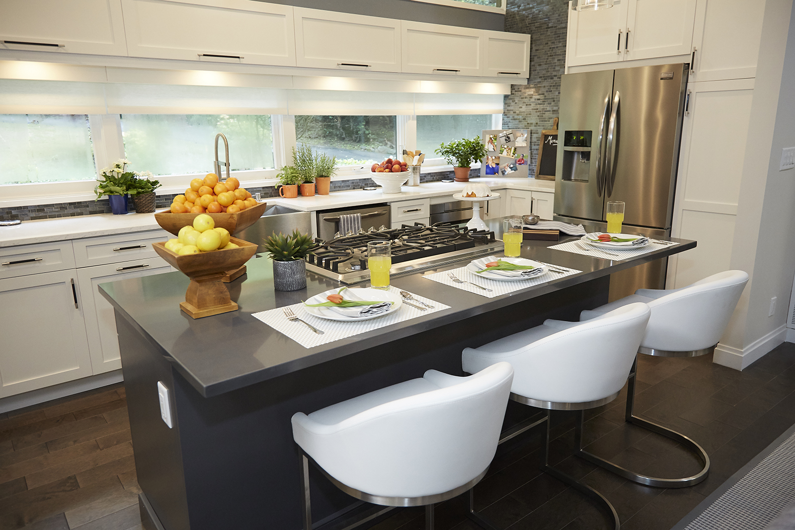
Island Living
When it came to the kitchen, this couple had one very big must-have: an extra-large island with plenty of seating. We’d say Jonathan delivered with this model, which includes a range top with a built-in (and hidden!) range to maintain the streamlined, open-concept look.
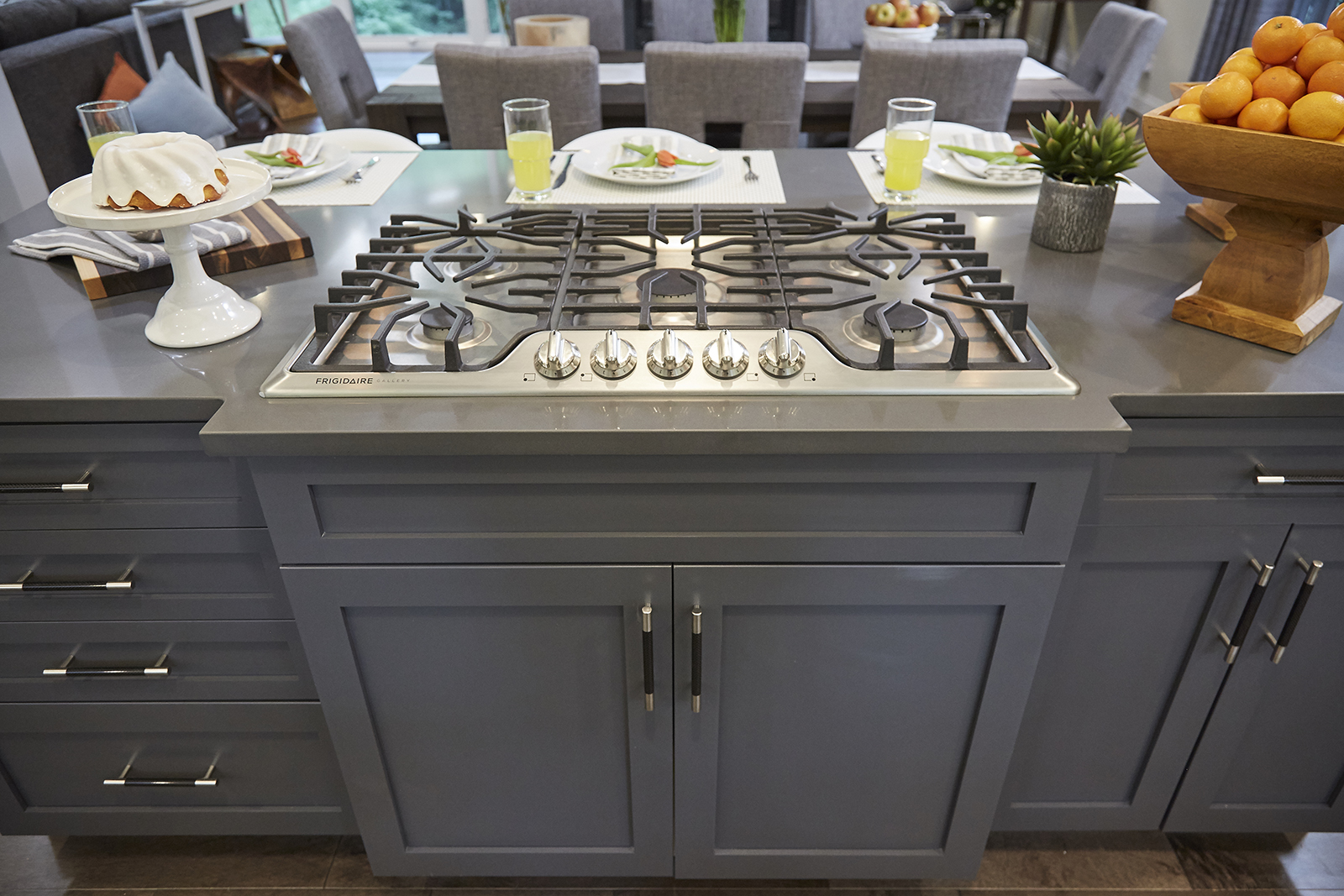
Home on the Range
While you can’t see the hidden range from this angle, the pretty high-end finishes have our attention. The cabinetry’s grey-blue hue helps define the island and grounds all the white and grey present throughout the rest of the kitchen.
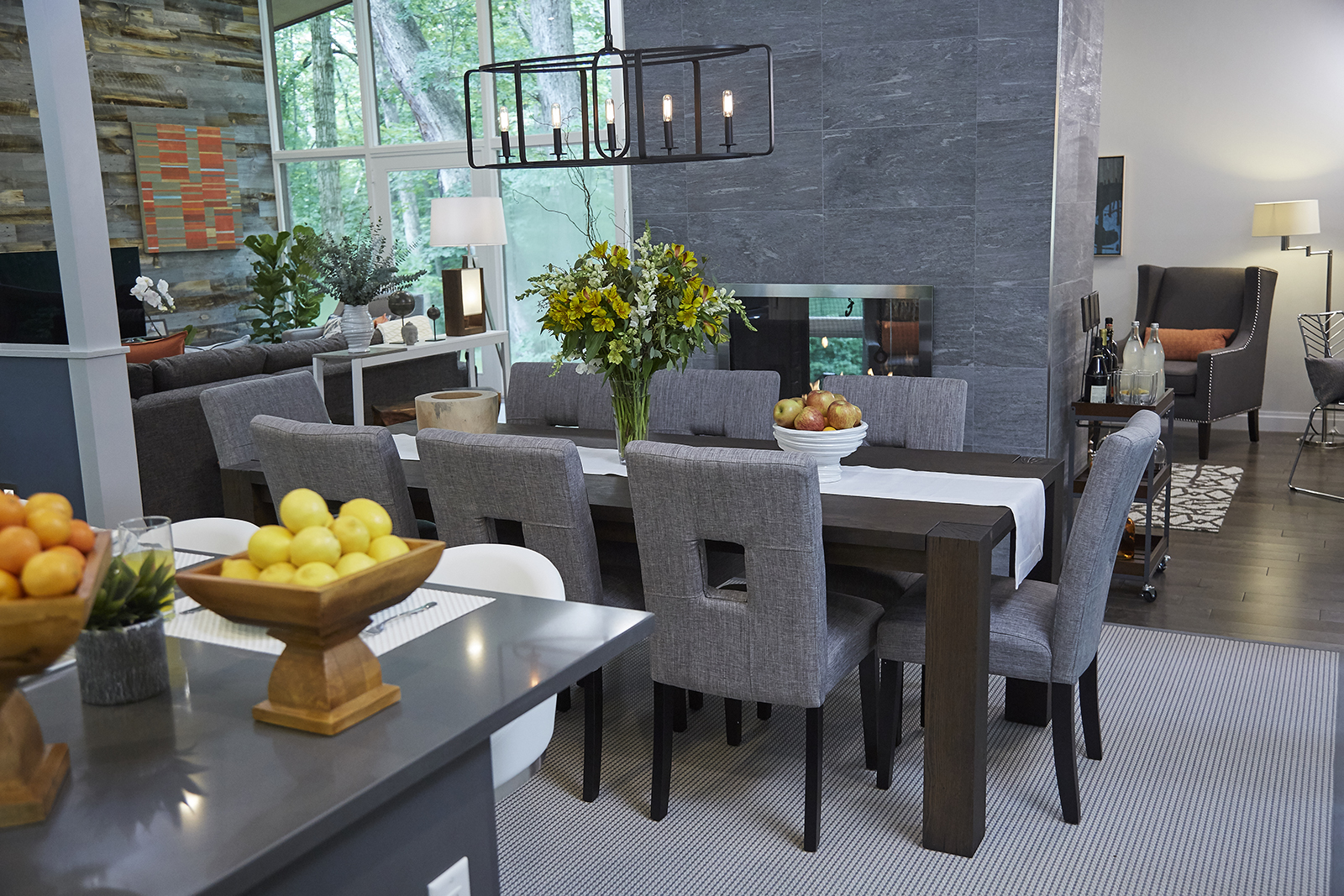
Formal Dining
On the other side of the island is a formal dining space. The elongated table and contemporary chairs add definition to the open-concept area while adhering to the overall colour scheme.
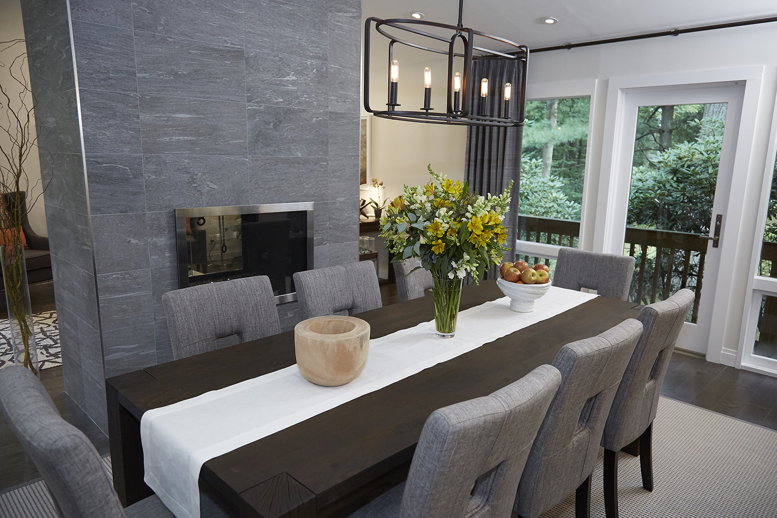
Warm and Cozy
Jonathan also took advantage of the double-sided fireplace here in order to create a warm and intimate setting. Now, anyone sitting down to dinner can’t help but feel cozy and settled.
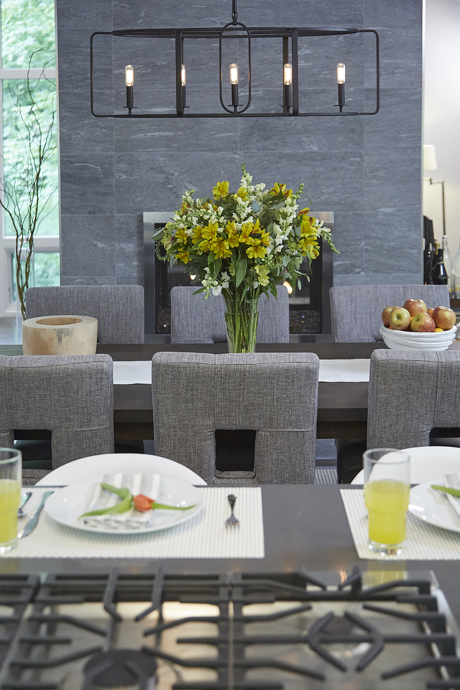
Modern Lighting
To further delineate the dining area, Jonathan opted for a simple yet modern candlestick-inspired chandelier.
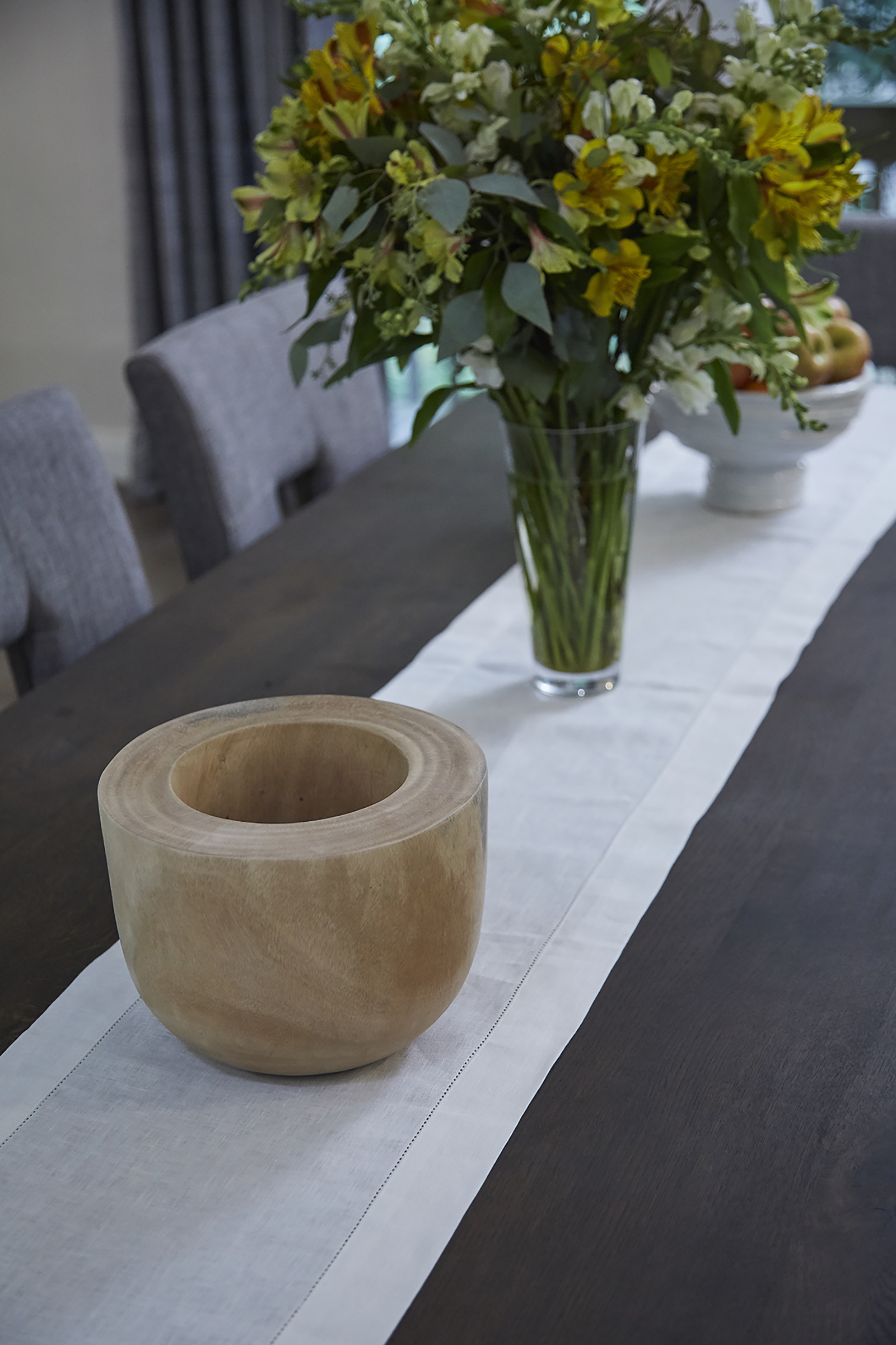
Table Setting
Rather than create individual place settings and clutter the table, Jonathan opted for a simple white table runner. He kept the rest of the centrepiece details simple with a wooden sculptural vase, fresh flowers and a bowl of fruit. The result is a warm but free-flowing setting.
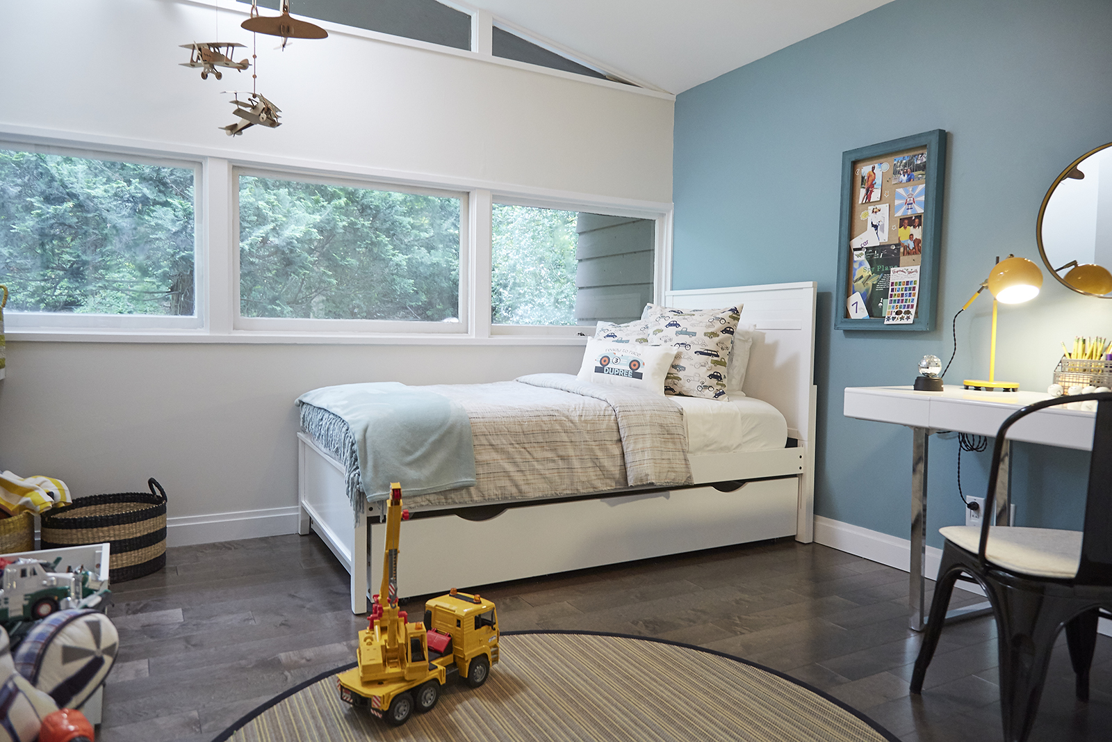
Child’s Play
It was important for this couple’s son to get the bedroom of his dreams after living out of boxes for much of his life. Jonathan delivered with a room that, while keeping with the home’s colour scheme, features kid-friendly elements like the airplane mobile, playful baskets and of course, plenty of toys.
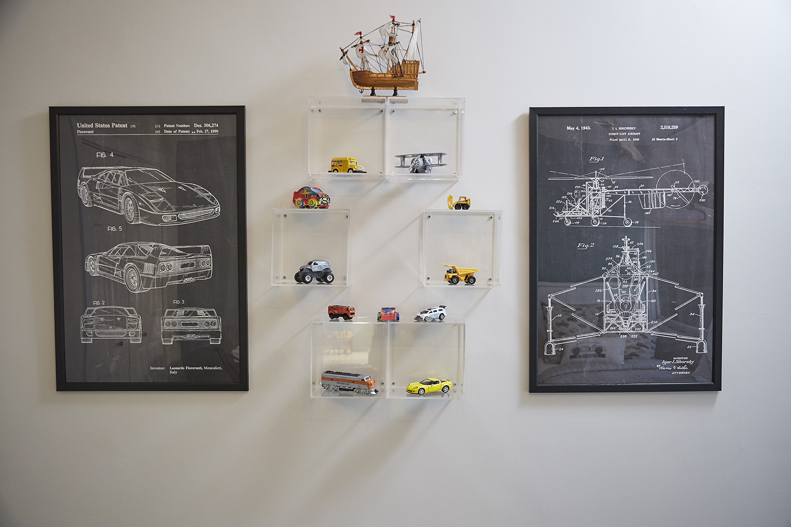
Art Deco
Even the walls got the kid-friendly treatment thanks to simple car blueprints and a fun display shelf featuring lots of cool new rides.
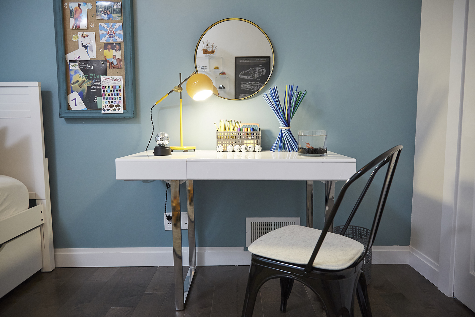
Streamlined Desk
The couple’s son was perhaps most excited to get his very own space for homework and crafting, which is why he picked out this simple desk design full of top-secret compartments. Functional and fun!

Fun Finishings
We don’t know if kids these days need that many pencils what with their electronics and tablets, but they sure do make for a fun design element. Add in some markers and letter balls that spell out the kid’s name, and you get one of the coolest designed kids’ desks we’ve seen in a while… with a perfect surface for easy cleaning, of course.
HGTV your inbox.
By clicking "SIGN UP” you agree to receive emails from HGTV and accept Corus' Terms of Use and Corus' Privacy Policy.


