These days it’s all about open concept living and bright indoor spaces. So when two homeowners were feeling slightly cramped in their home on a recent episode of Love It Or List It Vancouver, Jillian Harris came to the rescue with beautiful, clean lines that transformed this house into a real work of art. By Amber Dowling
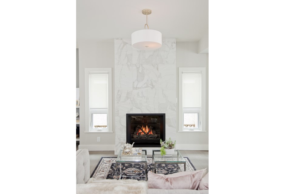
Burning Bright
The beautiful floor-to-ceiling marble detailing on this fireplace adds a sleek look to the wall and really opens up the space. Add in two small rectangular windows to flank the mantel and you’ve got a bright but cozy room.
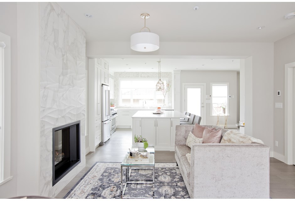
Open Concept
Jillian made the most of this space by opening up the walls and creating a natural flow from the front door all the way to the back. By keeping the decor in mostly whites the rooms just soak in the natural light, making this a neutral but brilliant space.
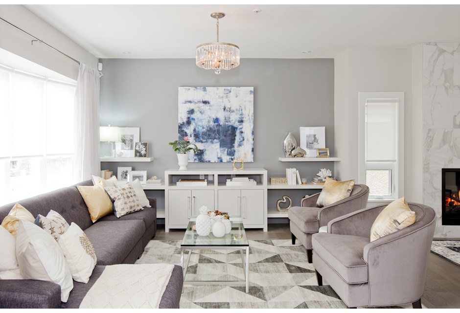
Modern Day Zen
The living room features more of that bright white coupled with neutral greys that make you feel as though you’ve walked into a piece of contemporary art. Speaking of, this pretty blue canvas adds some natural colour to the room, but can easily be swapped out for a flatscreen TV thanks to hidden wiring.
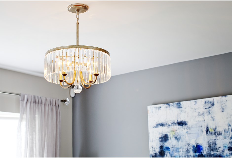
Elegant Touches
Light fixtures add so much personality to a room and this piece is no exception. The vintage, gold-plated finish coupled with the sheer casing creates a luxurious but calming effect.
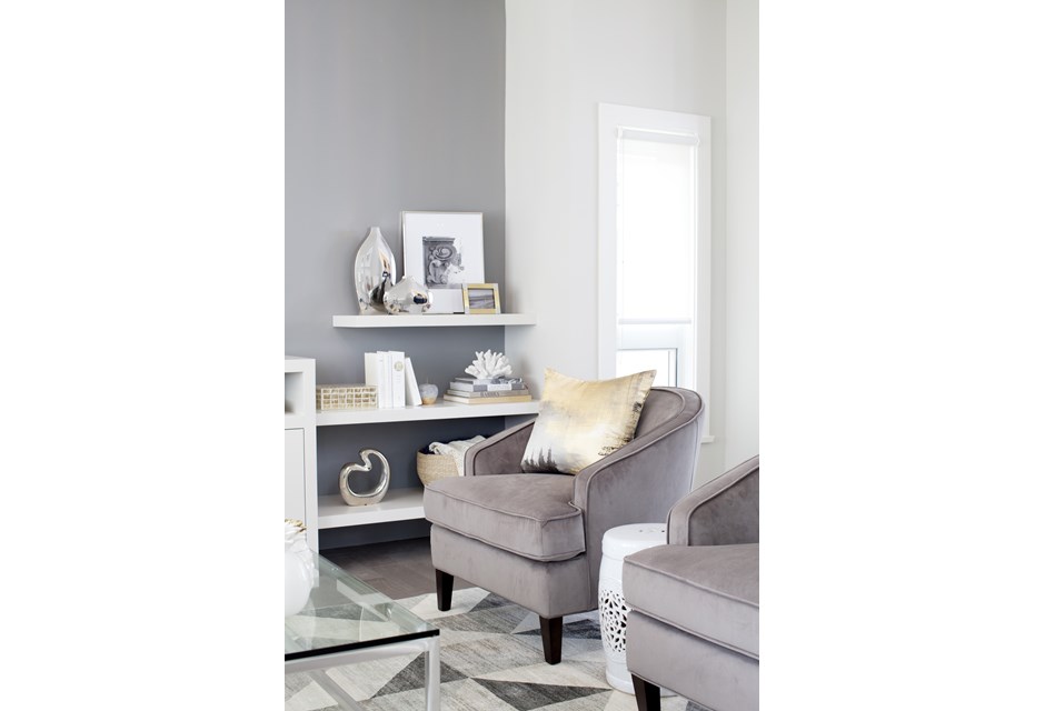
Floating Shelves
In order to maintain as much of a flow as possible, Jillian had these floating shelves installed along the wall. The lines help to elongate and not box in the space while creating that extra little bit of functional storage.
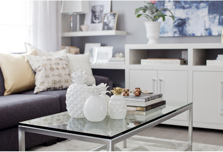
Funky Flair
A few cute pieces of art — like these ceramic pineapples — help the space to feel artsy but put together. As a result this home feels lived in but never cluttered.
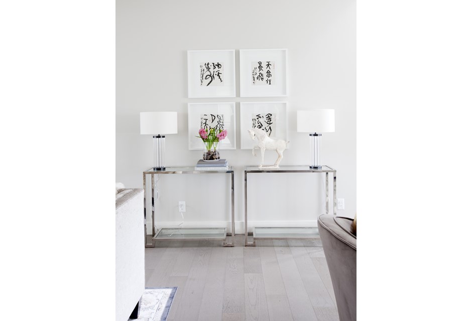
Defined Spaces
These small tables feature lightweight frames and glass surfaces that help keep the open concept feel. Meanwhile Jillian used family art in order to personalize but also define otherwise dead space on the wall.
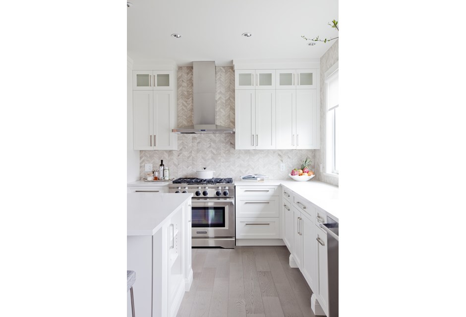
Custom Cabinets
By creating custom cabinetry Jillian was able to add infinite storage potential while also maintaining those clean lines. The brilliant white finish works with the rest of the house and keeps the room feeling bright and airy.
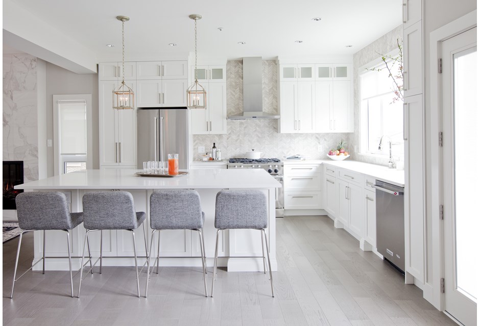
Breakfast Bar
The giant island is the perfect spot for the family to congregate or hang out at thanks to the sleek but modern bar stool chairs. It’s functional, too, thanks to the added counter space of course.
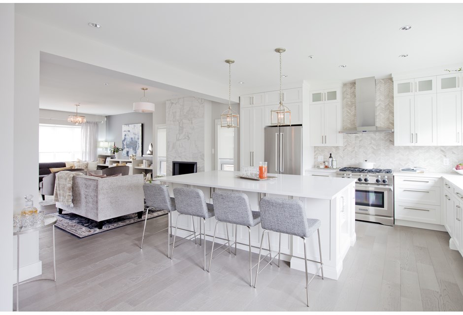
Modern Flooring
In order to keep an easy flow and to allow as much light as possible into the space Jillian opted for a lighter finish on the floors. Unconventional, perhaps… but definitely beautiful.
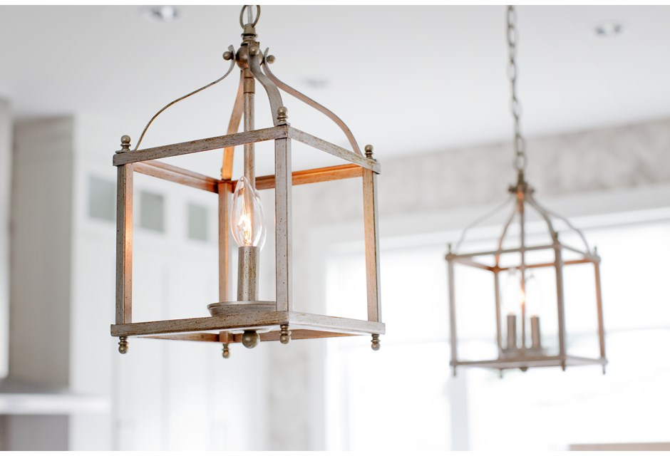
Chandelier Challenge
These lantern-inspired chandeliers in the kitchen add a rustic but modern vibe to the look without taking up too much space or ruining the sight lines.
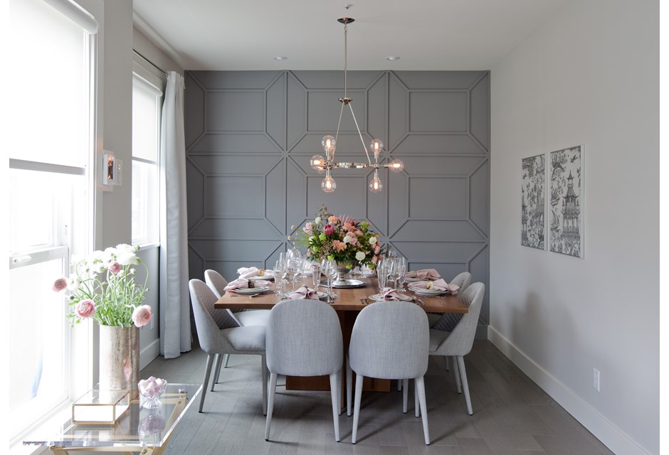
Accent Wall
We love accent walls, whether they’re painted or wall papered. Jillian took this wall one step further with customized detailing and paint that really add a beautiful wow factor.
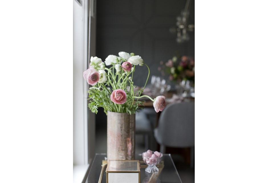
Flowers and Florals
One of the easiest finishing touches, flowers help any space feel fresh and bright. Jillian used them sparingly in this redesign, which means they really pop wherever they were added.
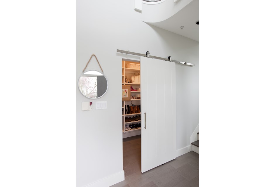
Sliding Barn Doors
This couple wasn’t able to add a mudroom like they had originally hoped, but Jillian did them a solid by adding this sliding barn door to the front entrance closet, creating a little more space by eliminating a bulky swing door.
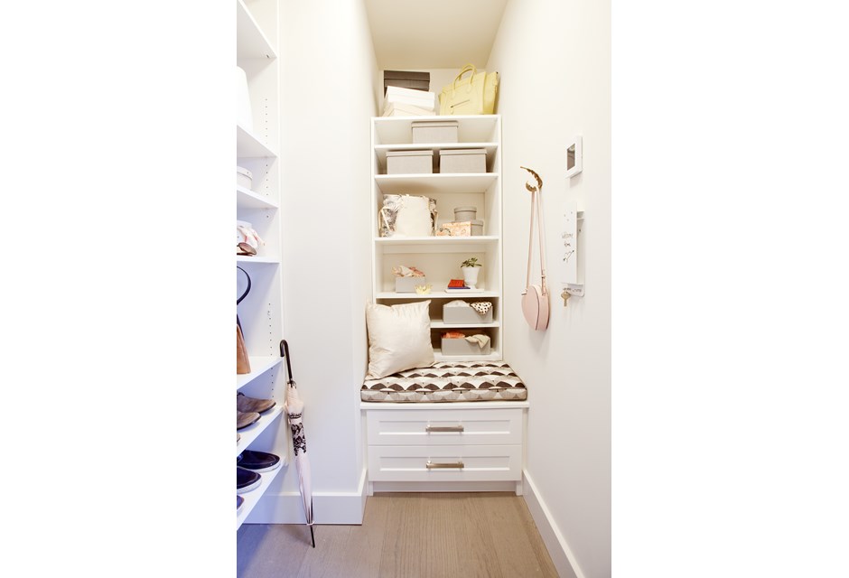
Organized Solutions
Beyond the barn door, Jillian added a small bench and lots of shelves and drawers to help the couple organize all of their things.
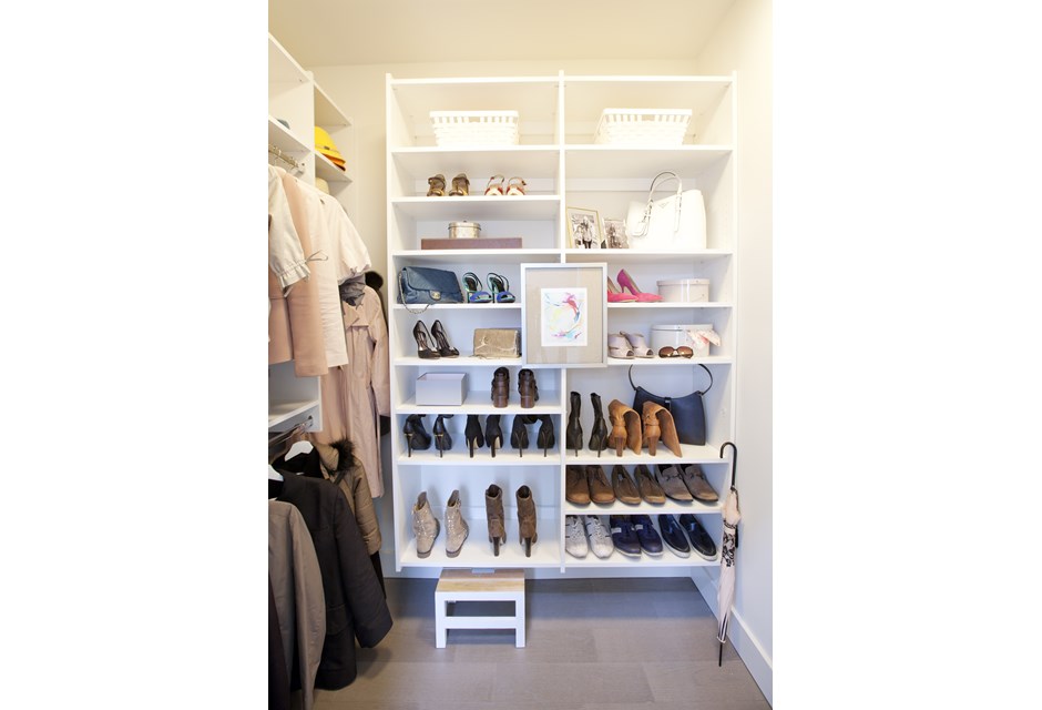
Neat and Tidy
Add in a beautiful shoe rack, dual coat racks and a little picture frame, and this closet suddenly becomes a neat, streamlined room. It’s just another finishing touch in a beautiful home with clean lines and an open concept that any home buyer would positively covet.
HGTV your inbox.
By clicking "SIGN UP” you agree to receive emails from HGTV and accept Corus' Terms of Use and Corus' Privacy Policy.


