Call it the Fixer Upper effect, with the design magic of Chip and Joanna Gaines (and let’s not forget shiplap!) transforming dumpy old houses into spectacular homes. Case in point: this cozy shotgun house in Waco, Texas, that was purchased for $28,000 before receiving a Gaines-style makeover on a season-three episode of the show – and is now listed at a whopping $950,000! Take a gander inside and it’s easy to see why.
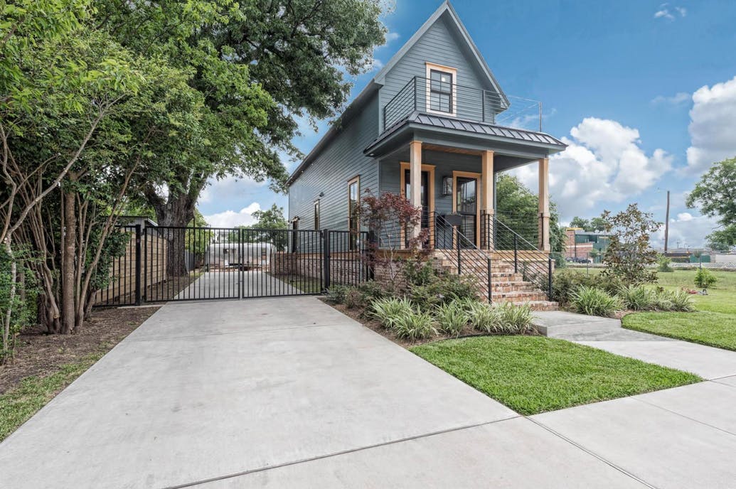
Shotgun House
When they first took on the project, the idea was to transform this dilapidated 700-square-foot shotgun home for the Bell family, which Joanna describes on the couple’s Magnolia Market website as “a unique project that kept us on our toes from both a construction and design standpoint.”
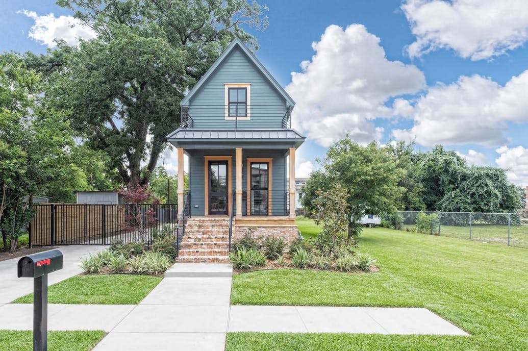
Charming Home
The result is this charming home, which added a second level and increased the living area from 720 square feet to 1,050 square feet. Another selling point – especially for Fixer Upper fans – is the home’s close proximity to the Magnolia Market, located just within walking distance of the Gaines’ headquarters. Note the front steps and skirt surrounding the house, made from Old Chicago reclaimed vintage bricks.
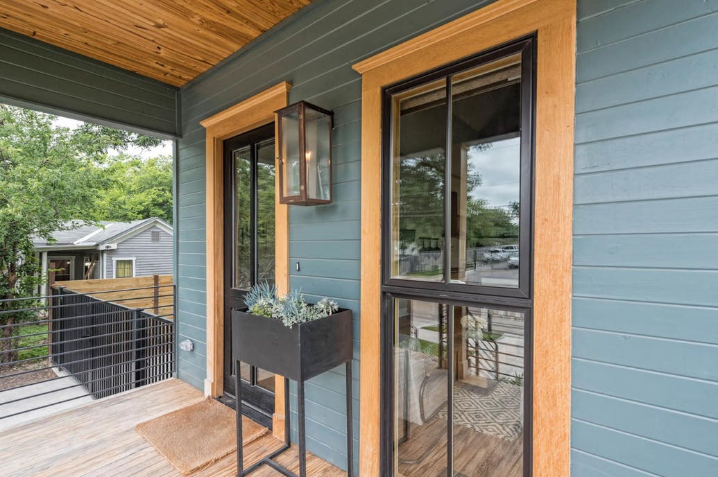
‘Fixer Upper’ Touches
As is their habit, Chip and Joanna added an array of delightful touches throughout the newly renovated home, including a Bevolo gas light on the front porch, along with a Dutch front door.
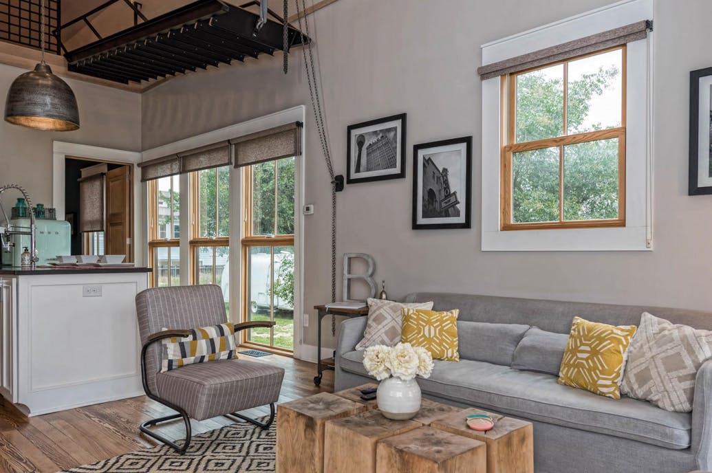
Open Concept
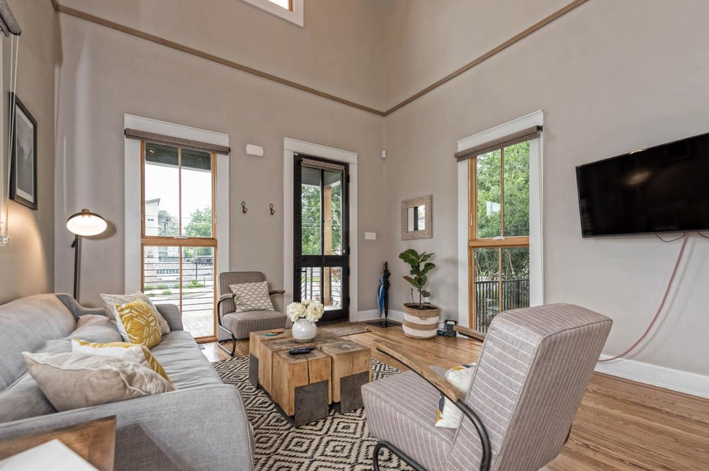
Given the home’s small size, Chip and Joanna went with an open concept for the main living areas that allows the bright, airy living room to flow seamlessly into the kitchen. “We installed wood floors and beautiful floor length windows,” notes Joanna in her blog, adding that “this space didn’t feel cramped in the least.”
Living Room
Creating the new living area took some doing. “We removed the wall that separated the living to the bedroom and converted this existing bedroom into the kitchen,” Joanna explains.
Surprisingly Spacious
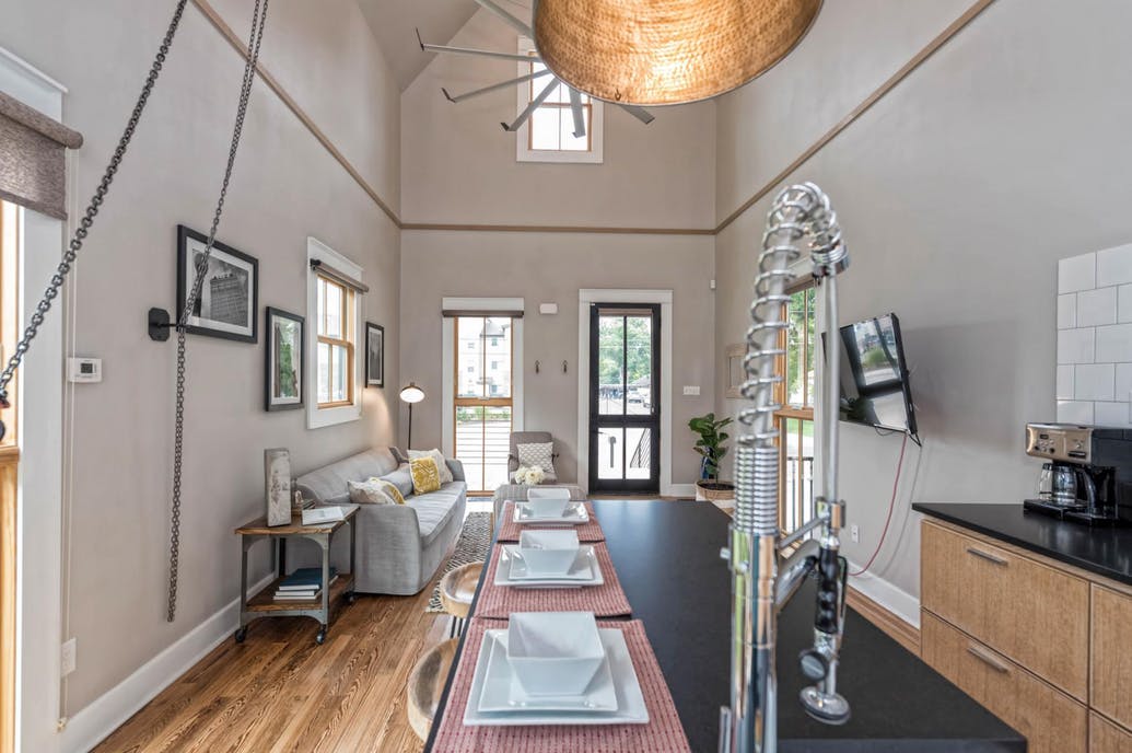
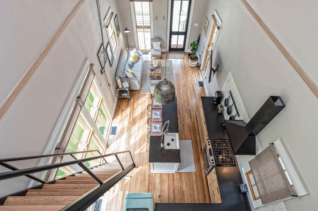
Opening up the main floor living space and the addition of a loft (more on that later), turned the single-storey home into a two-storey that added ceiling height and a feeling of expansiveness that wasn’t found in the original home.
Kitchen Improvements
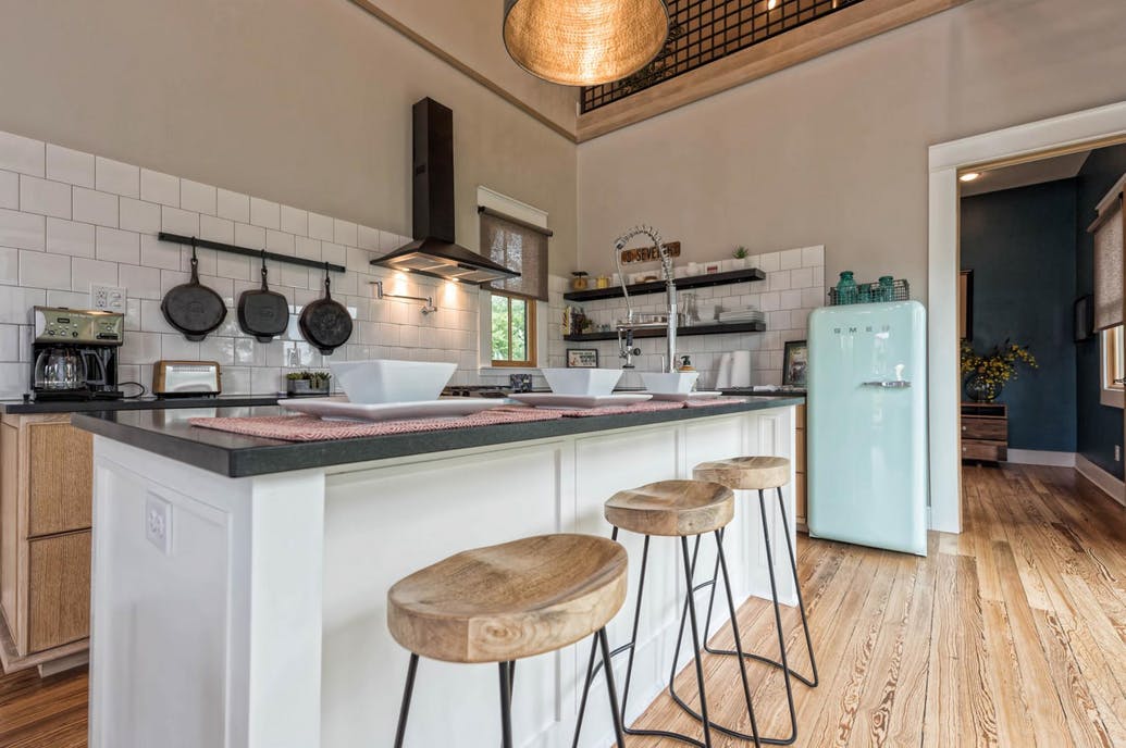
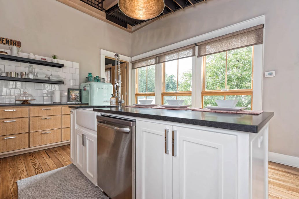
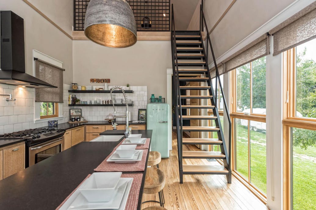
The kitchen boasts honed granite countertops, a turquoise vintage-look Smeg refrigerator and a space-saving island that doubles as a bar-style eating area. “The clients loved the idea of a retro style refrigerator,” adds Joanna, “so I chose a colour that I thought would accent the rest of the space.”
Double Duty
“The kitchen area would have to double as a dining room, so I designed the largest island that would fit in this space to double as bar seating,” says Joanna of the innovative design for the kitchen island.
Open Shelving
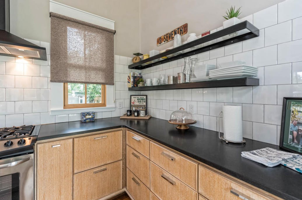
“I made sure there were as many lower cabinets as would possibly fit for ample kitchen storage, but ultimately decided on open shelving rather than uppers,” Joanna points out, “so the area would look as open and roomy as possible.”
Bright and Airy Kitchen
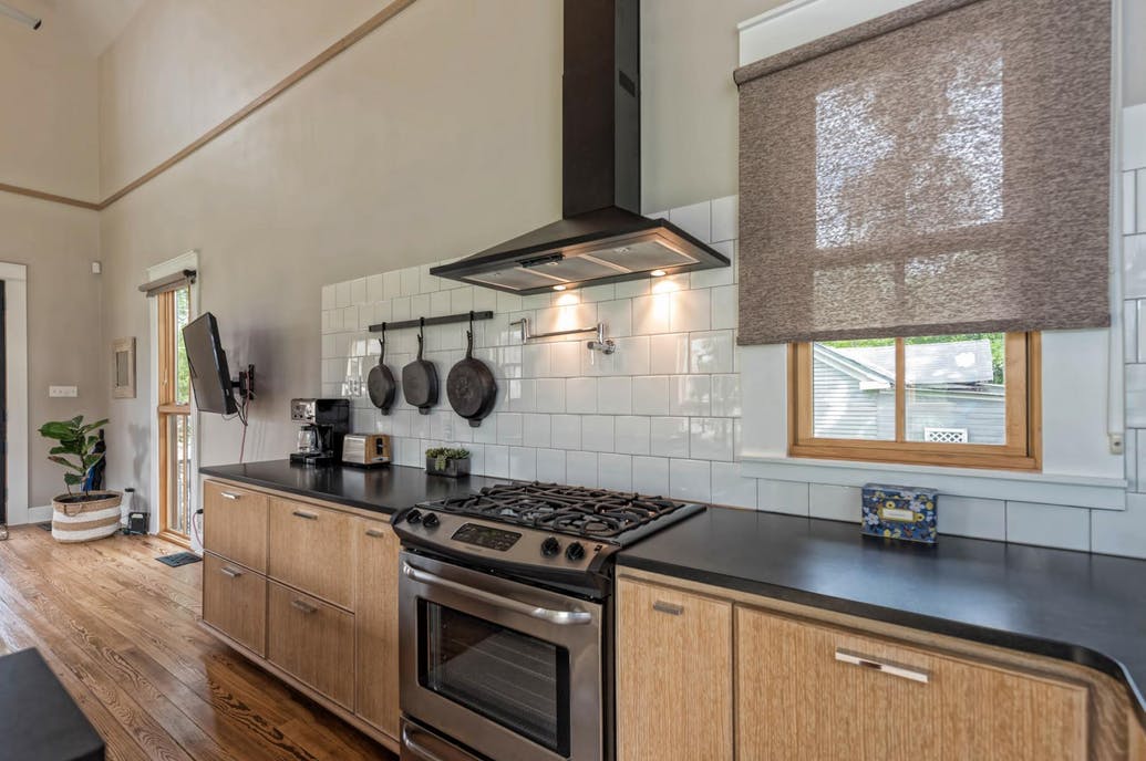
Blending the kitchen, eating area and living room into one large multifunctional space made sense in a narrow shotgun home, and the resultant space feels airy and open. A sleek black range hood and large white tile for the backsplash complete the look.
Staircase to the Loft
“To avoid taking up prime real estate by building a full-on staircase, we installed this ship ladder staircase that’s operated on a pulley system,” explains Joanna. “It can easily be left up, out of the way or lowered down for easy access to the top floor. Not only does it add a practical element, but with the high ceilings I felt like it was a really cool design feature in the main room.”
Opening Up the Home
“Not only did adding a second storey loft add livable space, but it also allowed for this incredible high ceiling that opened up this whole home, making it feel anything but small,” adds Joanna.
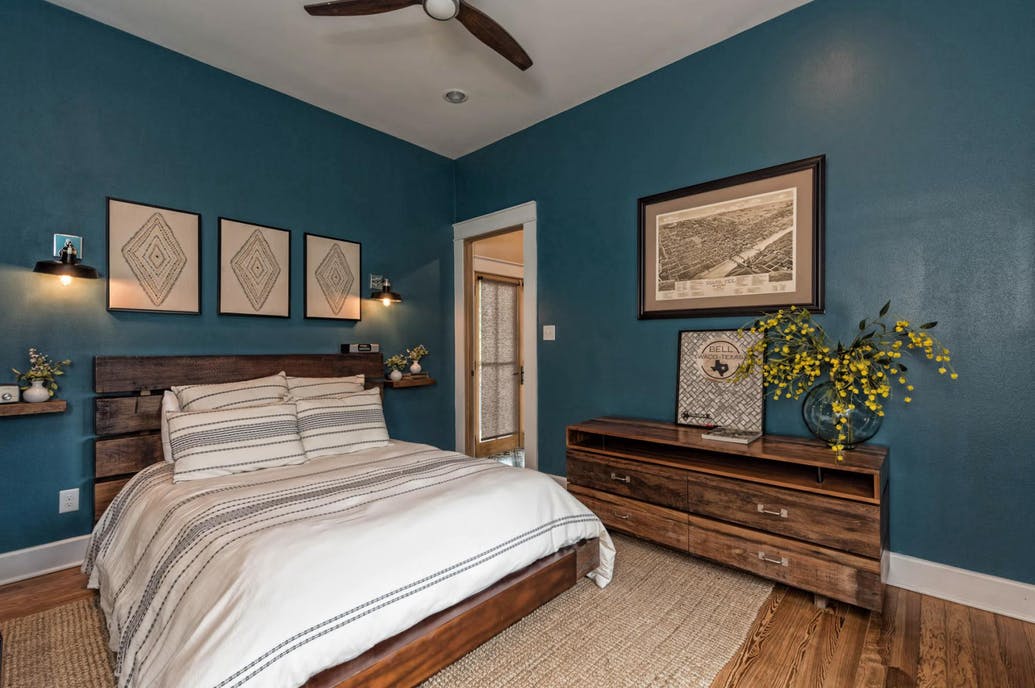
Master Bedroom
“We situated the master bedroom, bath, and mudroom behind the kitchen,” notes Joanna. “I had the walls painted this striking teal green to really define and differentiate this space from the rest of the home.”
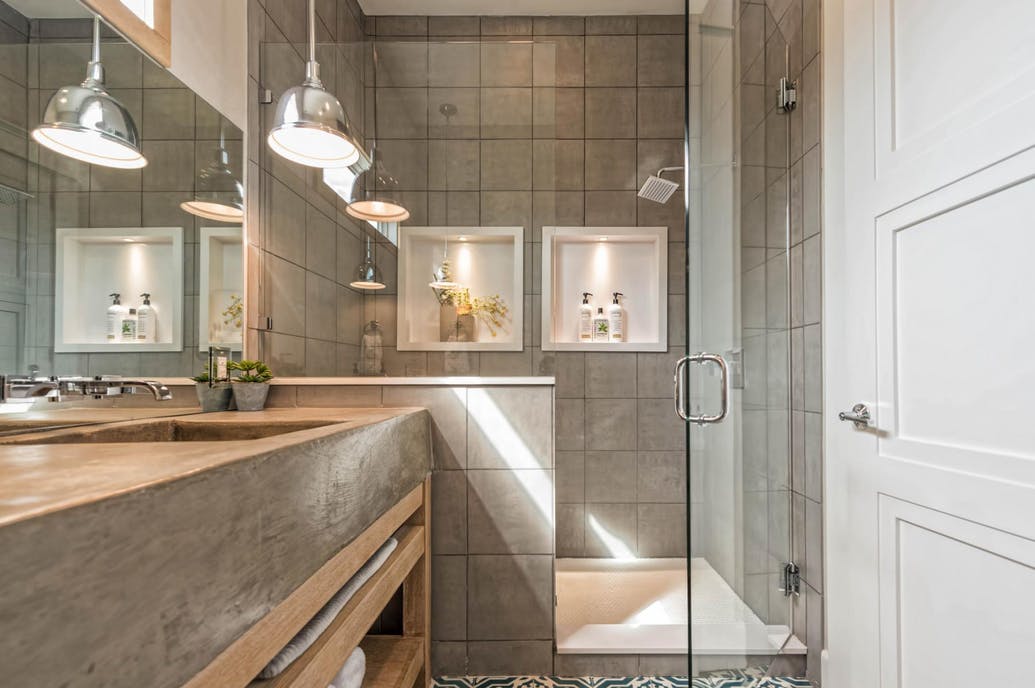
Master Bathroom
Among the features of the gorgeous master bathroom are a glass-doored walk-in shower and double sinks and countertops made from poured concrete.
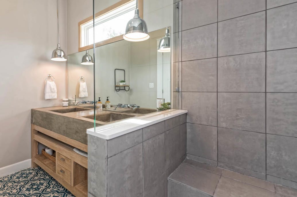
Natural Light
“The natural light in this room opened it up,” notes Joanna of the bathroom, “and the patterned concrete tile was fun and paired well with the colour of the Bells’ bedroom.”
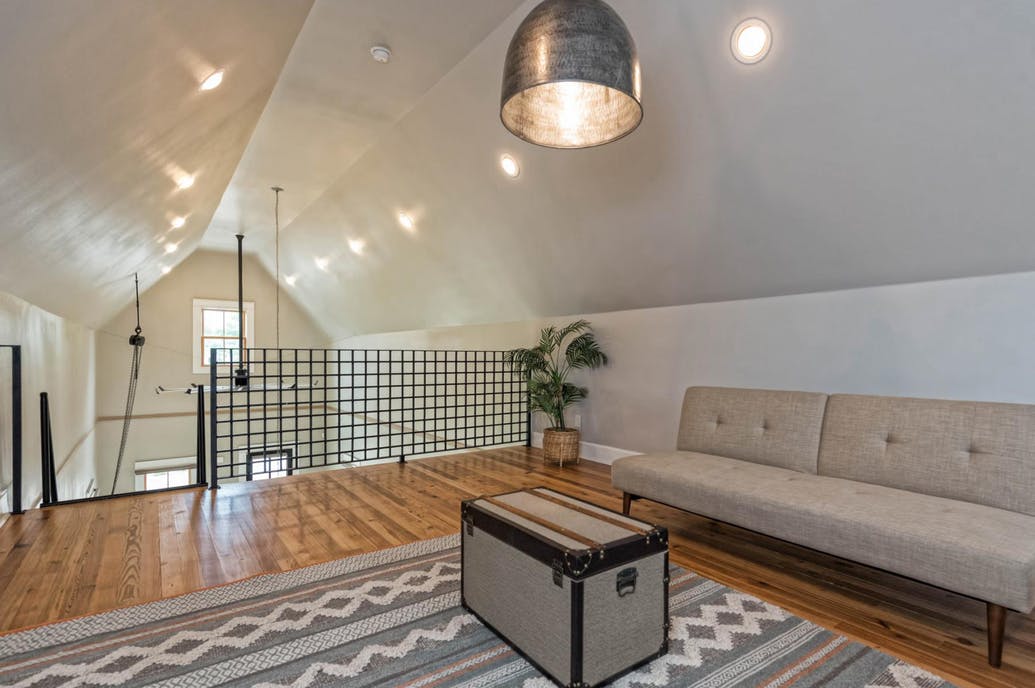
The Loft
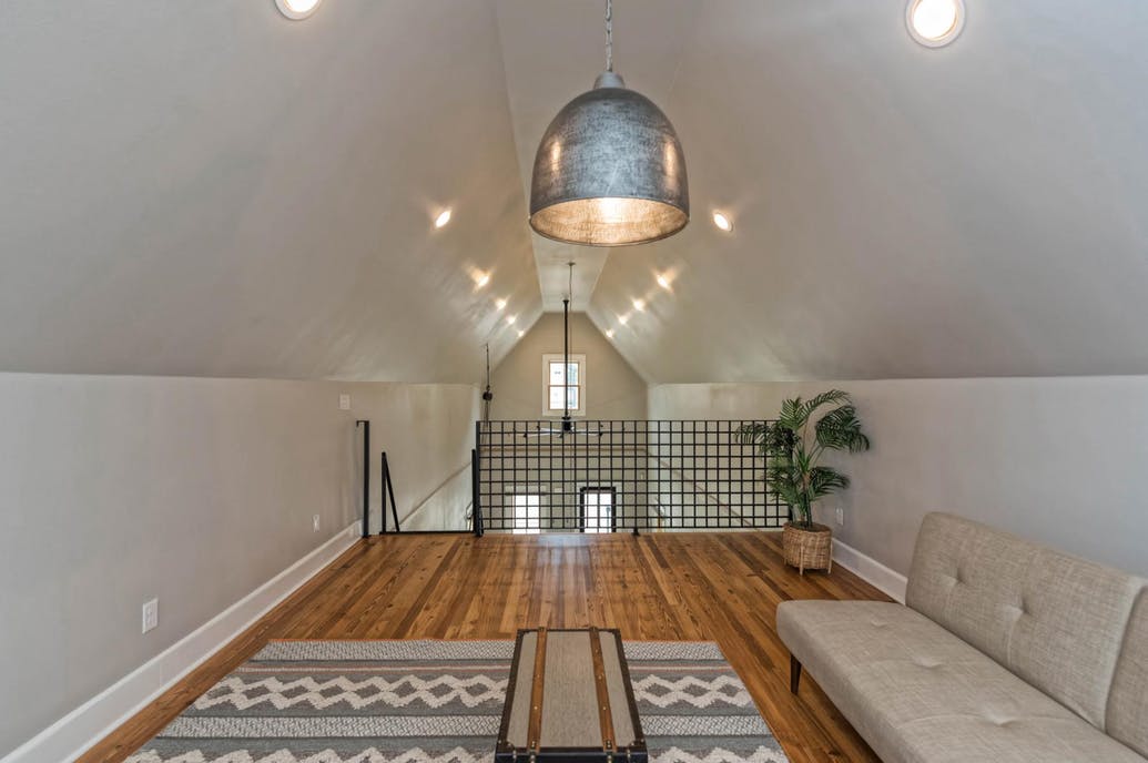
The second-storey loft boasts a unique architectural railing, and is surprisingly spacious. According to Joanna, it’s “one of my favourite areas” in the home.
From Tiny House to Practical Home
“This space took the whole project from tiny house to practical home,” says Joanna. “Having just one living area would’ve really made this house feel cramped, but this large office and sitting room transformed it and made all the difference.”
Fire Kettle
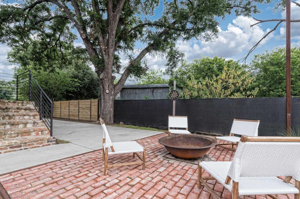
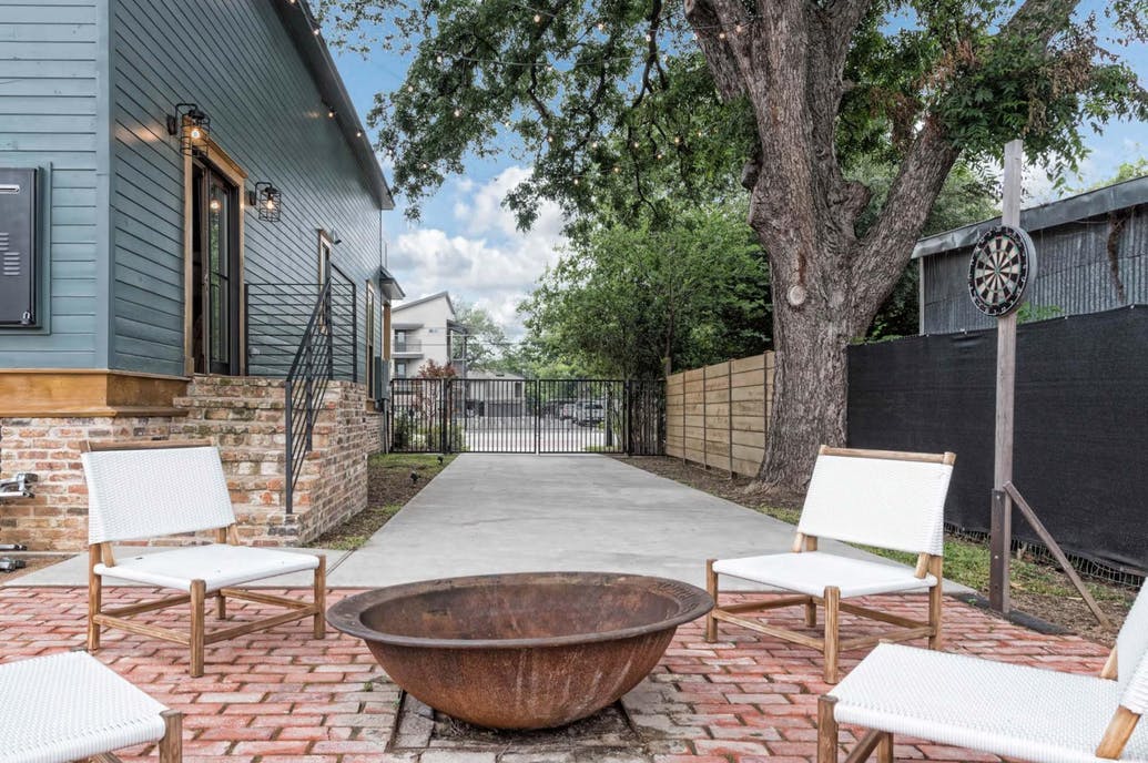
The backyard is ideal for outdoor relaxing, featuring a brick pad for outdoor seating in front of the branded sugar kettle fire-pit.
A ‘Fixer Upper’ Fave
“Ultimately, the Bell project ended up becoming one of my favourite homes we’ve had the opportunity to bring back to life,” reveals Joanna. “And this was definitely one of the top five most dramatic Fixer Upper reveals we’ve worked on.”
HGTV your inbox.
By clicking "SIGN UP” you agree to receive emails from HGTV and accept Corus' Terms of Use and Corus' Privacy Policy.


