As Kortney and Dave Wilson revisit their all-time favourite designs, disasters and dilemmas in their Masters of Flip special, Best Flips Ever, it got us thinking about some of the dynamic duos greatest moments on HGTV Canada. So we went ahead and rounded up a collection of your favourite Flip designs over the years – and they’re just as gorgeous as we remembered them.
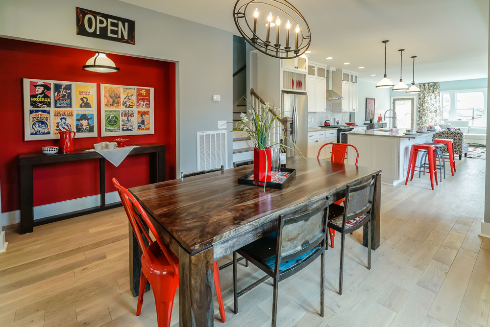
Red Hot
The modern-meets-rustic feel of this open-concept home has left us a little green with envy. From the dining table’s dark wood finish to the vibrant red accent wall and vintage artwork, this is one kitchen area we’d never want to leave.
Take the full tour as Kortney Wilson Goes Vintage, Modern and Red in Duplex Redesign.
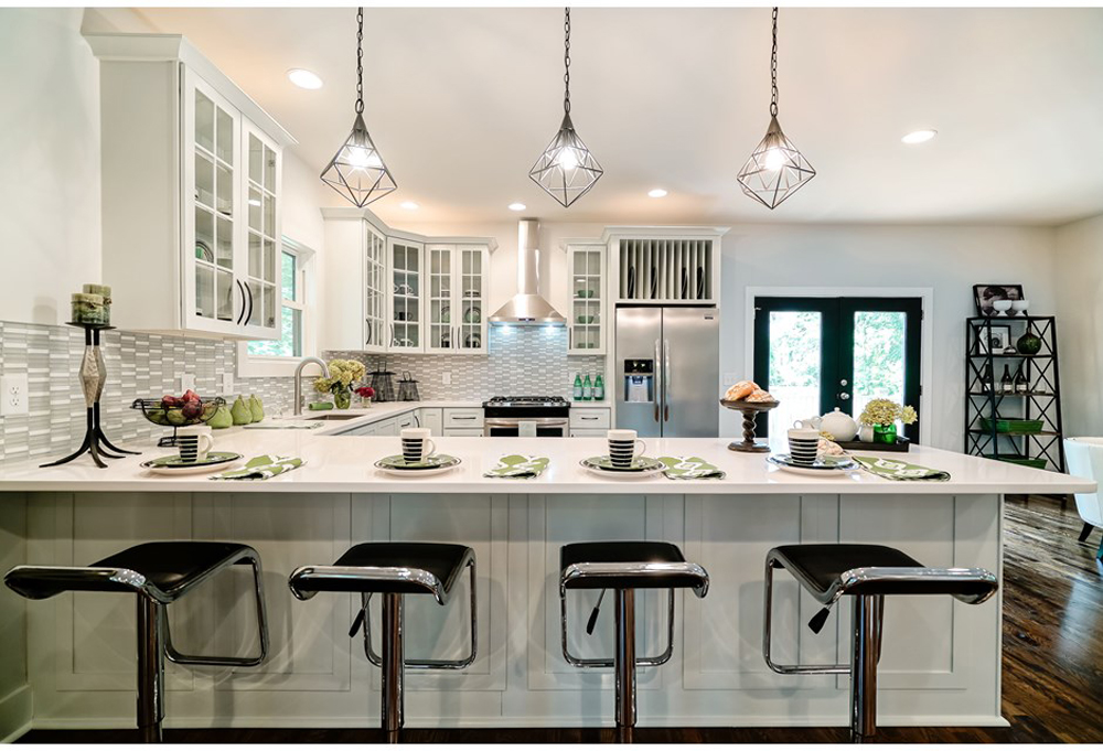
Black and White
This bright, wide-open kitchen is clearly a stunner, but it’s all in the little details. Notice the stark black hardware finishes and dark trim around the doors – it all subtly elevates this space to something much more modern than it once was.
Take the full tour and find out How to Pull Off a Black and White Home, According to Kortney Wilson
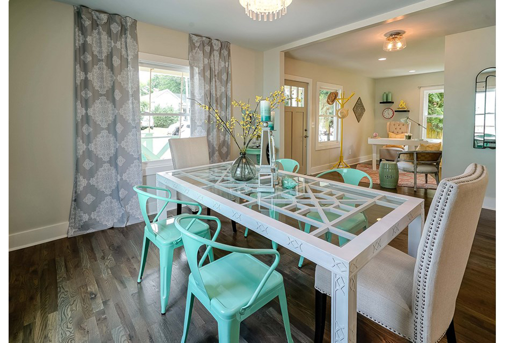
Lighten Up
This unique dining table is a show-stopper, especially when surrounded by soothing light colours and sweeping window drapes. You’ll have no problem kicking back and relaxing over a leisurely breakfast.
Learn more about Kortney Wilson’s 18 Tips to Make Your Home Cottage Chic.
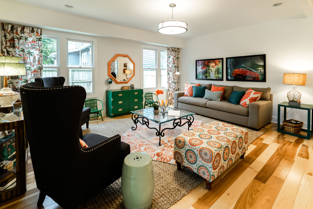
It’s in the Details
Small pops of colour scattered throughout this living room add just enough different hues without going overboard. From the green chest to the tropical cloth bench and area rug, it all comes together for a fun, contemporary look.
See how Kortney Wilson Transforms a Dated Home Into a Tropical Paradise.
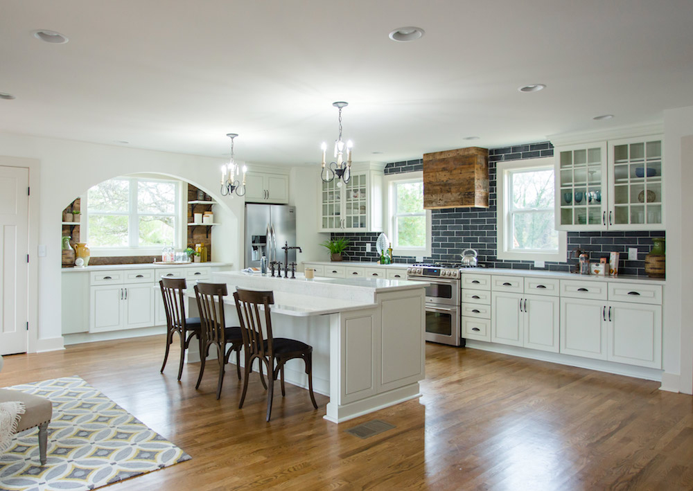
Ahead of the Curve
This open-concept kitchen is absolute perfection, from Kortney’s backsplash choice and the elegant island to the striking archway that immediately catches the eye.
Find out how a Disorganized Rental Property Was Transformed Into a Stunning Single-Family Home.
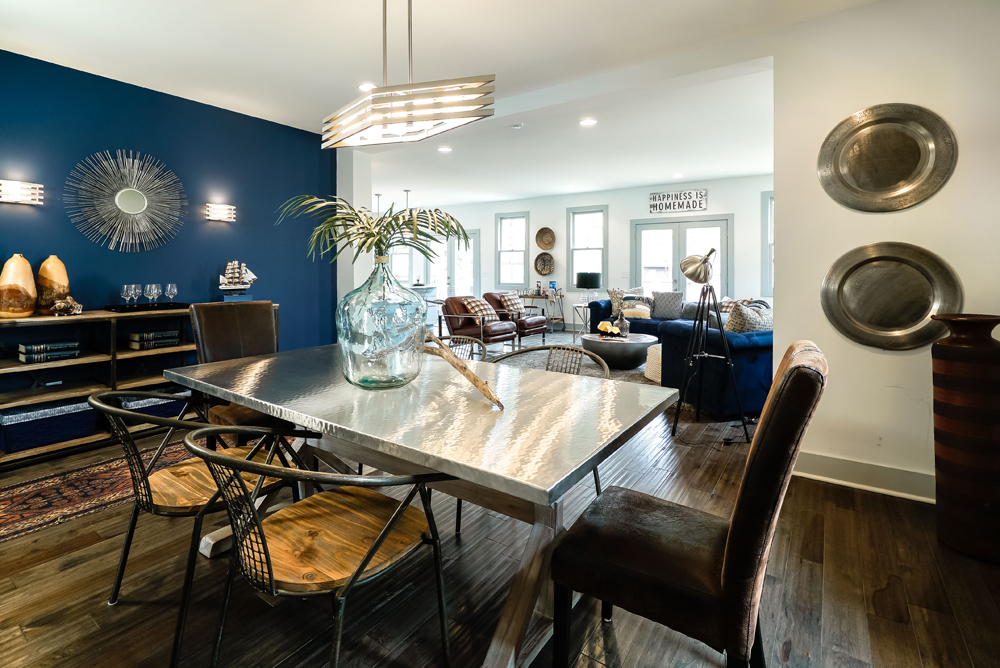
Dark and Dramatic
Kortney opted for darker colours in the dining room of this open-concept home, adding a deep blue accent wall for more depth. To give the house a modern spin, she went with oversized jugs and vases as decor and added wishbone-inspired dining chairs for an artsy finish.
Take the full tour of This Gorgeous Open-Concept Home With a Genius Guest Suite.
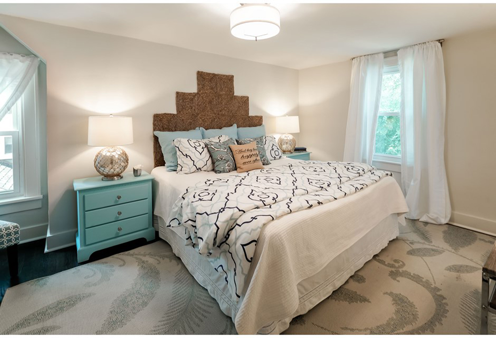
Light and Airy
Kortney had her work cut out for her with this major flip, extending the layout of the house and giving a major overhaul to the master bedroom – complete with walk-in closet.
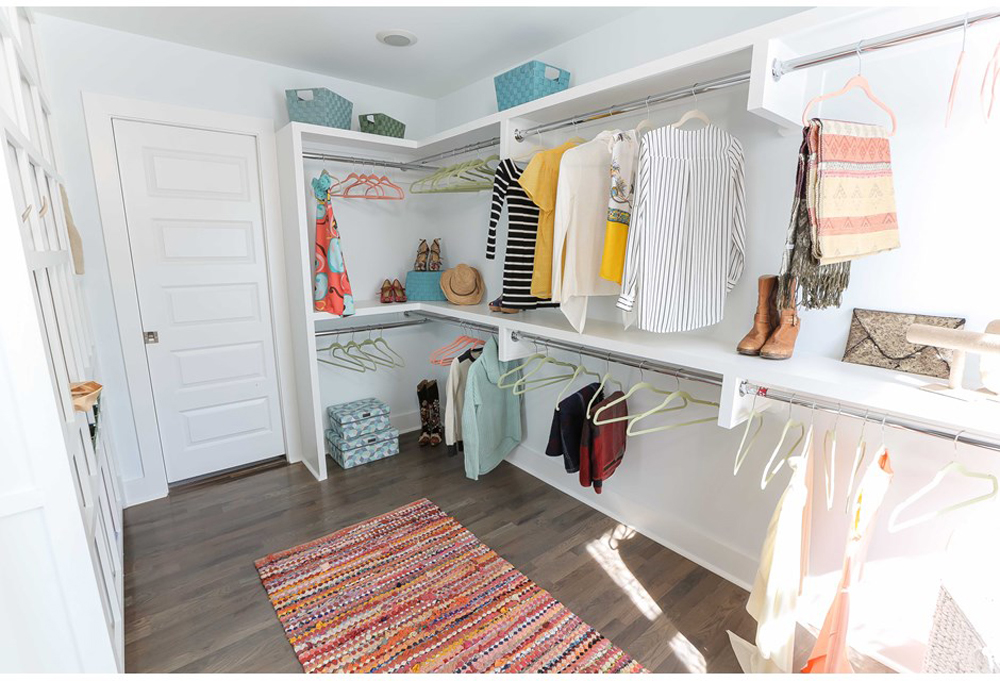
From Old to New
Walk-in closets are a major selling point in any home. Kortney gave a little extra TLC to this specific walk-in closet, adding character with simple touches such as a cool throw rug, adorable baskets and colourful hangers.
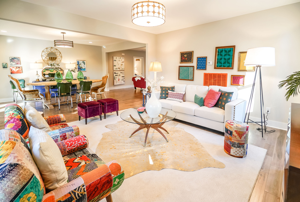
Like a Rainbow
Kortney made up for the lack of colour in the kitchen and living space by featuring plenty of cheerful accents, including bright artwork and patchwork armchairs. The neutral area rugs and glass coffee table help neutralize the look.
Find out how A Neutral Home Was Totally Transformed Thanks to Bright Pops of Colour.
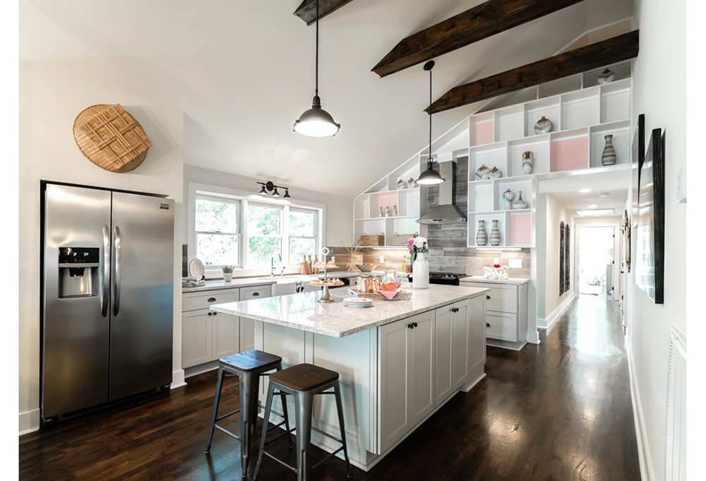
Pretty in (Hints of) Pink
The kitchen itself is fairly neutral, but on the back wall the pink is introduced into the space through shelving, which is pretty much an art installation on its own.
Find out how Kortney Wilson Gets Pretty in Pink.
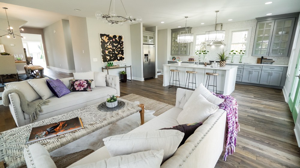
Keeping it Neutral
Kortney and her team kept all the main furniture pieces in this open-concept living room neutral, allowing for the various pops of colour (purple, coral, avocado) to immediately catch the eye.
Find out how A Tiny Cottage Gets a Major Facelift for Major Profits.
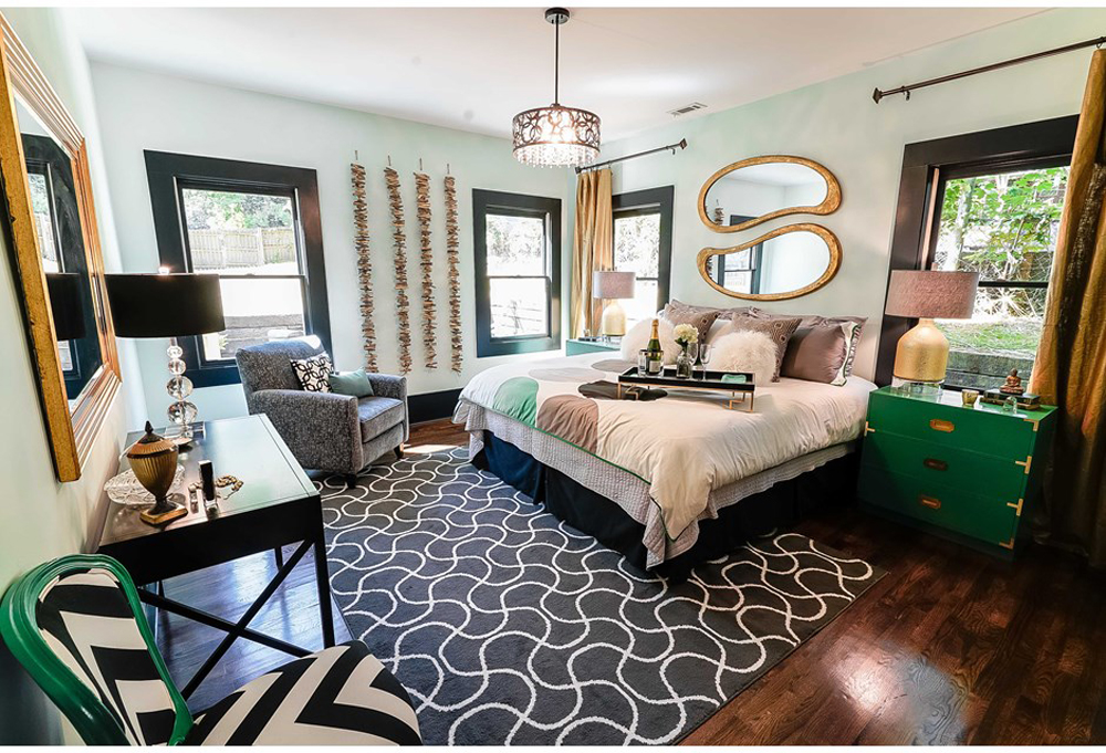
Pushing the Reset Button
A previously rundown property gets a major update from Kortney and her team. The rich gold of the unique mirrors and table lamp add a hint of vintage to the more modern elements such as the bedspread and throw pillows.
Find more ways to Update an Old Home, According to Kortney Wilson.
HGTV your inbox.
By clicking "SIGN UP” you agree to receive emails from HGTV and accept Corus' Terms of Use and Corus' Privacy Policy.


