“The homeowners wanted a cheery space that was a refuge from Vancouver’s grey rainy days,” says designer Ben Leavitt of PlaidFox Studio. The couple also wanted the home to have a playful feel for their growing family (since moving in with baby Ella, they’ve had two more kids). The designer began with a tall 2,300-square-foot blank canvas spread over five floors and ended with a layered, lively space that feels like the family has always lived there. Peek inside to see how he did it.
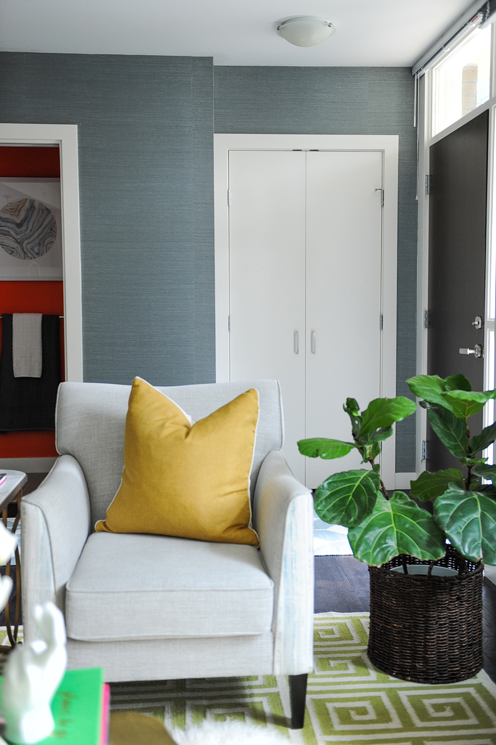
Paper Weight
Handsome blue grasscloth paper does more than delineate the entryway in the home’s open floor plan. “It’s casual and comfortable,” says designer Ben Leavitt. “It doesn’t make this small space feel too busy or cluttered like patterned wallpaper would.”
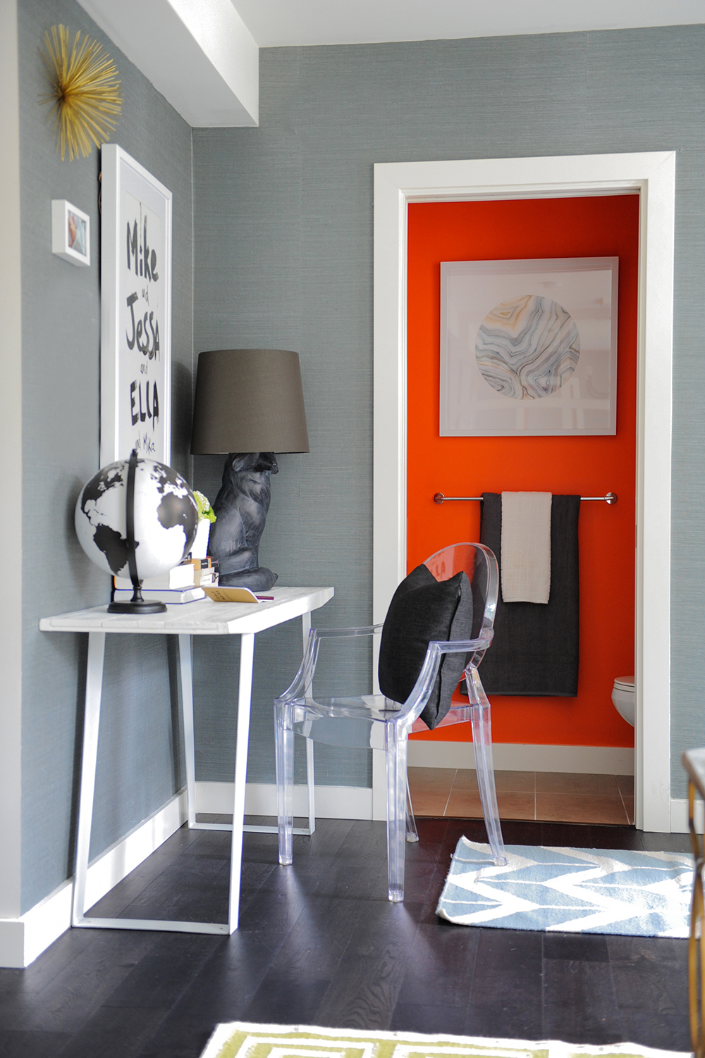
Orange Segment
Given that the powder room is visible from the main floor’s living area, some might be tempted to have it blend in with the colour scheme – not Ben. “We painted it a shade called ‘Volcano’, and I think it lives up to its name!” he says. “Powder rooms should be fun and give guests something to talk about.”
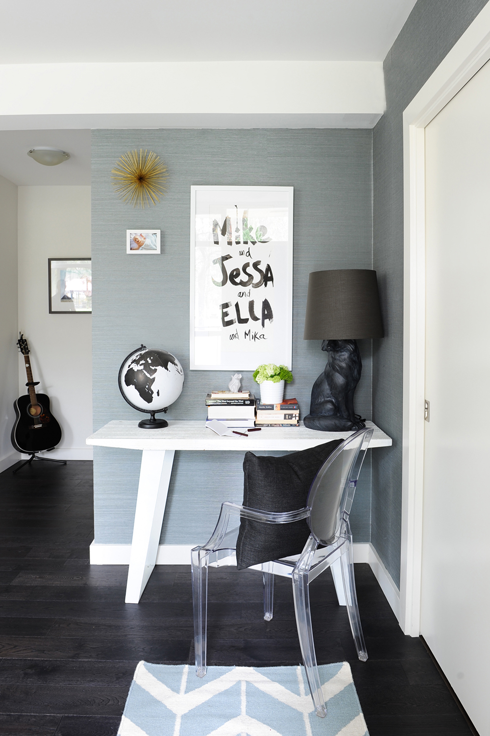
Name Dropping
Art should speak to its owners, and what says more to a person than their name? This customized piece features the names of the homeowners, their baby daughter Ella and cat Mika. It’s cheap and cheerful, yet sharply original. It, like the other black and white accessories in the space, animates the entryway.
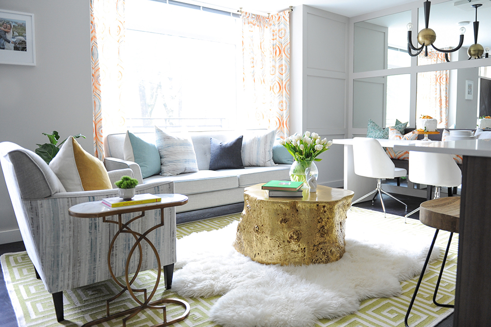
Take the Floor
The combination of area rugs in the living room speaks to Ben’s approach to decorating for a family. He says, “The patterned one has a low pile, so while it’s not ultra soft it is durable, which is great for kids and wear-and-tear. I layered the sheepskin over top to add softness and visual interest.”
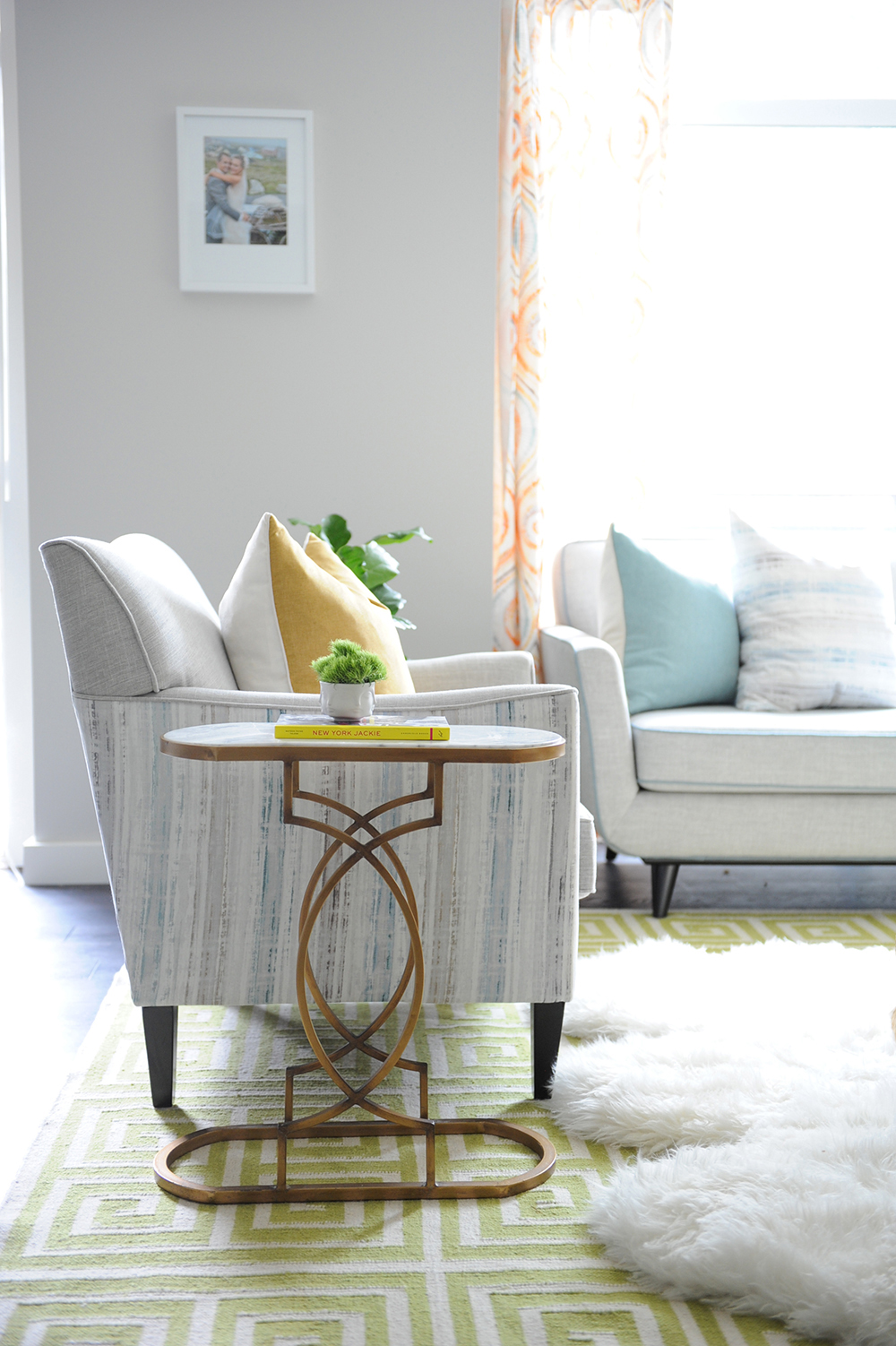
Fine Lines
The open base and sculptural lines of this side table work well in the small space. Its brass finish references the yellow cushion and drapery hardware.
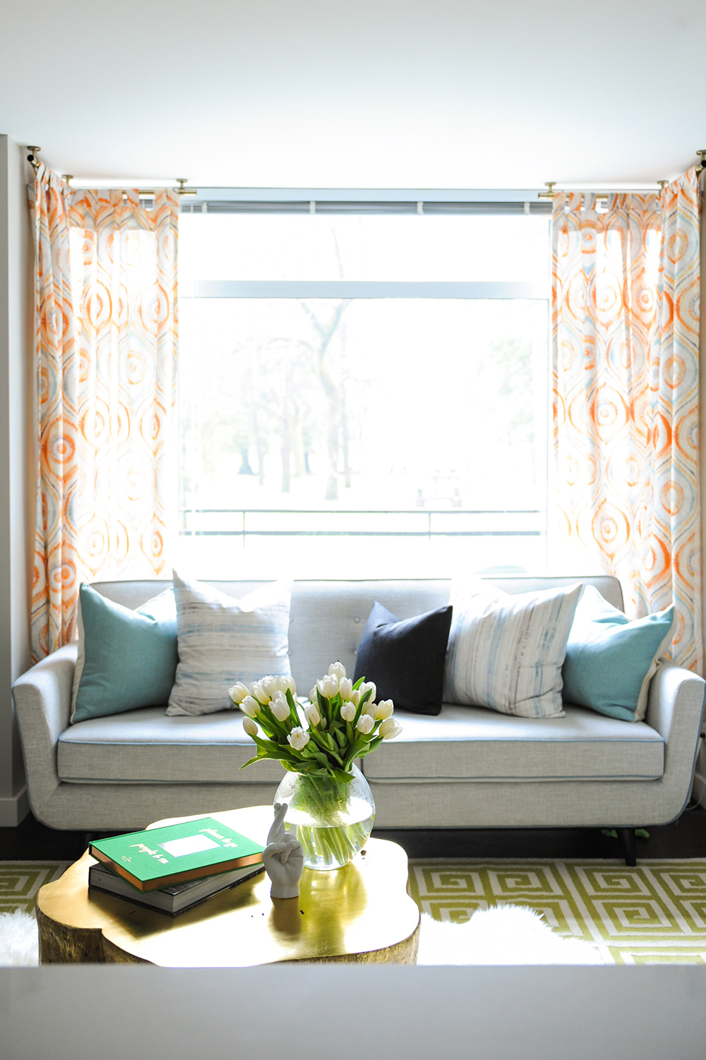
Curtain Call
Ben’s aversion to subscribing to one specific style is exemplified in the pizzazz of the drapery. “I chose orange Japanese shibori fabric and paired it with gold industrial-inspired hardware. The mix has a collected feel and a sense of fun.”
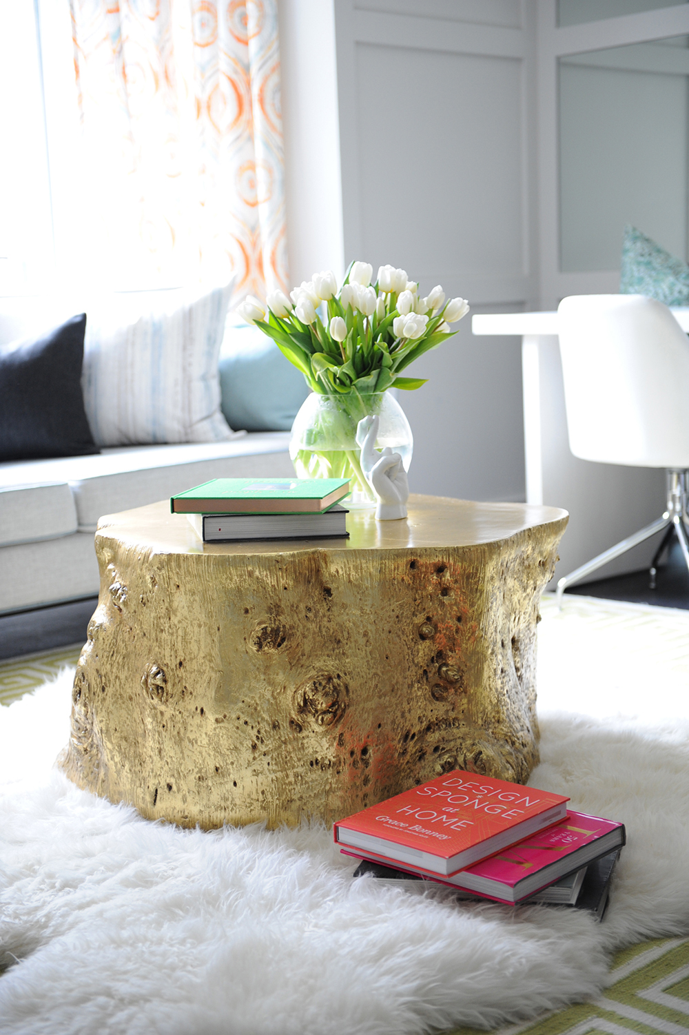
Trunk Show
That sense of fun is continued in the gold tree-trunk coffee table. “I love the humour of this piece,” says Ben. “It’s unexpected. I almost always add something to a home that feels kind of bizarre and playful.”
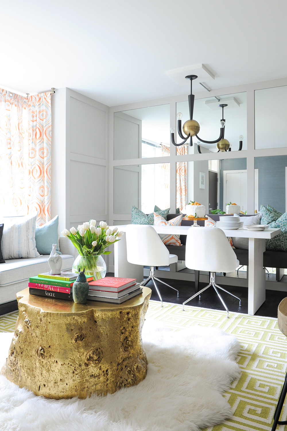
Mirror, Mirror
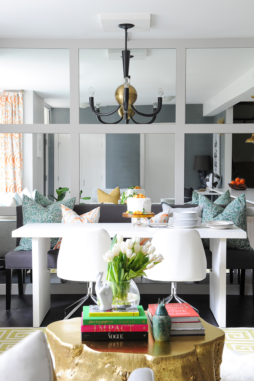
To banish any new-build blahs, Ben installed this stunning feature wall in the dining area, crafted from mirrors and wall panels. “It creates a retro, mid-century vibe. The mirrors also open up the relatively small space.”
Comfy Cozy
The sleek look of the mirrors is tempered with a lively mix of dining furniture and colourful cushions. “These really help cozy up the spot,” says Ben. Look closely at the table’s base – it’s been ingeniously cut out to hug the bench so it tucks in neatly when not in use and maximizes floor space.
Soft Touch
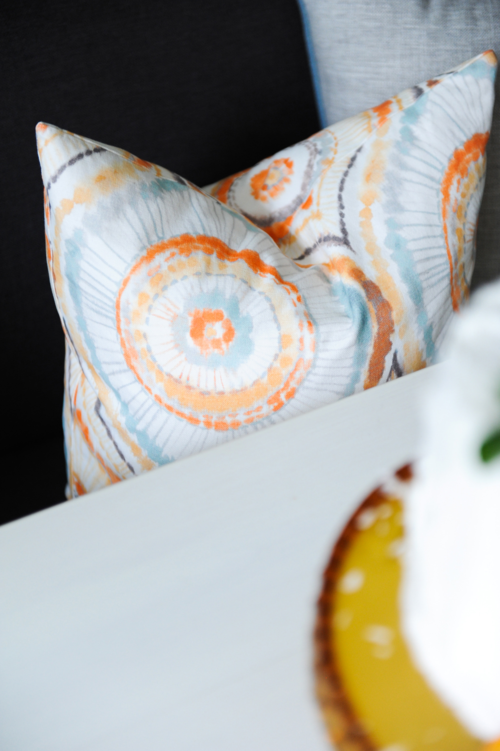
This cushion, one of two on the dining bench, is covered in the orange fabric used for the drapery for a charming cohesive effect.
That ’70s Show
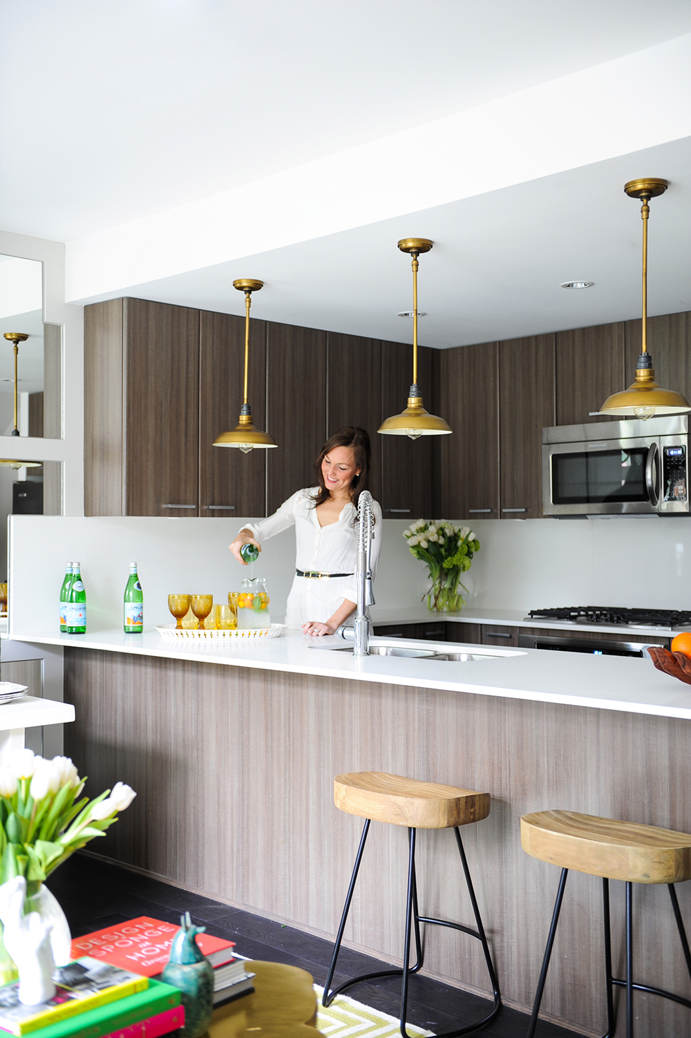
“The wood-grain cabinetry and island base give the kitchen a chic ’70s aesthetic,” says the designer. The wood-topped stools further the mood, while being overtly casual. Overall, each element avoids the look of the ubiquitous white new-build kitchen. Homeowner Jessa (pictured here) considers it the perfect space for summer entertaining.
Industrial Revolution
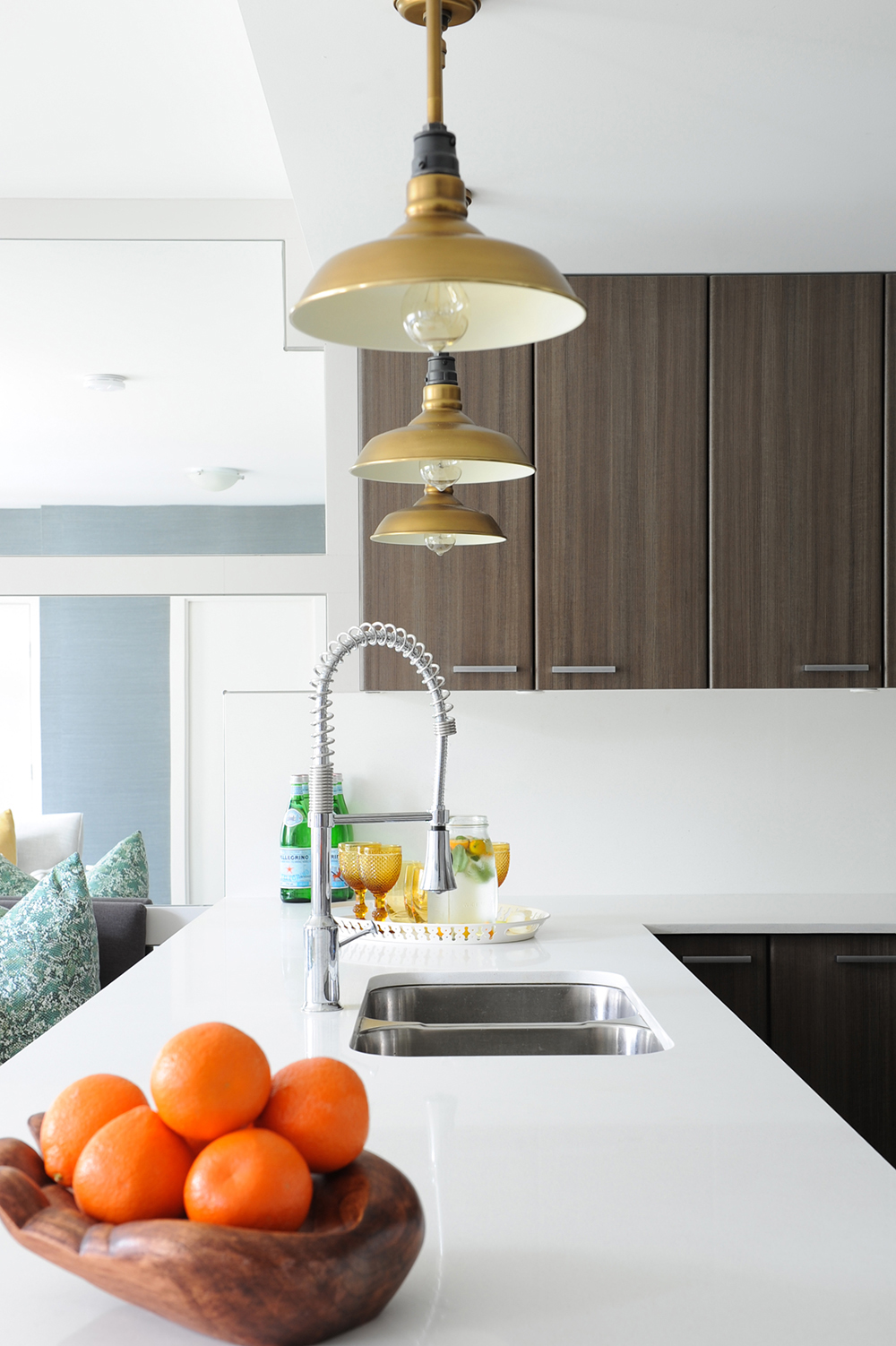
“With different light fixtures, the kitchen could have looked ultra-modern, but I wanted to mix it up,” says Ben. “These industrial-style pendants from Restoration Hardware make the space feel balanced and more eclectic. I think every home needs something with an industrial feel.”
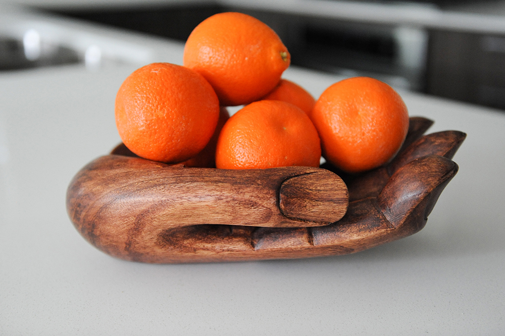
Organic Matter
This playful wooden dish, whimsically shaped like a hand, is casual, fun and a perfect place for edible kitchen accessories.
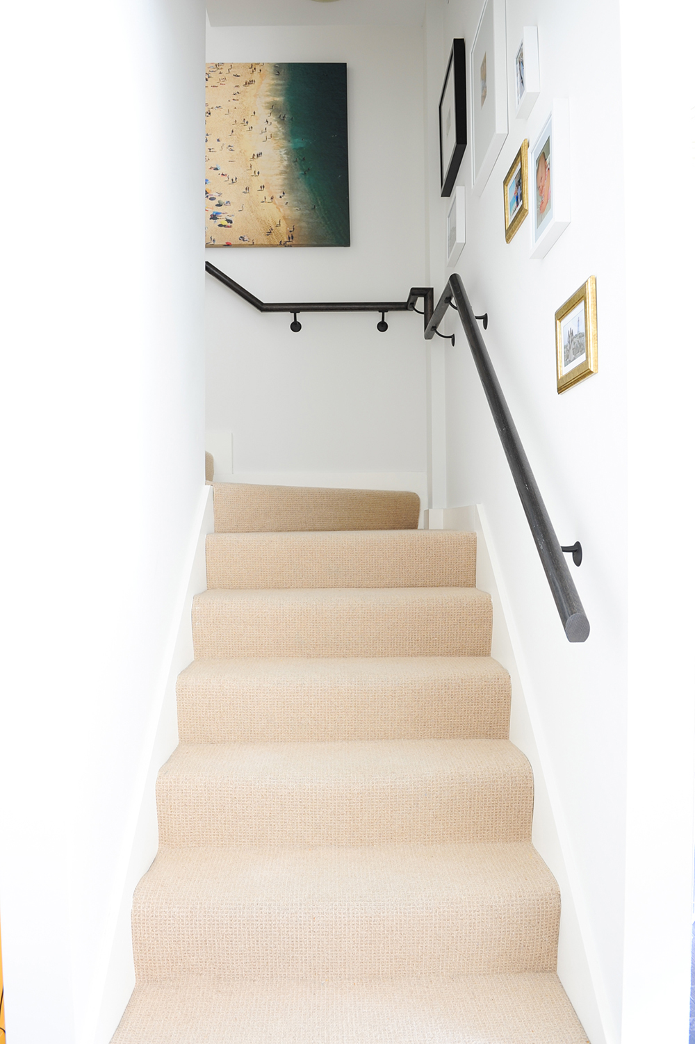
Pretty Practical
Knowing that baby Ella loves to crawl, the designer chose soft carpeting over wood for the staircase. “It’s durable wool and can take a beating,” says Ben. But he didn’t focus solely on practicality. “I made the railing and the art the focus here. A gallery wall should never be static and the family can add more photos as time goes on.”
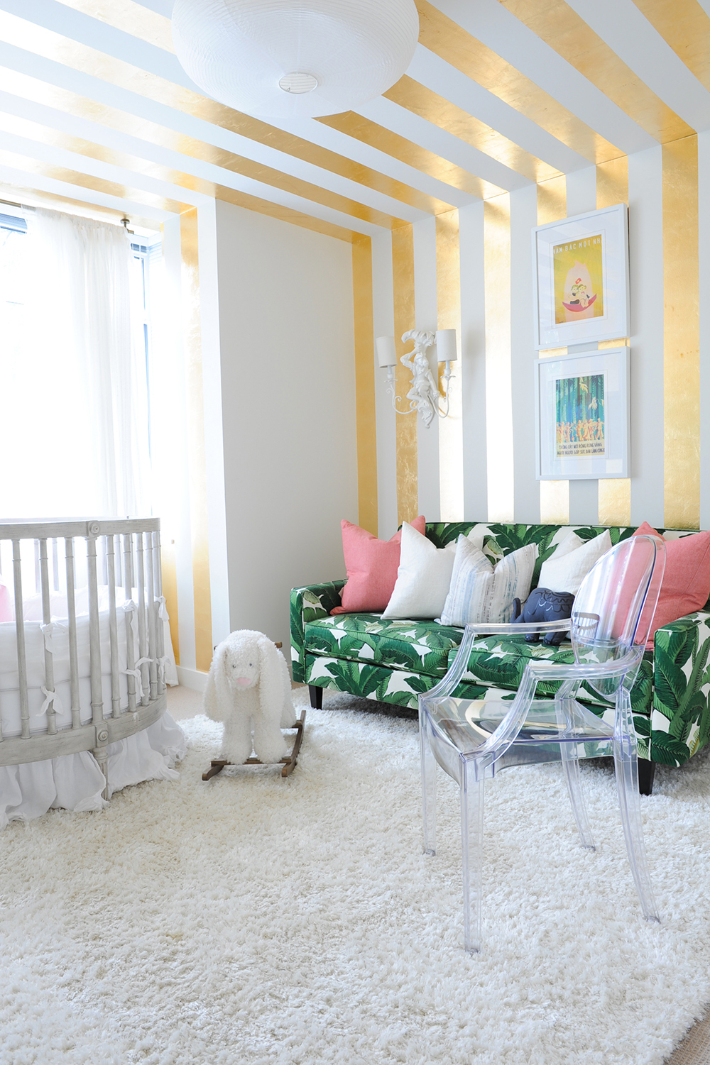
Between the Lines
Trompe-l’oeil alert – this is not wallpaper! Ella’s room features stripes of gold leaf that were painstakingly applied by hand. “The idea here was to create a circus tent feel,” says Ben. The effect is magical.
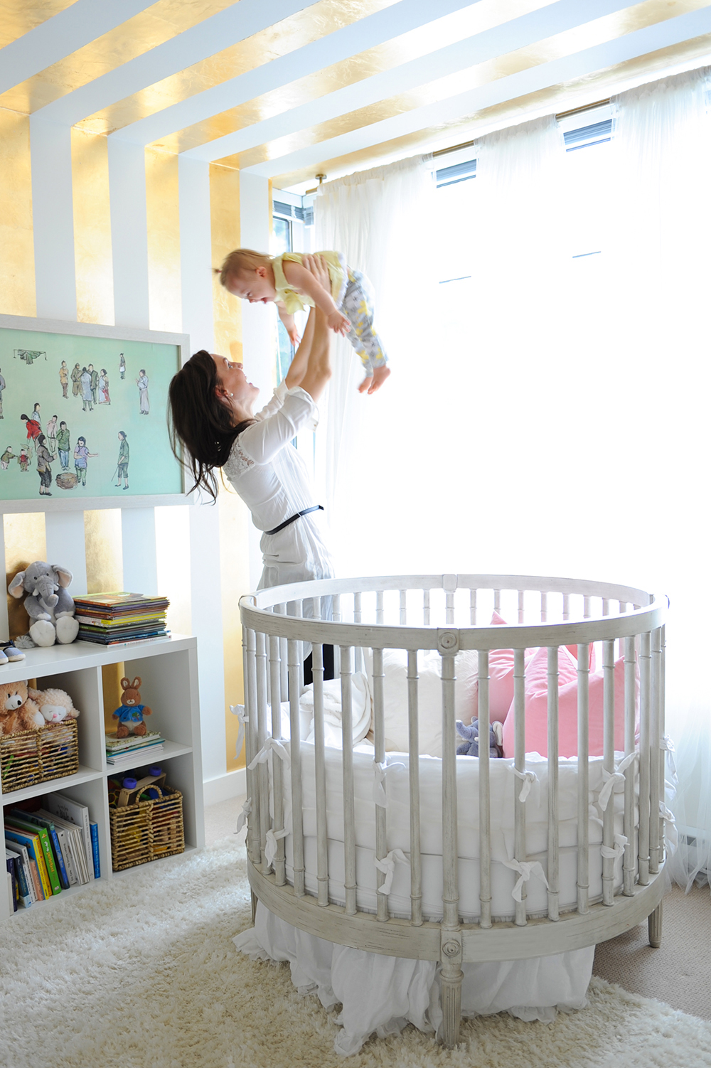
Well Rounded
A beautifully curved crib feels feminine in a girl’s room and is a lovely counterpoint to the wall’s golden stripes. It’s a happy place to be for mom Jessa and baby Ella.
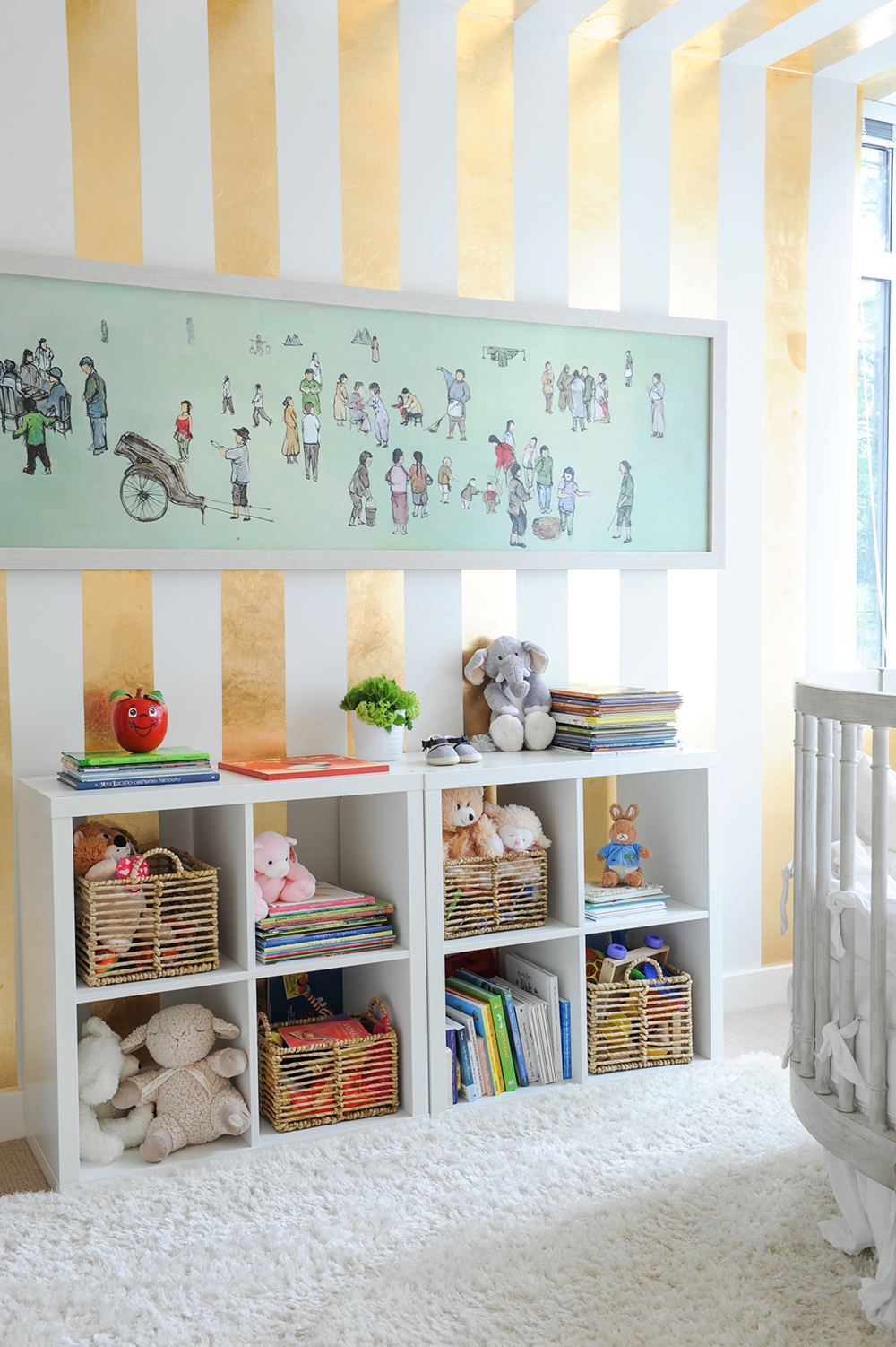
Act Globally
“In Ella’s room, we traded in typical baby decor ideas for ones that are more global yet still fun,” says Ben. “The artwork is actually a travel poster from Vietnam.” The shelving below keeps books and toys organized and within easy reach.
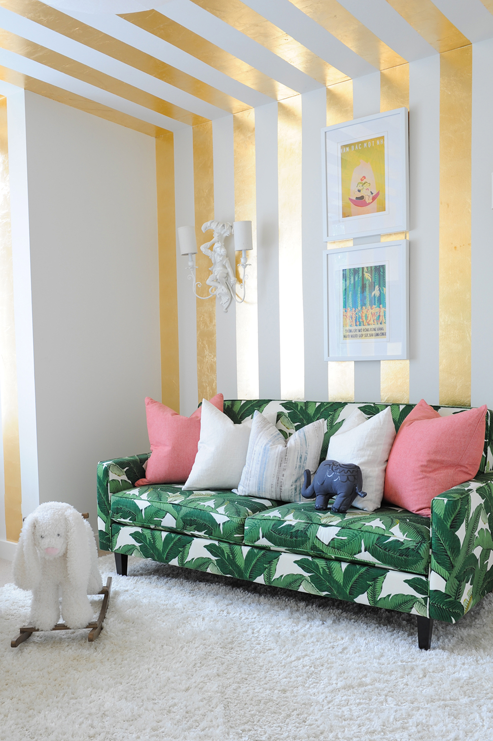
Tropical Delight
“This sofa is upholstered in a Tommy Bahama outdoor fabric and is intended for the parents’ comfort if Ella has a sleepless night,” says Ben. “Sofas are often similar in price to a chair, yet they are much more comfortable and practical for both parents in a kid’s room.”
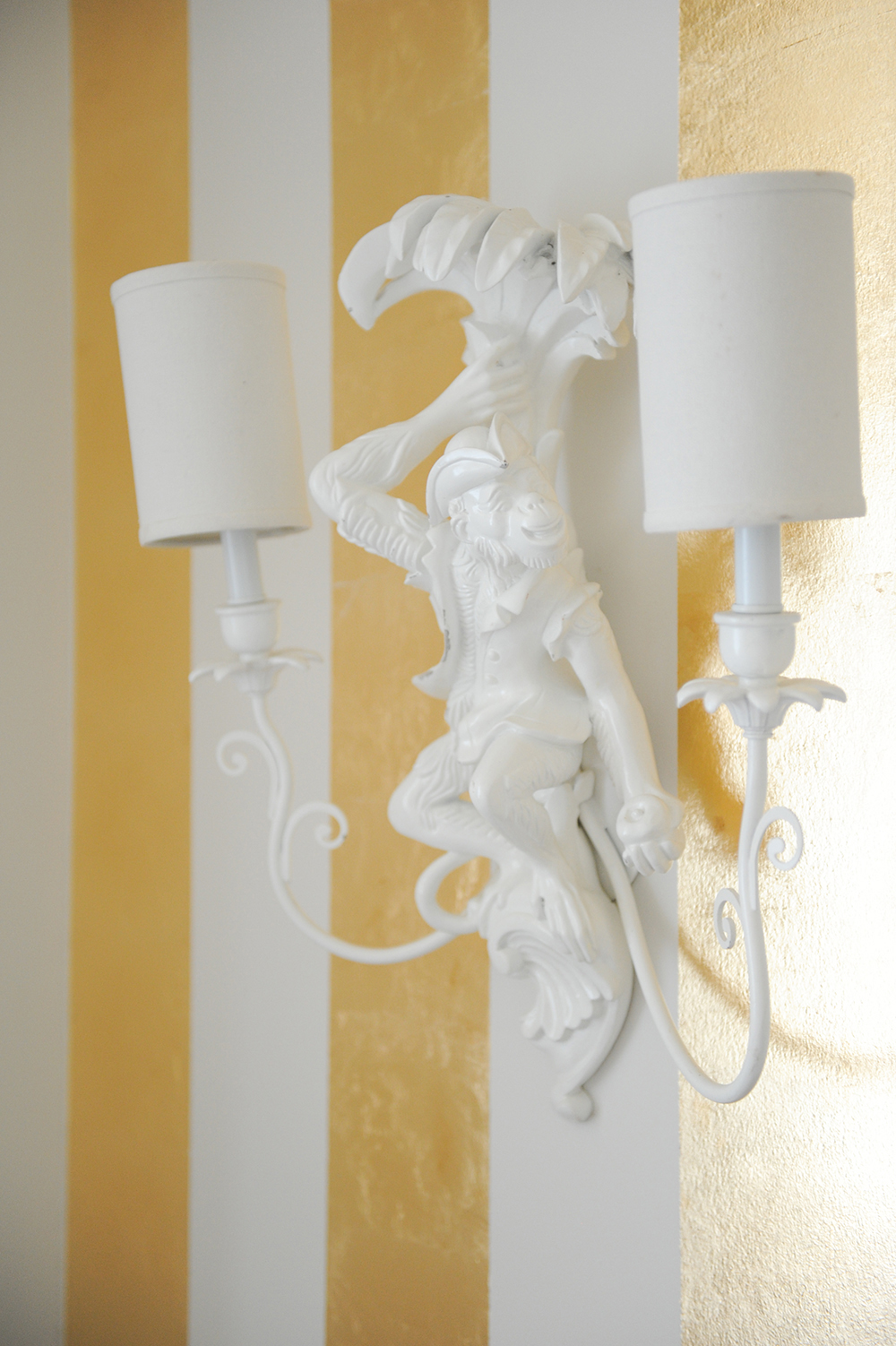
Play of Light
The circus tent frivolity is echoed in these wall sconces, which Ben found at a flea market. They’re not typical lights for a little girl’s room, and that’s precisely why they feel so fresh and fun here.
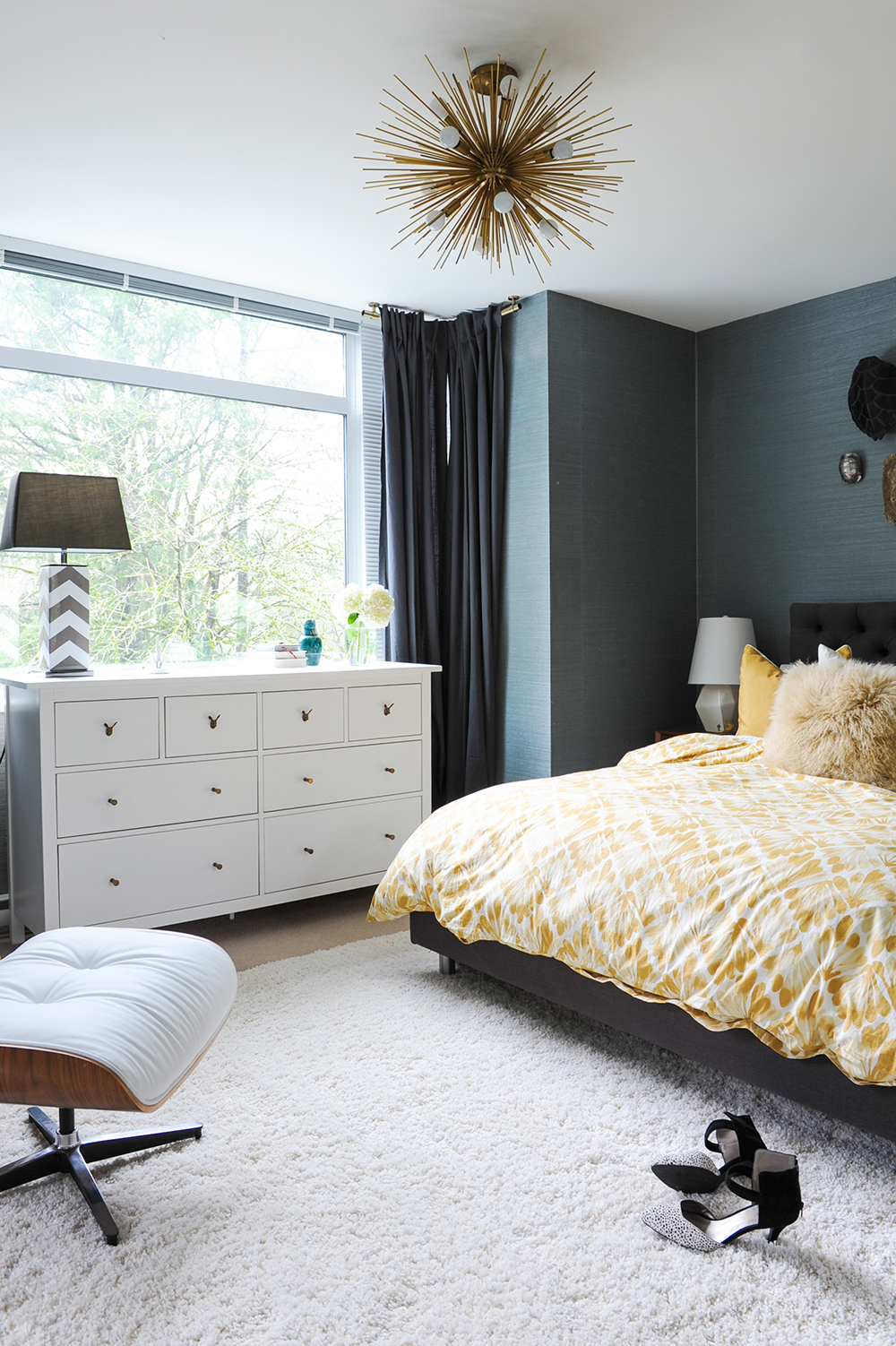
Moody Blue
Ben says the husband of the household was the inspiration for the master bedroom. “I wanted this space to be a bit more masculine for him.” The oranges and greens that dapple the main floor were swapped for mostly blues, greys and whites.
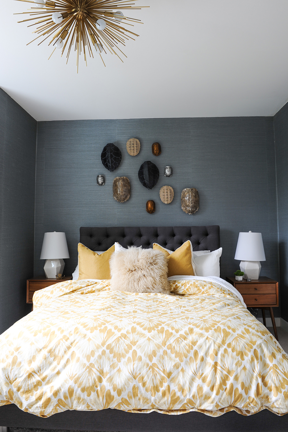
Pass the Mustard
To lighten the masculine palette just a bit, Ben layered in shades of mustard through the bedding and cushions. That hue, together with the teak side tables, parlay the mid-century vibe the designer created on the main floor.
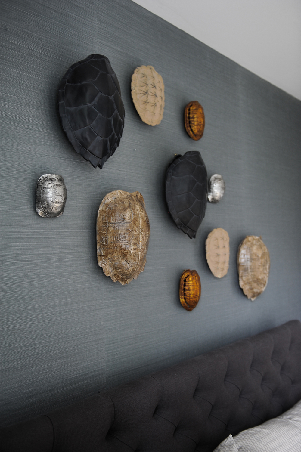
Shell Game
A novel wall treatment for a bedroom, these faux turtle shells are cast in resin. They add earthy colours and interesting textures, while providing an imaginative departure from traditional framed artwork.
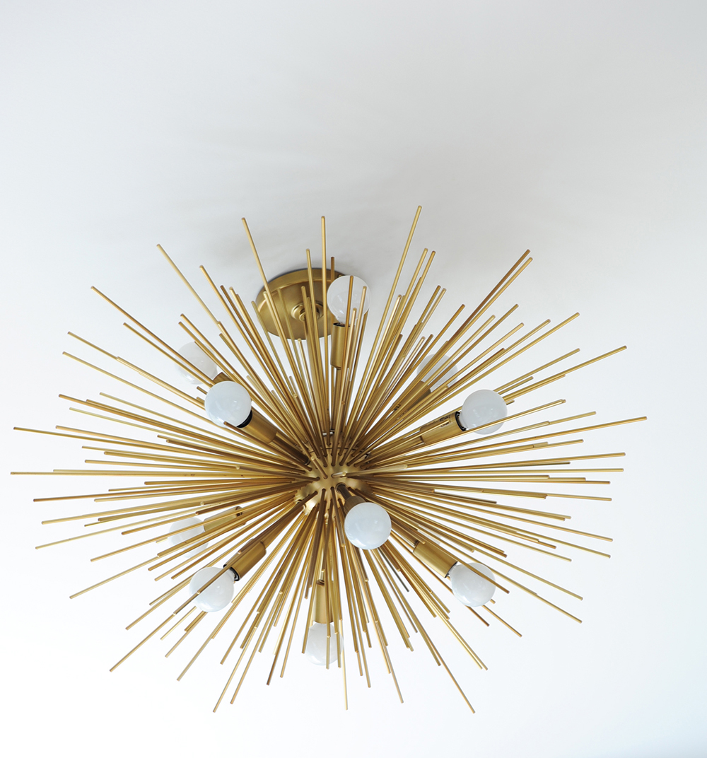
Not the Usual Suspect
The master bedroom’s stunning brass light fixture is from PlaidFox.com, the company’s designer home furnishings website. “It gives the room the dazzle of a chandelier without the crystal,” says Ben.
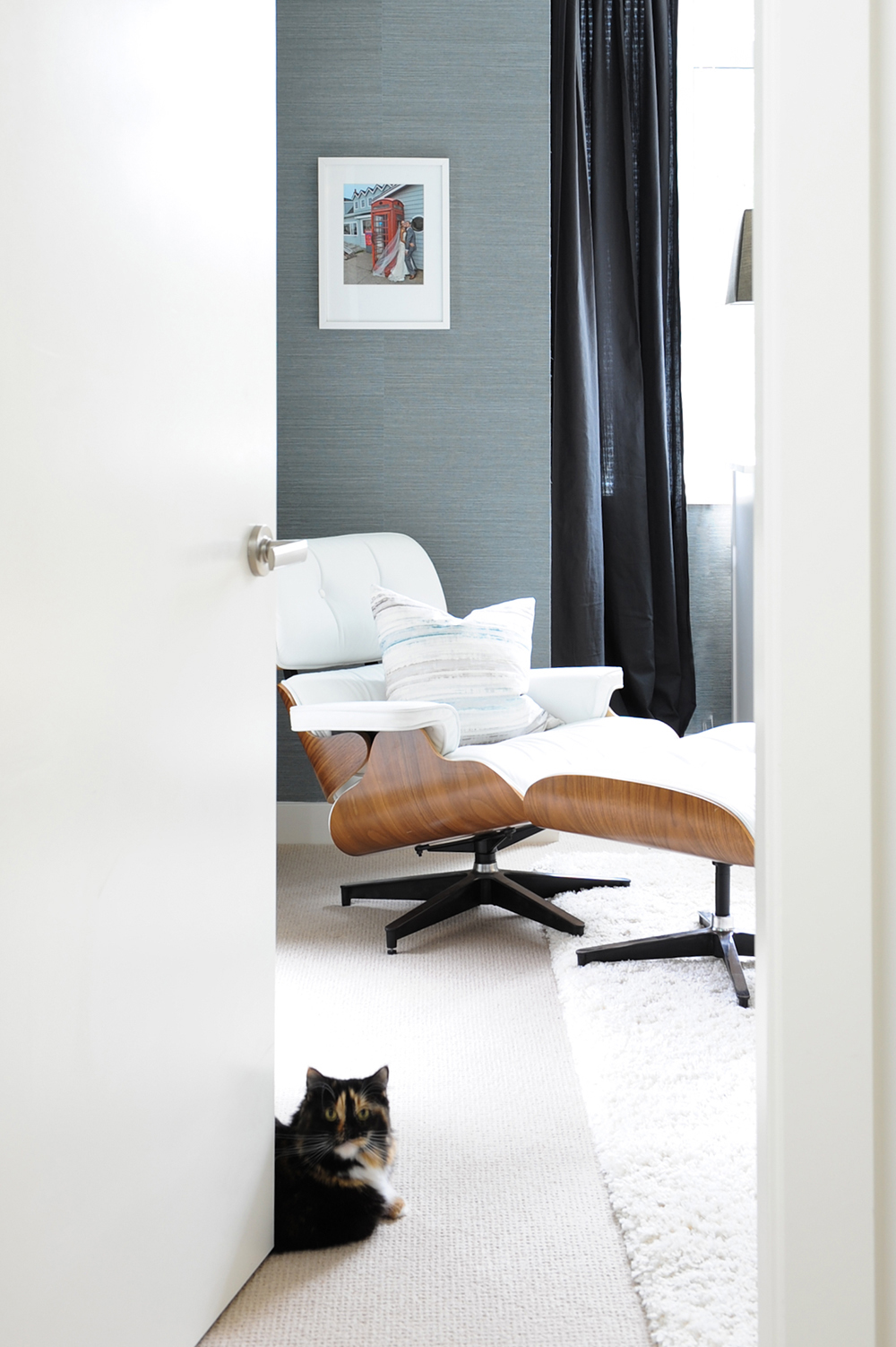
Big Spender
Mika stands on guard for one of the biggest splurges in the decorating budget: the master bedroom’s Eames chair. “It’s the most costly item in the house,” says Ben. “But this white leather beauty was a must. A few expensive items sprinkled throughout are anything but pretentious when mixed with vintage finds and bargains.” When combined together, the result is a comfortable, lived-in home, which is exactly what this family wanted.
HGTV your inbox.
By clicking "SIGN UP” you agree to receive emails from HGTV and accept Corus' Terms of Use and Corus' Privacy Policy.


