Pairing modern and rustic design styles may seem daunting to some, but for others, it’s a no-brainer. Such was the case for one couple, who tasked Jonathan and Drew Scott with designing them a stylish Scandi-inspired space on a recent episode of Property Brothers. While Drew was able to find the duo an abode in their ideal location, it was up to Jonathan to deliver on the cozy and contemporary aesthetic they were after. The result is a warm and spacious home with plenty of natural touches that’s ideal for any lover of the great outdoors.
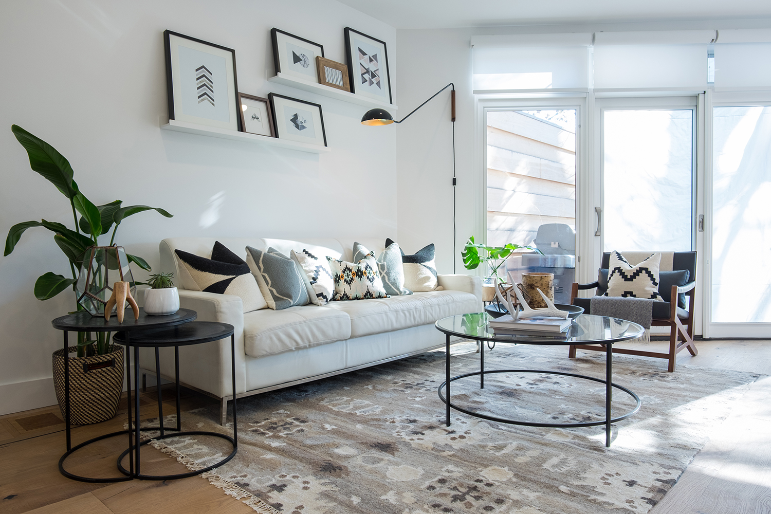
Living Large
Simple, strategic style could also be the theme of this home. The bright white finishes keep the space open and airy, while darker elements like the armchair and table frames lend modern appeal. The large area rug and collection of eclectic throw pillows add hits of fun pattern and interesting texture.
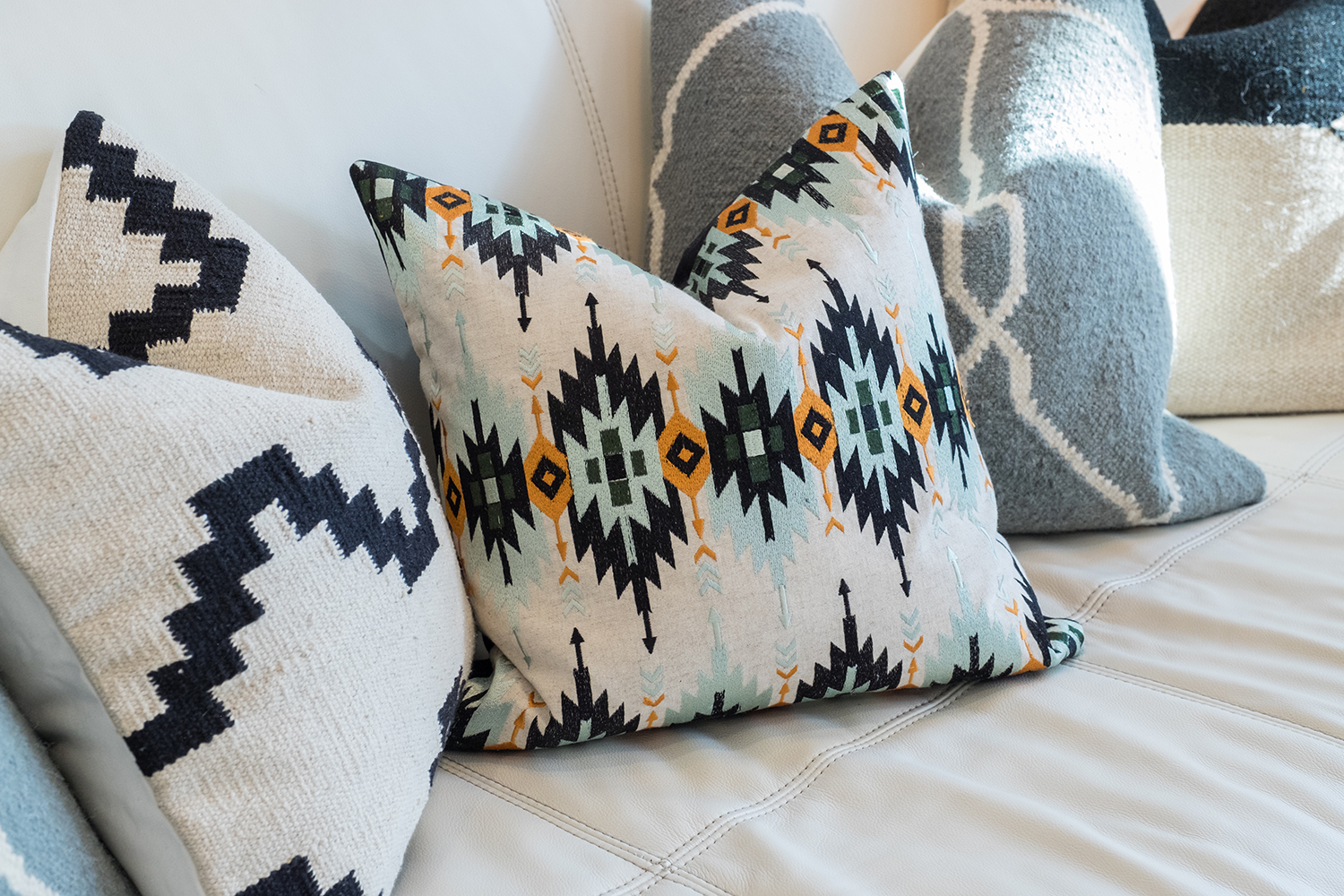
Throw It Out There
Throw pillows are a great and often inexpensive way to add character to a space. Jonathan tends to choose bold designs in a variety of complementary colours versus matching sets.
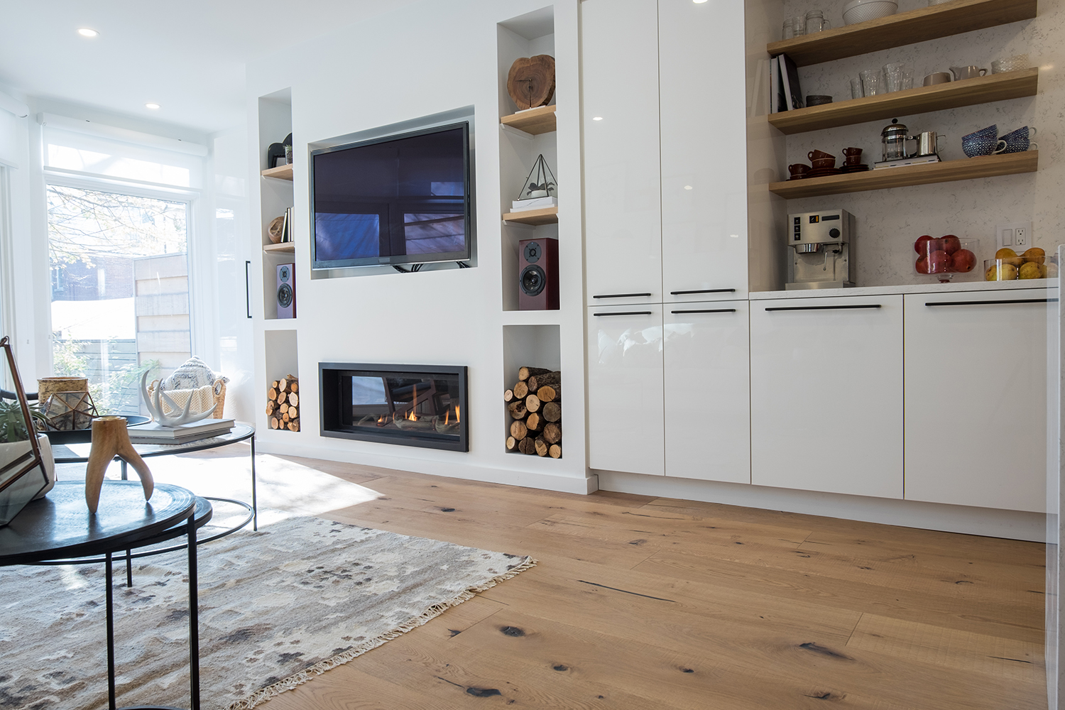
Sleek Storage
There may have been plenty of exposed pipes and other unsightly elements before Jonathan got his hands on this house, but thanks to built-in cabinetry, the new space looks refined and purposeful. The hardwood flooring adds rustic character, while the glossy white built-ins bring the look into the now.
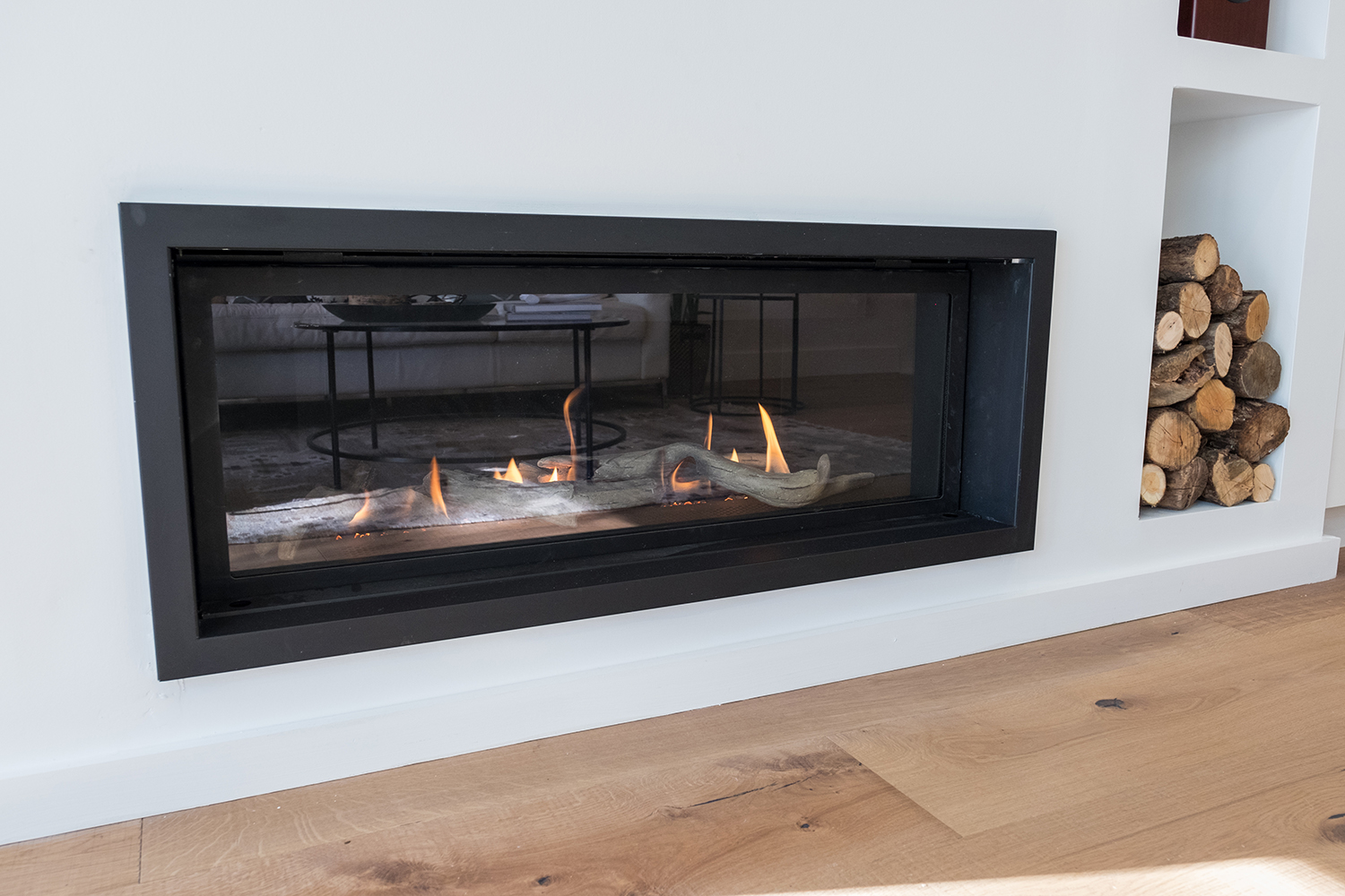
Modern Flame
This built-in fireplace offers a cozy and modern touch, and its sleek style doesn’t take up precious real estate. This model might not burn real wood, but we love how Jonathan still incorporated stacked logs into the room’s design.
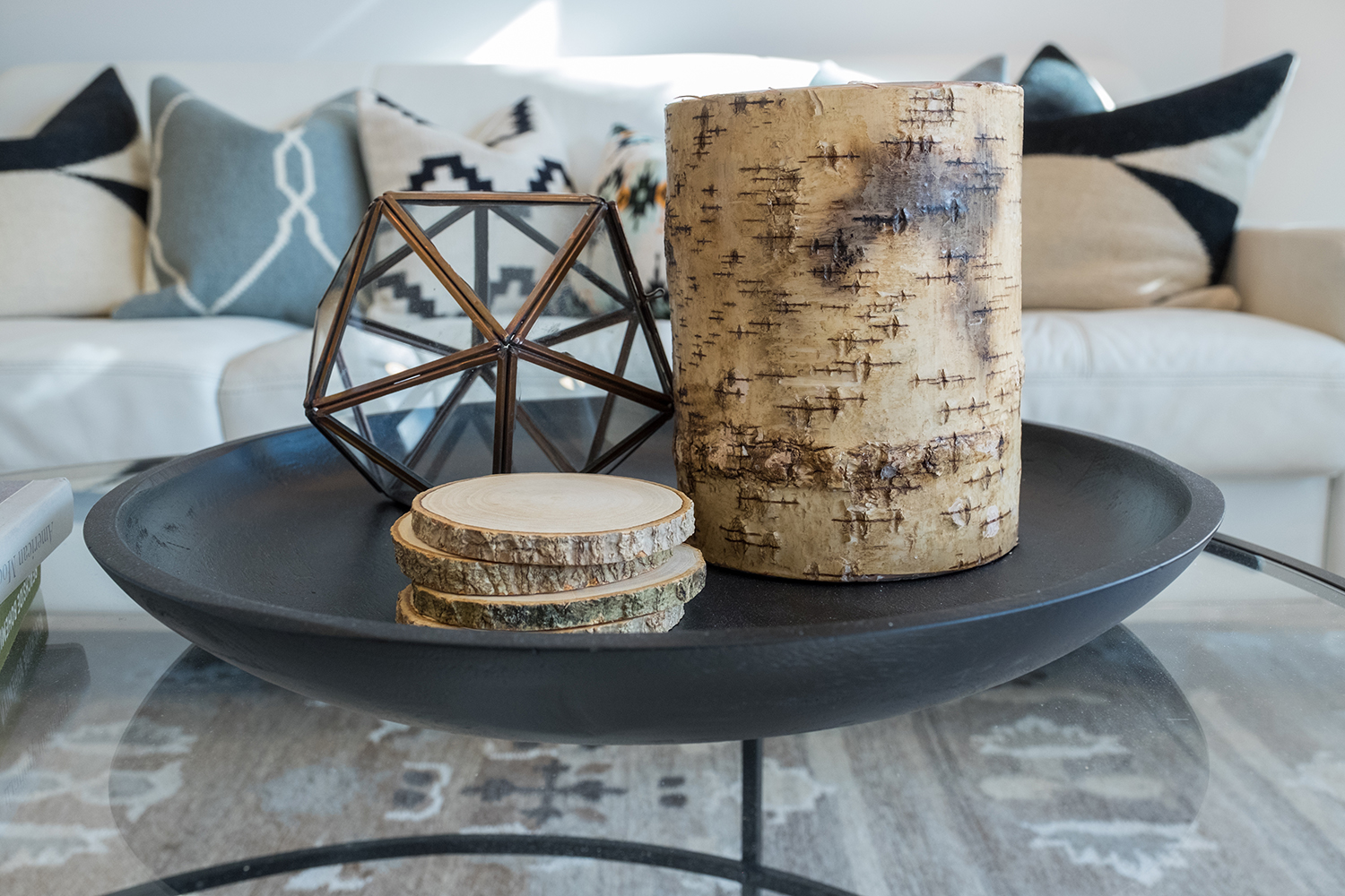
Wood Finishes
The fireplace surround isn’t the only place Jonathan incorporated wooden elements. The living room reiterates the home’s cozy contemporary theme thanks to modern furniture and birch-inspired accents.
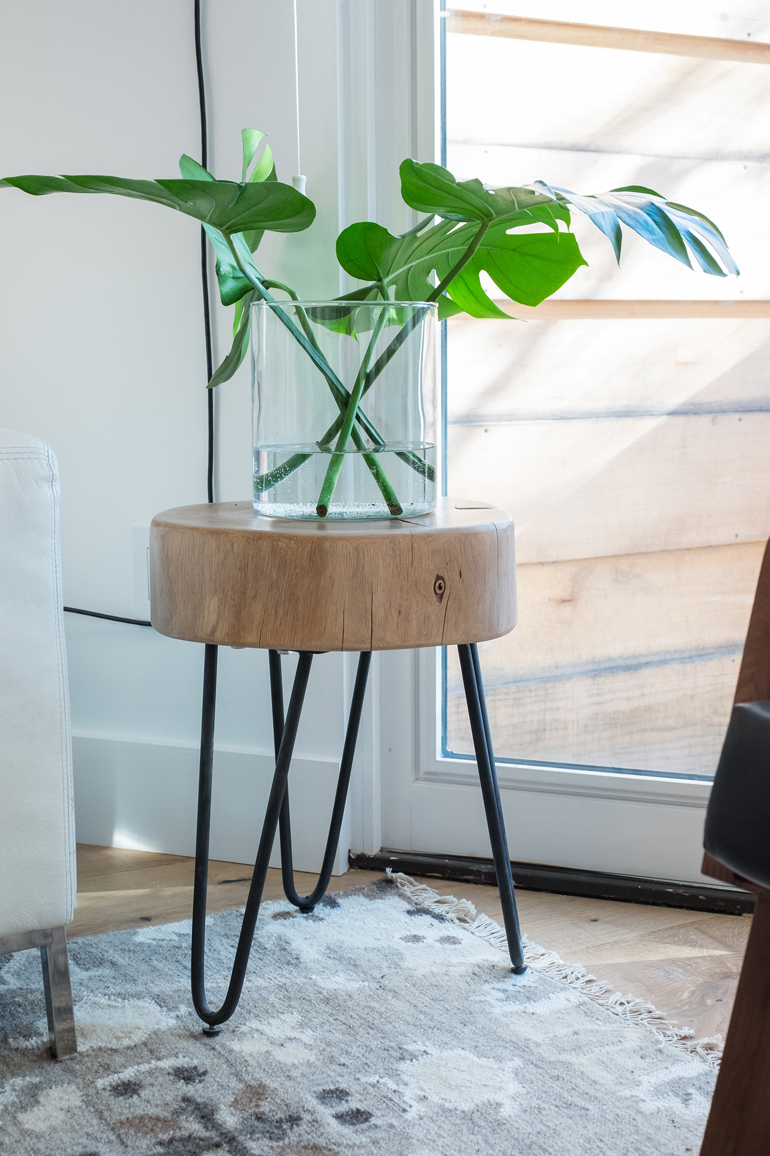
The Great Outdoors
This accent table is the perfect mix of rustic and modern thanks to its wooden surface and slender iron legs. We especially love the glass vase brimming with simple greenery to help bring the outdoors in.
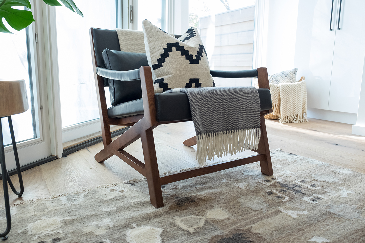
Snuggle Up
To give a modern chair a cozy upgrade, Jonathan decked it out with a throw pillow and blanket. It’s simple touches like these that create character and add warmth to a space.
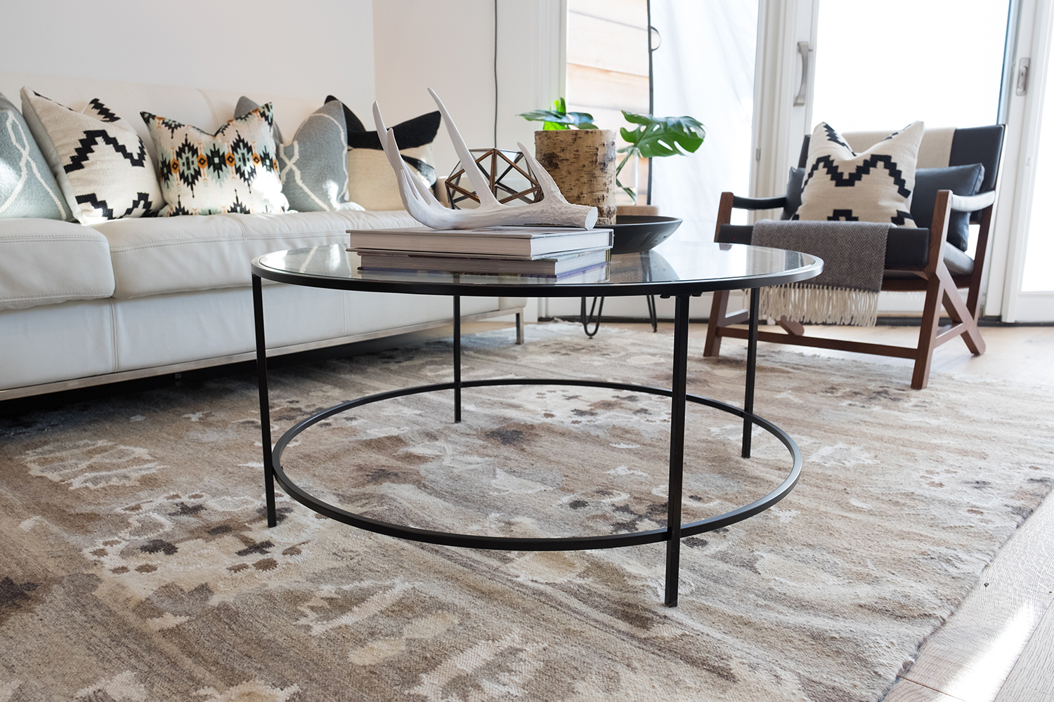
Looking Glass
Glass is a modern component that, when used in moderation, can add a beautiful finish to a cozy room. In this case, Jonathan kept it simple by adding a glass coffee table with a dark frame. The result is an ultra-stylish area that’s still highly functional.
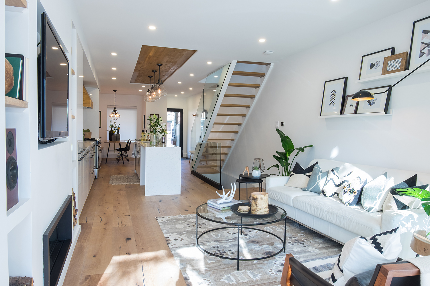
Long and Narrow
Just because you have a narrow space doesn’t mean you can’t achieve that open-concept feel. Jonathan removed a few walls from this original living space to create a bright and elongated space that still features distinct zones (read: the living area and kitchen).
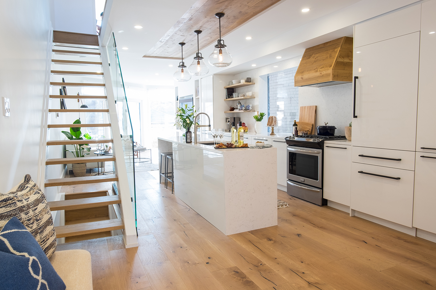
Crafty Kitchen
Given the narrow floor plan, Jonathan made the most of the kitchen by opting for a galley design and incorporating a small island. The rustic lantern-style pendant lights hang from a wooden panel cut into the otherwise white ceiling. Meanwhile, the modern staircase with a glass railing feels like an art installation of its own.
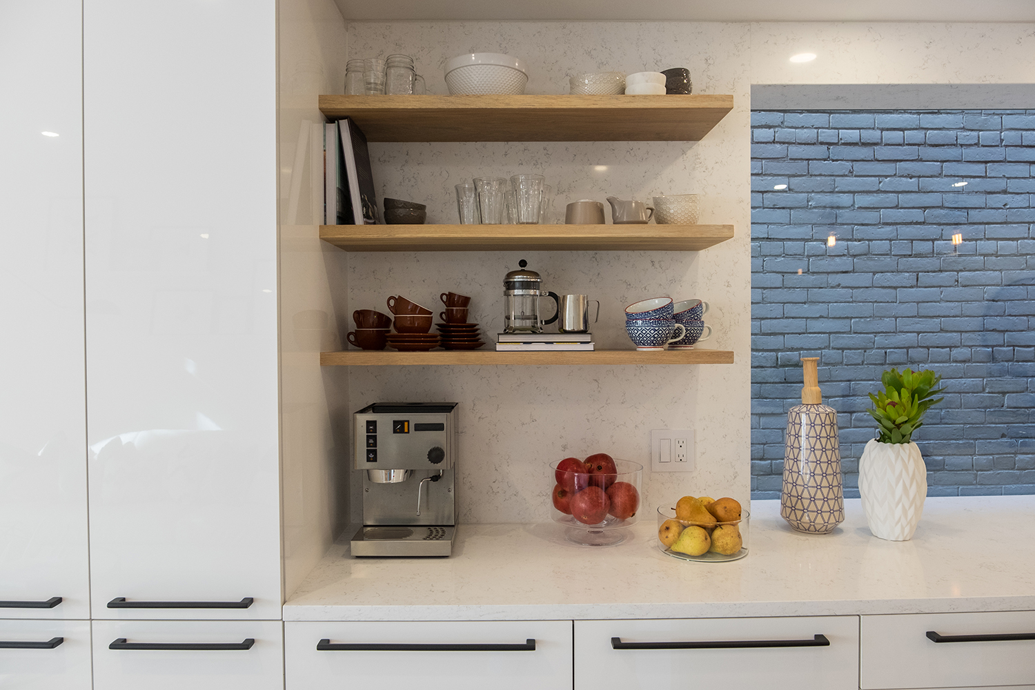
Crafty Corners
The wooden elements don’t stop in this kitchen. In one corner, Jonathan built on the rustic look via sturdy floating shelves. The open storage solution is perfect for highlighting pretty tableware and serving dishes, or for displaying cookbooks.
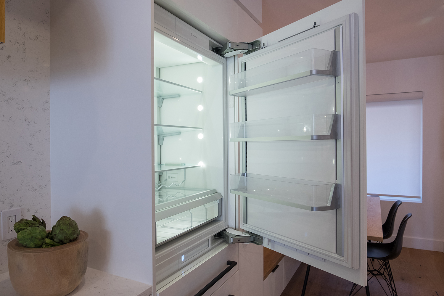
Built-In Convenience
Rather than bogging down the kitchen with too many stainless-steel appliances, Jonathan opted for an integrated fridge that seamlessly blends into the built-in cabinetry. The result is a sleek look that’s also incredibly functional.
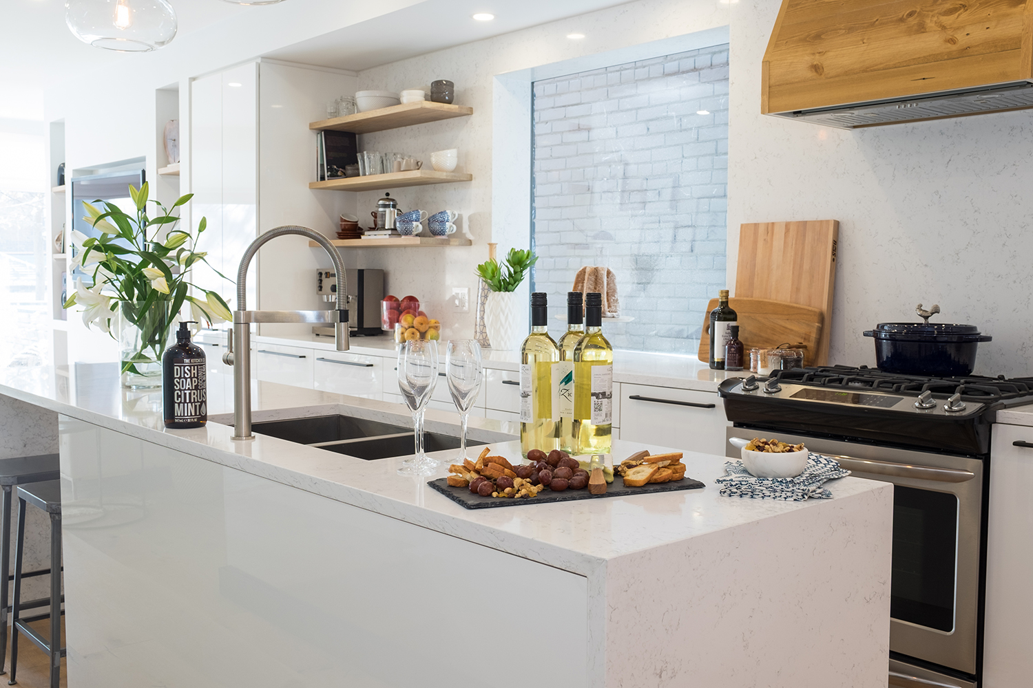
Island Living
By building the sink into the island and placing the stove across from it, Jonathan balanced out the stainless-steel notes to create a more cohesive look. Simple wood pieces like the range hood and cutting boards ensure the rustic vibe isn’t lost in the space.
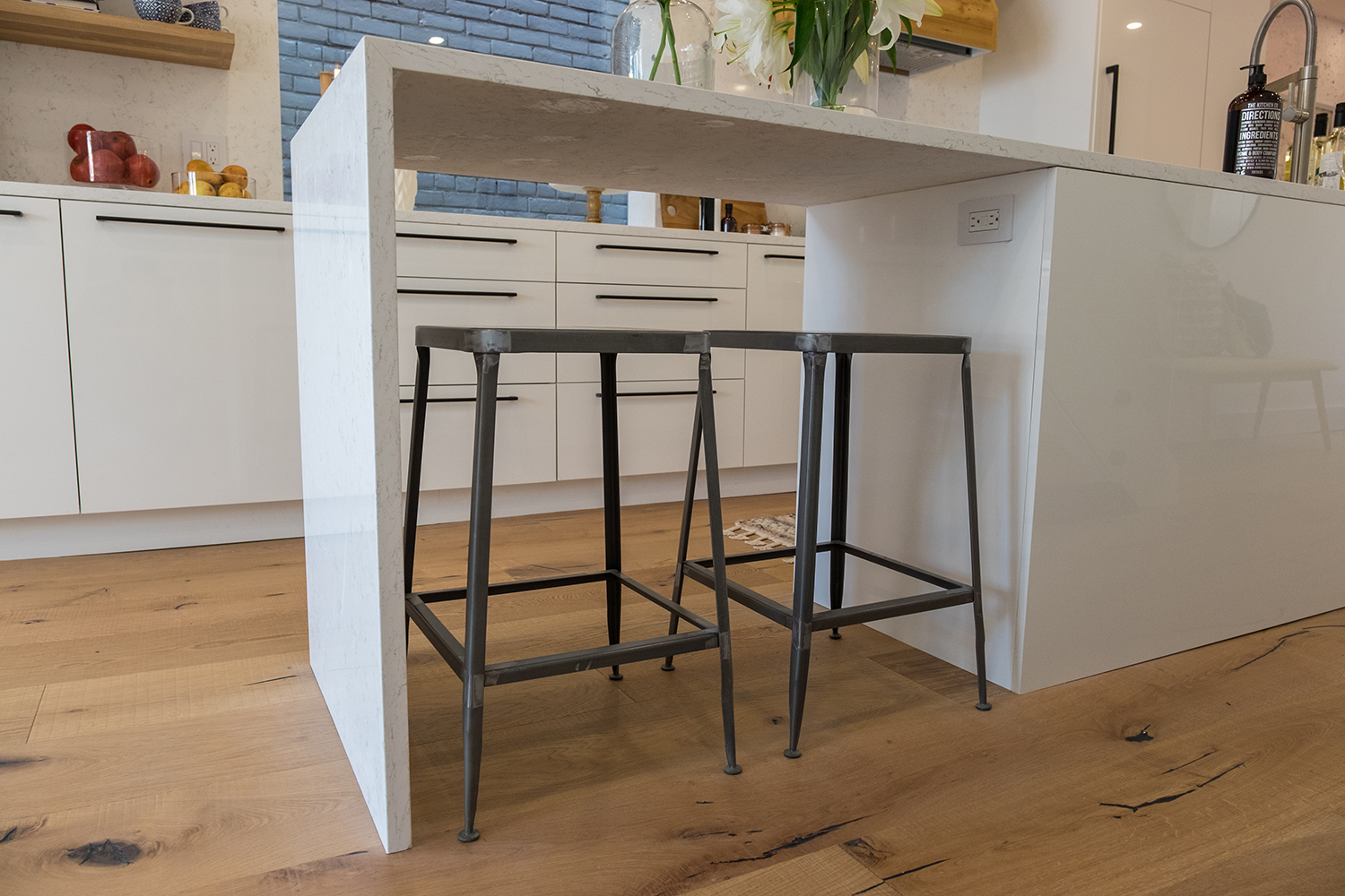
Maximized Space
Rather than adding bulky island chairs, Jonathan opted for sleek industrial-style stools that tuck underneath the island when not in use.
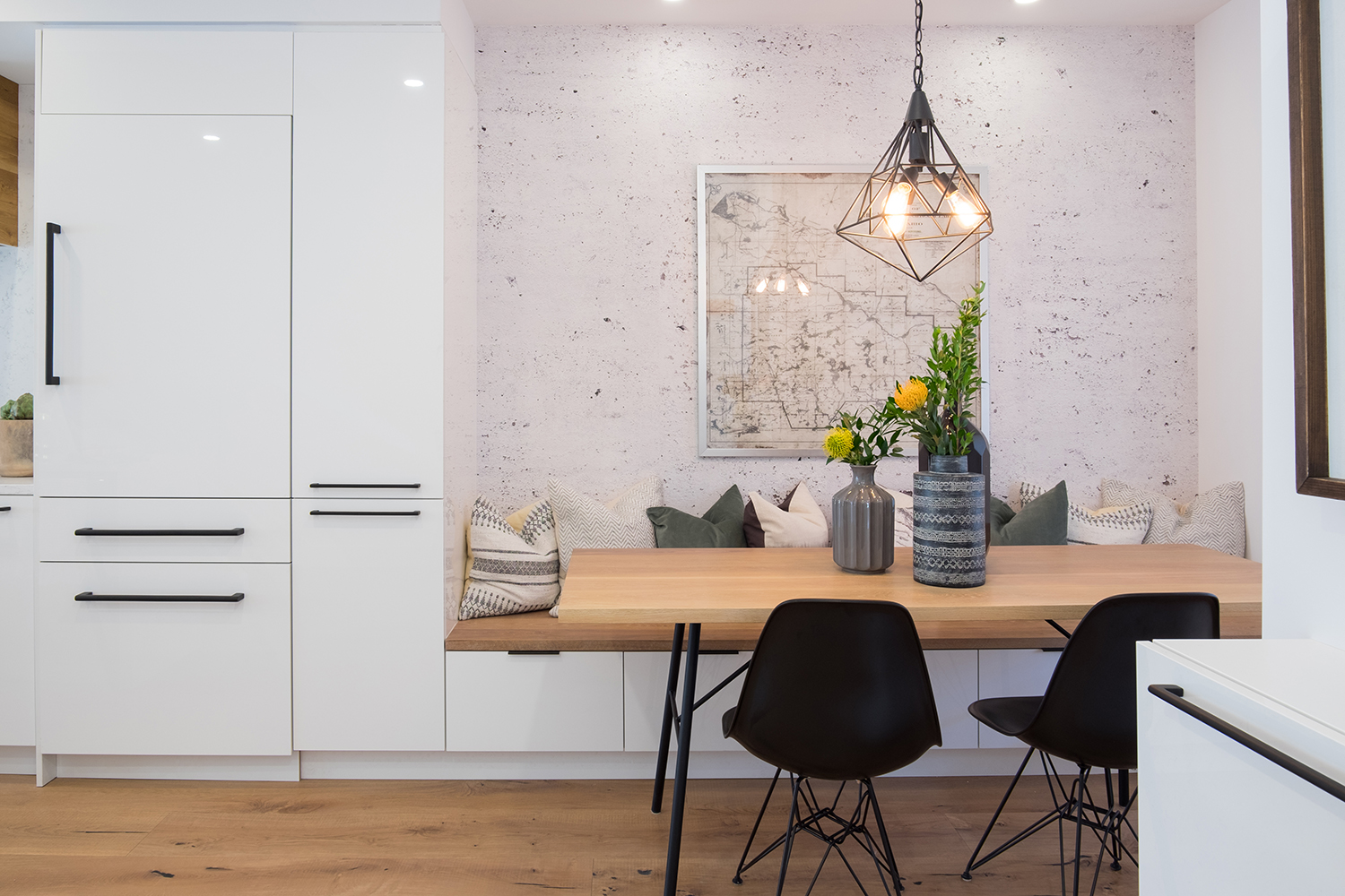
Creative Dining
With space at a premium, Jonathan decided to create a cozy dining nook rather than a full-blown eating space. That meant crafting a built-in bench paired with a beautiful wood table perfect for hosting guests.
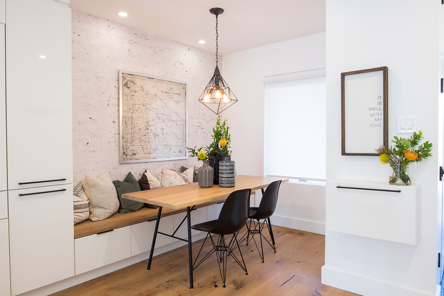
Bright and Airy
The eating nook’s large window helps open up the space, while the stark black chairs add a dramatic note. Cozy throw pillows make the space more welcoming, and the map art piece lends an urban feel. Add in a geometric pendant light and fresh flowers in sculptural vases and you end up with an entertaining haven.
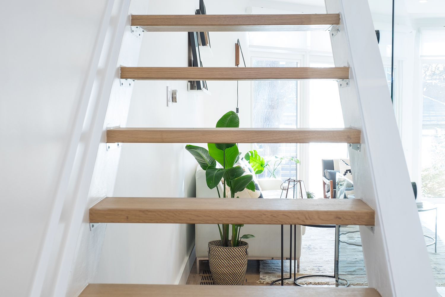
Modern Stairs
The modern, minimalist design of these steps helps open up the living space, allowing the natural light bounce throughout the home.
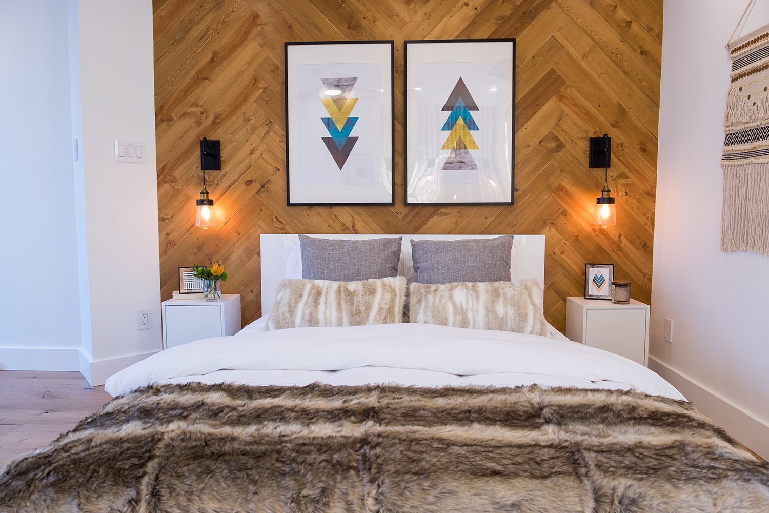
Feature Wall
The couple was adamant about having a wooden feature wall, which Jonathan happily provided via this beautiful design. The zig-zag panelling adds depth and texture, while the wall-mounted lamps are another great way to conserve space. Neutral colours and rich textures also add to the room’s chic Scandi-inspired look.
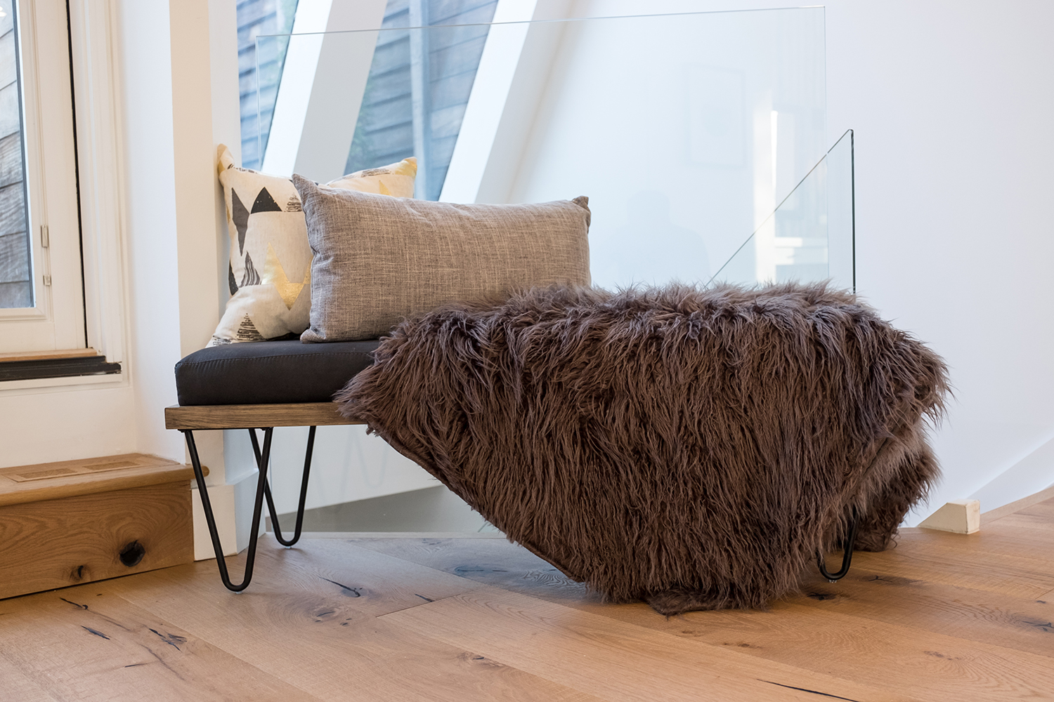
Lounging Out
A small modern stool is topped with a faux fur throw and complementary throw pillows. Together they add a fun finish to this lofty bedroom.
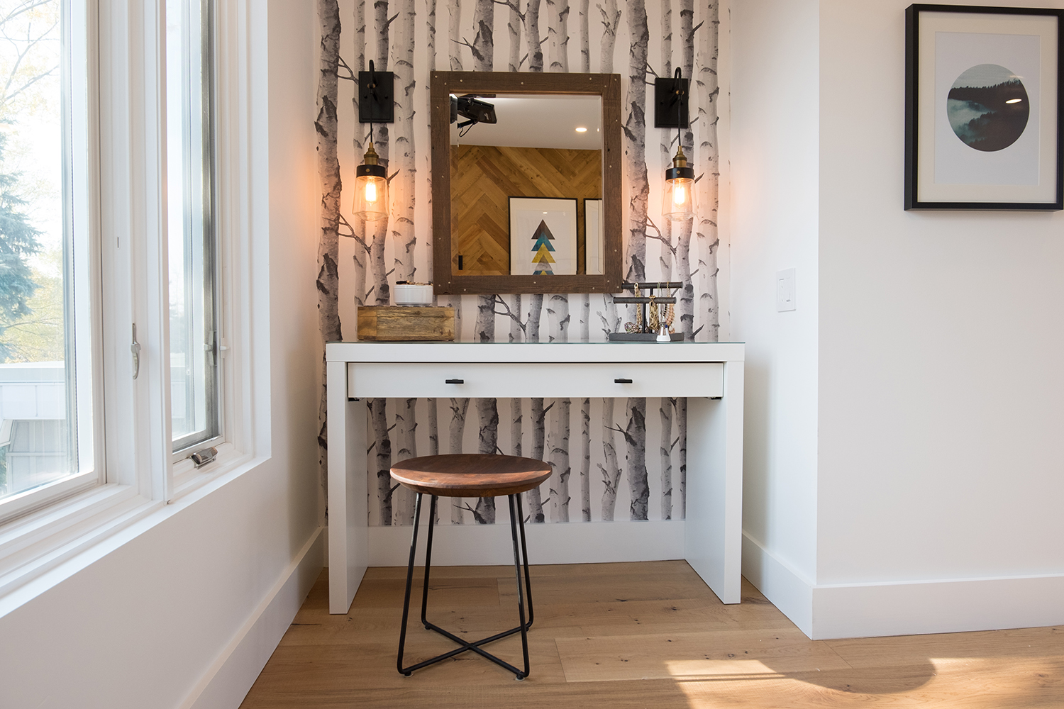
Dressing Table
We love the way Jonathan incorporated birch-inspired wallpaper into bedroom’s dressing area. The wooden mirror and stool reinforce the room’s nature-inspired vibe, while the sleek white table adds a contemporary feel. It’s finishing touches like these that not only increase the value of a property, but will have the homeowners loving their new and improved space for years to come.
HGTV your inbox.
By clicking "SIGN UP” you agree to receive emails from HGTV and accept Corus' Terms of Use and Corus' Privacy Policy.


