Designer Janet Scagel didn’t have to look far for inspiration when transforming this new 1,200-square-foot White Rock, BC condo. In fact, she just had to glance out of one of its many floor-to-ceiling windows. “The home has spectacular ocean views and owners Brent and Corina Strive, and their 20-something son, Brendan, are avid surfers,” she says. “My vision was a calm seaside look that was contemporary and comfortable.” See how she used natural materials and a mix of modern and classic elements to do so.
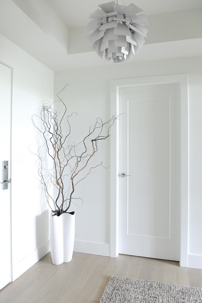
All in the Details
While many see a hallway as a transitional space to pass through, Janet sees it as a spot to create drama with carefully chosen accents that are a savvy mix of natural beauty and man-made elegance. Here, an “artichoke” chandelier (a Poul Henningsen replica) and an arrangement of curly willow branches have artful impact in an otherwise utilitarian space.
See here for 15 Plant-Filled Spaces for Serious Decor Inspiration.
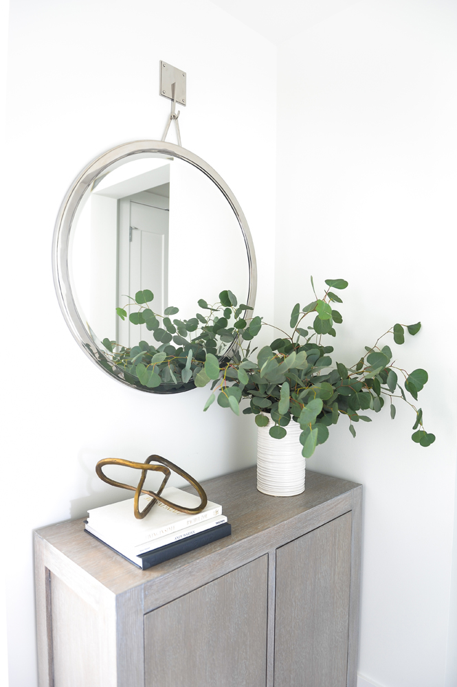
Made to Order
Janet custom-designed the front hallway’s grey-stained rift-oak cabinet to feature closed storage and a tableau for interesting objects. The modern mirror, from Restoration Hardware, helps define the space, and the arrangement of eucalyptus adds a fresh, natural element.
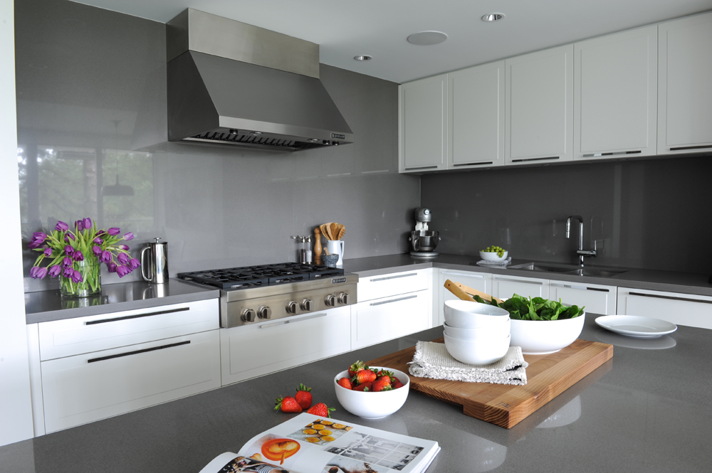
Making a Splash
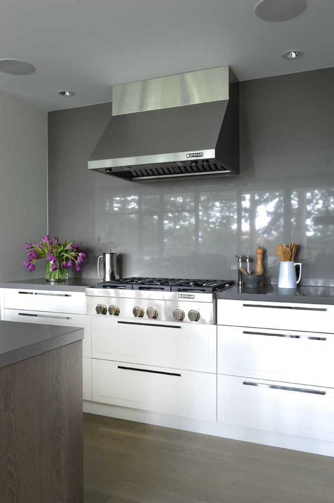
The developer of the condo fitted the kitchen with a stunning feature: backsplashes of seamless, glossy grey glass. Its cool tones inspired Janet’s colour choices in the other rooms and it feels whimsical and fun in a way many small tiles wouldn’t. She says, “I love interiors that aren’t too serious.”
Here’s everything you need to know about Common Kitchen Renovating Costs.
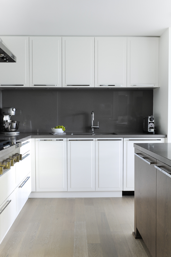
Nice Flow
The seamless feel of the backsplash continues in thoughtful details, such as the Caesarstone countertops. Presented in the same colour as the backsplash, they create a fluid continuity. White cabinets that extend all the way to the ceiling maximize storage and blend in with the walls and ceiling. The chrome pulls are another design link, as they are used throughout the condo and help bring the space together.
See here for 20 Timeless Kitchen Cabinet Ideas for Your Next Remodel.
High Gloss
This backsplash would look stunning anywhere, but its glossy finish is ideal for reflecting the view to White Rock’s idyllic setting of trees and the ocean – a finish to keep in mind when decorating a kitchen with vistas worth showcasing. We also love the use of the range top here – it is just the top (the ovens are built into a different bank of cabinets) and the drawers beneath it keep the kitchen design, rather than a stove, the focal point.
Recipe for Success
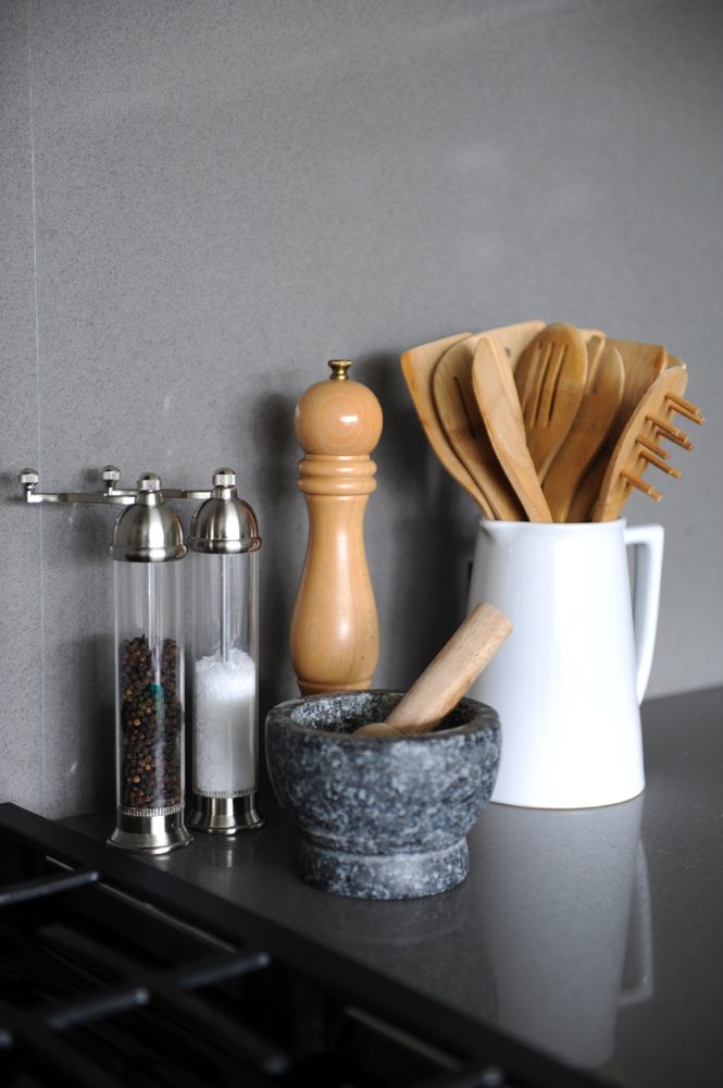
This kitchen counter vignette and its mix of materials sums up Janet’s design ethos. “Throughout the space, I married natural distressed wood, earthy log tables, linens and wools with steel, concrete and glass. Blending modern with classic elements adds a dash of fun.”
The Great Indoors & Out
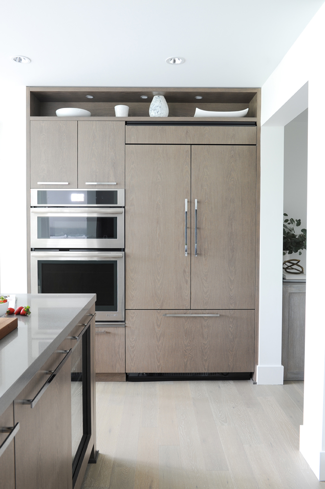
This angle of the kitchen shows off the built-in wall ovens and an interesting choice of cabinetry colour. In keeping with the room’s white and grey tones, the muted neutral cupboards recall driftwood and create much more interest than white finishes would. They also tie in nicely with the living room console Janet had custom-made using knotted alder wood. Like the rest of the home, the look speaks to the great outdoors, something the West Coast surfer owners of this condo love.
Floor Manager
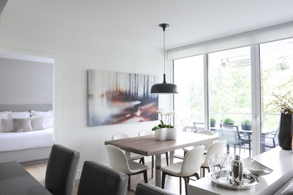
Though open-plan spaces can be tricky to decorate, even more so when they’re on the small side, Janet wasn’t fazed. “I basically custom-designed all the furnishings for this floor,” she says. “It’s always a challenge when you have limited space and want everything to be the perfect proportion and scale, so customization made sense here.”
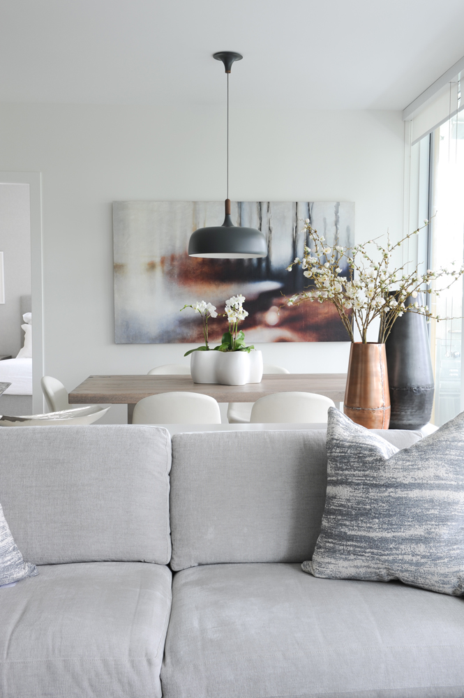
Nice Framework
We love how Janet positioned the custom-designed furnishings to define specific areas and how she didn’t limit her expertise solely to furniture placement. Note the two vases on the table behind the sofa – they introduce colour, a pretty arrangement of branches and keep the eye moving, drawing attention to the dining table’s centrepiece, pendant light and artwork. They frame the space and inject lively continuity.
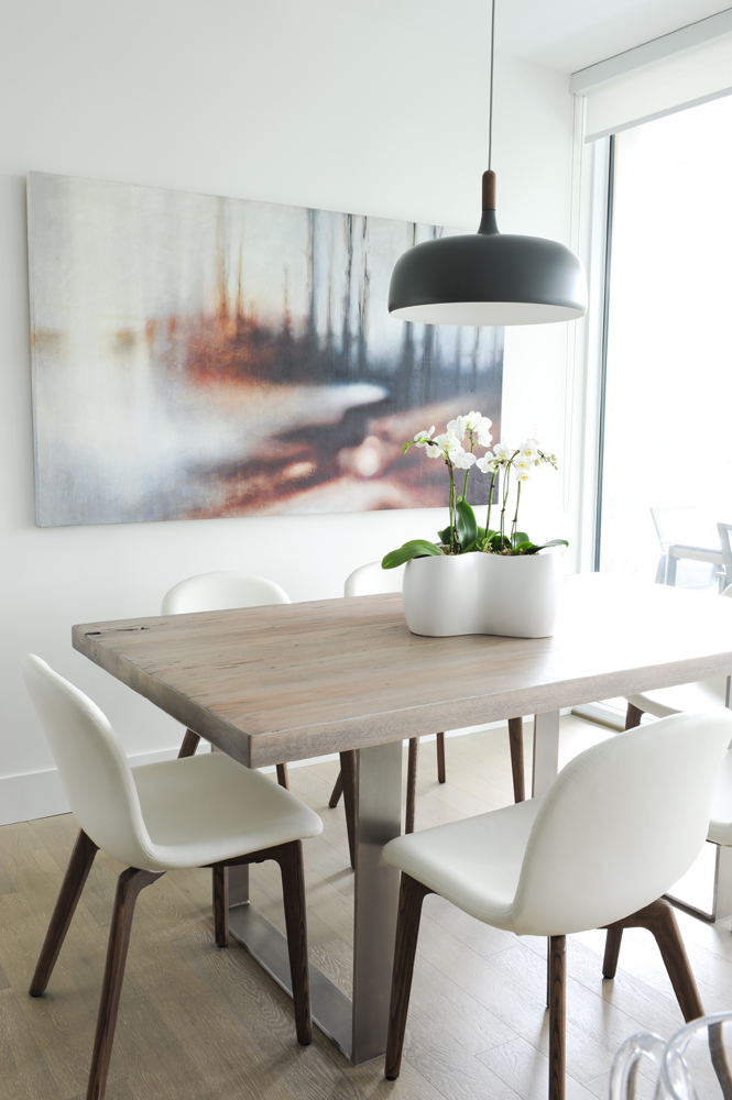
Beach Day
“I hired a contact who works on film sets and construction to build the dining table,” says Janet. “His team aged the solid oak top to look like it had washed up on the beach.” She once again uses scale to great designer effect, here in artwork that mimics the proportions of the dining table for distinctive balance. The original painting is by local artist Galen Felde, and the single black pendant was designed by Atle Tveit.
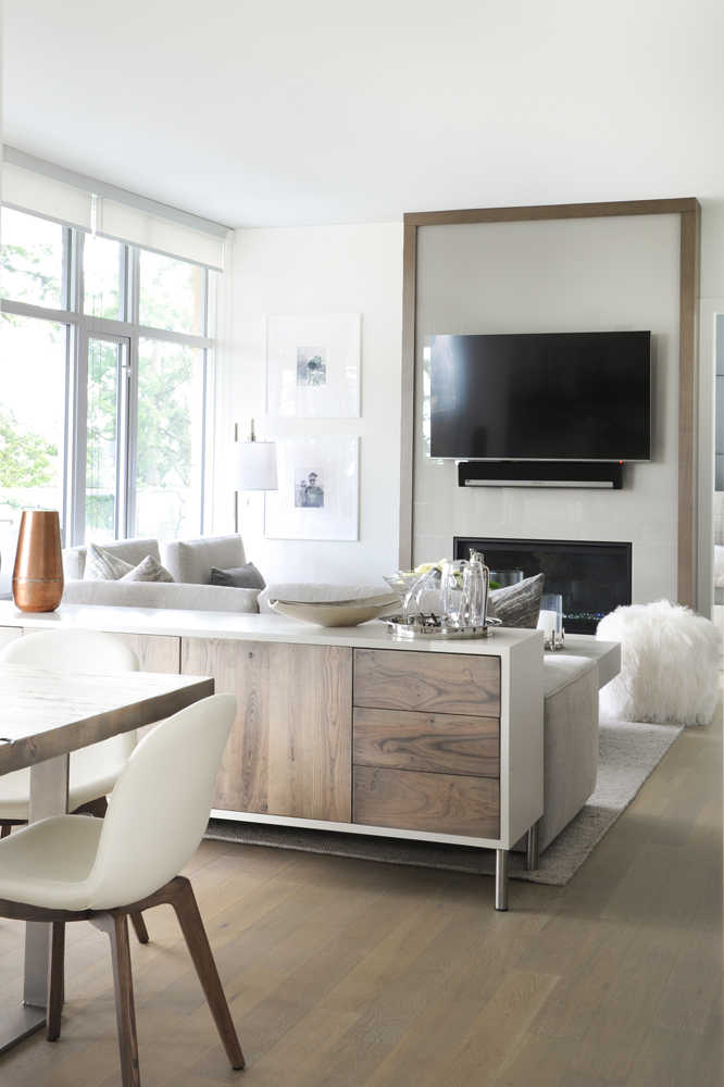
Knot What You’d Expect
The custom-made console dividing the living and dining areas has an interesting and opinionated provenance. “My manufacturer is an old-school European craftsman and he couldn’t understand why I wanted wood with open knots in it. He kept showing me beautiful select-grade woods, so I had to go out back to his ‘bone yard’ to select B-grade alder with knots. He thought I was crazy.”
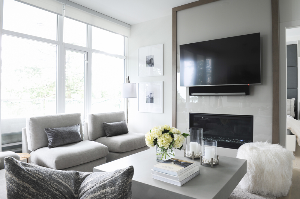
Totally Casual
The living room exemplifies the condo’s palette. “The colours for the entire home are visible in the living room’s design,” says Janet. “The greys and whites emulate the ocean. And, as the homeowners are avid surfers, they wanted an interior that was calm and beachy yet also sophisticated. To that, I suggested hiding the TV with a surround, but they liked the honesty of it showing. Again, nothing fussy suited them fine.”
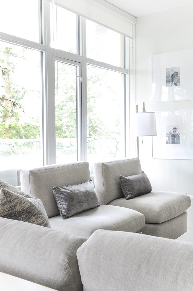
Nice View
“I kept the living room’s furniture profile low so as not to block the perspective and keep the space open yet separated,” says Janet. The custom-designed slipper chairs are covered in Romo fabric. “Layering in warm textural fabrics in heavy woven linens and wools keeps the cool tones soft and inviting.”
Designer Tricks
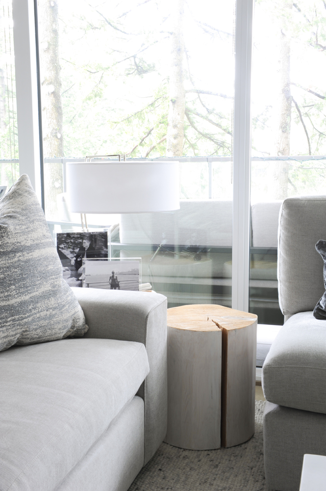
This side table was originally too yellow for my liking,” says Janet. “I took white paint to it and ragged it on myself. I didn’t tell the clients this until after they told me they loved it!”
Going Grey
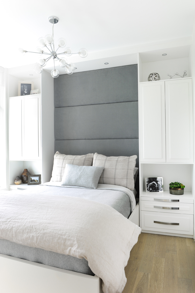
For this bedroom, designer Janet Scagel gave standard finishes a bespoke treatment. “This is the son’s room and these cabinets came with it – they were built by the developer,” she says. “I added in the panelled headboard and bedding.” We love how these two additions capture attention and soften the space, while still retaining a clean, masculine vibe.
Up Above
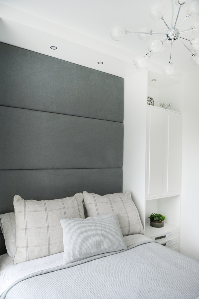
Though this room features serious shades of grey, the light fixture is pure whimsy. “It’s a sputnik chandelier and was a fun addition for the son.”
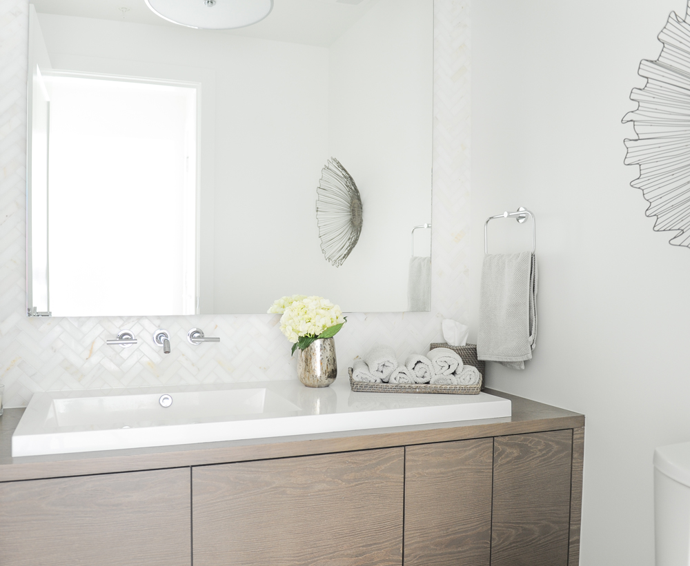
Finishing Touches
Accessories take this already handsome powder room to the next level. Fresh flowers, a tray of rolled hand towels and a wire sculpture inspired by a coral fan introduce soft lines and natural references, reminding us that powder rooms require more decoration than a candle and one towel.
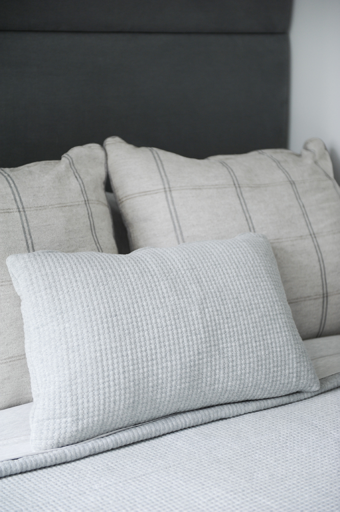
Cushy Job
Three neutral cushions dress the bed with a tailored and softening effect.
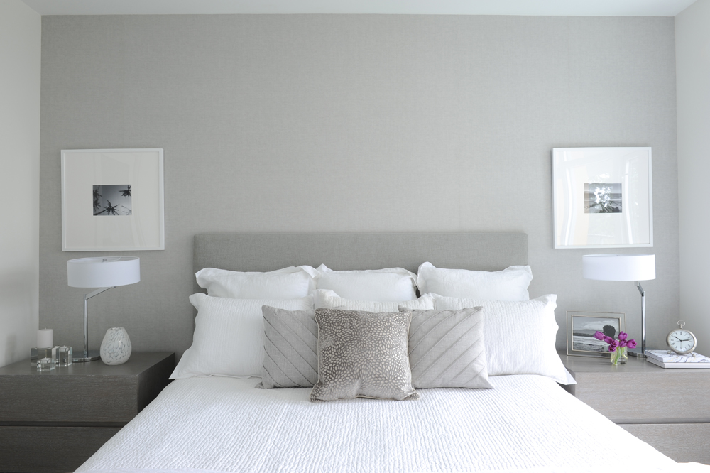
Master Retreat
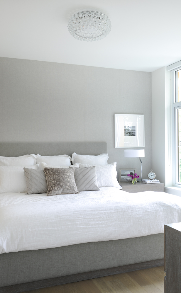
Janet relied on texture to impart interest in the condo’s master bedroom. “I had the custom-made bed covered in grey linen and covered the wall behind it in a beautiful silvery-grey grass-cloth wallpaper.”
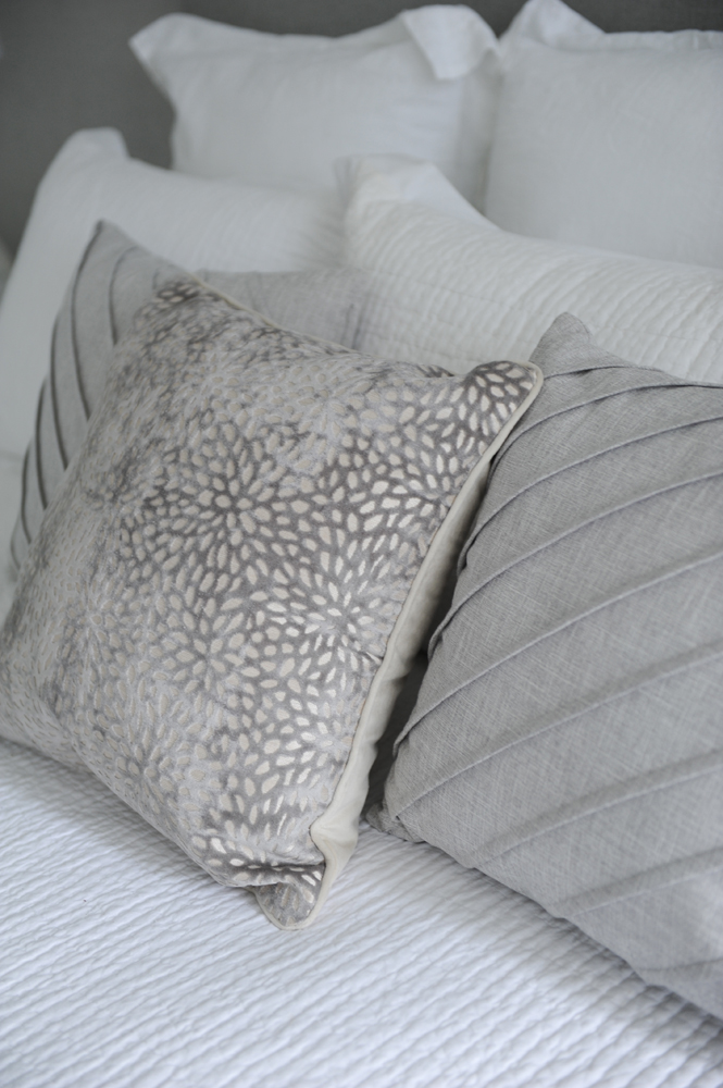
Touch-Me Textures
“The mix of textures and patterns in the cushions adds some variety and interest to this very monochromatic bedroom,” says Janet.
Add Some Sparkle
The bedroom’s light fixture is non-traditional in terms of scale and that is precisely why it appealed to Janet. “It is definitely small for a chandelier but I just love it, and how it adds to this space.” It’s an idea to steal too, as it imparts visual interest to an otherwise simple room.
Awash in Serenity
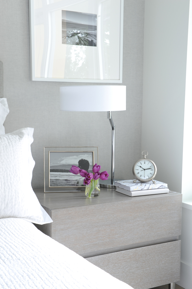
Stone-washed white linen bedding is a soft complement to the grey-stained rift-oak bedside tables that Janet custom-designed. We like how she hung black and white photos above these tables, rather than over the headboard, to create a soft symmetry and keep the grass-cloth the focal point.
Dressed to Perfection
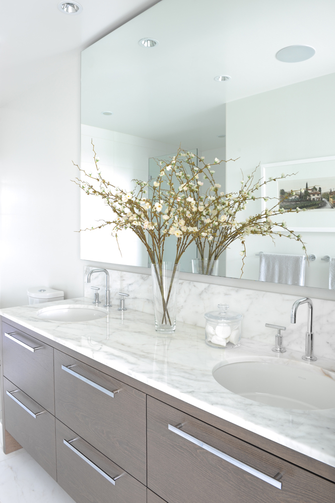
The sun-filled master ensuite, with its expansive marble-topped double vanity, presents a pretty perfect tableau. Janet energized it with personal mementos, such as framed artwork and natural touches, like this bunch of flowering branches. It’s another cheap-and-cheerful idea to steal, and just in time for spring.
HGTV your inbox.
By clicking "SIGN UP” you agree to receive emails from HGTV and accept Corus' Terms of Use and Corus' Privacy Policy.


