The hunt for the perfect starter house was really dragging Alexis and Tyler down. With sky-high prices in their desired area and not a lot of actual showmanship within those walls to write home about, they had pretty much written off the idea of ever being homeowners. So they called in best friends and contractors Mickey Fabbiano and Sebastian Sevallo for a little help. Here’s how the Worst to First duo took a regular old fixer upper and transformed it into the home of this couple’s dreams.
A Bright New Exterior
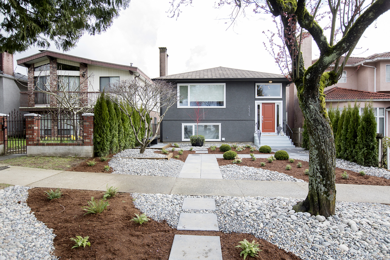
Before, this house didn’t exactly boast curb appeal, but a little landscaping was all that it needed. These all-season shrubs, complete with a rock garden and pathway don’t just mean that Alexis and Tyler will never have to mow the lawn again; they also transformed this home into one of the prettiest houses on the block. Add in a dramatic grey exterior and a pop of contrasting red with the front door, and this is a place you want to come home to.
A Modern Entrance
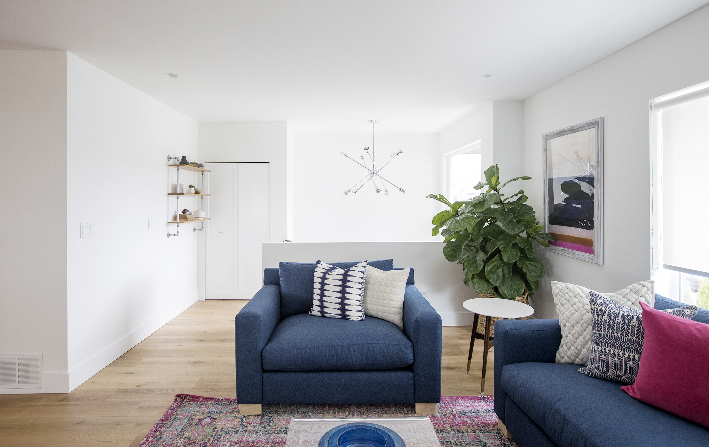
Once visitors get past the front door it’s important they’re greeted by warm and welcoming colours. Mickey and Sebastian took advantage of all the home’s natural light here by keeping the walls themselves white and bright, creating a sun-soaked welcome. Then, a little design appeal, like this contemporary light fixture, goes a long way in setting the home’s tone.
Statement Furniture
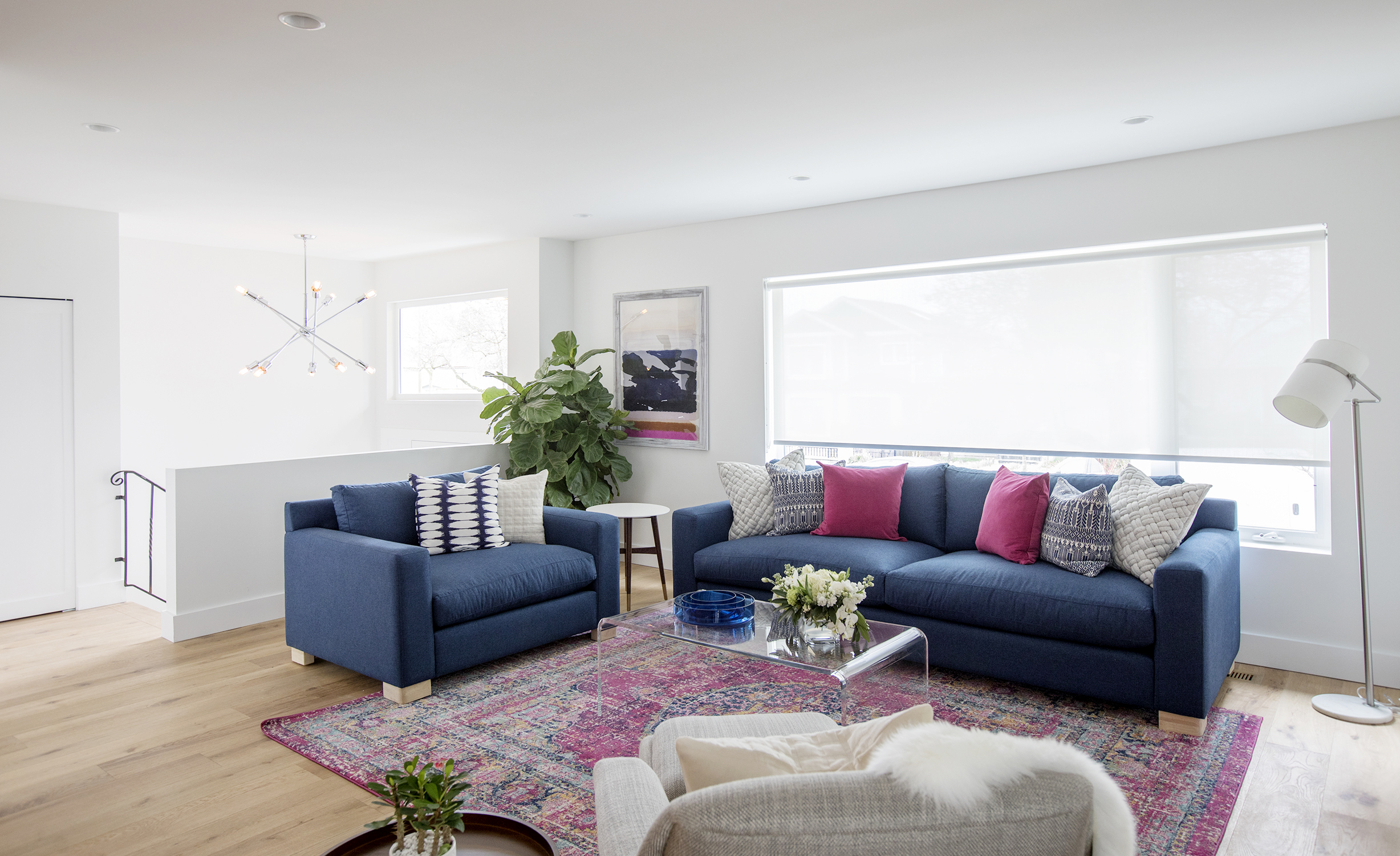
A great way to add bold colours and instant design appeal is in the pieces themselves. Here Mickey and Sebastian opted for a contemporary, rich blue to really bolster the look in the living room with this oversized arm chair and matching sofa. Meanwhile the deep reds of the toss cushions and area rug add even more dramatic effect, with a clear coffee table keeping the sight line clean and open.
An Open Concept
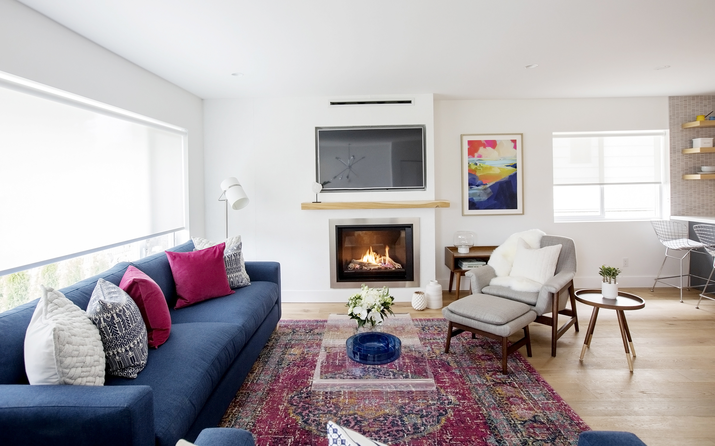
Open concept floor plans are a must-have these days, with homeowners opting for clean sight lines and large spaces in which to entertain and host. Mickey and Sebastian gave this couple exactly that by knocking down the wall between the living room and kitchen, completely opening up the space.
An Updated Fireplace
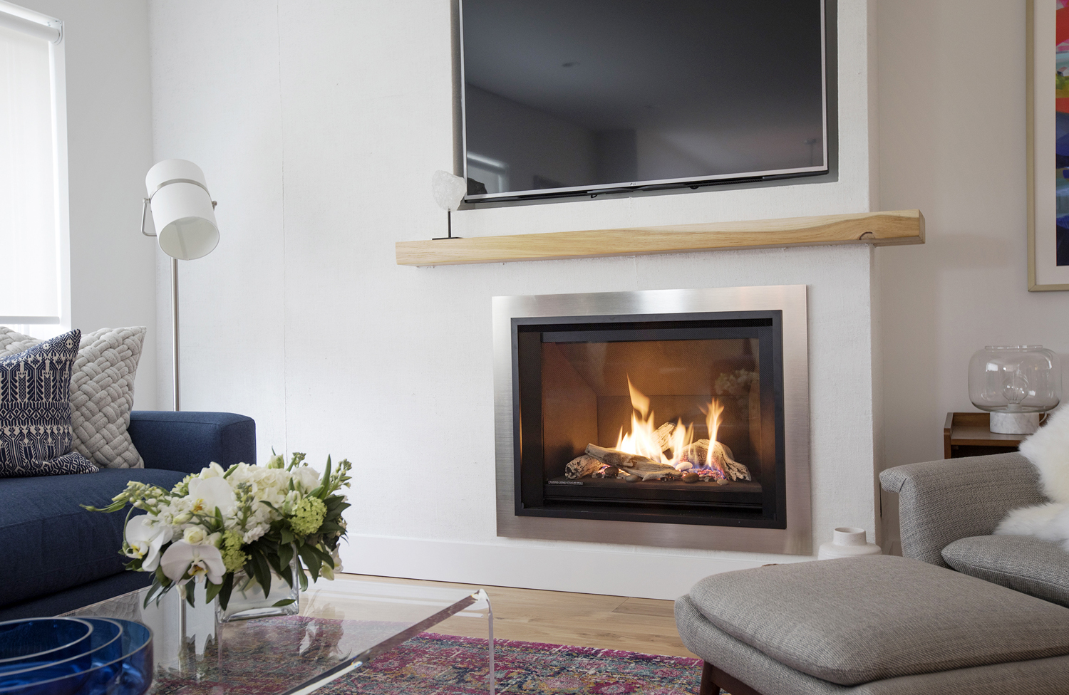
Few homeowners these days want your traditional wood-burning fireplace; gas and electric models are far more convenient and practical. Sebastian and Mickey turned this model into an art installation thanks to the built-in flatscreen above and the pretty burlap feature wall, which is dry-brushed white to add texture and a unique look to the space. A simple soft wood mantel completes the look.
No Wasted Space
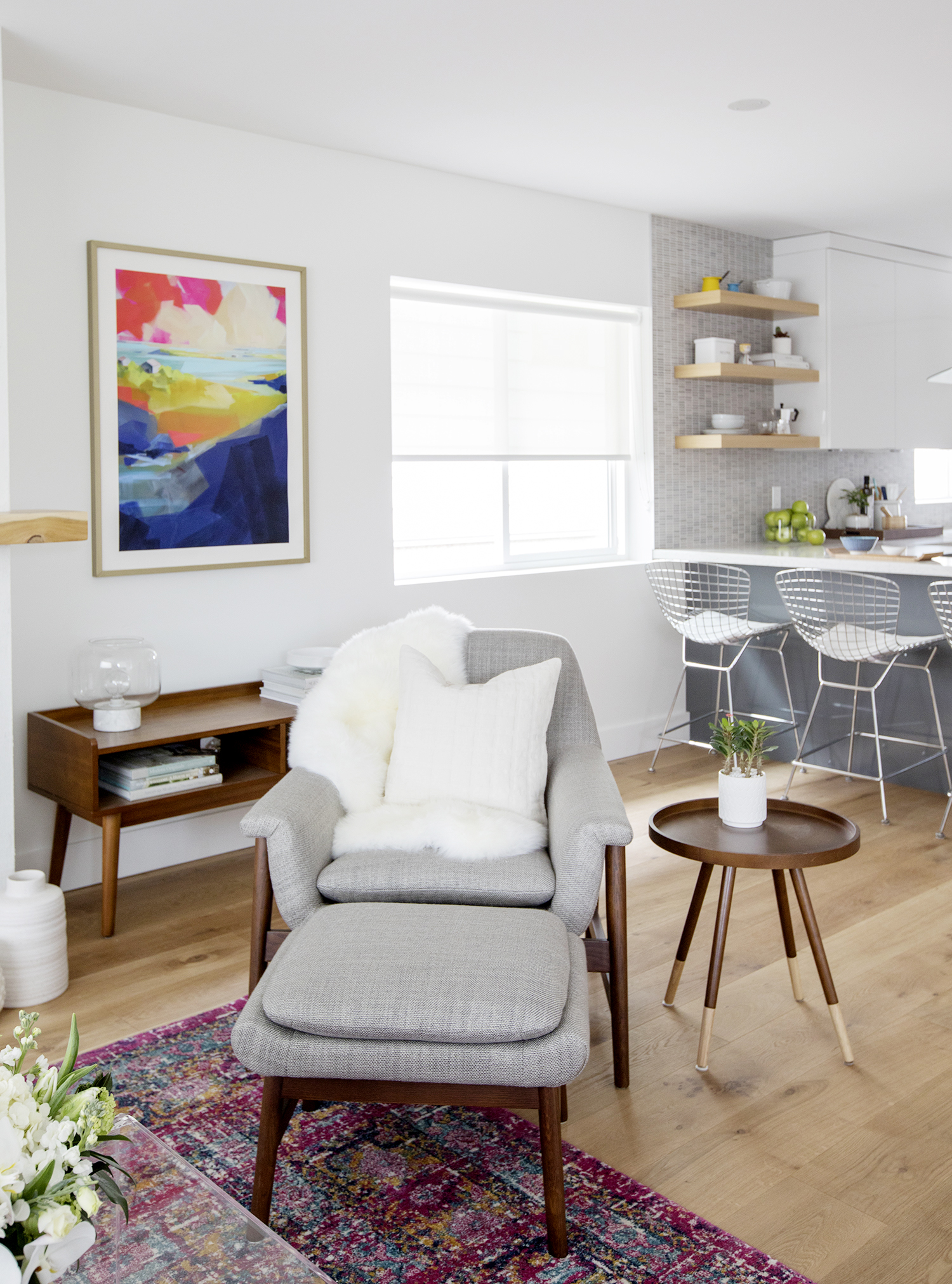
In an open-concept design it’s important to define each individual area in order to make the rooms feel separate and complete. Sebastian and Mickey divided the living room and kitchen space with another small arm chair in a soft grey. The colour pops against the brilliant area rug but its legs also tie into the stained side table and hutch along the wall.
An Oversized Island
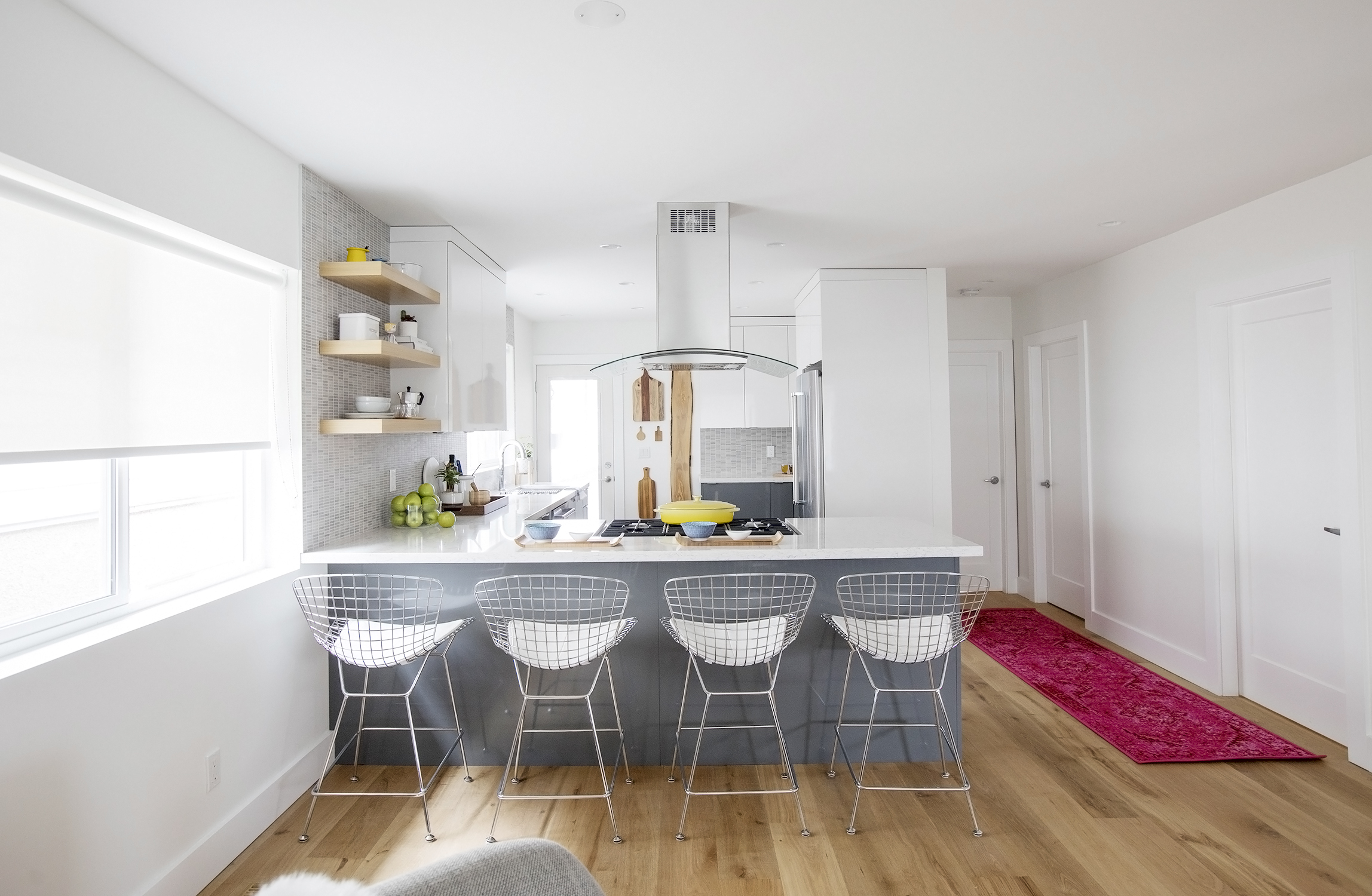
In order to get the most out of any kitchen, an oversized island is usually a must-have. This home was no exception, especially since the floor plan didn’t allow space for an actual dining area. The soft grey of the island itself transitions nicely into the living room, while the wire-backed bar stools add instant seating space.
Modern Appliances
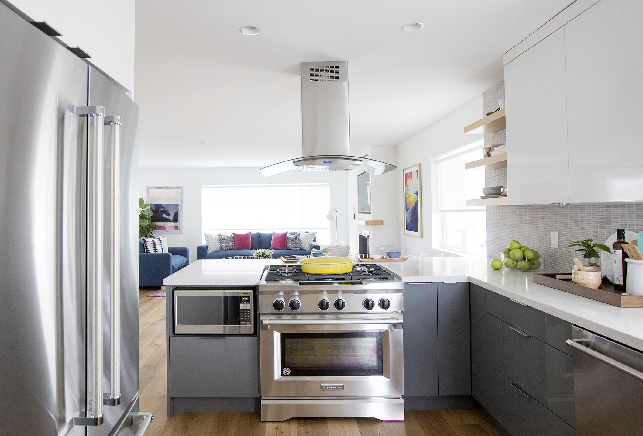
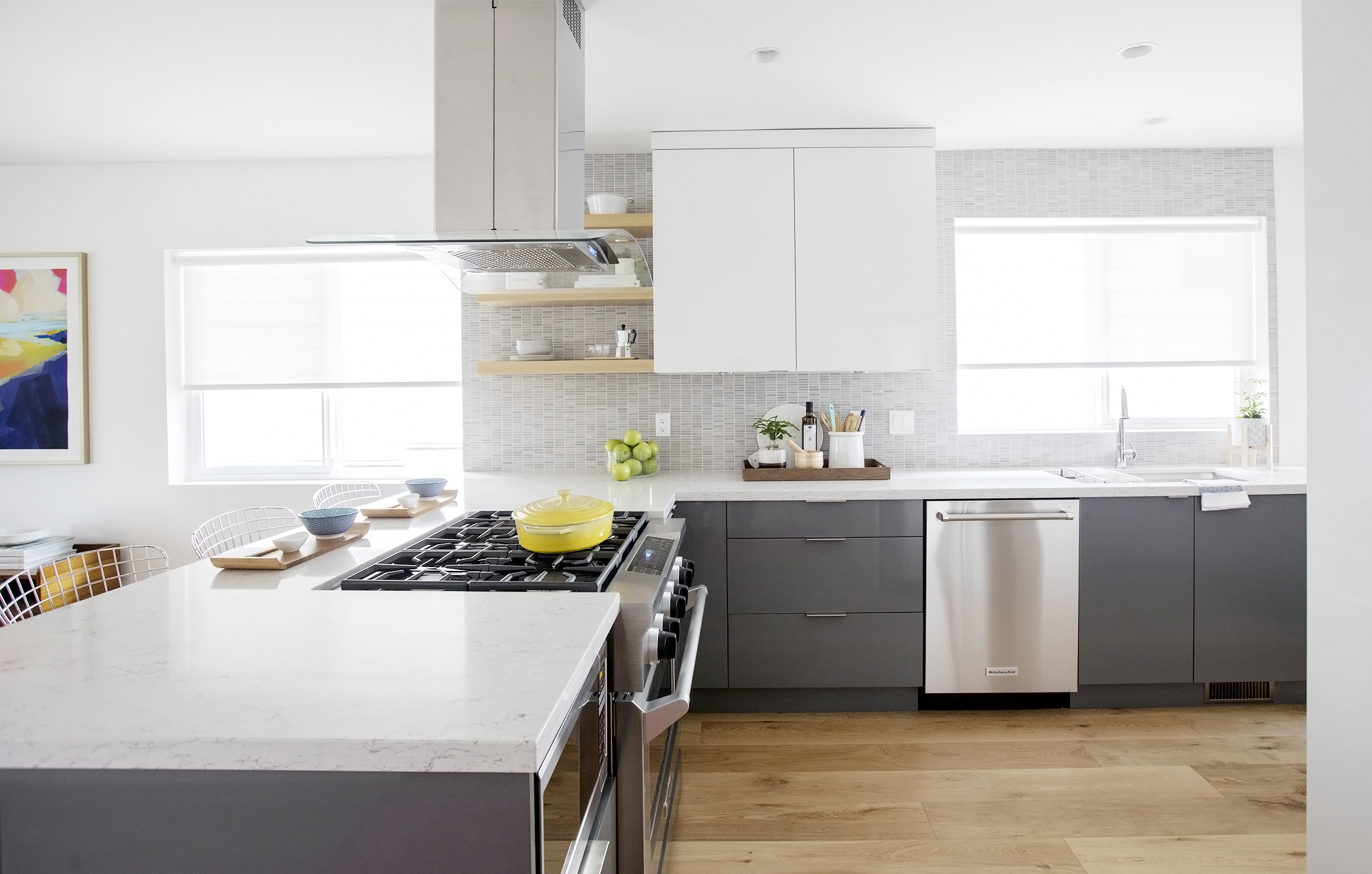
This state-of-the-art oven with its range top and four-way hood become a real focal point of the kitchen. Upgraded, stainless steel appliances like the fridge, dishwasher and built-in microwave are also essential for any modern new home, and are paired nicely with the flat, modern cabinetry in a corresponding shade.
Plenty of Natural Light
The oversized windows in this space allow lots of light to seep in, making the kitchen feel bright and open. Simple granite countertops add instant luxury, while the sink is well-placed below one of those windows in order to give a sensible, working flow to the overall floor plan.
Wrap-Around Cabinetry
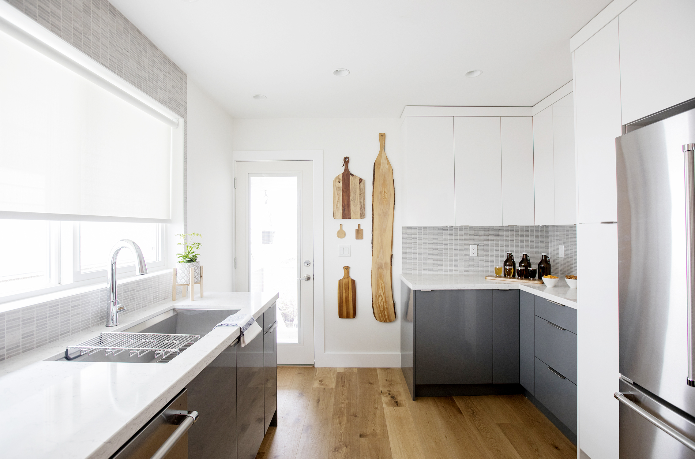
Kitchens never seem to have enough storage, which is why Sebastian and Mickey gave these homeowners plenty of storage options through wrap-around cabinetry. The units make use of every nook and cranny in this newly designed kitchen. Meanwhile extra details, like these brilliant live-edged cutting boards and soft hardwood flooring throughout help modernize and complete the look.
A Modern Backsplash
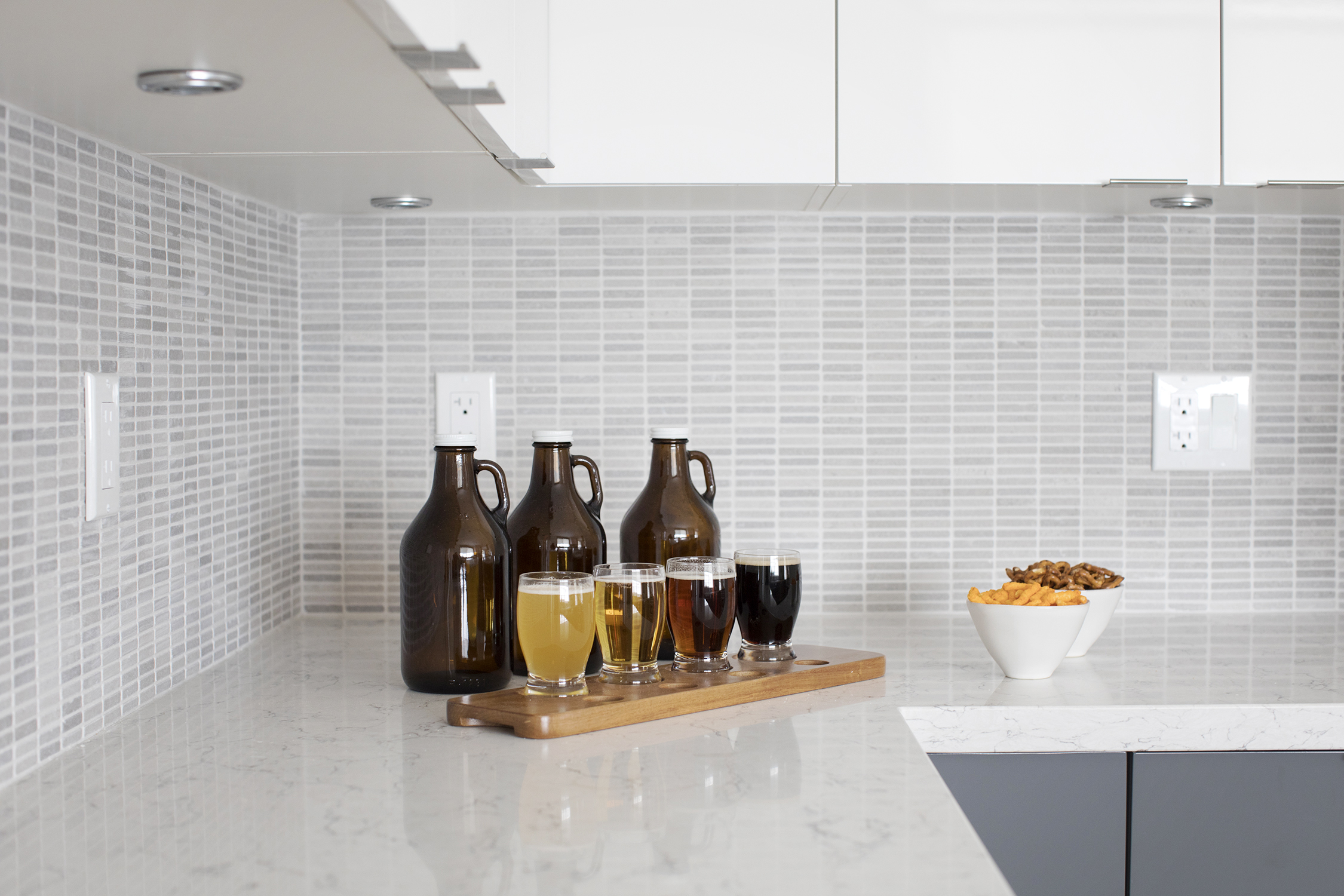
An eye-catching backsplash in a neutral colour is always in style; this one in particular is a marble brick variety that adds instant luxury and immediately draws the eye. Meanwhile staging a space like this with modern flights of fancy like this beer flight and some bar snacks help homeowners imagine the entertaining potential of their new space.
A Bold New Master
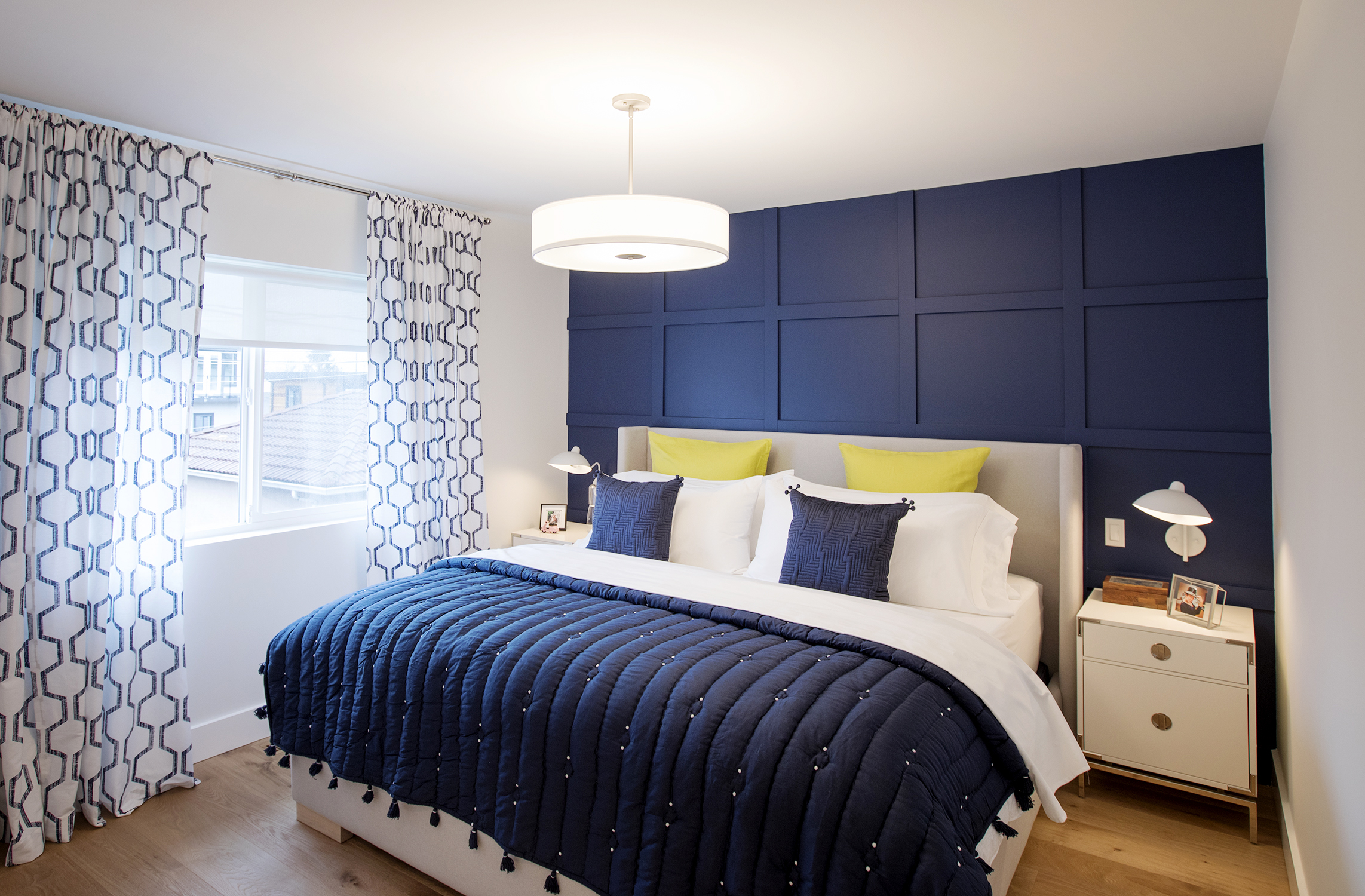
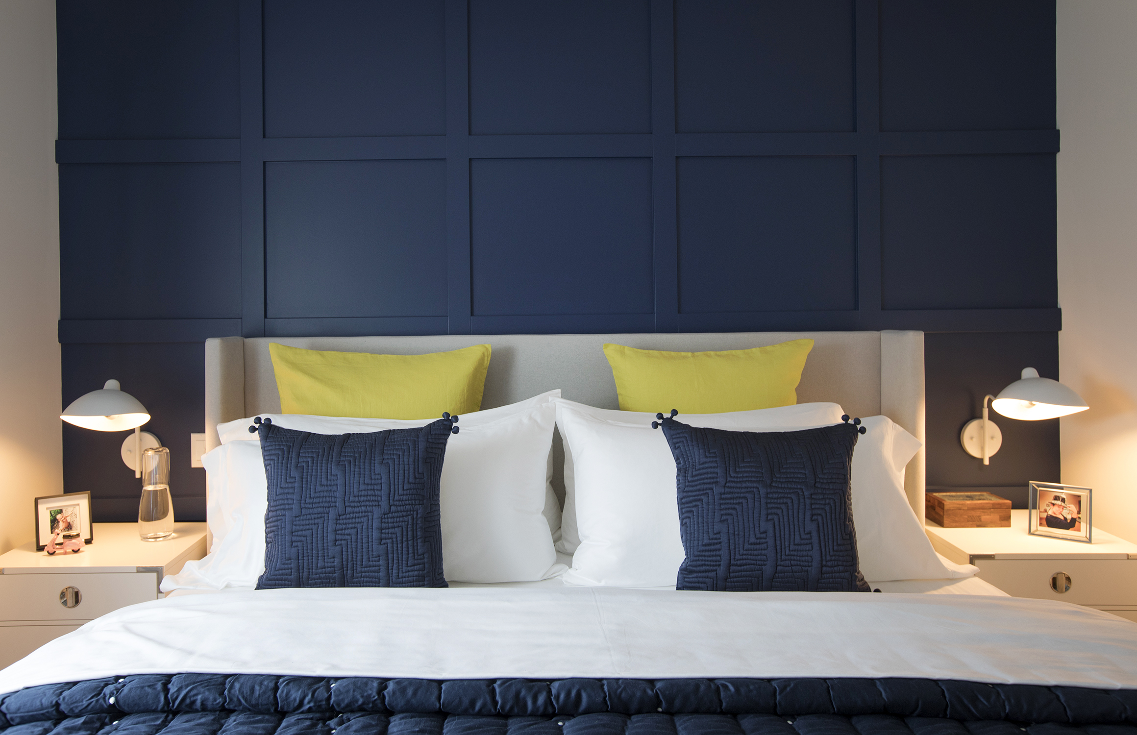
The same rich, contemporary blues continue into the newly designed master bedroom, which is meant to be an oasis and getaway for the homeowners. A brilliant feature wall with a statement headboard is a great way to add dramatic effect to the space, while soft window coverings and upgraded night tables complete the look.
A Feature Wall
Wainscotting adds texture and depth to the bedroom despite the wall being one main colour, instantly drawing the eye into the room. A neutral headboard helps to add contrast and design appeal, with toss cushions adding a cozy, complimentary effect.
An Enlarged Closet
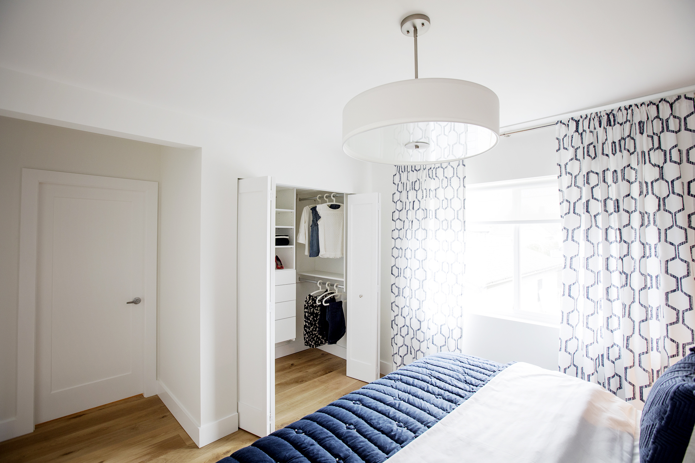
Most homeowners don’t need a massive walk-in closet with a chandelier and dressing table, but a large space that’s big enough for their belongings helps to declutter the actual master bedroom and to keep personal items tucked away. It took a little reconfiguring of this floor plan to make that happen here, but the results are well worth it.
A Luxurious Ensuite
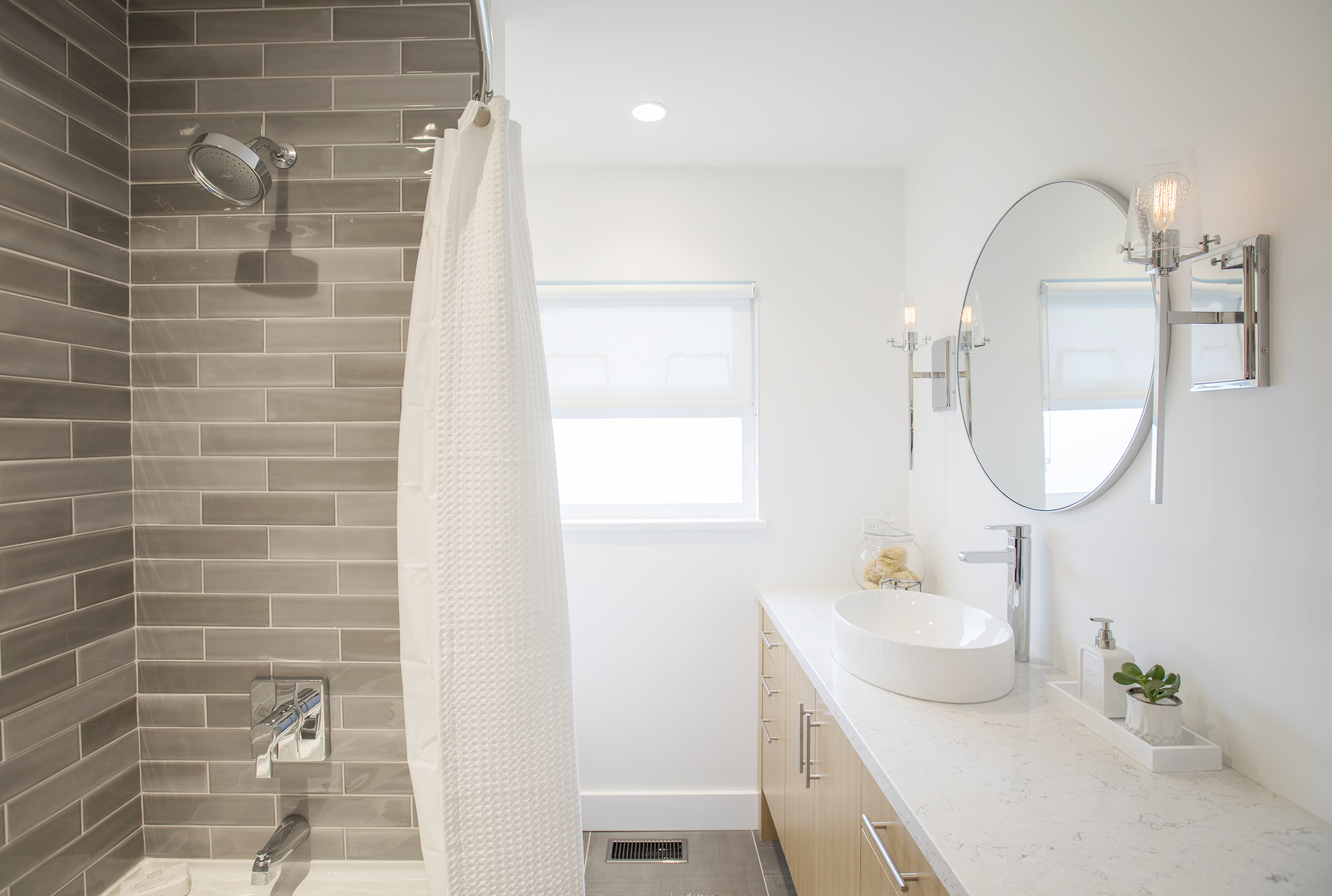
In order to add a master ensuite into this floor plan, Sebastian and Mickey reconfigured the main bathroom into such a space. They then upgraded it with luxurious finishes like a soaker tub, contemporary tiling and a floating sink atop of the vanity, making this space feel like the epitome of relaxation.
Bonus Storage
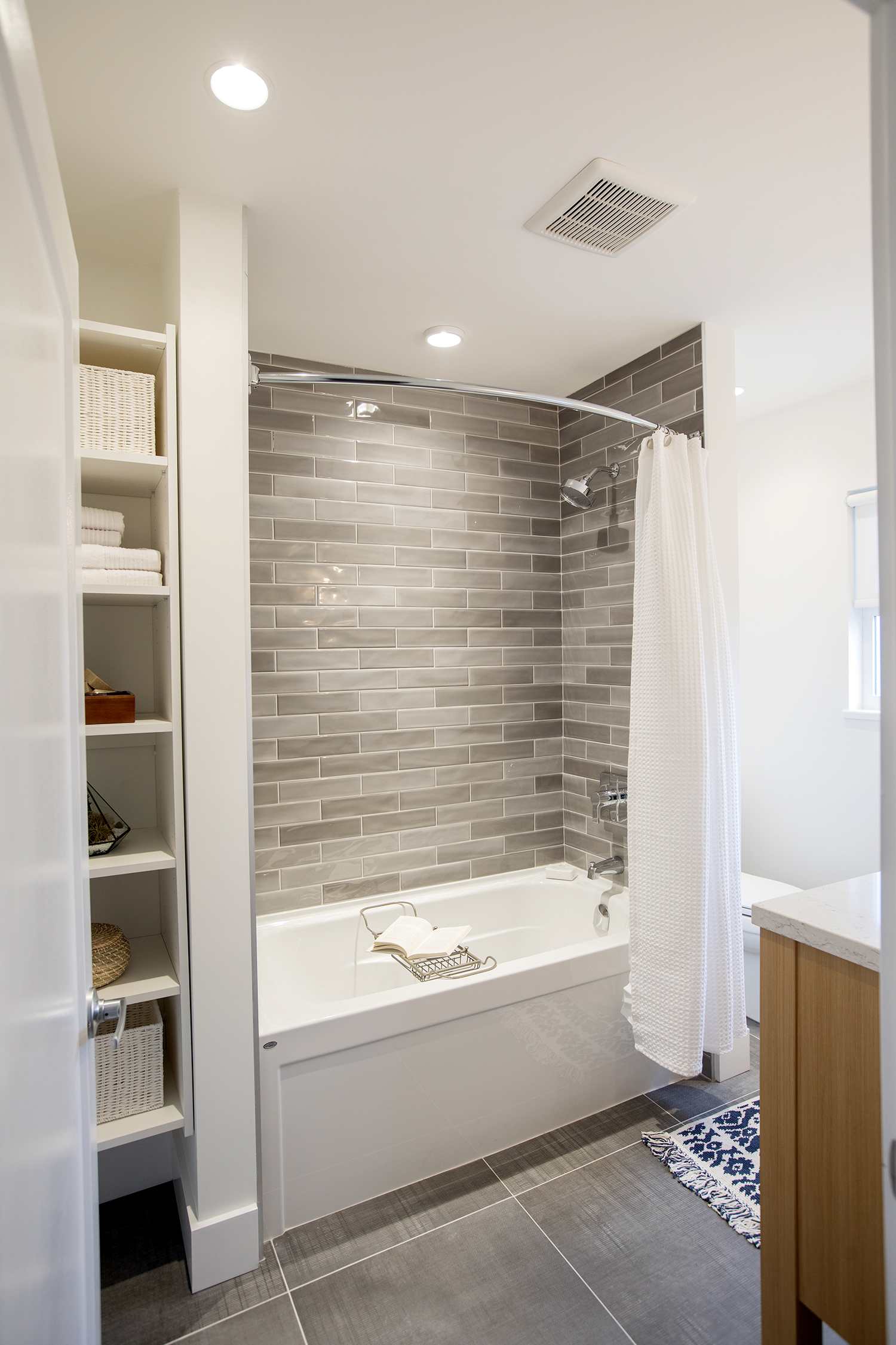
What homeowners don’t love a little extra storage in their space? Sebastian and Mickey delivered here with a crafty shelving nook beside the tub that makes the most of an awkward space and offers infinite storage potential in this new ensuite.
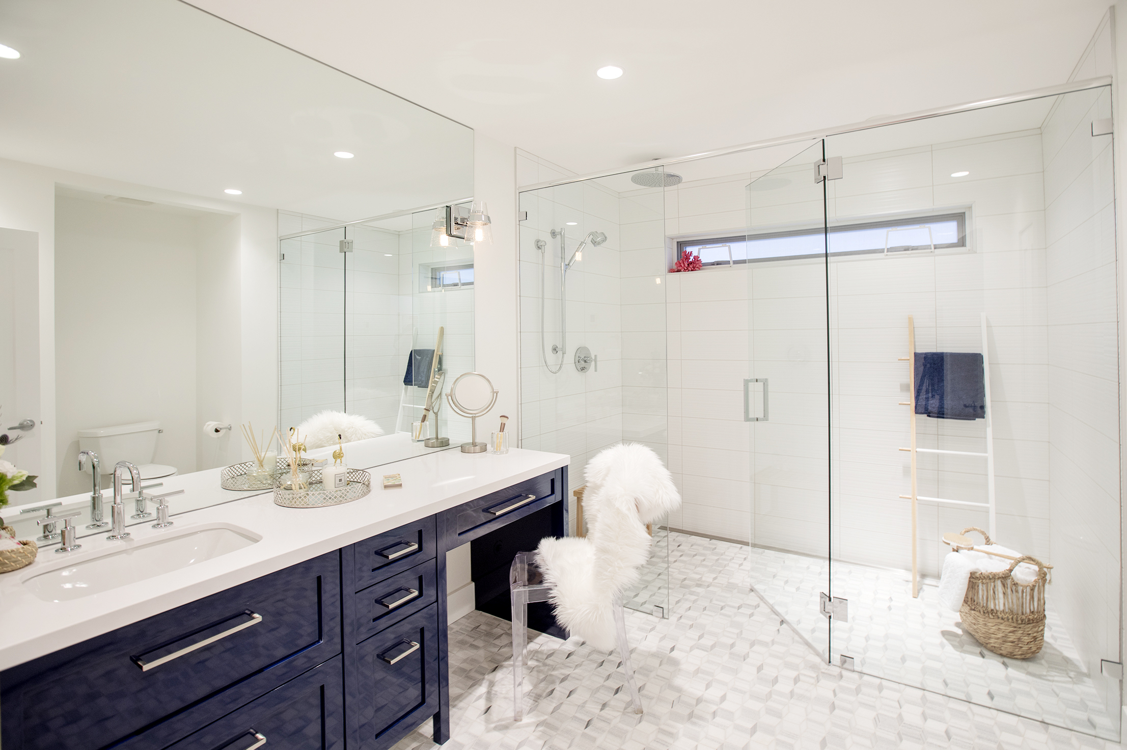
A Show-Stopping New Bathroom
Because Mickey and Sebastian used the main bathroom as the new ensuite, they reconfigured one of the bedrooms into this super-sized, luxurious bathroom instead. The space feels large and spacious thanks to glass shower doors and a dramatic vanity, with plenty of modern new upgrades to complete the look.
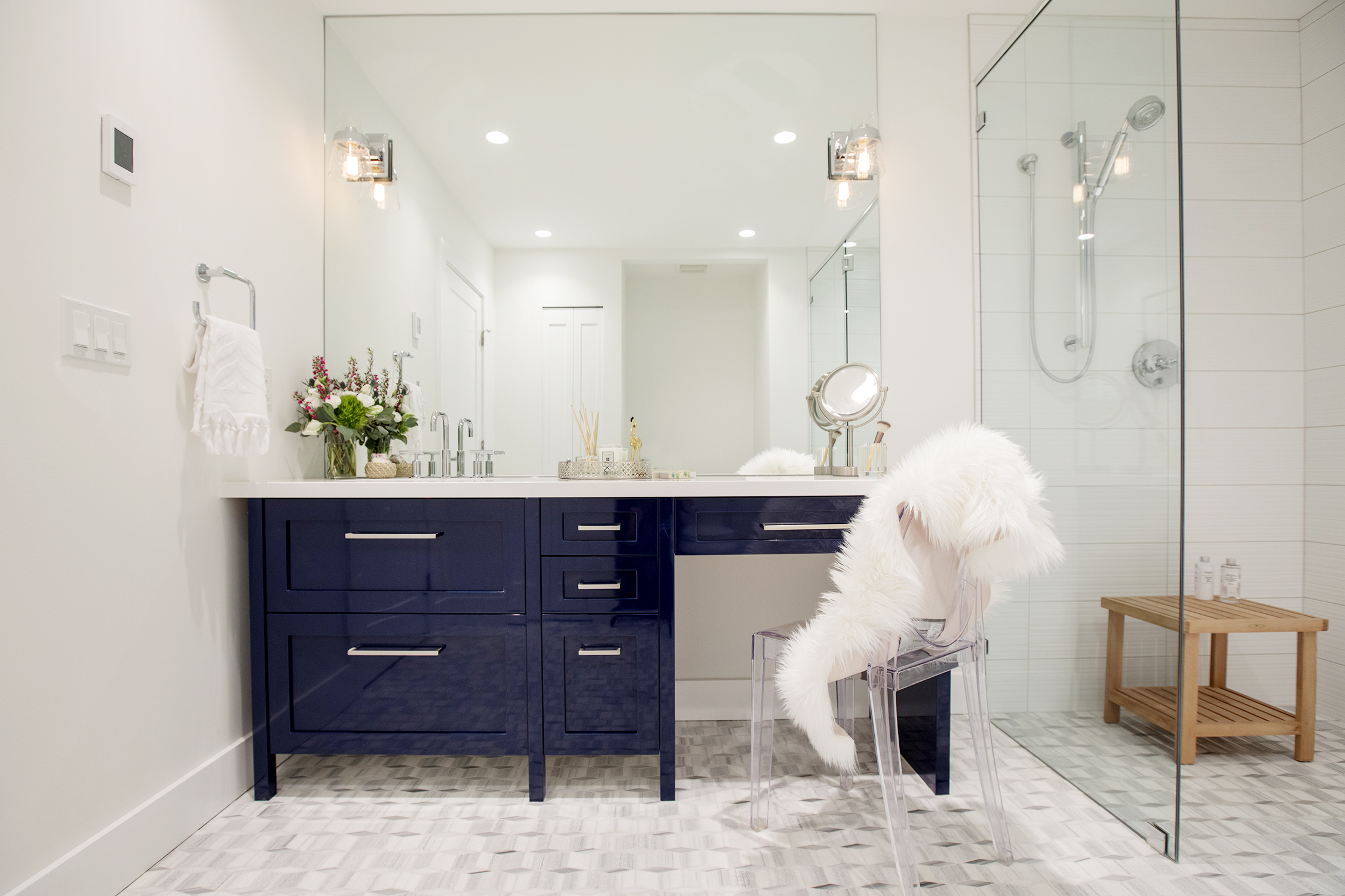
An Extended Vanity
White and bright is the name of the game for most bathrooms, but the guys chose to add a brilliant burst of colour with this pretty blue installation that features enough room for a sink and faucet along with a dressing table. Modern hardware, a clear chair with a furry throw and a magnifying mirror complete the look.
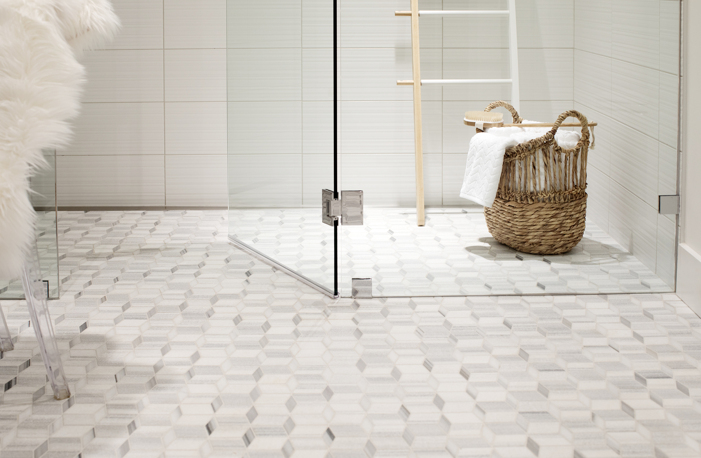
Upgraded Floors
The pretty tiling in this bathroom doesn’t just add instant design appeal; it also feels modern thanks to the continuation right into the enlarged shower. With no lip to interrupt the flow this space feels modern and bright – a real space for guests to feel pampered and preened.
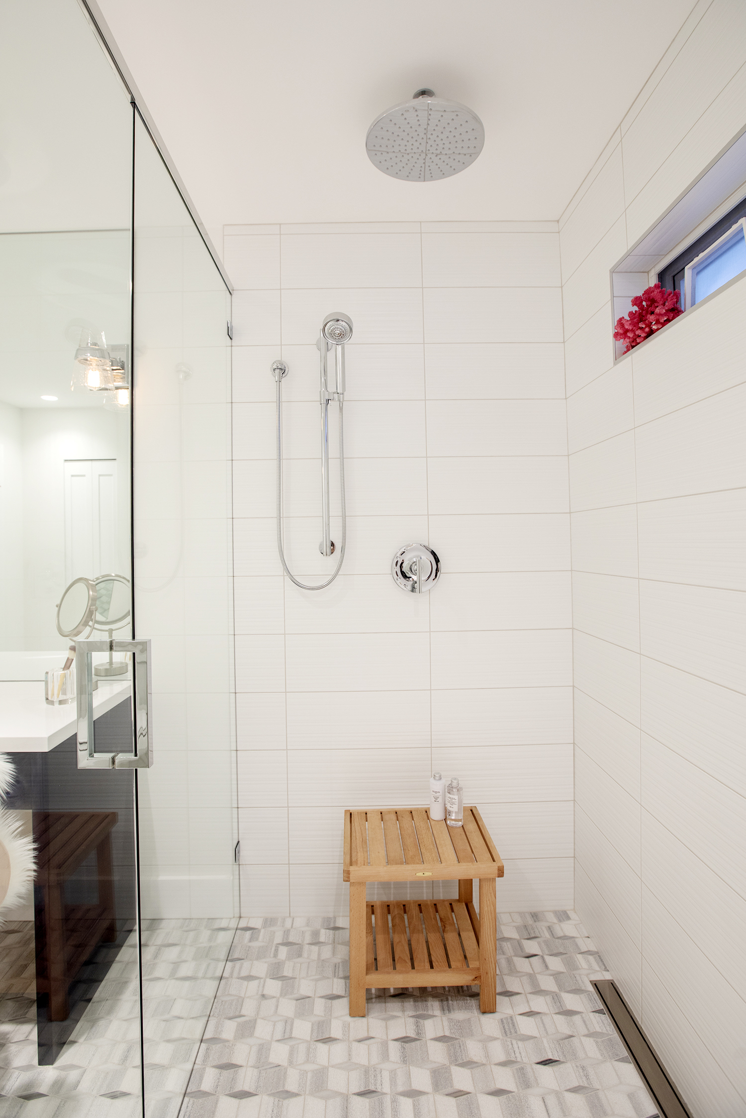
Dual Faucets
These days upgraded shower heads with several options are a must-have in any design-rich home. It’s simple upgrades like these that add to the overall wow factor and transform an okay abode into a home to be envious of. We’d say that in this particular case Mickey and Sebastian did a fine job indeed. Now, this is definitely a “first,” rather than “worst” home on the block.
HGTV your inbox.
By clicking "SIGN UP” you agree to receive emails from HGTV and accept Corus' Terms of Use and Corus' Privacy Policy.


