After decades together, high school sweethearts Shelley and Mike were finally ready to move back to their childhood neighbourhood and into a home they could grow old together in. The only problem? Everything in their area was overpriced and definitely over budget. So they asked for a little help from Sebastian Seville and Mickey Fabbiano in transforming one of the “worst” homes in the neighbourhood into the “first.” Here’s how the duo upgraded the abode with lots of modern conveniences while still retaining plenty of old world charm.
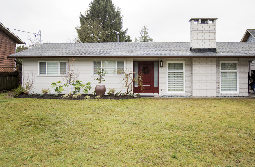
Bright New Exterior
In order to give this home massive curb appeal, Mickey and Sebastian matched the white facade throughout and updated the landscaping. Then, in order to draw the eye and create a strong first impression, they chose a deep burgundy colour for the front door. The result is a show-stopping exterior that draws people in with its rich contrasts and pretty finishes.
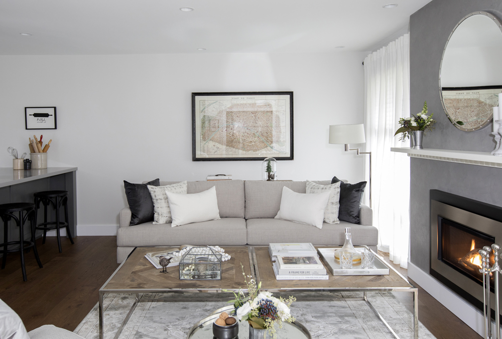
A Fresh New Look
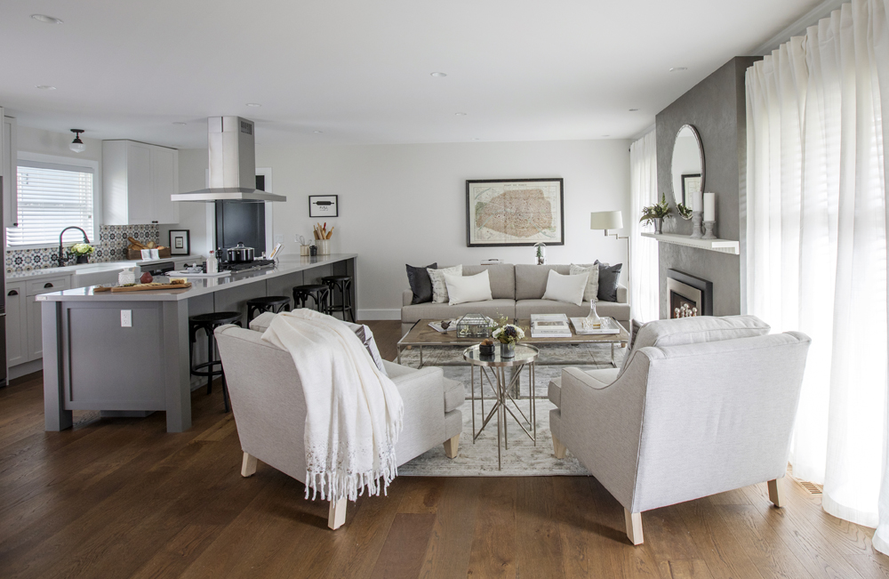
The updated, open concept living room greets you as soon as you enter this home, setting the tone for the rest of the house. Wire-brushed oak floors are present throughout, while soft neutrals on the walls and furniture help keep the space bright and appealing. Monochromatic finishes add instant modernity but the look is then pulled back with rustic, inspiring touches throughout.
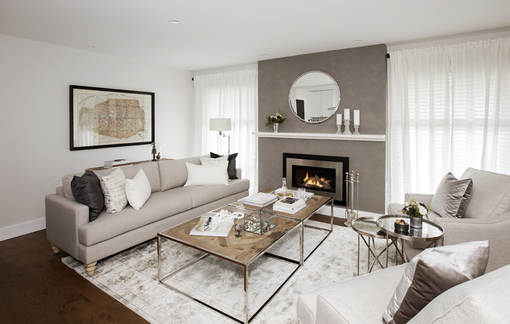
A Custom Feature Wall
The venetian plaster on the updated fireplace automatically draws the eye thanks to its rich colour and unique design. A bright white mantel and a large circular mirror help complete the look, while billowing, sheer drapery adds a romantic effect. The look ties into the whites from the area rug below and instantly brightens up the cozy space.
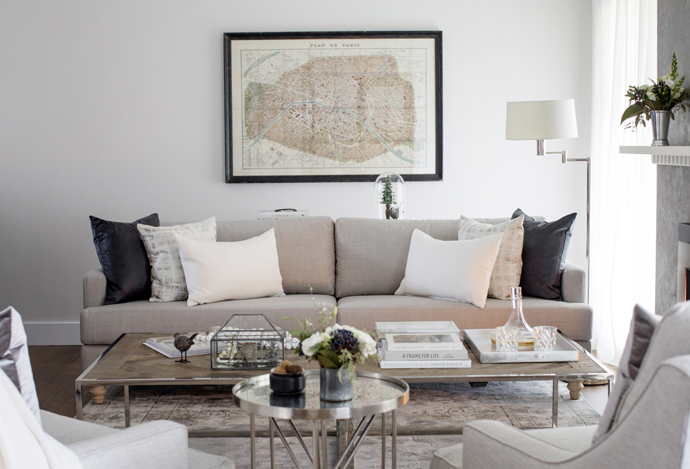
Custom Touches
The large, custom sofa is plush and large enough to entertain a crowd or to relax on for a little one-on-one time, while still maintaining lots of design appeal thanks to the monochromatic toss cushions. Meanwhile a large framed map print and updated coffee tables with a patterned wood surface add rustic, old world appeal.
Open Concept Vibes
By combining the kitchen and living rooms, this space is perfect for larger gatherings with family and friends. The hardwood runs throughout, adding a cohesiveness to the space, while soft touches like these plush arm chairs and the grey-and-white area rug help to define and separate so that the rooms also feel purposeful and unique.
A Spacious New Kitchen
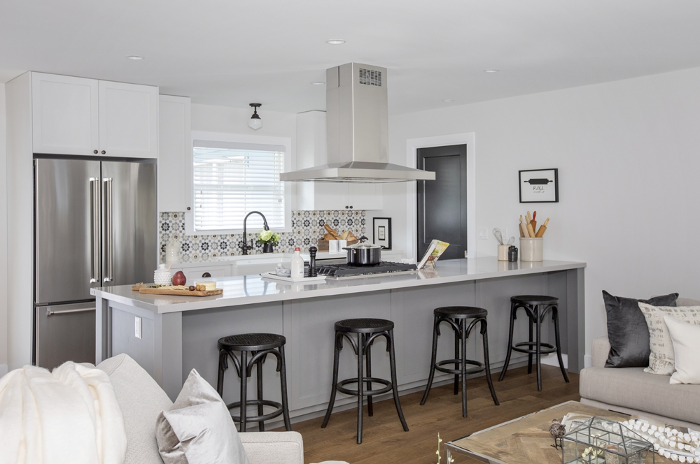
The kitchen itself doesn’t have to be overly large in order to be completely functional. The addition of a peninsula ensures there’s plenty of extra counter space and a breakfast area, while also adding extra cabinets and storage below. Upgraded, stainless steel appliances and a four-way hood add lots of modern appeal, with the monochromatic finishes keeping the look sleek and streamlined.
Old World Touches
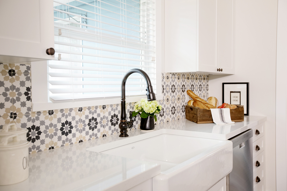
A large basin sink is a modern must-have with instant charm, while the vintage faucet adds a bit of refined, classic appeal. Then, the mosaic tiling made of hand-painted cement adds another old-world touch and a unique design aspect that you won’t find in other homes in this neighbourhood, truly making this house stand out from the rest.
Extended Dining Area
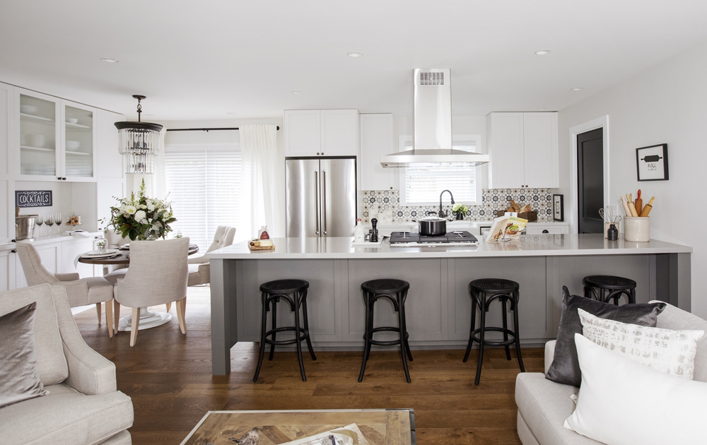
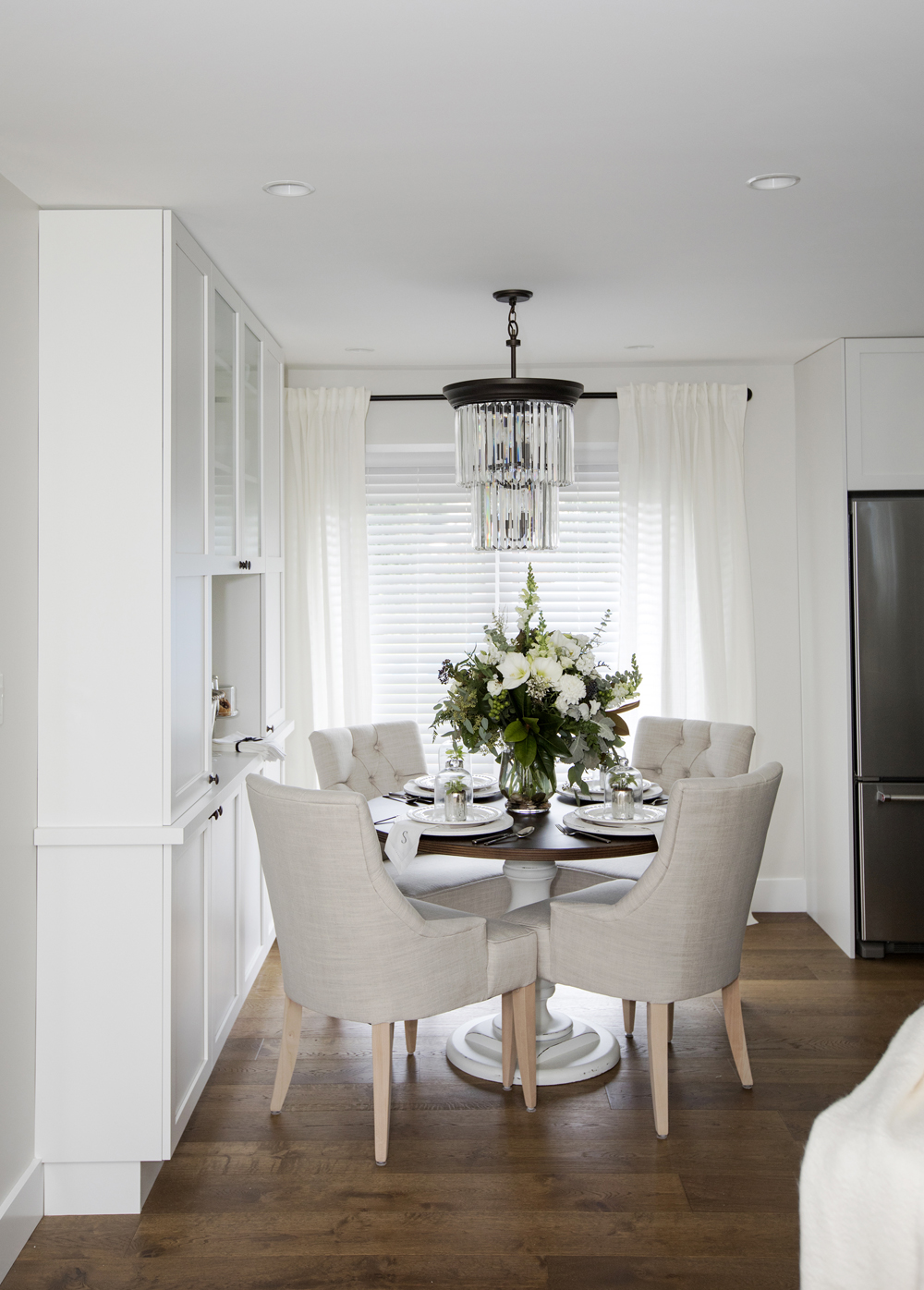
The dining room is also a part of the open-concept floor plan, serving as a natural extension of the kitchen and allowing a separate space for family meals and entertaining. More built-in cupboards along the wall add even more storage, and Mickey and Sebastian were also sure to add a small serving nook for easy-access to after-dinner desserts and drinks.
Maximized Space
The cream and wood colour combo on these oversized dining room chairs adds a regal statement to the dining area, especially surrounding the circular table with its carved post. A drop chandelier in a matching monochromatic colour scheme helps tie this room into the living room and kitchen, creating a cohesive flow.
Tons of Potential
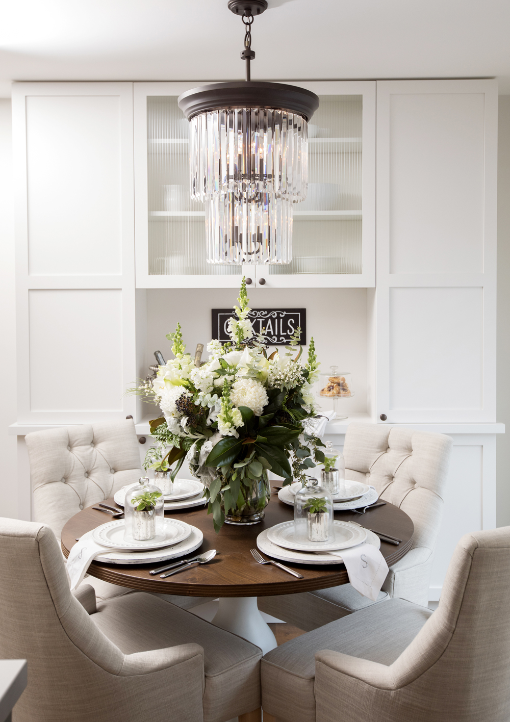
Although the area is small it packs a lot of potential as Mickey and Sebastian showcased here with this staging. Large flowers add a homey and warm effect, while simple place settings are elevated with the addition of even more greenery and monogramed napkins.
A Reimagined Mudroom
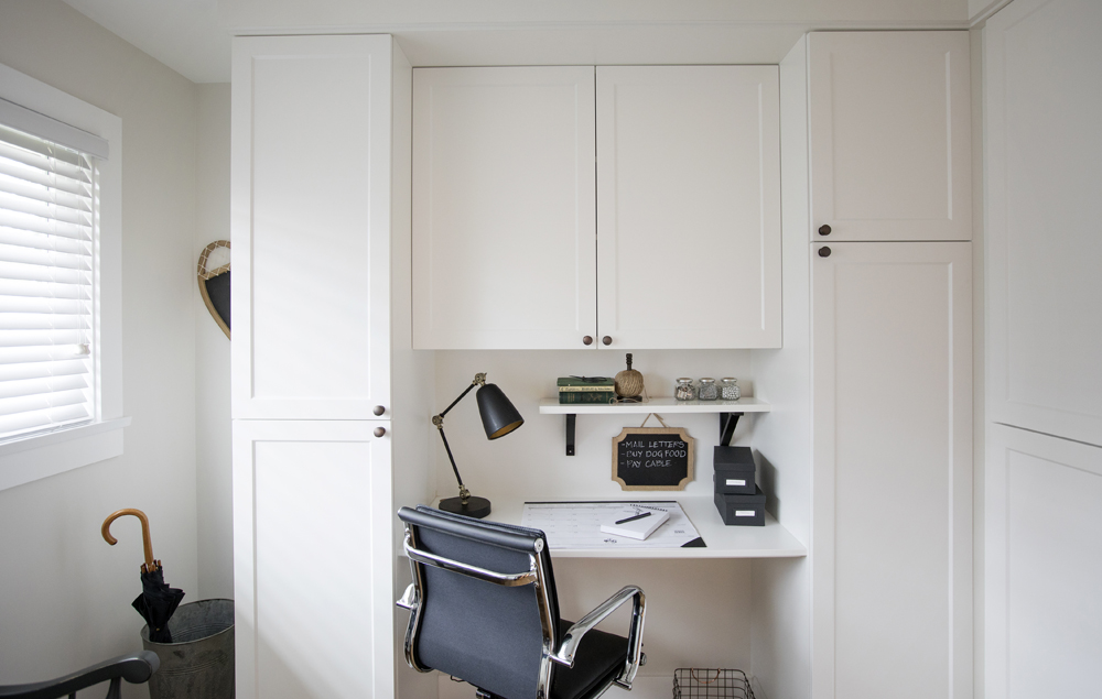
A large mudroom was a top priority for Shelley and Mike, so Mickey and Sebastian transformed the third bedroom into a welcoming space complete with a little office area for household accounting or writing cards and letters before heading out the door. Custom cabinets above and below help increase the wow factor and create ample storage for the entire home.
Second-Hand Love
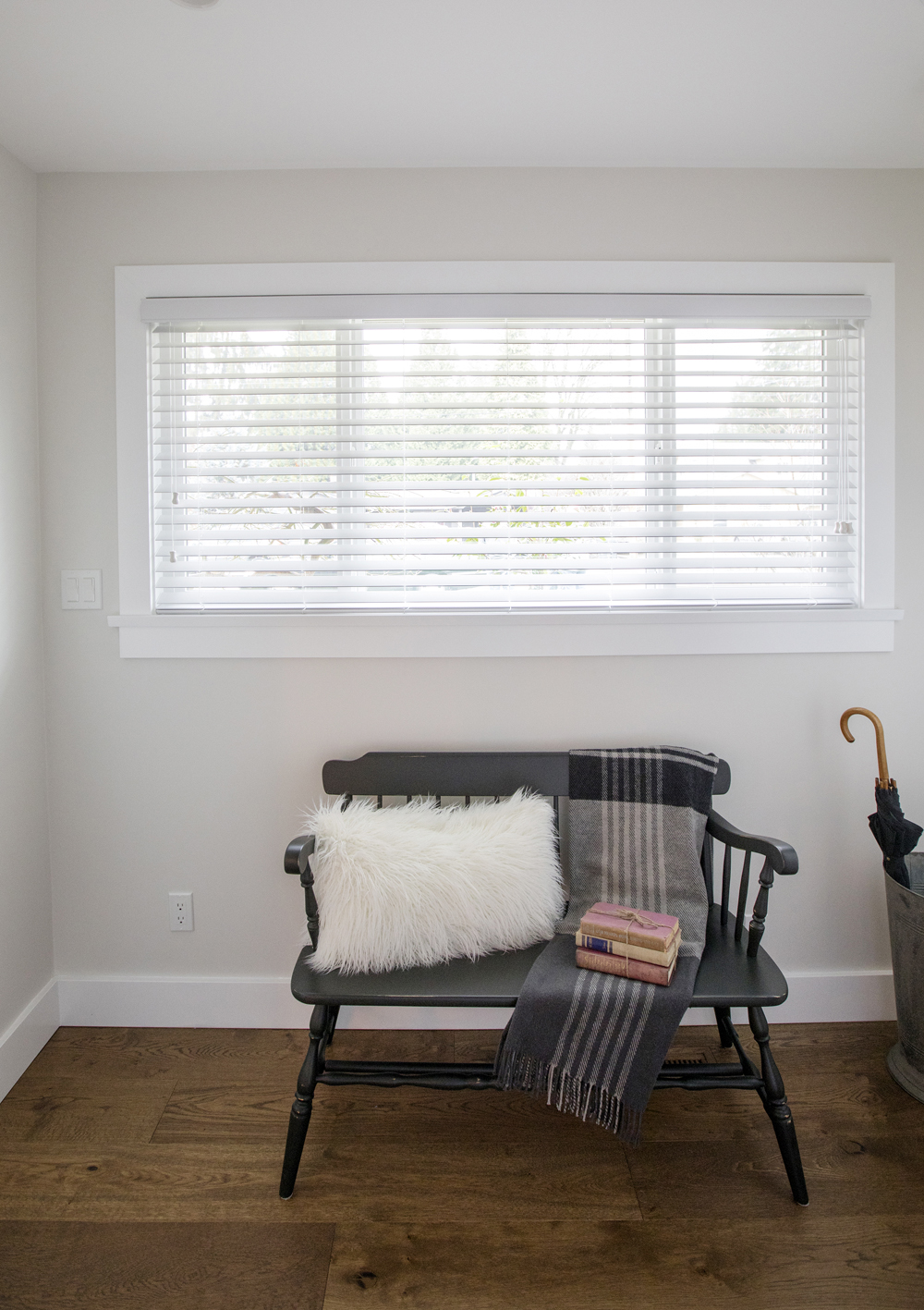
Mickey spotted this gem of a bench among the rubble the previous homeowners left behind, and salvaged it by sanding it down and giving it a fresh coat of paint. It’s the perfect little antique addition to the mudroom, giving the space another touch of that old world charm.
Multi-Purposes
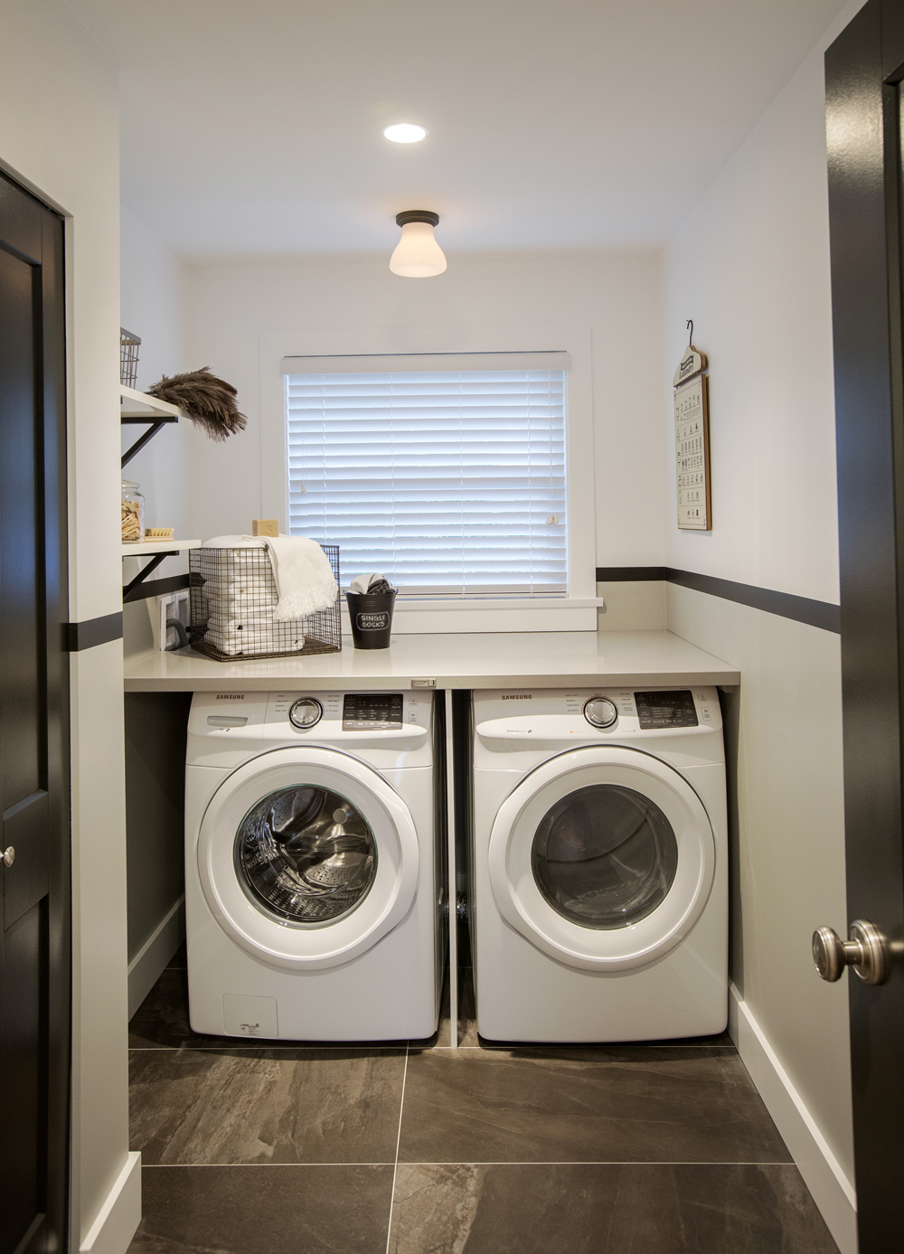
An updated laundry is also present in the new mudroom, where updated tiling and new front-loading appliances make the household chore a little bit more enjoyable. A large countertop for storage and folding clothes helps elevate the look while a large window instantly brightens up the space.
Bonus Storage
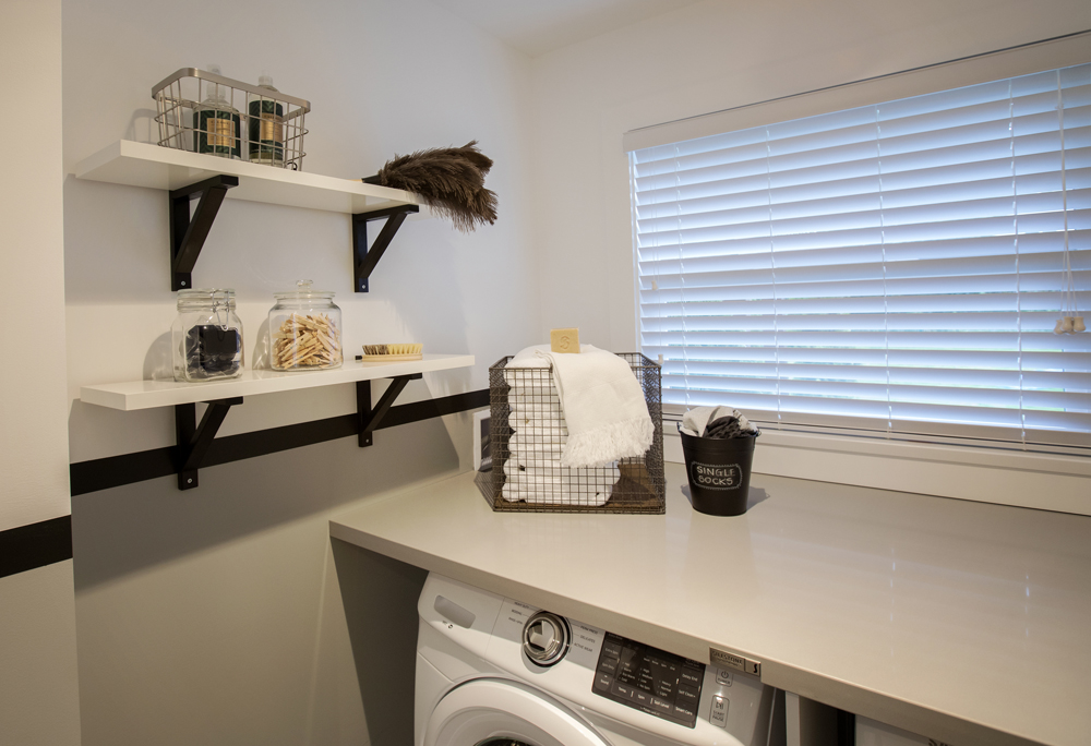
The contractors made the most of the small nook by also installing modern shelves along one wall and adorning them with glass jars and metal baskets for instant storage. The monochromatic finishes help tie the look into the rest of the home’s interior, creating a uniform design.
A Refreshed Bathroom
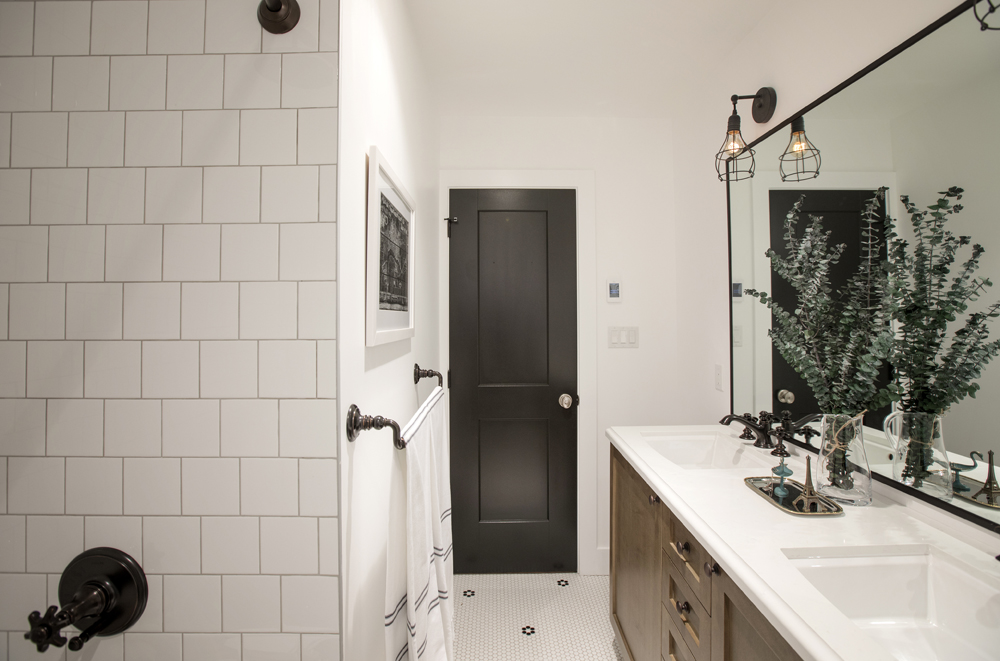
The black-and-white finishes extend to the newly renovated main bathroom, where a dual vanity and a new shower-tub sink combo were installed for maximum function. The brilliant black door helps instantly set the tone as soon as you walk in, while fresh greenery adds a subtle burst of colour.
Simple Finishes
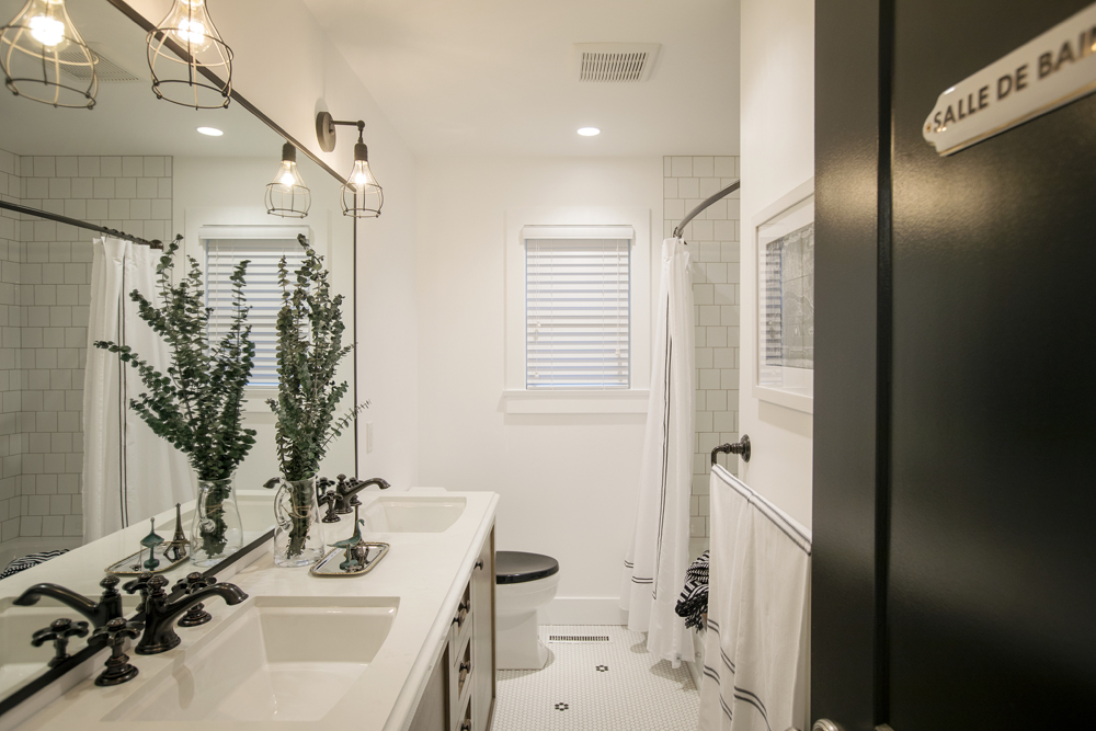
Mickey and Sebastian kept the walls white in order to make the space feel even larger than it is, keeping the preexisting layout to help save money in the overall budget. Meanwhile antique faucets and wire-framed lights add depth and design appeal, especially against the mirror’s trim.
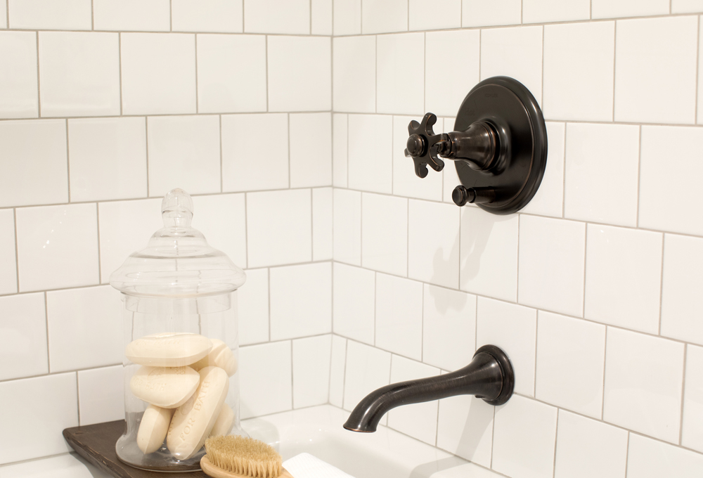
A Unique Design
The same retro fixtures are featured in the bath, where they pop against the white tiling. The tile squares themselves are offset in a unique pattern to give the look even more contrast and texture, truly making the bathroom standout.
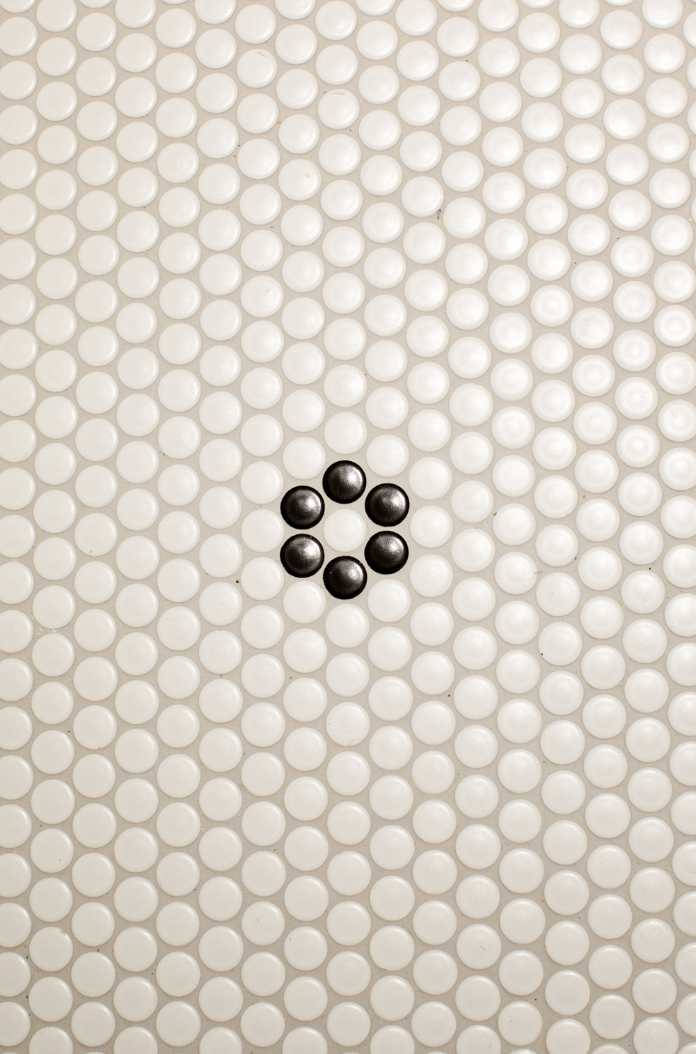
Upgraded Features
Pretty and heated penny round tiling with black florets complete this bathroom while giving it that extra bit of luxury. With finishes like these, Shelley and Mike didn’t just find a space to grow old in together; they got the worst home in the neighbourhood and thanks to Mickey and Sebastian’s help, transformed it into a true “first” pick.
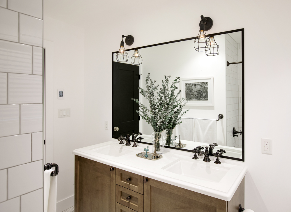
Contrasting Textures
To add warmth and more of that worldly charm, the contractors selected this warm wood vanity with updated hardware. The contrasting colours instantly draw the eye, while the fresh countertop ties into the other modern finishes in the space.
HGTV your inbox.
By clicking "SIGN UP” you agree to receive emails from HGTV and accept Corus' Terms of Use and Corus' Privacy Policy.


