When Bryan and Sarah first started working with Katelyn she wanted the first floor of her family home to be completely remodeled. But after careful consideration, she added more to her budget to include the second story in the plans as well.
Budget Busting
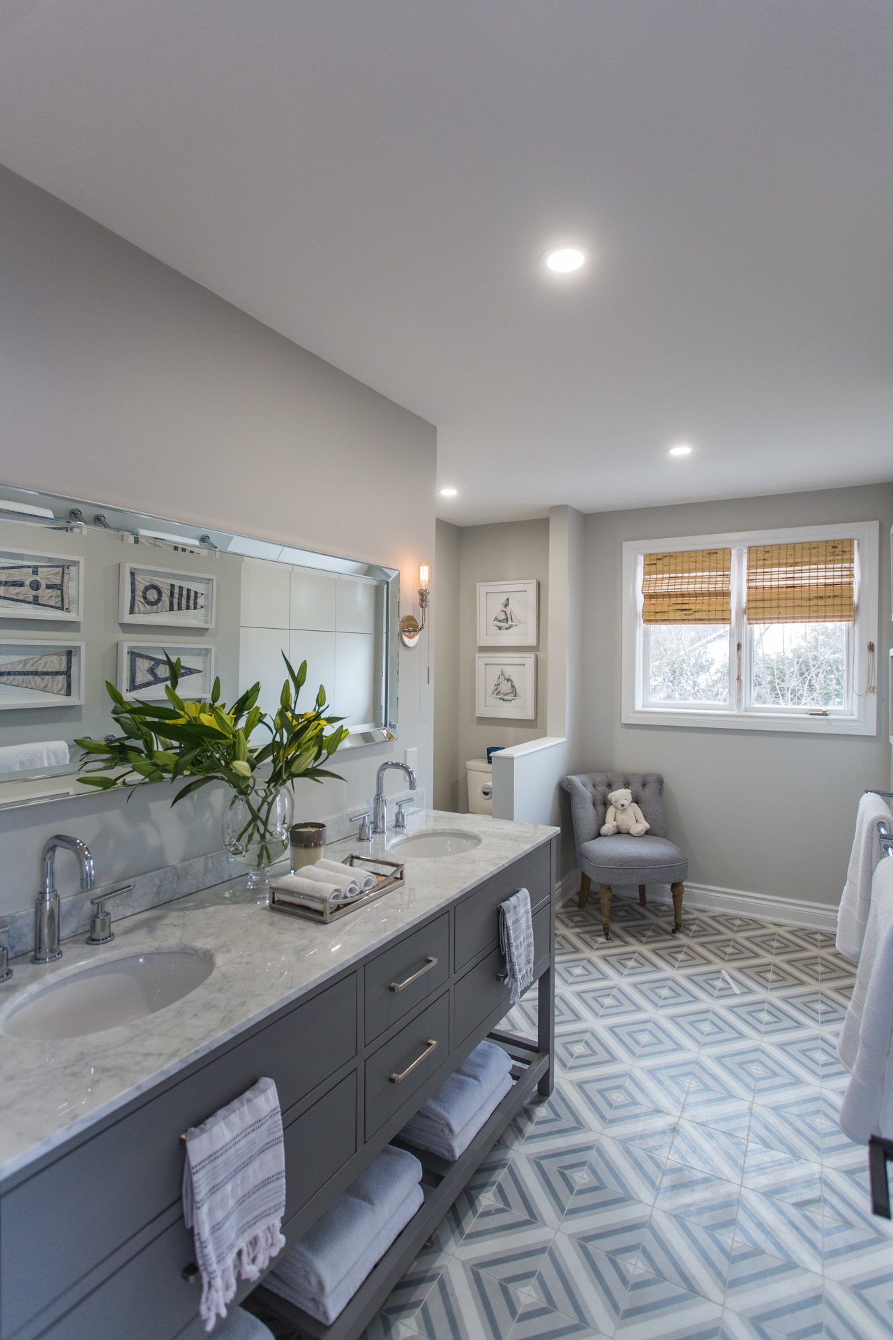
Having a separate working bathroom for her two young boys to use (and grow into) was one of the reasons Katelyn decided to add $83K to her original $120-reno budget.
Sonny and Share
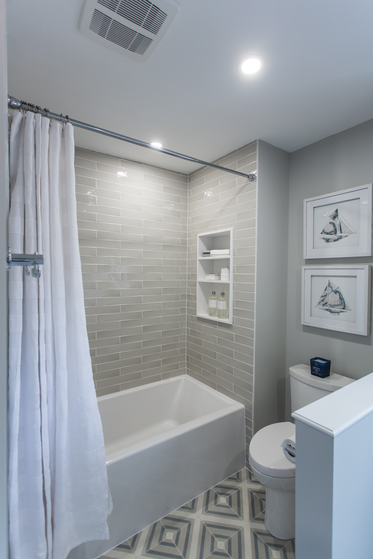
Bryan and Sarah totally reconfigured the layout of the original outdated 1980s bathroom, with its step-up jetted tub and vinyl everything, to create an inviting, youthful space for Katelyn’s sons.
Thinking of renovating your old space? Make sure you read Bryan Baeumler’s 10 must-know tips for renovating an old house.
No Shortage of Storage
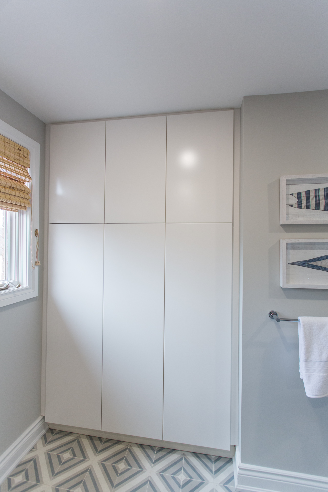
“It’s a whole different bathroom!” exclaimed Katelyn when she sees her boys’ sweet, inviting bathroom (which includes plenty of much-needed storage) for the first time.
Taking Her Suite Time
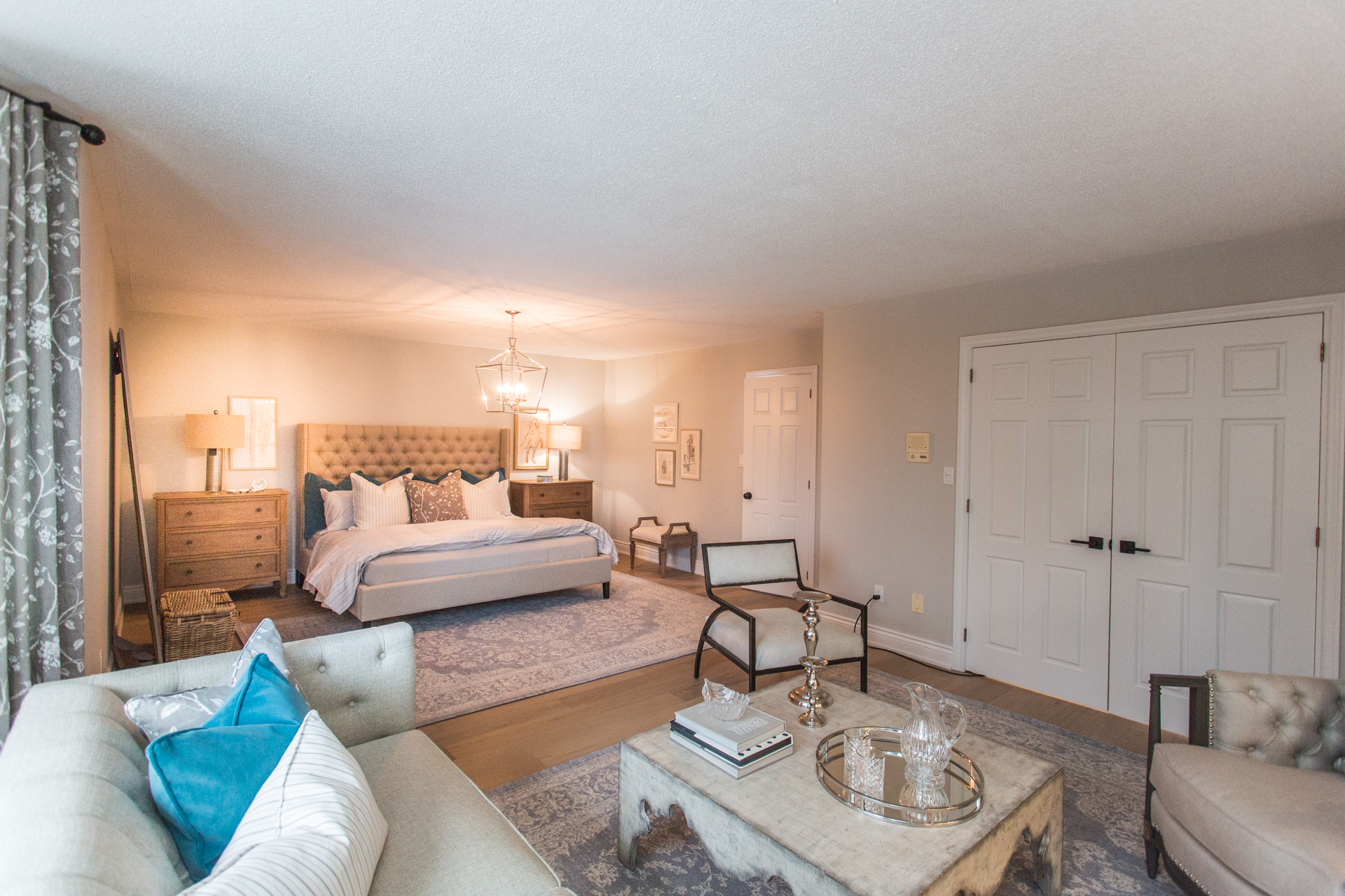
“I can’t believe this is my bedroom,” says Katelyn, thinking back to when she stepped into her brand-new master suite. “I had no idea that that space would transformed the way that it was. I was just shocked”
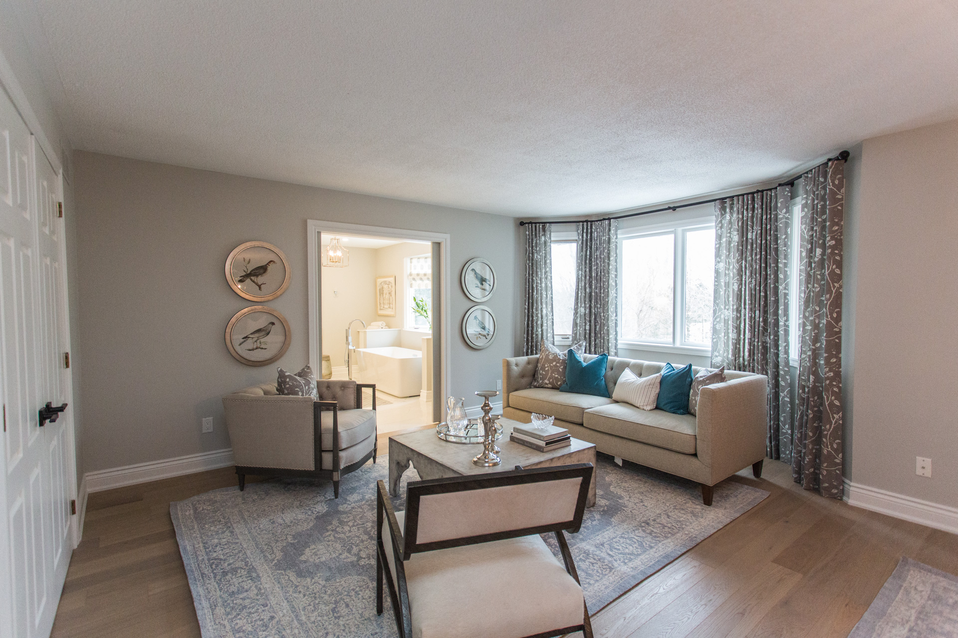
Two Rooms in One
In Katelyn’s bedroom Sarah’s design concept was to delineate two separate areas in the very linear space – at one end a private sleeping area and at the other a more public sitting nook.
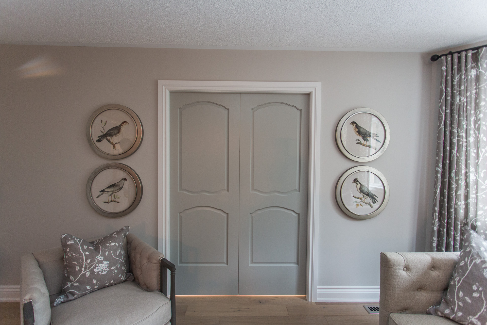
Open Sesame
In Katelyn’s bedroom there’s all new paint, artwork, furnishings and engineered hardwood throughout but as Sarah says, “where all the real work happened, is behind these doors.”
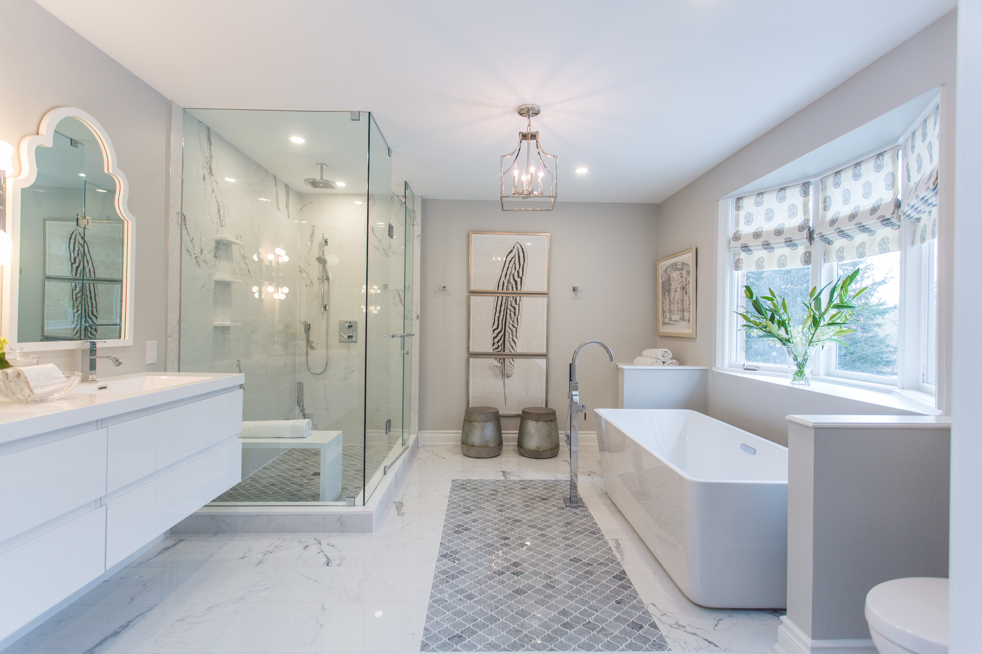
Dreams Do Come True
The other reason Katelyn decided to increase her budget was so that she could get the spa-like ensuite bathroom of her dreams – and Sarah and Bryan gave her exactly that with this breathtaking space.
If you think you’re the ultimate Bryan Baeumler fan, you’ll definitely want to check out these 12 things you might not know about him.
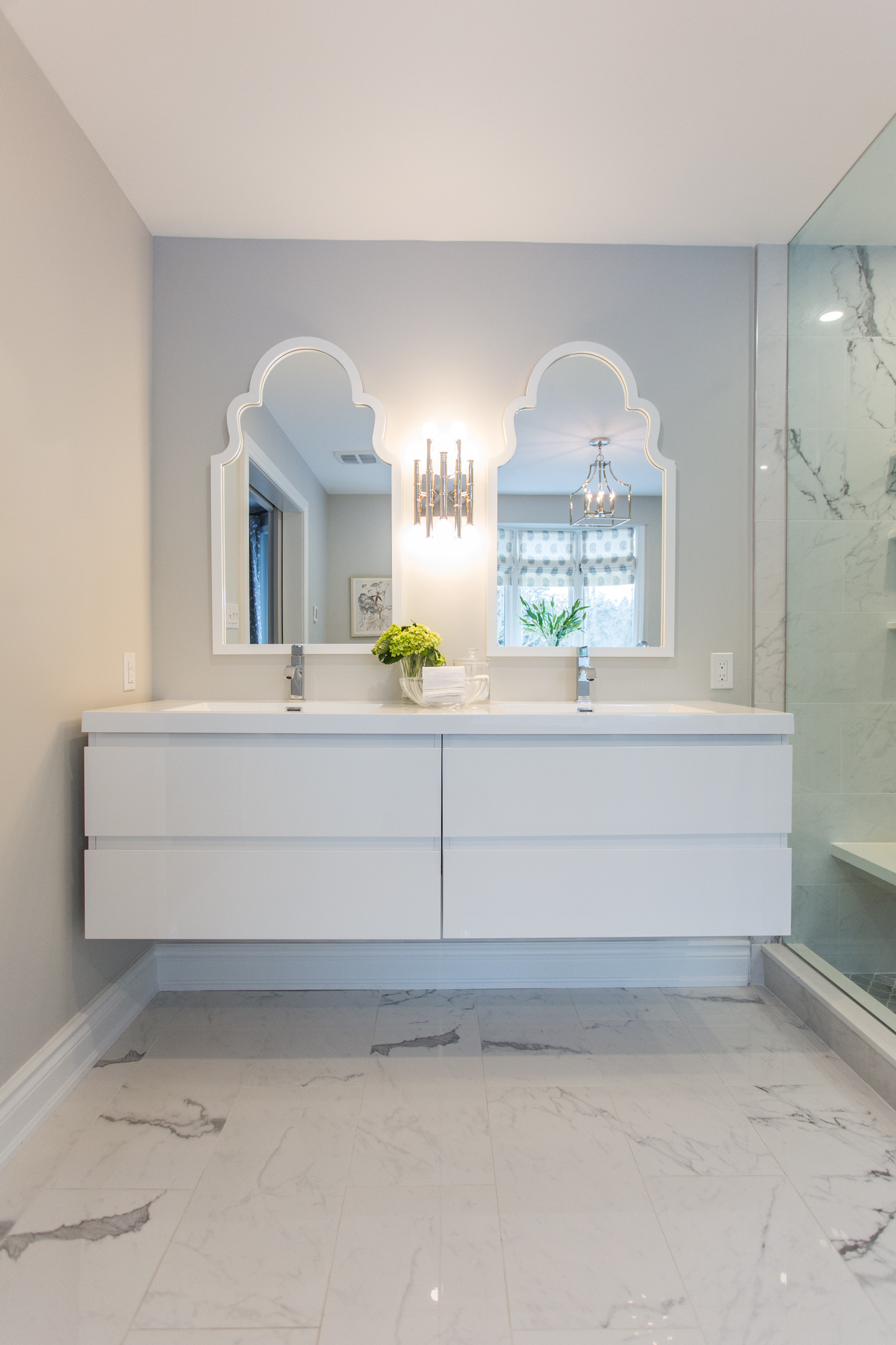
Spa Day Everyday
Ripping this ensuite back to its studs, the Baeumlers rebuilt this epic bathroom-for-one to include heated floors, a floating double vanity, a deep soaker tub and a giant rain-headed shower.
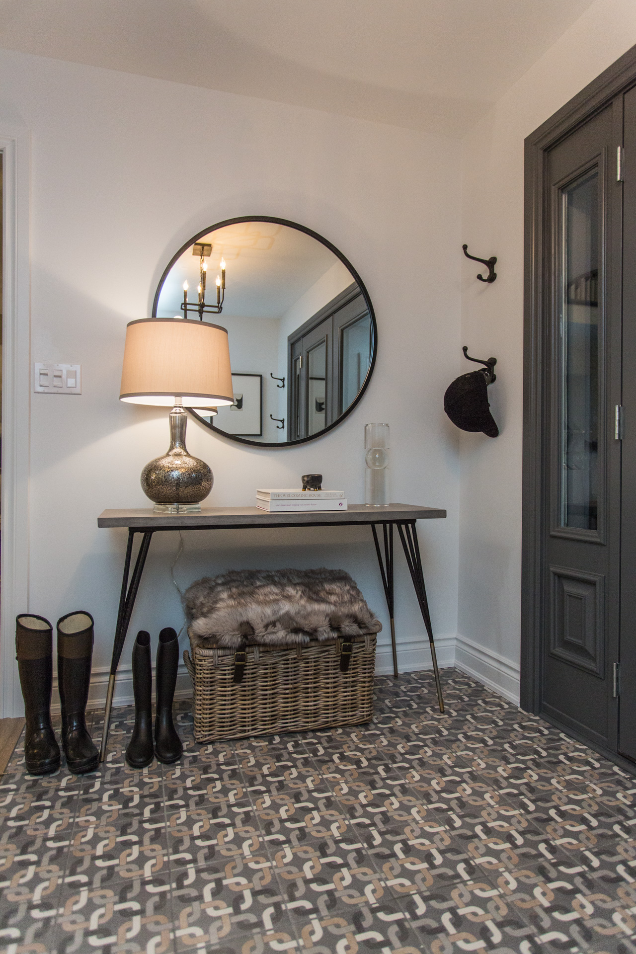
Design Diary
Back downstairs, touches of Sarah design aesthetic are seen throughout with the selection of geometric tile, refined furnishings and seamless colour palette.
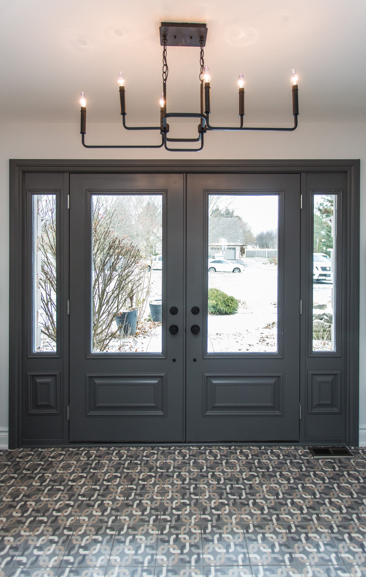
First Impressions
“I was walking up with a lot of trepidation,” recalls Katelyn about seeing her refinished home on completion “But as soon as I opened it up and saw how it looked and felt the vibe, I loved it.”
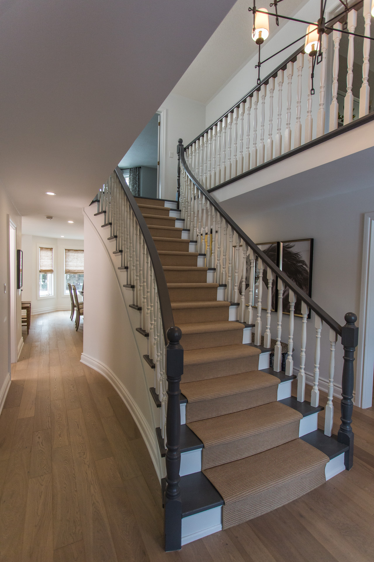
Ta Da Design
“We’ve essentially given Katelyn’s house a complete upgrade,” says Bryan on the day of the big reveal. “Now that we’ve crossed the finish line, it’s now time to give that house back to Katelyn and her boys.”
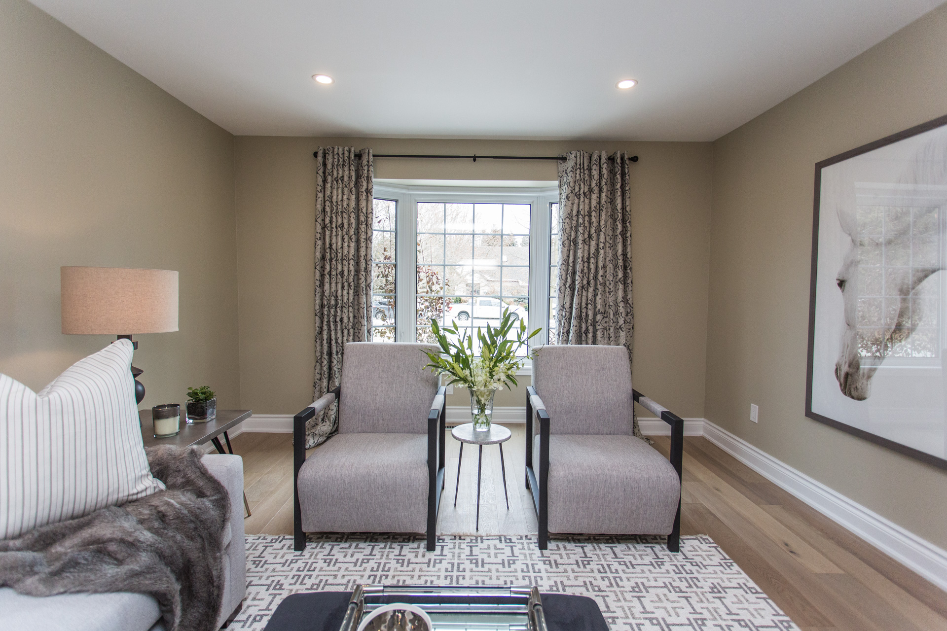
Miss Matched
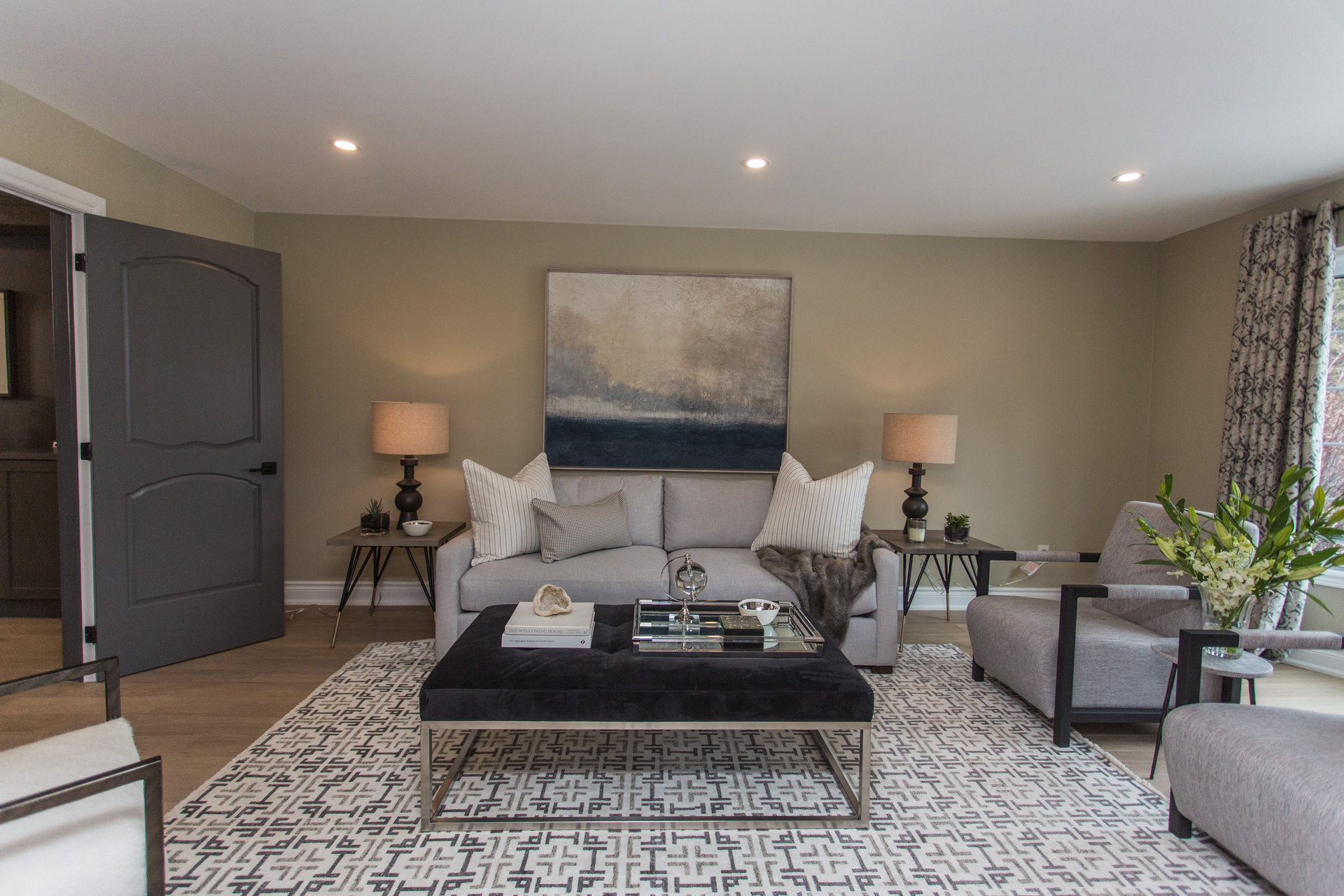
Katelyn had furnished her house with tired inherited pieces and mismatched artwork, much of which Sarah donated so they could start from scratch and come up with a cohesive design.
What’s Passed is Past
“Right from the beginning, Katelyn said do what you think what I would love,” says Sarah. “I think it really allowed me to just run with it and that means leaving old furnishing and paintings in her past.”
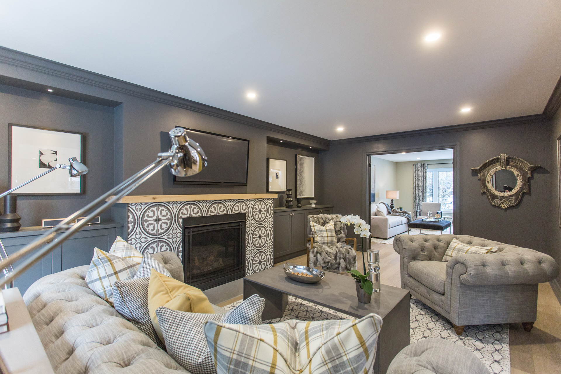
Be Our Guest
“You had some big scary furniture in here before,” says Bryan of Katelyn’s old hand-me-downs. “Furniture just came to die in this room a little bit,” agrees Sarah. “Now when you come in, it’s inviting. You feel you can come right in and sit down.”
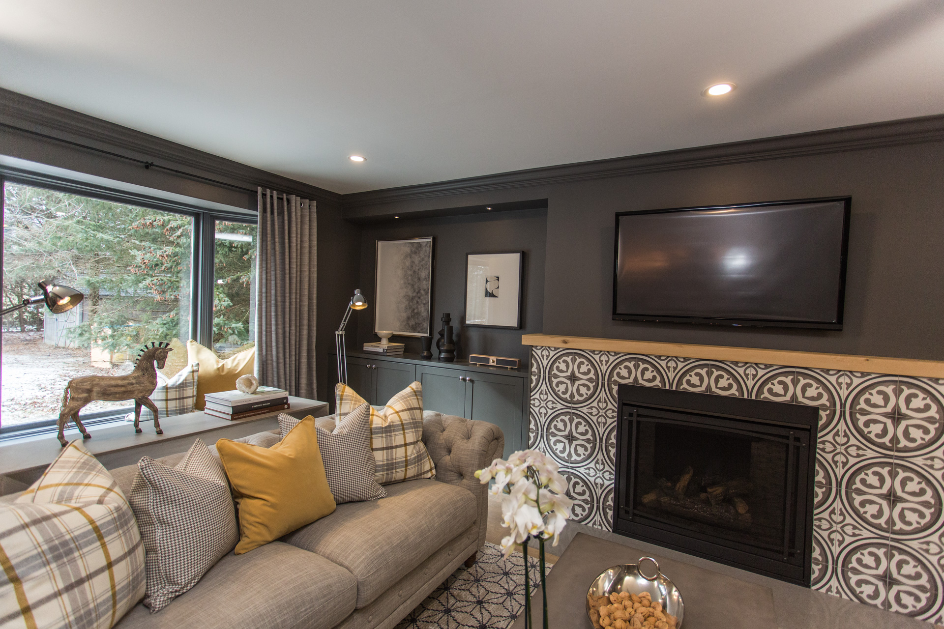
Dis Mantle
Taking design inspiration from the stair treads back at home, Bryan suggested to Sarah that she use a slab of custom-cut, lightly oil wood as the new mantelpiece. Unfortunately, Bryan knocked off some drywall when installing it, but patched it up without any further problems.
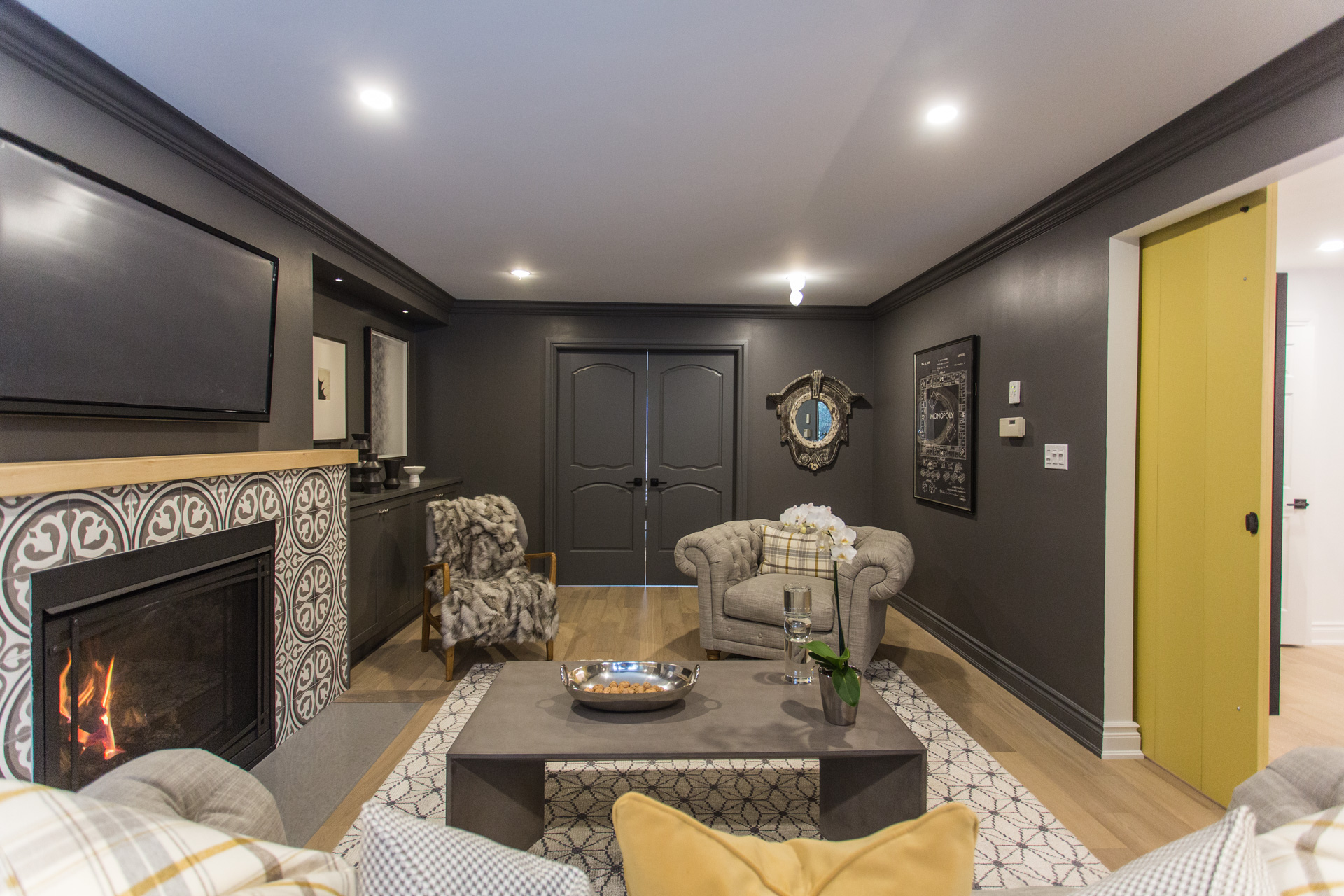
TV Night
Now the TV-watching area can be seen from both the formal living room and the kitchen, giving Katelyn clear sightlines to the place where her boys will no doubt spend a lot of their time.
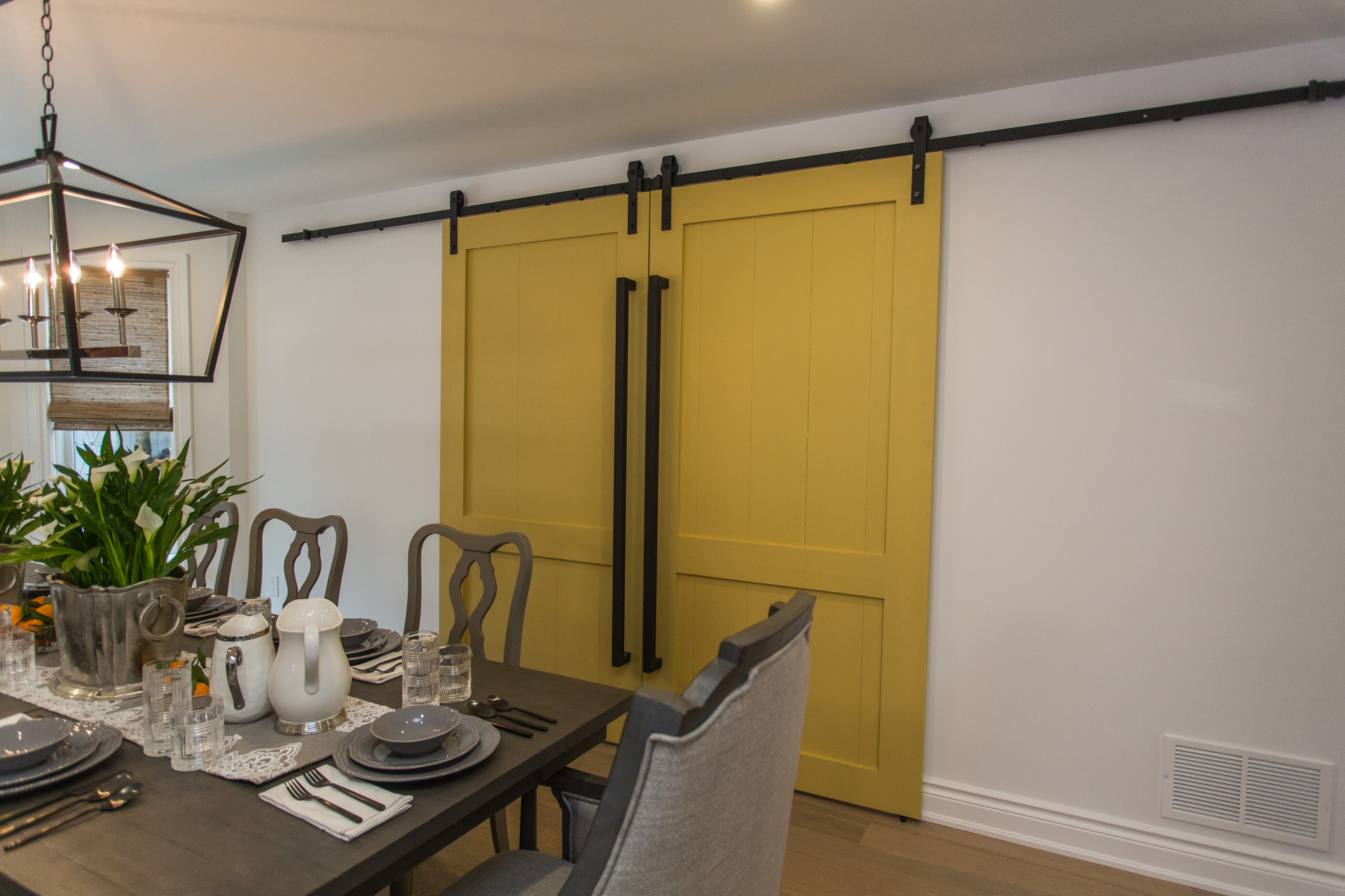
Must-Do List
Sarah had two design objectives for the formal dining area – integrate bold, barn doors to create separation from the TV area and incorporate Katelyn’s old, newly refinished dining-room chairs.
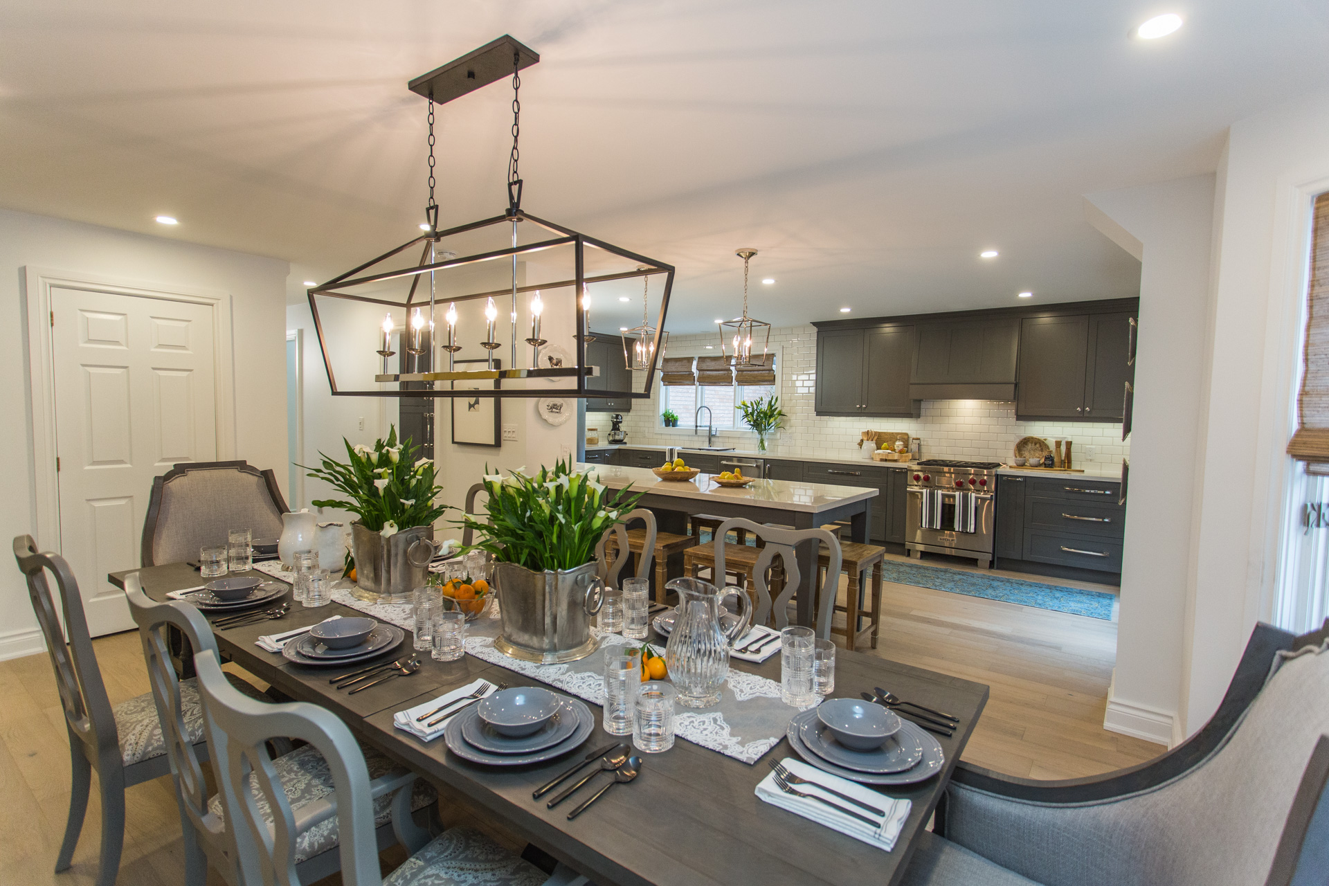
Tall Order
“Up to this point Katelyn’s project is by far the largest scope of work on a client build that Sarah and I have tackled together,” says Bryan, who’s thrilled with how the whole project turned out.
Bryan and Sarah take you inside their home and share special family moments. Watch here!
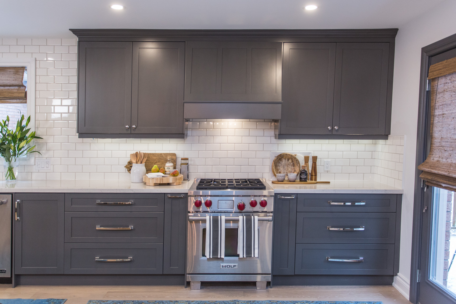
Buyers Beware
To get this massive kitchen, Bryan opened up the walls as far back as he could, updating the electoral and insulation as he went. With all the updates he predicts Katelyn could double her investment if she sells, but she isn’t leaving anytime soon.
See more exclusive photo galleries here!
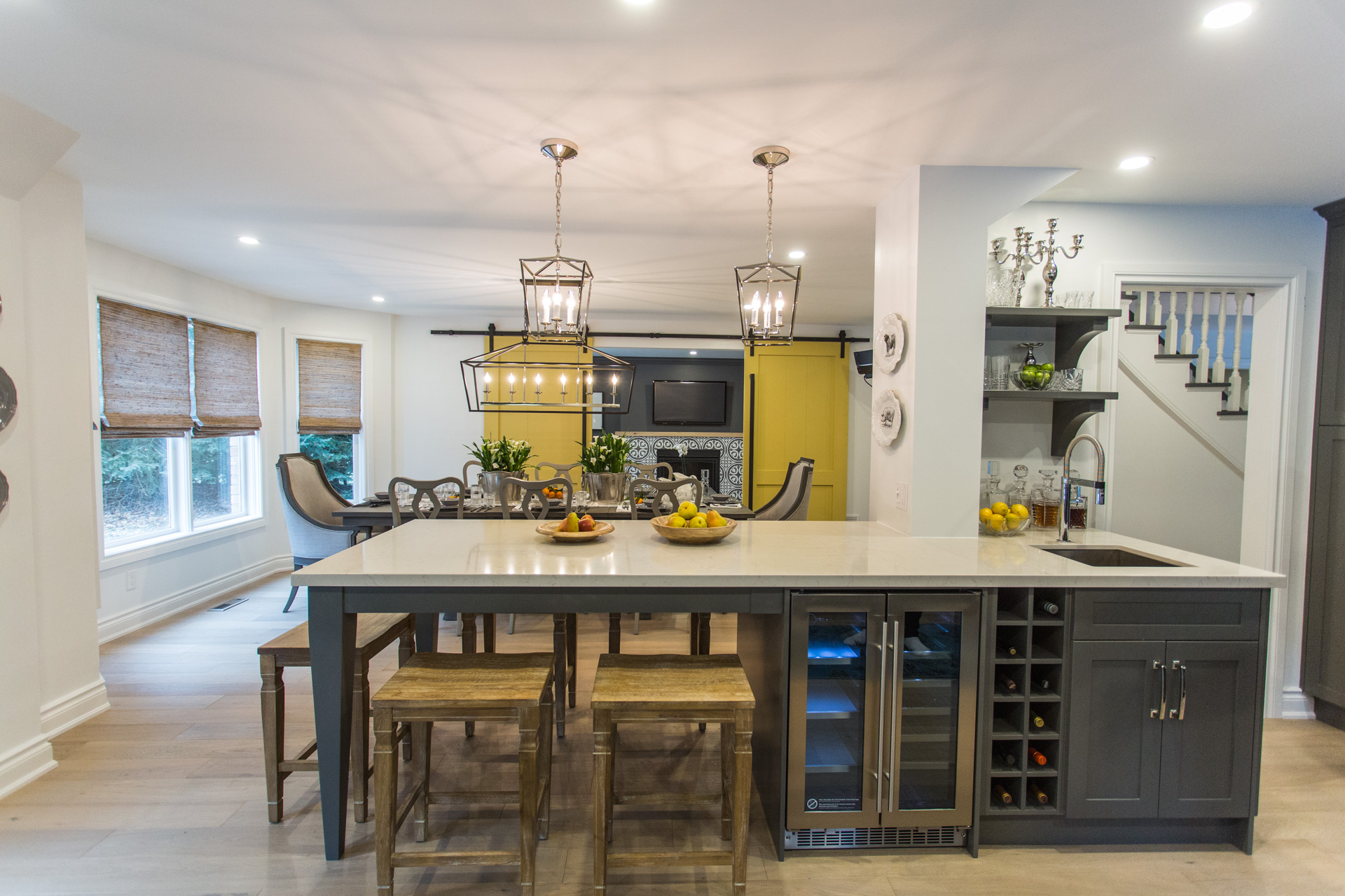
Nailing It
“I love the house, I can’t believe it’s the same space that I lived in a couple months ago,” says Katelyn. “I didn’t know it could look this good, to be honest – they really nailed it.”
Are you up to date with the latest episodes of Bryan Inc.? Catch up here!
HGTV your inbox.
By clicking "SIGN UP” you agree to receive emails from HGTV and accept Corus' Terms of Use and Corus' Privacy Policy.


