If you love a sleek, contemporary aesthetic, a new-build property can be the perfect clean slate – but for a house to be a home, you need to layer in a little character. This was the challenge for the homeowners of this new-build townhouse in downtown Toronto’s Corktown neighbourhood: their new home was modern and bright, but it lacked personality and warmth. To make the space feel inviting – while staying true to the homeowners’ modern sensibility – designer Jessica McGouran of Jessica Leigh Interiors used art, texture, custom elements and hints of colour to create a true home.
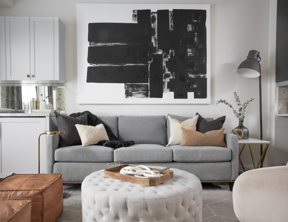
Classic, Comfortable, Luxurious
When designer Jessica McGouran first met with the townhouse’s homeowners, she was given three descriptive words – “classic, comfortable, luxurious” – which then guided her design inspiration throughout the process. “We wanted the space to feel mature, contemporary, and polished – but also comfortable and warm to reflect the clients,” she says. “Each room had to deliver on these three words/concepts.”
Related: How Do You Strike a Balance Between Modern Design and Warmth? Ask This Vancouver Home
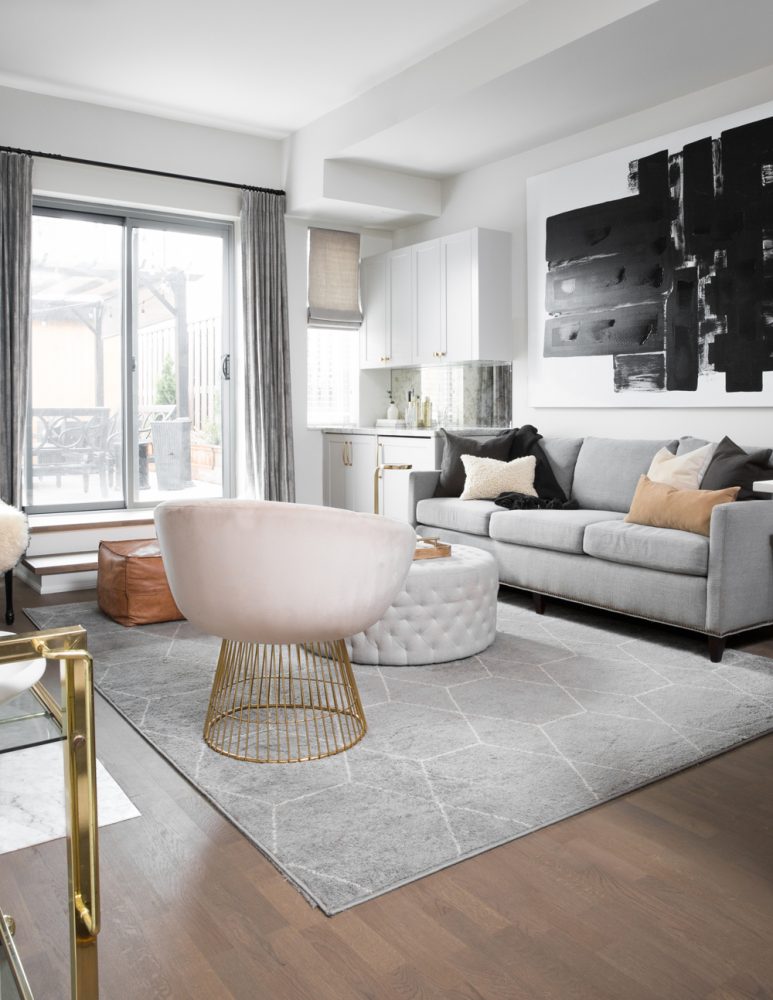
Cool Colours
Throughout the home, Jessica uses colour (or, more specifically, a thoughtful lack of colour) to evoke a consistently contemporary feel. With a neutral scheme of black, white and grey as the foundation, soft contrasting details like a pale-blush chair or cream-hued throw pillows bring major warmth.
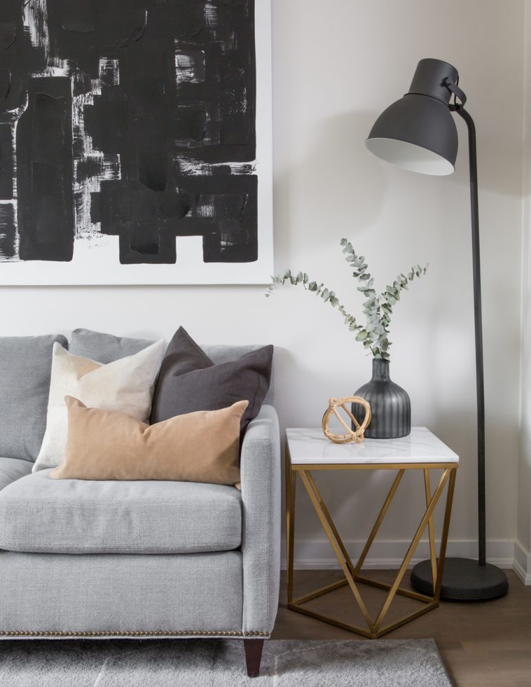
Modern Art
plays an important role in elevating the contemporary aesthetic throughout the home, with a range of bold pieces placed in key areas to create distinctive focal points. While much of the art was sourced from artists known by the homeowner, the striking painting in the living room was already part of their collection – though Jessica hung it on its side for a different effect. “Flipping this piece gave it a new look, and suited the scale way better,” Jessica says.
Related: Awesome Living Room Wall Art That Makes a Statement: Beyond Paintings and Photos
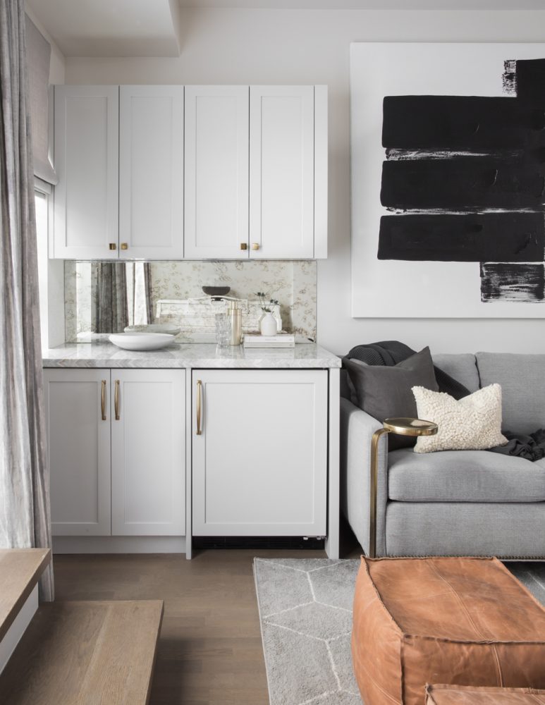
Raising the (Bespoke) Bar
The custom bar tucked into the living room isn’t just stylish to look at – it’s ultra-functional for a couple that loves to entertain. “They needed a second area to make and serve drinks and put out snacks that wasn’t in the kitchen,” Jessica explains. The custom-bar solution was both practical and a little luxe, with a built-in wine fridge, pullouts for their wine collection and storage for glassware. “The unit is extremely functional, and the addition of the lacquer cabinets, brushed-gold hardware and marble stone adds some bespoke details that elevate the space,” Jessica adds.
Related: You’ll Be the Ultimate Party Host With These Beautiful (and Affordable) Bar Carts
Warm Finishes
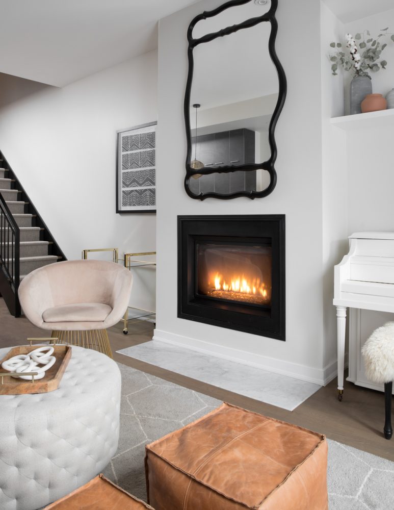
It’s hard to go wrong with a cozy fire, but a basic fireplace in a modern new-build could verge on bland if left on its own. While the living room’s fireplace was clean-lined, it lacked (stylish) warmth. To elevate the look, Jessica added a marble hearth in front – and a distinctive detail above. “The mirror is actually a vintage vanity mirror that was painted and turned vertical to give it an asymmetrical shape,” Jessica says.
Related: 20 Gorgeous Fireplace Mantel Decorating Ideas That’ll Keep You Cozy
A Sophisticated High Note
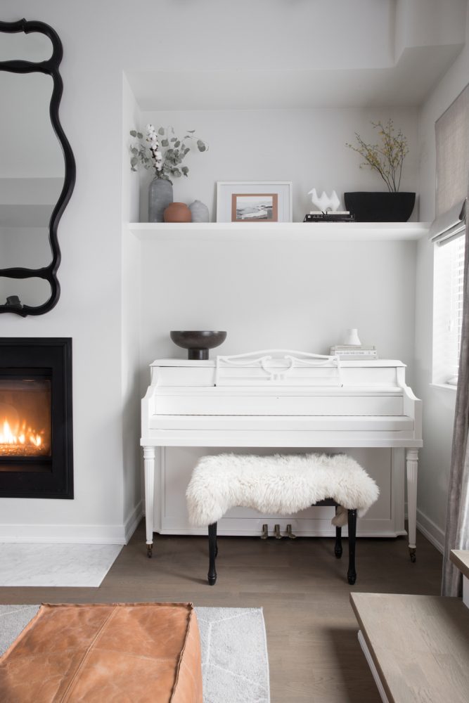
While most of the townhouse’s architecture and furnishings are quite modern, Jessica found subtle ways to incorporate touches of character and history for a more balanced, grounded feel. One particularly harmonious example? This beautifully refinished family-heirloom piano. “This is our client’s grandmother’s piano, which has been passed down three generations and is still used at family gatherings,” Jessica explains. “It’s a sentimental piece, so they painted it white to give it a fresh look, so it would work in their main living room.”
Clean Lines
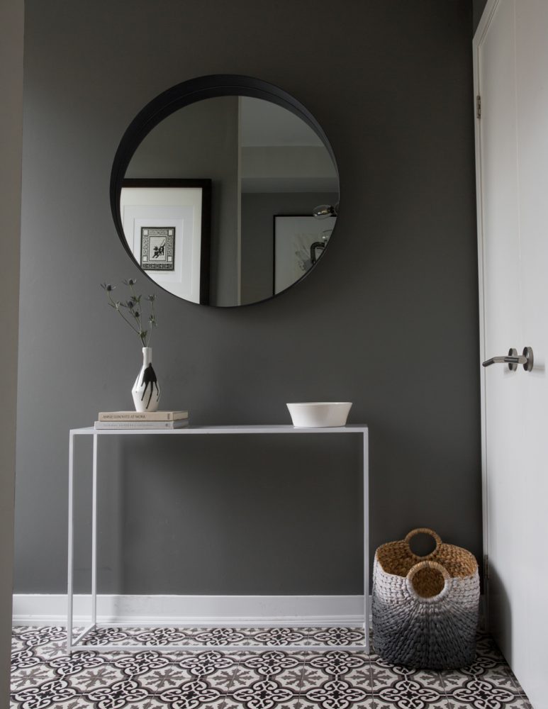
Another central goal of the home’s design was keeping the look clean and contemporary, but never boring or clinical. As Jessica says, the homeowners’ goal “was to make the home an extension of them and reflect their style and personality.” We love how a round mirror and sleek table add distinct character to the hallway, without overpowering the small space.
Related: This Vancouver Home Proves That Contemporary Can Have Texture and Warmth
A Perfect Fit
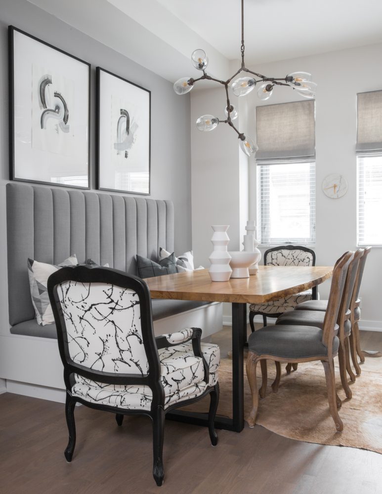
Sometimes, a design challenge (like a slightly narrow dining area) can lead to statement-making solutions (like the custom look of this space). “The dining room area is a little narrow,” Jessica says. “Adding a banquette and pushing the table over allowed for more space to walk by and serve guests, and the channelled banquette added some much-needed texture and interest to the large wall.” To layer in more character, Jessica added a few consignment-find chairs to the table. We love how the two distinctive end chairs, which they had reupholstered in a bold black-and-white fabric, provide a burst of modern, artistic energy.
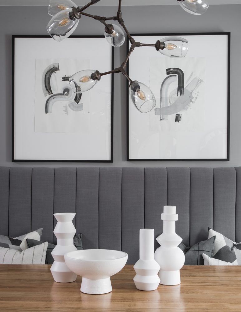
Polished Personality
Touches of contemporary art enhance the dining space, as well. “Over the dining room banquette are two lovely pieces our client purchased from a local artist,” Jessica says. “The light whimsical feel was perfect for over this tailored custom banquette we added.”
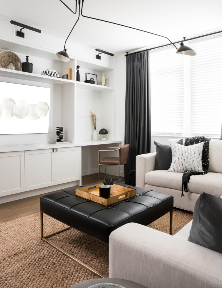
Stylish Storage Solutions
“Two challenges in this home were the lack of storage, and character,” Jessica says. Adding custom millwork addressed both issues perfectly. “We didn’t want to clutter up the rooms with too many pieces of furniture, so adding in cabinetry was a streamlined way to add functional storage, while also adding some depth and character to the space.”
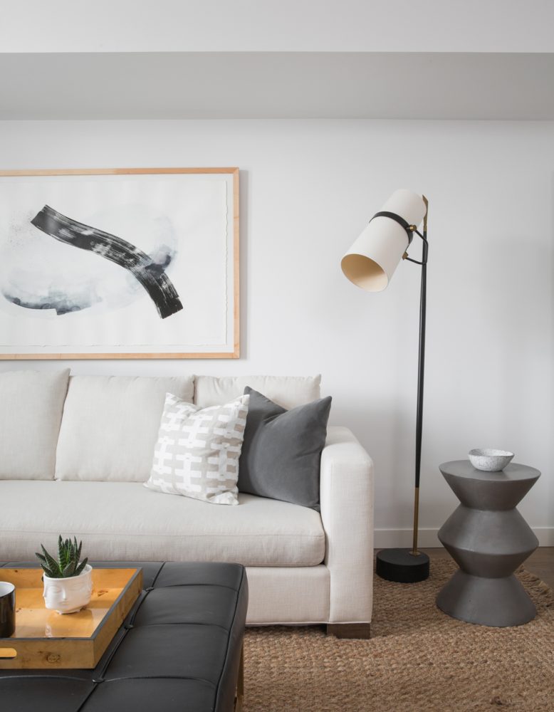
Custom Details
Many of the elements in this space – from the art to the furnishings – were thoughtfully created with the homeowners’ specific tastes and needs in mind. “In the family room, this piece was actually commissioned by a local artist and family friend,” Jessica says. “We sent the artist our design schemes and fabrics, and an idea of what we wanted, and she created this beautiful piece.” When it comes to seating, “the big custom sectional has a queen bed inside for when guests come over, but it also serves as a cozy place to curl up at watch movies,” adds Jessica.
Multi-Function Spaces
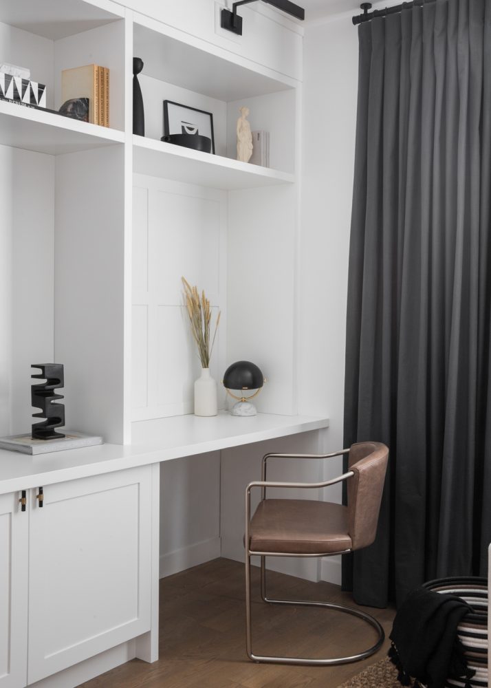
The cabinetry also helped to create a refined but versatile space for the homeowners. “The clients needed a multi-function room: guest room, home office and TV room, so that’s just what we did,” Jessica says. The end section also added a desk space complete with panelling details – creating a bright, stylish work-from-home area.
Related: How to Take Your Home Office to The Next Level, According to an HGTV Designer
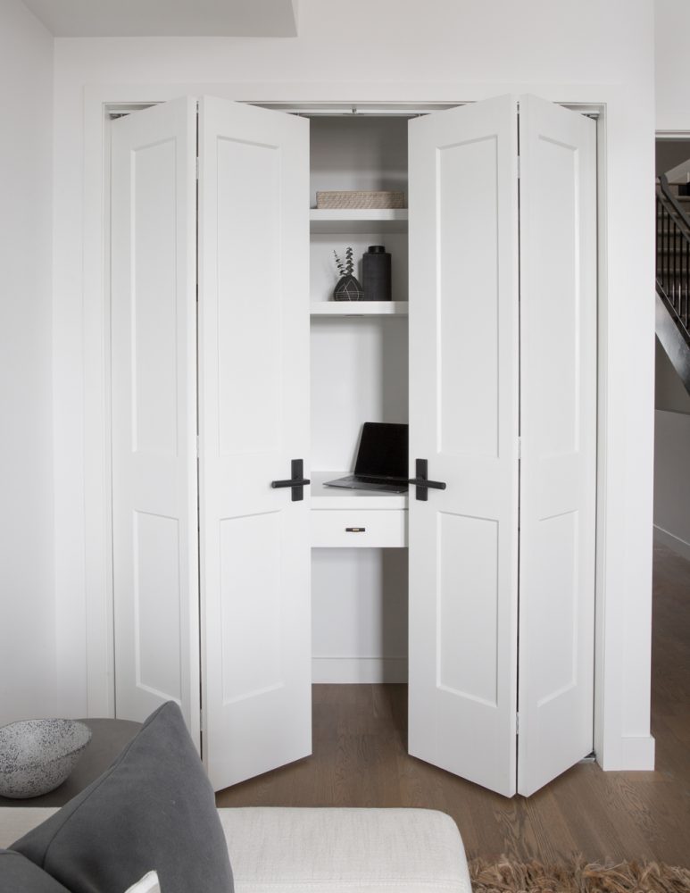
A Hidden Office
To further enhance the home’s functionality, Jessica added a clever hidden workspace for her client’s husband with this bright, white closet office.
Related: How to Make Any Room Double as a Home Office (Yes, Even the Bathroom!)
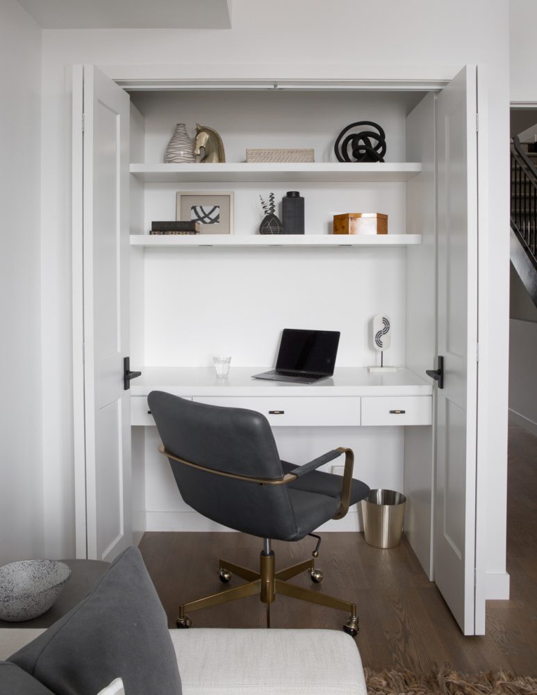
Home Work
The compact office space makes it simple to keep the larger room tidy when it’s not in use. “Since they often use this room for guests, they wanted to be able to close the doors and hide any desk ‘mess’ easily,” Jessica says. We love how the curated items on the upper shelves keep the workspace feeling sophisticated.
Related: The Best Home Office Furniture Picks (and Accessories) Under $300
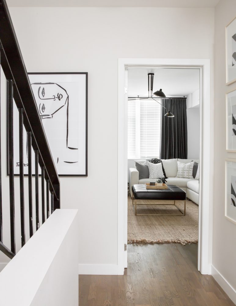
Modern Luxury
Artful influences connect the home’s spaces with a sense of personality as you move from room to room – as this view from the hallway demonstrates with a combination of framed art pieces on both walls beside the door.
Related: 11 Things Every Stylish Home Has (It’s Not What You Think!)
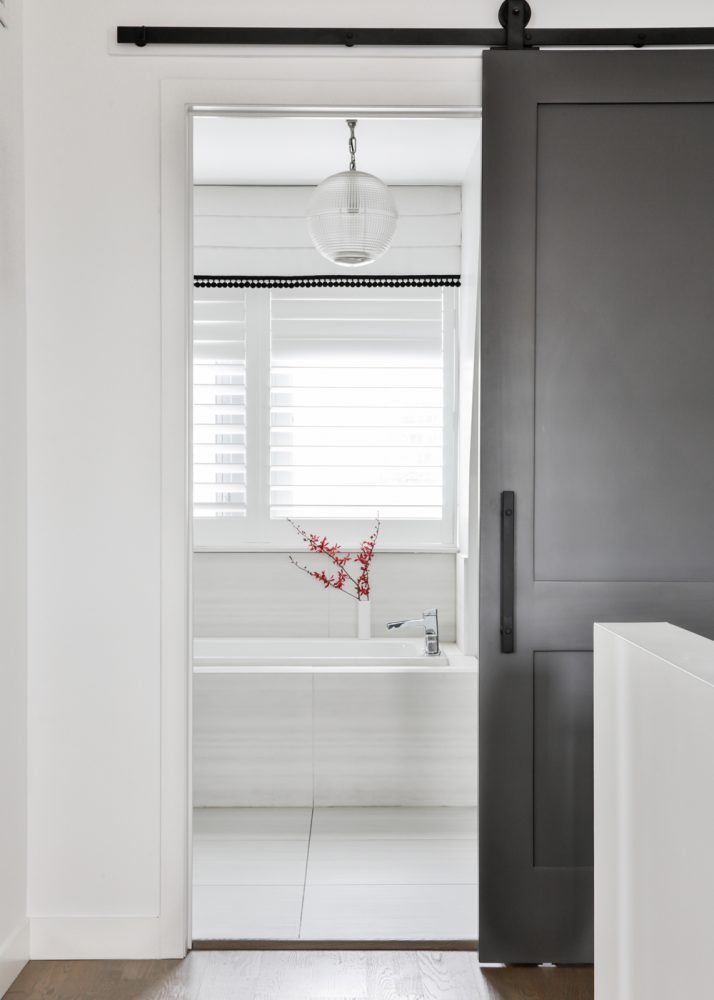
Sliding Doors
The bathroom was already a fairly neutral space, so it only needed a few touches – like new roman shades above the tub -to create a sense of continuity with the rest of the home’s third floor. Perhaps the biggest change to the space? The standard hinged door was swapped for a custom sliding barn door. “It’s the first thing you see when walking up to the third floor and we wanted to make a statement,” Jessica says.
Related: Trust Us – These Modern Bathroom Design Ideas Have Major Staying Power
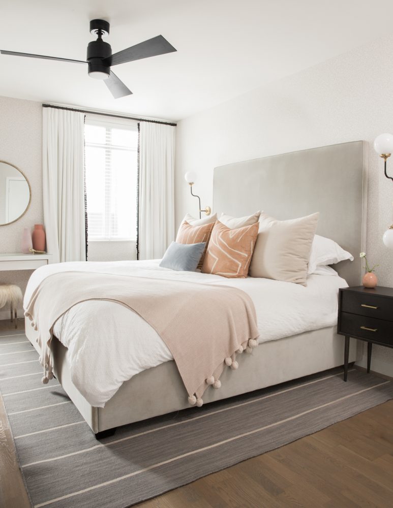
Light and Bright
In the bedroom, Jessica’s design mission was clear. “Our goal was to create a light, and bright cozy bedroom retreat.” To achieve this, Jessica layered soft touches and subtle colour into the room. “We have a black, white and grey colour scheme running throughout the whole house, and to add that extra warmth and luxury feel to the bedroom, we added in this beautiful salmon colour with these Kelly Wearstler pillows.”
Related: 10 Super Easy Ways to Add Character (and Value) to Your Bedroom
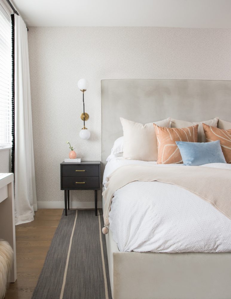
Dreamy Elements
can transform the feel of a bedroom, and the drapery used here evokes the fresh, cozy feel. “One of my favourite elements is the drapery panels. We went with a simple white linen for the windows, but added in a black ‘pom-pom’ trim to the edge. It really elevates the drapery and ties in with the classic black accents in the room. It’s all in the details,” Jessica says. Speaking of details: the modern wall sconces from ELTE in Toronto save space on the side tables while also providing some extra contemporary character for the room.
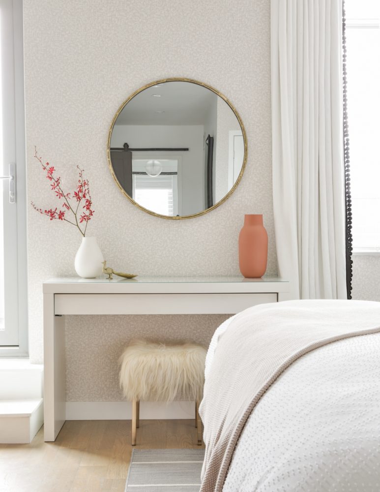
Feature Walls
As for the walls, Jessica and the homeowner went for a touch of texture. “Both myself and our client love wallpaper,” Jessica says. “We knew we wanted to incorporate it, but didn’t want it to be overbearing, so we selected this small pattern, tone-on-tone paper from Kate Spade. It gives great texture and depth to the space without being too busy.”
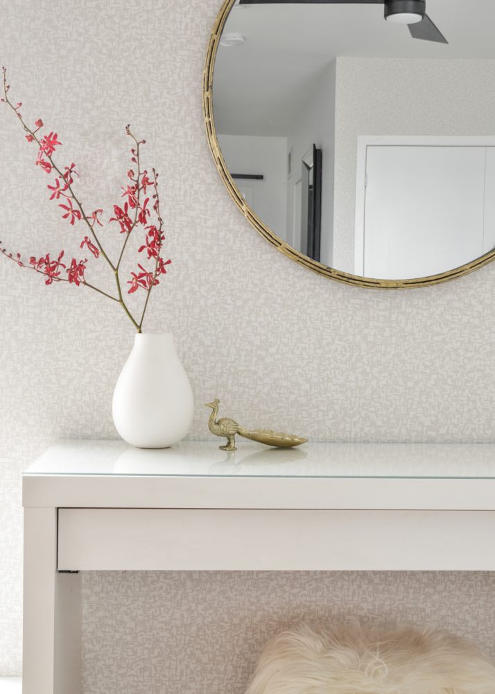
It’s All in the Details
While the bedroom’s aesthetic still reflects the clean lines of the rest of the home, delicate touches like this small gold peacock from West Elm provide pretty detail – that’s also functional. As Jessica says, items like the peacock are “great for this vanity table to put rings or jewellery before hoping into bed.”
HGTV your inbox.
By clicking "SIGN UP” you agree to receive emails from HGTV and accept Corus' Terms of Use and Corus' Privacy Policy.


