While there’s something to be said for a good surprise, homeowner Philip wasn’t exactly thrilled when his wife, Elly, made an impulsive offer on an historic home – before he’d ever stepped foot inside it. Once the couple and their young son moved in, issues with the more-than-100-year-old home’s odd layout and old-fashioned design seemed even more insurmountable – until Dave and Jenny Marrs stepped in. By reworking the home’s flow and adding thoughtful touches, the Marrs transformed the old house into a dream home that both Elly and Philip could love.
Watch Fixer to Fabulous Wednesdays at 9PM e/p on HGTV Canada. Stream HGTV Canada anytime with the Global TV App and on STACKTV. HGTV Canada is available through all major TV service providers.
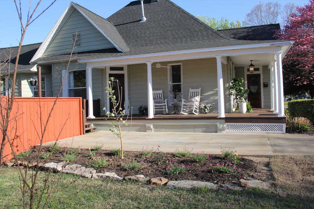
What’s Old is New
The bones of the historic home’s exterior is what initially made Elly fall in love with it – and what made Philip question their decision. The Marrs improved upon the house’s exterior by landscaping and adding a fresh coat of classic sage-green paint. Also, by replacing the leaky roof, the Marrs made sure that all their hard work on the inside would be protected from water damage.
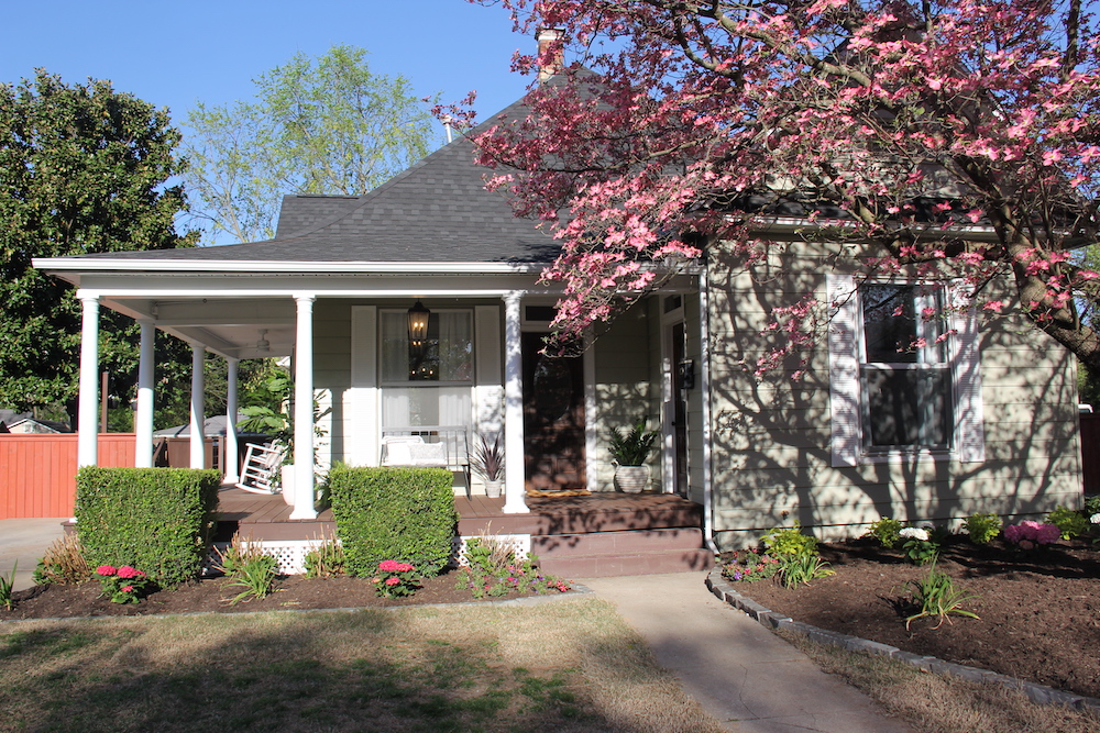
A Wonderful Wrap-Around Porch
An ugly car port had been a serious eyesore that inflicted heavy damage to the home’s curb appeal. By replacing the old car port with the stunning wrap-around porch of Elly’s dreams, Dave and Jenny were able to enhance the home’s look, give the family more outdoor space and honour the house’s original character.
Related: 15 Balcony and Front Porch Design Ideas We Want to Steal
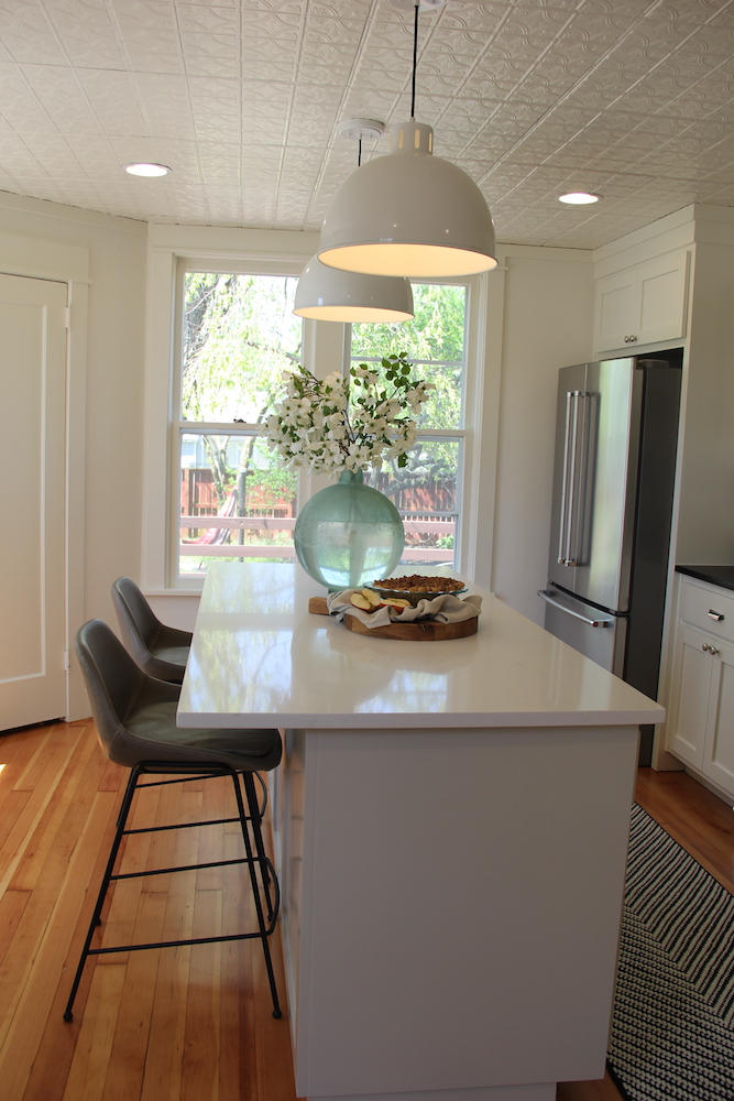
A Bold Move and a New Kitchen
Because the 1,630-square-foot house was built in 1902, it wasn’t designed for the needs of a 21st-century family. It was a bit of Frankenstein’s monster of hodgepodge additions and oddly placed doorways. The Marr’s goal was to honour the home’s character, while modernizing the space and making it more functional – as they did by totally moving the kitchen from the back of the house to the light-filled front, in what was formerly their guest room.
Related: How to Transform a Dated Century-Old Home Into a Light-Drenched Dream
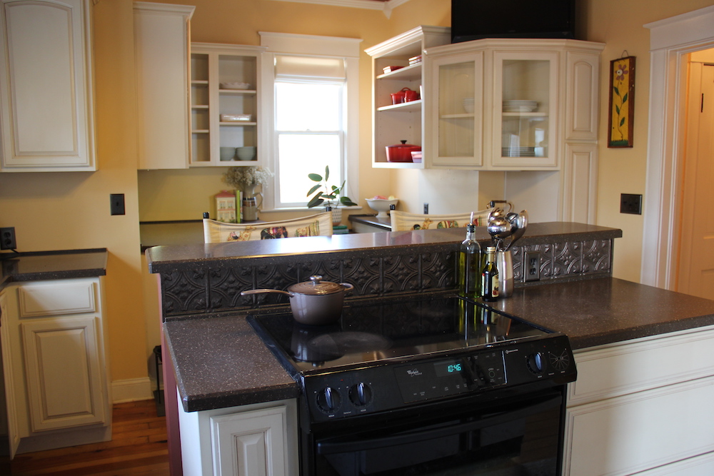
Awkward and Tight
As you can see, the original kitchen wasn’t functional with its random assortment of cabinets and too-tight cooking spaces. Relocating the kitchen was a major upgrade, and – while it may seem like an extravagant idea – it made sense for the century-old home. Moving the kitchen in an older home often requires all-new plumbing and added expense but if Philip and Elly didn’t make the move in this this renovation, it would likely never get done.
Related: Backsplash, Tile, Cabinetry: The 15 Top Kitchen Trends for 2021
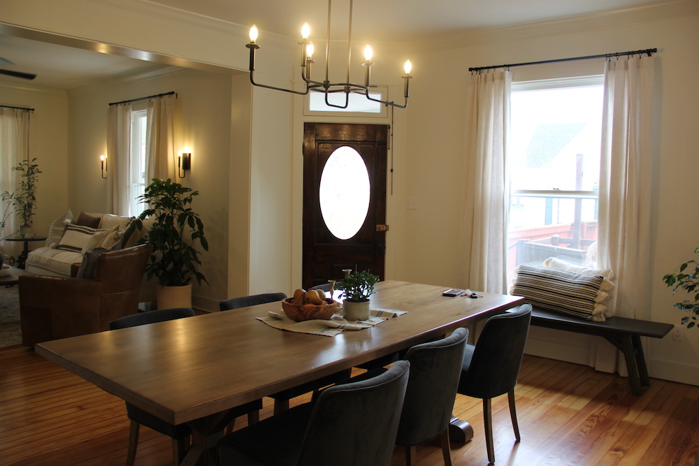
An Open Feel
Part of the reason why Philip didn’t love the home initially was because it felt too cramped for his taste. While the home’s old archways added character, Philip had always dreamed of living in a more open-concept home, so Dave and Jenny took down the dividing walls to build a flowing open-concept living room and dining room, and to show Philip his home’s true potential.
Related: 15 Dining Room Lighting Ideas That’ll Shine in 2020
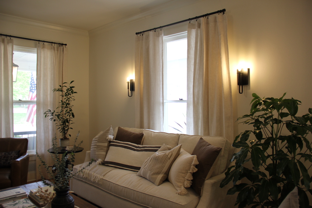
Hardwood Issues
One of the features that Elly loved most about the home was the pine hardwood floors, which were original to the house, but had seen much better days. To save the old floors, the Marrs called in an expert to help them repair the floors where needed and create a seamless finish – preserving the historic character that Elly valued.
Related: 20 Tips for Arranging Furniture in Your Living Room
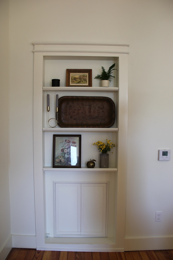
Hidden Productive Potential
The old laundry room was located down in the dungeon-like basement, which made doing laundry (especially with a baby in tow) a huge (and even dangerous) chore. Dave and Jenny solved this problem by building a laundry room upstairs – which they kept stylishly out-of-sight behind a secret hidden door that looks like a bookcase.
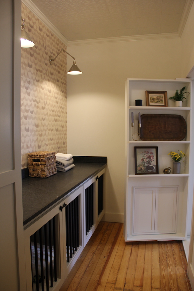
A Luxe Laundry Room
The new laundry room is the perfect mix of style and function. To bring the family’s dogs up from their basement crates, the Marrs designed a custom built-in pet kennel area in the laundry room. They also added a special fishing pole storage cabinet to offer a special touch for Philip, who is an avid fisherman.
Related: The Home Edit Founders Share Their Laundry Room Organization Tips
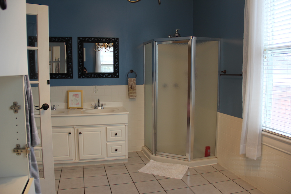
A Waste of Space
Before, Philip and Elly’s master bathroom was huge… but also a huge waste of space. The bathroom featured a tiny corner shower on one side and an oversized tub at the other, with a wide-open space in-between. With their adjacent bedroom lacking closet storage, the big bathroom just didn’t make sense.
Related: 10 of Our Favourite 2019 Bathroom Renovations From HGTV Shows
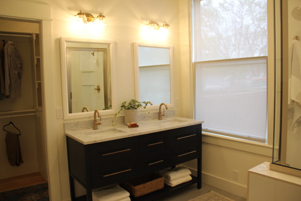
Redistributing the Room
As with all the home’s updates, the bathroom renovation made the most of the space so that it was aesthetically pleasing and functional. By stealing some of the wasted square footage from the bathroom, the Marrs were able to create a spacious closet for the couple. New floors, a shower and an updated vanity completed the stylish finish.
Related: Our Favourite Storage Solutions to Stash Your Stuff Around the House
HGTV your inbox.
By clicking "SIGN UP” you agree to receive emails from HGTV and accept Corus' Terms of Use and Corus' Privacy Policy.


