When Maca Atencio and her husband, Esteban Chacin, first entered their Montreal home, they were floored. “As soon as we stepped in, I was like, ‘oh my God, is this real?'” Maca said. The shoebox house, originally built in 1915, had been redone by an eco-conscious contractor with an eye for detail: concrete heated floors, glass partitions, a rainwater recycling system. The couple had been searching for three months and realized immediately that this place was the one. They bought the home within 24 hours and wasted no time planning their modern-Bohemian redesign. Plus: you’ve gotta check out the video tour of the walk-in pantry.
Published November 7, 2019, Updated March 19, 2021
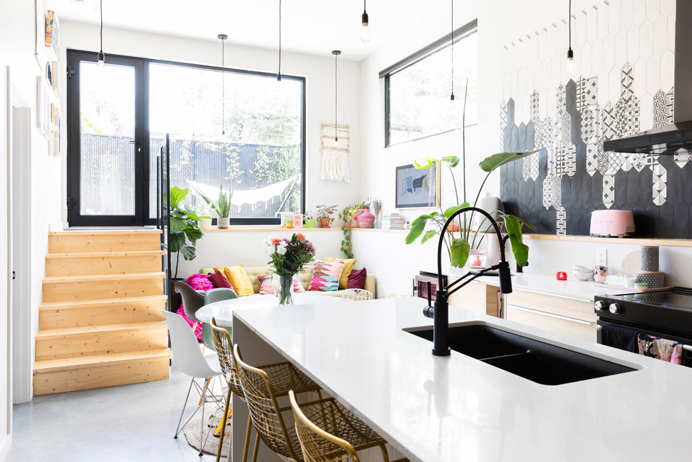
Heart of the Home
Any experienced host knows that no matter where you start a party, it always ends up in the kitchen. Maca, a blogger who focuses on lifestyle, travel and design, brought in a variety of plants and colours to make the space as welcoming as possible.
Related: Video: Colourful Pantry Makeover
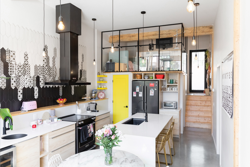
More is More
The kitchen is centred around the quartz island, where a couple gold chairs from CB2 offer a stylish spot to grab breakfast.
Related: This Dreamy Montreal Bungalow is the Epitome of Pink Perfection
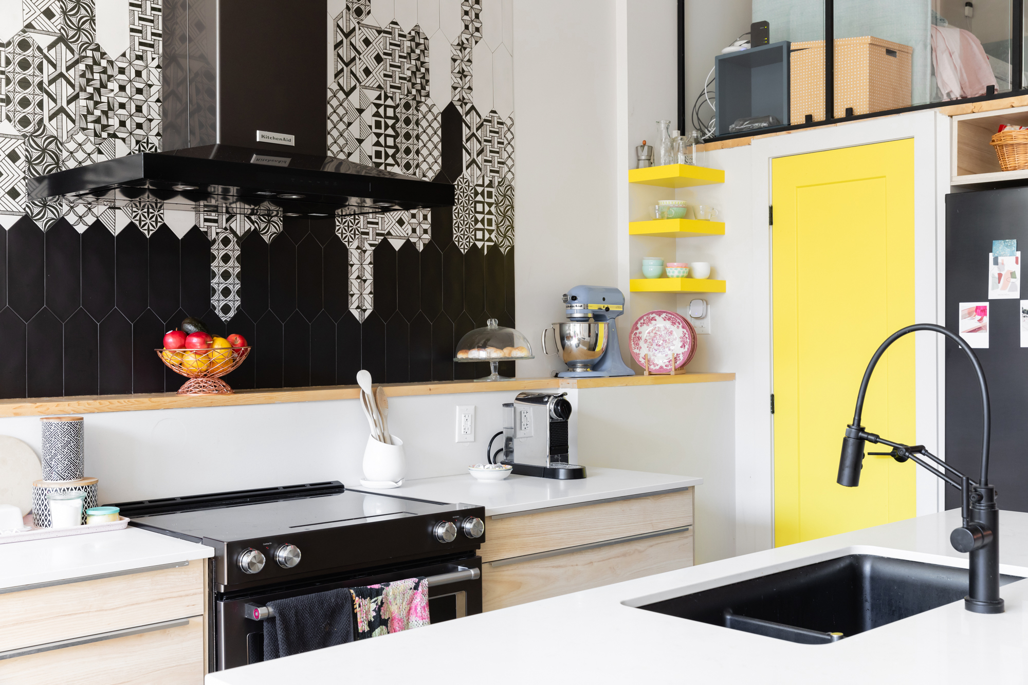
Black and Yellow
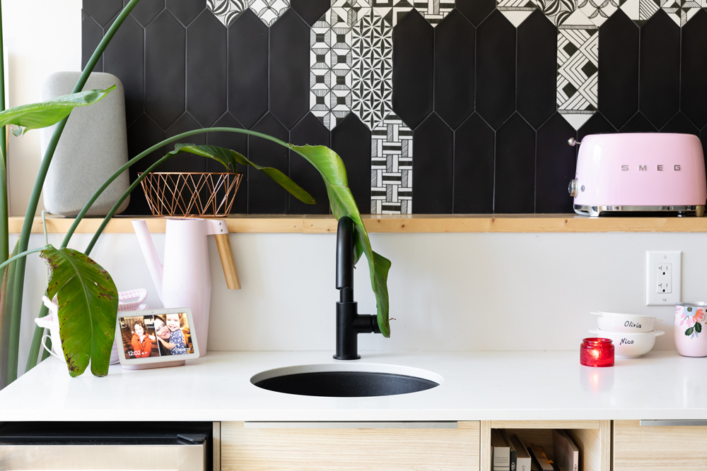
One of the most striking features in the kitchen is the black-and-white tiled backsplash. It was one of several unique touches from the contractor, Marie-Jeanne Rivard. The matte black faucet matches the monochromatic approach.
Related: This is How to Use Creative, Cool Decor to Create a Bespoke Home – No Renos Required
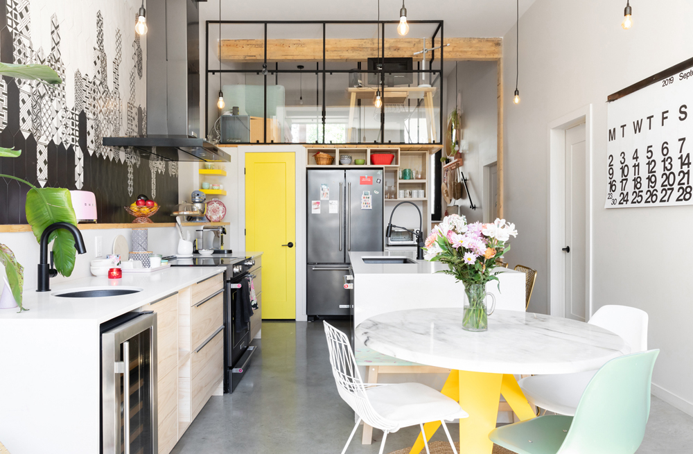
Mix and Match
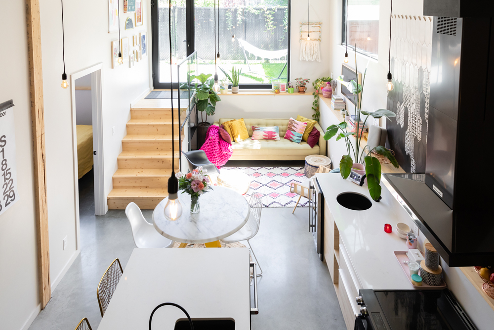
There wasn’t enough space for a proper dining room, but this circular table from EQ3, nestled beside the countertop, certainly does the trick. For an eclectic approach, Maca brought in a couple mismatched chairs from some local vintage shops.
Lemon Fresh
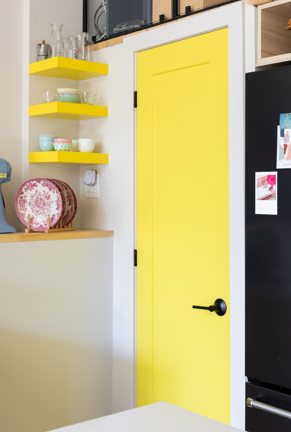
The yellow door was another one of the contractor’s bold design choices. Maca bought a couple shelves from IKEA and painted them herself to match the sunny tone.
Related: This Calgary Loft Delights With Whimsical Goodies, Original Art and Fortifying Pattern
Pretty in Pink
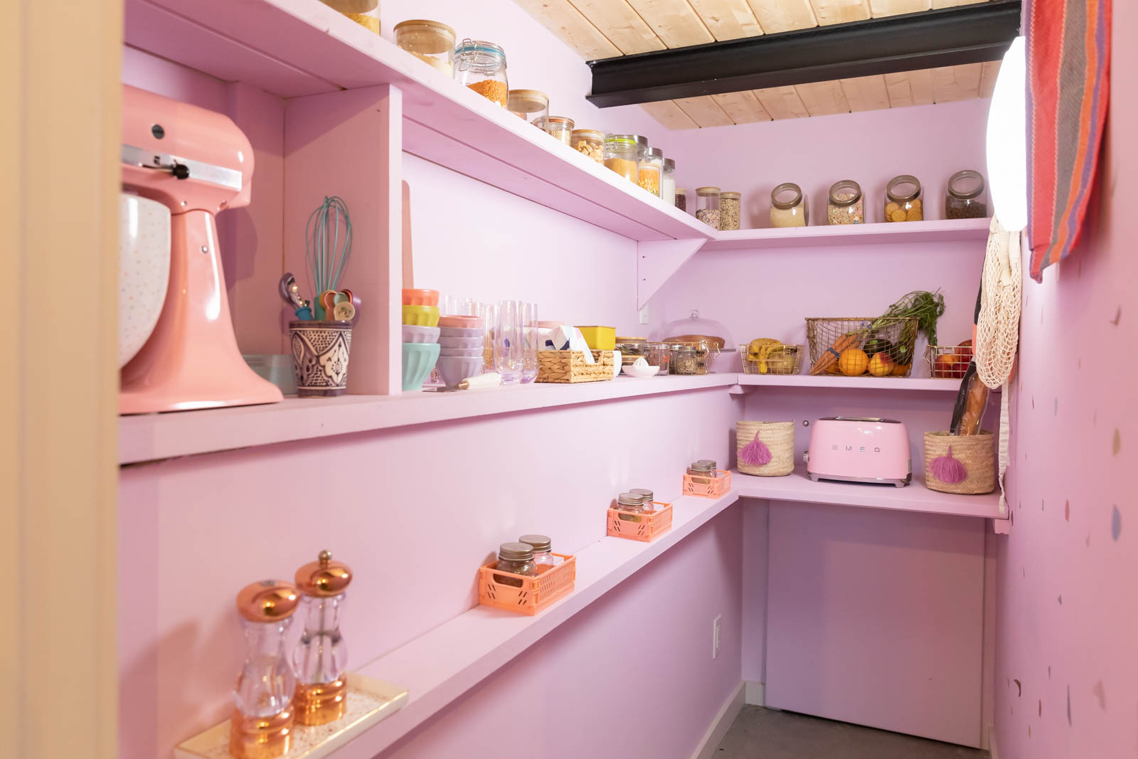
Behind the yellow door is this walk-in pantry, which Maca redesigned into a thing of beauty. See the video tour of the pantry here.
Double Duty
Why have one sink, when you could have two? The kitchen has double the sinks, which Maca originally thought was a bit odd, but it’s turned out to be super functional, especially when the dishes start piling up. The bubblegum-pink toaster, from Smeg, adds a snappy layer to the kaleidoscopic palette.
Up Above
Here’s another look at the kitchen from the mezzanine.
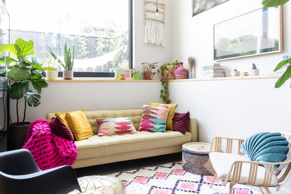
Cozy Spaces
The house isn’t huge, so Maca and Esteban made strategic decisions with furniture. “I can’t even fit a table. Nothing. It’s very minimal,” Maca said. This couch, from Structube, fits the space perfectly.
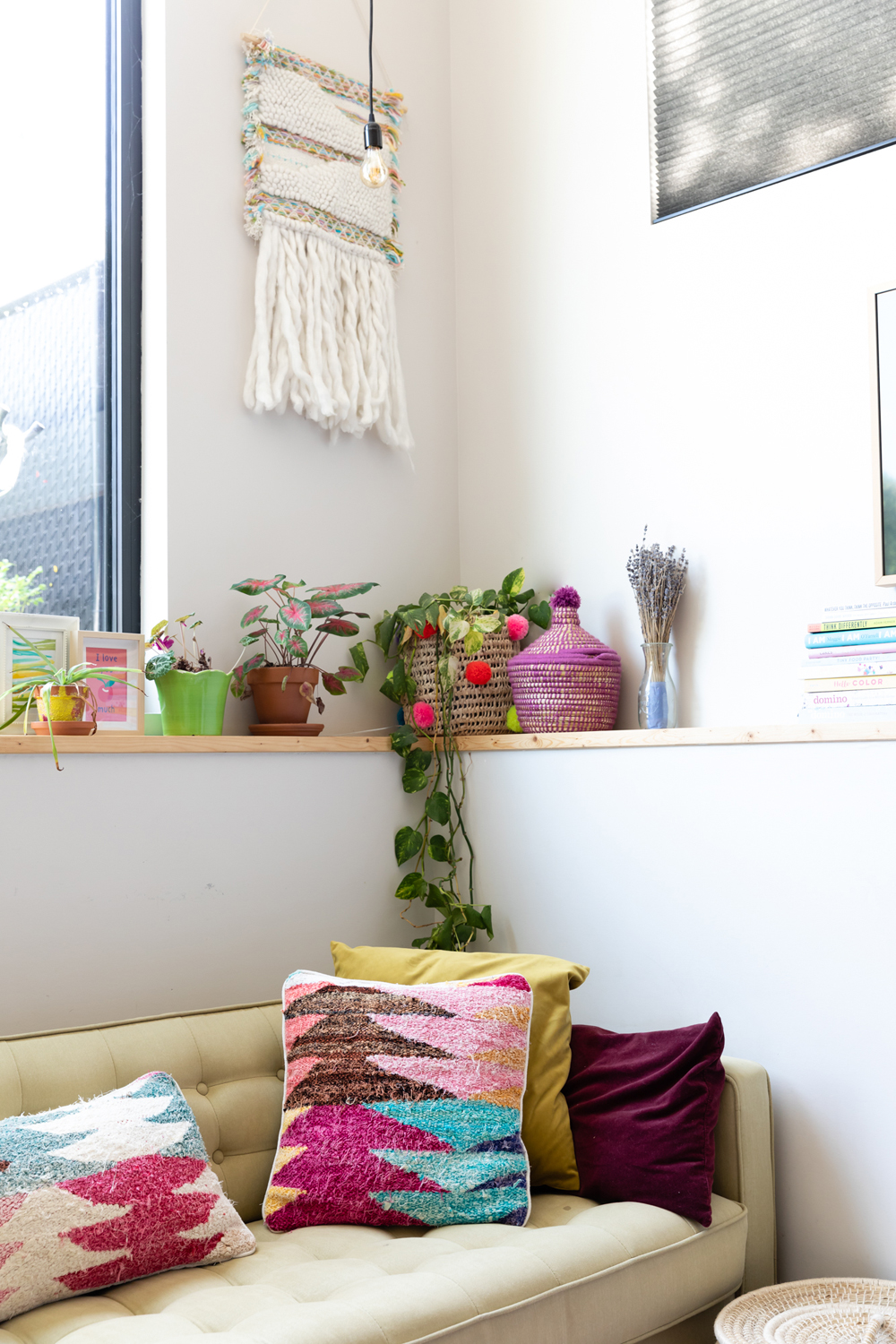
Vibrant Touches
Maca is a big fan of Baba Souk, a Montreal shop that specializes in colourful Moroccan decor. The pillows, rug and pouf are all from the shop.
Related: 15 Moroccan Decor Ideas for Every Room in Your Home
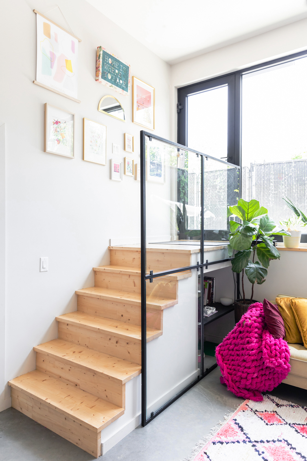
Natural Tones
The gallery wall, seen here, includes a variety of photographs and artwork that Maca sells through her blog’s shop, including a map of Montreal.
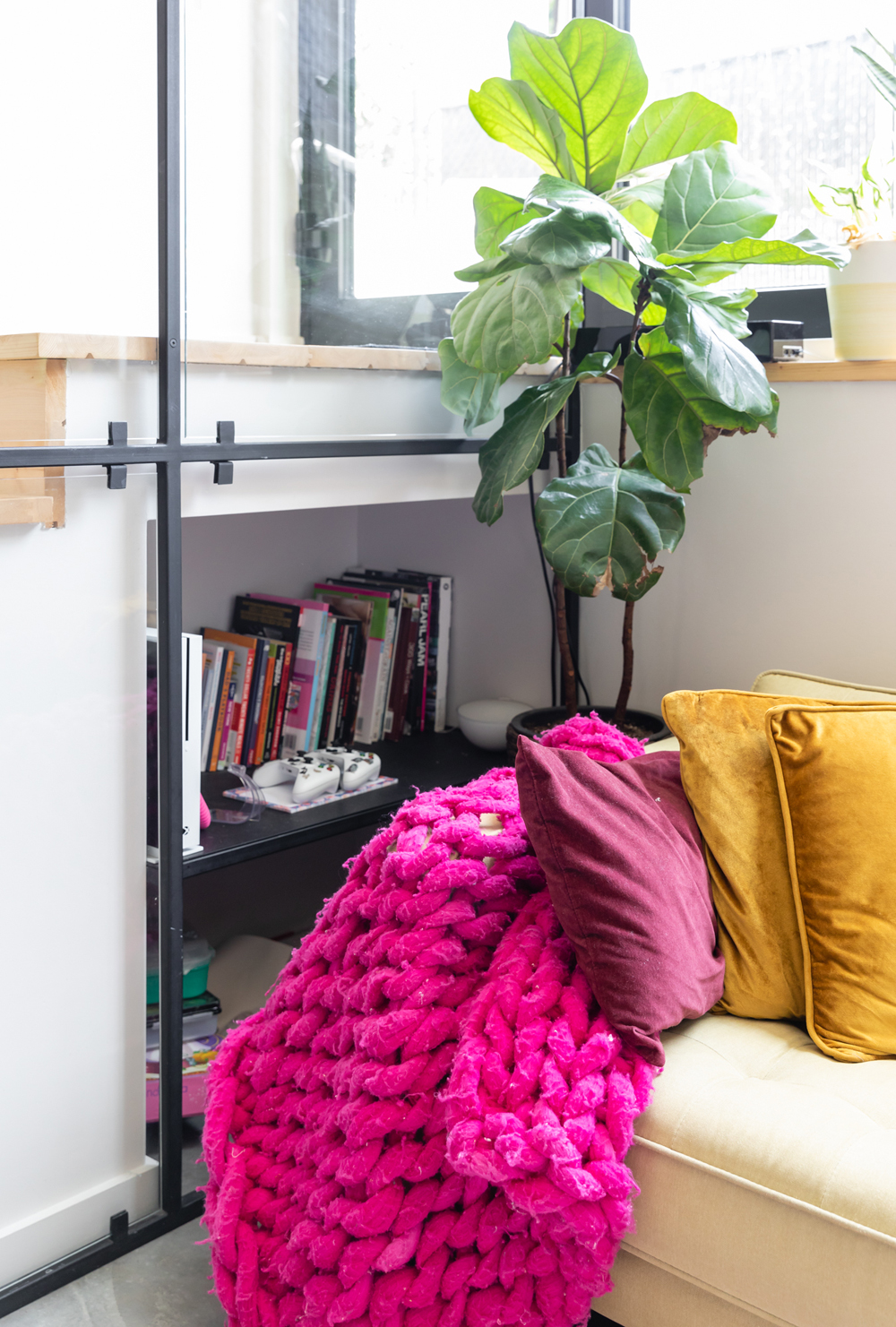
Hide and Seek
The nook beneath the stairs is the perfect hiding spot for books, video games and the kids’ toys. “It’s such a great corner,” Maca said.
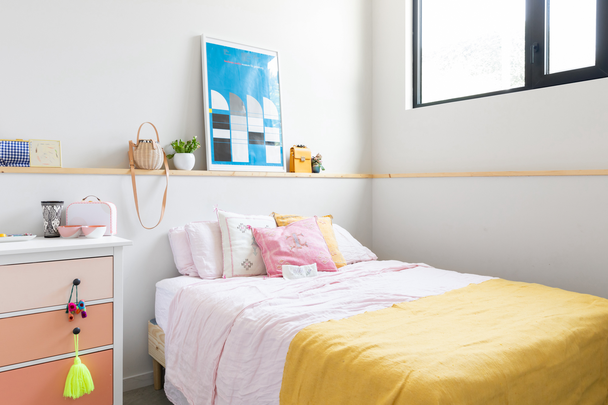
Pastel Heaven
This is the master bedroom – a place Maca describes as “happy,” thanks to all the pink. The bed is a simple frame from IKEA and the artwork on the wall is from Bauhaus in Amsterdam. Maca brought it along with her on the flight home, which took up plenty of space. “I was like, ‘This is my baby.'”
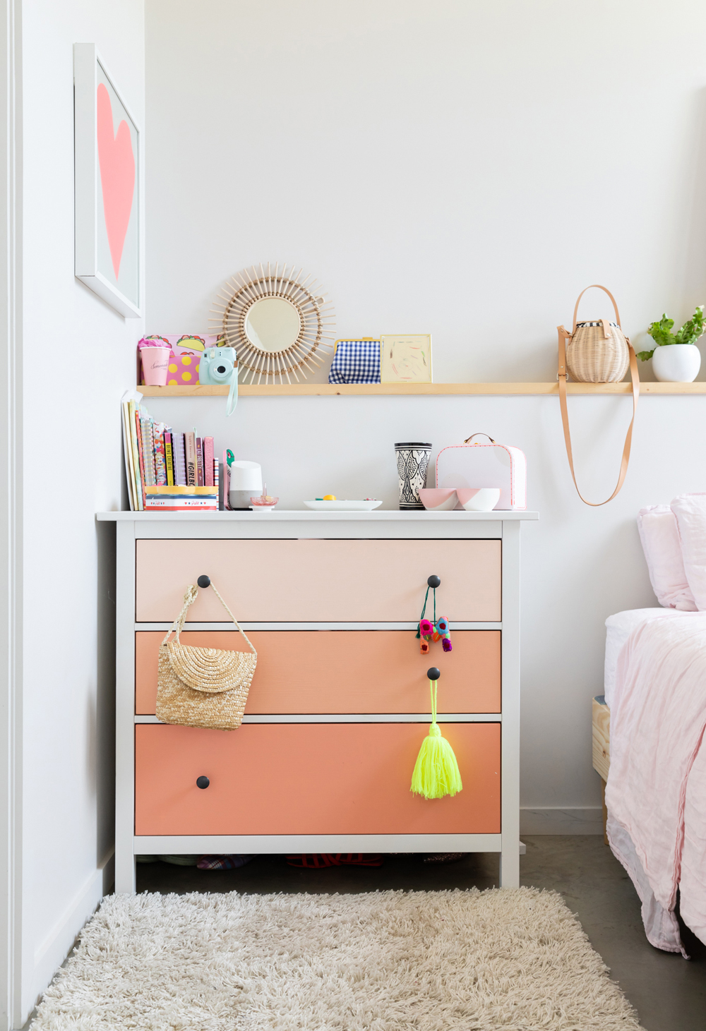
Pink on Pink on Pink
The three-tone pink dresser is a DIY project Maca did for her blog. “It’s been one fo the best blog posts so far and was so easy to do,” she said. The little bamboo mirror above is from H&M.
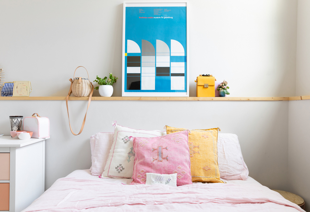
Common Thread
The wooden shelf above the bed is a through-line in the home and appears in several different locations. Bonus points: it’s very functional.
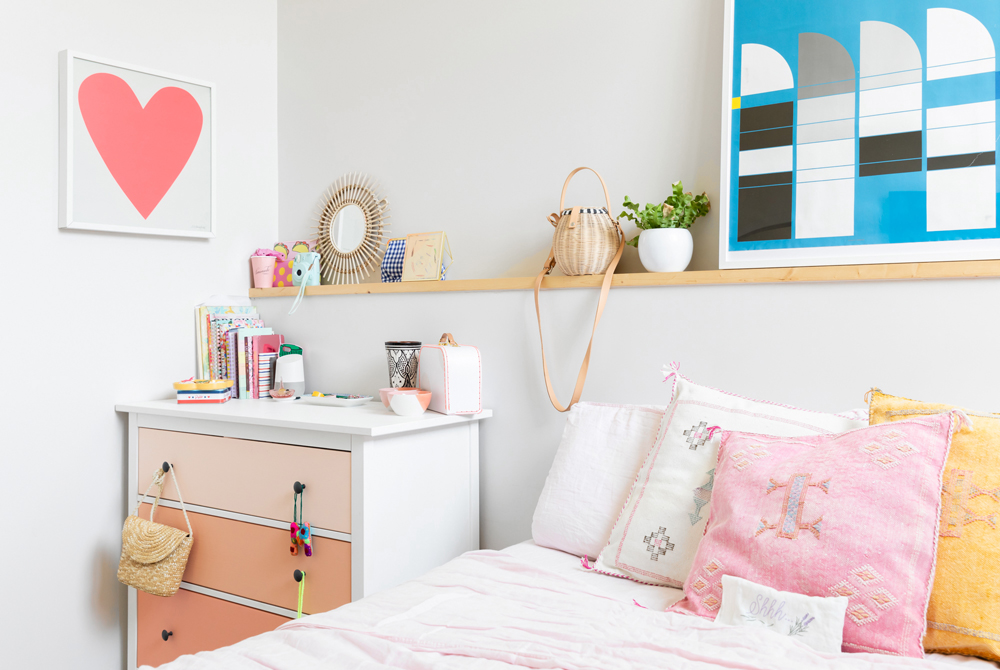
Love Is in the Air
Here’s another look at the bright, sunny space.
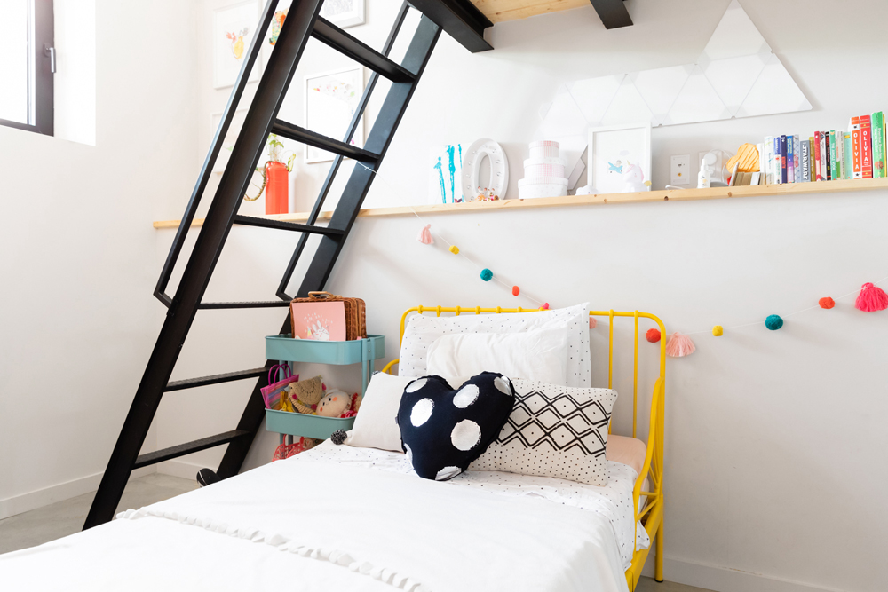
Play Time
Maca and Esteban have two children: Nico, 6 and Oli, 3. The two kids share a bedroom and this is Oli’s space. “What was challenging for me was how to create a room half for a girl and half for a boy,” Maca said. She ended up dividing the room in layers. The lower half is Oli’s space, while the upper loft belongs to Nico. Her yellow bed is from IKEA and the pompoms are from Souris Mini.
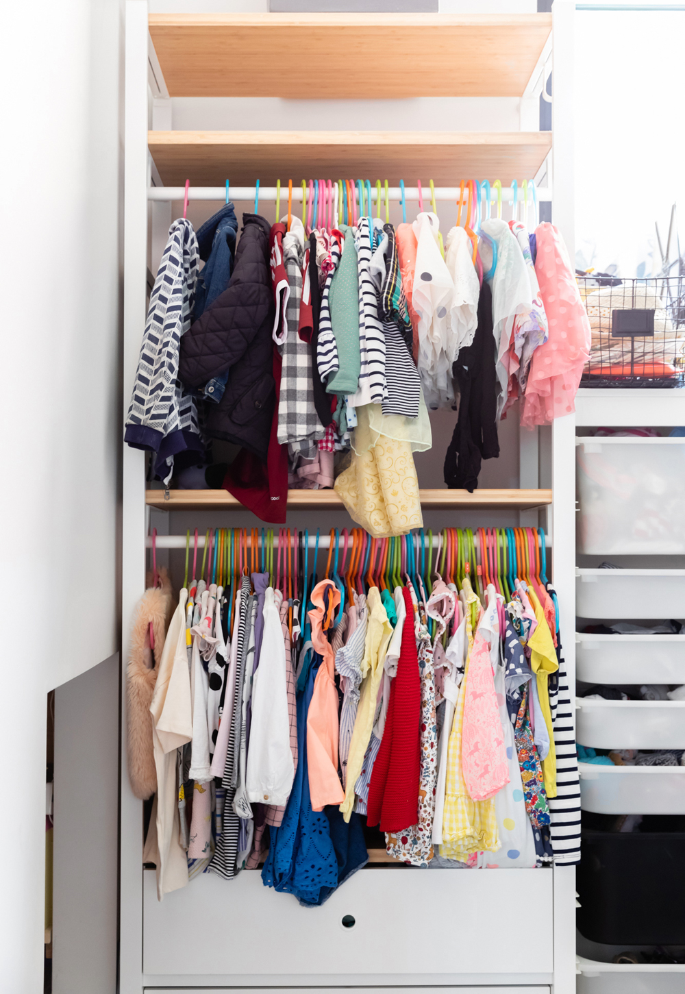
Fashion Forward
Oli loves picking out her own outfits each morning from the open-concept closet, from IKEA. The hangers, also from IKEA, add a cheery burst of colour.
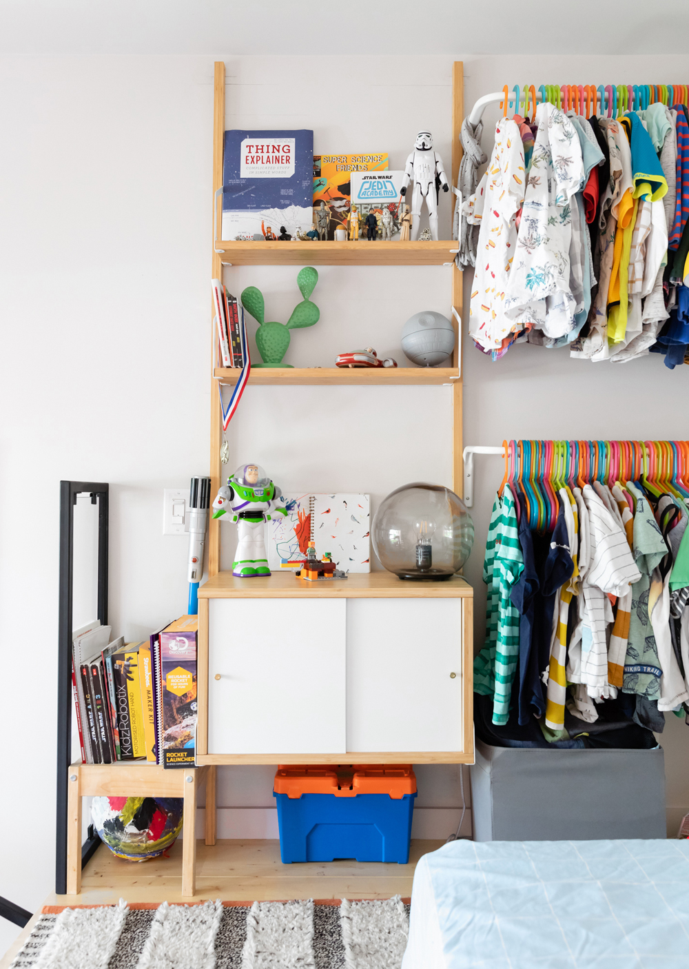
To Infinity and Beyond
The top loft belongs to Nico, who, as his toys can attest, loves outer space.
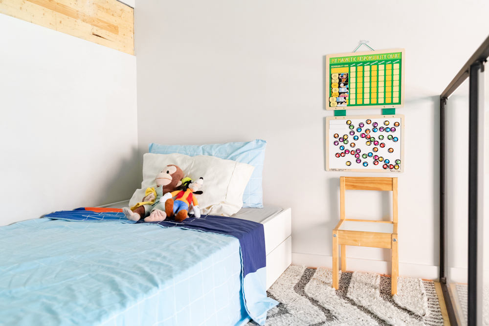
Storage Solutions
Nico’s room is small, so for storage, Maca makes use of his IKEA bed, which comes with drawers. The chart beside his bed is for tracking “grown-up tasks,” for which he gets points.
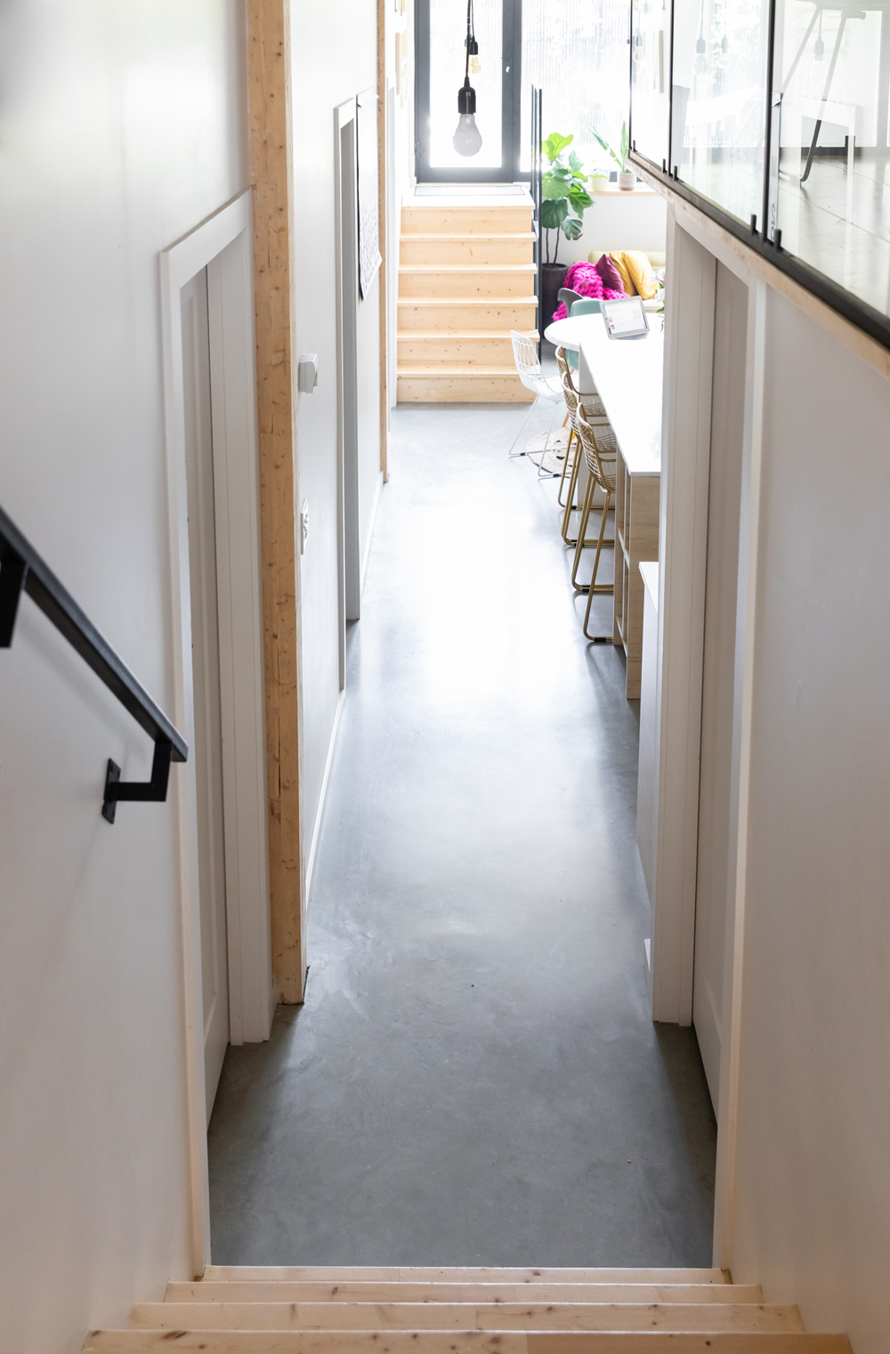
Wood Tones
Pine detailing is seen throughout the home, like here in the hallway.
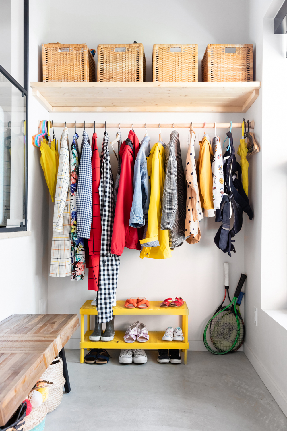
Always Sunny
Yellow tones are a consistent theme throughout the home, like here in the mudroom. The baskets from IKEA help keep the place in order and the wooden bench on the left is from Structube.
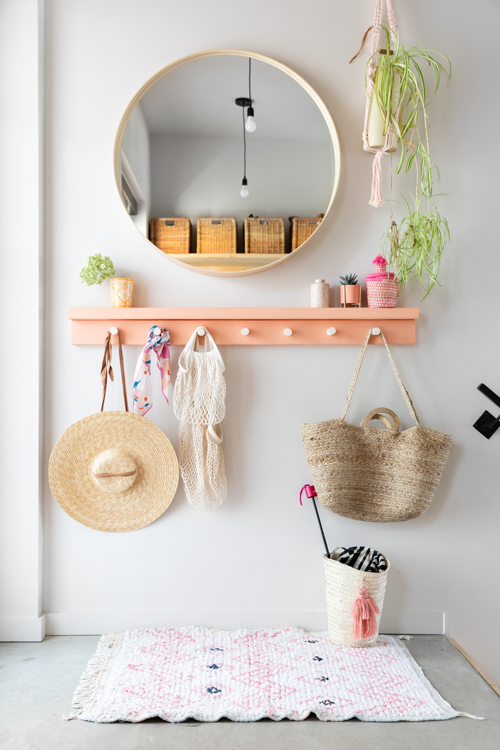
First Impression
The main entrance offers a light, airy introduction to the home. Maca made the shelf herself and painted it using the same shade of pink she used on her bedroom dresser. The round mirror is from IKEA and the macrame plant hangings are from BOHO Montreal.
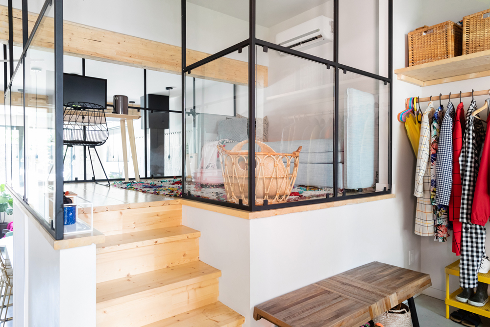
Space Between
One of the home’s most distinct features is the black-and-glass dividers, which allows light to pour from room to room while partitioning off each space.
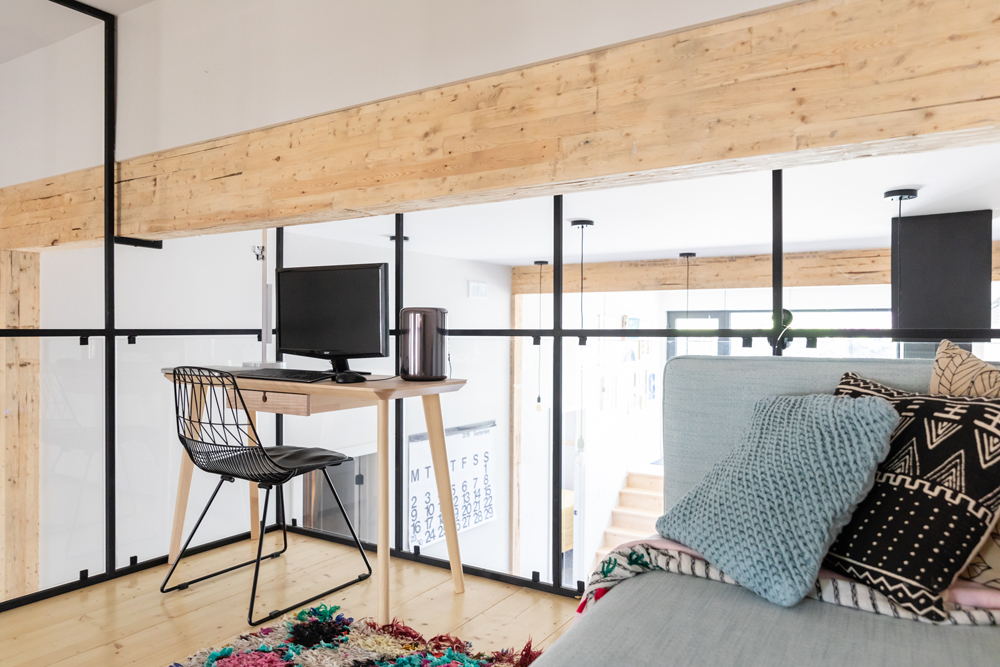
Tree House
In Maca’s office, a beam of reclaimed wood runs along the ceiling. It was another one of the contractor’s smart, eco-friendly choices.
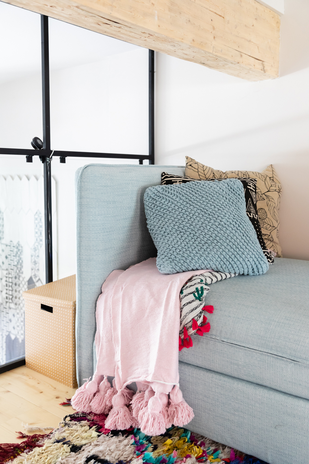
Rest Your Head
What would an office be without a place to take a nap? This sofa bed is from IKEA and it’s ideal for when guests crash. The rug, from Baba Souk, adds a pop of colour.
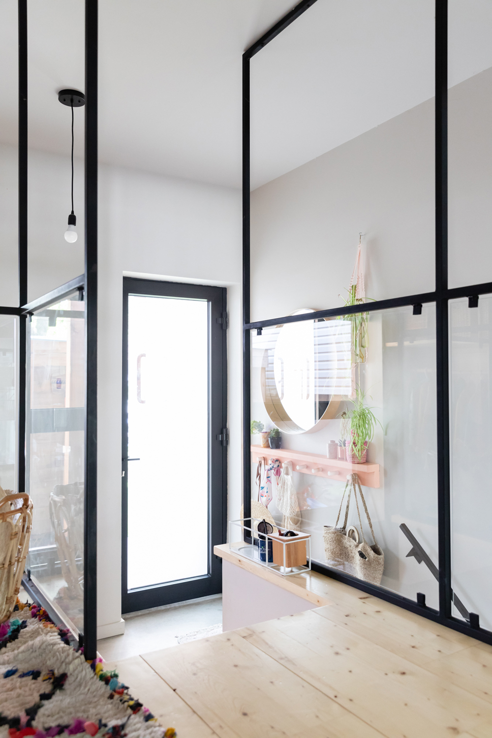
Honey, I’m Home
Every corner of this home aims to maximize light – including the glass front door.
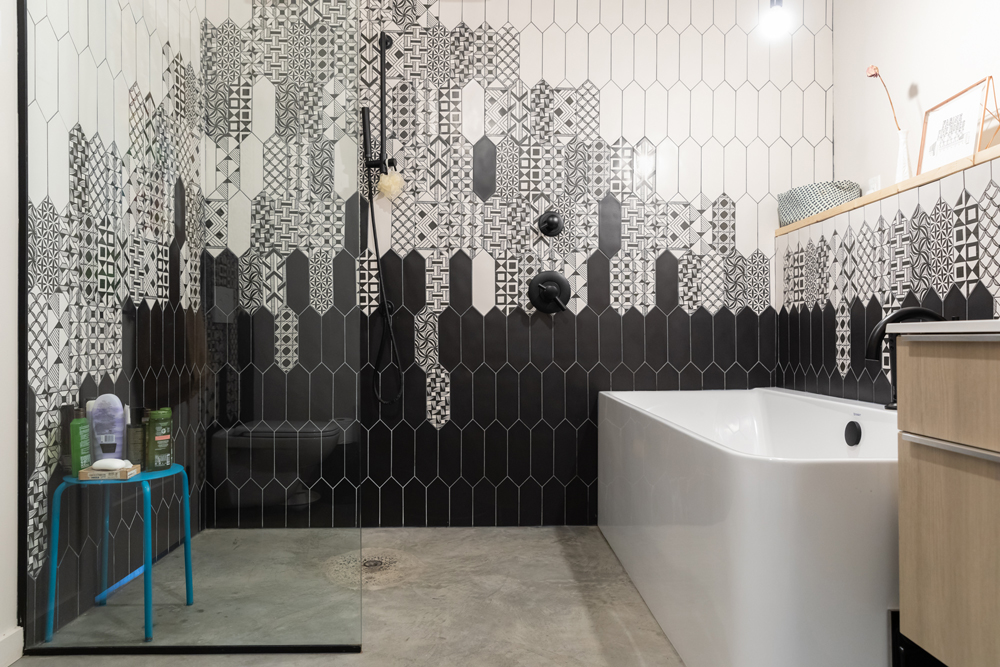
Tile Dreams
Remember this? The kitchen tiles make a second appearance in the bathroom, where heated concrete floors make it difficult to leave the shower.
Related: This Cheeky Montreal Home is Pretty Much the Opposite of Minimalism
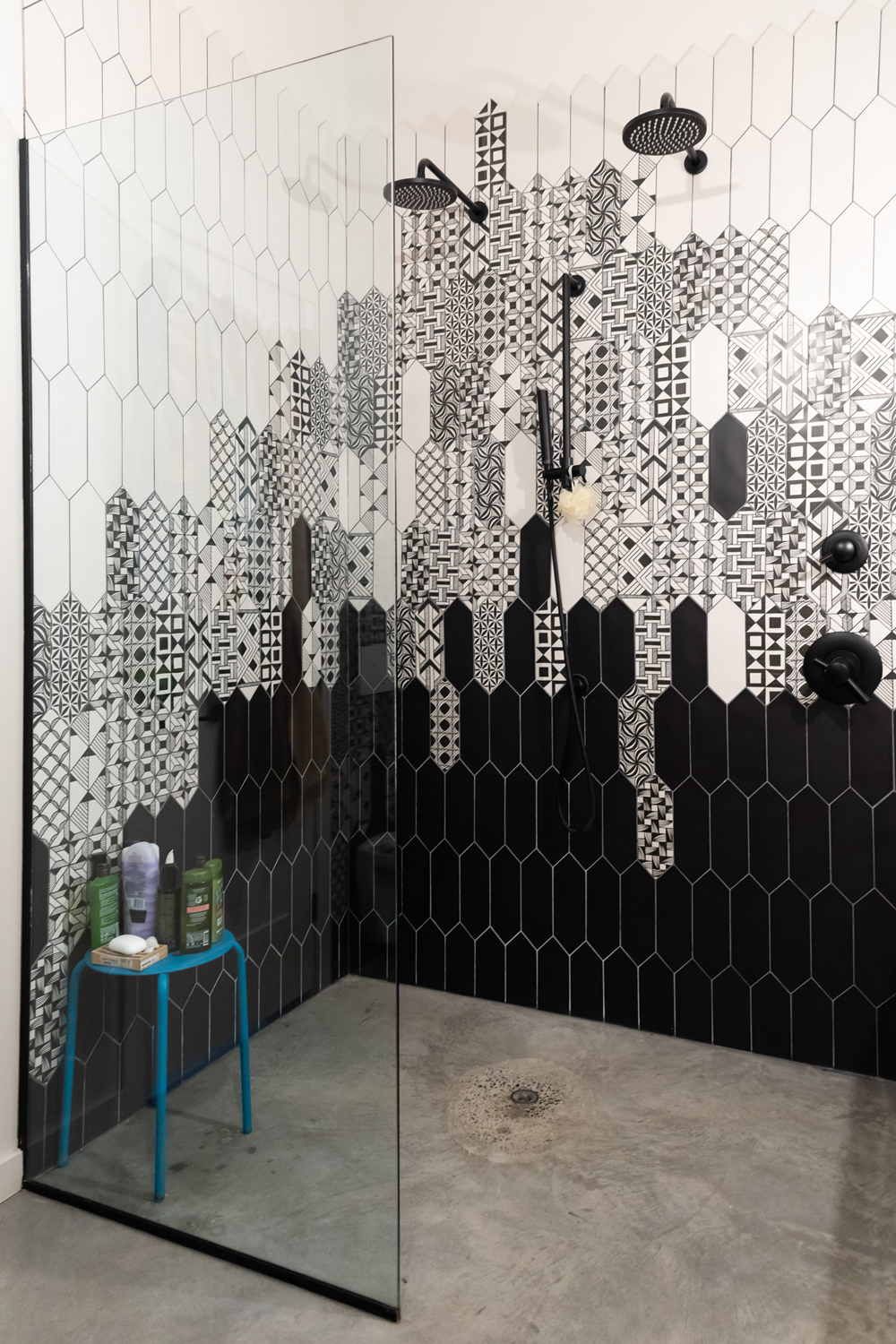
Going Monochrome
Here’s a closer look at that beautiful tile work.
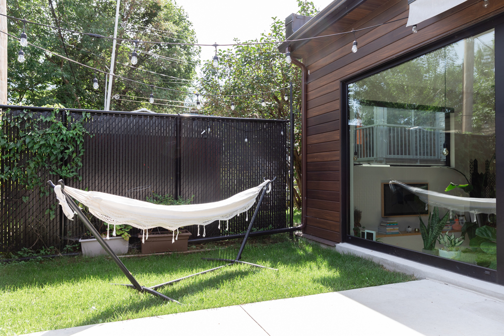
Hanging Out
The backyard is an excellent reading spot, thanks to this hammock from Amazon. The fairy lights are from Canadian Tire.
Related: Less is More With This Mindfully Designed, Minimal Montreal Home
HGTV your inbox.
By clicking "SIGN UP” you agree to receive emails from HGTV and accept Corus' Terms of Use and Corus' Privacy Policy.


