This 1,200-square-foot Lachine, QC, condo can thank its owner, artist Emma Lindsay, and her fiancé, photographer Andrew, for breathing new life into it. The couple removed heavy shutters to let light into the open-concept space, invigorated rooms with paint and wallpaper and decorated it with items that have meaning. The result is eclectic and welcoming and, oh, their puppy Hillie loves it too (wait till you see Hillie’s darling bed)… Bonus: check out the video of this charming and ultra-stylish home.
Warm Welcome
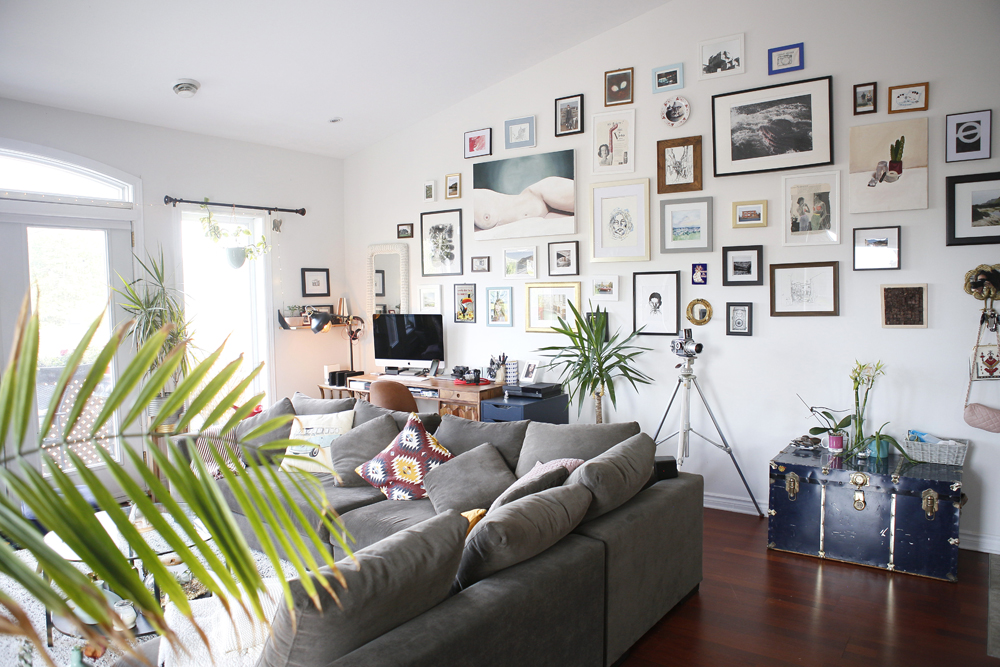
“I would describe our style as mid-century modern, with some vintage flair and a little bit of boho mixed in,” says Emma. “We love wooden furniture, plants, textures and patterns.” The low-profile furniture keeps the fantastic gallery wall a focal point (more on that later!).
Related: The 16 Most Popular Interior Design Styles Explained
Seating Plan
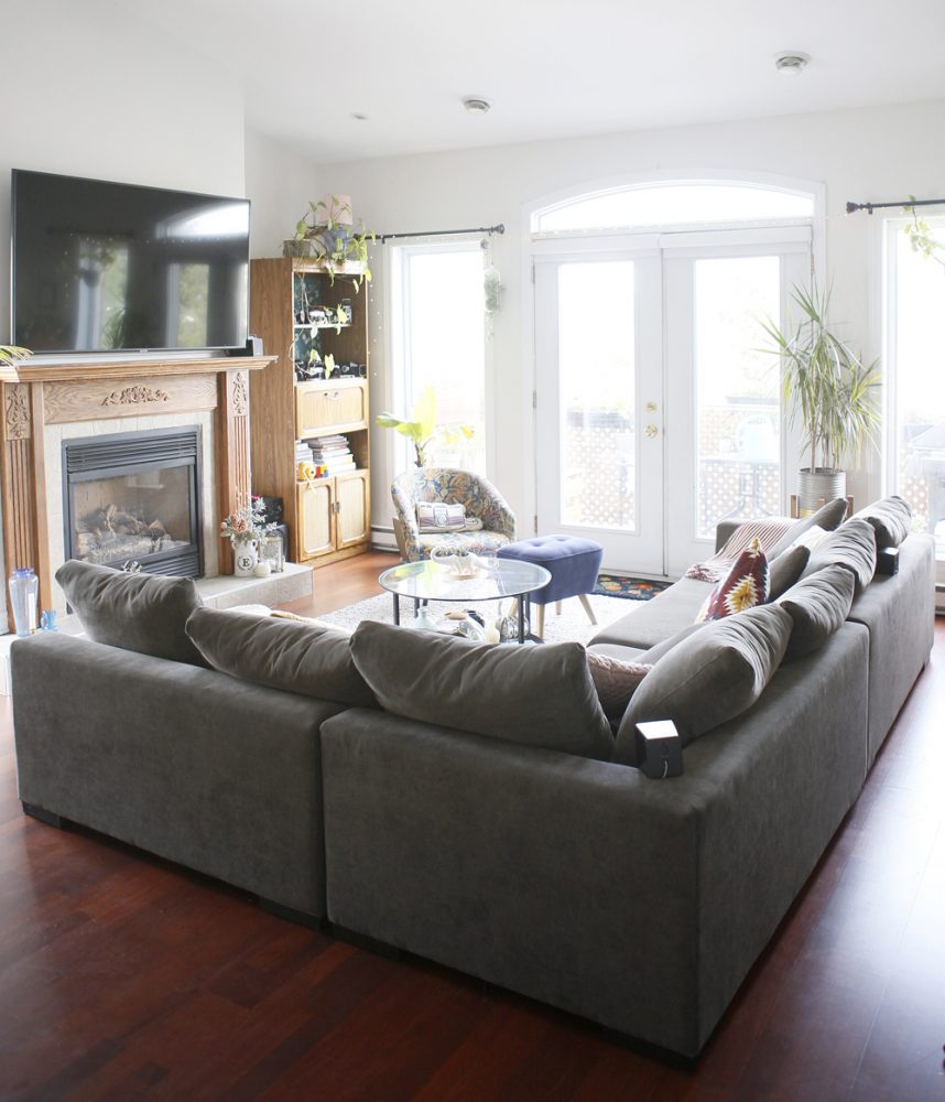
Emma chose a large L-shaped sectional from Structube with entertaining in mind, as well as to demarcate the living area in the condo’s open floor plan. While it has a handsome presence, the space still feels light and airy. She also found the blue stool at Structube.
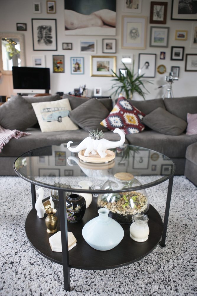
Table Manners
Initially, Emma imagined using a wooden coffee table she already owned for the living room – then she saw this charmer on sale for $50 at IKEA. Its glass keeps the area open and light and the displays are regularly changed up. The current scheme: vintage vases mingling with a Crate and Barrel terrarium.
First Impressions
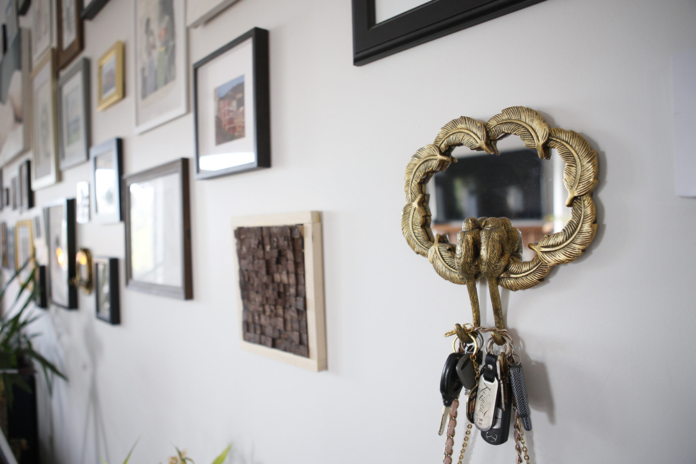
The condo’s stylish attention to detail starts just inside the door, with this lively key holder from Zone. “It’s a brass mirror with two small monkeys cuddling and their tails become the key hooks,” says Emma. “When I saw it, I knew immediately that I had to get! The mirror is also great for checking your appearance when you’re running out the door.”
Related: 25 Eye-Catching Entryways That Make the Ultimate First Impression
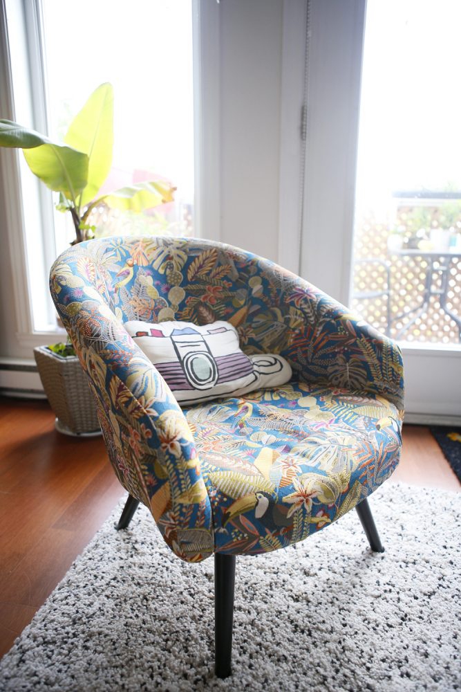
Pattern Play
Some of the best finds are the ones you don’t plan. Emma was shopping for something else when she spied this chair in Zone. Its energetic pattern of tropical birds, palms leaves and flowers spoke to her immediately. Bonus: it’s low profile, like the sectional, for cohesion. The cute cushion was a gift.
Related: 10 Tropical-Inspired Room Designs Perfect for the Ultimate Staycation
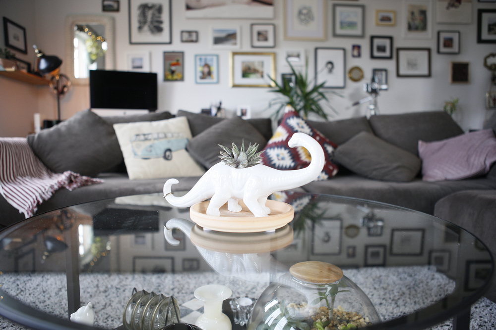
Dino-Mite
Everything has meaning in Emma’s condo – just one of the reasons it feels so layered and welcoming – and this planter is no different. She and Andrew purchased it on a trip to California, and it now has pride of place (and a little cactus) on the coffee table.
Related: Expert Tips on Styling Your Houseplants (Plus a Genius DIY Macrame Plant Hanger!)
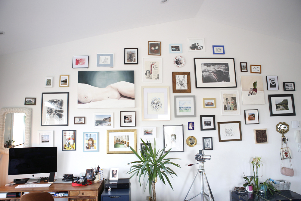
Picture This
One look at this fun gallery wall and it’s no surprise that an artist and photographer live here. “The gallery wall is one of the favourite parts of our home!” says Emma. “Most of the pieces on the wall are our own, and a few are things we’ve picked up on our travels. Each piece has its own significance and story, and is very important to us.” We like how she incorporates different types of wall hangings, like mirrors and plates, into the mix.
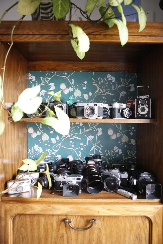
Style Focus
Emma refreshed an old shelving unit with a bit of stick-on floral wallpaper. Andrew’s cameras are kept here – some old, some new and all functioning, so it’s not just a fab decorative vignette.
Related: How to Use Cane to Turn an Old Shelf Into a Sweet Design Piece
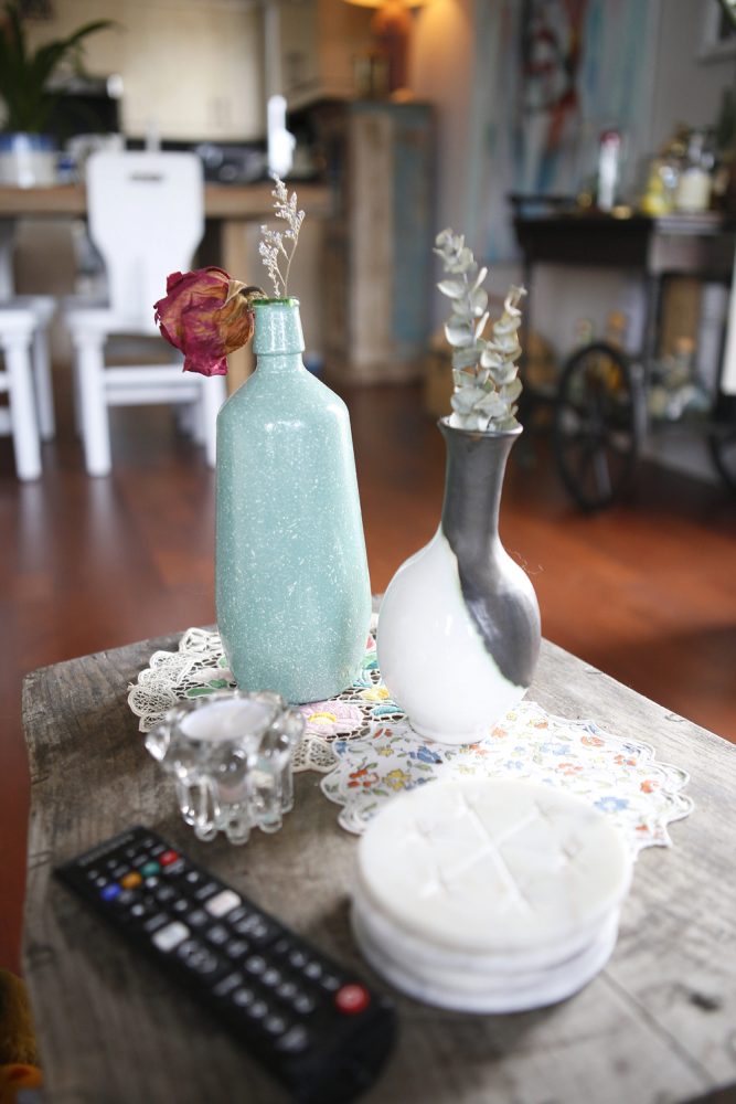
Thrift Giving
“Nearly all of my vases are thrift finds, including these ones,” says Emma. “I have an Etsy shop where I sell curated vintage decor, so I’m constantly picking up things either to sell or to keep for the home. I made it a rule to only buy things I would want to keep for myself, so if I don’t end up selling it, it’s no big deal.”
Related: 15 Canadian Vintage and Antique Shops to Find the Perfect Piece for You
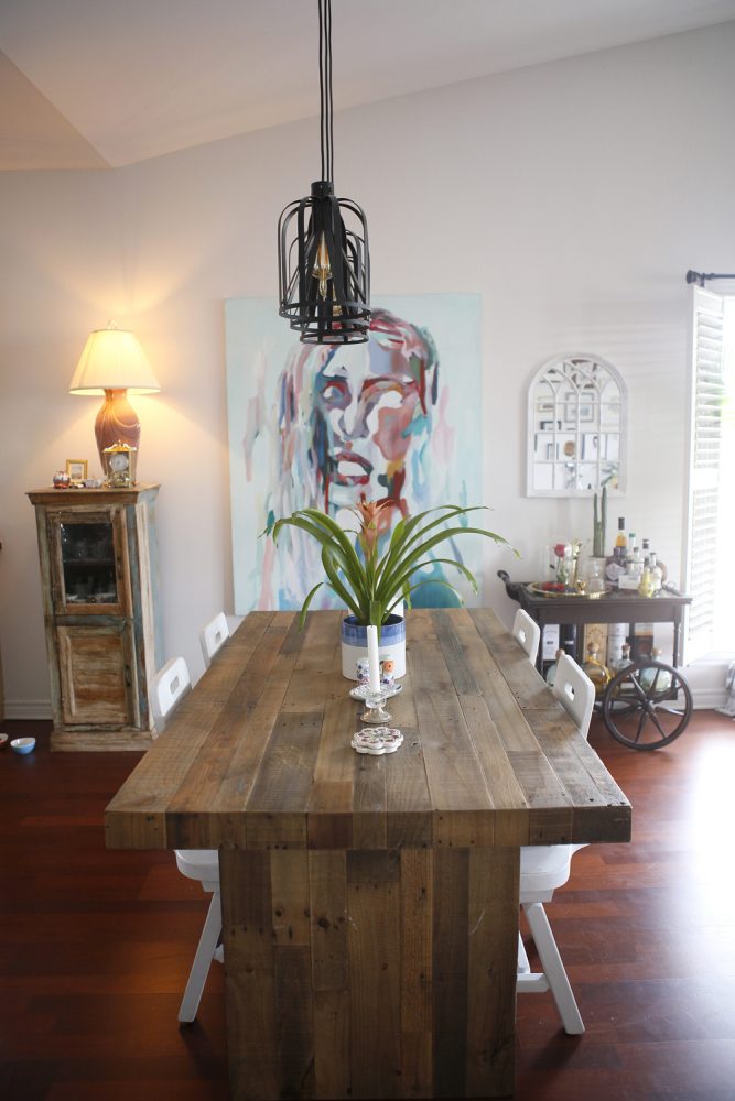
Sustainable Style
The dining table was handcrafted in Toronto using recycled wood (it was purchased at a store-closing sale). The chairs have interesting provenance: old ones from a Ponderosa restaurant that were a gift from a friend. Emma reinvigorated them with a coat of white chalk paint.
Related: 10 Ways to Use Reclaimed Wood in Your Kitchen Design
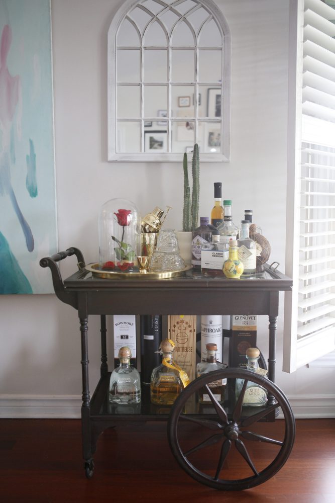
Bar None
We’re not sure what is more compelling here: the characterful antique bar cart (an online find) or the fun way that Emma has styled it. “I fell in love with the big wheels and the deep-brown colour,” she says. “The cart was made in the early 1900s from wood and brass. There’s even a secret drawer inside where we keep our polaroids!”
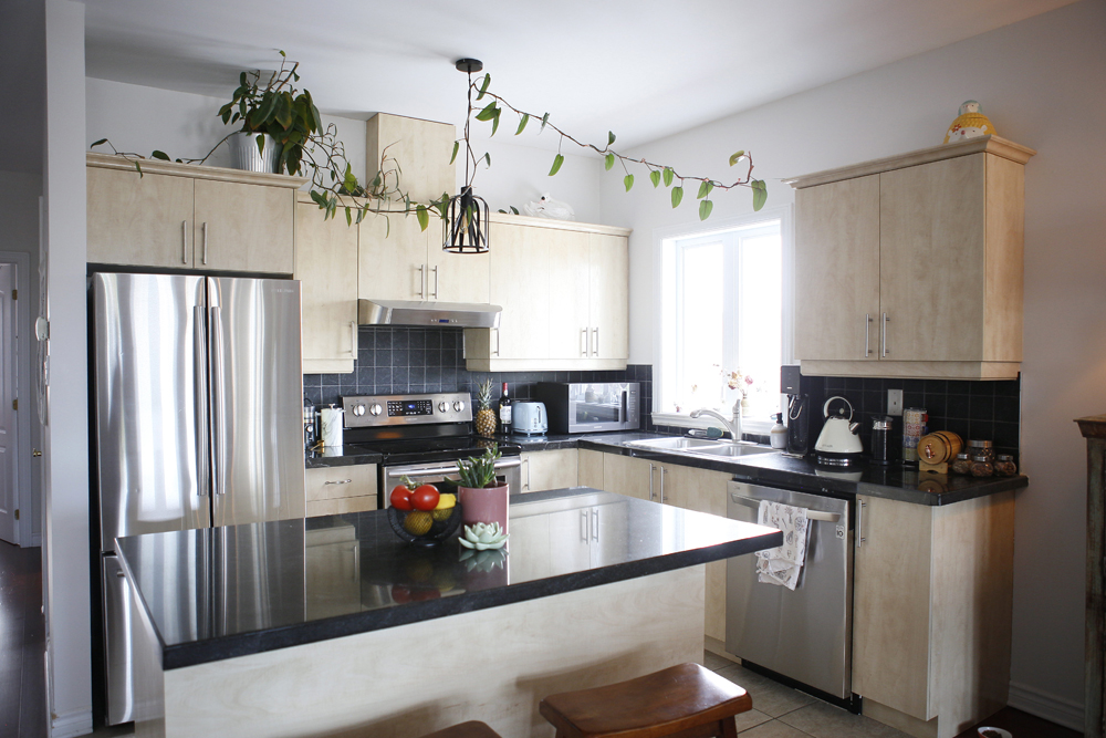
Room to Grow
We love this inventive way of adding greenery to the kitchen. Emma says, “It’s a philodendron we got shortly after moving in. It started out very small, but the vine across the cupboards has been growing rapidly in the past year, and recently made it all the way across the kitchen.”
Related: The Best Indoor Plants for Every Room in Your House
Think Pink
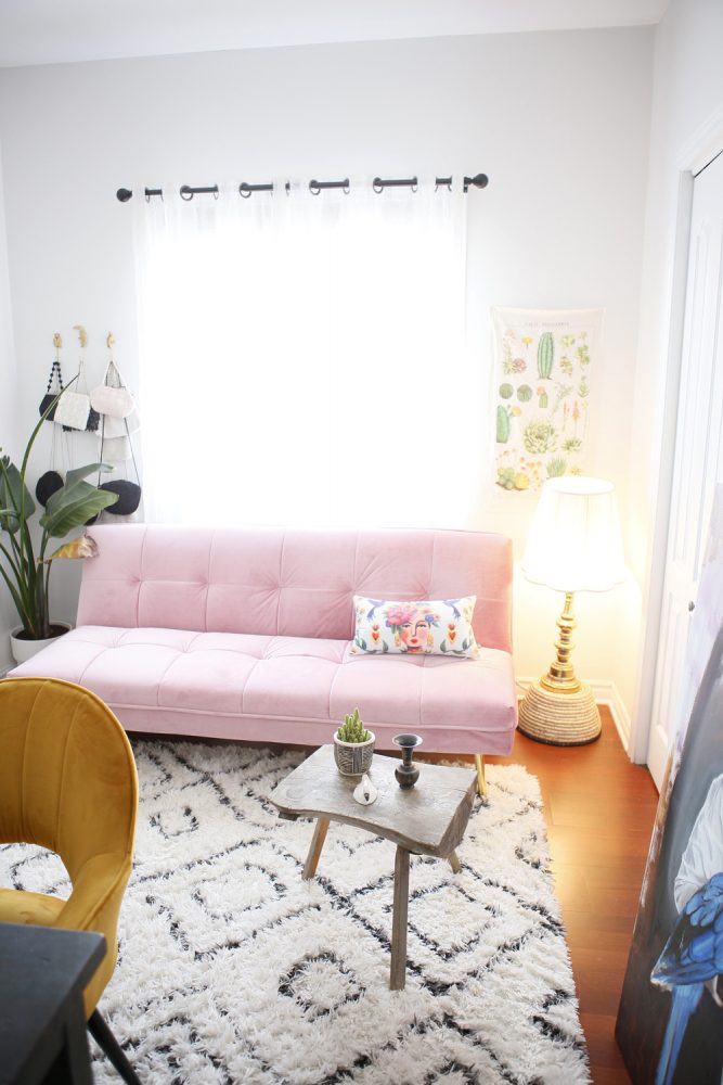
A pretty pink velvet sofa from Structube is a striking addition to the den/home office, and it also folds out to a single bed. “We didn’t want to take up too much space, since it’s a small room, but we still wanted to have the option to have guests sleep over – this was the perfect (and most stylish) solution!” The rug is from HomeSense and layers in a bit of texture, pattern and brightness over the dark wood floor.
Related: 20 Bright Sofas That’ll Bring Personality to Your Living Room
Work Well
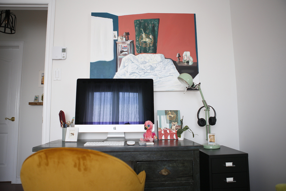
The functional office space takes on fun form thanks to an orange velvet dining chair from Structube (not all office chairs need to have wheels!), colourful artwork and quirky touches – like the pink Beanie Baby.
Related: How to Take Your Home Office to The Next Level, According to an HGTV Designer
Moody Blue
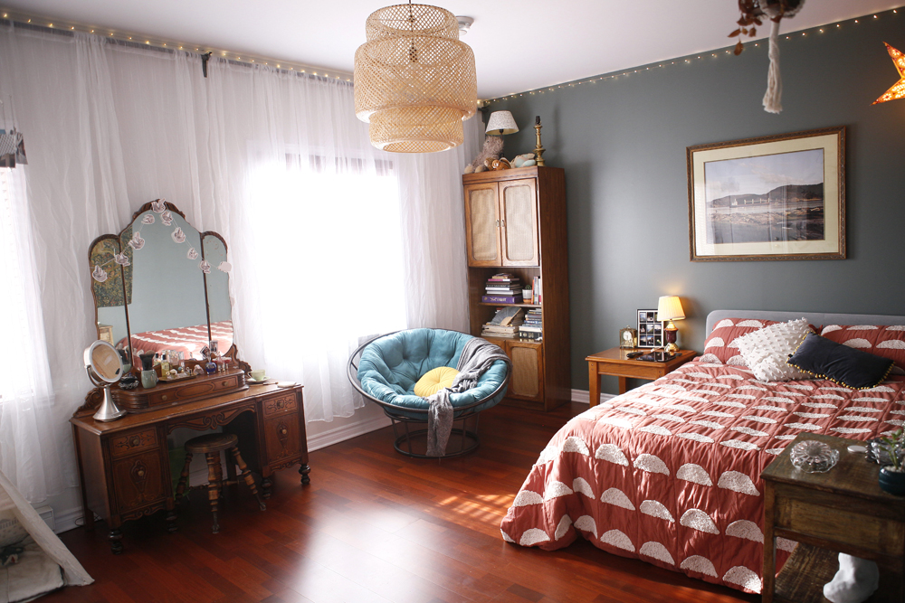
Emma’s eye for style is evident in many aspects of the bedroom, but one of the most interesting has to be Sico’s Russian Blue paint colour, especially because she bought it online without having seen it in person! She says, “Luckily it turned out exactly how I pictured it. It’s nice and bright during the day and cozy and moody at night.” We love the fairy lights as a ceiling border – a great idea for almost any space.
Bird Calls
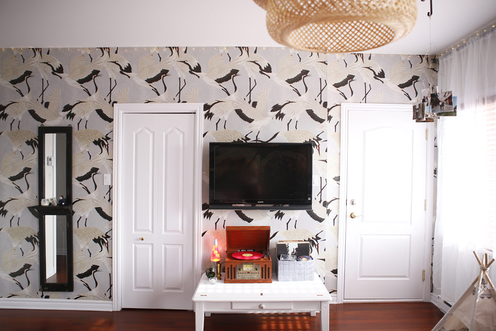
The bedroom’s striking heron-print wallpaper is from Wallpapers4Beginners on Etsy. It feels fresh and graphic, and the hits of black complement the TV so it doesn’t become a focal point.
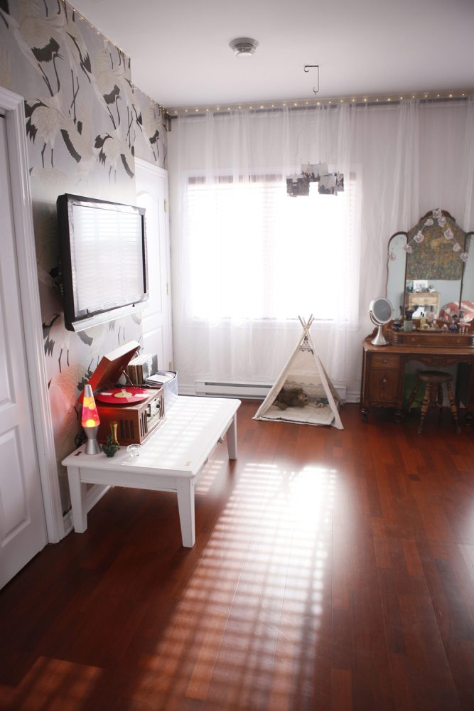
Four-Legged Design
Who says the principal bedroom is for humans only? This sweet tent belongs to puppy Hillie, and it lets him sleep in style close to his owners. The unadorned dark wood floors amp up the room’s cozy feel.
Related: 12 Stylish Pet Accessories Your Home Needs This Year (Ditch the Cat Tree)
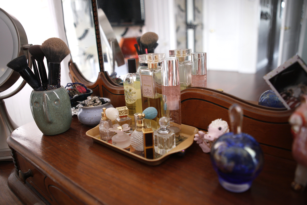
Tray Chic
“Andrew brought this tray and the large perfume bottle back for me from France, and I added a few other little bottles to it,” says Emma. “Some of the small bottles are blown glass and some are vintage. The tray goes well with the vanity, and it’s practical and organized when I’m getting ready.”
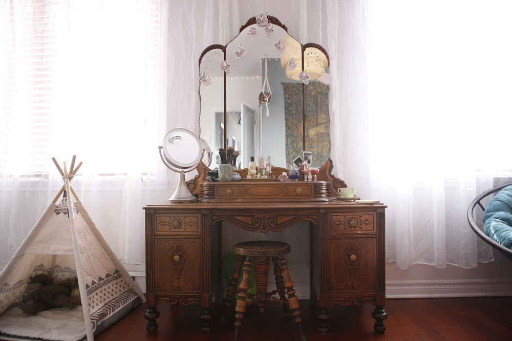
Glamorous Life
Emma does her makeup at this vanity everyday, and admits that getting ready here feels glamorous. It was purchased years ago from an old neighbour who reckons it was made in the 1920s. The stool looks like a perfect match, but it actually belonged to Emma’s mother when she was a little girl. It brims with eye-catching details, including charming claw feet.
Related: This Stunning 1920s Home Enchants With Antique Treasures and Chic Charm
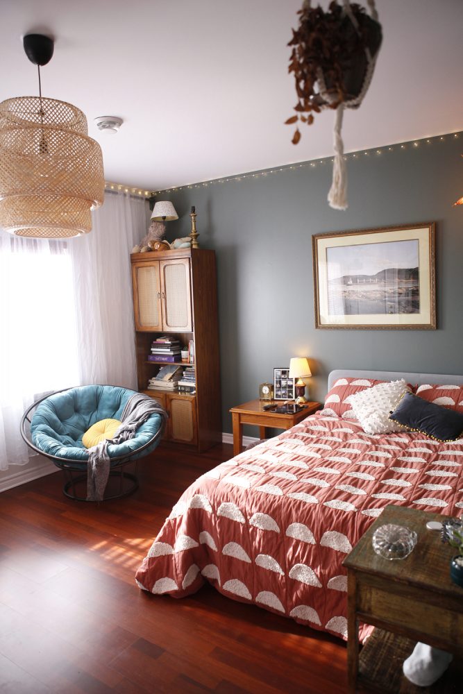
In the Mix
The bedroom’s appeal is definitely down to the deft mix of styles and elements. A rattan IKEA pendant light softly illuminates thoughtful furnishings, from a textured Linen House duvet cover and Pier I turquoise papasan chair that belonged to Emma’s parents to personalized artwork. “Andrew took this beautiful photograph on our trip to Saguenay. It’s a photo of the fjord with a boat passing through. It’s one of our favourite places in Canada, and reminds us of our time there.”
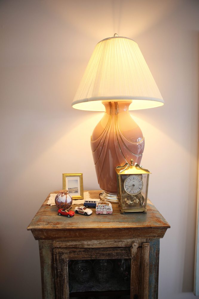
On Display
Emma is the first to admit she is not a minimalist, and this sweet table display is proof. “I like bringing together a range of different objects and pieces and making them look like they belong together, despite being from different decades or different colours and materials. It’s a great feeling.”
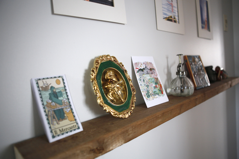
Memory Lane
This floating shelf in the hallway is a perch for antiques, like this vintage cherub plaque, and treasured items that the couple have picked up on their travels, including a tarot-card menu from a bar they visited in Venice and a Victoria, BC print.
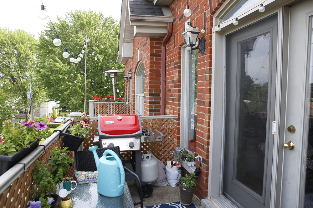
Happy Outlook
The condo’s cheery aesthetic continues to the outdoor space. Though small, it boasts festive string lights, colourful accessories (how cute is that red Weber grill?) and assorted flower boxes. Like the home’s interior, it’s a place that feels happy and bright.
HGTV your inbox.
By clicking "SIGN UP” you agree to receive emails from HGTV and accept Corus' Terms of Use and Corus' Privacy Policy.


