Whether you’re booking in for a staycation or just want to indulge in some armchair travelling, these Ontario getaways are brimming with design ideas you’re going to want to explore.
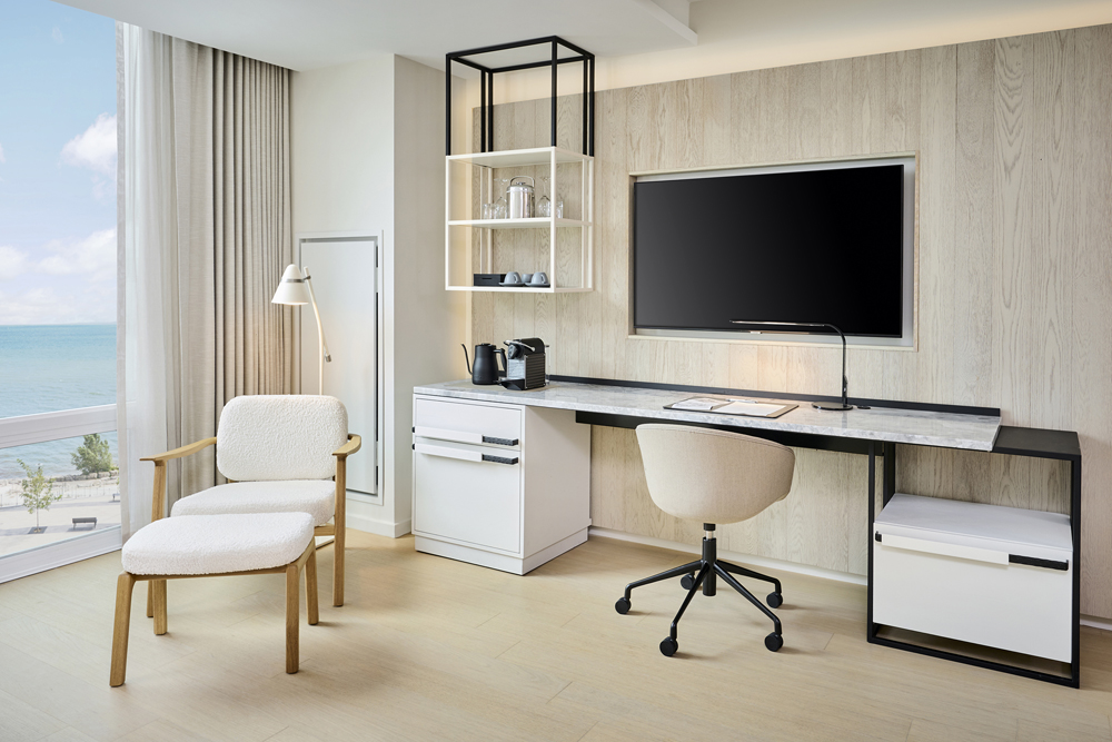
Room With a View
The Pearle Hotel and Spa in Burlington is so light and bright with such uninterrupted water views, you might feel more like you’re in Miami than on the shores of Lake Ontario. On top of all the stunning style features (wait till you see the bathroom!), we love the seamless appeal of the room’s work stations. Forget the obligatory desk and chair – this is a sleek stone-topped work surface with ample closed storage and easy-on-the-eyes details like contemporary matte-black finishes. A nice template for WFH inspo.
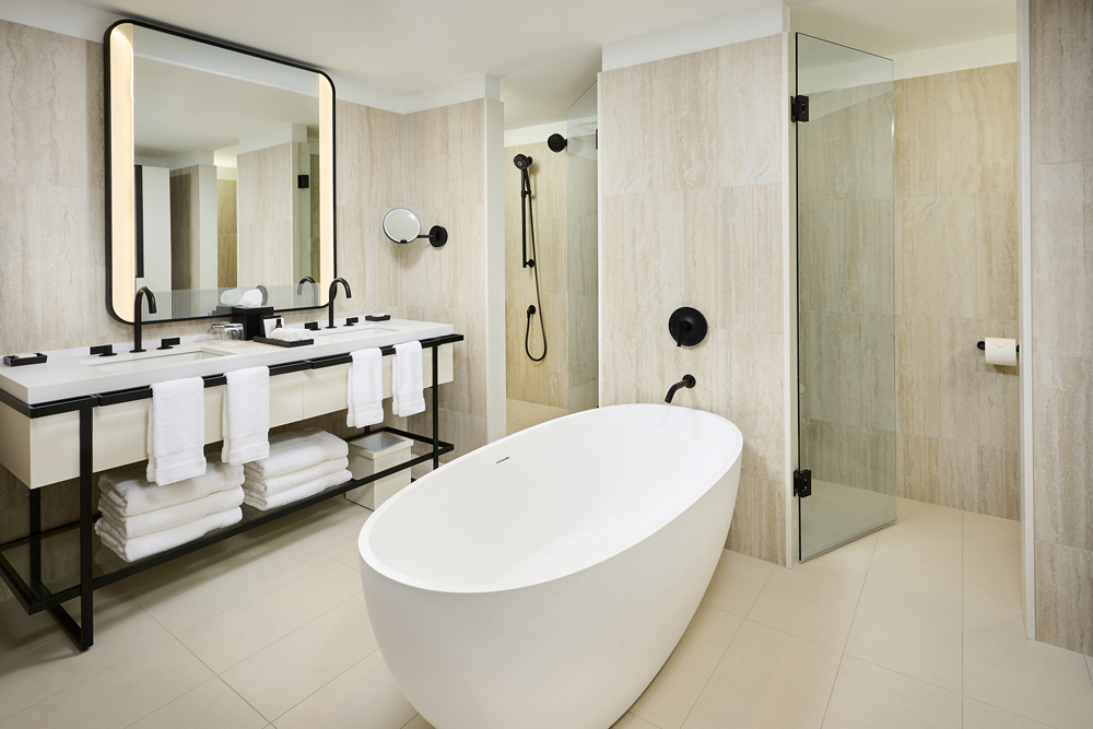
Bathing Beauty
The Pearle’s bathrooms tick all the style and feel-good boxes. There’s the yawning tub, the separate shower and WC, but it’s the finishes and palette that intrigue most. The creamy ivory tones exude a decadent richness that’s lifted by the black hardware for a genius contemporary effect. And there’s something so reassuring about ample towels, especially when neatly folded and within reach (note the hanging placement in front of each sink).
Related: Stylish Vacation Retreats in Ontario to Check Out Now
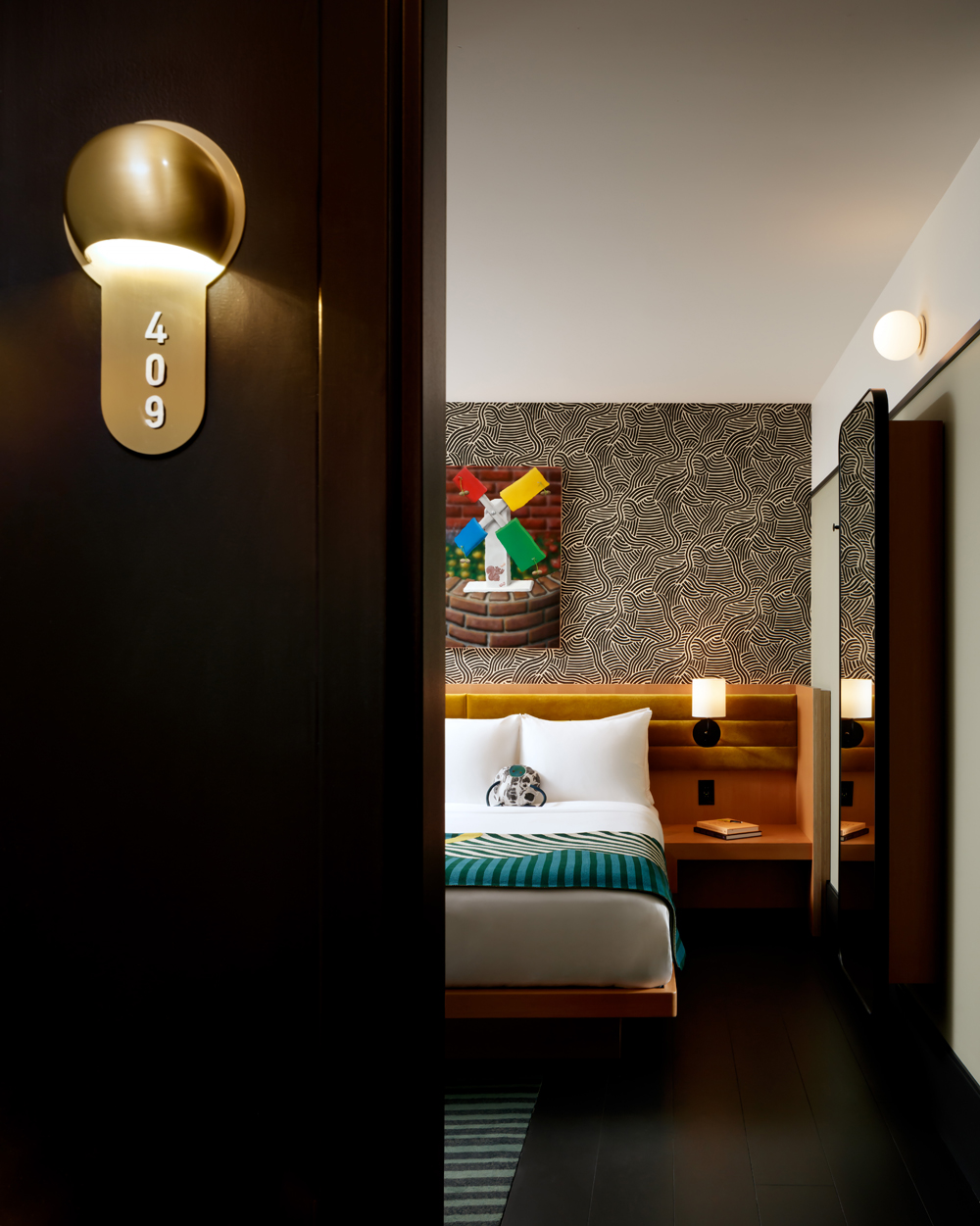
Oncoming Graphic
Toronto’s buzzy Drake Hotel added to its design evolution this past December with The Modern Wing, a contemporary new addition comprising five storeys of high-impact style. Rooms are comfy, thoughtful spaces where locally designed sconces sit above USB charging ports, custom carpets layer in softness and original art adds curated heft. Note the dynamic tension between the graphic wallpaper, warm woods and toffee-rich colours.
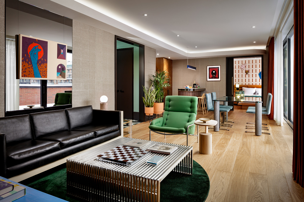
Life is Suite
If you can splurge on a rooftop suite in The Drake’s Modern Wing, be prepared to post all day as you’ll want photos to capture every inch of this two-bedroom beauty. It’s on-trend thanks to pale-wood floors and judicious green accents, but also cool and timeless thanks to furniture and materials that feel fresh. Did you notice the rockstar bar in the corner? It’s topped with terrazzo. Be sure to also check out the Drake’s sister property in Prince Edward County.
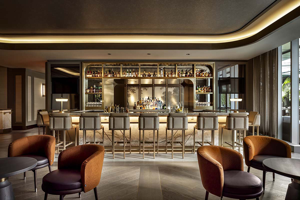
Beauty in the Bar
The Ritz-Carlton in Toronto spent much of the past two years under renovations and boy does it ever show. The glamourous reinvention of the hotel’s Epoch Bar is nothing short of spectacular. Wide-planked herringbone floors, rich jewel-toned seating and gold accents galore all work together cohesively to provide guests with a serene yet super sophisticated setting. The bar’s CN Tower backdrop certainly doesn’t hurt the ambiance either.
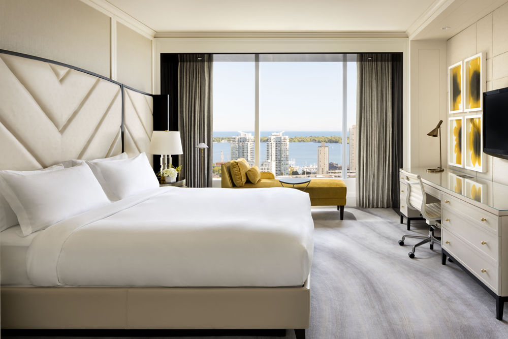
Glam Guestrooms With a View
The guestrooms at the Ritz-Carlton are simple yet refined. A neutral colour palette is punctuated with punchy art, a colourful chaise lounge and of course, a spectacular view of Toronto’s coveted waterfront. Guests are sure to want for nothing in a room such as this one.
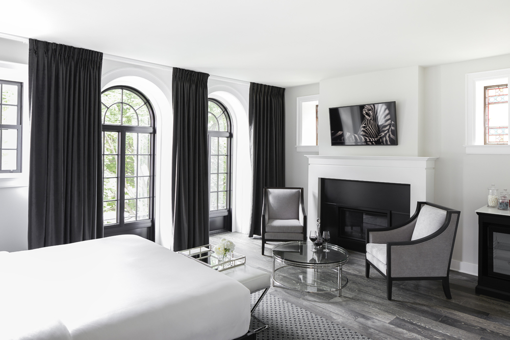
In Black and White
The Frontenac Club, Kingston’s dreamy boutique hotel, combines 19th-century heritage with new-build smarts. The Locomotive Suite is part of the new and we love how its monochromatic colour scheme imparts luxury. A designated seating area in the bedroom should be an everyday luxury, along with drapes, a much softer yet more dramatic option to standard blinds.
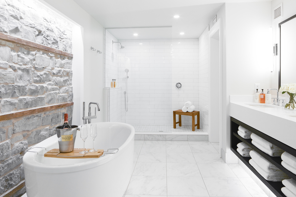
A Fine Vintage
Renovating this bathroom in The Frontenac Club revealed an original wall from the early 1900s that was too beautiful to cover up. “Throughout the hotel, we uncovered limestone and left niches, wooden beams, lintels and other historical elements that showcase the history of the Club,” says owner Sean Billing. It has an organic feel that’s a great foil to the contemporary finishes.
Cozy Quarters
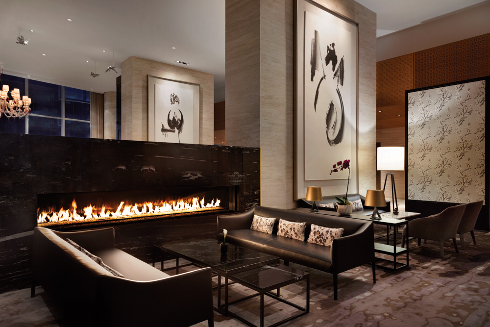
There’s something so understated and elegant about the Shangri-La Hotel in downtown Toronto. As soon as you enter, you’re met with a warm, home-like lounge area that’s as comfortable as it is stylish. Grand accents like the black-and-white art paired with the larger-than-life stone fireplace provide a sheltered space for guests to relax.
Skyline Soaker
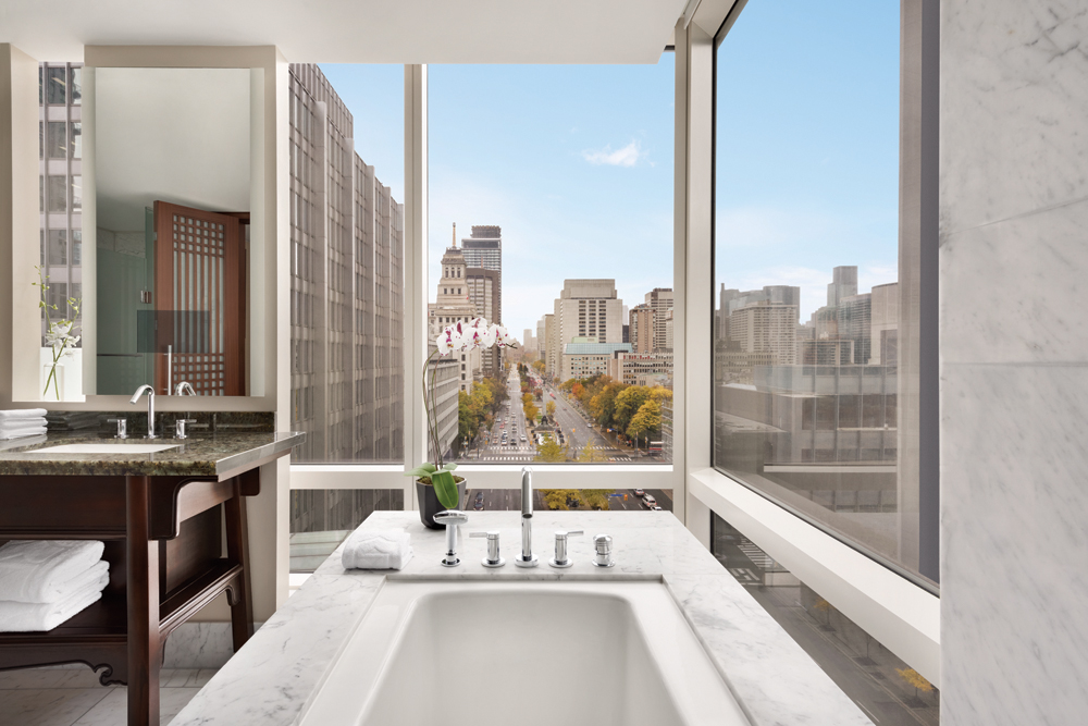
The hotel’s warm ambiance continues in its spacious guestrooms. One look at this grandiose marble-clad tub and its accompanying city view and it’s hard not to think of revamping your own loo. You’re sure to get inspired and bring a little luxury home after staying in a room like this.
Related: Here’s Where to Save and Spend When Renovating Your Bathroom
Breakfast is Served
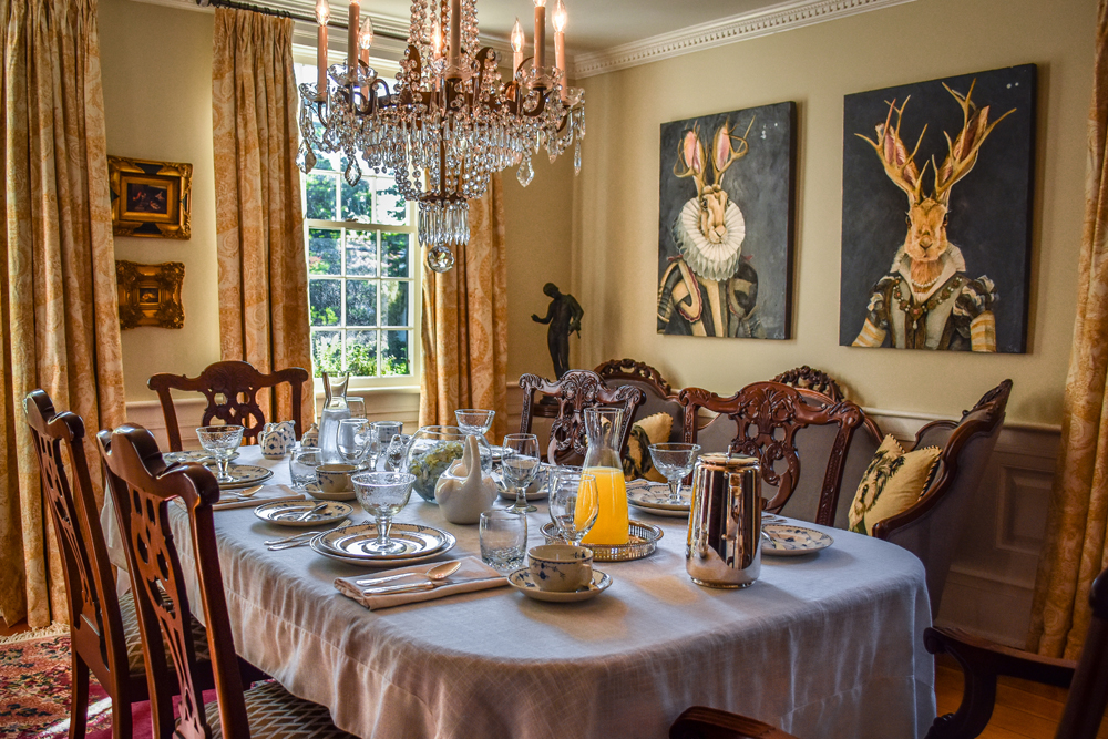
The Stocking House in Niagara-on-the-Lake takes the bed-and-breakfast experience to another level. Owners Scott Langill and Paul Evans have lavished the 19th-century home with a lot of love and a bit of swish. An opulent chandelier and drapes with serious provenance (they used to hang in Toronto’s Four Seasons Hotel) are lavish counterpoints to whimsical rabbit portraits and a dining set gifted by friends. The result is rich, while the charm is invitingly lived-in.
Royal Treatment
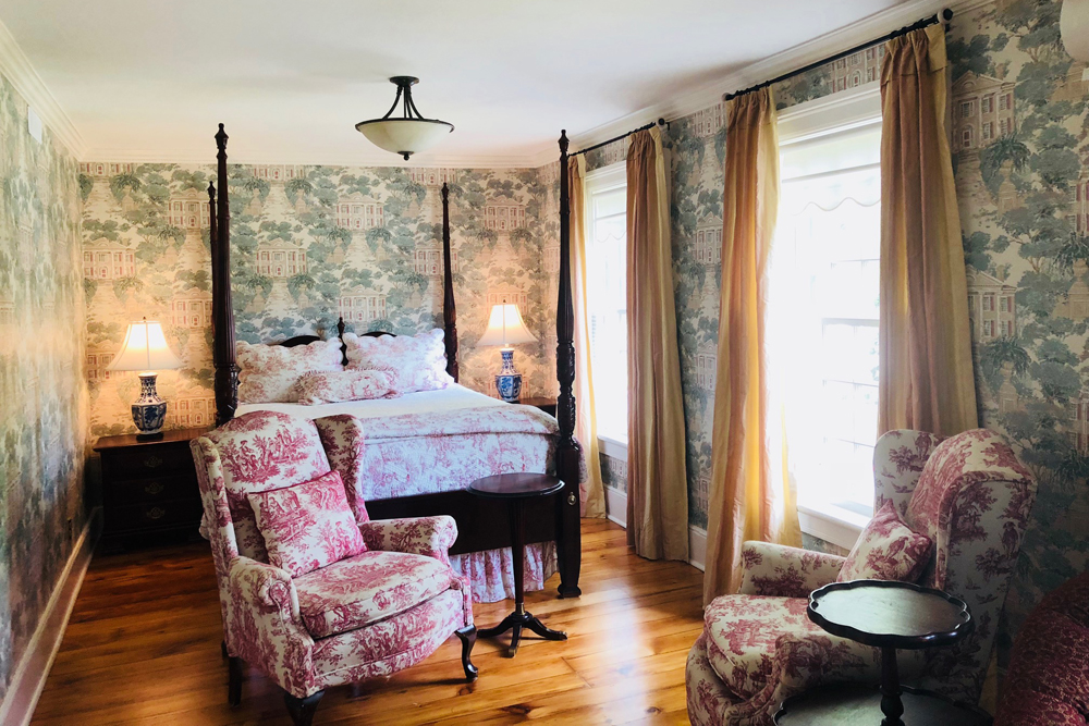
All of the suites at The Stocking House are named after royals and this stunner, with original floors, is “The Charlotte.” Scott and Paul removed a wall to make two smaller rooms more spacious then layered in powerhouse patterns. Red-toile chairs from the previous owners were the jumping off point to the rich Sanderson wallpaper that wraps the room. The pale colours have a feminine vibe that’s nicely tempered by the dark four-poster bed.
Bricks and Mortar
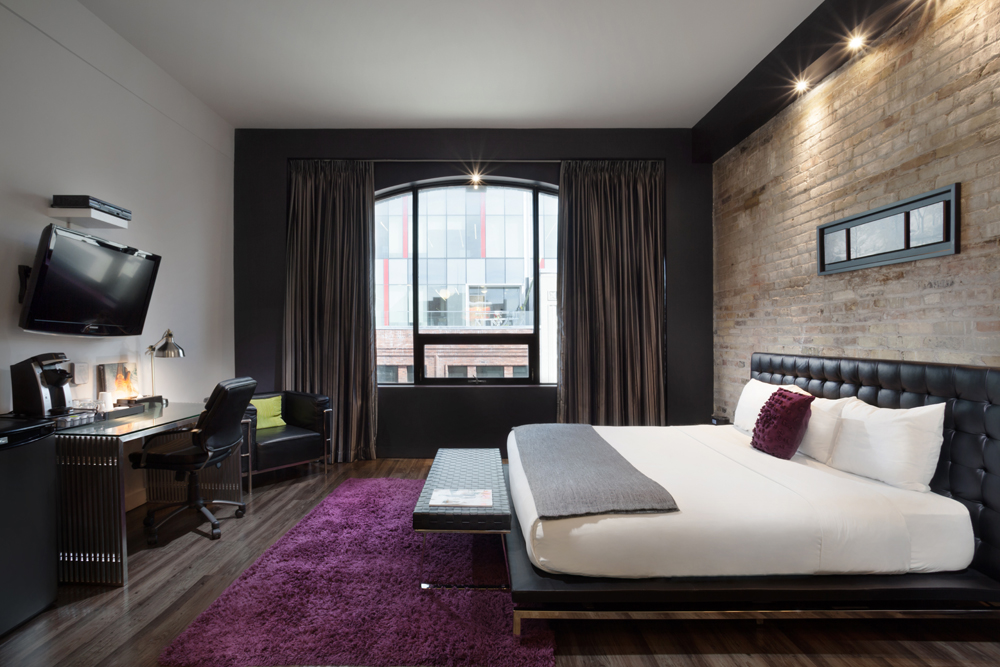
London’s Hotel Metro, the city’s only boutique hotel, offers accommodations with presence. Ceilings are 10-feet tall and there’s definitely a cool city vibe going on, but the real star for us is the wall of exposed 1892 bricks. It’s enlivened with black leather accents and shocks of vibrant colour for a contemporary spin.
Open Concept
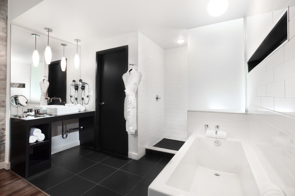
Yes, the bathroom is in plain sight at the Hotel Metro and it’s a fun idea to copy for a principal bedroom’s ensuite. The deep soaker tub feels like a piece of furniture and the sleek lines and black-and-white colour scheme lend a bit of edge to the practical space. A WC is a smart luxury too.
Beauty on a Budget
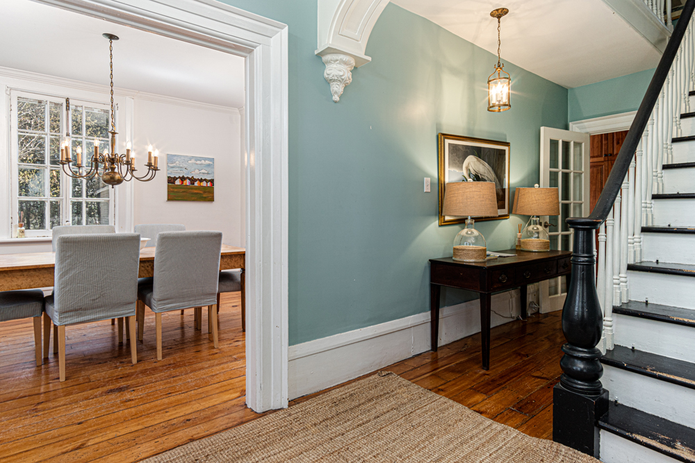
Michael Stewart, owner of Kingsgate House in Kingston, wanted to imbue the 1850s-built, lakeside getaway with a bit of soul, without splurging. The front hall’s vintage console was a consignment purchase (along with the crane print), the lamps are from HomeSense and the pendant light was a yard sale score. The warm and casual result keeps perfectly in line with lakeside living.
Serenity Now
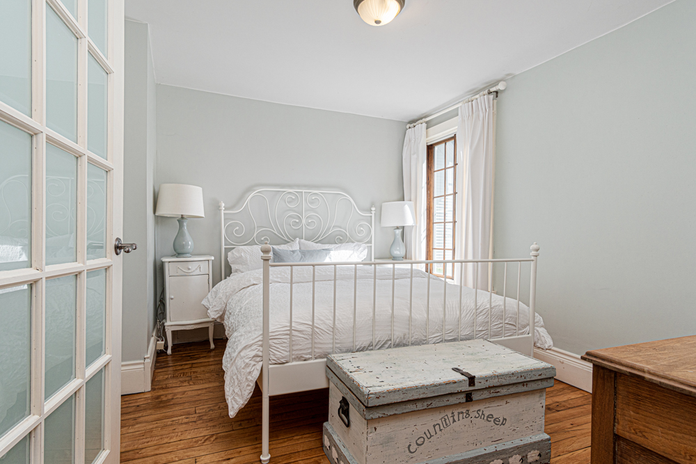
This bedroom at Kingsgate House shows how using a tone-on-tone colour palette creates lovely impact without breaking the bank. White paint, thrift store finds and an IKEA bed feel almost upscale in this minimal milieu.
Related: The Joy of Less: Minimalist Bedroom Decorating Ideas That Aren’t Boring
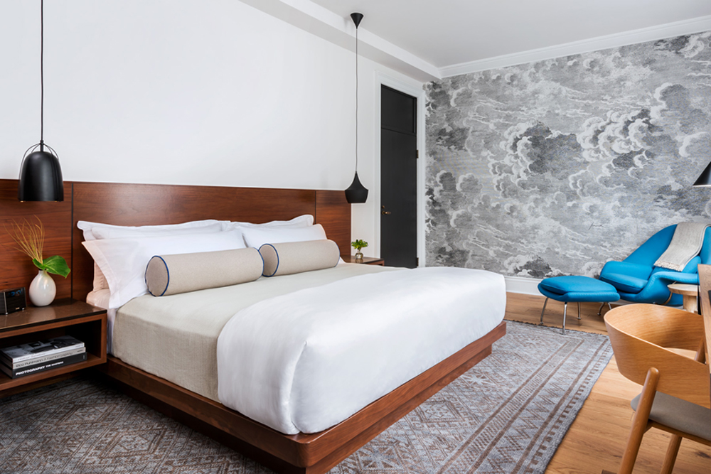
Mix Master
Kitchener’s historic Walper Hotel effortlessly melds old and new with a keen mashup of materials. Guestrooms defy a single style categorization as they seamlessly offer a bit of everything: sleek beds with integrated storage, softly patterned rugs, contemporary furniture and showstopper wallpaper. The effect is both rich and fresh.
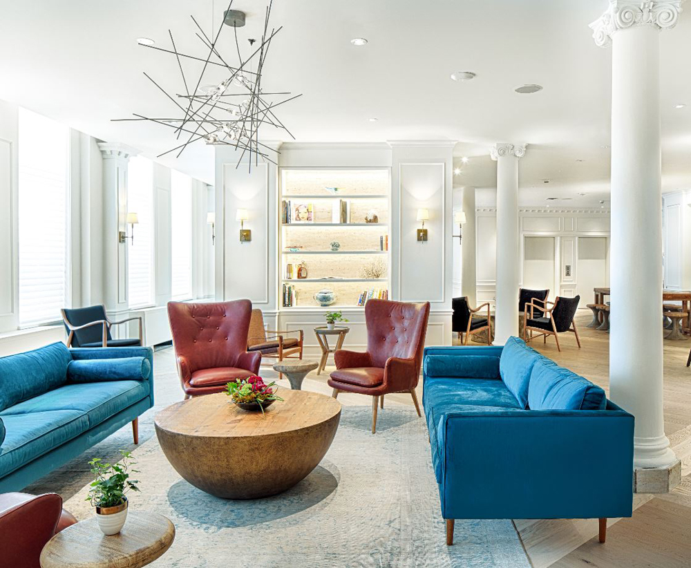
Loungewear
The Walper’s Lokal Lounge brims with inspirational decor ideas. Firstly, there’s the mix of colours (would you pair red with royal blue?) then there are the dynamic contrasts of an organic-appeal wooden coffee table and sculptural linear light fixture. All of these against the historic backdrop and ionic columns, feel pretty fab.
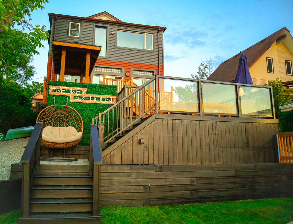
Al Fresco Design
Set on the shores of Lake Scugog, the Redkey Lakehouse is a year-round retreat. It’s also a genius source for beautiful backyard ideas. How cute is the faux-living wall (which is easy to replicate too, even on a tiny city balcony) and hanging chair?
Related: How to Make Your Own Living Wall
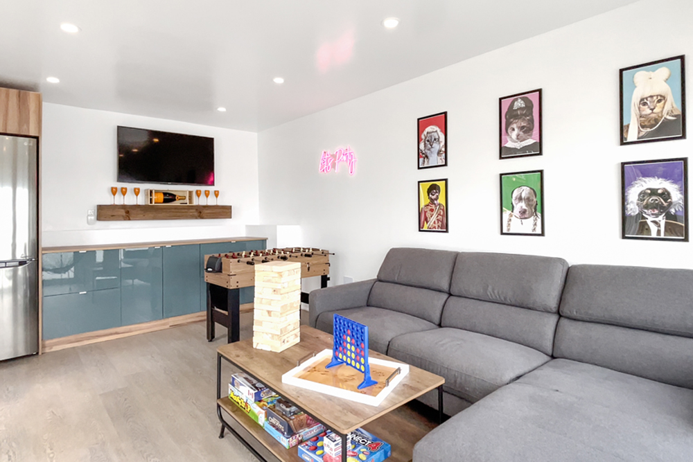
Game On
The Redkey Lakehouse also boasts a designated games’ space, a separate structure that used to be the boathouse. Isn’t this something all of us (especially parents) could appreciate right about now? The practical sectional and bar/TV area are invigorated by fun whimsical art and a neon sign. Perhaps an idea to copy for that unused shed?
Related: How to Make a DIY Neon Sign Light for a Fraction of the Cost of Buying One
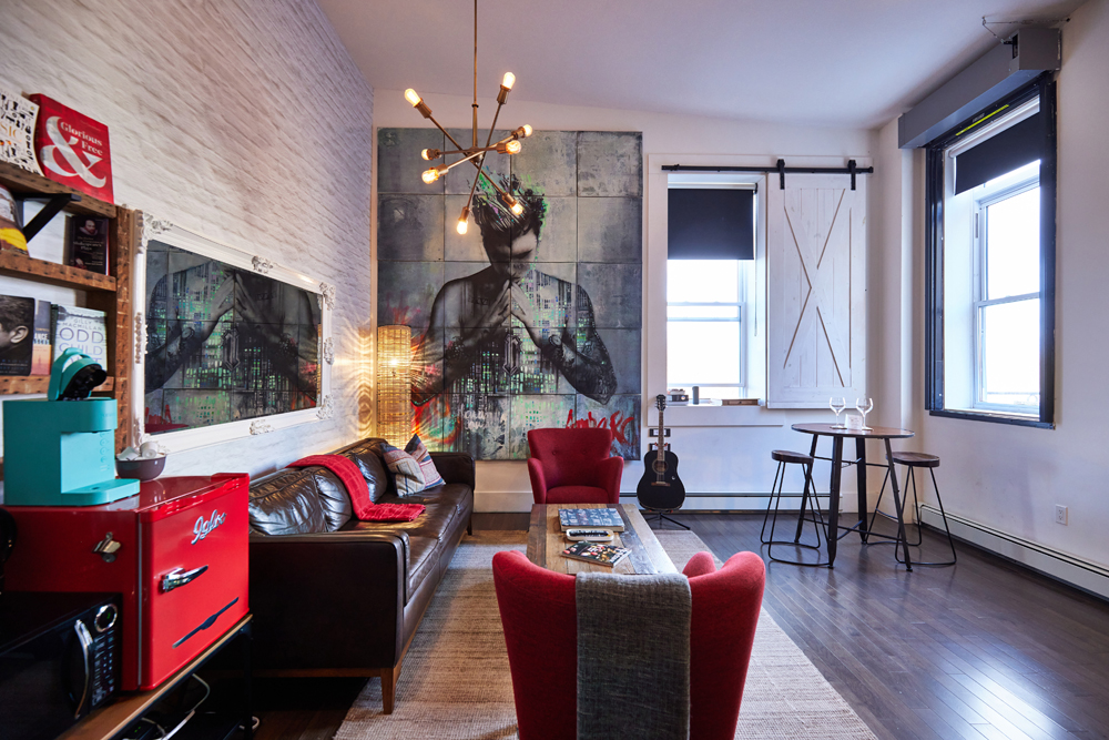
Yummy, Yummy, Yummy
Yup, that’s Justin Bieber up on the wall and for good reason, too. Edison’s Inn is located in the heart of Stratford, which is birthplace to the Biebs. His aunt actually created this piece of art (pro tip: copy its scale to give any room heft). There are just three rooms in this Inn, each one individually decorated by the owner Bruce Whitaker. We’re all for the pops of red in this aptly named “Music Room.” Oh, and Thomas Edison lived here in the 1800s… hence the Inn’s name.
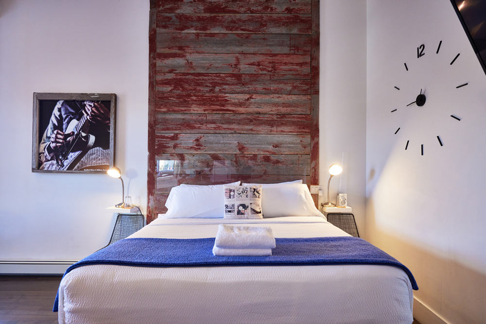
Timely Design
The Music Suite at Edison’s Inn hits all the right notes. How cool is the clock as a wall mural? It actually works and is a stylish idea for a home office. The headboard is noteworthy too, thanks to its distressed finish and its scale. Imagine if it were standard headboard height? The impact wouldn’t be the same.
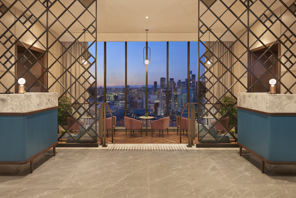
View to a Thrill
The Sheraton Centre Toronto Hotel recently revamped its 43rd-floor Sheraton Club and the results are stupendous. The view to the city remains the star thanks to smart design elements like see-through screens that reference the urban grid and low-slung chairs that don’t compete with the vista. Accents of brass are on point and statement pendant lights punctuate the space nicely.
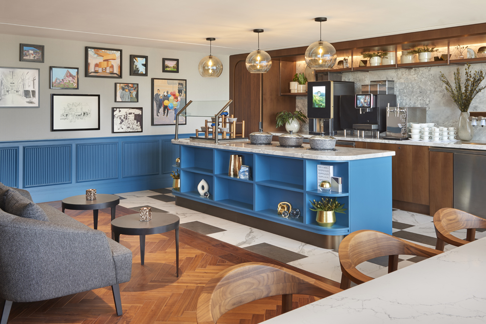
Help Yourself
This section of The Sheraton Club serves up a more casual vibe with a colourful buffet kitchen (isn’t this cheery paint a clever way to refresh a home kitchen?). The artwork is fun, too. A gallery wall featuring a mix of media by local artists; it’s another way to add interest to a practical space.
Related: Design Tips to Steal From the World’s Best Boutique Hotels
HGTV your inbox.
By clicking "SIGN UP” you agree to receive emails from HGTV and accept Corus' Terms of Use and Corus' Privacy Policy.


