Designer Louis Duncan-He, of Louis Duncan-He Designs, and his doctor husband Donovan Duncan-He lead busy lives. So, when they moved into this abode in the city’s Marda Loop area, Duncan knew he wanted to create a serene space that felt calm, restful and kind of like a boutique hotel. That’s why this home is rife with hotel-esque elements: Floor-to-ceiling curtains, wall-mounted headboards, elegant trim and more.
Bonus: Check out the video of this incredible home here.
Transitional: Where Classic Meets Modern
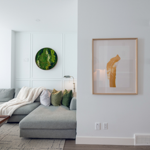
Do you know about the transitional style in interior design? Well, you’re looking at it! This new build exudes charming old-world character, thanks to a simple yet powerful addition: Paneling.
“I wanted finishes that would create a bit of depth and add interest to our all-white space,” says interior designer and homeowner Louis-Duncan He. The detailing also acts as a visual deterrent to the room’s uncentred column (more to come on that later).
Airy & Open
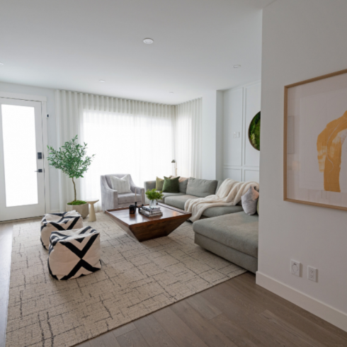
There are plenty of decoration ideas to inspire here, especially for spaces without a designated hallway. Louis keeps the living room open, enlarging the space. Two soft and easy-to-move ottomans cleverly act as a gentle boundary forming a passageway to the back door. The jolts of black stripes lend a mix-master edge and the ample sectional feels city-chic.
Go Green
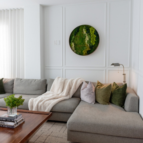
Remember that column we mentioned in the first slide? This view shows it in all of its uncentred glory. But thanks to the white-out effect of the paint palette and the picture frame panels that distract the eye, Louis has softened the column’s presence. The fabulous green accents add a natural tone and captivating focal points, from the cushions to the 3-D artwork which Louis made by gluing mosses onto a mirror. Its circular silhouette is a nice break from all the straight lines.
Carpet Tile!
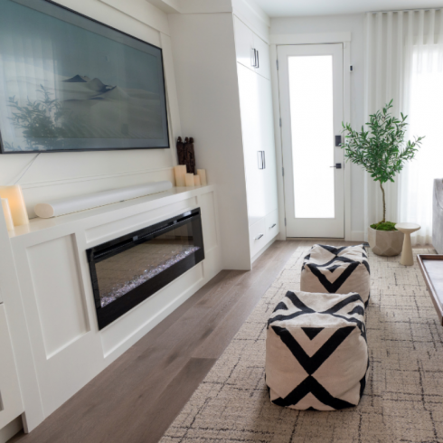
Another great decorating idea is underfoot in the living room. This area rug is actually composed of carpet tiles, which are a savvy alternative to spaces where standard-size offerings just won’t cut it. The sculptural coffee table imparts an earthy feel to the white space. “I love a mix that is sophisticated but then has a hit of something natural,” says Louis. This is exactly what transitional style is about — clean modernity disrupted by classic details.
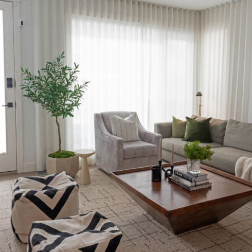
Soft, Diffused Hotel Windows
Doesn’t this room make you want to get sheer curtains? The softening effect is undeniable. Lightweight, see-through fabric lets in ample light while still offering privacy. That sweet, velvet armchair is custom-made (and actually swivels! A bonus when the couple want to pivot from the TV to a view of the backyard where their puppy, Archie, plays).
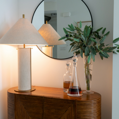
A Masterclass in Composition
The mixture of lines and curves in this corner speaks to Louis’ design expertise. This sweet little vintage credenza with handsomely carved curves opens up to reveal a concealed bar. Atop it sit a textural, retro lamp, sleek decanters and a tall vase of fresh greenery trimmings. The simple round mirror serving as a quiet backdrop for this scene is the perfect addition to complete this vignette.
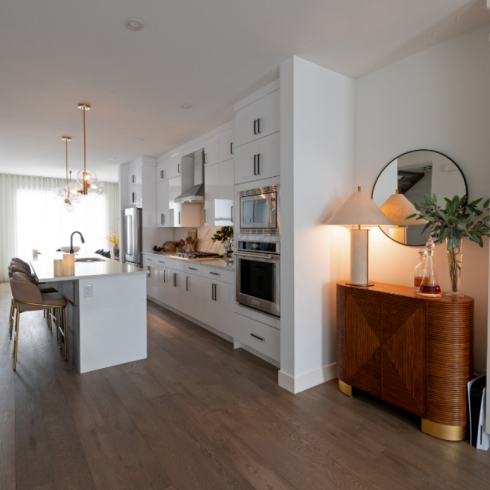
Go With the Flow
The bar cabinet and the cozy glow from the lamp atop it layer in some warmth and light in the transition from living room to kitchen. Brass accents throughout create chic continuity — an integral element of interior design.
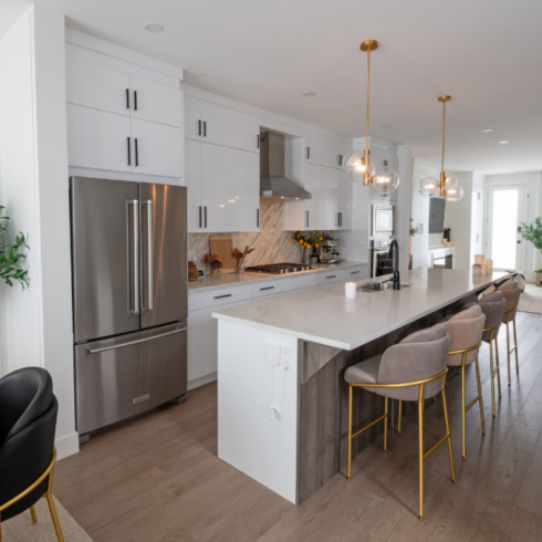
Heart of the Home
Rather than being tucked out of the sight in the back, this home’s kitchen is in the centre of the main floor. This is an interesting and unique position to consider when drawing up a new plan or devising renovation ideas.
Moving into this house, Louis and Donovan didn’t need to renovate entirely. They just replaced the kitchen island’s original black lacquer front with a more natural-looking wood-tone paneling.
Louis-Duncan-Hy-home-tour-18
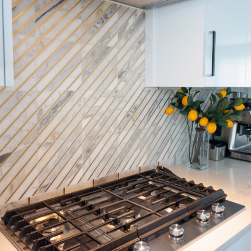
This stunning backsplash was in place when the couple moved in. “I thought it was really beautiful and so decided to keep playing on the brass accents,” says Louis. “Looking at the backsplash reminded me a little of some of the boutique hotels and cafés in Paris.”
Cheery Bubble Lights
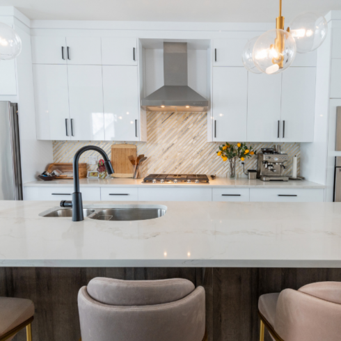
Louis let the brass-trim of the backsplash inform his choice of pendant lights. “I think black lights would have been a little too stark and dominant,” he says. “I really wanted to keep the eyes moving throughout the entire main floor. I didn’t want any one area to dominate too much.” This also answers why he chose pendant lights with transparent glass shades.
Velvet Touch
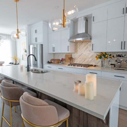
The velvet island stools layer in a slightly formal edge that’s still welcoming. Their soft tactile appeal and rich muted shades are a nice counterpoint to all the white and hard surfaces. The black faucet is a bold choice that lends edge to the space and ties the black hardware in.
Kitchen-Side Dining
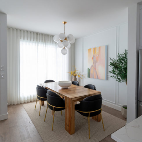
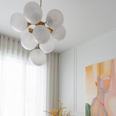
Sleek black leather dining chairs are a masculine foil to the abstract art in soft peachy tones. It was painted by Vancouver artist Zoë Pawlak. Did you notice that the dining chairs are the same shape as the island stools? Again, we see the brushed gold legs. Hints of more brass peek out from the large modern chandelier overhead.
A Muted Statement
If there is one item to consider splurging on, it’s lighting. This stunner, from Visual Comfort, was a definite investment. But it sets the tone for the dining room and feels more like a piece of art than a ceiling lamp. There’s energetic tension between its sculptural orbs and the bulky, natural wood table. A spray of yellow flowers adds some all-important visual interest in a corner of the room.
Pow!
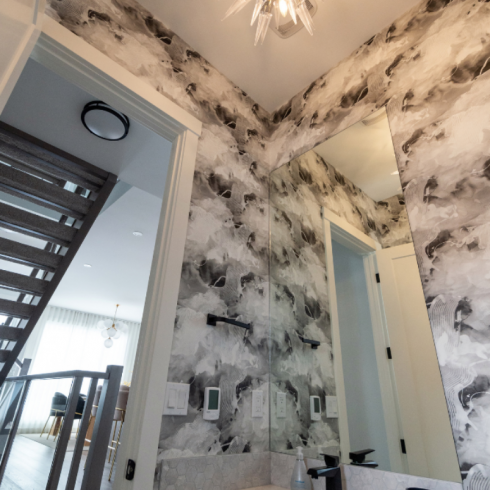
A small powder room sits just by the stairs, looking out to the front of the main floor. Powder rooms are the perfect place of rbeing bold with wallpaper, and Louis clearly knows this.
“Because the powder room’s wallpaper and tile are visually quite strong, we needed a light fixture that could hold its own,” he says. “We call this chandelier our ‘game of thrones’ light.”
Mural, Mural on the Wall
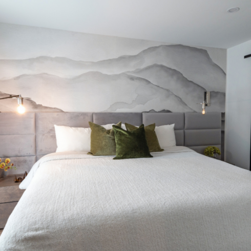
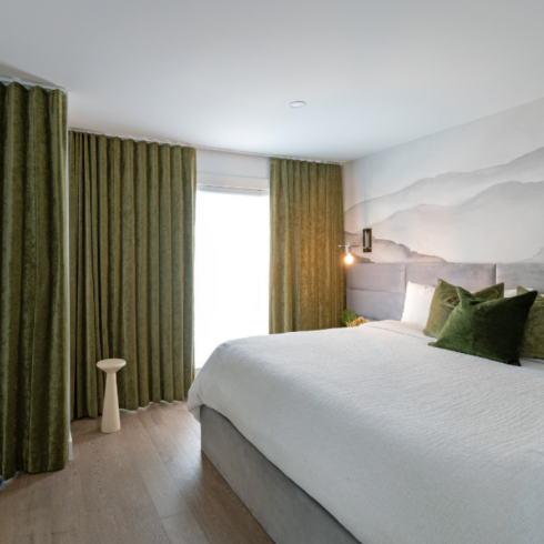
The design brief for the principle bedroom? Elegant boutique hotel. This incredible wallpaper mural depicting a mountain range in greyscale was the starting point for the room. It soft greys and echoed in the large wall-mounted headboard spanning the entire back wall. The lux velvet used in this headboard adds the elegant sheen you’d expect in a high-end hotel room.
Want more boutique hotel vibes? Check out The Ivy House Inn, in Lunenburg, Nova Scotia
More Hotel Touches
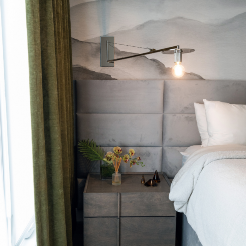
“I wanted the bedroom to be super easy to keep clean and tidy, so I kept many of the accents and decorative elements off of the floor,” says Louis. That was the idea here with these incredible articulating wall-mounted bedside lamps. “These wall sconces were the right scale and so elegant but also utilitarian.”
Continuity, Continuity, Continuity
Remember the lively green accents and drapes in the living room? They’re echoed here it great effect, creating a cozy foil to the cool white and grey tones. Again, we’re seeing more inspiration taken from hotel rooms: The curtains hang in perfect pleats, covering the entire length of the window wall from ceiling to floor.
Sleek & Simple
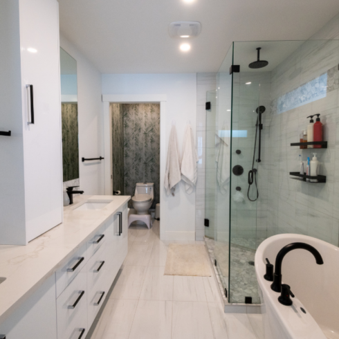
The ensuite bathroom needed very little in terms of décor. Louis loved the shiny tiles and contemporary black hardware and made two small additions: Mounting wall shelves in the shower and putting up wallpaper in the water closet. Keep an eye out — you’ll see this moody wallpaper again soon!
At-Home Studio
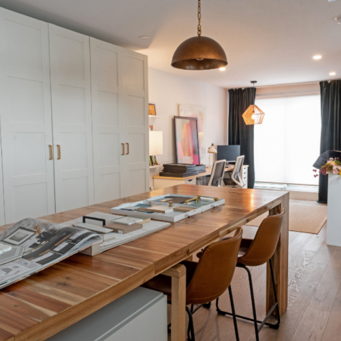
Louis’s third-floor home office acts as a studio space and home design studio. The tall, sleek cabinetry spanning the wall houses his sample library. The transformer table expands to seat up to a whopping 14 people. The green velvet drapes are on point with the rest of the home’s design brief and the hammered gold pendant light cultivates a vintage vibe.
Work, But Make It Pretty
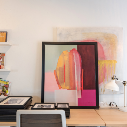
Eye-catching artwork from the couple’s previous home sits on Louis’s office desk. “Its free-flowing and organic nature just seemed to fit here,” he says. “It has a lot of creative energy, which I wanted to inject into the studio.”
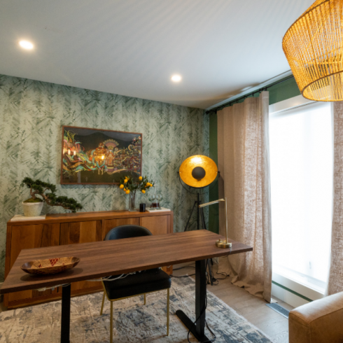
A Moody Home Office
Who would ever want to go back to the office when this moody, masculine workspace sitting right at home? Louis designed this cozy work-from-home office for Donovan as his birthday present. The desk is custom, the artwork is one of the first pieces the couple bought together and the leather chair was brought from their previous home. The overall effect is personal, intimate and layered.
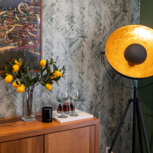
Finishing Touches
“I love wallpaper in general, so this home office seemed like the perfect place to make a splash,” says Louis. “My husband needed to have lockable storage for patient files, so the credenza serves both a visual and functional purpose. He also enjoys scotch so it was a nice place to feature that as well.” The floor lamp exudes a bit of drama and warmth.
HGTV your inbox.
By clicking "SIGN UP” you agree to receive emails from HGTV and accept Corus' Terms of Use and Corus' Privacy Policy.


