Lifestyle blogger Amy Peters primarily documents her day-to-day adventures in family life and motherhood, along with style, travel and the occasional DIY. And her meticulously curated functional family house makes for the perfect backdrop. From the neutral colour palette, ample storage options and overall clean aesthetic, you’d never believe Amy’s two growing boys play floor hockey in the hallways! This home is a masterclass in cozy, layered, neutral design that still feels like a family home. Catch the video tour here:
A Dramatic First Look
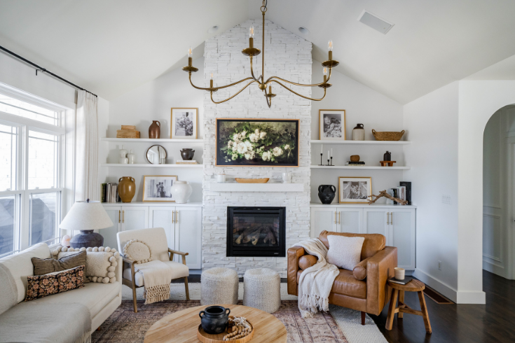
Upon entering the heart of Amy’s home, you’re greeted by a dramatic living room wall featuring a central grand fireplace flanked by shelves laden with goodies.
“Some of my favourite pieces are items we’ve collected over the years,” says Amy. Whether they’re antiques, thrift finds or recent purchases, Amy treasures that they bring back good memories the family shared together.
Cozy Cohesion
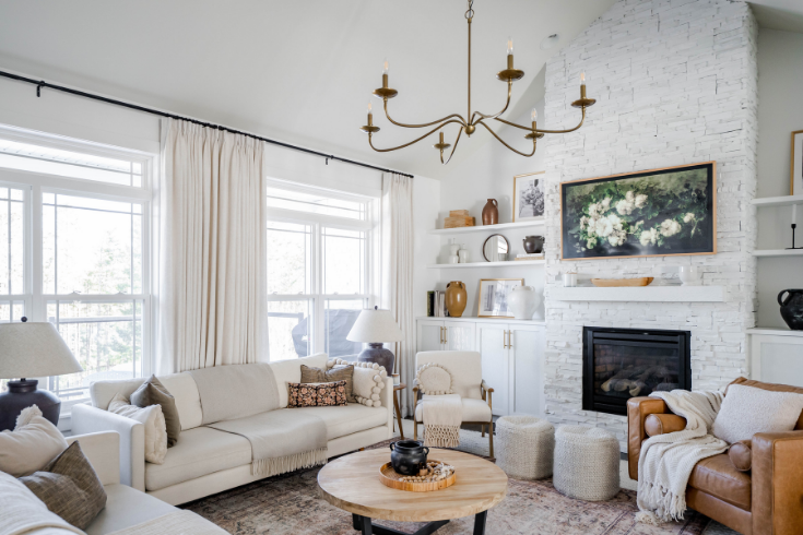
When the family first moved into this home, Amy decided to paint everything white to give them a blank canvas for decorating.
This clean white canvas is made cozy by layering plenty of warm, natural materials like wood, wicker, soft leather, brass and touches of black.
“I added in many textiles and materials to add more interest. These textiles have some soft pinks and burgundy, greens and beiges.”
Sweet Touches
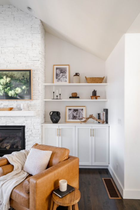
While her shelves hold artifacts of countless fond memories, Amy does have a favourite knickknack: Black and white family photos from when her sons were one and three years old.
Soft Arches
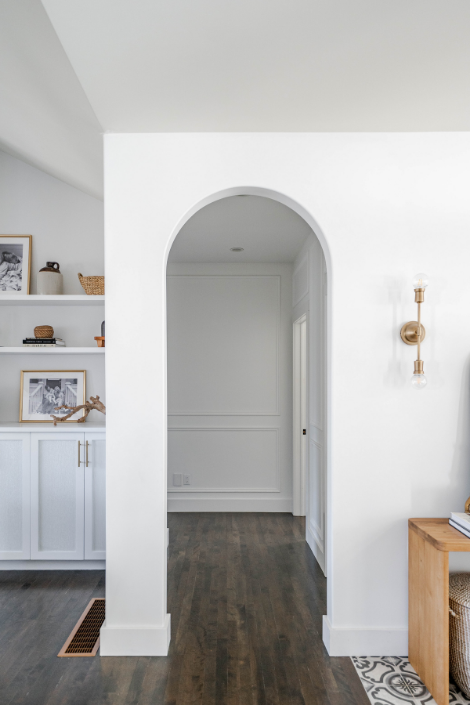
The walls may be bright white, but this home avoids appearing harsh and clinical with soft touches. These elements don’t stop at the layered off-whites and countless appearances of cozy textiles. Amy also incorporates arches throughout her home to soften corners, as seen in this archway that opens into her hallway.
Warm & White
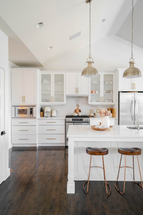
The theme of all-white-everything is also carried into the kitchen, of course. But just like the rest of the home, this room also masterfully balances stark white walls and furniture with warm, natural elements. Dark wooden floors and matching barstools are some defining features of the space. Meanwhile, frosted glass door cabinets flanking the kitchen sink keep the space feeling airy while still concealing clutter.
Modern vs. Natural
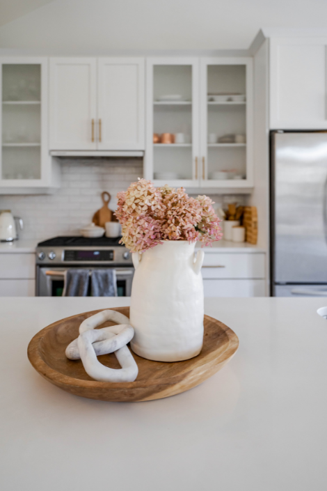
Natural touches break up the sleek, blank modernity of the white kitchen. Wooden elements, such as this decorative tray, are scattered throughout. As always, freshly cut flowers lend a pop of colour and freshness to your home.
A Family-Forward Kitchen
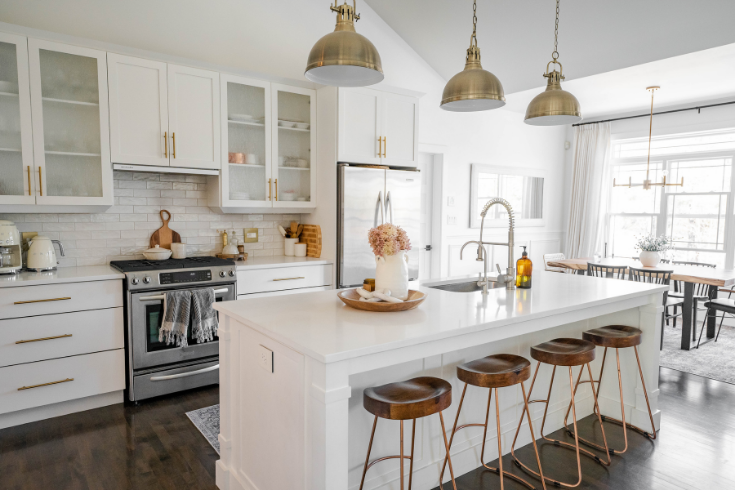
“One of my favourite things about our kitchen is the large island, so the kids can pull up their stools and eat,” says Amy.
The Most Charming Pantry Ever
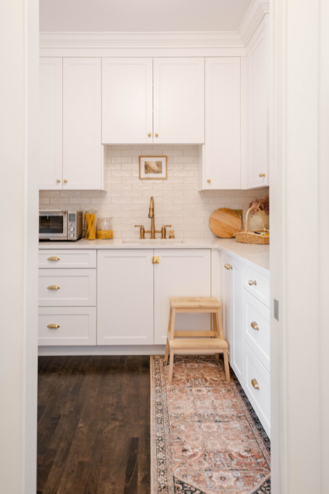
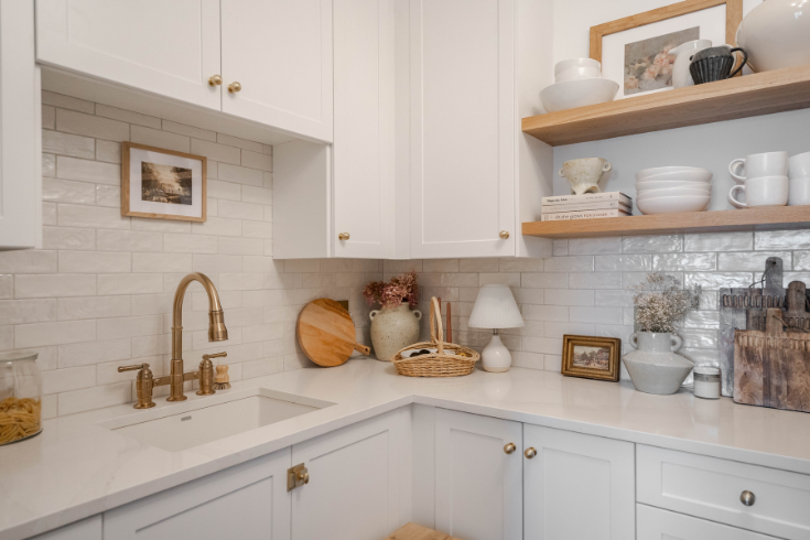
While Amy’s glorious white kitchen provides ample storage, this home takes it a step further with this kitchen add-on. Her enviable pantry features more dark wooden floors paired with tons of sleek white cabinetry. Warm touches like the rosy runner and the brass taps infuse the space with personality.
A Stylist’s Dream
This corner of the pantry is a lesson in cohesive use of colour. The initial canvas is white, but not blank: There is ample contrast between the smooth white cabinets and textural, pearlescent white subway tile backsplash. Amy scatters colours from a natural palette throughout this area, styling the counter space and beautiful open shelving with wood and brass elements.
Open Shelving Done Right
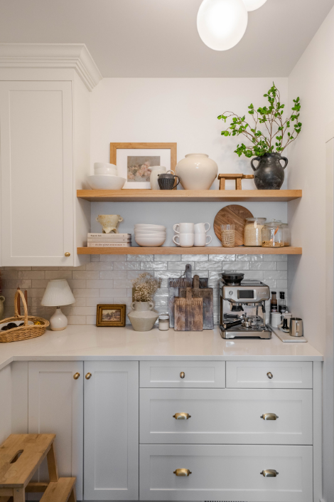
The family carefully considered different kitchen storage solutions and ultimately opted for a mix of both open and closed storage. The open wood shelving adds warmth and creates a beautiful focal point when looking through the arched opening into this space.
“I decorated these open shelves with a mix of items we use on a daily basis and added a few pieces for style,” says Amy.
A Chic Take on Laundry
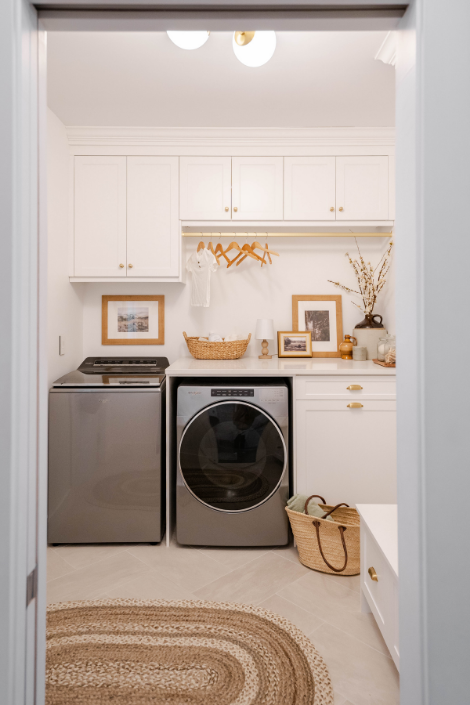
The whole sticks steadfastly to a neutral colour palette of natural elements (like wood and wicker) layered over a canvas of white. The stunning laundry room is no exception and there are thoughtful touches that showcase immense attention to detail. Even the hangers echo the wood accents scattered throughout this space
A Mud Room With More
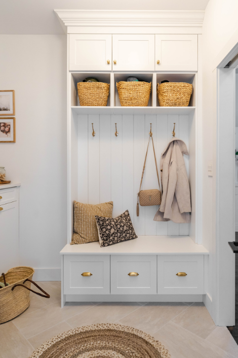
Amy’s family lived in this house for almost four years before embarking on their laundry room/mudroom renovation. This allowed the family to better understand the flow of their home and make the necessary renos to this spac.
“Having the mudroom right by our garage, that leads into our pantry made so much sense,” says Amy. “Easy to kick off boots and drop off groceries.”
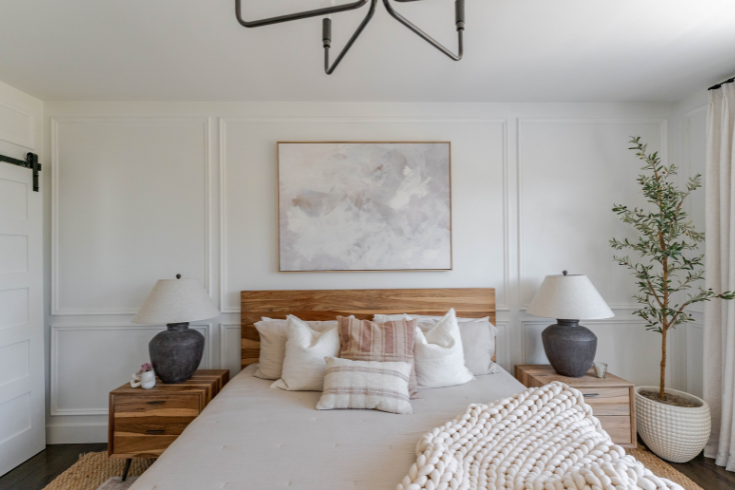
A Restful Retreat
The bedroom in this home is just as serene as the rest of the house, almost resembling a hotel suite. Both bed and side tables are made from gorgeous Indian rosewood.
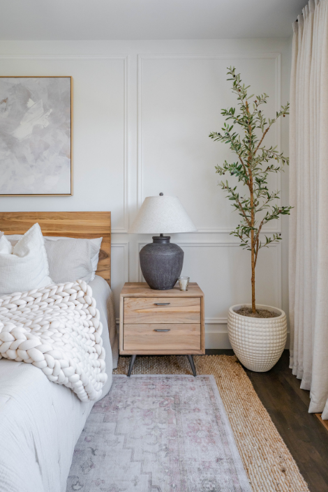
For the Love of Olives
Believe it or not, this realistic olive tree is actually faux — and from Amazon! Amy’s trick to making it look a little more realistic? Put it in a large pot and prop it up underneath with some old books and cardboard to add height. She tops off the base with some preserved moss and makes sure to occasionally fluff and move the branches!
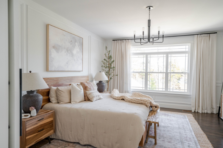
Warming Layers
Want to know a cool trick for adding greater depth and visual interest to a space? Layer your rugs!
Some go-to rug-layering tips from Amy include choosing a bottom rug that is the correct size for your space. The top rug can be one or two sizes smaller, creating a nice border effect when layered atop the bottom rug.
“I like to use a simple neutral rug made of natural fibre on the bottom so it is a nice backdrop for a fun top rug.”
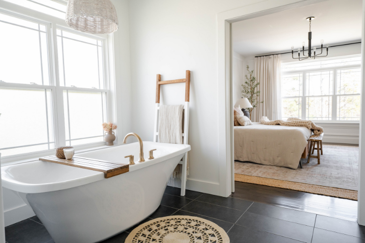
Ensuite Haven
One of Amy’s favourite things about her bathroom? The glorious standup tub. Amy styles this beauty with natural materials, like a jute bathmat and wooden bath tray.
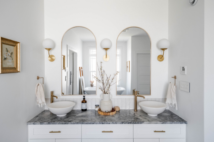
Arches, Arches & Even More Arches
If there’s one thing this house has mastered, it’s continuity and cohesiveness. Arches carry on into the bathroom in the form of these elegant double mirrors situated above the vanity. A touch of additional glamour is sprinkled throughout the space in the form of warm brass, seen in the sconces and hardware.
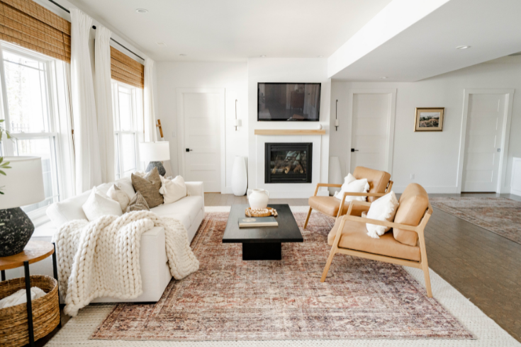
A Functional Family Home
The downstairs TV room in Amy’s home reflects the upstairs formal living room in a few key ways: A central fireplace anchors the room, with a TV mounted atop it. A comfy white couch and a pair of peachy armchairs are laden with
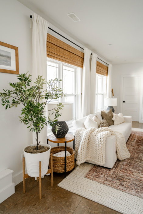
Never Enough Layers
Amy brings layered rugs into this TV room space, too. Here, she pairs her rosy Persian-style rug with a simpler white jute base. “The bottom layer can add texture and the top layer can bring the personality & some colour,” she says. Full-sized rugs can be expensive, so you can opt for a full-size rug on the bottom and a smaller rug on top.”
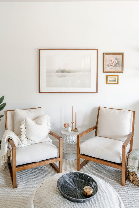
Conversation Starter
On the opposite side of the TV room sits a little conversation area. This vignette is simple and functional, featuring a pair of Scandi-inspired armchairs on either side of a space-conscious little white table. Additional artwork within the same colour palette completes this vignette.
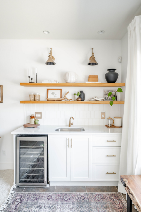
Happy Hour
Can you tell Amy loves open shelving? This home’s lounge space includes a space-savvy home bar. Ample concealed lower cabinetry keeps the space organized, while the wall-mounted wooden floating shelves above are perfect for styling.
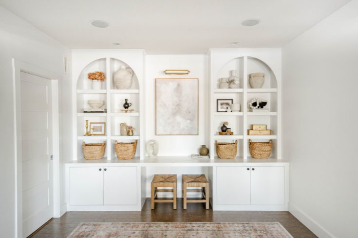
An Unlikely Arena
This magnificent feature wall anchors the back corner of the recreational space. These shelves are often restyled by Amy. A row of wicker baskets populates the lowest shelf, providing additional storage. While Amy uses this space as a focal point for her home, her two kids use it as their personal ball hockey arena!
HGTV your inbox.
By clicking "SIGN UP” you agree to receive emails from HGTV and accept Corus' Terms of Use and Corus' Privacy Policy.


