“A love of nature, natural materials and neutral palettes,” is how Kimiko Willgress describes Indie Home, the décor concept store she owns in Halifax, NS. Kimiko relied on these three loves when updating her own home, a 2,500-square-foot bungalow she shares with her husband Scott and their three kids (Jackson, Mariko and Bode). She transformed it from a dark and dated space to a charming boho-chic family home brimming with natural light. You can also watch the video tour here:
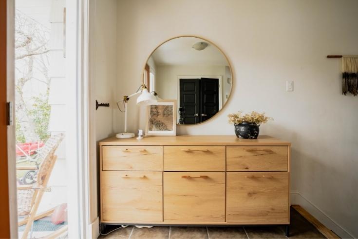
Warm Welcome
The home’s front entrance exudes a laid-back charm that’s also super functional. Closed storage keeps clutter out of sight, while accessories layer in visual interest. The round mirror (perfect for checking appearances before heading out the door) introduces some curves. The sweet vase, is actually a vintage cookie jar; Kimiko ditched its lid then spray painted the jar and added mud and baking soda to the surface for a tactile patina. The overall neutral palette feels warm and calm.
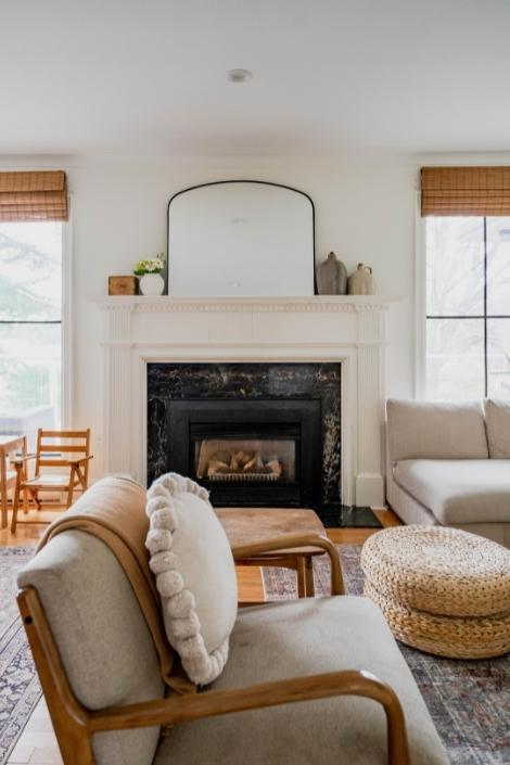
Mix Master
“I’ve always been drawn to light and bright looks,” says Kimiko. “I like a mix of collected items: elements of nature, boho and mid-century.” The living room is testament to her style and the windows impart some symmetry to the airiness of the space. The curves of the mirror and furniture keep the look soft.
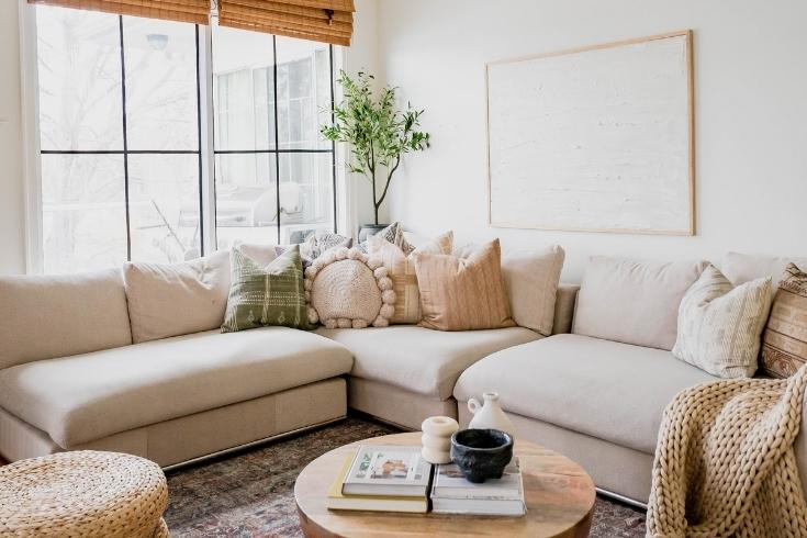
Pillow Talk
If you follow Indie Home on Instagram, you’ll know that Kimiko believes a good pillow collection can make or break a room. These ones from her store definitely make the living room. The placement – grouped together in a corner of the sectional, rather than spread across it – is fresh and fun.
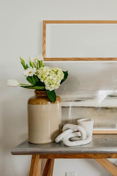
Why Knot
Organic shapes can be found throughout Kimiko’s home and the nautical feel of a sculptural knot references another one of her favourite aesthetics: a coastal vibe. That breezy look is furthered by a simple arrangement of fresh flowers.
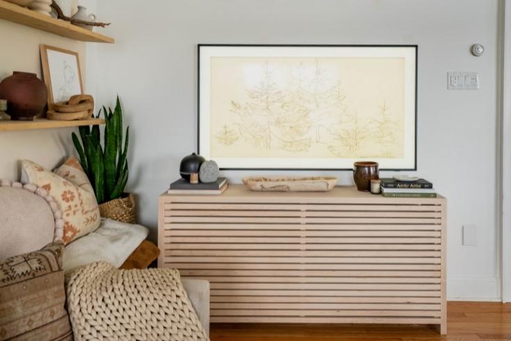
Cover Up
While it looks like a stunning piece of furniture, this slatted beauty is actually a radiator cover the Kimiko had custom-made for the space. It prettily hides the heating source and offers a display area for decorative vignettes beneath the Frame TV.
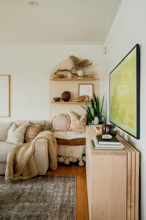
Look Again
The back of this “shelf” in the corner of the living room is actually painted on – it’s a genius DIY trick that layers in visual interest and is also budget-friendly. The designated pale pink space features two floating shelves that are perches for pretty things. This is the entrance to the living room and the sleek Frame TV keeps the space (not the TV) the focal point.
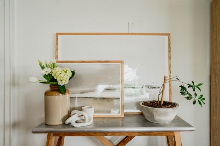
Artful Presence
Layered artwork propped against the wall has high-impact charm, is easy to change up and much easier than hanging art on the wall.
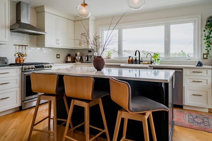
Island View
The 1970s bungalow originally had the dining area at the front of the house. “Reconfiguring the layout and putting the kitchen up front to face the lake was a game-changer,” says Kimiko. The new placement, adjacent to the open-plan living room, is conducive to modern family living.
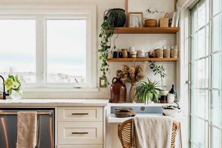
Plant Life
Incorporating plants into principal rooms is a huge trend that Kimiko loves. “One of my favourite ways to decorate is bringing nature inside, whether with plants, or rocks or branches,” says Kimiko. “I love how plants help with air quality indoors, but also give a pop of green in an otherwise neutral pallet. There’s nothing prettier than decorating with nature.”
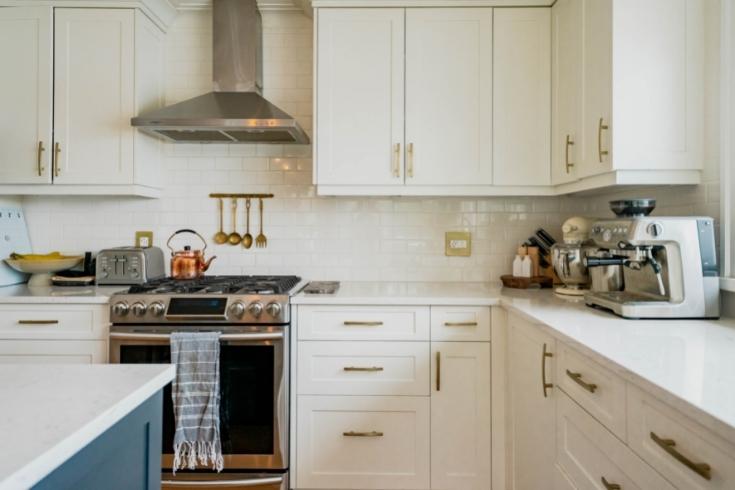
Fine Finishes
A backsplash (to the ceiling) of glossy white subway tiles feels fresh and contemporary and the tiles are a snazzy complement to the stainless-steel range hood. Brass pulls craft more of an elegant effect and the overall mix is dynamic and fun.
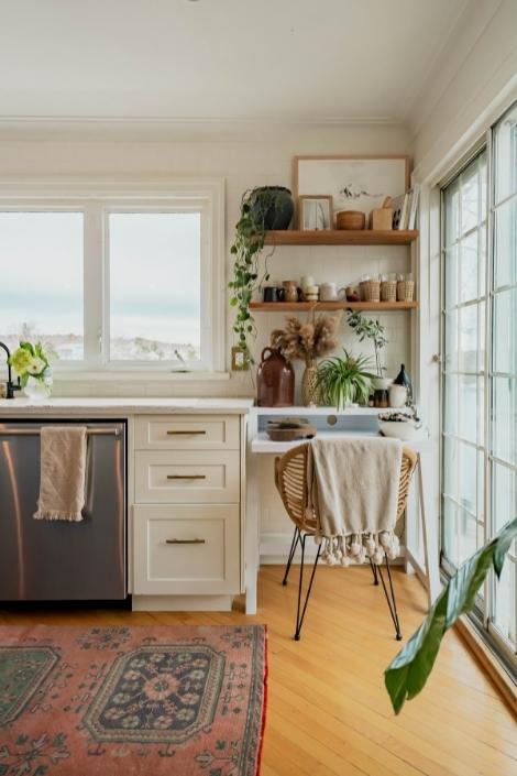
Bright Stuff
The windows and doors in the lake-facing kitchen are kept unadorned to let light in and keep the view front and centre. Positioning an indoor plant (see that green leaf!) beside the doors is a fresh way to subtly demarcate the kitchen in the open floorplan.
Related: How to DIY Live Shelves
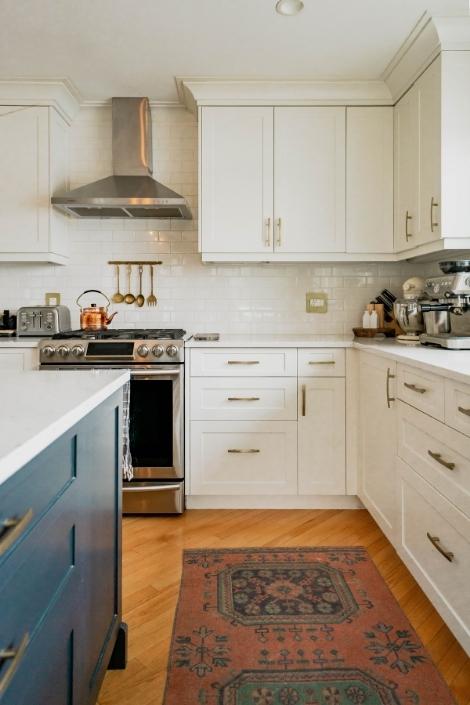
Softly, Softly
Kimiko layers in colour and pattern to the kitchen with a mini vintage rug from Nova Scotia’s Velvet and Loom Shop. It adds some old-world charm to the new kitchen and picks up the colour of the island nicely.
Light Show
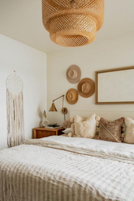
The principal bedroom is a tonal beauty (more on that later) and the mix of lighting charms. The textural showstopper pendant is from Ikea and its woven, natural appeal is a nice foil to the bedside sconces: burnished brass beauties from Hinkley Lighting. The takeaway? Always have more than one light source in the bedroom.
Blue Note
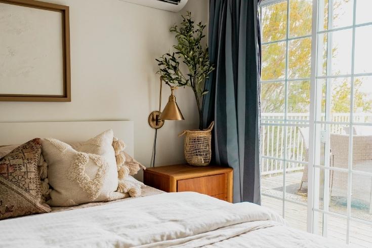
The airy, neutral palette of the principal bedroom is punctuated with slate-blue drapery. The hue works well with the greenery beside it and nicely references the colour of the kitchen island for design continuity.
Hats Off
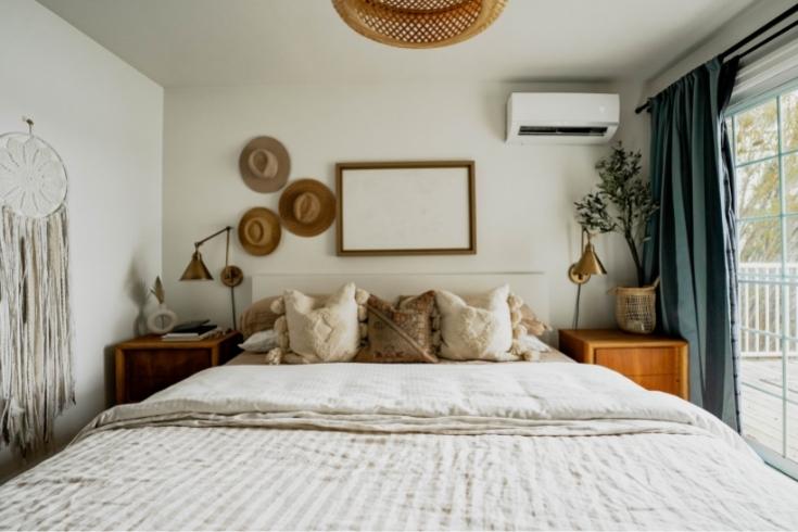
While hats are a go-to fashion accessory for Kimiko, they’re also an original home furnishing. “I own so many hats that it seemed only natural to include some in my décor,” she says. The grouping of three (an odd number) to one side lends an edgy look, and the toppers’ neutral tones reflect the room’s earthy and calming colour palette.
Artist in Residence
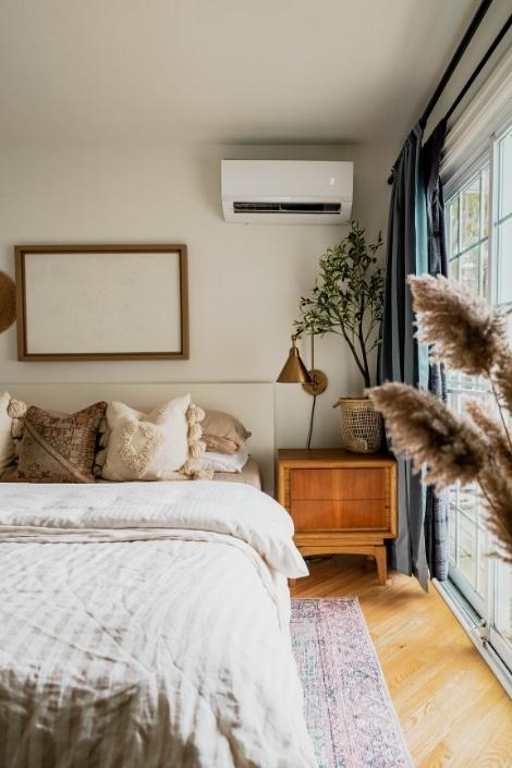
That cool piece of artwork over the bed is actually a DIY project that was inspired by an expensive piece of art Kimiko had seen online. She took an existing piece of framed colourful art and covered its bright abstract stripes with a creamy neutral paint. Here’s where it gets fun – she mixed the paint with baking powder (!) to get a textural finish. “I really like how the finish gives it a cloud like appearance.”
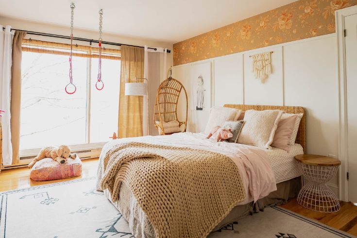
Calming Zone
“I wanted the kids’ bedrooms to be comfy and functional for them,” says Kimiko. “This is my daughter Mariko’s room and she likes to spend a lot of time here. I wanted it to be a place of calm colours, rather than one with big bold pinks and purples (which she may have chosen if given full rein to do so!) that would give off more energetic vibe. Trust me, Mariko doesn’t need any extra stimulation – LOL!”
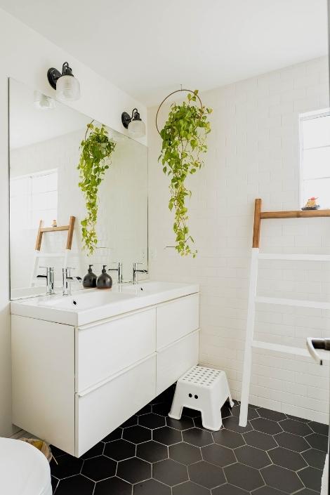
Nice and Simple
A classic colour scheme keeps the family bathroom fresh and clean. Dark floor tiles are a graphic foil to the otherwise white space and they’re super practical for the heavy traffic space. Even here, Kimiko layers in a live plant where it exudes that boho vibe she loves.
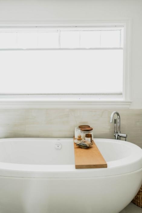
Wood You
The bathroom’s crisp, white palette gets a bit of the natural and neutral vibe found in the rest of the home with one simple addition: a wood bathtub tray. It factors in a bit of rustic warmth to the monochromatic space.
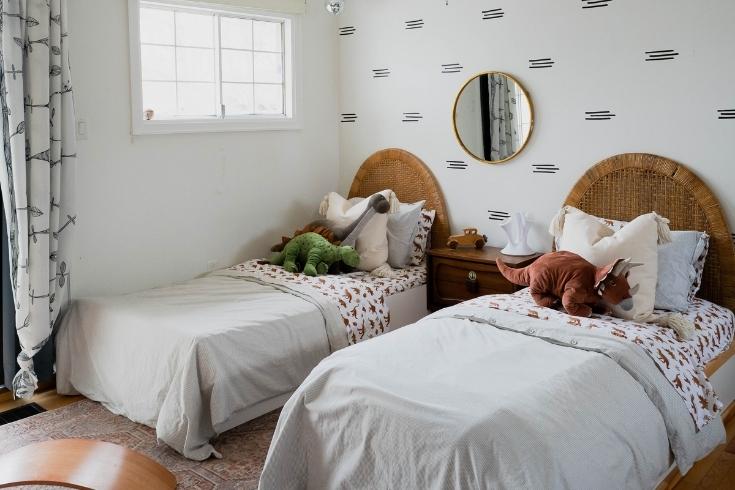
Doubly Nice
“Decorating my sons’ Jackson and Bode’s bedroom was a little tricker than Mariko’s because we needed two beds,” says Kimiko. “The vintage headboards were the jumping off point for their room.” A focal wall and patterned bedding finish the look with playful zing.
HGTV your inbox.
By clicking "SIGN UP” you agree to receive emails from HGTV and accept Corus' Terms of Use and Corus' Privacy Policy.


