Taking the plunge with your own home renovation can be liberating, but it can also be risky. Just ask the homeowners featured on Help! I Wrecked My House. Their dream home visions were anything but thanks to a slew of rotten contractors or DIY disasters. Luckily, designer-contractor Jasmine Roth was there to save the day. Ahead of a new season of her reno-saving series, we revisited some of the most dramatic transformations from season 2.
Season 3 of Help! I Wrecked My House debuts on Wednesday, August 31 at 9 p.m. ET/PT on HGTV Canada. Also available on the Global TV App and on STACKTV with Amazon Prime Video Channels and Rogers.

A Gorgeous New Fireplace
This crisp, white look is modern and pretty with bright pops of blue. A wood mantel, built-in shelves, and a bench with extra storage also add practicality, with modern pieces of furniture pulling it all together.
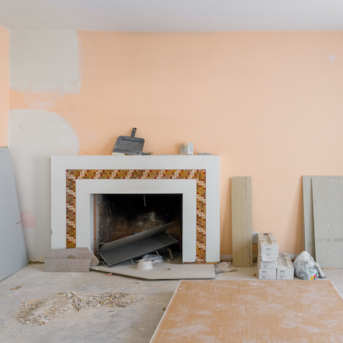
The Before
It’s hard to believe this is what the room looked like before Jasmine arrived.
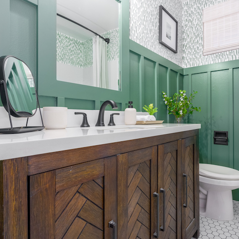
A Calming Oasis
This peaceful bathroom is serene and spa-like, thanks to the green tones and wood hues. Some hex tiling and wainscoting keep it modern and fresh, with a bit of greenery for good measure.
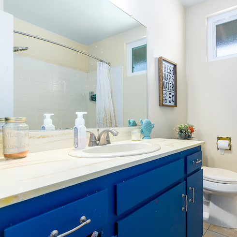
The Before
This blue was trying way too hard. Add in a builder-quality mirror, old tiling, and plain walls and, well, this isn’t what we would have called a spa-like space at all.

A Dreamy Retreat
This primary bedroom is the kind of room you can easily drift away in at night or spend hours lounging around in on a lazy Sunday. The elongated headboard is chic, the room has a cozy reading nook, and the windows offer plenty of light to keep things light and airy.
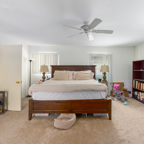
The Before
There’s nothing wrong with this space, but nothing remarkable about it either.

A Kitchen Combo
This large kitchen and dining room area has coastal vibes and blue hues you’d dive into the deep end for. There’s lots of seating, storage, and design appeal.
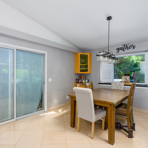
The Before
While the homeowners were doing what they could with the design, there’s a ton of wasted space here.
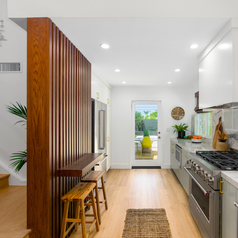
Midcentury Modern Vibes
This galley kitchen is a beautiful example of making the most of a small space, with an airy divider and modern appliances.
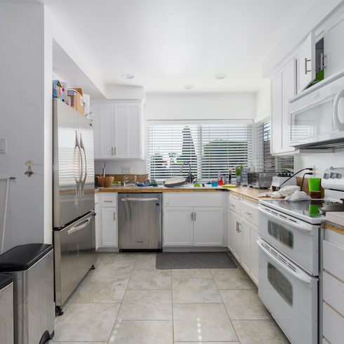
The Before
Cramped and dull best describes this cooking space.
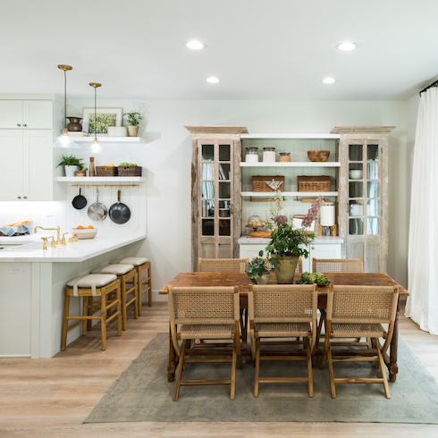
A Bright and Functional Kitchen
This kitchen redesign feels spacious and modern, with plenty of storage for a big family to enjoy, thanks to the extended L-shaped countertop and the large dining table.
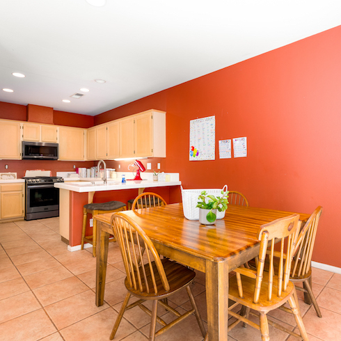
The Before
Orange you glad Jasmine came to the rescue?
Orange you glad Jasmine came to the rescue?
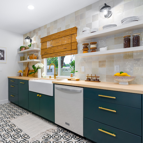
Modern Galley
This jewel-inspired kitchen is bright, functional, and modern, with plenty of exciting design elements like the farmhouse sink, the gold hardware, and the checkered backsplash.
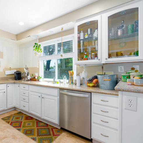
The Before
Okay, so the galley kitchen wasn’t bad, but it wasn’t giving off design appeal.

Modern Dining
This open-concept space is airy and welcoming, with many midcentury modern details to catch the eye.
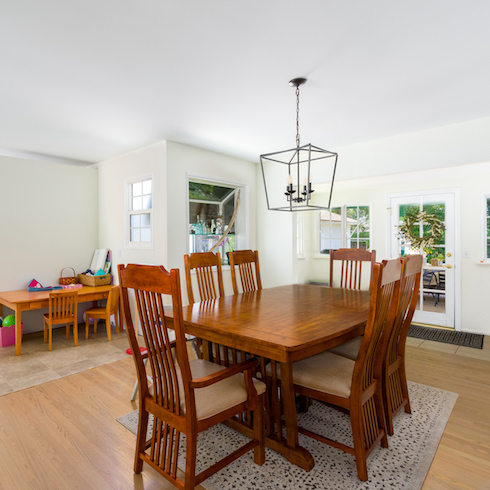
The Before
Before, there was no flow or design appeal, just some empty-feeling rooms.
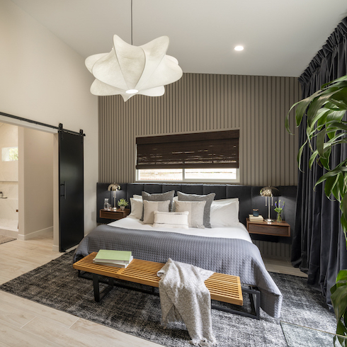
Modern Sleeping
This hotel-inspired bedroom features dramatic finishes, a black barn door to the bathroom, and beautiful, modern lighting. It’s a space you could lounge in for hours.
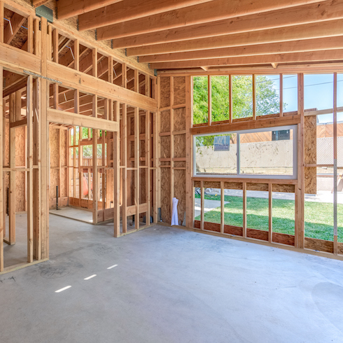
The Before
Let’s say this is an example of bedroom additions gone wrong.
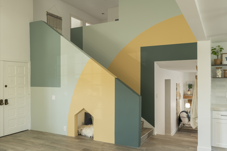
Colourful Creativity
Is there anyone who wouldn’t love this brilliantly designed, open-concept stairway with its bright yellow and greens? Add in that little dog nook under the stairs and it’s basically brilliant.
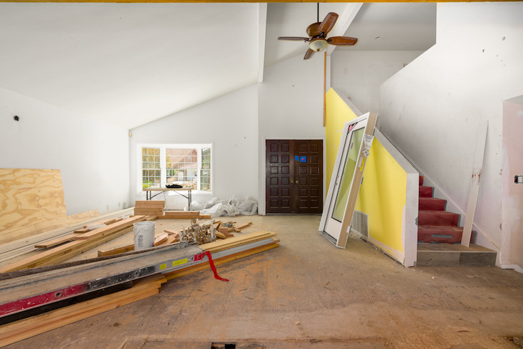
The Before
We’ll call this one a homeowner’s nightmare.
HGTV your inbox.
By clicking "SIGN UP” you agree to receive emails from HGTV and accept Corus' Terms of Use and Corus' Privacy Policy.


