After busy careers in the world of film and television, Rose and Keith decided to move cross-country and start a family. The couple found their dream home, complete with an adorable cow pasture just across the road, and have since had two beautiful daughters. But as their family and needs grew with time, it became clear the space needed some changes to grow with them. That’s when they called Kortney, Kenny and the rest of the Making It Home team!
See how Kortney and Kenny transformed their dated and dysfunctional house into a stunning family home with French-Country style – all on a $175,000 budget.
Watch Making It Home with Kortney & Kenny Tuesdays at 10 p.m. ET/PT on HGTV Canada. Also Available on the Global TV App and STACKTV with Amazon Prime Video Channels and Rogers.
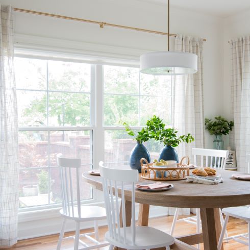
A Place to Enjoy the View
One of the many things that sold Rose and Keith on their home was the picturesque views around the home. The couple wanted a place to raise their children, and with views of cows and lush fields, they wanted to be able to enjoy those views as much as possible. To do so, Kortney wanted to give them a relaxed dining area, with French countryside design. She did so by introducing light, bright colours that accented the natural hardwood installed throughout the home.
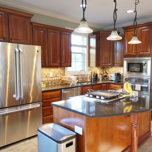
A Cramped Cooking Space
It just worked. There was nothing inherently wrong with their kitchen, but is that how we should feel about our homes? With an undersized island, narrow walkways and dated design, the family just couldn’t love the space. It was simply a space that had served its purpose and was ready for new life.
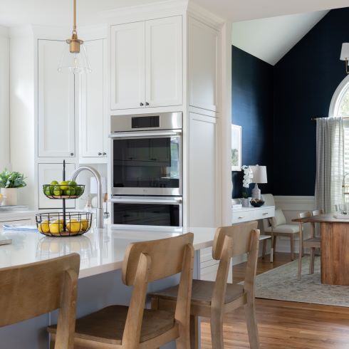
Island Envy
When Kortney and Kenny asked Keith about the kind of island he envisioned, only one word came to mind: Bigger. “Don’t think of it as an island, think of it as a continent.” After years of working on cooking shows, Keith had become quite the chef himself. He knew the space he needed to feel comfortable in, as he both cooked for his children and taught them to cook for themselves. Kortney and Kenny more than delivered with a massive, stunning waterfall island, but it wasn’t without its challenges.
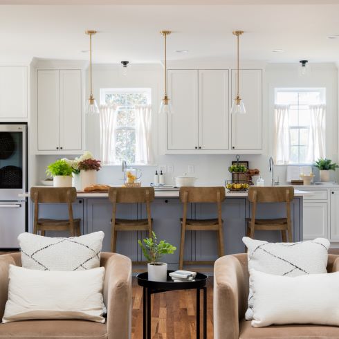
Taking Up Space
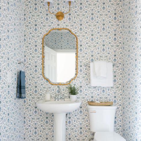
Installing a large island isn’t very hard for K&K’s crew, installing one where there’s already a wall and a powder room is another story. That is what Kortney and Kenny were faced with as they tried to make Keith’s kitchen dreams a reality. In order to solve this dilemma, Kenny and the team installed a massive support beam where the wall had been and relocated the powder room, taking space from the garage.
Positioning the Powder Room
In every challenge the team faces, there’s also opportunity. This is true in the case of relocating the powder room. Having nowhere in the floorplan to put it, they looked to the garage. Luckily, the garage had space to spare and even enlarged the room. Once it was done the team found that the added privacy of having the room tucked away discretely, rather than center of the room, felt much more natural.
Door Difficulty
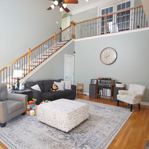
Rose and Keith loved their living room. It was a space to gather, relax, and enjoy others’ company. The problem was that it was difficult to create a layout that felt natural due to an awkwardly placed door under the stairs. It meant that a walkway always needed to be made directly through the space. This, coupled with a dated fireplace and mantle, kept the space from reaching its full potential.
Related: Keeping Up With Kortney and Kenny
Quick and Easy Modernization
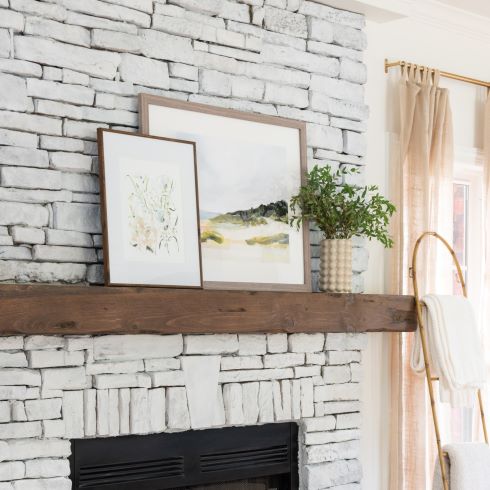
The fireplace, like much of the rest of the main floor, was fine but dated. There was no way the team could leave it as it was. Given the budget, it wasn’t their highest priority, so Kortney had to find a cheap way to bring it into the present. By whitewashing the brickwork and adding a rustic timber mantle to the façade she was able to make it a true focal point of the space. A change of colour and a big chunk of wood works wonders.
Tunes and Time with the Family
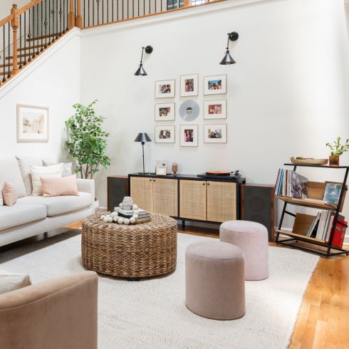
Most living rooms are centered around a television, but not Rose and Keith’s. For them the most important feature of the room was a vintage stereo Keith’s late father had left him. Paired with a vinyl record player, it was now an integral part of the home and a means for their children to connect with their grandfather. Kortney and Kenny understood this importance, and after relocating the door beneath the stairs, were able to center the room around this important feature. Kenny, wanting Keith to be able to showcase his collection, even helped design a stylish record holder. It’s true that there’s no sweeter music than the sound of family.
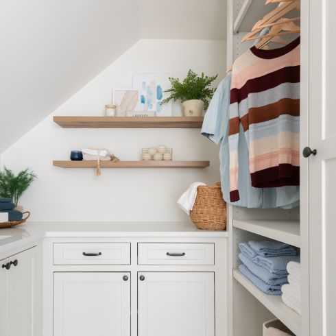
Aesthetic Organization
Although the team’s primary focus was the main floor, some change did make it upstairs. To make more room downstairs, the team stole some space from a landing room in order to create a laundry room, complete with lots of additional storage. As adorable as children are, they can also be messy, so best to keep the detergent close by.
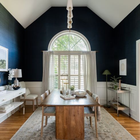
Simple Design for Stunning Dining
When you have young children the dining room might not get used as much as you’d like. As a family grows, that can change which is why Rose and Keith wanted to update this space without getting too intensive. The walls already had beautiful trim work, so rather than change the whole room Kortney brought in the light hardwood flooring throughout the house. She left the ceiling a bright white but contrasted the walls with a rich, dark blue paint to add flair and intrigue.
Love this transformation? Shop the look here!
HGTV your inbox.
By clicking "SIGN UP” you agree to receive emails from HGTV and accept Corus' Terms of Use and Corus' Privacy Policy.


