Dana and Phil moved to Nashville from California to start a family and be closer to Phil’s family. They found a house in a quiet suburb with a gorgeous yard. The yard was the main selling feature for one critical reason, they love their dogs. Though the property was ideal for their three dogs and son Rory, the house was not. A dysfunctional layout and cramped living spaces left them with an uncomfortable home. Dana, having previously been a dog groomer in California, had dreams of blending stylish decor with a puppy paradise.
Wanting both a home they could love, as well as expand Dana’s dog grooming business, the couple called Kortney, Kenny, and the Making It Home team to see if they could bring this reno to life—all on a budget of $150,000.
Watch Making It Home with Kortney and Kenny Tuesdays at 10 p.m. ET/PT on HGTV Canada. Also available on the Global TV App and STACKTV with Amazon Prime Video Channels, fuboTV, Rogers Ignite TV and Ignite SmartStream.
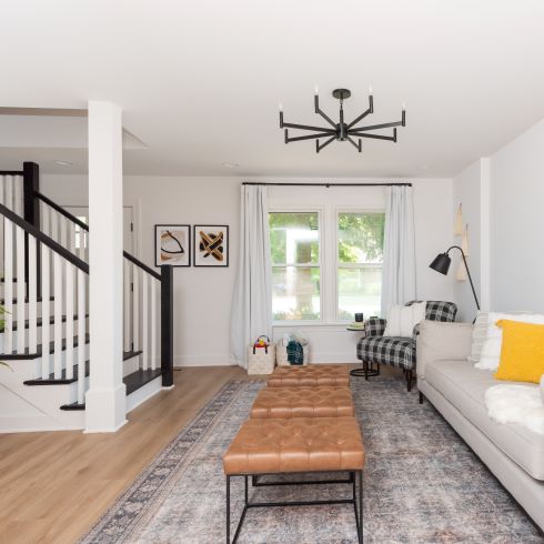
Reworking an Awkward Layout
You can’t teach an old dog new tricks. That’s what they say, but in reality, it’s a matter of patience and creative solutions. The same was true for reworking the uncomfortable layout of Dana and Phil’s home. Adjusting a layout is a daunting task for anyone, a house’s footprint can feel set in stone. By simply reconfiguring the stairs and replacing a wall with a support beam, Kortney both opened the space and created an entryway that didn’t feel so cramped.
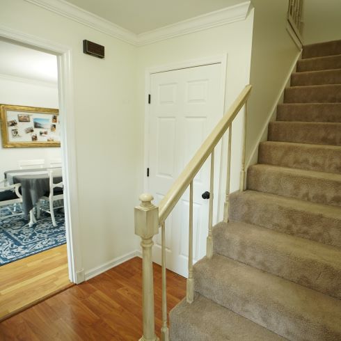
A Headache of a Stairway
We don’t ask much of our stairs. We want them to be easy to climb, safe to use, and ideally look nice. The stairs in this home did none of those things. A steep incline, dated carpeting, and a low ceiling ideal for head-bonking made these stairs a challenging issue for the team to solve. Since the stairs were already encroaching on the front door, they couldn’t just extend them out. After a lot of thinking, and a little sledgehammering, the team rebuilt the stairs with a much safer angled design.
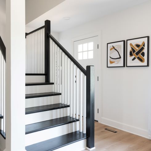
One Stylish Stairway
Who says stairs can’t elevate your design? (Pun intended) Once Kortney and Kenny had created a set of stairs that functioned the way that the family needed, they still had to make them worthy of the home’s new aesthetic. With a sophisticated black and white contrasting paint scheme they made these stairs a focal point of the room. Now, instead of being greeted by a wall of carpet when you enter the home, you’ll find a bright open decor.
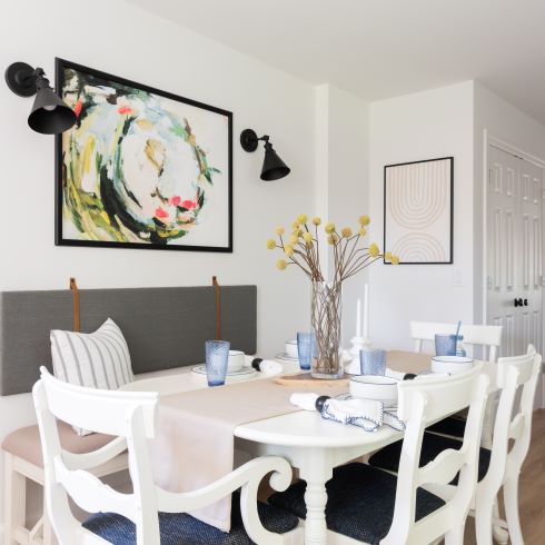
Finding Home in a New House
Moving to a whole new place can be daunting, but there’s ways to make it easier. When Dana and Phil moved to Nashville they were leaving behind a lot of memories in California. Kortney could see that this was difficult for Dana and wanted to help make this house really feel like her new home. Together the two of them went over some of the pieces and heirlooms that could remind her of family and friends. One of these pieces, a refurbished antique dining set that had been in her family her whole life, made the perfect centerpiece for the home’s new dining area. It served as a reminder that home isn’t one place, it’s the people that matter the most, wherever they are.
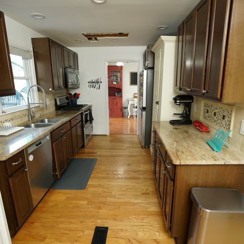
A Kitchen in the Way
Beautiful decor is great, but it’s pointless if the space doesn’t function well. Nothing catastrophic was wrong with this kitchen, but the little issues were piling up. Its position in the house left it disconnected from the other spaces and that made using it feel awkward. Whether it was a hole in the ceiling from a plumbing issue, dated cabinets and countertops, or a narrow layout, this space just didn’t work. It was for this reason the family and Kortney decided to relocate the kitchen to an addition that had been underutilized.
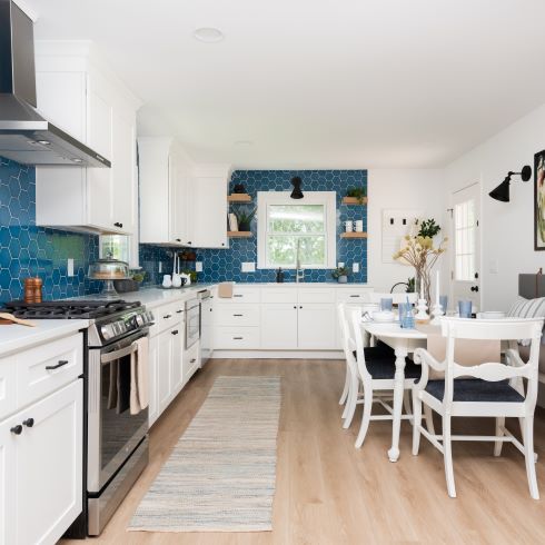
New Room, New Kitchen
If there’s one thing Dana and Phil aren’t afraid of, it’s change. Not often are families brave enough to entirely relocate their kitchen. This comes from them knowing exactly what they wanted and what suited them. Such specific taste even left Kortney nervous, afraid that the changes would be too specific to them and hurt the resale value of their home. Despite this they were adamant, so the team got to work. One of the things they wanted was light coloured flooring to hide their golden retriever’s hair. Their reasoning may have been specific to them, but it ended up being a beautiful design choice that opened up the entirety of the home.
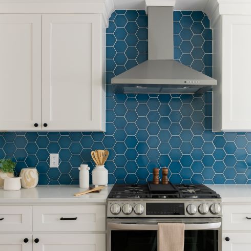
A Bright Classic Kitchen
As intimidating as their layout changes were for Kortney, that wasn’t the case with their style choices. The couple knew from the start that they wanted light and bright designs with traditional influences. By installing the same hardwood throughout and installing classic white cabinetry with a splash of colour on the backsplash, Kortney and Kenny achieved exactly that. This timeless styling made this a home that will have appeal no matter your design taste for years to come.
Related: The 15 Top Kitchen Trends for 2023
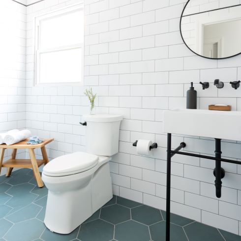
Porcelain for the Pooches
We all have that one thing we’d love to have in our home regardless of how niche it is. In Dana’s case, that was a massive wet room where she could groom. It was important that this be a room that functioned well for her but also had utility outside of her business. To accomplish this, Kortney designed a room with oversized subway and floor tile to reduce the amount of grout lines and make cleaning easier. Along with that, she added a toilet, vanity and shower so the space doubles as a full bathroom. Sometimes we can have the best of both worlds, it just takes a little creativity.
A Space for the Furrier Family Members
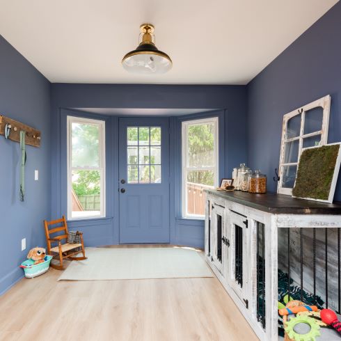
Would it really be a Making It Home episode if Kortney didn’t work in a surprise? This time she worked with a local artisan to create a double dog crate. With the distressed finish that Dana and Phil both love, the piece blends into the decor while being a functional piece for the dog grooming business. Coupled with the new exterior door leading to the backyard, Kortney created a space that not only looks beautiful, but makes life much easier as this family continues to grow.
A Hallway of Hiding Places
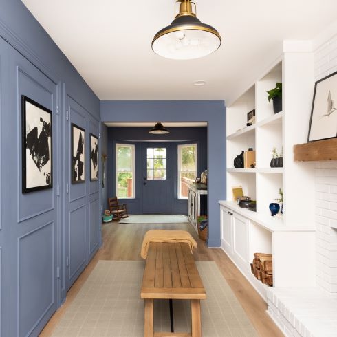
If there is one thing a growing family needs, it’s room and lots of it! When reworking the footprint of their home Kortney asked them what they wanted to do with their second living space. Their answer surprised her, they didn’t want a living space at all. Instead, they chose to convert the space into a multi-purpose storage room. The team installed built-ins on either side of the fireplace. On the other side, doors with decorative trim work hid a closet and as well as their washer and dryer. It was another design choice that might be considered unusual by some, but in the end, it was exactly what suited this beautiful family home.
Love this transformation? Shop the look here!
HGTV your inbox.
By clicking "SIGN UP” you agree to receive emails from HGTV and accept Corus' Terms of Use and Corus' Privacy Policy.


