When Emma and Scott bought their forever home six years ago, they did so with big plans of growing their family. However, as the years passed, so did their need for not only a forever home, but a functional one. Juggling their busy life with two daughters had forced them to put off any renovation dreams, but the couple knew it was time to call in the pros. Their biggest motivator for finally tackling their reno plans was Emma. The disconnected and dysfunctional layout of the home often made it difficult for Emma, who has M.S., to maneuver throughout, affecting her day-to-day and quality of life. Enter Kortney, Kenny and the Making It Home team.
See how Kortney and Kenny add a pop of colour while making this deserving family’s forever home more accessible – all on a budget of $130,000!
Watch Making It Home with Kortney and Kenny Tuesdays at 10 p.m. ET/PT on HGTV Canada. Also available on the Global TV App and STACKTV with Amazon Prime Video Channels, fuboTV, Rogers Ignite TV and Ignite SmartStream.
A Focus on What Matters
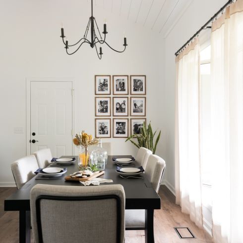
High art and stylish design can make any house beautiful, but it takes family to make it a home. It was for this reason that Emma asked Kortney to help her with a secret project for Scott. By taking the beautiful family photos and children’s artwork they already had and framing them, they were able to create a beautiful gallery wall. Now this family can display the moments that matter the most while adding to the design of their home.
Closed Off and Cramped
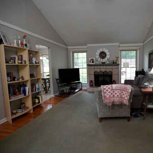
A home should fit the needs of whoever lives there. Emma, Scott, and their daughters, Eva and Annabelle, had many of the typical needs of a growing family. A kitchen that functioned well for them, open sightlines to watch the girls, and bathrooms to suit their needs. Because of Emma’s M.S. they had some additional needs. With a compartmentalized layout and narrow doorways, it was often difficult for Emma to maneuver within her own home. It was important to the family that the team make their home more accessible for her.
Adding Accessibility and Comfort
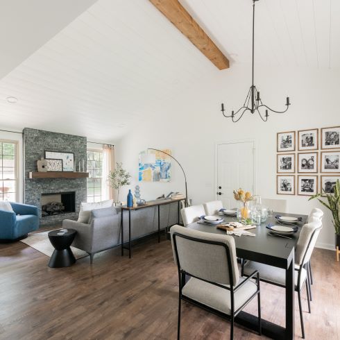
For their living room Kortney wanted to create a space that was relaxing and easy to use. By opening the space, removing tripping hazards and adding large communal furniture, the space transformed into one that worked for the whole family. By opening the space, the team made it possible for the family to feel together, even when in separate rooms. Now Eva and Annabelle have a wide-open space to perform and play while mom and dad watch.
A Feature of a Fireplace
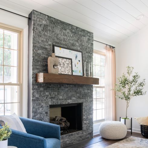
As the colder months set in, we can all appreciate a good fire. For this family, fires are an opportunity for bonding, but their previous mantle was dangerous and a potential hazard for their young girls. To solve these problems, Kortney redid the façade with contemporary stonework and added a solid timber mantle. Now their fireplace is not only safer for the girls but serves as the room’s design focal point. We expect that they’ll enjoy cozy nights around this stylish fireplace for years to come.
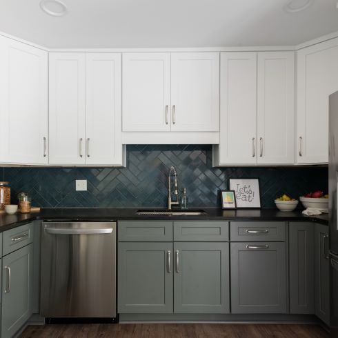
Balancing Design and Daily Use
In any kitchen the most important aspect is how well it functions. When we think of kitchen design, we often envision a big, beautiful island, but that isn’t always the right choice. In the case of Emma and Scott, they needed ample space, which is why instead they chose a peninsula. By choosing this option it opened the walkways, giving Emma room to maneuver in and out as she needs. Cooking should be a joy, for that we need to feel comfortable.
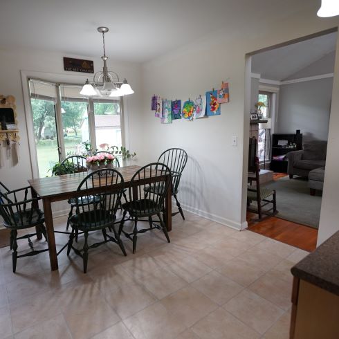
A Kitchen Separated
Before Kenny had his way with the sledgehammer, the kitchen was cut-off from the rest of the home. Whenever Emma or Scott was in the kitchen, they couldn’t see what was happening in the rest of the house. When you have young children, you want to witness and be a part of as much as possible. That was all the reasoning Kenny and the team needed to start their demo.
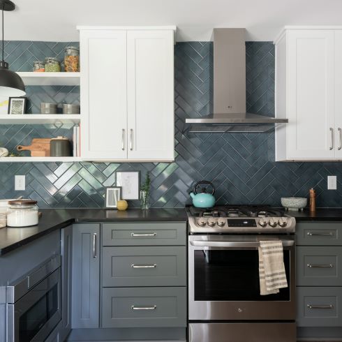
Not Two-Toning it Down
Emma and Scott’s design tastes differed, she liked a pop of colour, and he liked more subdued earthy tones. You might think these two design elements would be contradictory, but Kortney wanted to prove that it’s just the opposite. By creating a subdued colour base, it made colours and brighter tones jump out that much more. In the kitchen she chose to install bright white uppers and a more subtle grey for the lowers. Paired with a soft blue, herringbone backsplash, the new design creates intrigue and draws the eyes upwards.

A Seamless Shower Experience
It’s easy to forget just how important grooming is to us. With Emma’s mobility issues it was crucial to create a primary bath that gave her a sense of both comfort and independence. Together with Kortney, they worked out the best way to achieve this. By widening the doorway, adding a stylish double vanity with storage, and installing a massive tiled shower with seamless entry, the team created a bathroom that would allow Emma to unwind however she needed.
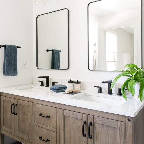
A Vanity to use Together
For a couple that loves being together like Emma and Scott, it’s important to have a space where they can do that without feeling cramped. To make sure that’s never the case, Kortney installed a beautiful double vanity in their primary bath. This way they both have their own individual space and storage as they get ready for the day.
A Clean, Comfortable Retreat
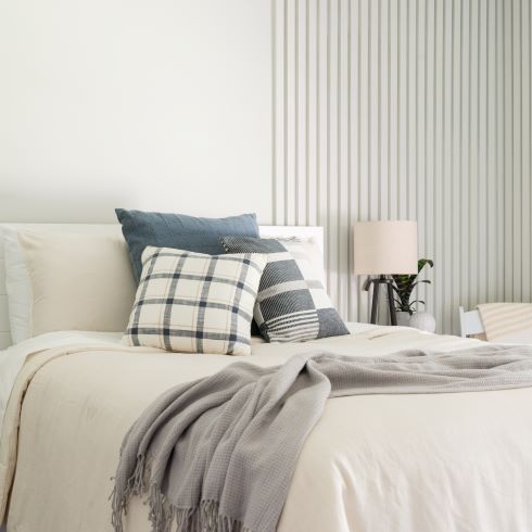
We all want to wake up in a space that brings us joy. After assessing the home’s footprint, Kortney decided it was best to relocate the primary bedroom. This gave them more options for the bathroom’s layout. Once the bedroom was moved, all that it needed was some design elements to make the space one they can enjoy. Kortney’s final touch was to incorporate a feature wall with vertical slats into the bedroom’s redesign, giving the room a crisp and clean new colour scheme.
Love this transformation? Shop the look here!
HGTV your inbox.
By clicking "SIGN UP” you agree to receive emails from HGTV and accept Corus' Terms of Use and Corus' Privacy Policy.


