Our love for Natalie Chong’s modern and contemporary style is no secret (remember this incredible condo, designed almost entirely with IKEA?), but her latest project from Nest Design Studio revealed a softer side of the designer. See how Natalie took a basic Toronto condo and transformed it into an uplifting oasis, complete with a gorgeous brick wall and the dreamiest bedroom we’ve ever come across.
Elegance on a Small Scale
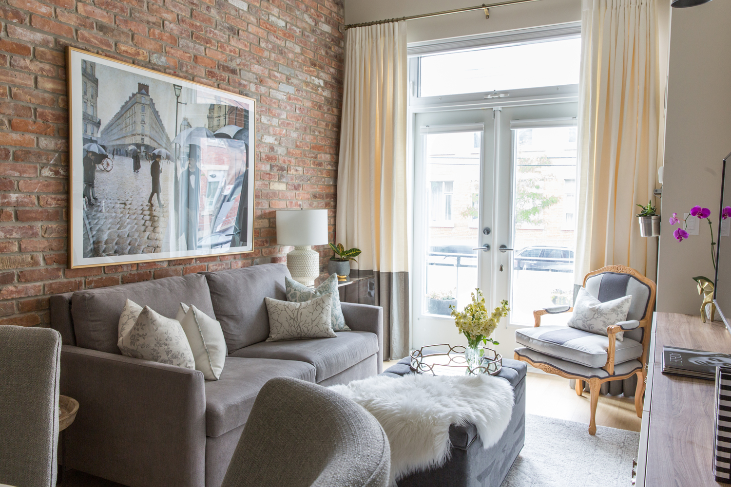
When a friend tapped Natalie Chong to transform her basic Toronto condo into a calming oasis, the designer was thrilled. Although the space was small, it came with loads of unique features that would help form the backdrop for Natalie’s work. A spectacular brick wall brought a warm, industrial feel to the cozy living room nook, and high ceilings allowed for dramatic window treatments that infused an old world European elegance to the downtown home.
Colour Concepts
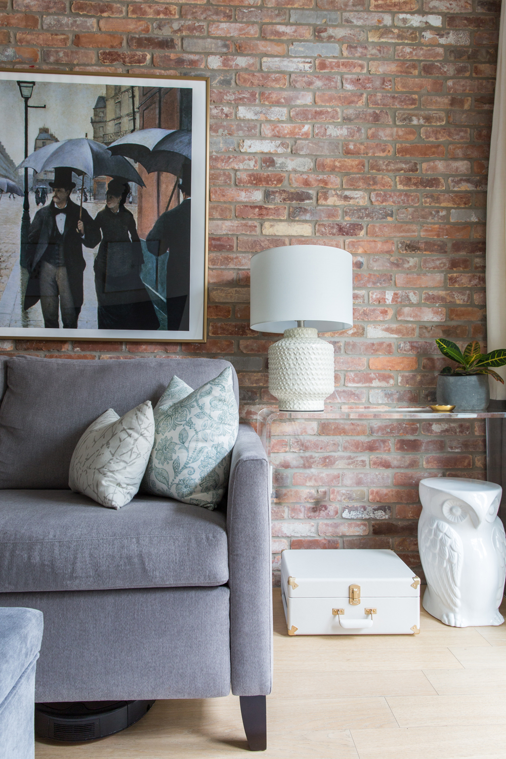
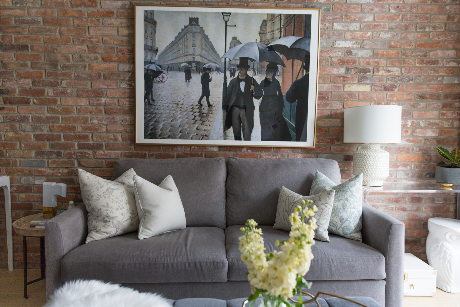
With a commanding brick wall to consider, Natalie chose a palette of muted neutrals that would pair well with the aged brick. Grey, white and a few hints of blue and green offered a fresh, modern and feminine colour story for the space.
Butter Yellow
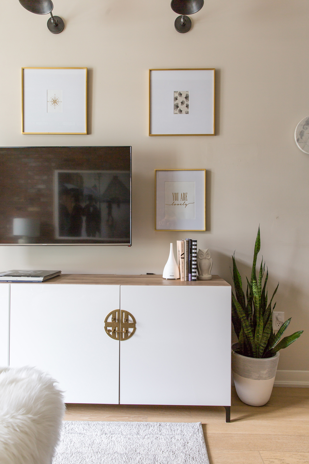
For the wall opposite the brick, Natalie chose a warm, butter yellow, which provides a calming base that pairs nicely with rusty red.
Plush Accents
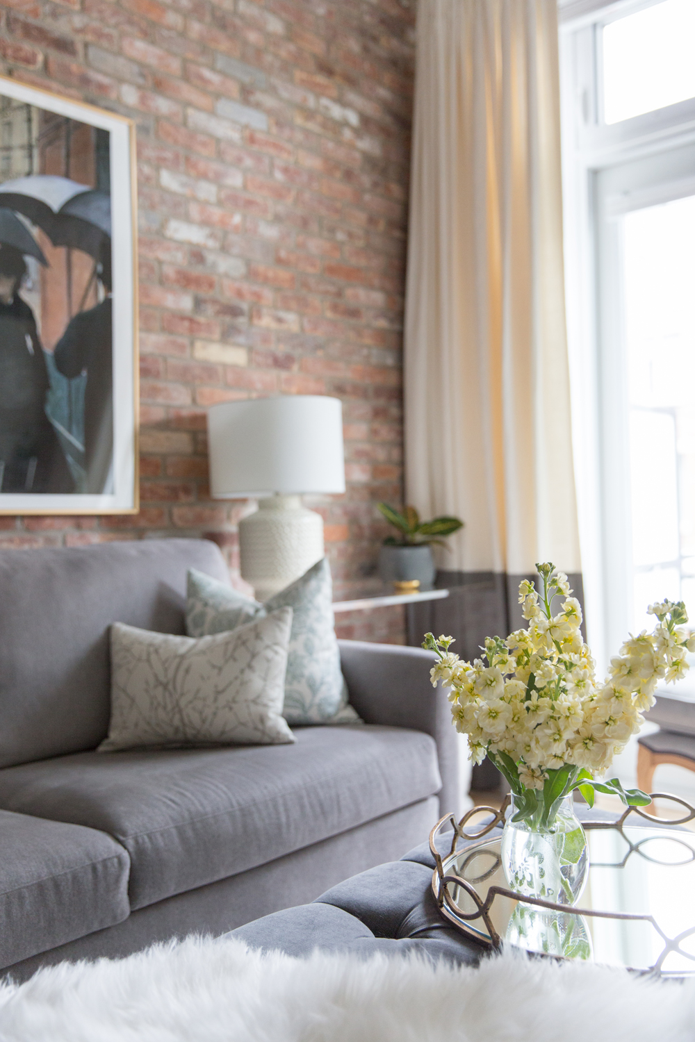
Natalie wanted her friend’s home to feel plush and cozy, so she opted for a custom ottoman from Grand Dukes Design over a coffee table.
Mirror, Mirror on the Ottoman
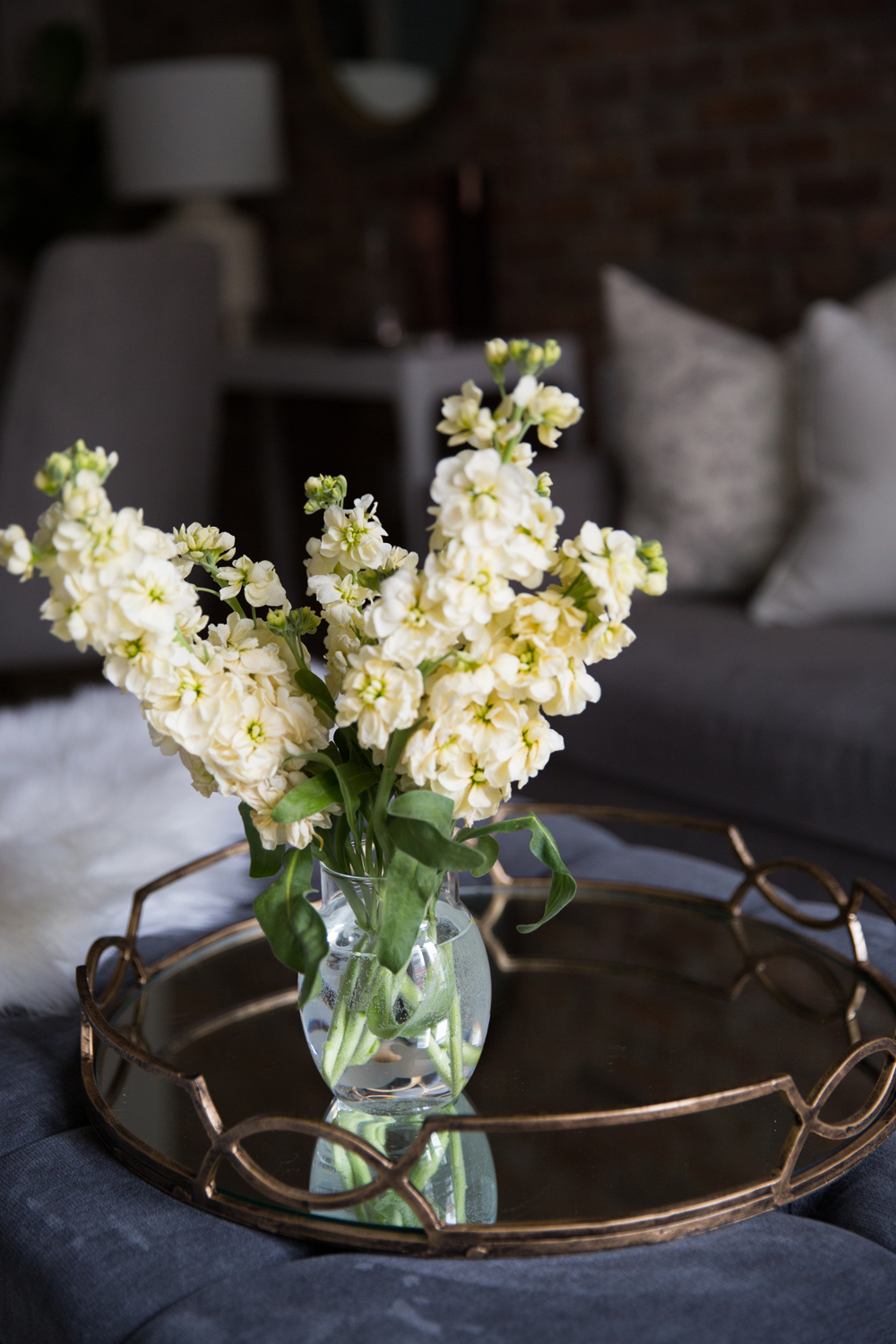
A tray is a must if you plan to go the ottoman route in a living room (it provides a hard surface for objects, vases and mugs) but a mirrored tray does one better, reflecting flowers or candlelight.
Dreams of Paris
Gustave Caillebotte’s Paris Street; Rainy Day conjures the feeling of quiet grey mornings, and the smell of fresh rainfall on pavement.
Custom Where it Counts
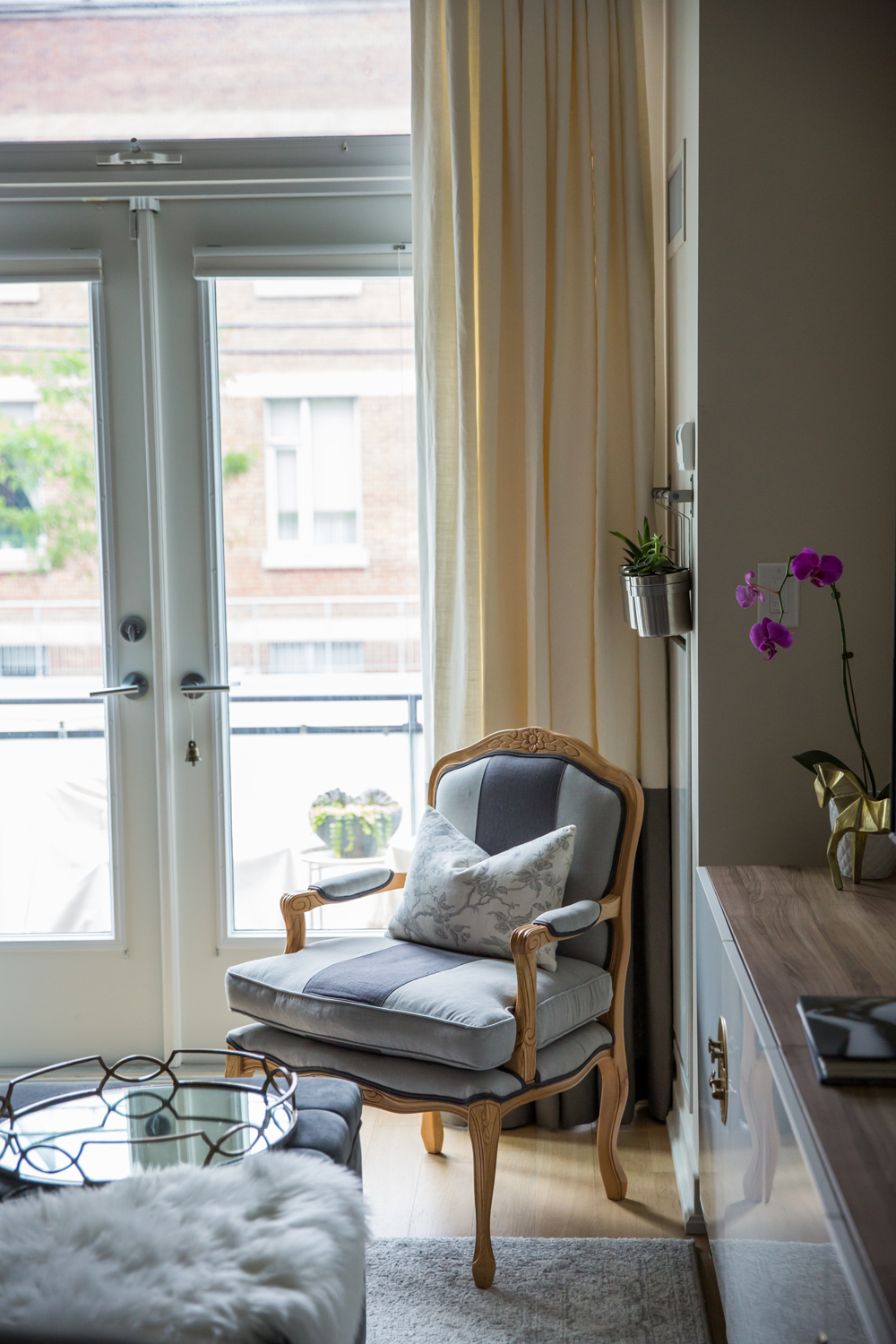
Natalie sourced the sofa for her friend’s condo from Casalife, but she went custom with Grand Dukes Design for the elegant armchair that takes on a regal aura in the living room’s corner.
A Gallery Wall Grid
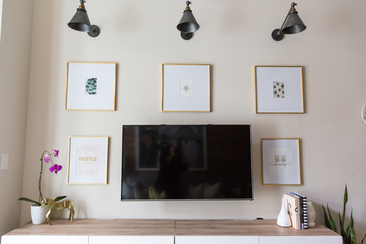
To maintain the sense of calm and order, Natalie created a gallery wall around the television in a uniform grid.
Petite and Sweet
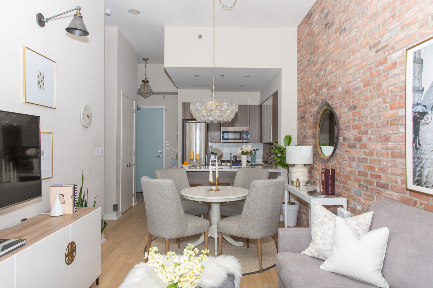
From here you can see the amount of space Natalie had to work with (not very much). By sticking with a primarily soft and neutral palette, Natalie was able to layer in lighting, decor and wall art without overcrowding the condo. (And how about the stunning blue door? We’re filing that idea away for future weekend projects.)
Perfectly Poised
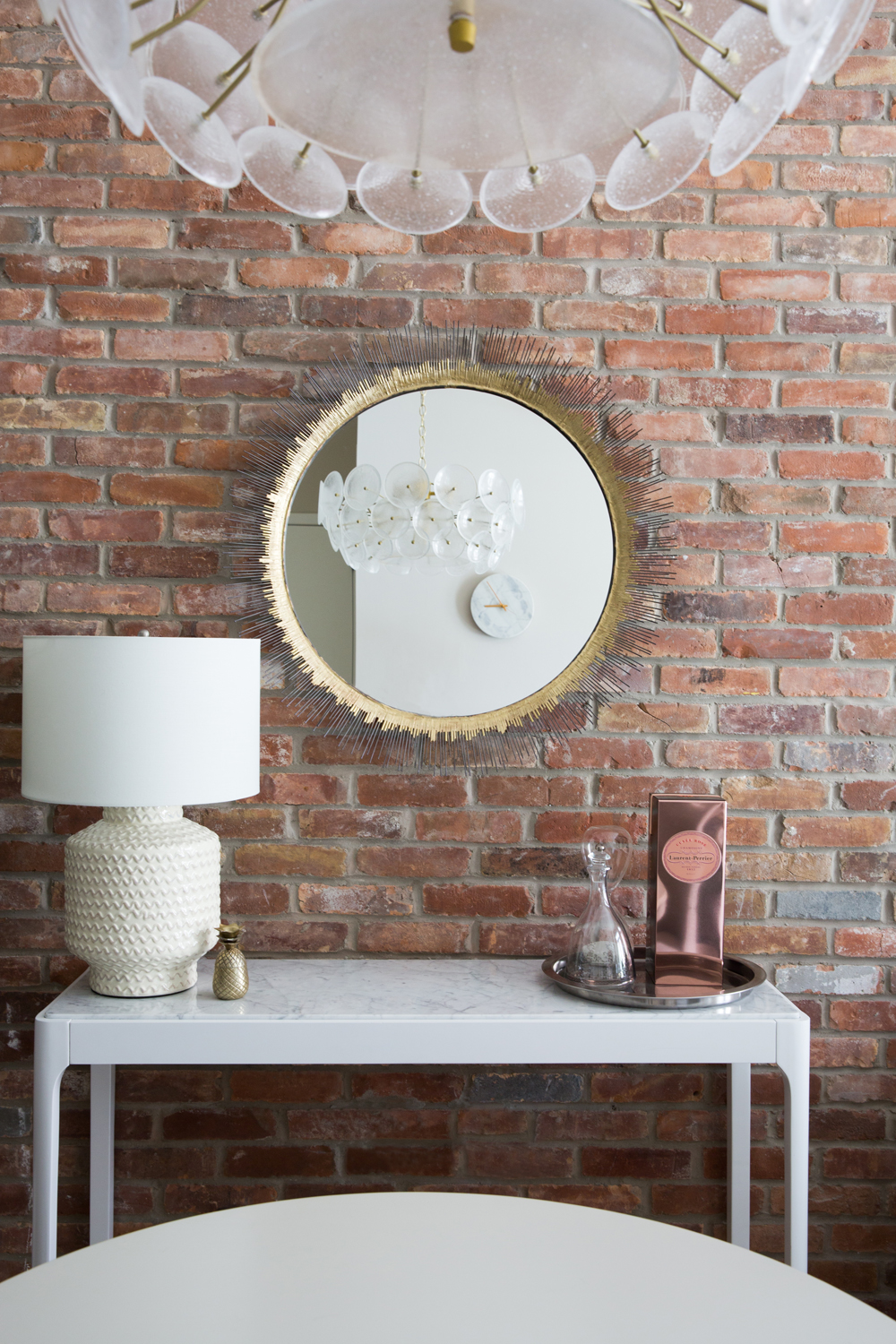
A well positioned mirror beside the dining table catches reflections of the beautiful West Elm glass chandelier and a minimalist marble clock.
I Spy…
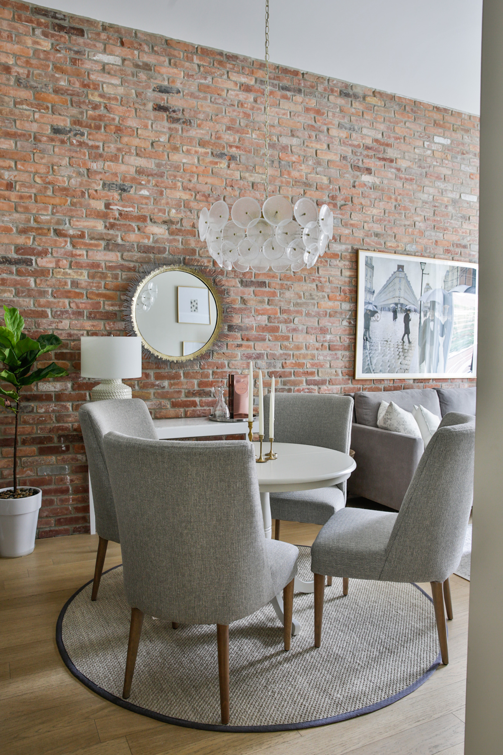
Peeking out of the corner of the dining room is a colourful fiddle leaf fig tree, the easiest way to add a burst of life and colour in a neutral room. Plants are a decorator’s go-to when it comes to decor, like lighting or rugs, a room isn’t complete until it has a plant or two.
Low Rider
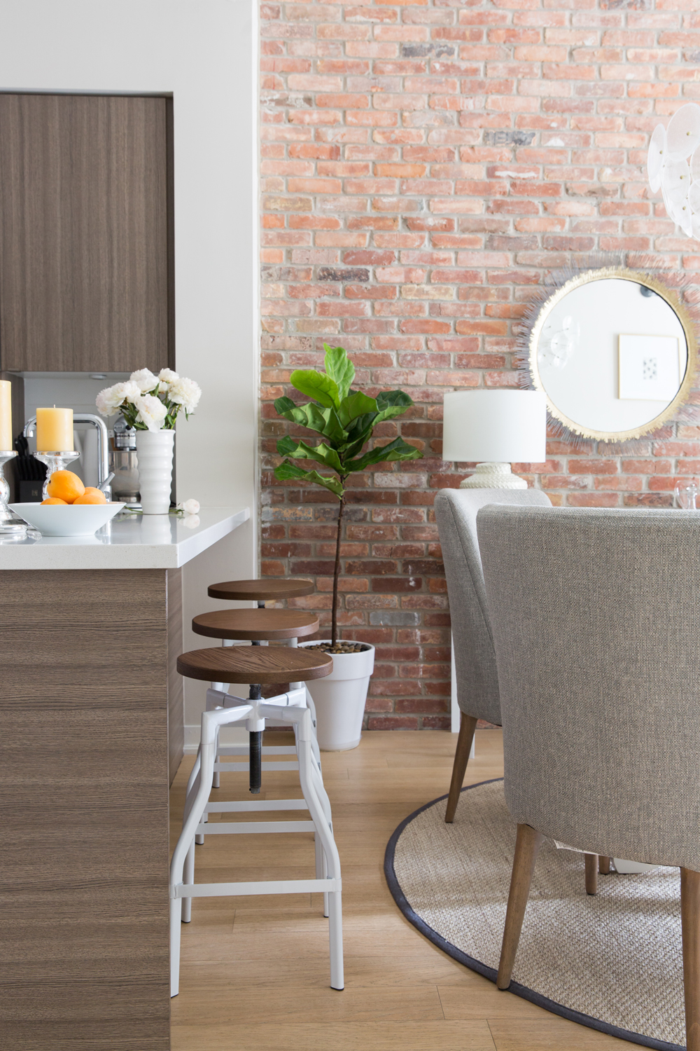
Natalie managed to fit a dining table into the cozy condo, but she still wanted bar seating for the kitchen island, too. Backless stools offered seating that wouldn’t crowd the visual space, and we love how the white legs look vibrant and modern against the brick wall and wood bar.
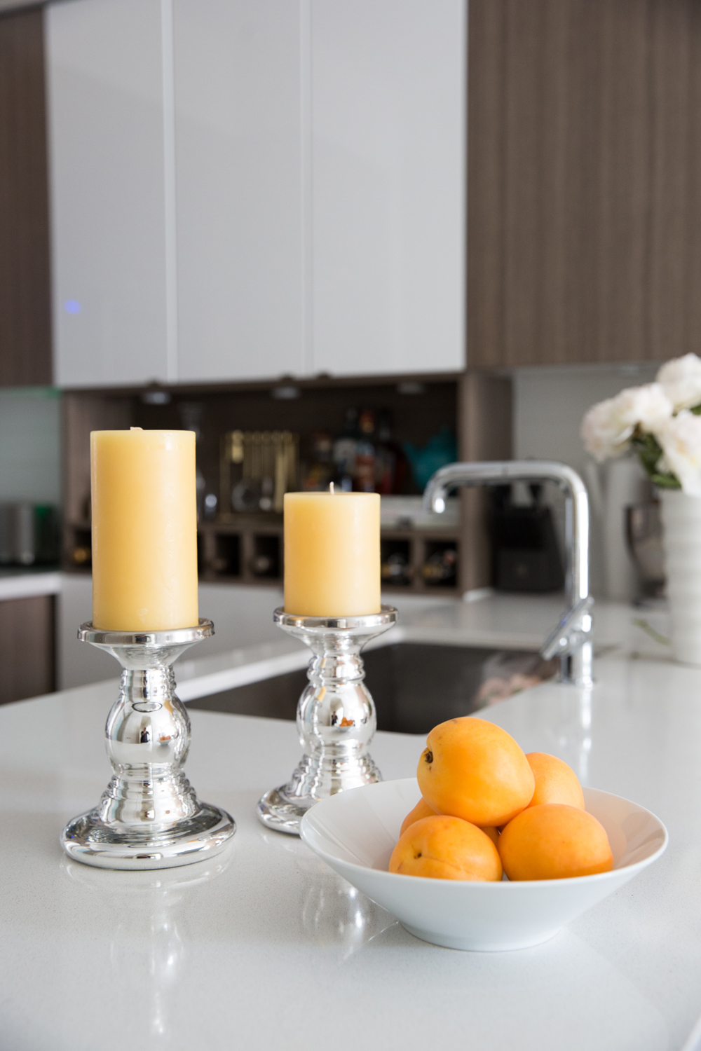
Colour Stories
A builder basic condo kitchen left little room for personalization, so Natalie relied on decor, and even produce, to create a sweet little colour story on the counter.
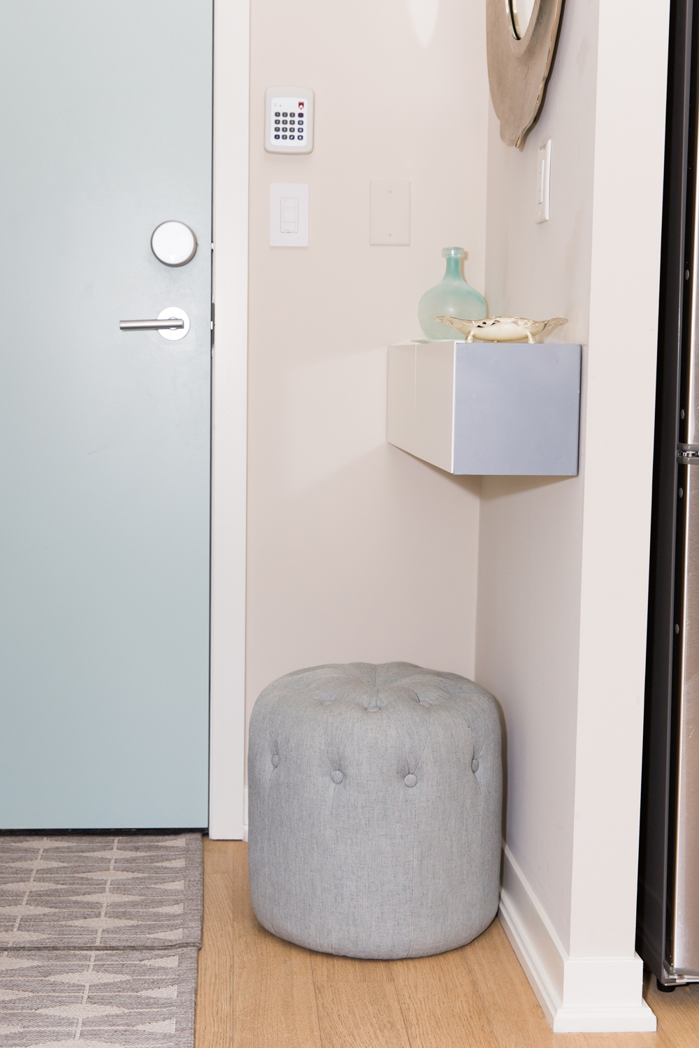
A Pint Sized Entryway
Think your condo is too tiny for a proper entryway? Think again! A wall mounted “hide n’ seek” storage shelf from CB2 provides hidden storage for keys and clutter, and a top shelf for decor. A pouf from homesense lends a welcoming vibe (not to mention seating for yanking off winter boots) and a Moroccan inspired mirror from Crate and Barrel is the perfect feminine touch to pull it all together.
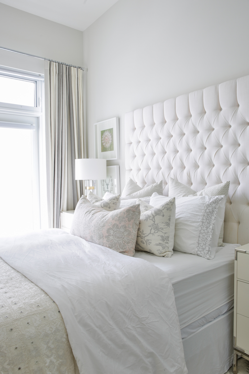
Heaven Awaits
Have you ever seen a dreamier bedroom? Not only is the palette light and lovely, the bed looks like a legit cloud!
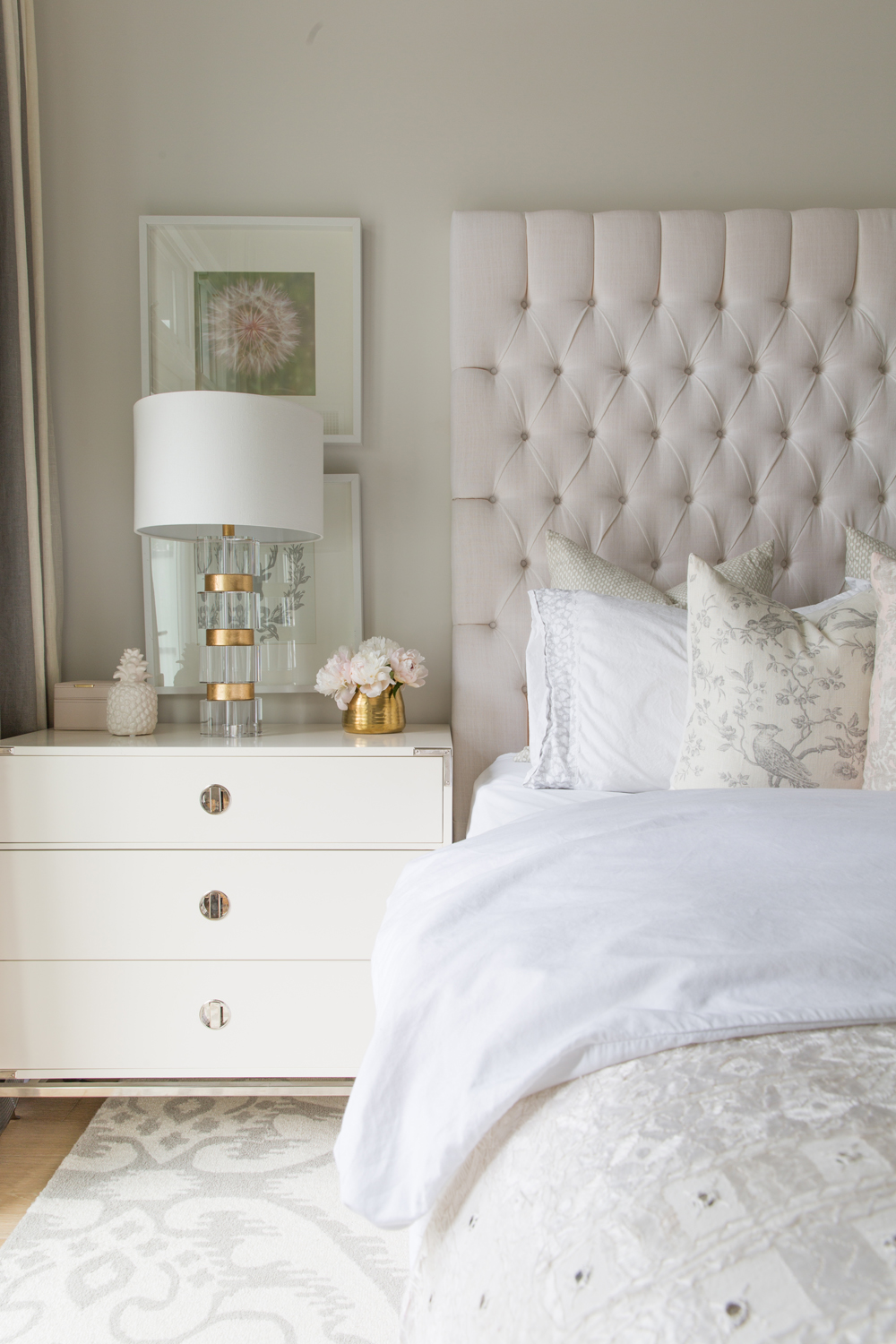
The Dreamiest Bed
Natalie designed the dreamy tufted headboard herself and worked with Grand Dukes Design to have her vision come to life. From there she layered in Homesense bedding in a mix of white and cream.
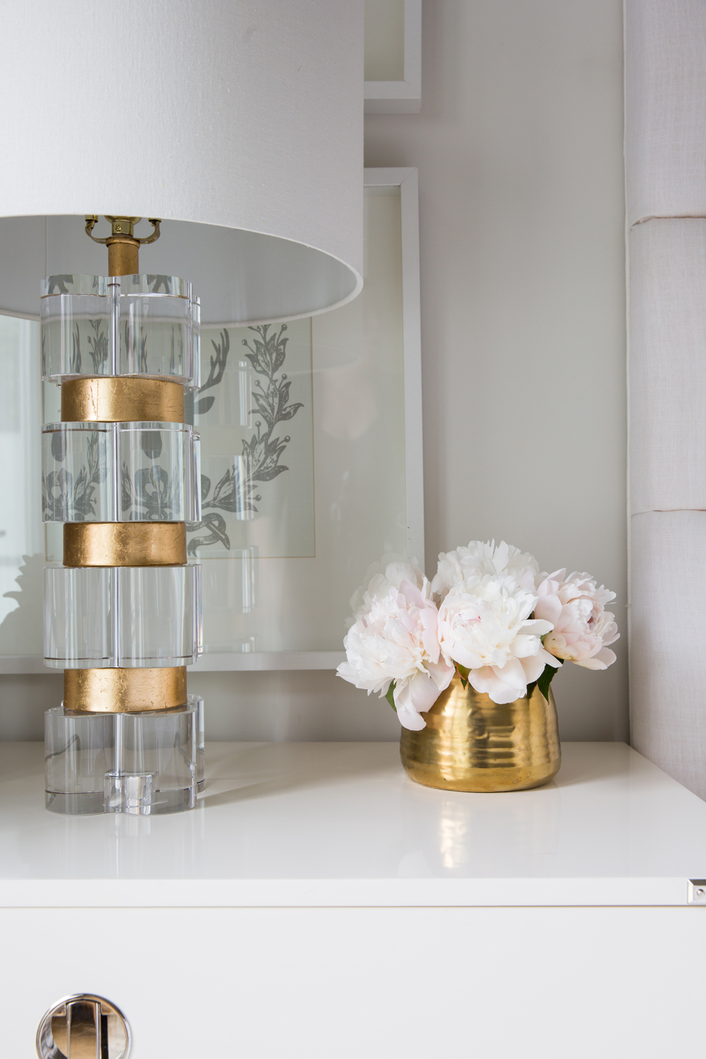
The Gold Standard
Peony season only lasts so long, but this gorgeous Homesense lamp, accented with a gold vase, is eternally chic.
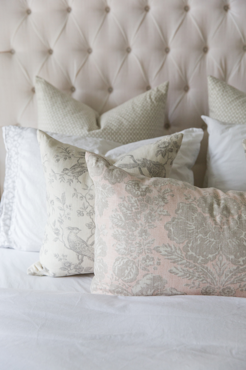
Prints Charming
These pretty prints in a muted grey complete the look of the bed, drawing on the subtle colours of the prints hanging on each side of the bed.
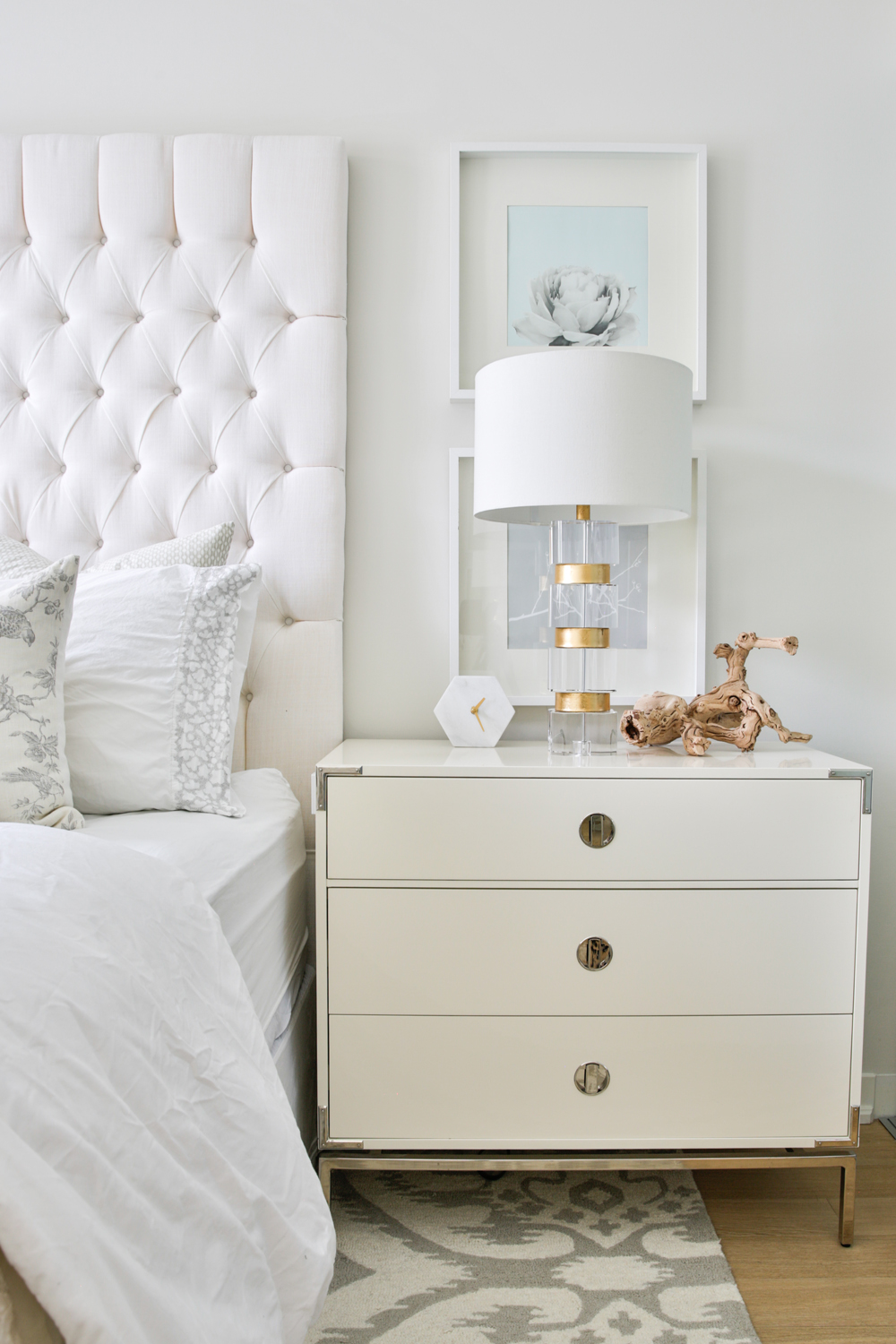
When Opposites Attract
Though the bedroom is primarily white with touches of silver and gold, Natalie broke up the glam with a natural element, a small piece of driftwood that introduces an unexpected texture and colour to the bedside table.
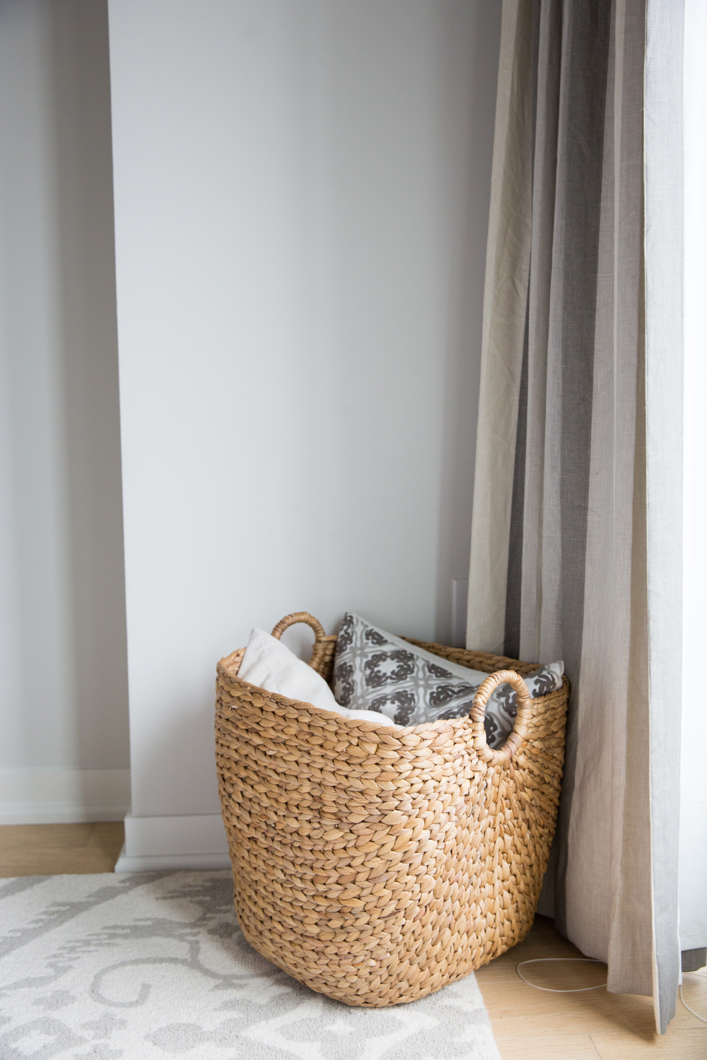
A Case for Baskets
Like plants, you can never have too many baskets on hand for storing spare blankets and pillows. We love how the basket draws on the rough and raw touch of the driftwood, too.
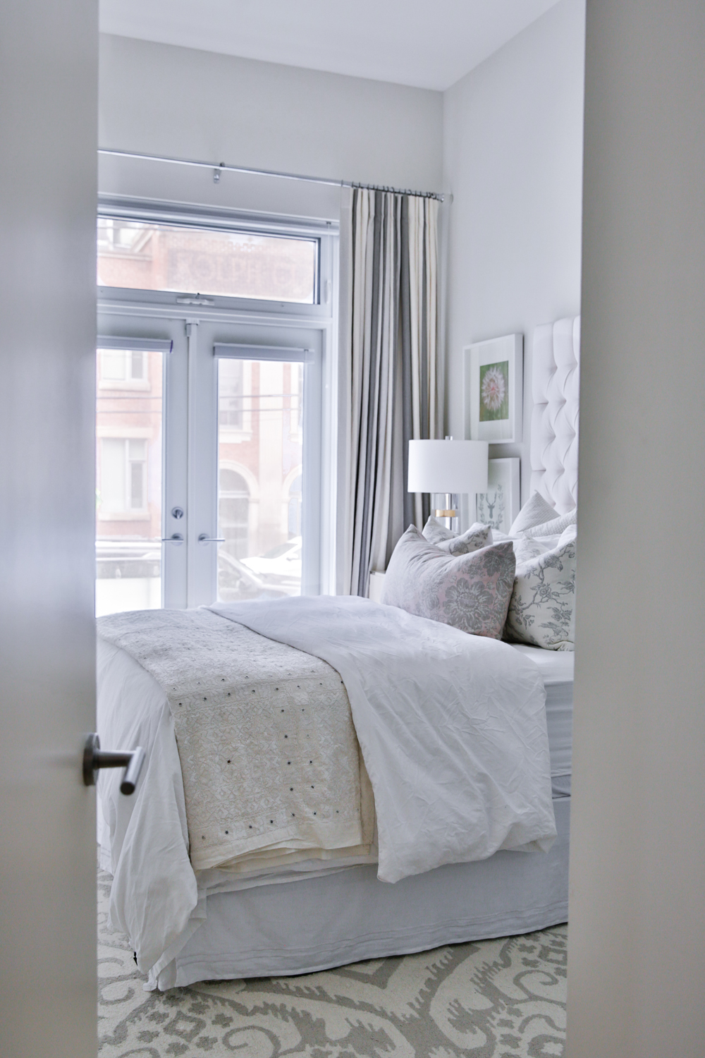
A Little Slice of Heaven
With a statement headboard and elegant bedding, the condo bedroom required little else to create a calm and chic oasis in the city.

Thank You, Natalie!
Thank you for sharing your beautiful design, Natalie! We loved touring this elegant oasis in the city. For more from Natalie Chong, visit nestdesignstudio.ca.
HGTV your inbox.
By clicking "SIGN UP” you agree to receive emails from HGTV and accept Corus' Terms of Use and Corus' Privacy Policy.


