The 1970s brought us some fun trends such as bell bottoms, disco music and macramé but also some bad ones. The modular architecture of this home may have worked during the Saturday Night Fever days but it needed a serious makeover to bring it up to date.
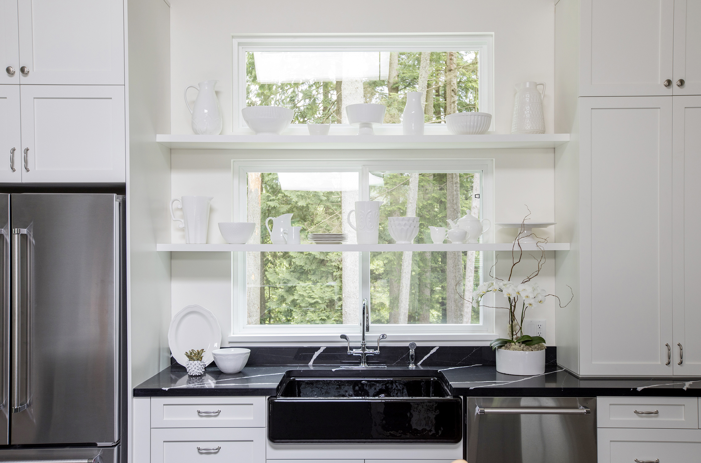
White Knight
Gone are the Formica countertops and wood paneled walls, in their place are bright white cabinets, exposed shelving and ceramic accessories. Hello, 2017!
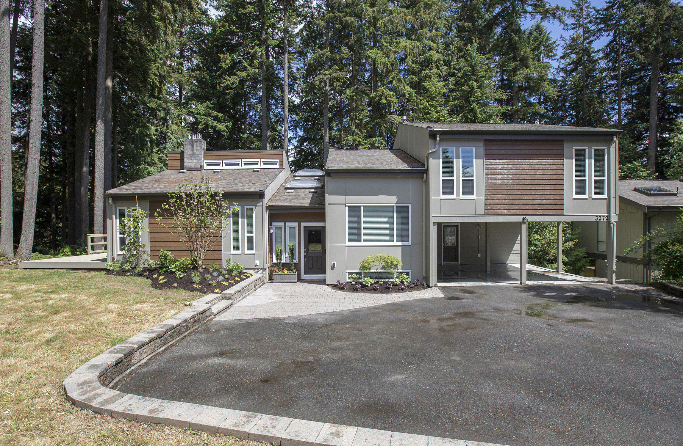
Sideways Glances
One of the quickest ways Worst to First hosts Mickey Fabbiano and Sebastian Sevallo brought this 1970 house into this century was by breaking up the siding materials.
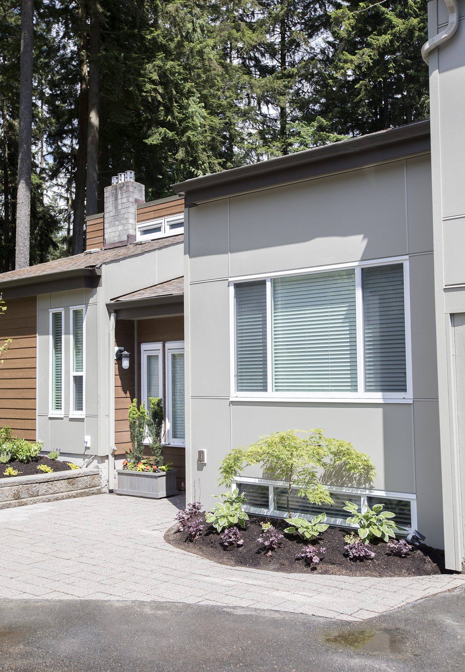
A Modern Vibe
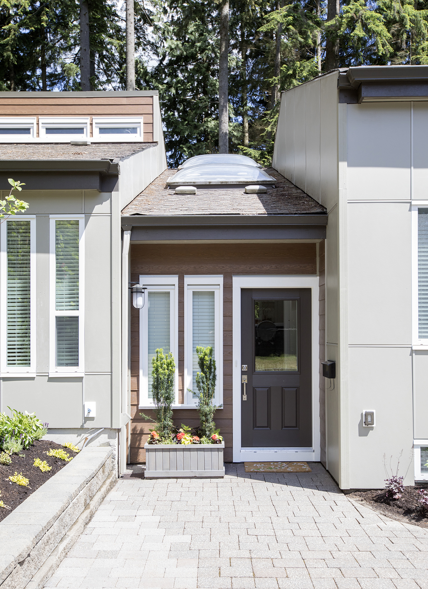
By using alternating flat-paneled and wood-grain siding on different “blocks” of this B.C. home, there is a strong textural change to the facade of this tree-ringed home, giving it a definitively modern vibe.
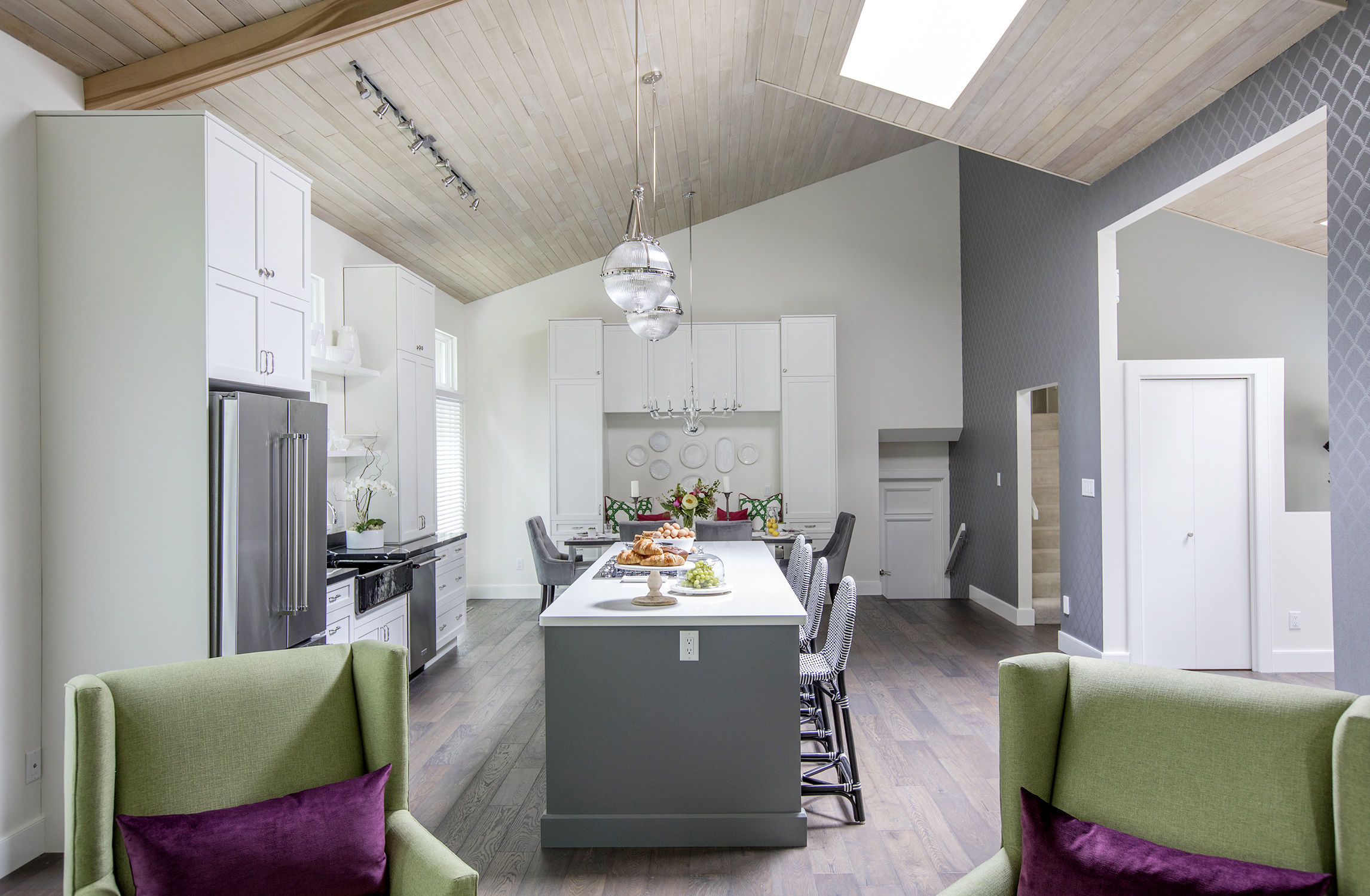
Vaulting Apparatus
The high, 18-foot vaulted ceilings were one of the features that drew the current home owners to take a chance on this Lynn Canyon, B.C., property and invest in a Worst to First makeover.
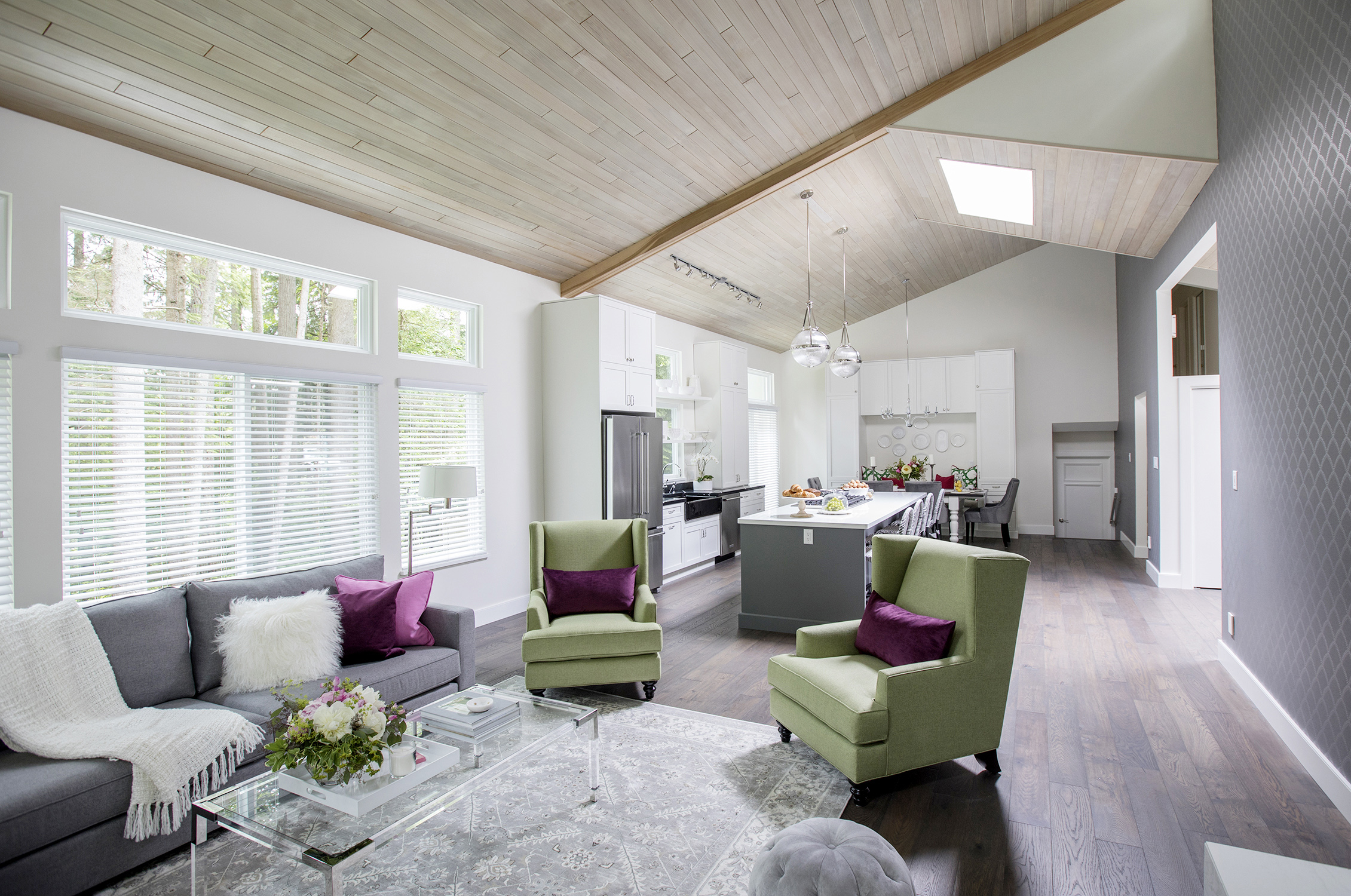
Wall To Wall
Two walls came down to create this massive open-concept space. The original cedar tongue-and-groove ceiling was whitewashed to reflect light and visually open up the space even more.
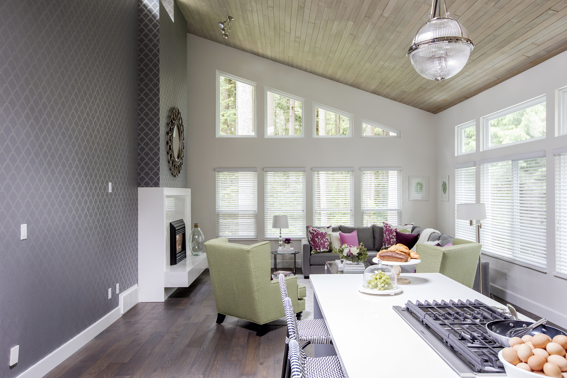
Paper Trail
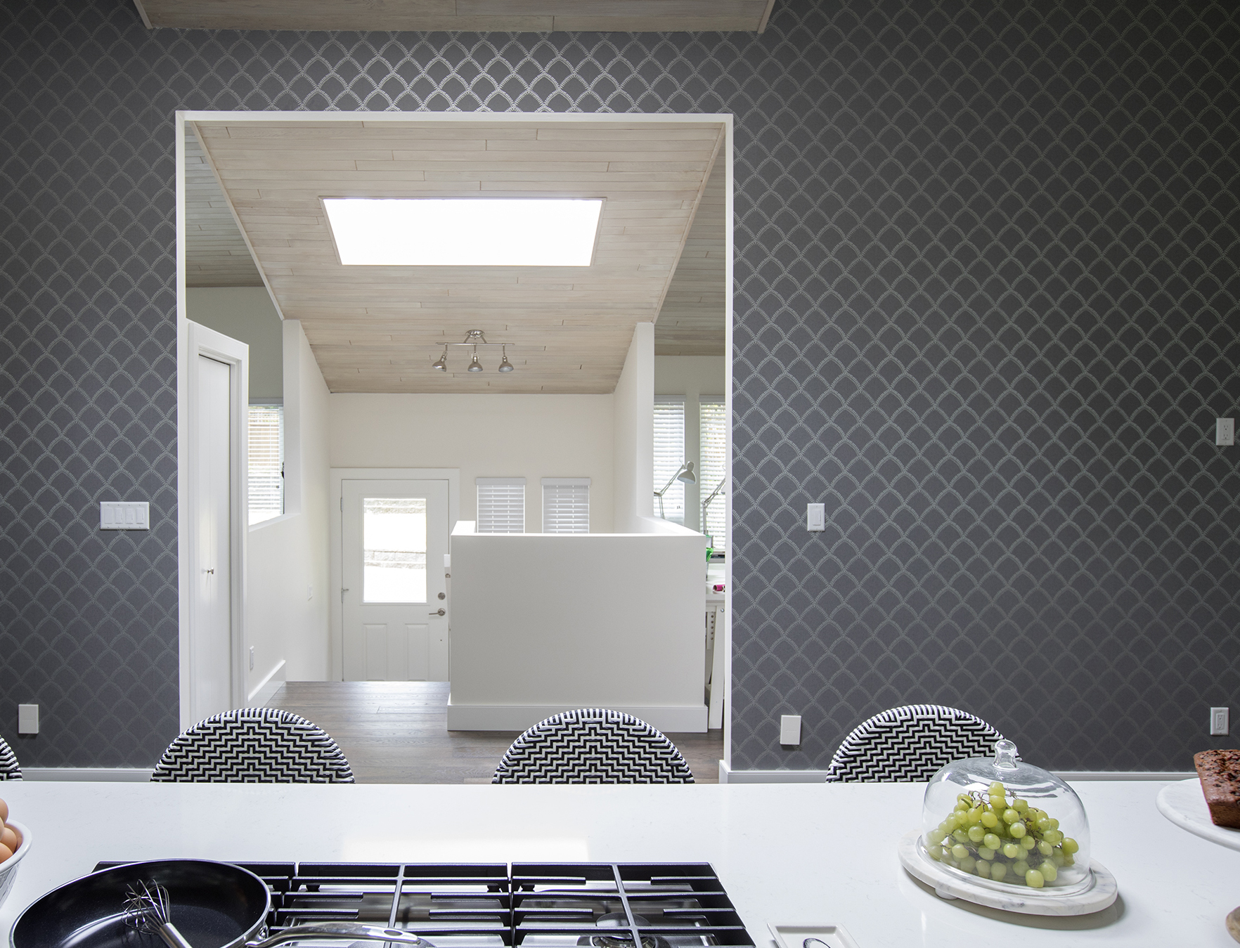
Using a geometric fish-scale wallpaper in a neutral palette on this massive feature wall adds interest through pattern rather than colour – which will outlast five more decades of colour trends.
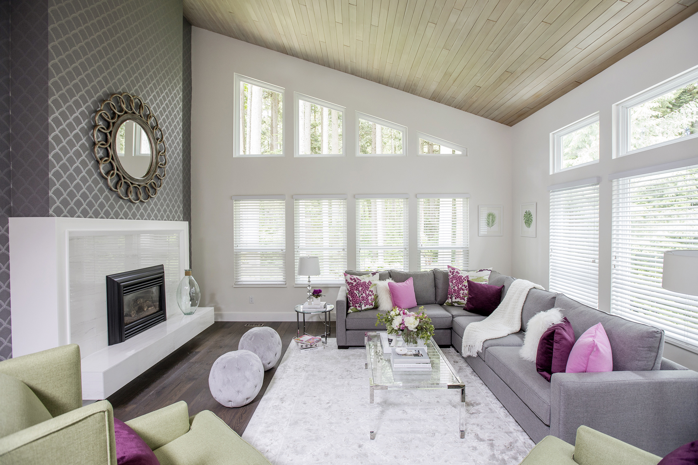
Geo Metrics
While the off-kilter trapezoid windows still carry that 1970s vibe, the white slat blinds and brilliant white walls scream modernity.
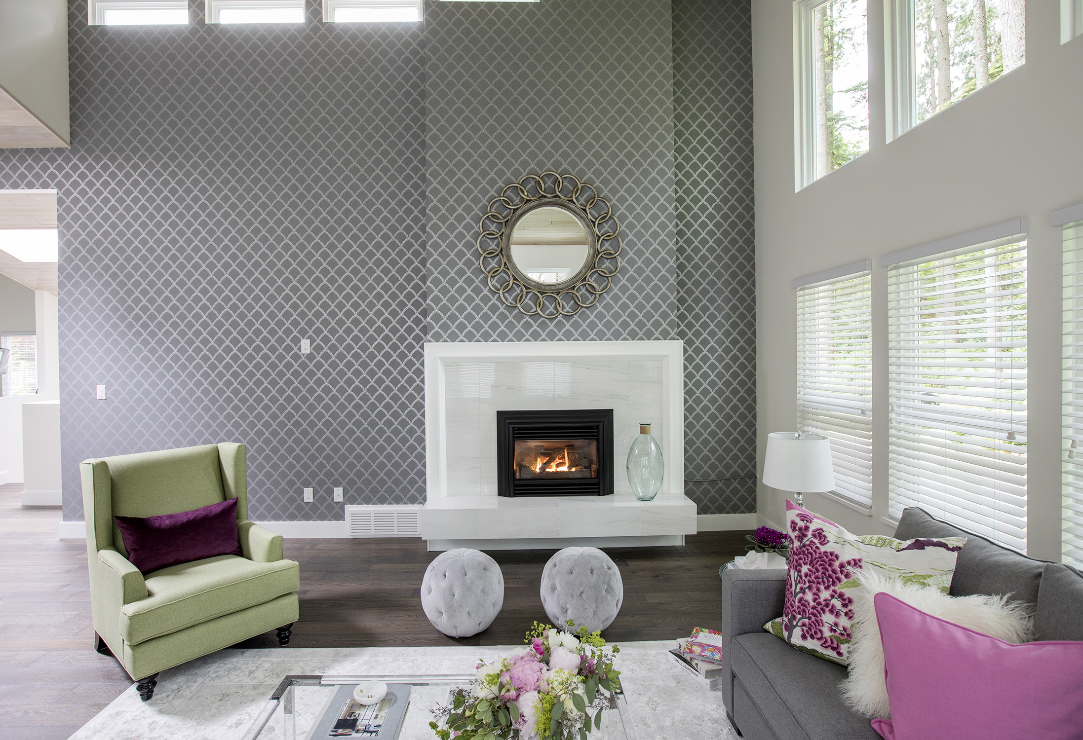
Fan The Flames
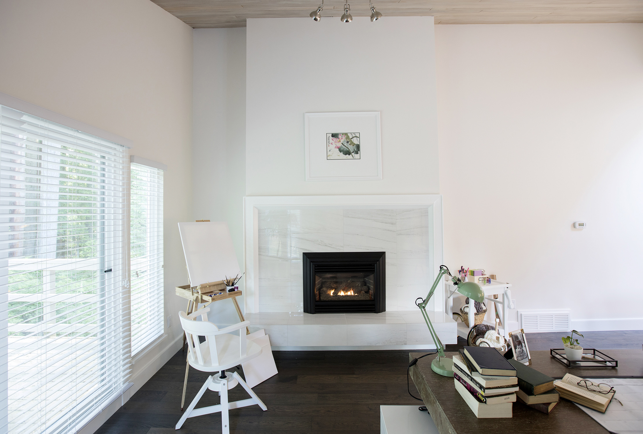
High-shine glass and white, marble-like porcelain tiles are showcased in this sleek gas fireplace – not a shag rug or lava lamp in sight.
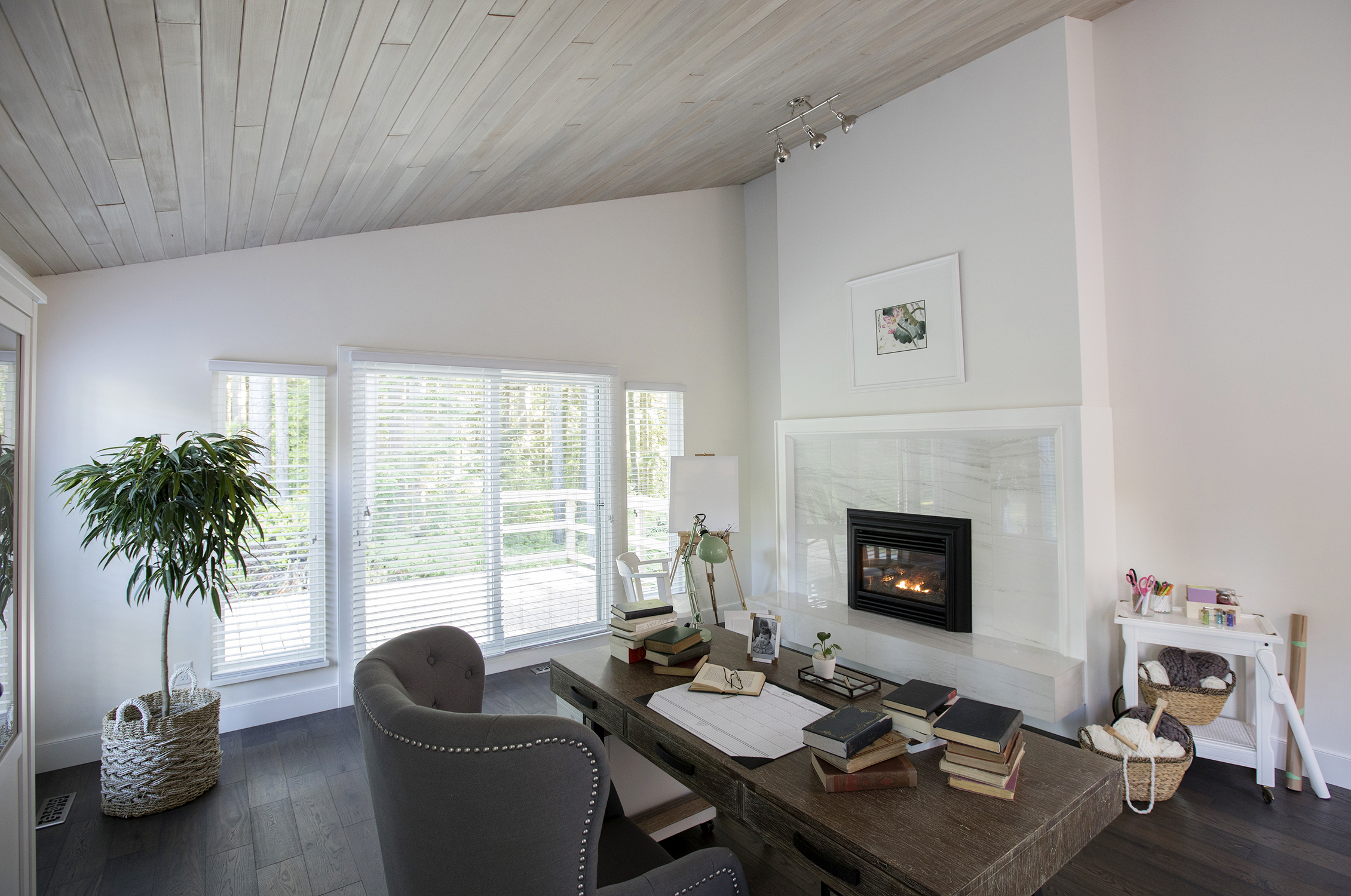
Double Sided
Making use of the same gas line and venting, there is a second fireplace in the home office on the other side of the living-room feature wall.
Getting Crafty
When you buy and renovate your forever home, it’s important you get what’s on your wish list. For these home owners, a creative crafts room was a must.
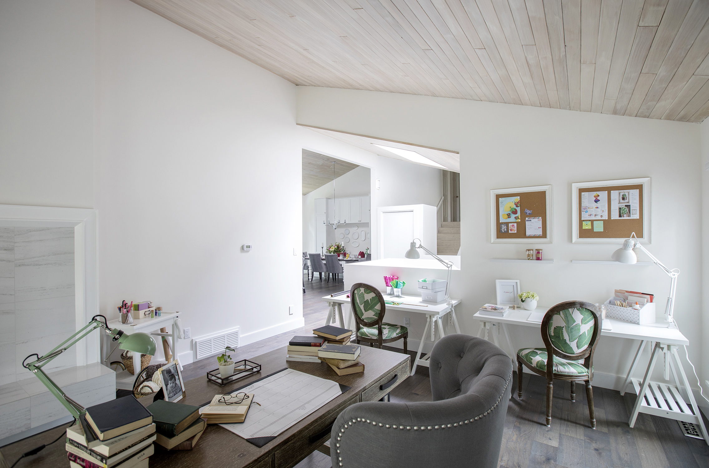
Palm Springs
The matching palm-leaf upholstered desk chairs make use of a trending 2017 motif, but can easily be recovered as tastes change throughout the decades.
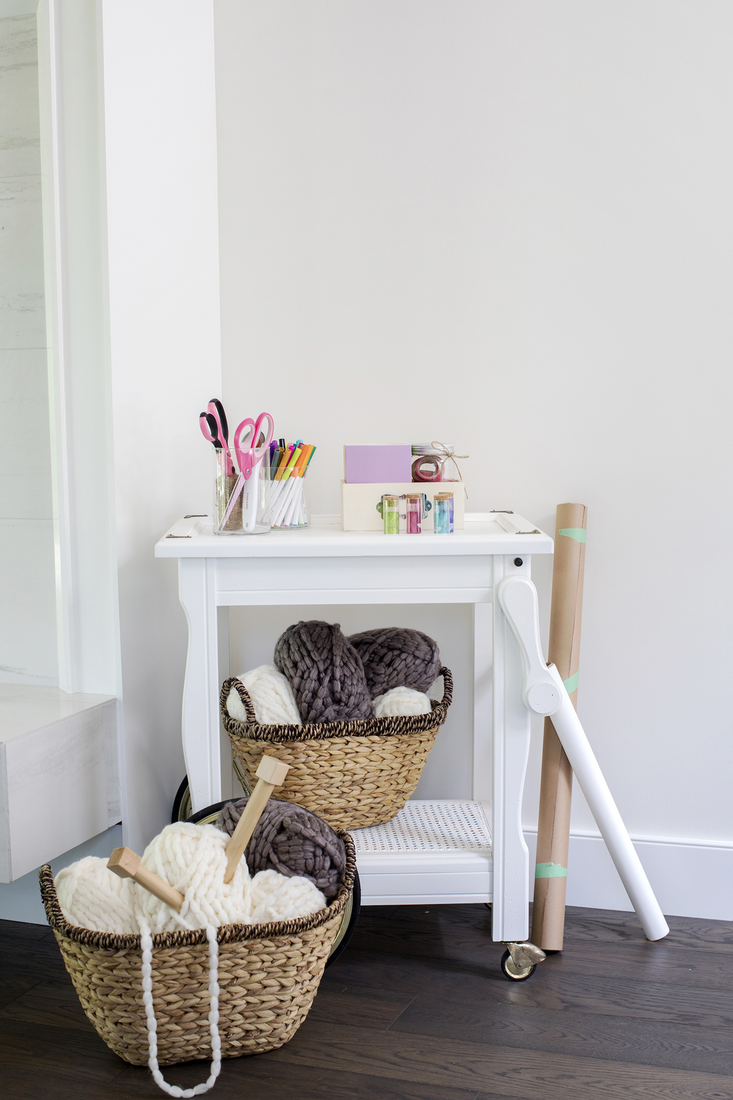
Knit Wit
A rolling arts-and-craft table gives these artistically minded owners versatility when they switch from big-needle knitting to greeting-card designing.
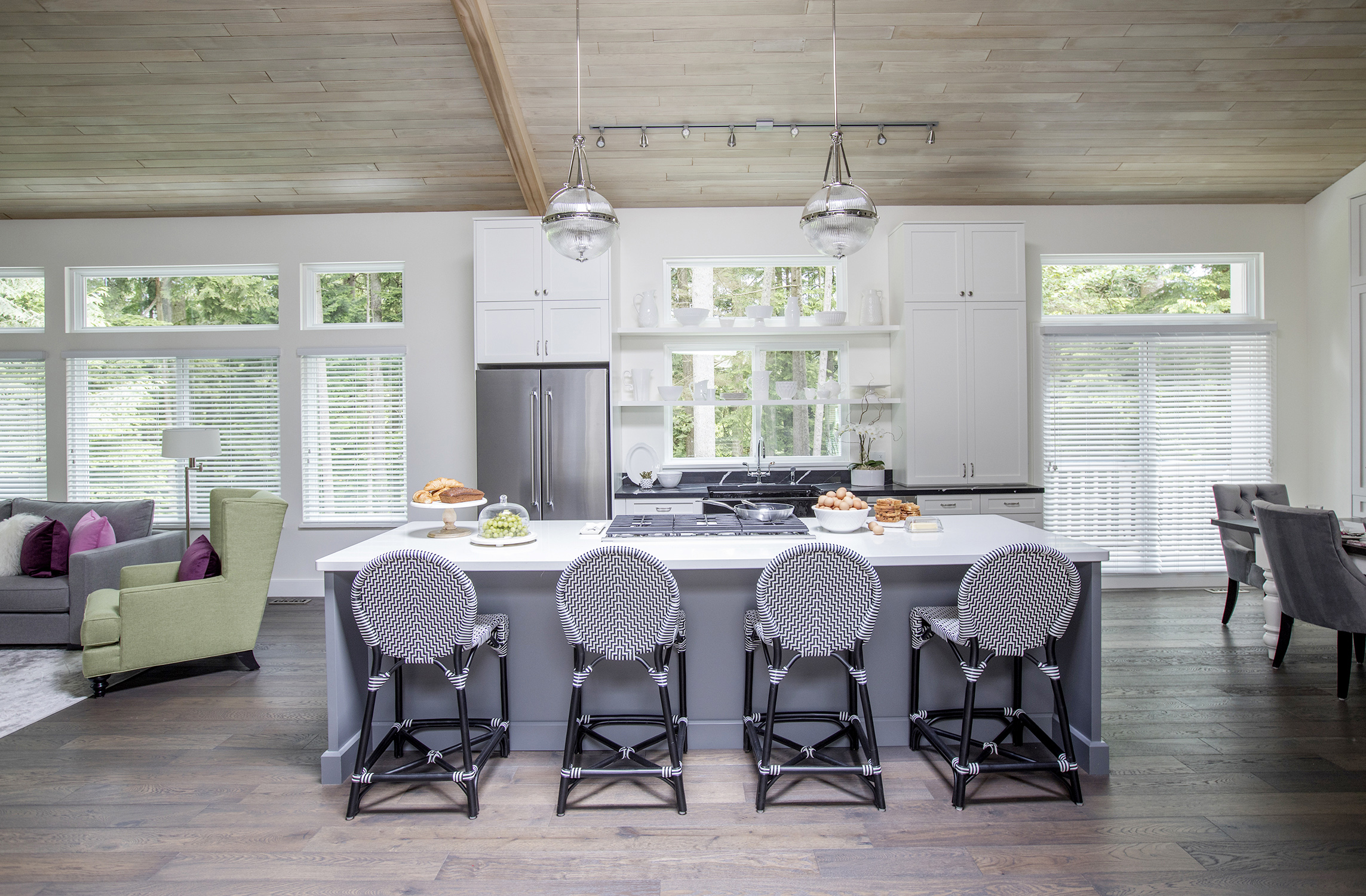
Island Living
This massive quartz-topped island provides seating, workspaces and storage underneath. The grey, white and black palette is timeless and will take this house into the next half a century.
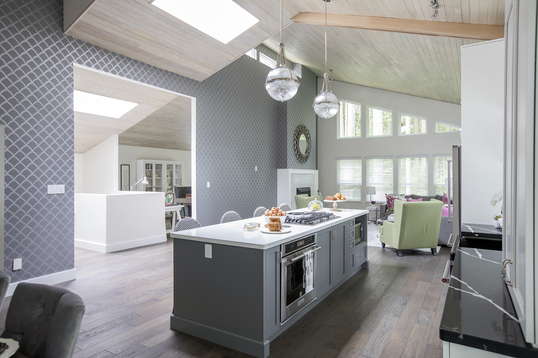
Open Wide
Having the kitchen sandwiched between the living room and the dining area means entertaining is going to be a cinch – just skip the ambrosia salad and cocktail weenies.
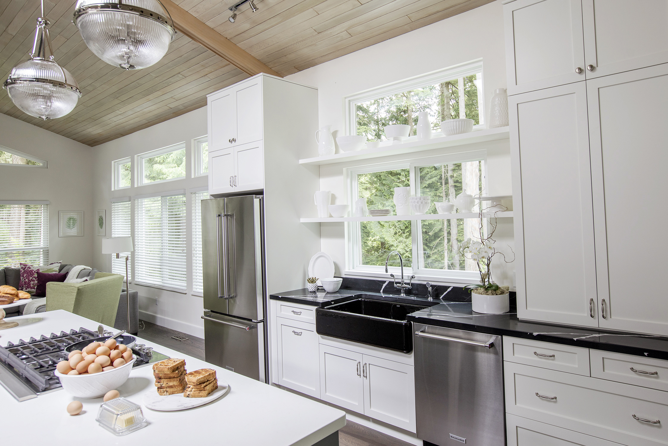
White Out
When the kitchen is in the middle of an open-concept home, it’s visually important not to break up the seamlessness of the space – white cabinets, white countertops and white stoneware keep it simple.
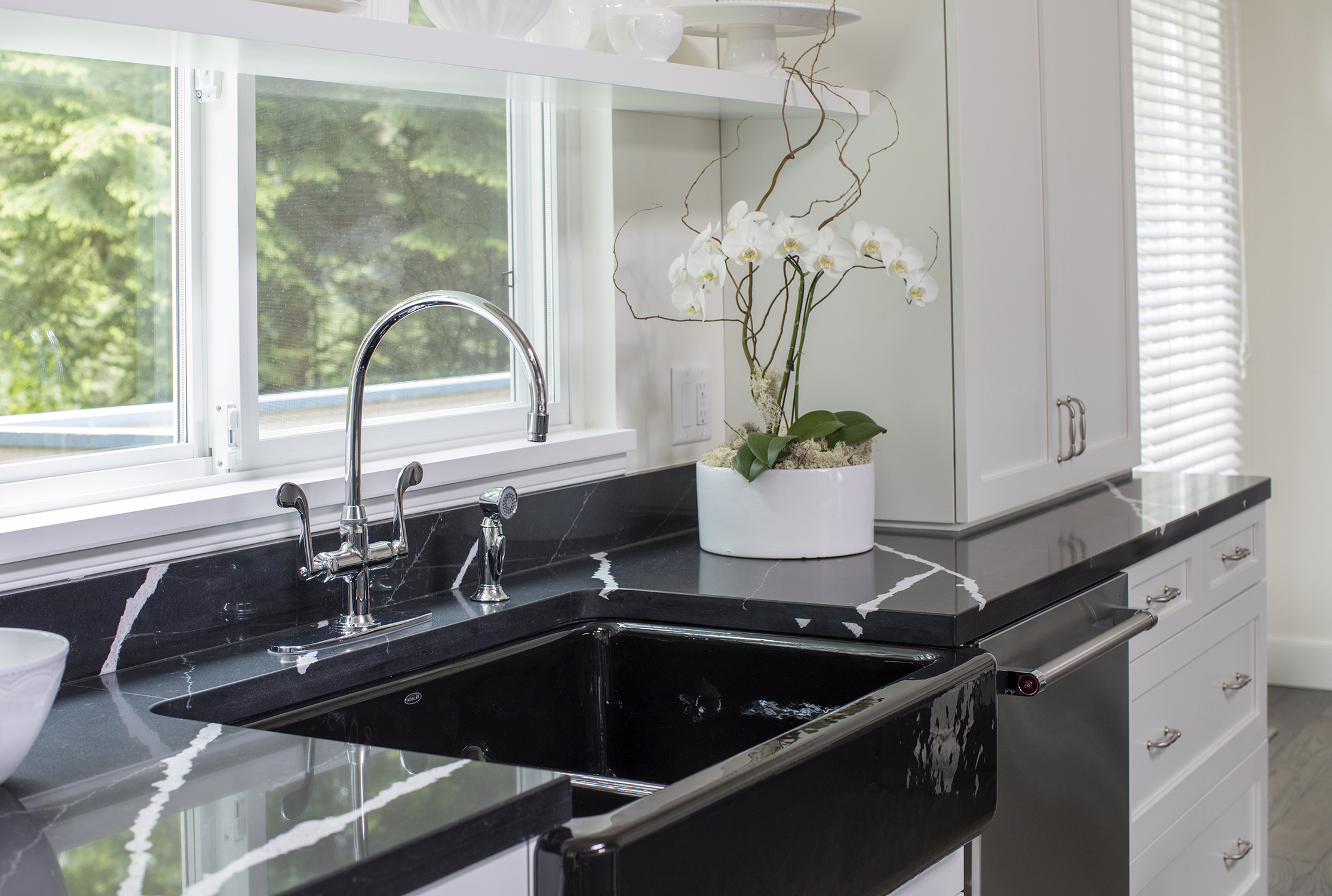
Going Marbles
The back wall of the kitchen features a shiny, black apron sink and black quartz countertops with white marble graining, anchoring an otherwise all-white look.
Building Blocks
The modular design of the house was a big turnoff to these home owners, but Worst to First hosts Mickey Fabbiano and Sebastian Sevallo turned it into a design advantage, creating cool, angular features throughout.
Banquet Hall
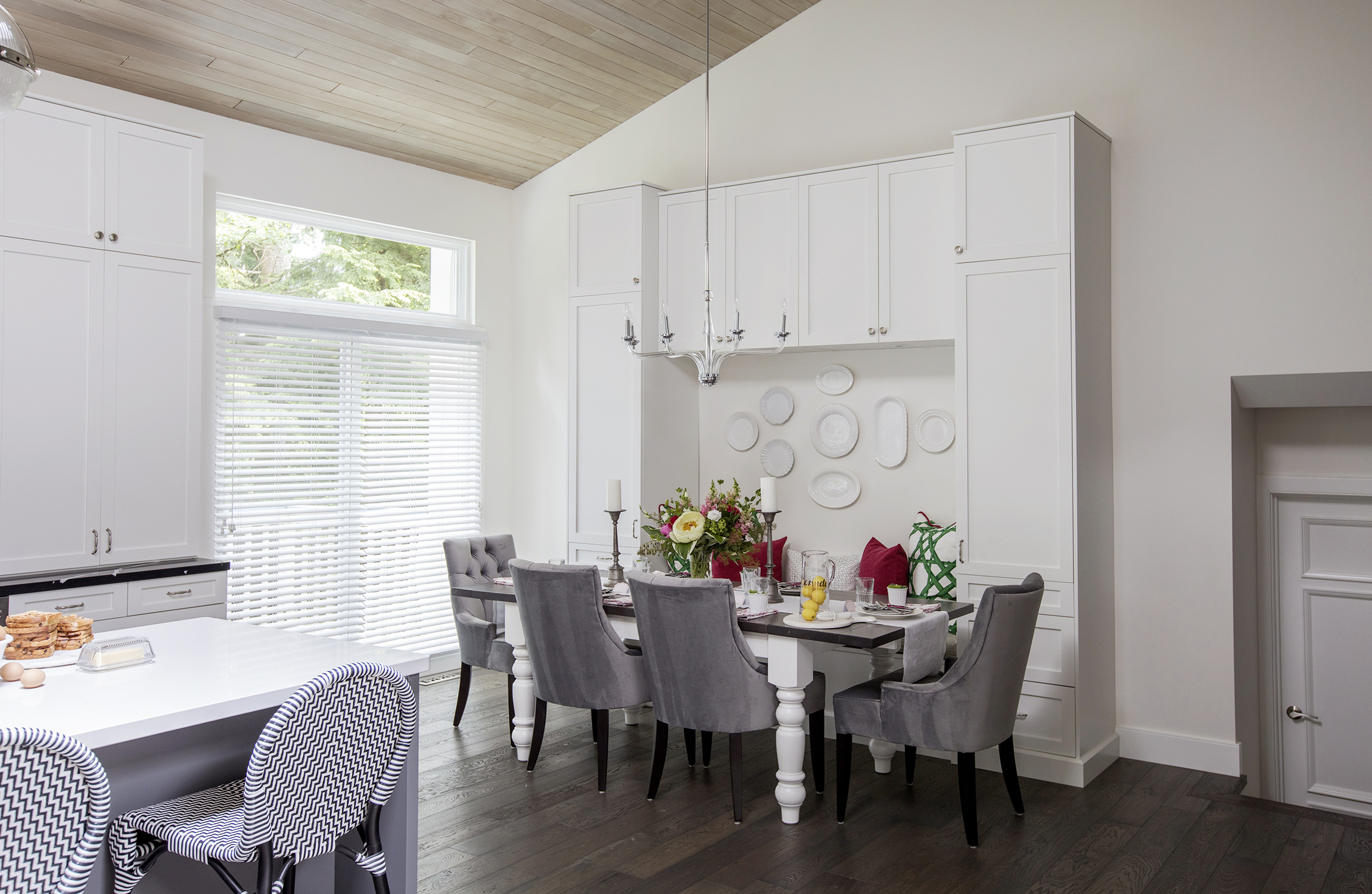
A sleek, build-in, 10-foot-wide banquette establishes a permanent dining area, as well as a stretch of extra badly needed storage options.
Dine In
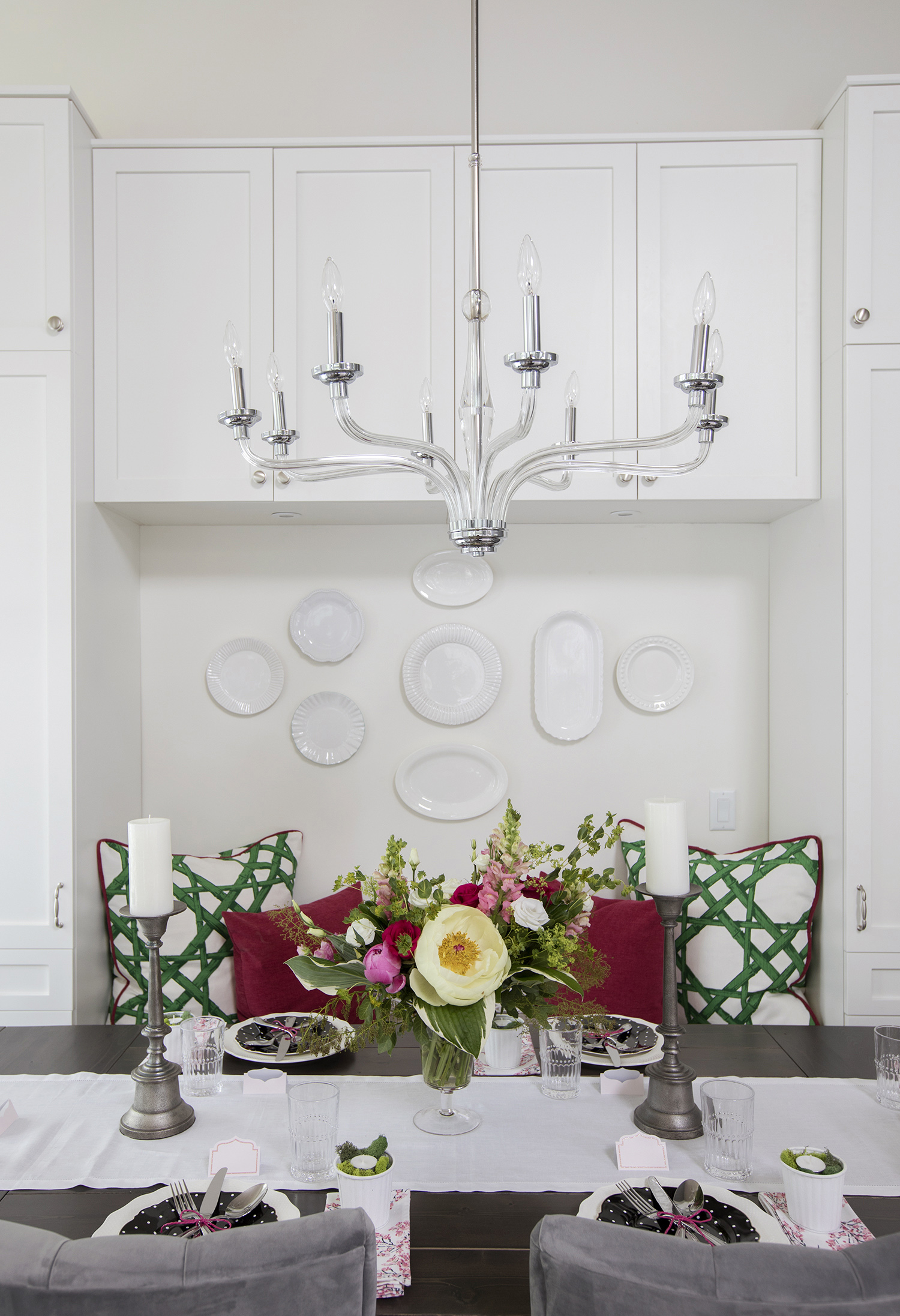
This simple glass chandelier over the dining table is a modern take on a traditional style, continuing the light and airy feel in this now contemporary home.
Block Party
Thanks to some insightful design choices, what was once outdated and tired is now revitalized and contemporary. Welcome to the future (and welcome home)!
HGTV your inbox.
By clicking "SIGN UP” you agree to receive emails from HGTV and accept Corus' Terms of Use and Corus' Privacy Policy.


