After learning the hard way that some renovations are better left to the professionals, homeowners Lainie and Brian enlisted designer Sabrina Smelko and contractor Sebastian Clovis of Save My Reno to help them tackle their main floor makeover. See how the duo saved Lainie and Brian thousands from their budget, while giving them the contemporary makeover they’d been dreaming of.
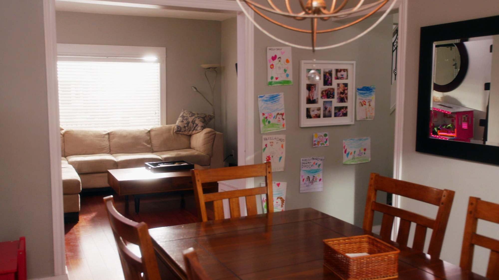
Before: Drab and Disjointed
Drab furniture and a boxed-in dining room made this space feel small and confined. Meanwhile the large living room was crammed thanks to an oversized sectional that didn’t really fit the space. And of course, there was no real flow to speak of, which made having family time a little more challenging.
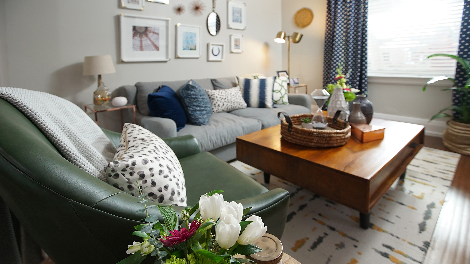
After: Bright and Cheerful
By redesigning the living room to make it smaller and more functional, Sabrina and Sebastian gave Lainie and Brian a more adult space with lots of designer touches. There’s still plenty of room for the whole family, but now this area feels open and airy as opposed to small and crammed.
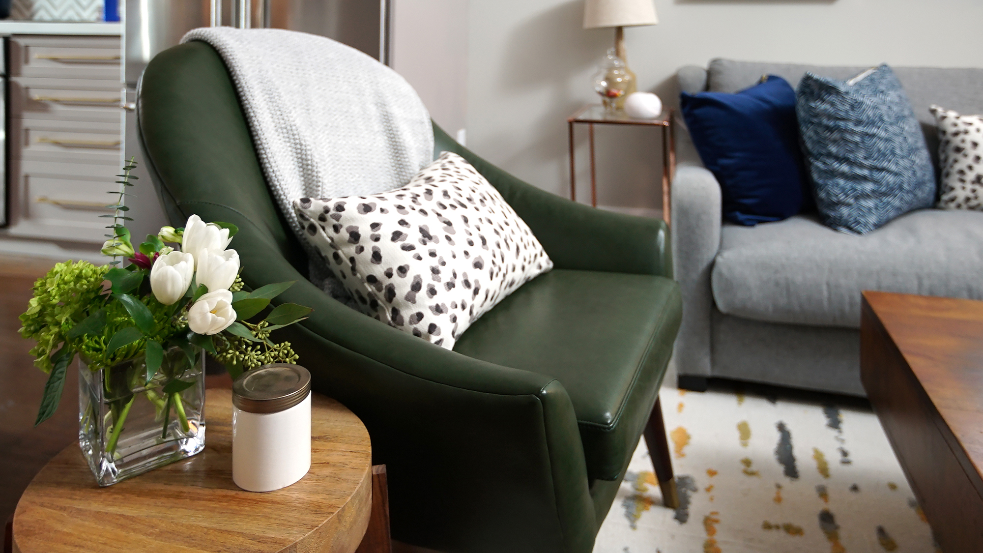
After: Bargain Hunting
Sabrina and Lainie scoured online sources and local vendors for fantastic deals on furniture and more, which helped bring down the overall budget.
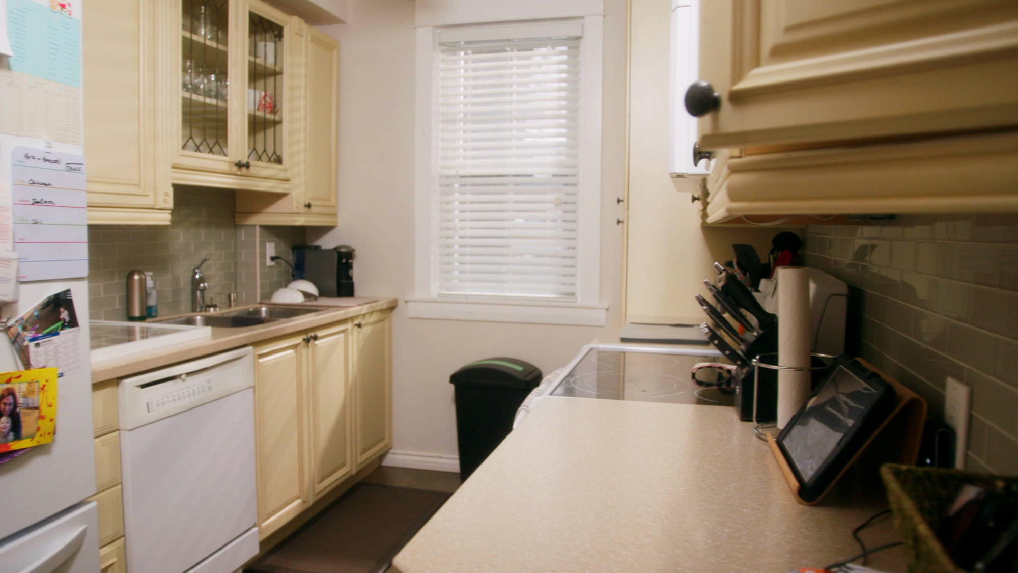
Before: A Gallery Kitchen
This tiny nook of a kitchen definitely wasn’t functional enough for this couple. Not only were they constantly running into each other, but there was no storage or way for them to keep an eye on the kids while they were cooking and prepping.
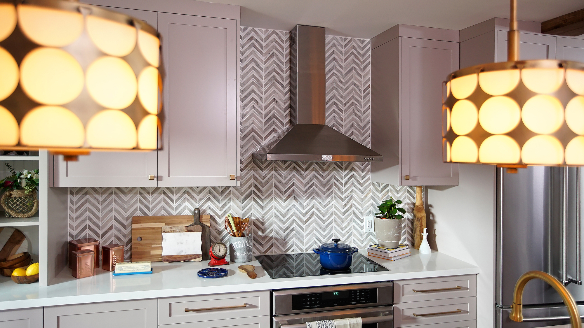
After: Some Modern Flair
Some prefab cabinets went a long way in helping to save these homeowners money, but they look custom thanks to the great installation job Sebastian did. A pretty backsplash gives an artful appeal, while the updated appliances make this space feel fresh and new.
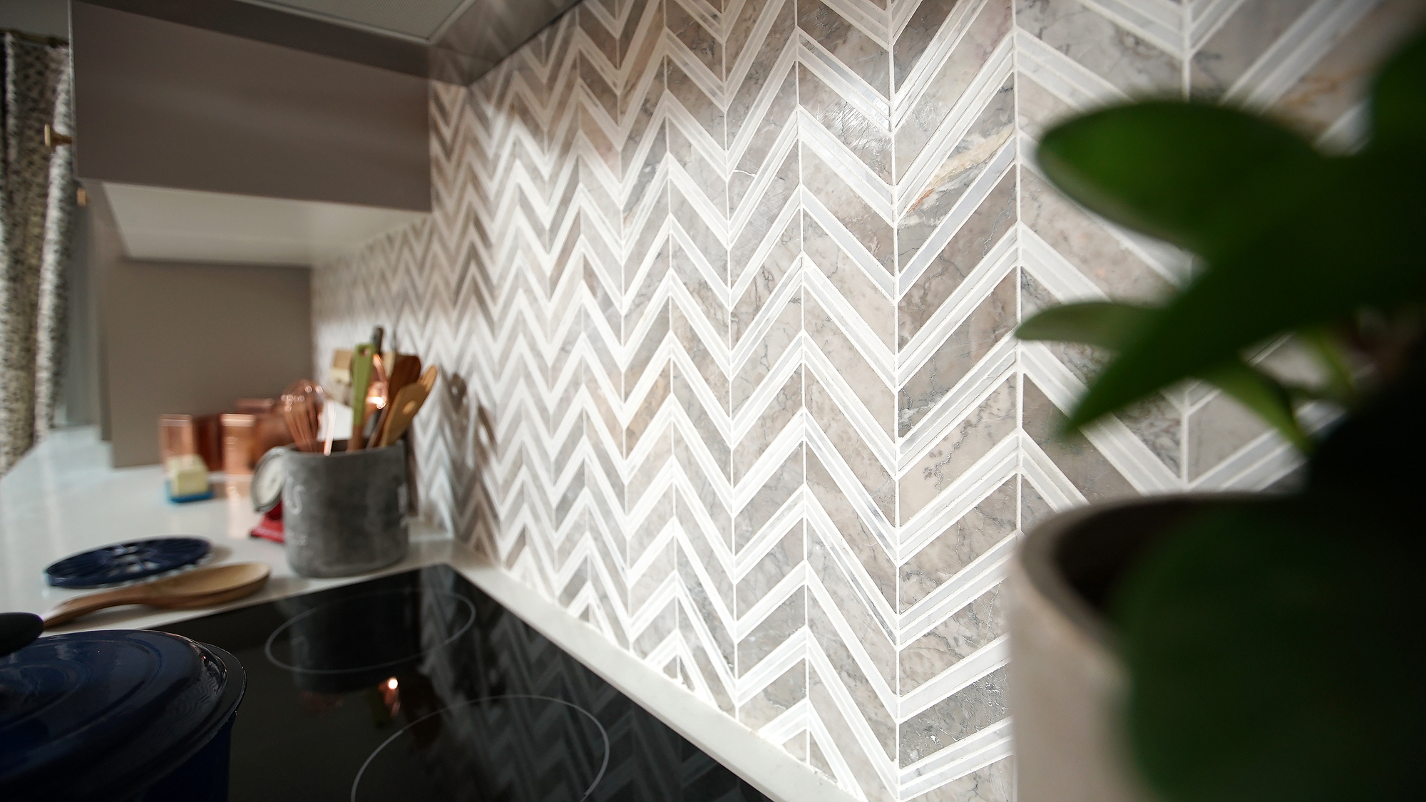
After: A Better Backsplash
Grey chevrons are certainly a trendy design right now, but that’s because they’re versatile and fresh. By keeping the main design colours neutral it’s easy to add pops of colour in later. And that versatility means this kitchen will absolutely stand up to the test of time.
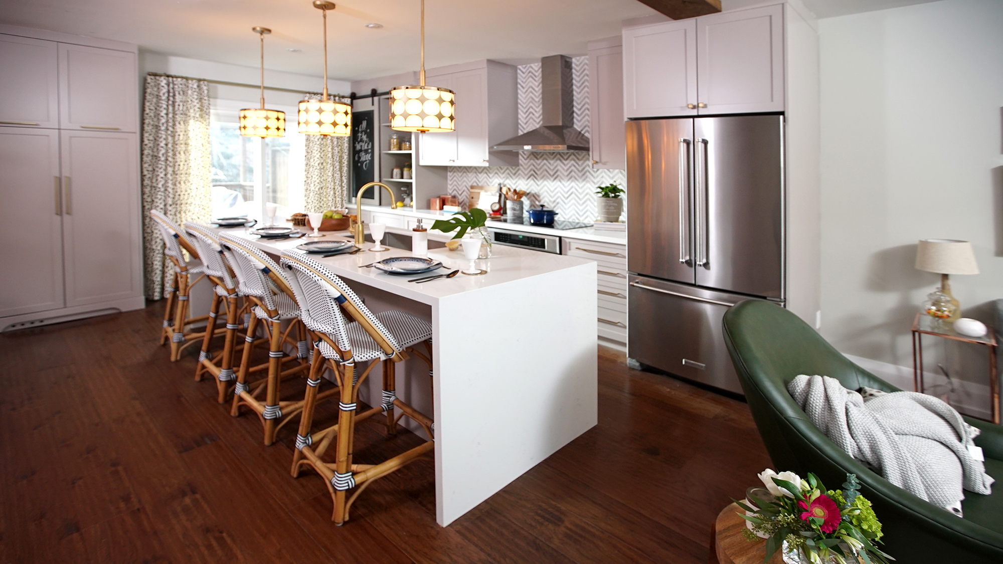
After: An Open Space
With the walls gone and some of the living room transformed into the kitchen area, this open-concept layout feels spacious and modern. A large waterfall island with wood-framed chairs adds functionality and a contemporary touch, while the other side of the piece contains lots of extra storage.
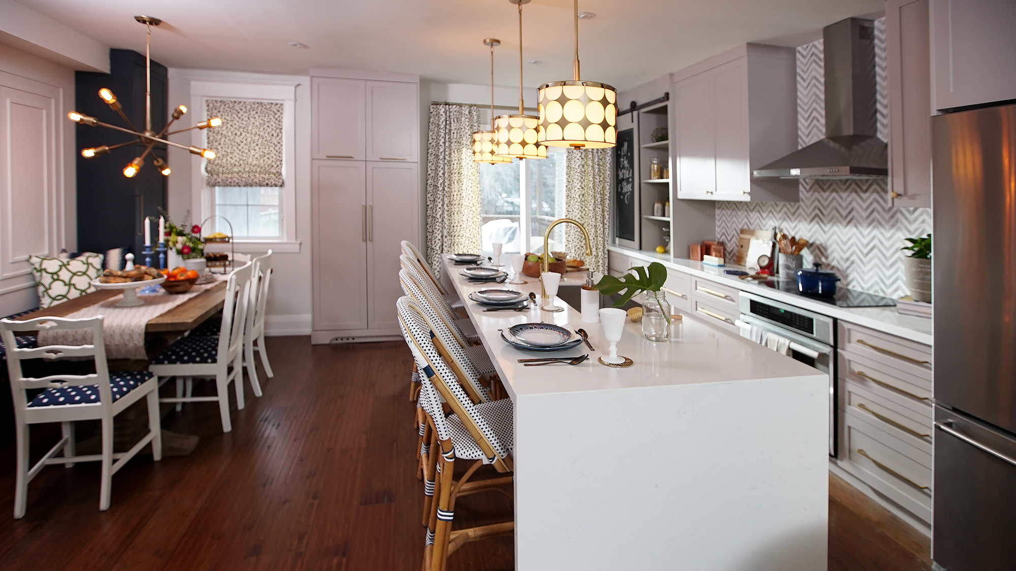
After: Seating Galore
Not only did Sabrina and Sebastian manage to give the homeowners tons of seating options in this open-concept space, but they saved them money by sourcing deals on everything featured. That includes the four mismatched chairs to the left. After a fresh coat of white paint and new upholstery, the pieces feel artful and fun.
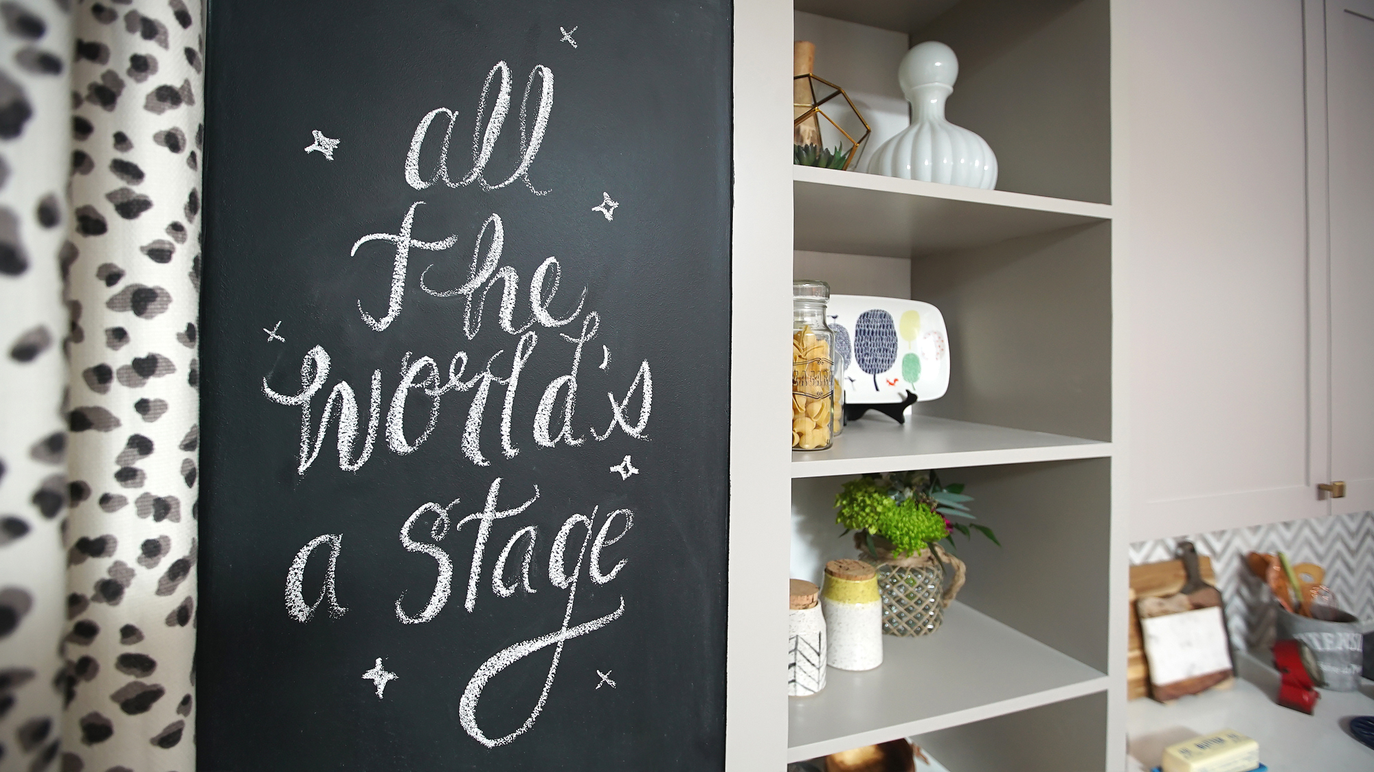
After: Custom Touches
Lainie couldn’t stop saying how much she loved everything in her new home upon seeing it and we can’t really blame her for that. With small finishing touches like this inexpensive chalkboard and the open-concept shelves to store essentials and knickknacks, this is indeed one pretty great space.
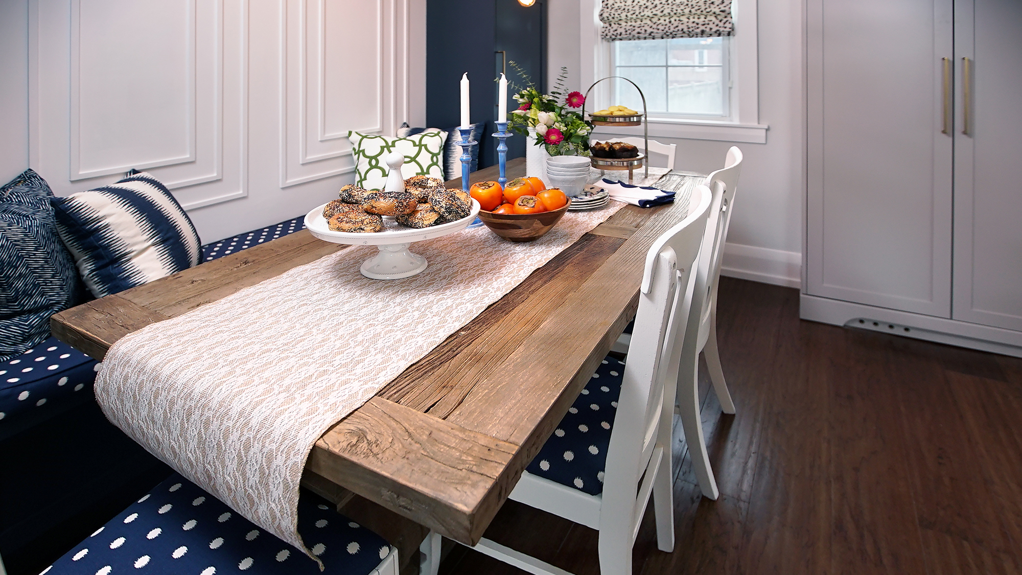
After: A Custom Banquette
This built-in banquette is brilliant in that it adds extra seating and helps to streamline the space while adding a ton of storage and design potential. The same fabric that covers the chairs has been added to the bench, adding a nice pop of colour to the space. Elegant throw pillows and a pretty table setting complete the look. What family wouldn’t want to hang out in this gorgeously reconfigured space?
HGTV your inbox.
By clicking "SIGN UP” you agree to receive emails from HGTV and accept Corus' Terms of Use and Corus' Privacy Policy.


