In a perfect world, all couples would have the same design vision. But sometimes, tastes clash – which is where the art of compromise comes into play. On Property Brothers, new parents George and Jenn (who also happen to be major decor aficionados), couldn’t agree on any decor decisions beyond having plenty of windows and enough space to entertain. So it was up to Jonathan Scott to hunt down the perfect fixer upper, which involved transforming an asbestos-filled space into a safe and stylish abode under a time crunch unlike any other. Here’s what he came up with.
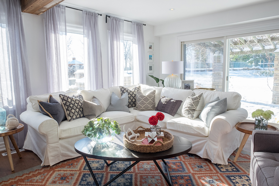
Light and Bright
Installing floor-to-ceiling windows was no small feat, but the commitment was clearly worth it. The homeowners are thrilled with all the natural light that spills into the updated space. Jonathan underscored the living room’s fresh look by sticking to neutral-coloured furniture and adding plenty of natural wood elements.
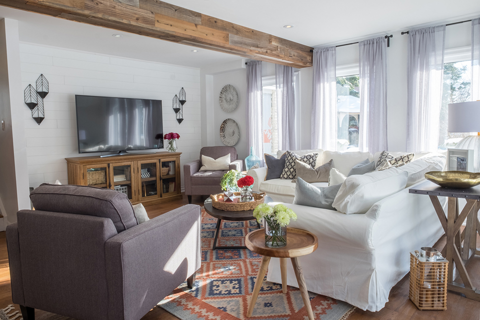
Feature Wall
While the homeowners originally wanted a fireplace, that plan was derailed as problems arose and costs escalated. Instead, Jonathan created this gorgeous feature wall using white-painted planks and modern sconces.
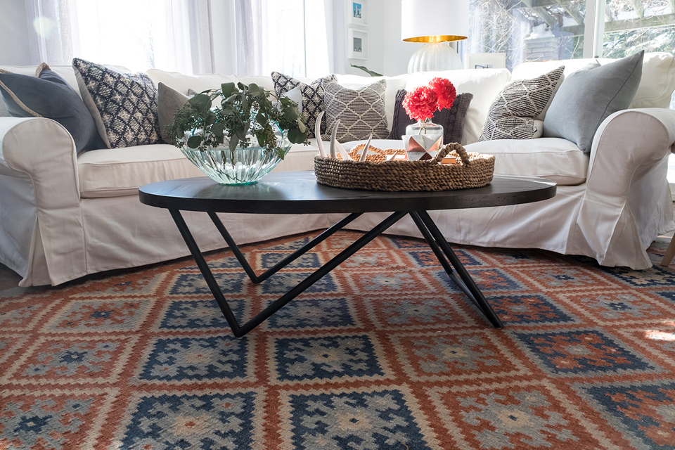
Earthy Tones
This patterned area rug makes a big statement thanks to its deep rust and blue hues. The toss cushions add to the boho feel, while the modern wood coffee table and plush white sofa soften the look and add elegance.
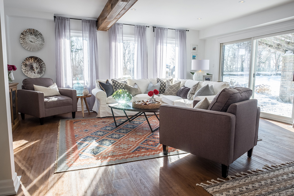
Exposed Beams
In order to open up the space, Jonathan installed support beams on the ceiling. He left them exposed and added a dark wood stain to lend character and correspond with the home’s hardwood flooring.
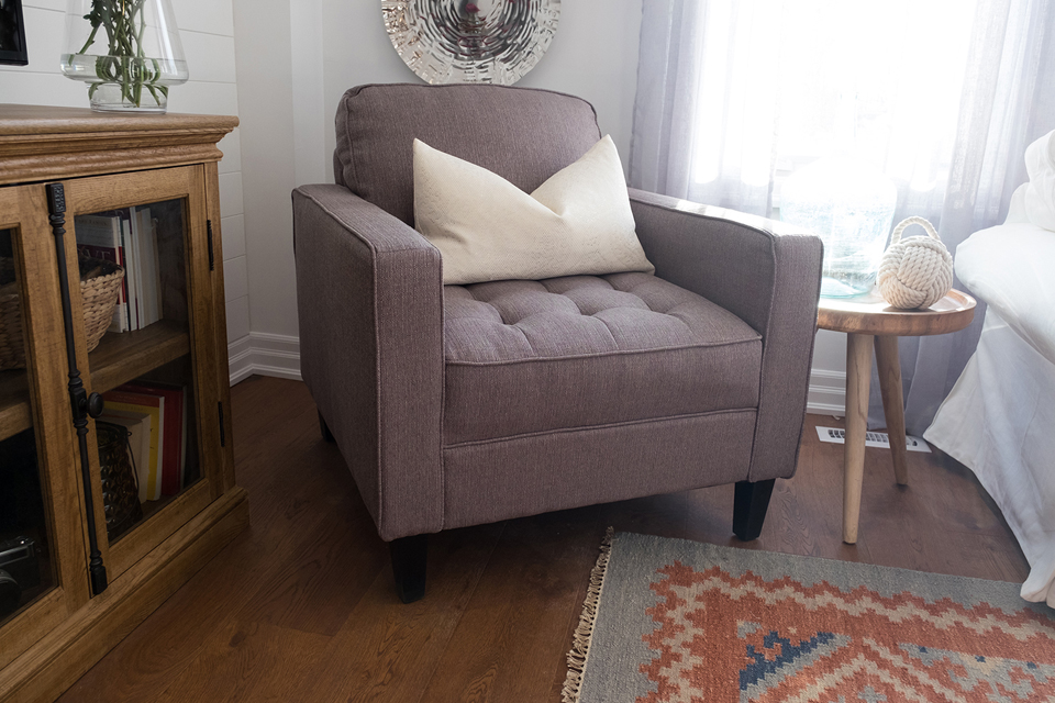
Comfy Corner
This plush grey armchair is built for lounging. The white throw pillow ties into the other neutral elements in the room for a fresh, cohesive look.
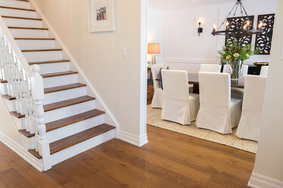
Modern Flow
Hardwood floors continue throughout the home and are even present on the treated staircase. And when dealing with a design-conflicted couple, you can’t go wrong with timeless off-white walls.
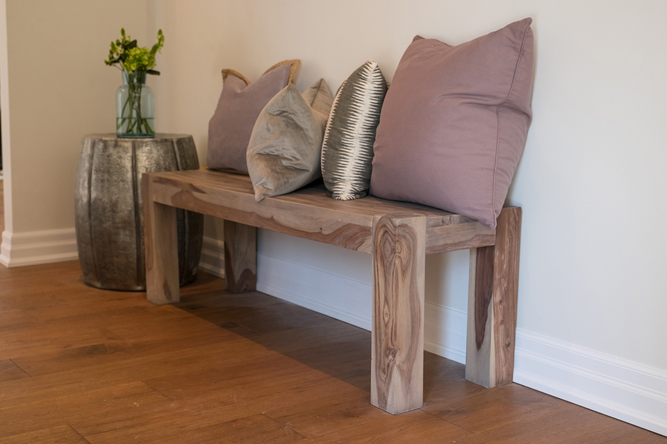
Bonus Features
We love the look of this simple wooden bench, which not only provides entryway seating, but speaks to the home’s classic-meets-rustic vibe. Dusted rose and shimmery gold toss cushions add a dash of glitz and make for a grand first impression.
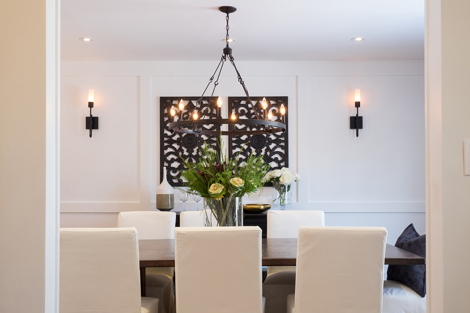
Modern Dining
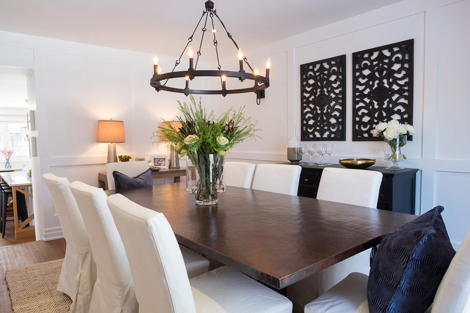
In keeping with the homeowner’s design wishes, Jonathan treated the dining room wall with wainscoting for an elegant finish. Jet black wall sconces and interesting art pieces create a regal aesthetic that helps to define the space.
Classic Features
The wainscoting wraps around the dining room, creating architectural interest. The chairs are also outfitted in a similar material to that of the living room sofa for cohesion. As for the large wood table? It offers plenty of seating for when the couple entertains.
Rustic Lighting
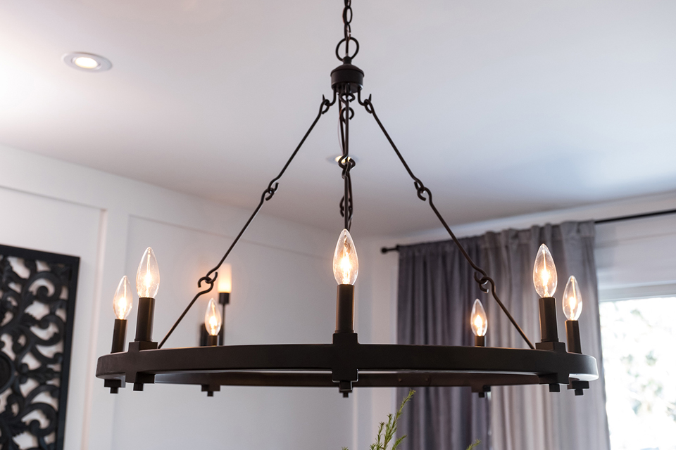
The homeowners are big on light fixtures and wanted to make sure the styles selected reflected both of their design preferences. So Jonathan opted for an elegant chandelier with a circular frame and candle light bulbs to add a rich and rustic finish.
Functional Living
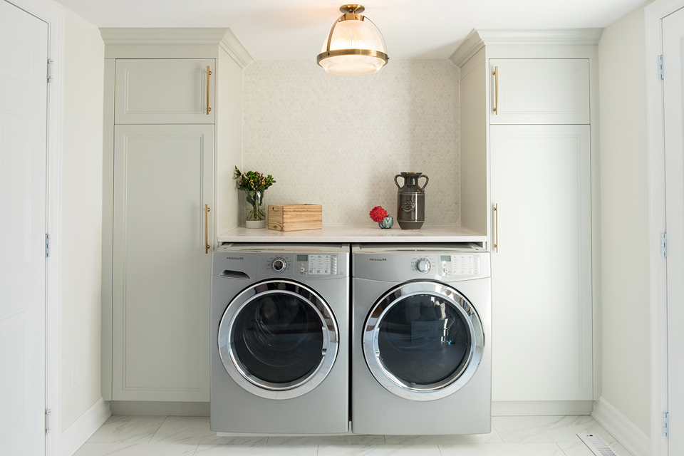
The laundry room wasn’t huge, but Jonathan transformed it into a functional space by incorporating floor-to-ceiling cabinets and a folding surface. The room is also stylish thanks to modern brass accents and a textured backsplash.
High-End Appliances
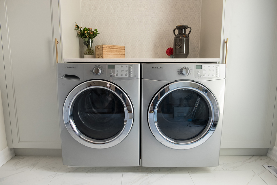
As for the appliances themselves? These front-loading units are large and sleek, making laundry that much easier. Marbled ceramic floor tiles polish off the look.
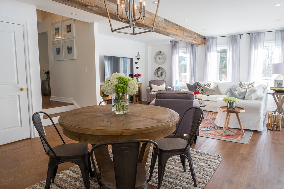
Eat-In Area
This gorgeous circular table (which sits adjacent to the living room) is ideal for those less-than-formal gatherings. The area benefits from all the natural light, but also reads as a separate space thanks to the area rug and light fixture above.
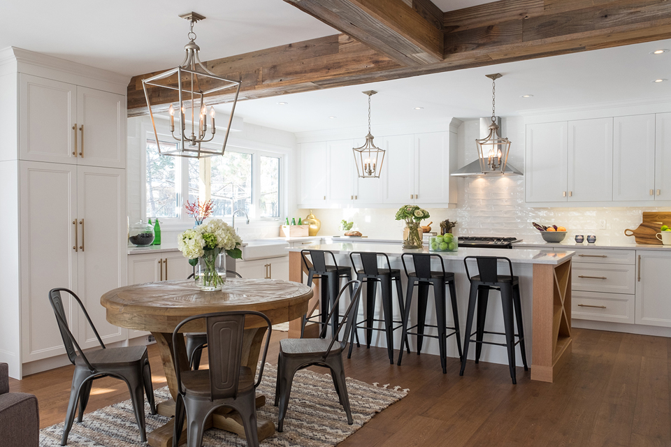
Natural Flow
In the kitchen, the exposed beams and wood flooring ground all the white and create a modern, country feel. Matching lantern-style light fixtures also connect the eating area to the rest of the cooking space.
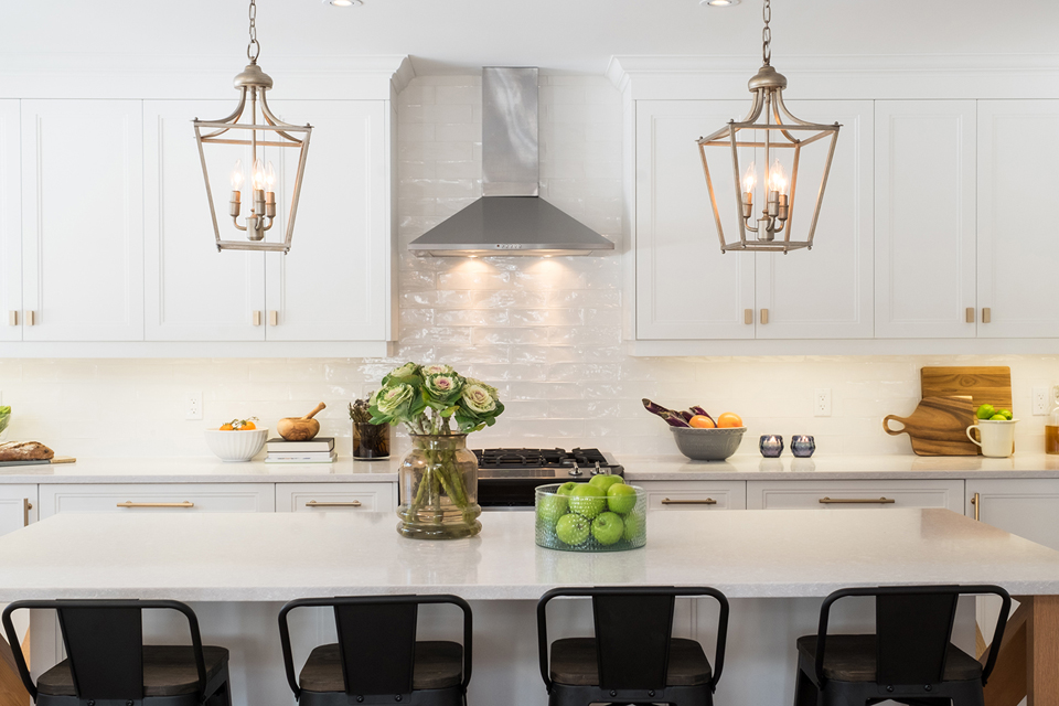
The Island
No open-concept kitchen is complete without a large island, and this design is no exception. Jonathan kept the look light and bright, but then added dark stools for a healthy hit of contrast.
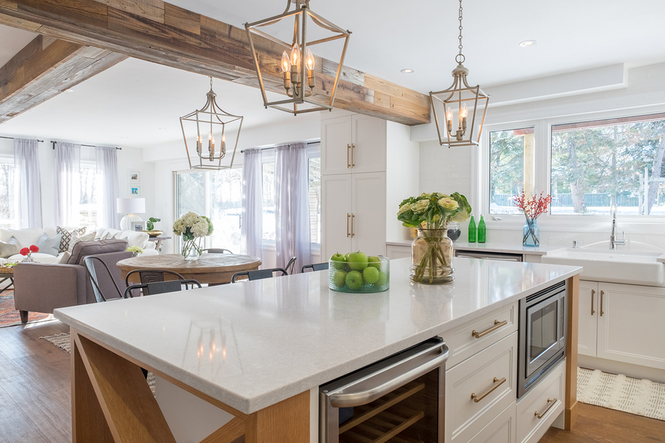
Functional Space
The gorgeous island features integrated appliances and extra storage space. It’s a great way to hide items like an unsightly microwave and maintain a streamlined design.
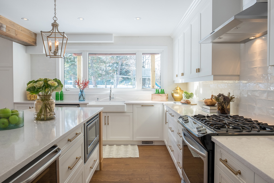
Brilliant Cupboards
There’s tons of cabinetry to get excited about in this space. Translation: the homeowners have plenty of room to store all their cooking essentials (and non-essentials!). The elegant gold pulls elevate the look.
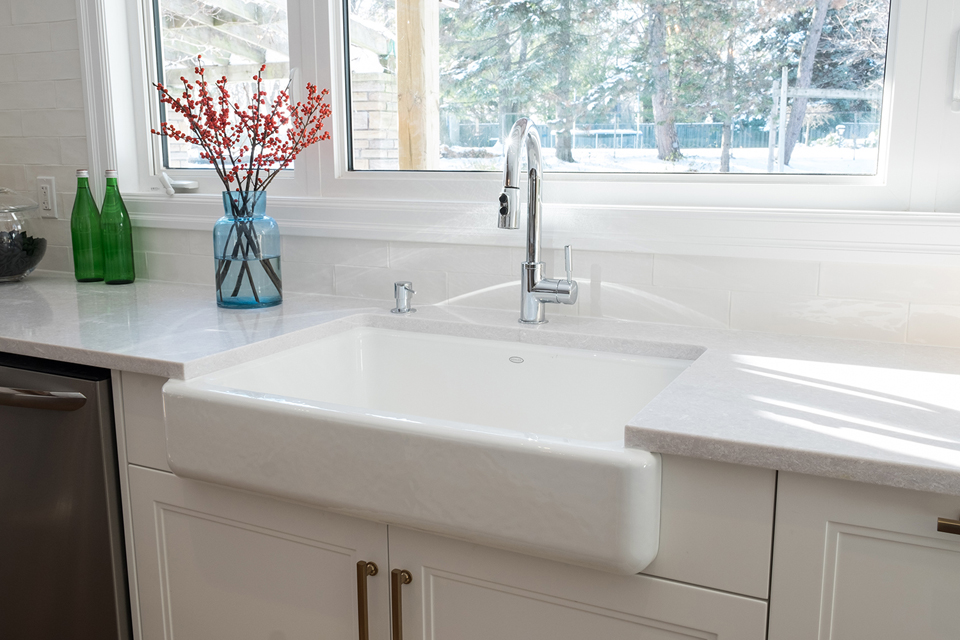
Simple Finishes
The large basin sink is another pretty design element that adds function. Coupled with sleek countertops and an extra-large window, it’s motivation enough to stay behind and do the dishes.
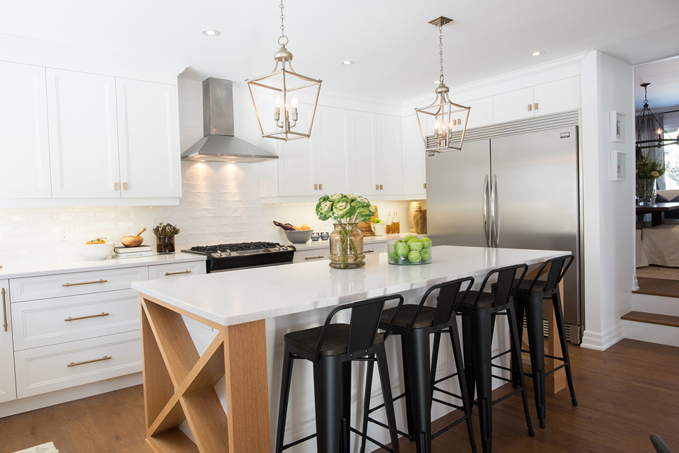
Rustic Details
We love the rustic wood detailing along the sides of the island. It gives the otherwise standard addition instant character.
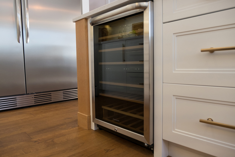
Beautiful Bonus
Last but not least, Jonathan incorporated a small wine fridge, which is crucial when entertaining and also frees up space in the larger fridge. It’s small touches like this that really transform the abode into the perfect retreat where the homeowners can live in harmony.
HGTV your inbox.
By clicking "SIGN UP” you agree to receive emails from HGTV and accept Corus' Terms of Use and Corus' Privacy Policy.


