This dated bathroom from the 1990s was bad to the bone…we’re talking bad bone structure, bad layout, bad tile, bad everything. The homeowners’ big dreams were restrained by a limited budget, so they called in the big guns: Save My Reno hosts Sebastian Clovis and Sabrina Smelko, to save the day and save the bathroom renovation from floundering. Sebastian and Sabrina managed to cut costs, scrap that horrendous tile and give the homeowners the spa bathroom they’d been dreaming of.
When it comes to upping a home’s resale value, everyone knows that the kitchen and bathroom is where you want to invest your money. But when one couple only had $40,000 to transform their completely outdated master ensuite into a work of art, Save My Reno hosts Sebastian Clovis and Sabrina Smelko had to get a little… creative. The result is a gorgeous ensuite full of top-notch finishes for half the price.
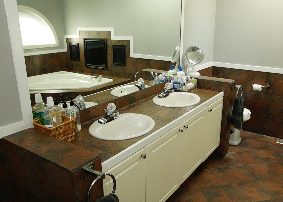
Before: Tiles, Tiles, Tiles
Dark and brown seemed to be the theme of this original ensuite, which featured way too many tiles. The homeowners also weren’t too fond of the lack of privacy this peek-a-boo toilet and skylight overhead added.
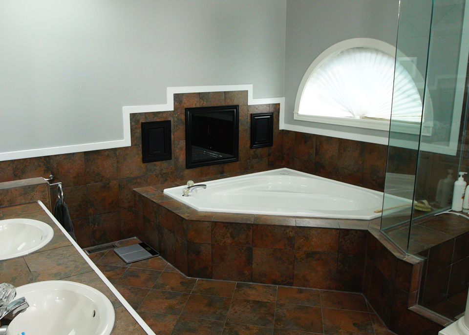
Before: Wasted Space
The brown tiling continued to the awkward corner tub, which actually wasn’t the big soaker tub you’d hope it would be. Meanwhile a weird TV box was sitting empty and led right to the bedroom closet of this couple’s son, leading to some not-so-fun games of peek-a-boo.
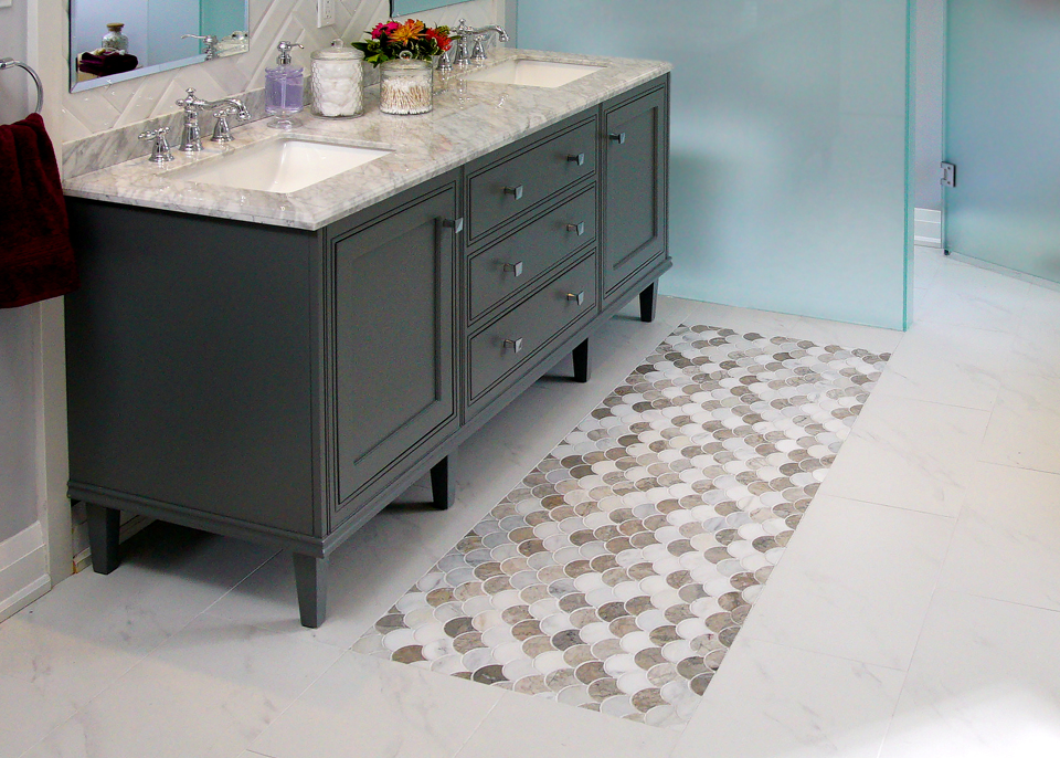
After: A Pop of Colour
If you’re going to splurge anywhere, the vanity is where you want to do it. This model isn’t just full of storage potential and modern edging, but its bold colour adds a pretty and refined statement to the ensuite as a whole.

After: Pretty Faucets
The rich look is capped off by dual sinks with elegant faucets that compliment the inexpensive herringbone backsplash above.
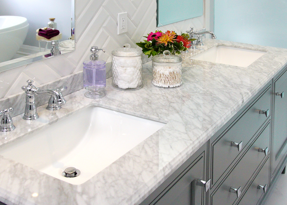
After: A Touch of Marble
The homeowners were set on adding marble to their new ensuite, but to do the entire thing in marble tiles would have been a huge expense. Instead Sabrina and Sebastian installed this pretty marble finish on top of the vanity, proving that a little goes a long way.
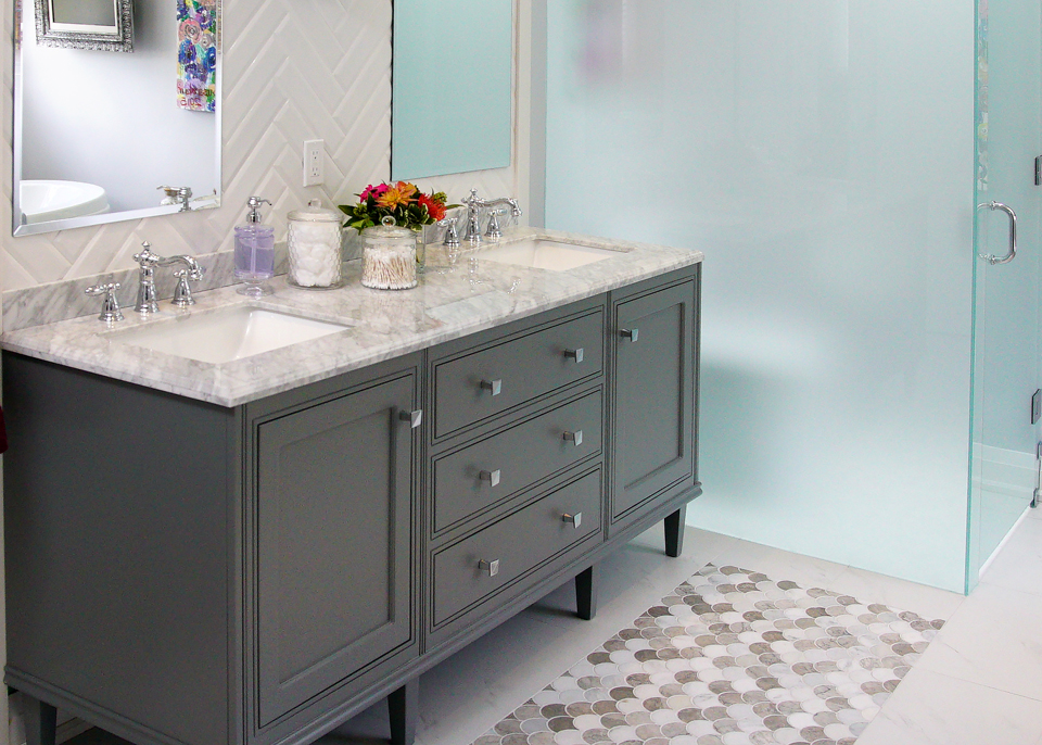
After: Pretty Finishes
Below the vanity this inlay tiling adds another rich finish without going overboard and helps to make this little nook a real statement piece. Meanwhile the homeowners now have total privacy thanks to these frosted walls, which were repurposed from the old shower walls in order to save a few bucks.
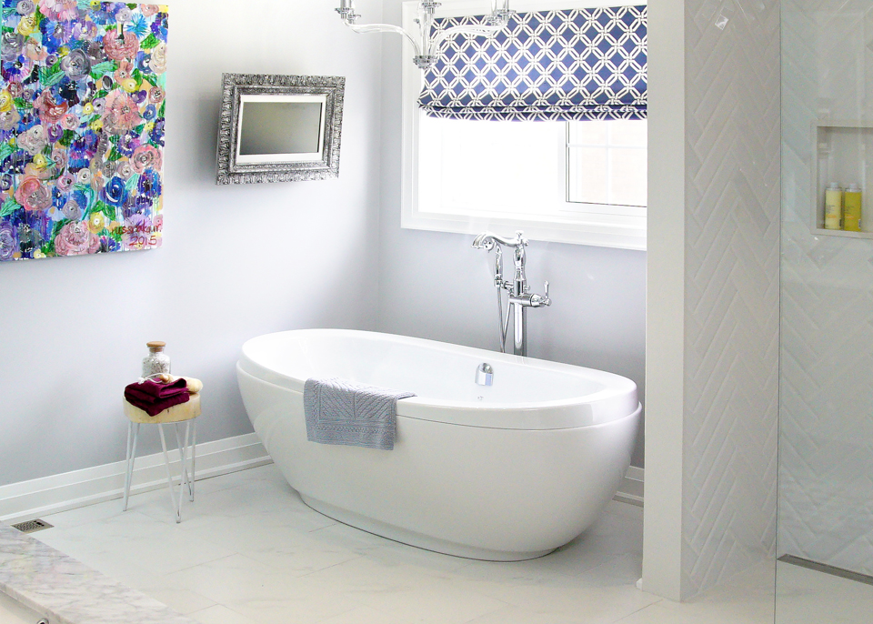
After: A Soaker Tub
Without all of that extra tiling this soaker tub feels bright and open, and it makes complete use of the space. Meanwhile Sebastian enlarged the old half-moon window above in order to allow in even more natural light. Also missing? The peep window, thank goodness.
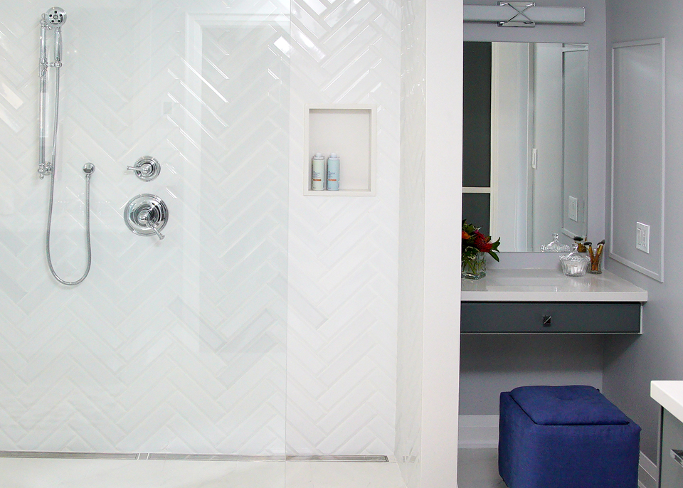
After: An Open Concept Shower
The gorgeous and inexpensive herringbone tile continues into the shower, which is open and big enough for two. The bright white finishes help to reflect all of that natural light, making this a warm and welcoming space.
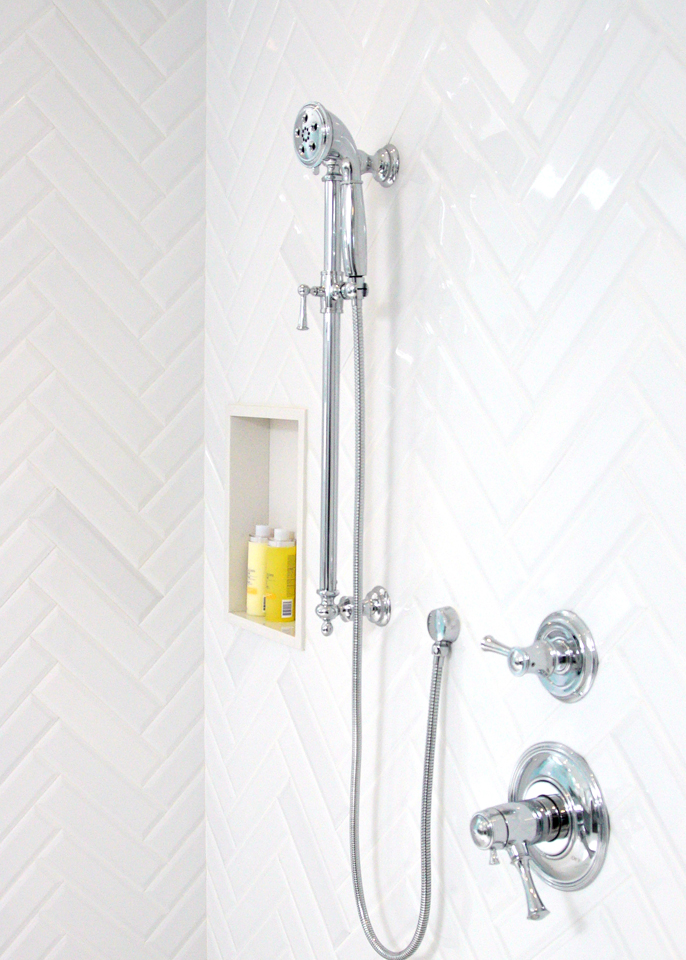
After: New Shower Heads
Nothing feels more luxurious in a newly renovated shower than when you have dual shower heads. Sebastian and Sabrina added an inexpensive manual and waterfall shower head to this particular design, giving the homeowners at least a couple of showering options.
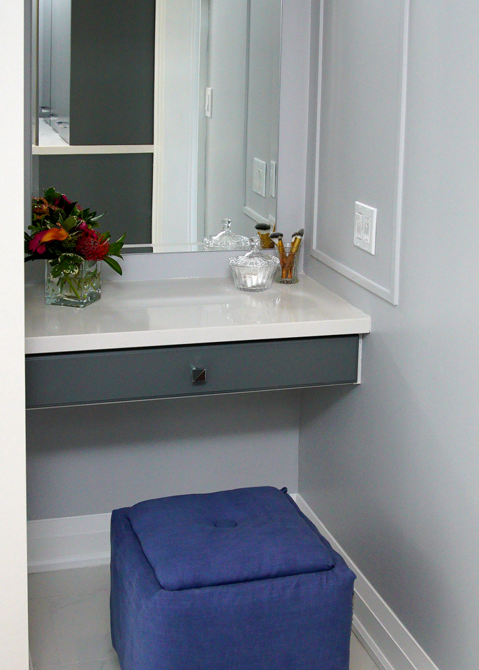
After: A Vanity Table
It’s always nice to have a designated area to do your makeup, and Sabrina and Sebastian didn’t disappoint with this ensuite. They transformed this tiny nook into the perfect vanity space with a small shelf and a repurposed drawer from the old vanity. Meanwhile the stool below cost a total of ten bucks plus the fabric, as Sabrina helped the homeowners give it a bit of a facelift. It’s those small touches that add up to big savings in the long run, and that helped to create the ensuite of these homeowners’ dreams.
HGTV your inbox.
By clicking "SIGN UP” you agree to receive emails from HGTV and accept Corus' Terms of Use and Corus' Privacy Policy.


