Sandy and Phillip were content with their bachelor-style apartment… that is until they had their first baby. So with a limited budget they contacted the Property Brothers for a little help in transforming a fixer upper into a great starter home for their new family. Here’s how Jonathan and Drew Scott turned this cramped and tired layout into a spacious abode with plenty of modern-meets-rustic finishes.
A Bright New Entrance
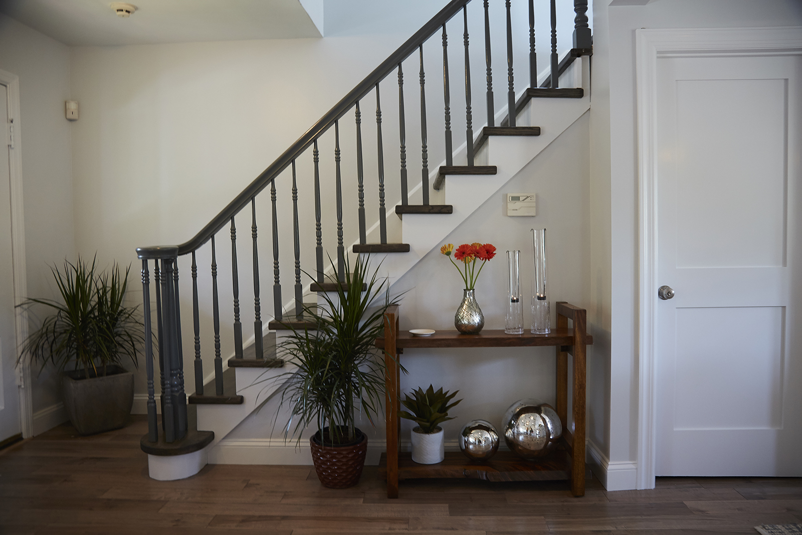
From the moment you walk into the redesigned house it’s clear this is now the same space Sandy and Phillip first purchased. A dramatic staircase in a rich stain meets you alongside brand new hardwood floors that automatically give this entrance personality and character. A small side table with tons of greenery and a few key vases are strategically placed beside the stairs and a doorway, with fresh flowers and a couple of simple knickknacks completing the look.
Modern New Living Room
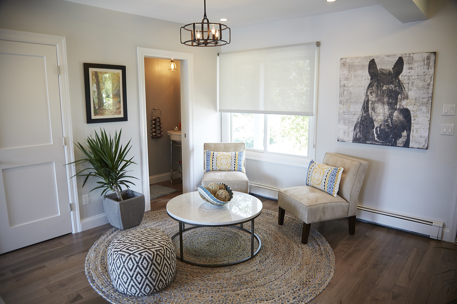
Sometimes less is more, as the brothers proved with this pretty new layout in the main living space. A couple of creamy armchairs are offset by a geometric patterned ottoman while a circular table and a small, neutral area rug underneath tie it all together. Above a simple horse print lends a more casual, rugged feel to the space, with more greenery and an artful table centrepiece keeping things rustic and flowing.
Pretty Powder Room
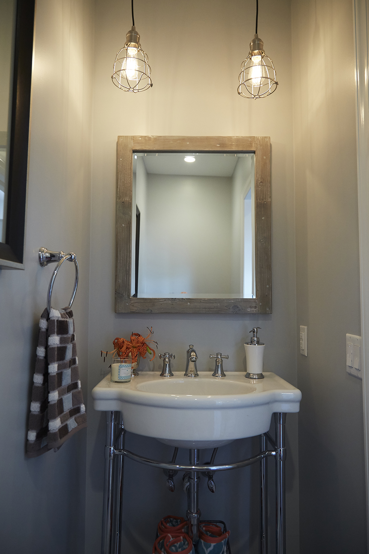
Fresh paint, a simple vanity and a large mirror make the most of this small space off of the living room, with pot lights and these updated pendants providing ample lighting.
Centre Island
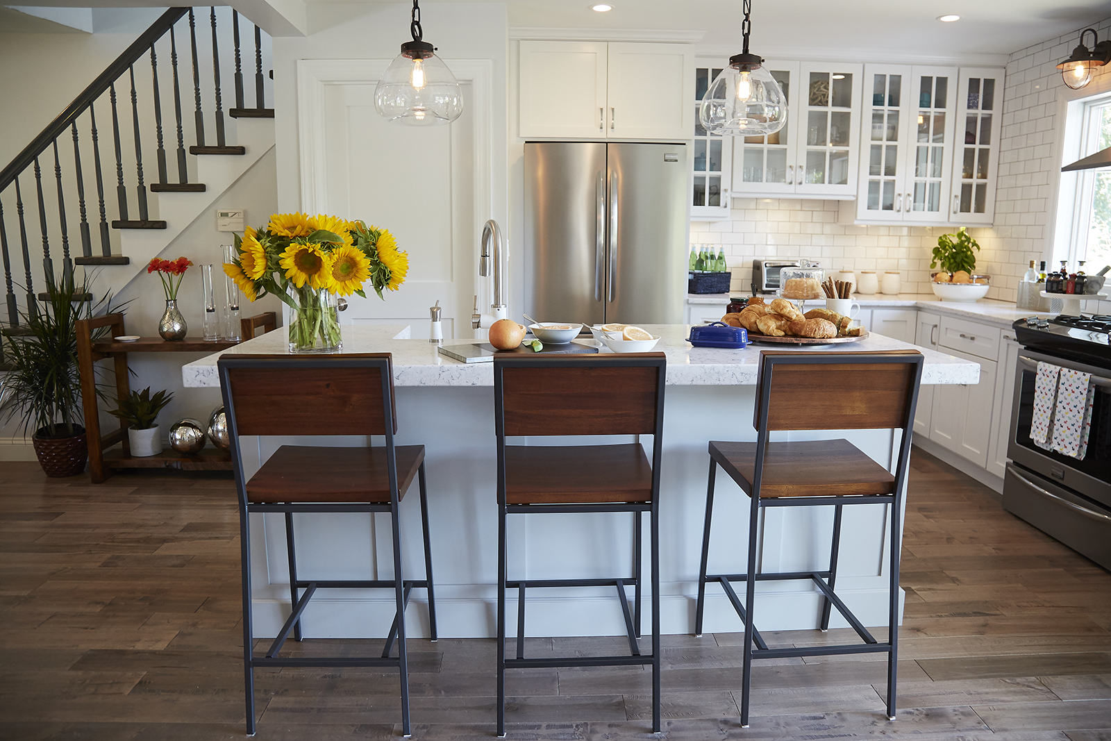
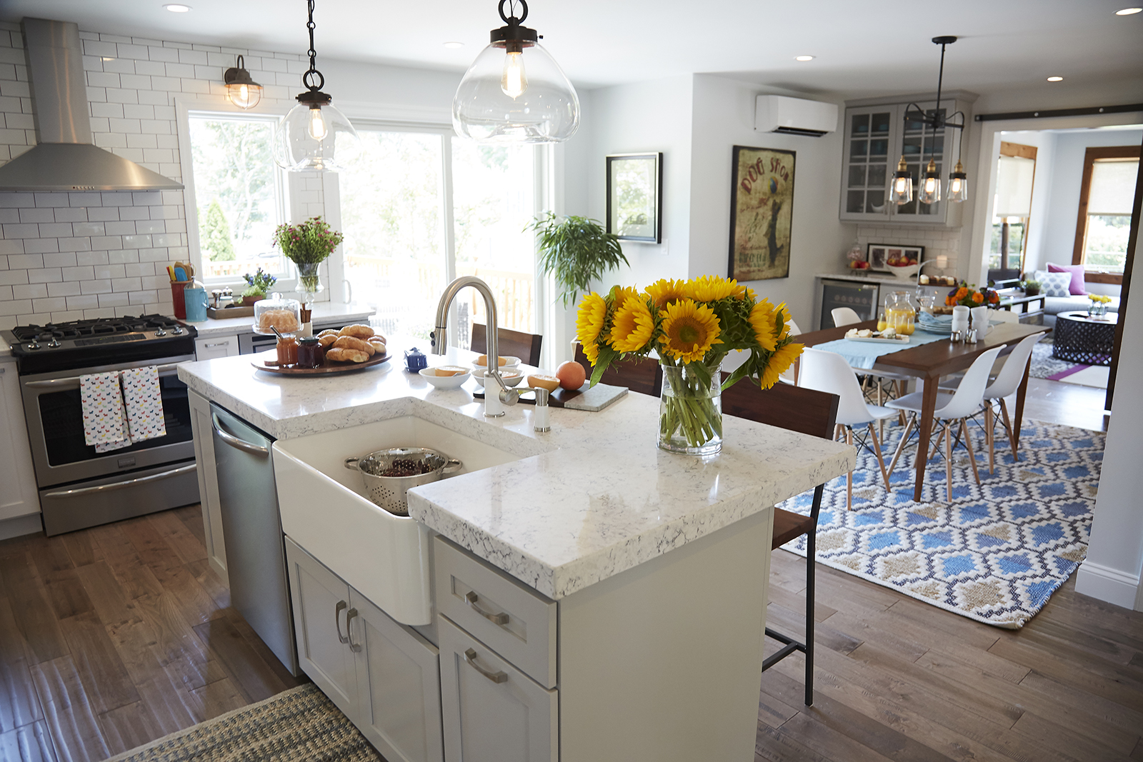
An oversized island was a must-have for Sandy and Phillip, and the brothers were sure to give it to them. The look helps to further define the kitchen and living room spaces, with the stained finish on the bar chairs providing more of that rustic, natural vibe. A couple of hanging pendant lights with clear shades and an iron finish elevate the look into a real piece of art.
Multi-Functional Space
On the other side of the island an oversized basin sink is perfect for easily digging into all of those dishes, but there’s still plenty of counter space to eat and prep at. Below, a dishwasher is strategically built-in along with more storage space and drawers making this a truly functional piece.
Secret Storage
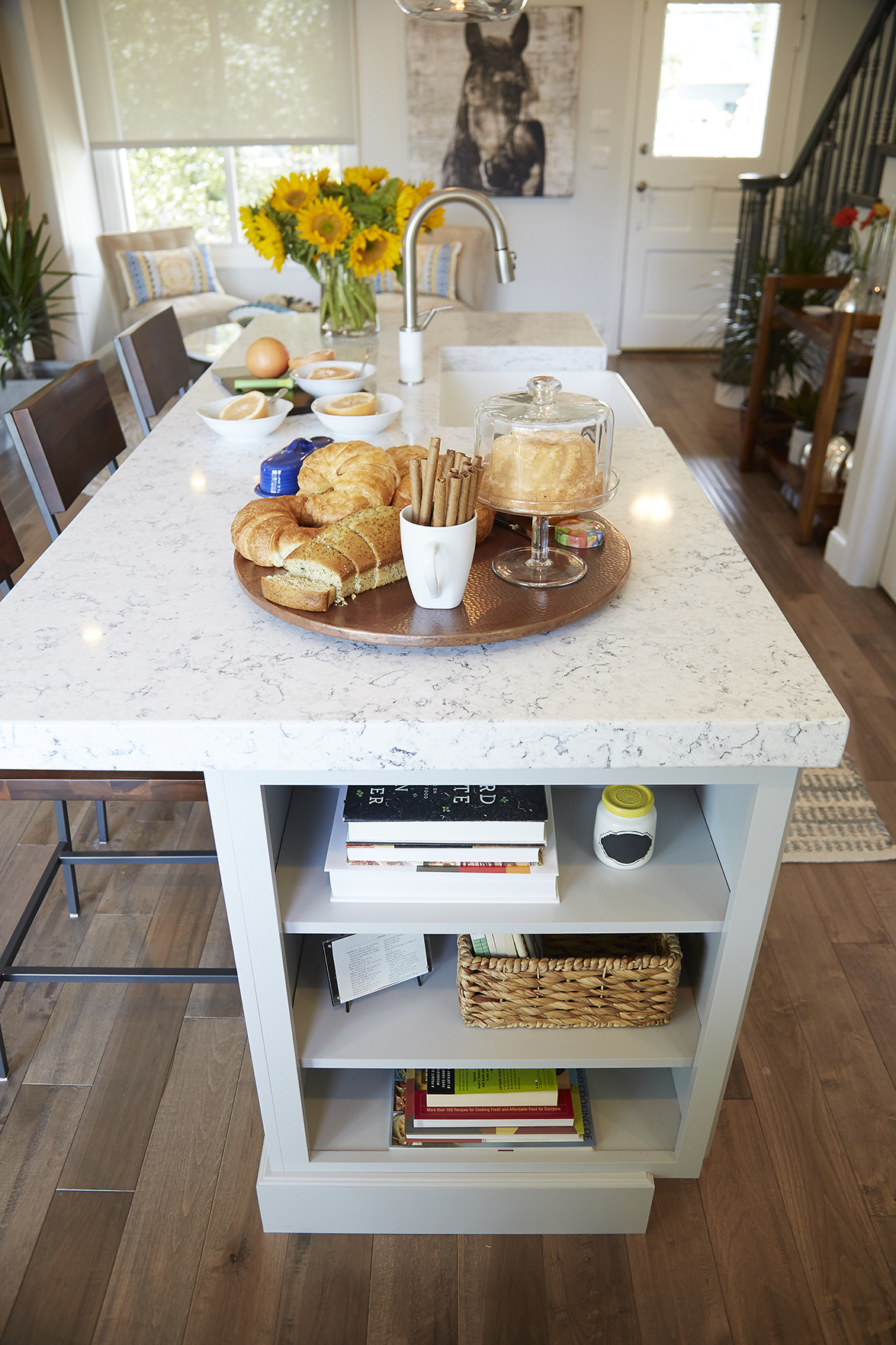
Last but not least, this exposed built-in shelving on the side of the island is the perfect spot to tuck away cookbooks, recipes and any extra jars or spices in a neat and organized way.
Maximized Space
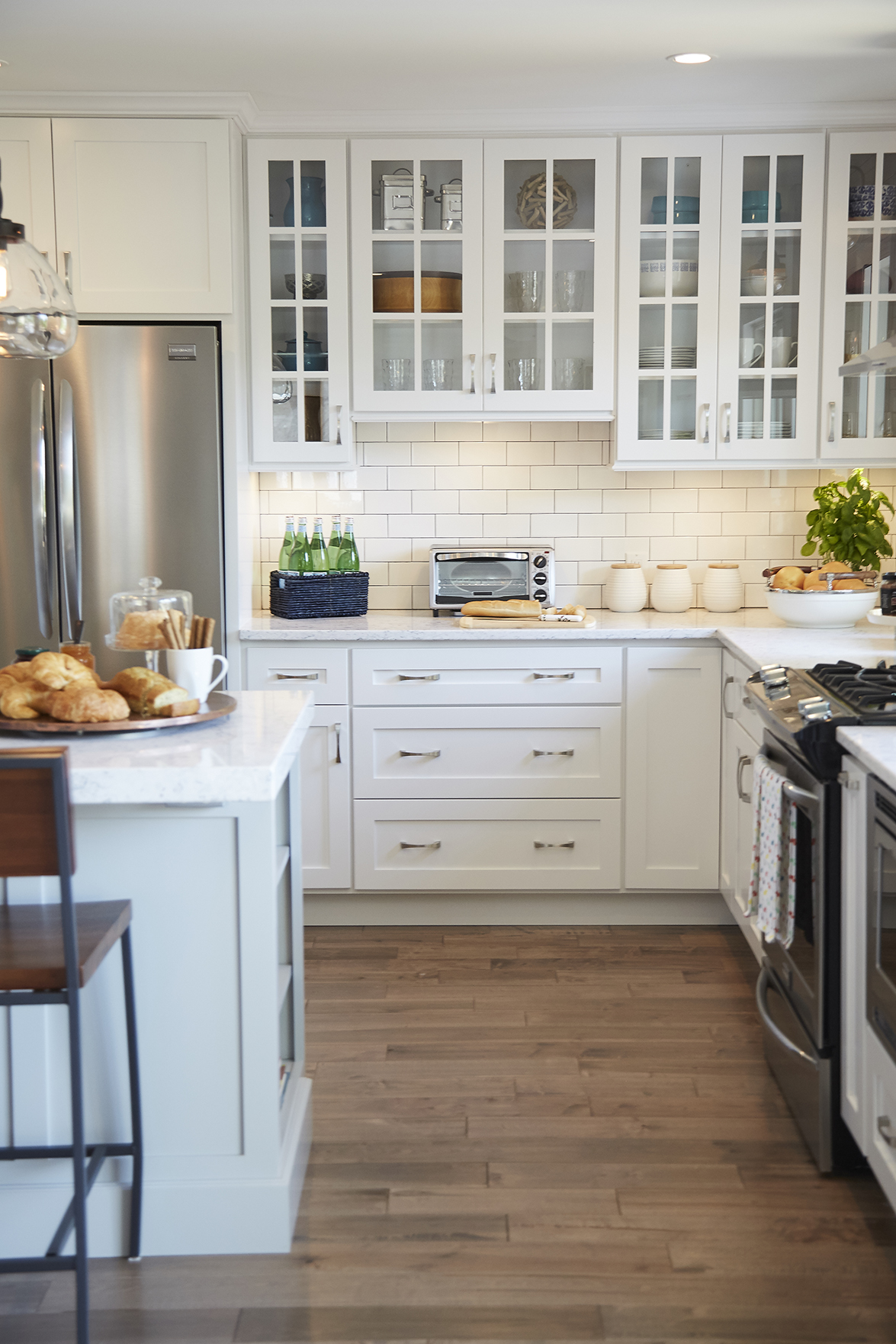
The kitchen itself boasts floor-to-ceiling cupboards and storage, which means that all of this couple’s small appliances, cooking gear and anything else in between can be easily stored away. The hardwood floors continue throughout, giving the area a uniform and flowing look. Upgraded, stainless steel appliances keep it modern and functional.
Kitchen With a View
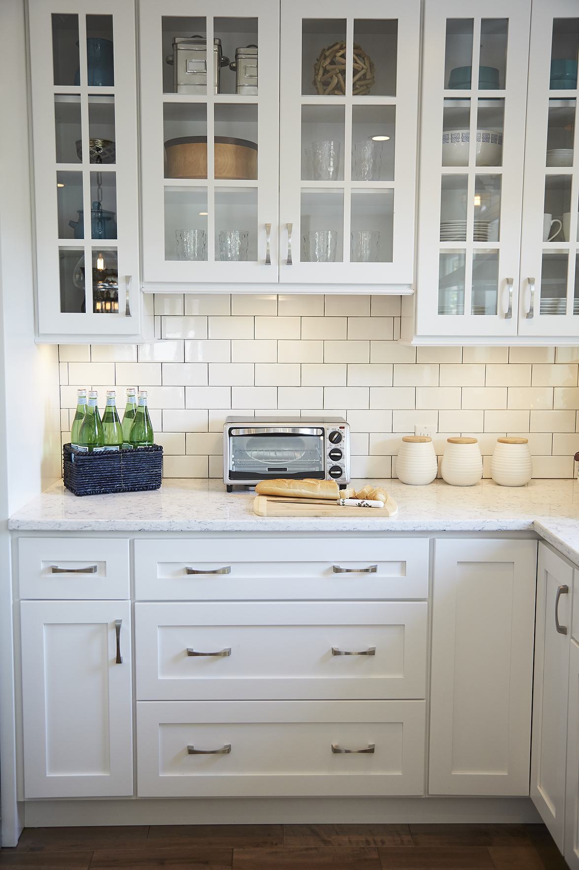
Below, the kitchen features upgraded base cabinets with recessed panels and pull-bar hardware. Above, the look switches up with glass doors that add a modern edge. The simple white brick tile backsplash with dark grooves ties it all together, with a marbled countertop adding plenty of extra prep space and designer appeal.
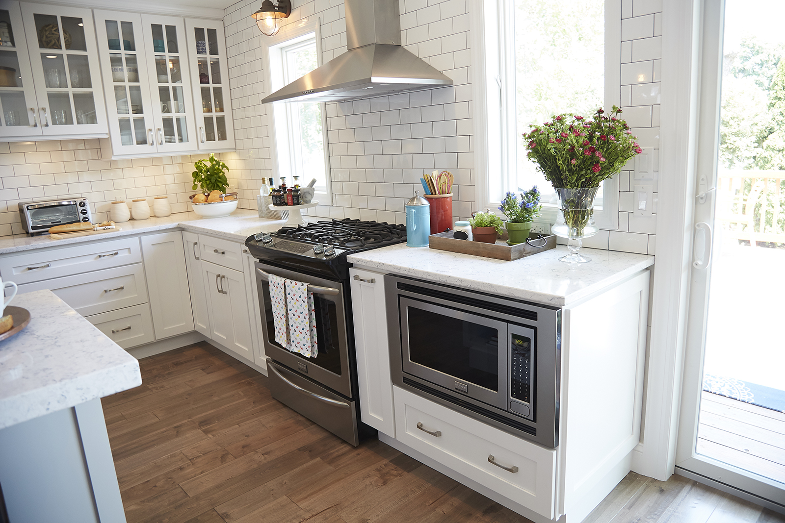
Built-In Convenience
Even the microwave is artfully built into this design, which means the overhead sight lines are kept clean and clear. Meanwhile a door to the patio adds tons of natural light and ensures an easy transition for those entertaining nights of barbecues and patio drinks.
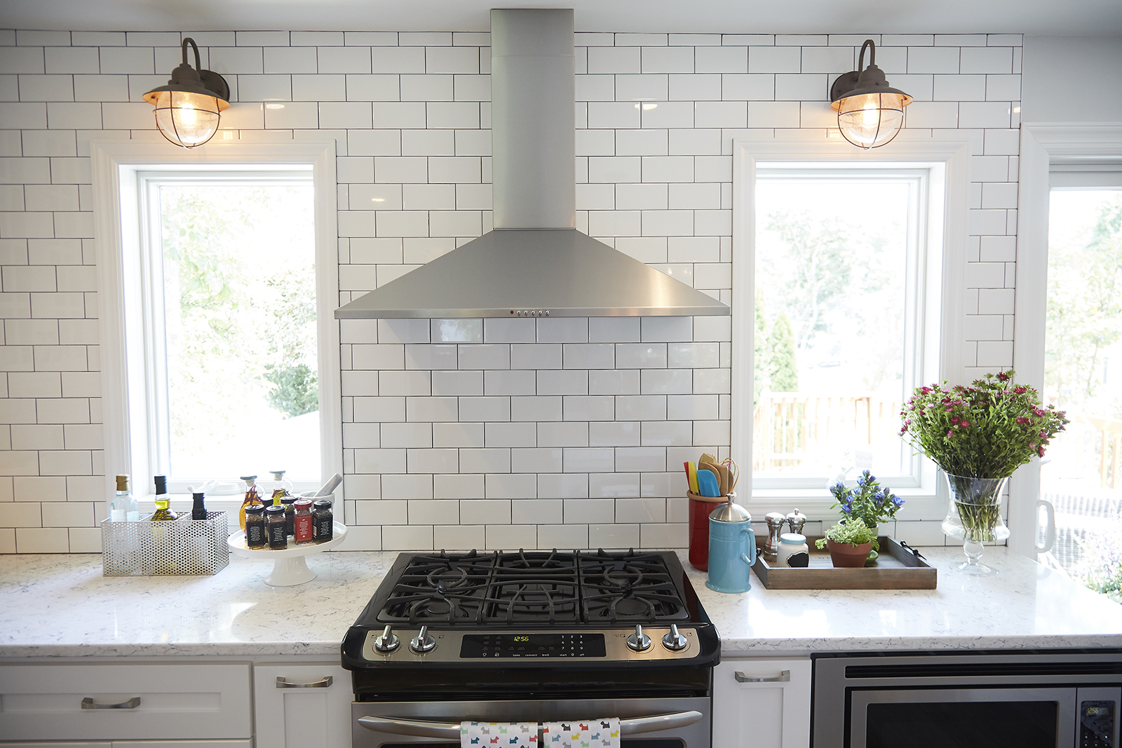
Industrial Touch
The unique backsplash continues to the ceiling along this wall, where two window cutouts add lots of natural light. In the evenings, a couple of iron wall sconces add extra lighting and a slightly industrial, modern feel. Meanwhile the exposed exhaust keeps the area clean and open, instantly enlarging the space.
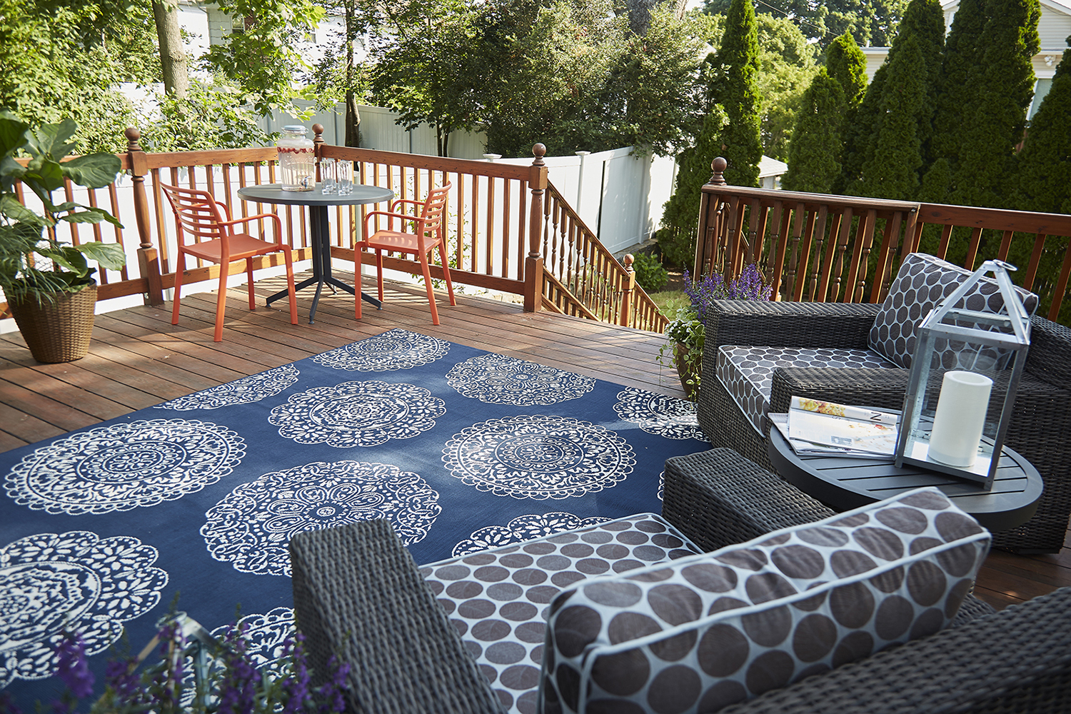
Outdoor Oasis
Outside, the brothers made the deck feel like an extension of the indoor living space with a weather-friendly rug and some outdoor arm chairs for relaxing in, along with a smaller table with a couple of chairs. It’s the perfect setup for a meal or drink, or for a more intimate space to sit during larger gatherings.
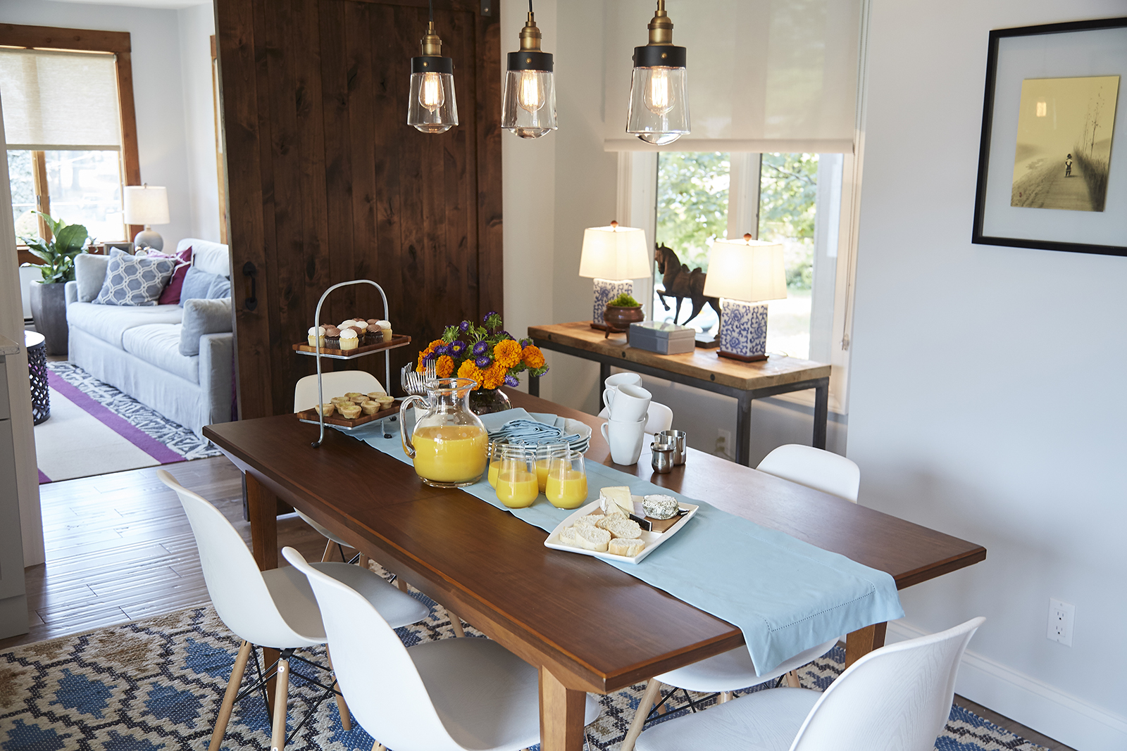
Easy Dining
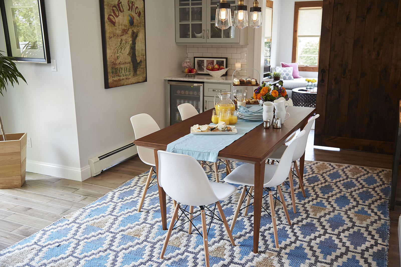
The rustic wood elements and pops of blue continue in the dining room space, where a large table and simple curved chairs are family friendly (and baby proof!). A simple table runner with a dessert stand and some fresh juice help stage the modern, country feel of this space, while a small side table with a horse statue and iron details along the back wall help complete that look.
Cozy Dining
More plants and a beautiful sliding barn-board door help achieve more of that rustic feel in this space. Meanwhile a blue-and-brown area rug in a simple diamond-patterned design adds a cozy feel to the space, tying the various elements together.
Entertaining Nook
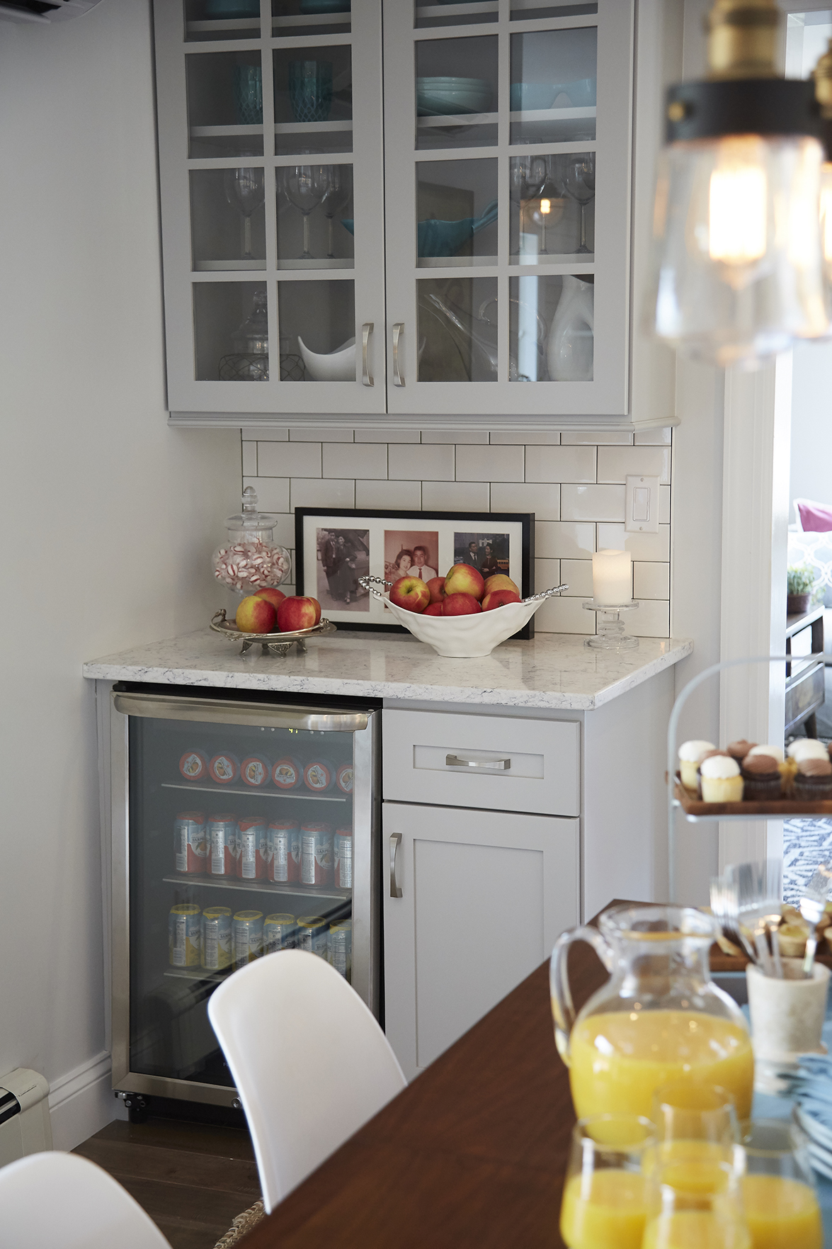
No gourmet dining room is complete without a small beverage nook, and this space is no exception. The brothers made the most of the small area behind the table by installing a mini fridge for wine, beer and juice, and installing a service area above. That same brick tiling from the kitchen serves as a backsplash, with extra cabinetry providing ample storage space.
Brilliant Sunroom
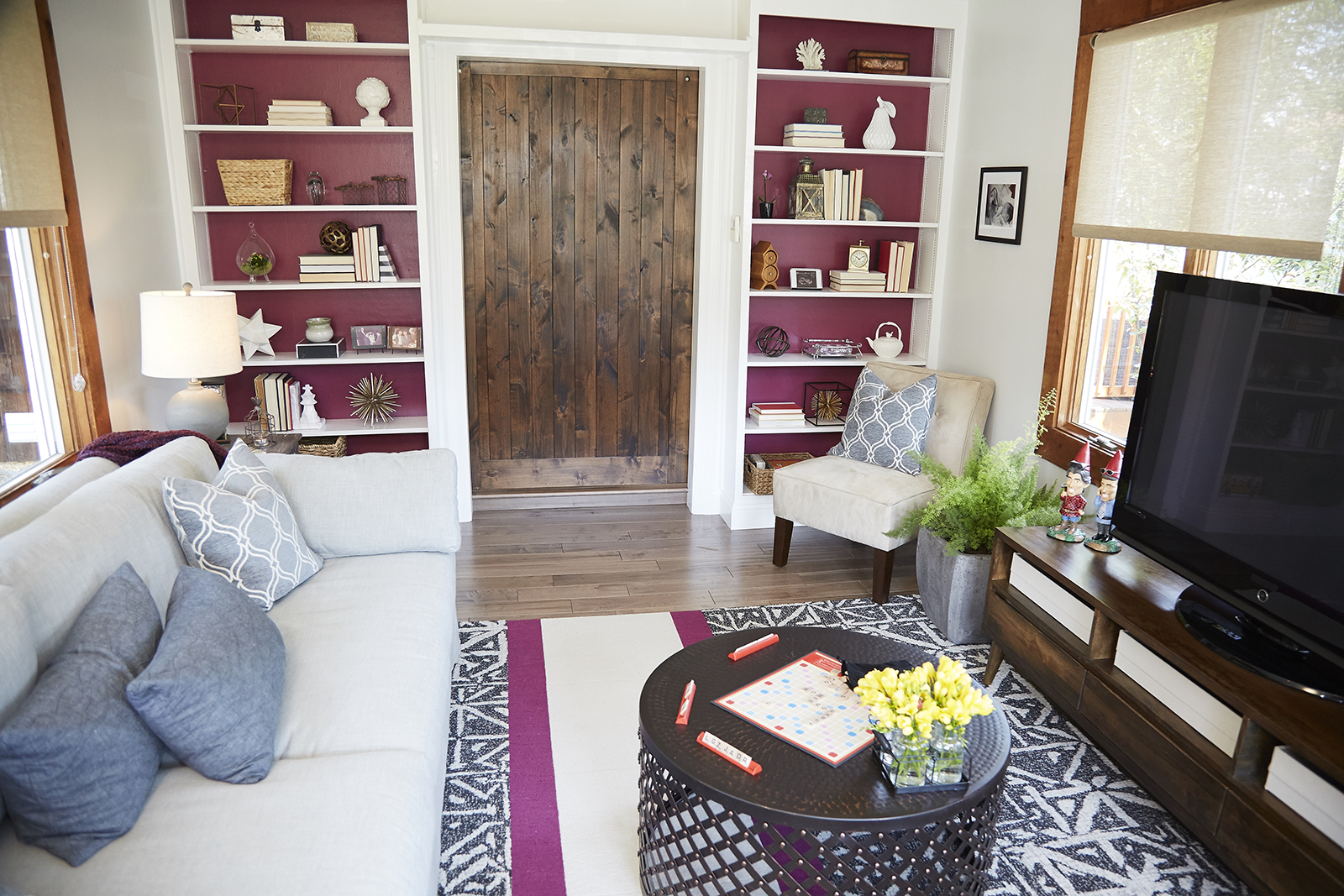
On the other side of the sliding door sits this bright and cheerful sunroom, with a touch of colour thanks to the purple behind the bookshelves and the simple runner below. Meanwhile some of those same blues are featured on the larger area rug and throw pillows, which are offset by neutral, cream-coloured furniture. A matching armchair and a media centre make this the ideal family space, capped by an artful coffee table that adds yet another designer touch.
Personal Space
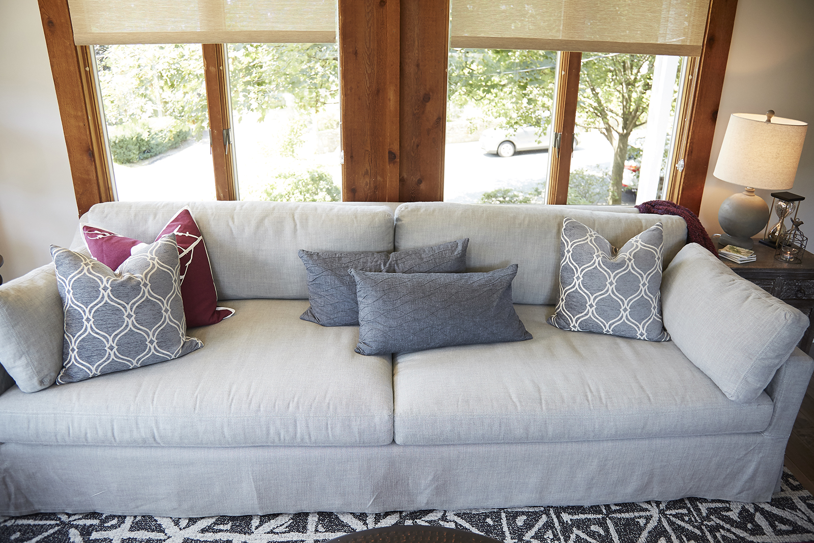
The oversized wood trim on the windows adds another rustic feel to the updated space, making this a cozy room that’s great for spending time in as a family. The oversized couch is plush and comfortable; perfect for naps or hangouts, while the side table adds even more function with its simple lamp and storage options underneath.
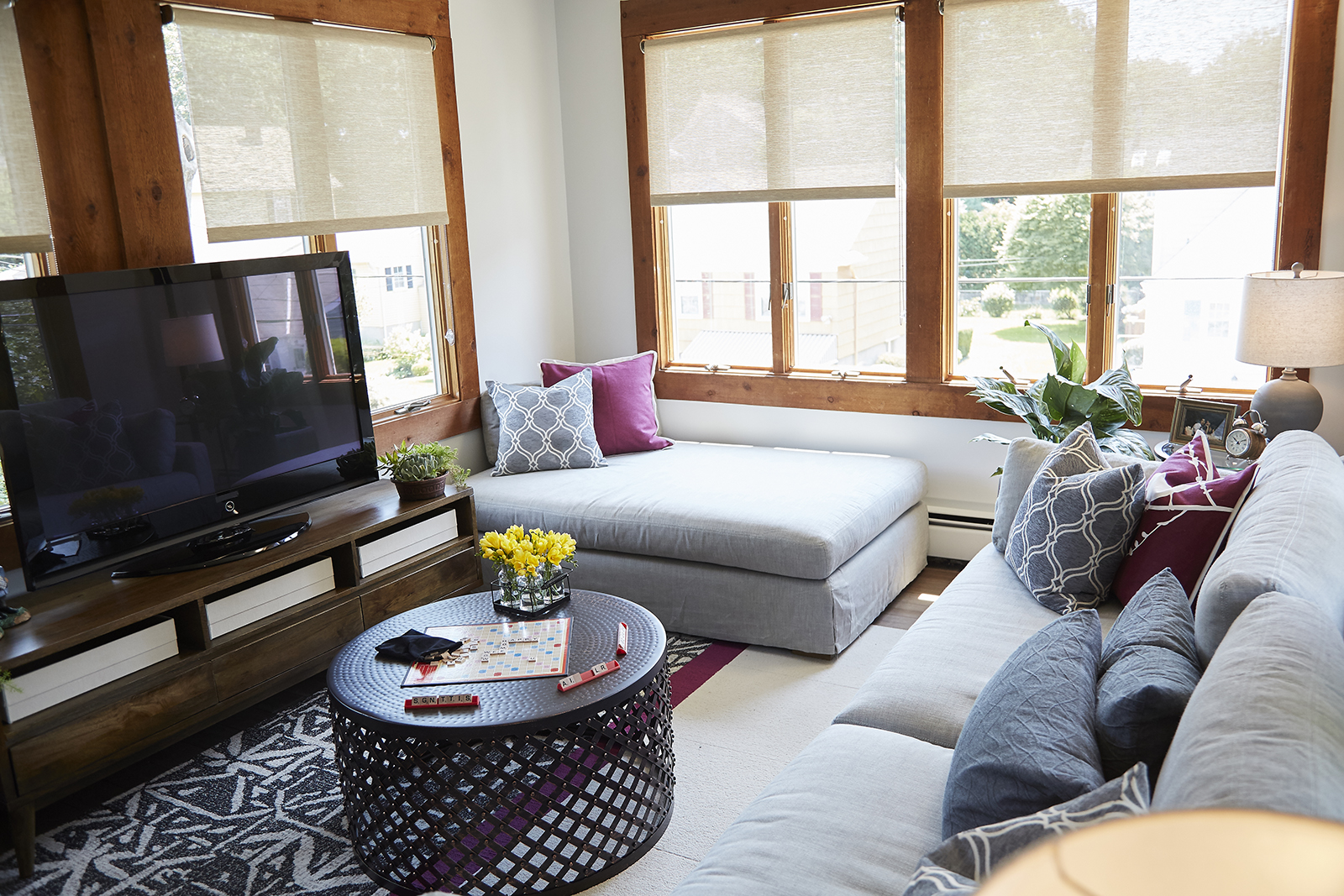
Custom Piece
Last but not least the brothers were able to incorporate this ottoman from Phillip’s personal collection; not only was he married to the oversized piece, but he insisted that it work within the space. Turns out the brothers had a solution for that by using it as a sun bench in this room, giving the homeowners one last personal touch that had them head over heels for this former fixer upper. After seeing the overall results, we can’t say we blame them.
HGTV your inbox.
By clicking "SIGN UP” you agree to receive emails from HGTV and accept Corus' Terms of Use and Corus' Privacy Policy.


