Julie and Paul were ready to move out of their starter home and into something a bit bigger, but they didn’t want to upgrade their mortgage along with their living quarters. So in came Property Brothers Jonathan and Drew Scott. Here’s how the dynamic duo helped this couple transform their cramped space into a coveted, open-concept layout that easily attracts buyers… and top dollars.
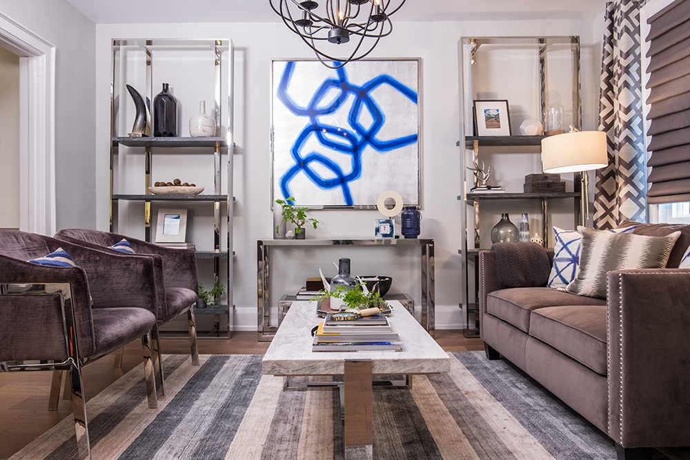
Artful Living
Fresh paint, new floors and uniform walls all lead to an updated and modern living room that’s sure to appeal to buyers with its cohesive look. Velvety furniture, a soft striped area rug and a standout art piece keep the space neutral but rich, like something you’d find in a showroom.
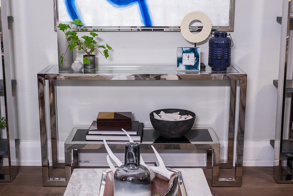
Neutral Accessories
It’s always important that homebuyers can see themselves living in the space, which is why personal knickknacks and photos are a no-go. As such, Jonathan and Drew staged this room to feel worldly and modern thanks to decorative items like this antler, vases with fresh flowers and an interesting timepiece.
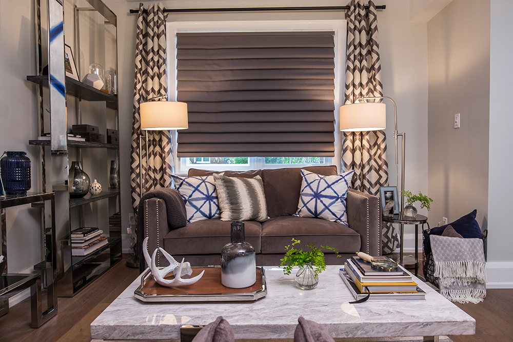
Upgraded Drapery
These blinds feel weighted and modern thanks to their dark colour and rich texture, and are perfectly paired with the cream-and-brown drapes accompanying them. A couple of smart lamps with neutral shades complete the look. Meanwhile, the area is made to feel even more cozy with some throw pillows and a basketful of blankets, meaning prospective buyers could easily see themselves curling up here after a long day at work.
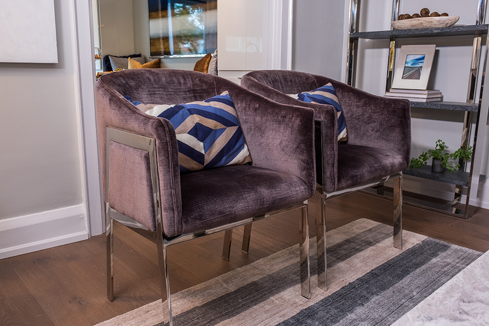
Extra Seating
In order to keep the space open and flowing Jonathan and Drew opted for a couple of matching armchairs opposite the couch rather than another sofa. The result is a space that still allows for ample seating, but one that doesn’t feel cluttered or small.
Modern Coffee Table
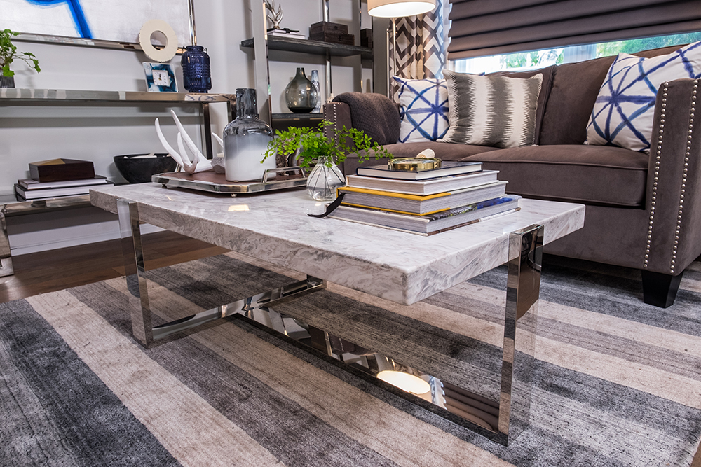
This marble coffee table with its industrial legs is a real showstopper in the living room, especially paired next to the dark furniture and atop of this area rug that ties in all of the room’s colours for a cohesive and purposeful look.
Classy Touches
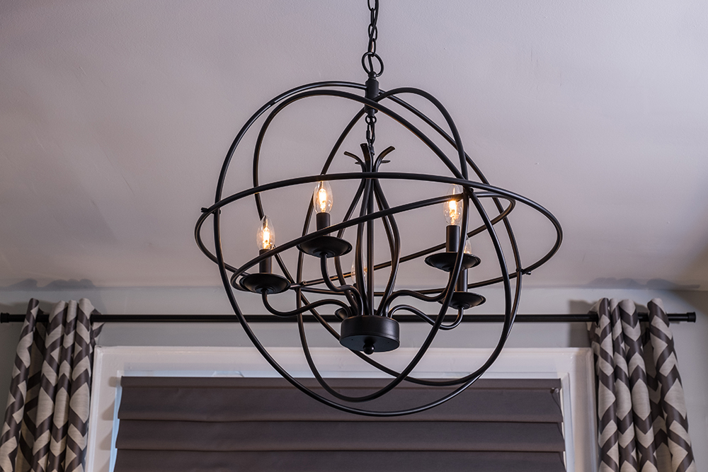
Julie was the first to admit she’d never think to put a pendant light like this in the room, but its artful and industrial design make it perfect for this updated and modern space. Who said pendants are just for eating areas, anyway?
Stylish Eating Nook
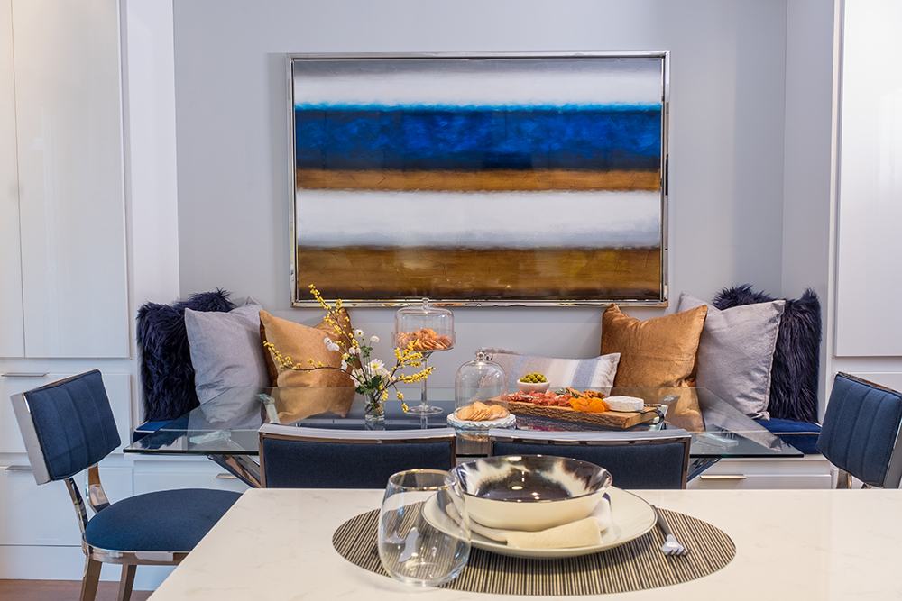
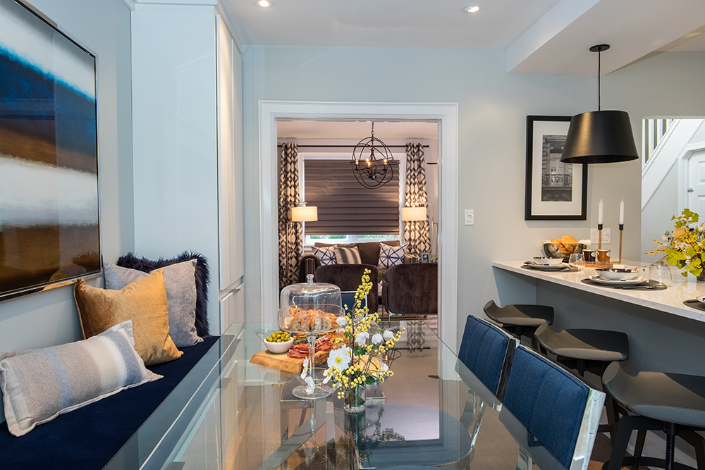
Before, an awkward wall separated the dining room and kitchen, making the layout feel cramped and cluttered. By removing that wall, Jonathan opened up one space into the next, enlarging the overall living area and giving the sellers more bang for their buck. He created this stylish nook where the dining room once stood, complete with bench seating and a large table with plenty of room for entertaining.
Hues of Blue
Small bursts of blue continue in this space thanks to the modern chairs and the brilliant painting above. Meanwhile a glass-top table ensures that light reflects throughout the space and keeps it uncluttered. A few fresh flowers, a serving tray and a cake stand complete the look.
Small Comforts
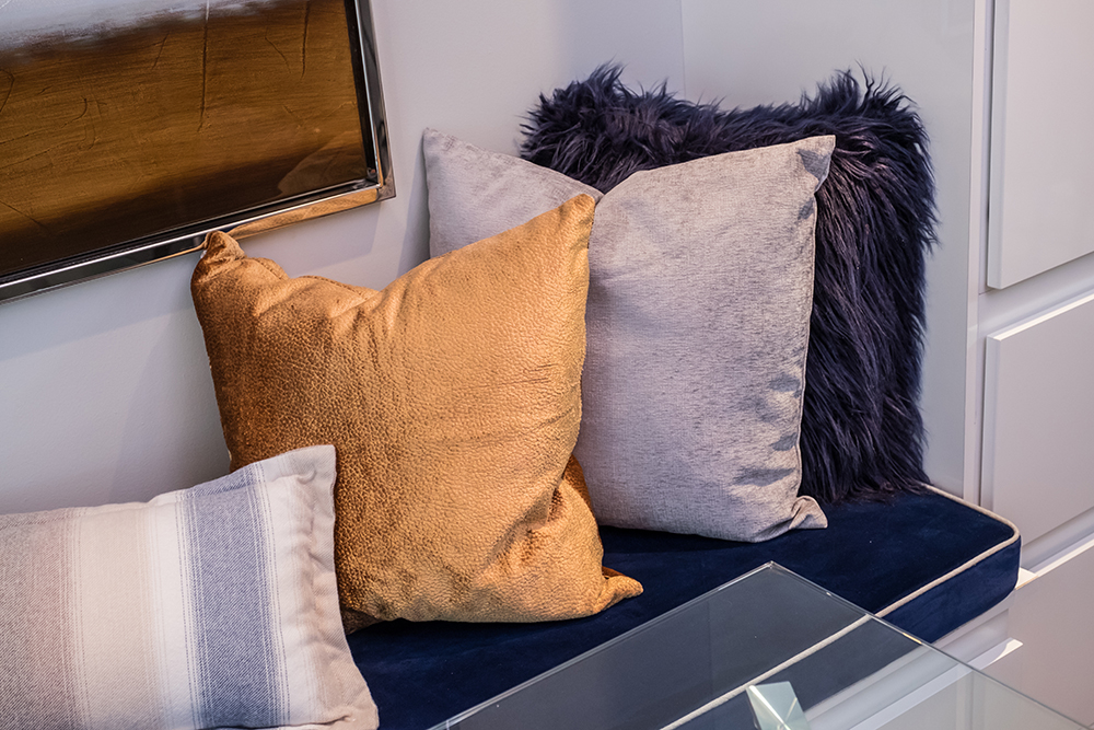
On the custom bench, the brothers added these luxurious throw pillows in the same blues and greys featured through the rest of the house, adding in a pop of gold for a rich and modern effect.
Expanded Kitchen
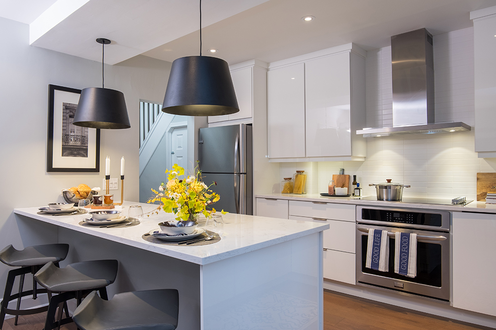
Where a wall once stood Jonathan installed this beautiful island with extra seating and storage instead, really maximizing functionality. New flat-top cabinets in a modern finish and some stainless steel appliances all work together to create an updated space that ensures any potential buyers feel as though they’re purchasing something custom and special.
Entertaining Area
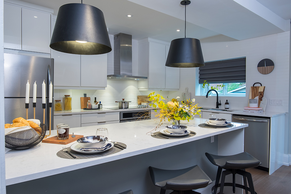
It’s easy to see small gatherings happening here thanks to the large island and overall flow; it’s also a great kitchen for a starter family thanks to the storage space and functionality that the extra countertops provide.
Continuous Flow
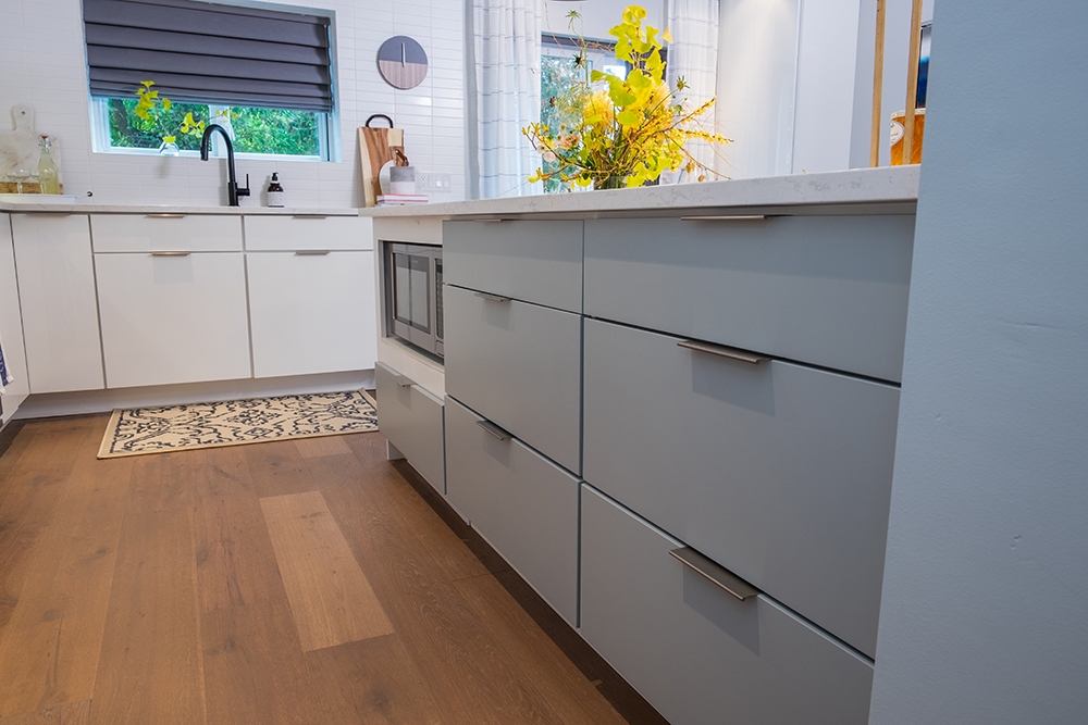
On the other side of the island you can see the hardwood floors continue, helping to give the main floor a flowing feel. Drawers have also been added for some bonus storage, while a built-in microwave is slightly hidden from sight lines.
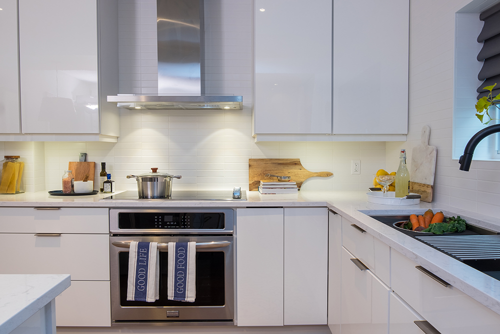
Maximized Space
Every square inch of this kitchen is in use, with the cabinets reaching to the ceilings and plenty of drawers underneath. Upgraded hardware feels modern and lends that same industrial vibe featured throughout the rest of the house, while bonus lighting under the cabinets adds another little extra touch.
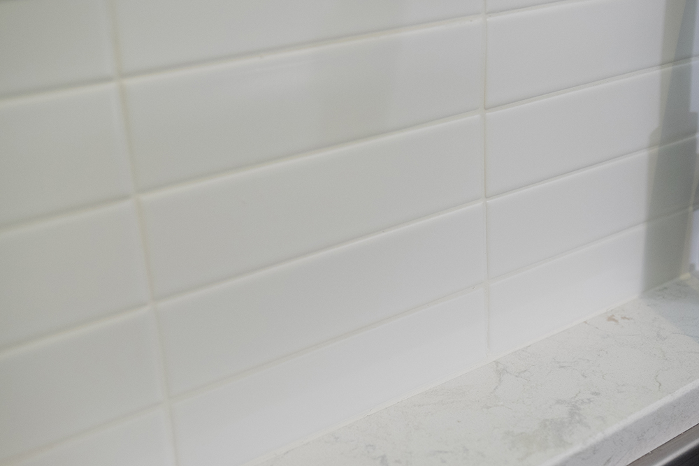
Neutral Backsplash
In order to keep sight-lines open and the space bright and welcoming, the brothers selected this white brick tiling for the backsplash. It’s a clean but modern look that works with any new homeowner’s vision.
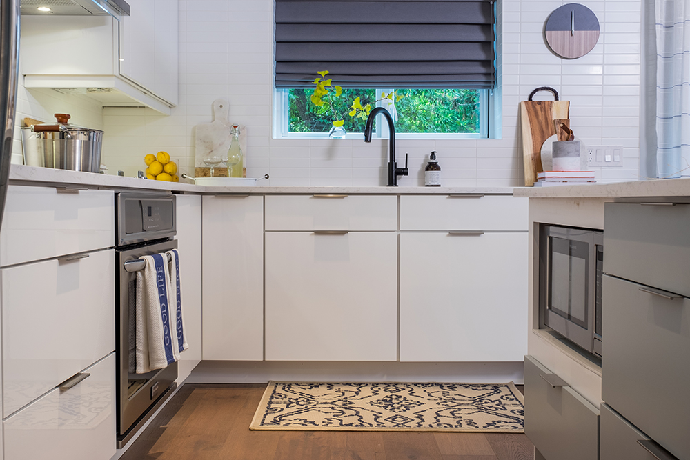
Reconfigured Space
Before, this was one of three doors leading out to the back porch. By turning one of those doors into a window and moving the sink to that area instead, Jonathan further opened up the kitchen, increased space and gave potential homeowners a brand new view of the backyard.
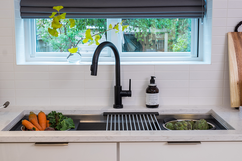
Small Upgrades
This three-piece sink and its upgraded faucet are yet another example of a high-end finish designed to capture the big bucks. It’s no wonder that with so many upgrades Julie and Paul were able to sell their home for way above the house’s original quoted value, easily helping them to make a lateral move to their next new abode.
HGTV your inbox.
By clicking "SIGN UP” you agree to receive emails from HGTV and accept Corus' Terms of Use and Corus' Privacy Policy.


