When homeowners Emily and Ken sold their condo faster than they had expected, they were forced to move in with family. But with a baby on the way and limited personal space, the couple knew they had to enlist Property Brothers‘ Jonathan and Drew Scott for help. Not only did Drew find them a home within their dream neighbourhood, but Jonathan was able to transform it into a bright space with mid-century modern style. Here’s the end result.
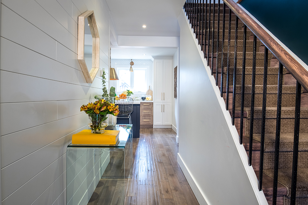
Warm Welcome
The narrow entrance is simple yet elegant thanks to the panelled walls and bursts of sunny yellow. The hardwood’s subtle rustic finish adds instant charm, while the clear acrylic table keeps the space open and free.
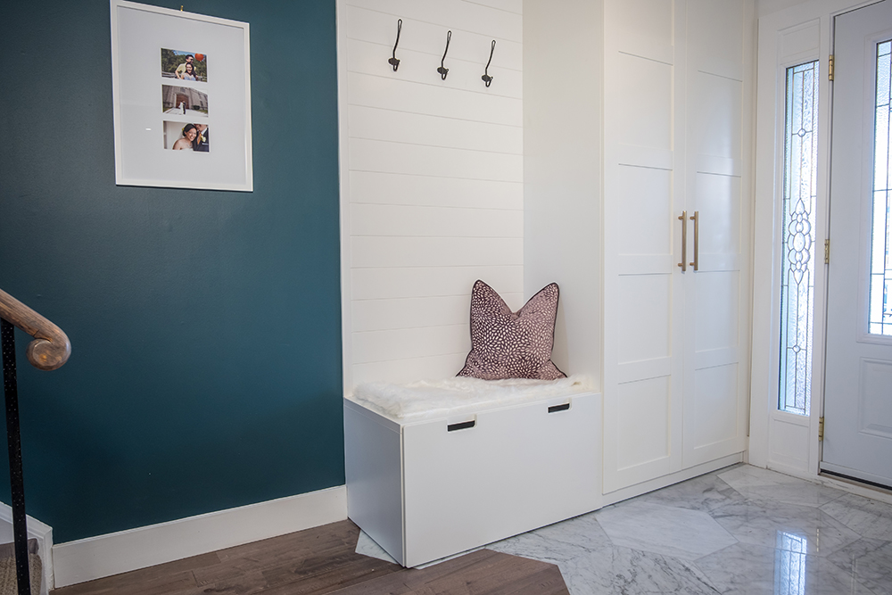
Storage Solutions
Because the front entrance is so narrow, Jonathan created a mudroom of sorts with custom cabinets. The clever addition adds storage and seating space without overcrowding. Simple wall hooks are pretty but functional, while the honeycomb floor tiles help to define the area.
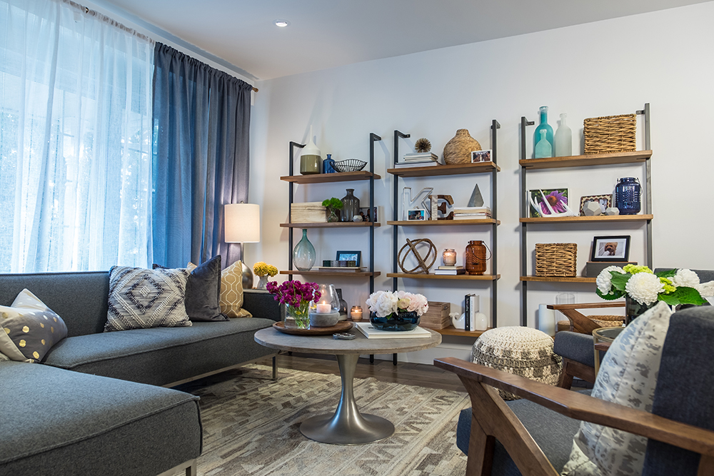
Living Large
This couple had many personal knickknacks to incorporate into the space, which Jonathan showcased on these pretty open shelves. The overall look doubles as a makeshift feature wall and lends instant personality to the cozy living area.
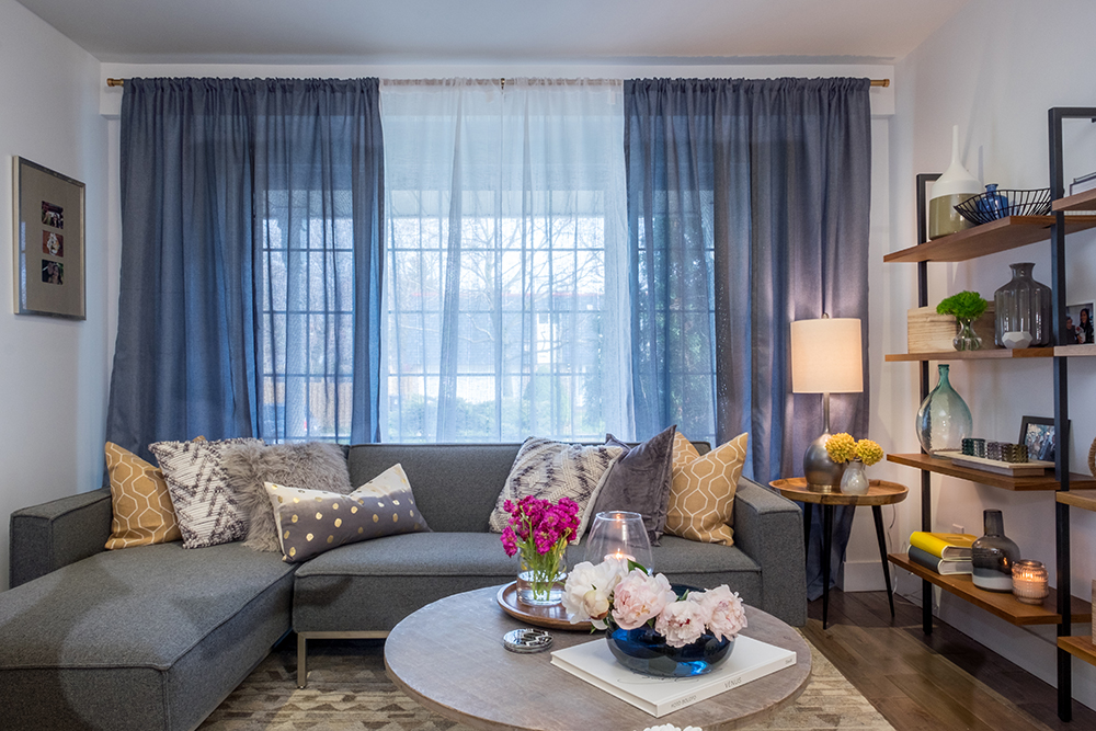
Streamlined Look
To achieve that modern mid-century look, Jonathan opted for clean-lined furniture and natural wooden elements, then brightened up the space with cheerful blooms.
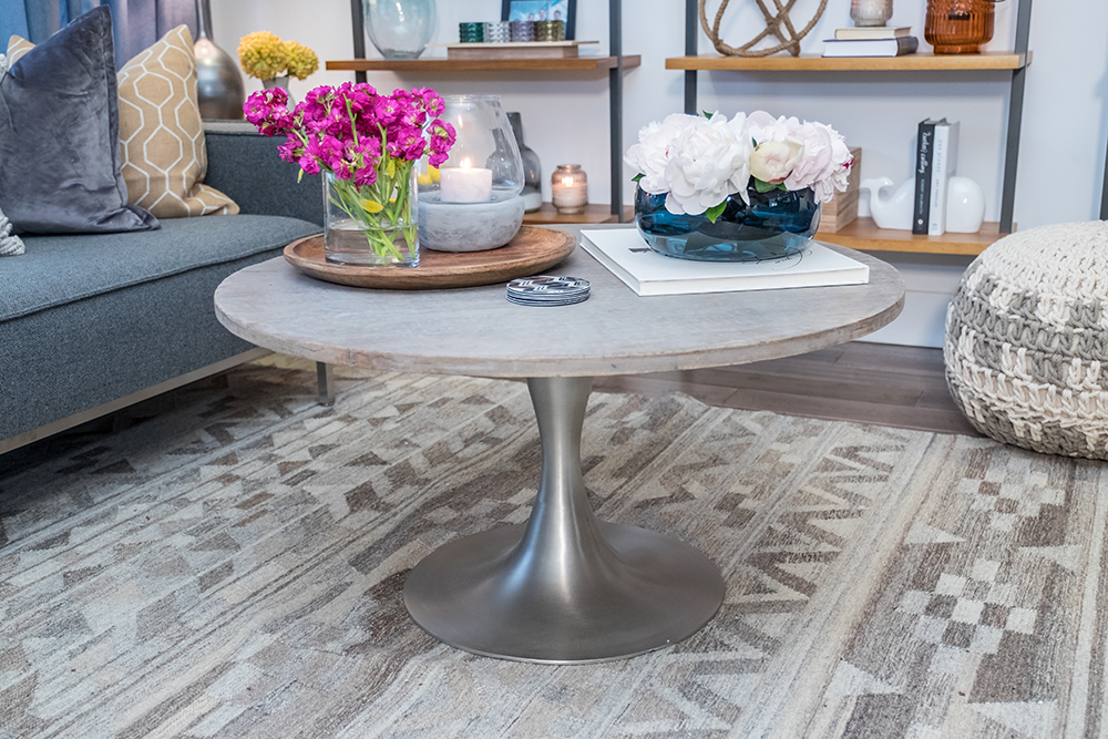
Natural Elements
Warm wooden elements coupled with subtle hits of grey make for the perfect pairing. Take this coffee table, for instance. Its soft wood finish ties into the rug below, while the glossy metallic stand keeps the look modern and refined.
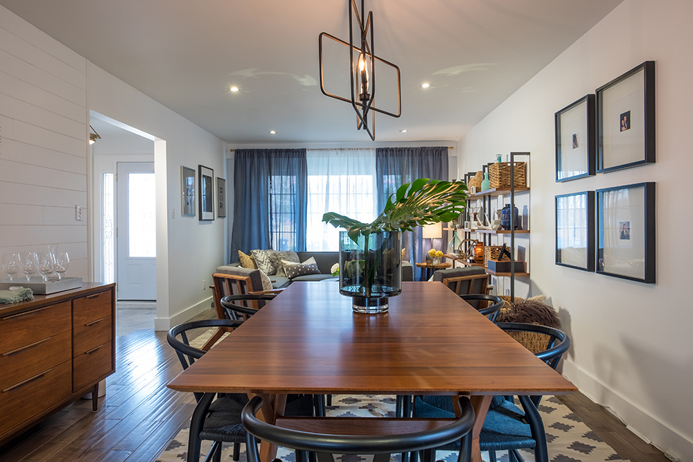
Dining Experience
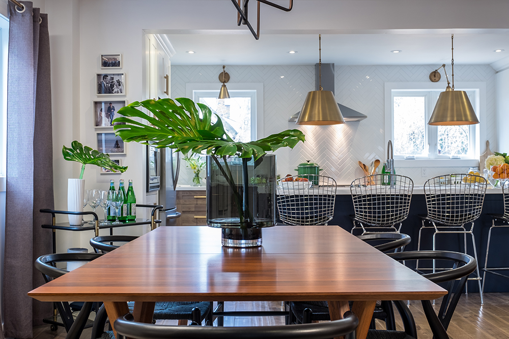
The natural finishes continue into the dining room thanks to the sleek wood table and bentwood chairs. Rather than stage the room with an extravagant table setting or centrepiece, Jonathan kept the look simple with natural greenery set in a modern vase.
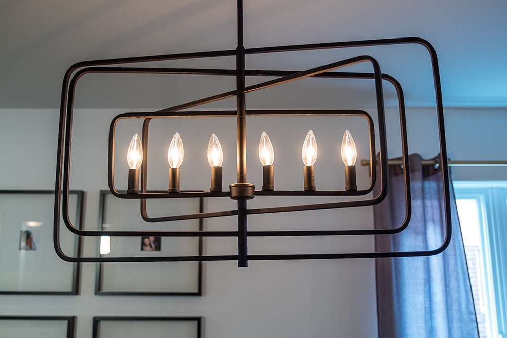
A Space to Light Up About
Even the chandelier is streamlined thanks to its rectangular design. The candle-inspired light bulbs lend a romantic glow to the space while keeping sightlines open.
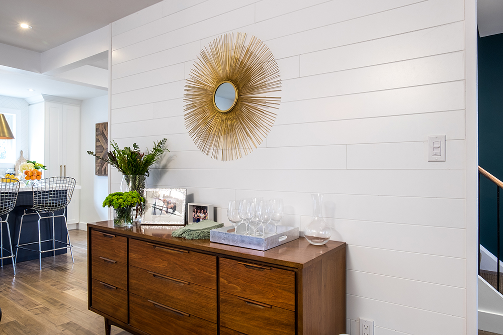
Repurposed Piece
This area was originally supposed to feature a wet bar, but when unexpected costs rose and the home’s structure needed help, the homeowners presented Jonathan with this hutch instead. Its natural wood finish pairs nicely with the dining table and floorboards. The crisp white panelled wall behind adds even more texture to the space.
Nooks and Crannies
Jonathan ensured every nook and cranny served a purpose. Take the corner area that features a bar cart, for example. The cart is perfectly situated between the dining room and kitchen, but thanks to a few framed photographs on the wall beside it, it fits right into the home’s overall design.
Modern Pieces
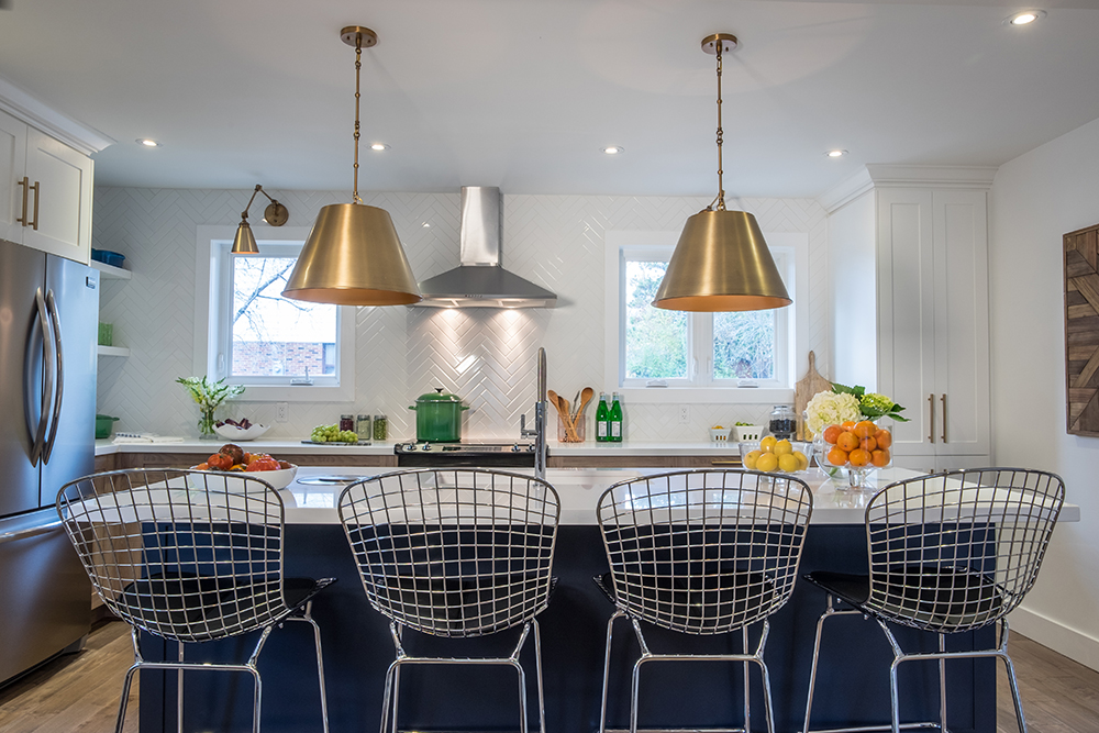
The kitchen’s large island is functional in more ways than one: it’s a great prep surface and also helps to separate the kitchen from the adjoining dining room. The wire-framed chairs add modern appeal and play nicely off the kitchen’s rich blue and gold accents.
Built-In Appliances
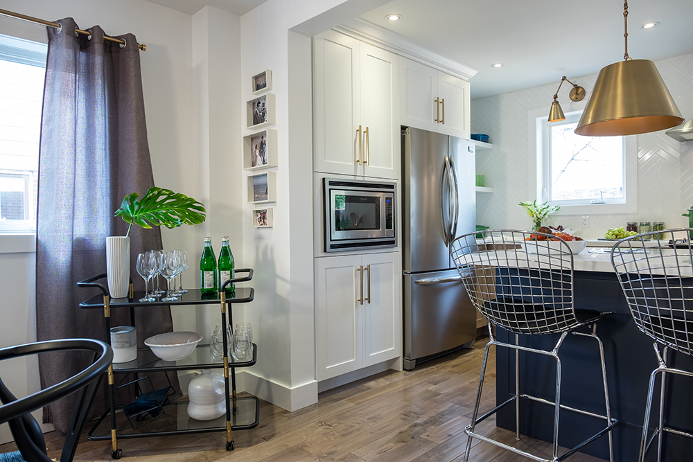
High-grade appliances are essential in any modern kitchen, but they can be eyesores when improperly incorporated into a design. Here, Jonathan kept the look streamlined by integrating the fridge and microwave into the cabinetry.
Hidden Storage
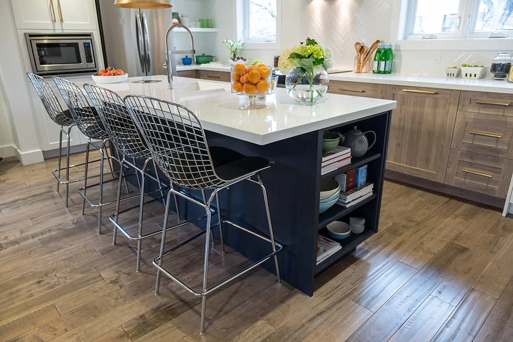
Jonathan snuck extra storage space into the island to store everything from cookbooks to dishware. It’s a great solution for keeping items off the counter while still having them close at hand.
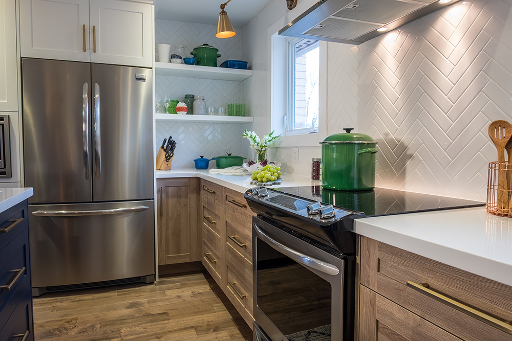
Simple Backsplash
The elegant (and inexpensive!) white herringbone backsplash is a perfect counterpoint to the wood cabinetry and flooring. By keeping the look bright, the kitchen appears larger, all while achieving that rustic-meets-modern effect.
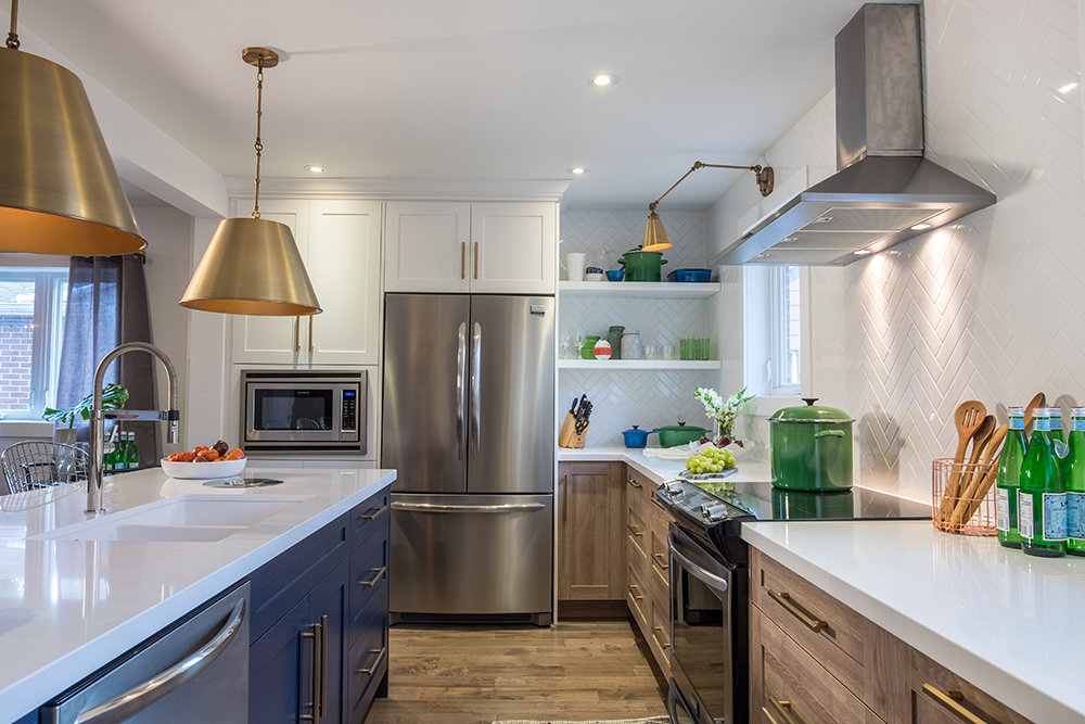
Bonus Shelves
Instead of boxing in the space with more cabinetry, Jonathan flanked one side of the fridge with open shelving. The shelves are ideal for displaying eye-catching cookware, and also add to the space’s open and airy feel.
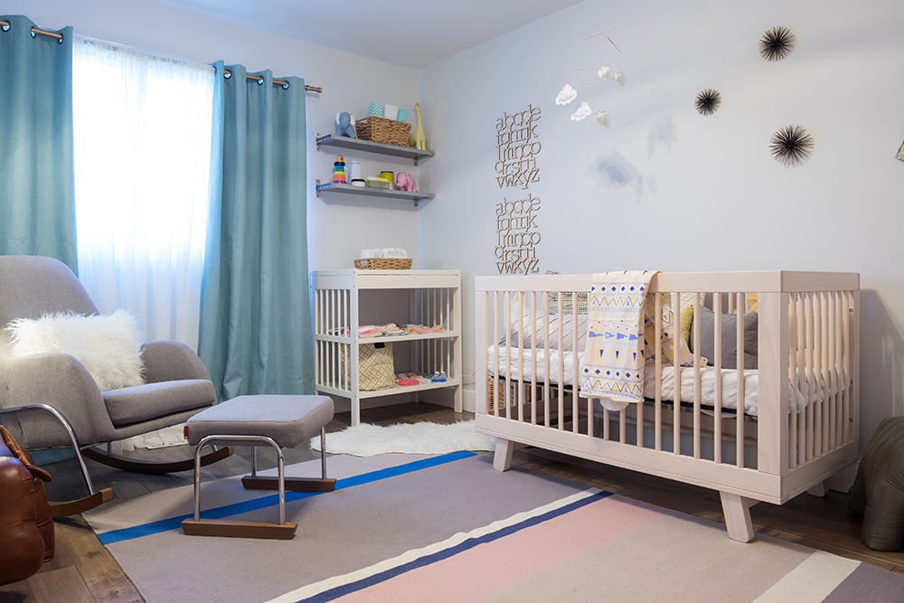
The Nursery
Husband ken is a bit of a hands-on dude, so his wife worked with Jonathan to secretly design this nursery as a surprise. The room’s soft blue, grey and pink palette makes it a stunning and soothing space for the baby girl to be.

Simple Details
We love the playful and eye-catching details Jonathan added to the nursery. Who says you can’t double up on design elements for a little extra impact?
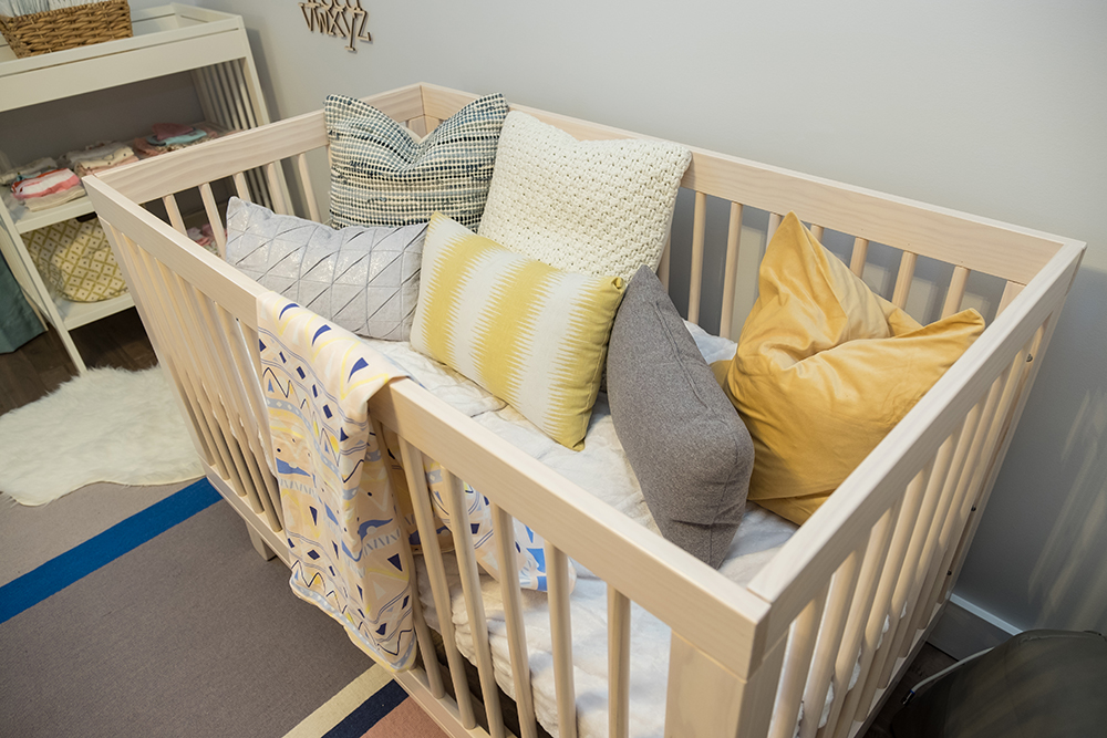
Bonus Textiles
Even though the homeowners will be taking out all these pillows once the babe arrives, they add a fun and cozy design element for the time being. We wish we could crawl in there and take a nap!
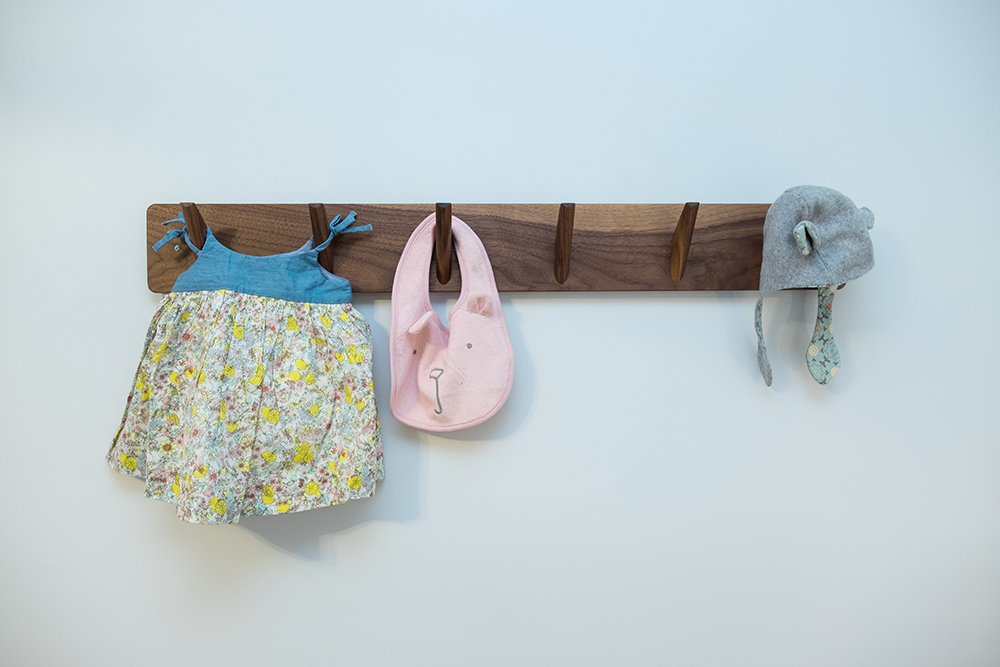
Functional Design
This wall-mounted rack is a staple piece that will grow with the child as she gets older. Sure, it’s perfect for displaying all those way-too-cute baby items now, but it will also be great for hanging coats and robes down the line.
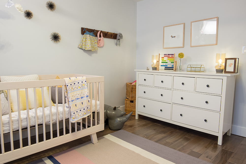
Storage Options
Know what every teeny, tiny baby has? A bunch of teeny, tiny baby clothes that need to be sorted and washed at every turn. Jonathan made sure this babe will stay organized thanks to an oversized dresser with lots of different drawers.
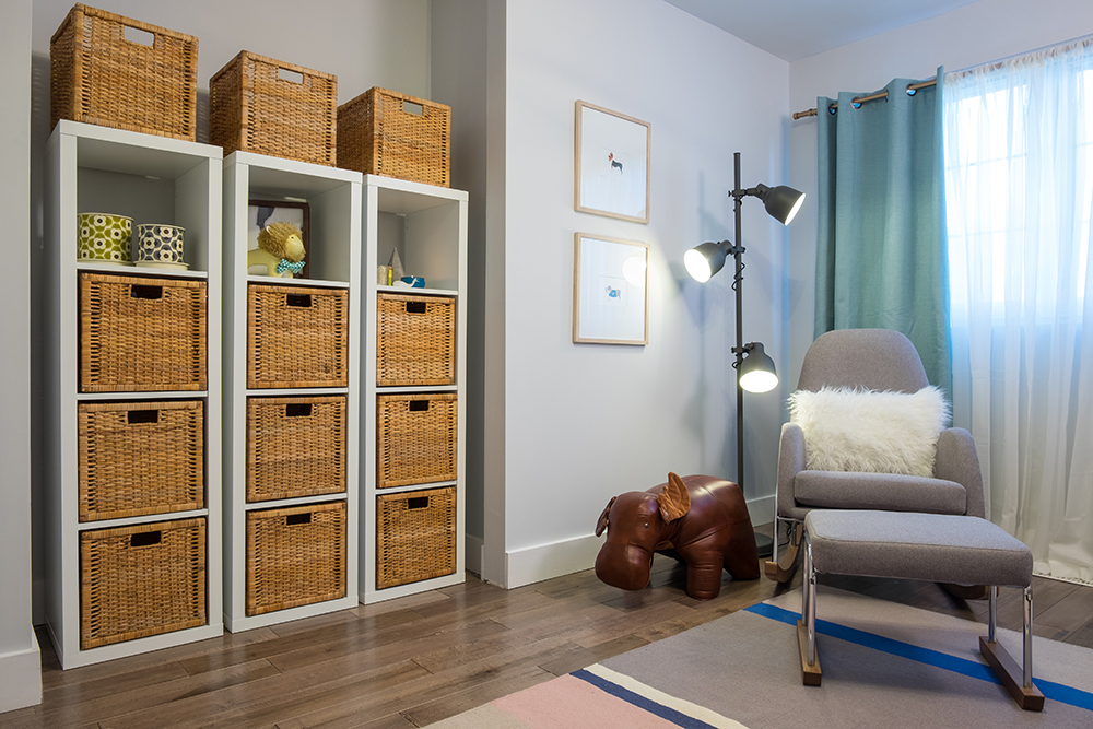
Stacking Up
Jonathan maintained the home’s modern mid-century look in the nursery, too. The cubby storage unit stocked with wicker baskets is perfect for hiding stuffed animals and baby toys. Not to mention, the stylish rocking chair and lamp are a life-saver for all those late night feeds.
HGTV your inbox.
By clicking "SIGN UP” you agree to receive emails from HGTV and accept Corus' Terms of Use and Corus' Privacy Policy.


