Gail and Mike loved their home when they built it from the ground up, but over the years, they grew less and less proud of its design. With drab decor, an aging kitchen and a less than welcoming living room, the abode was no longer an inspiring place to be. That’s when Jillian Harris and the Love it or List it Vancouver team stepped in, completely transforming the main floor into a stylish entertaining haven. The designer also managed to give the couple the ensuite of their dreams. Ready to be hit with a serious case of decor envy? Read on.
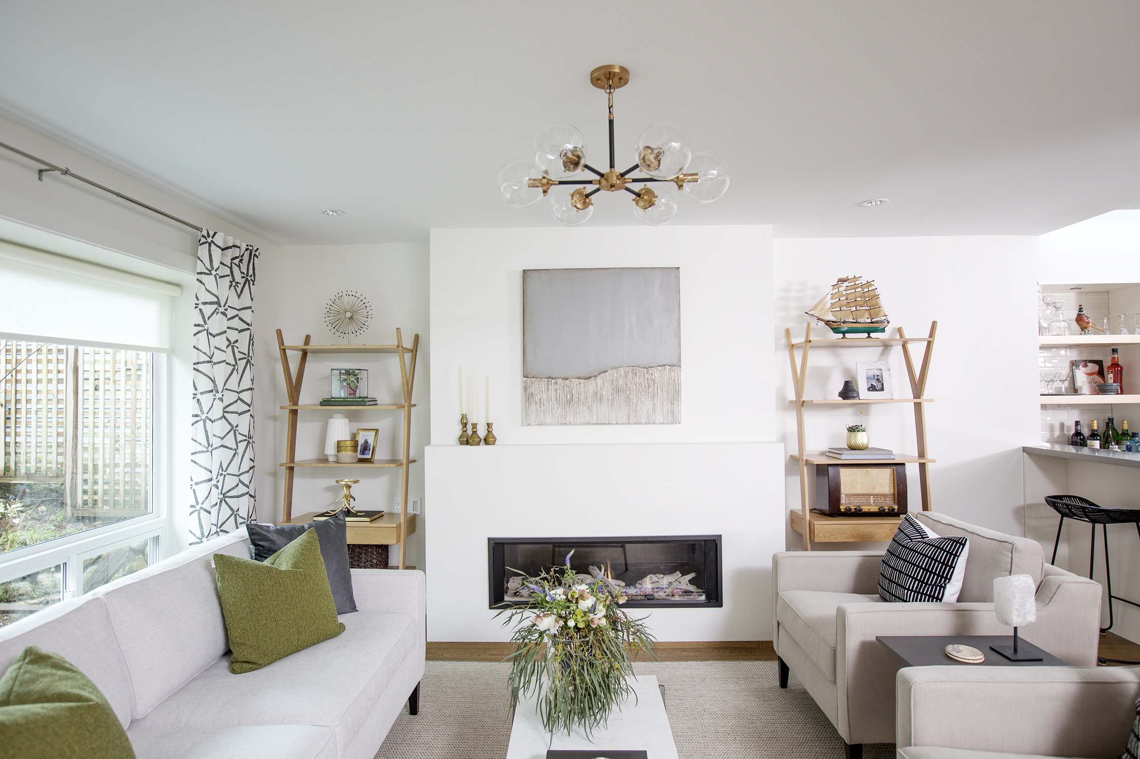
Fresh Front Room
Designer Jillian Harris warmed up the home’s front room with neutral colours that bring forth a crisp and contemporary feel. A few pops of green channel the outdoors, while simple artwork and ladder-style shelves add designer appeal.
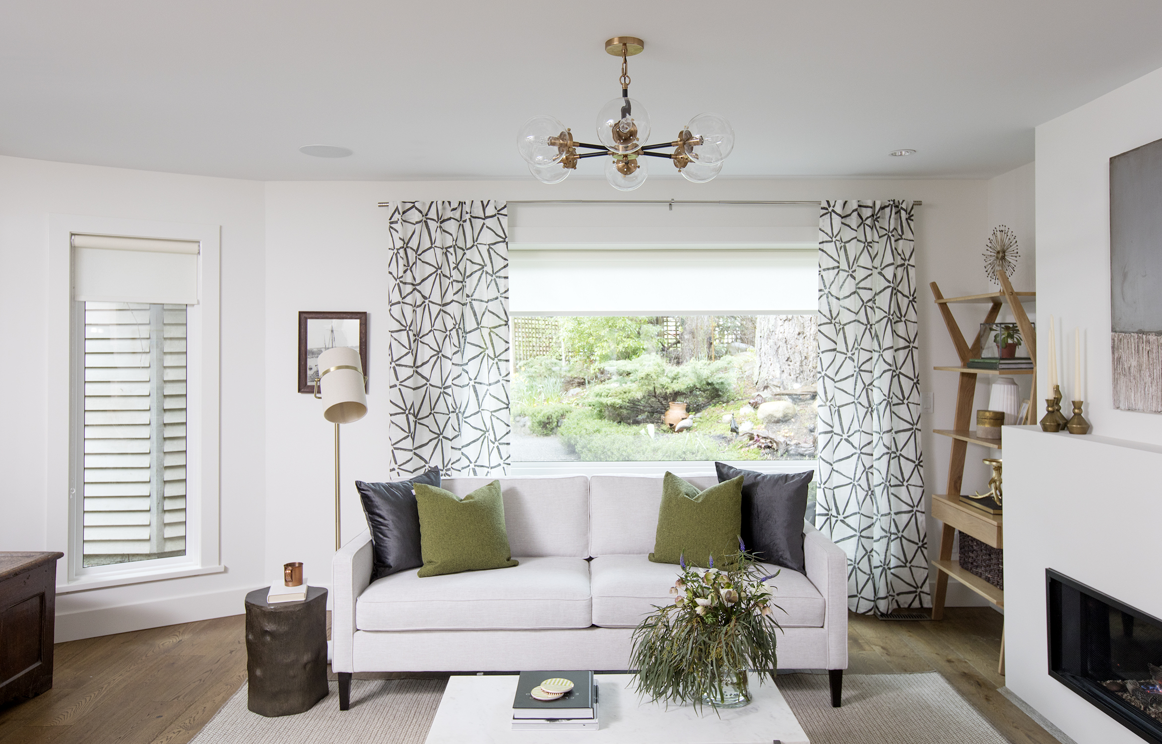
Natural Light
The designer took advantage of the home’s natural light with a large picture window. The brightness is amplified thanks to the crisp white walls and new oak flooring. Darker elements, such as the throw pillows and side table, provide intriguing contrast.
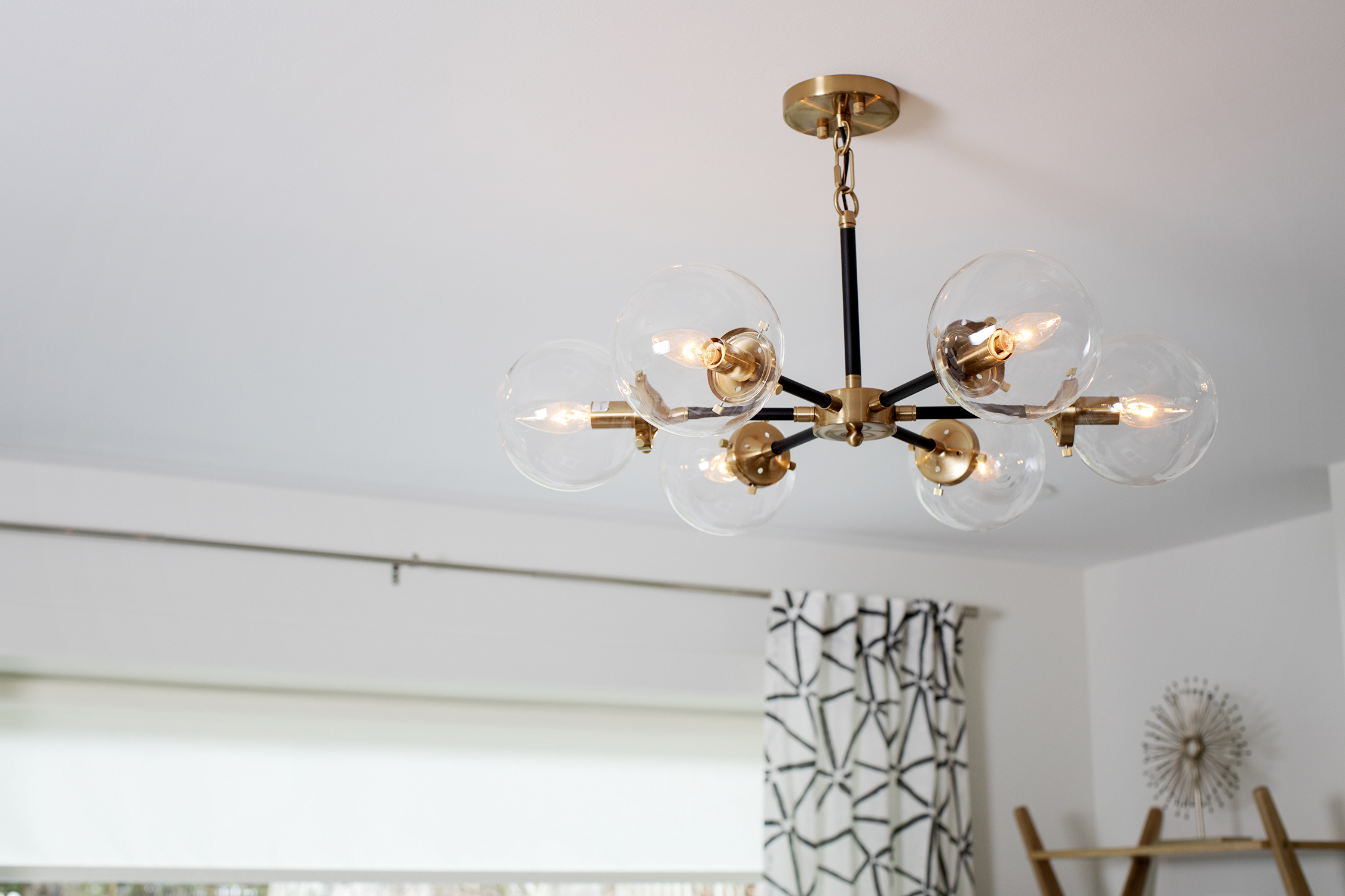
Intricate Lighting
The contemporary light fixture adds a glam note to the living space. Its brass detailing also lends warmth to the mostly white space.
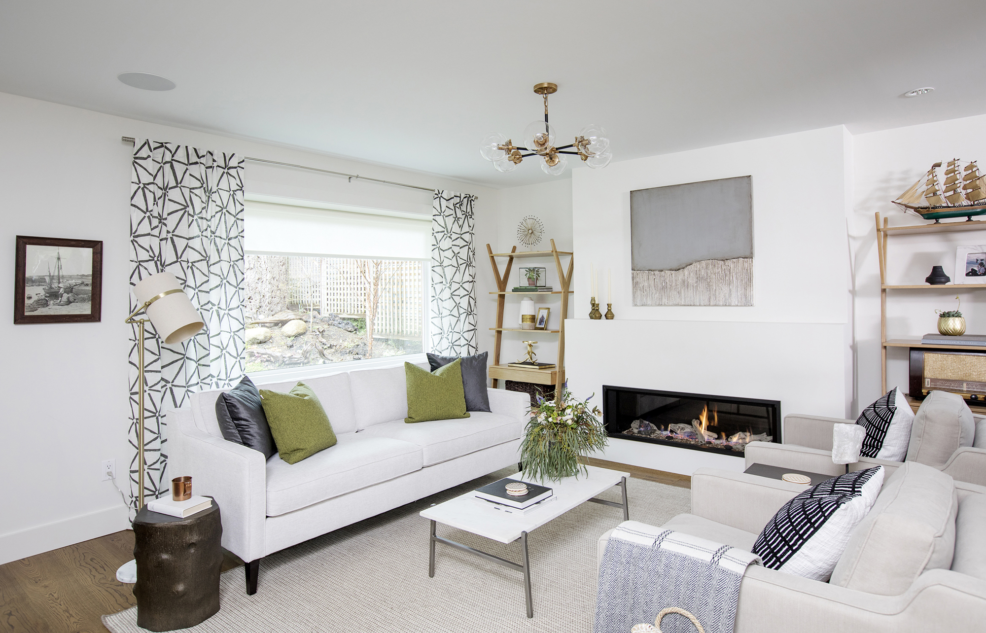
Finishing Features
Features like the bold patterned drapery and soft-hued area rug introduce a healthy hit of texture without taking away from the other stylish elements in the space.
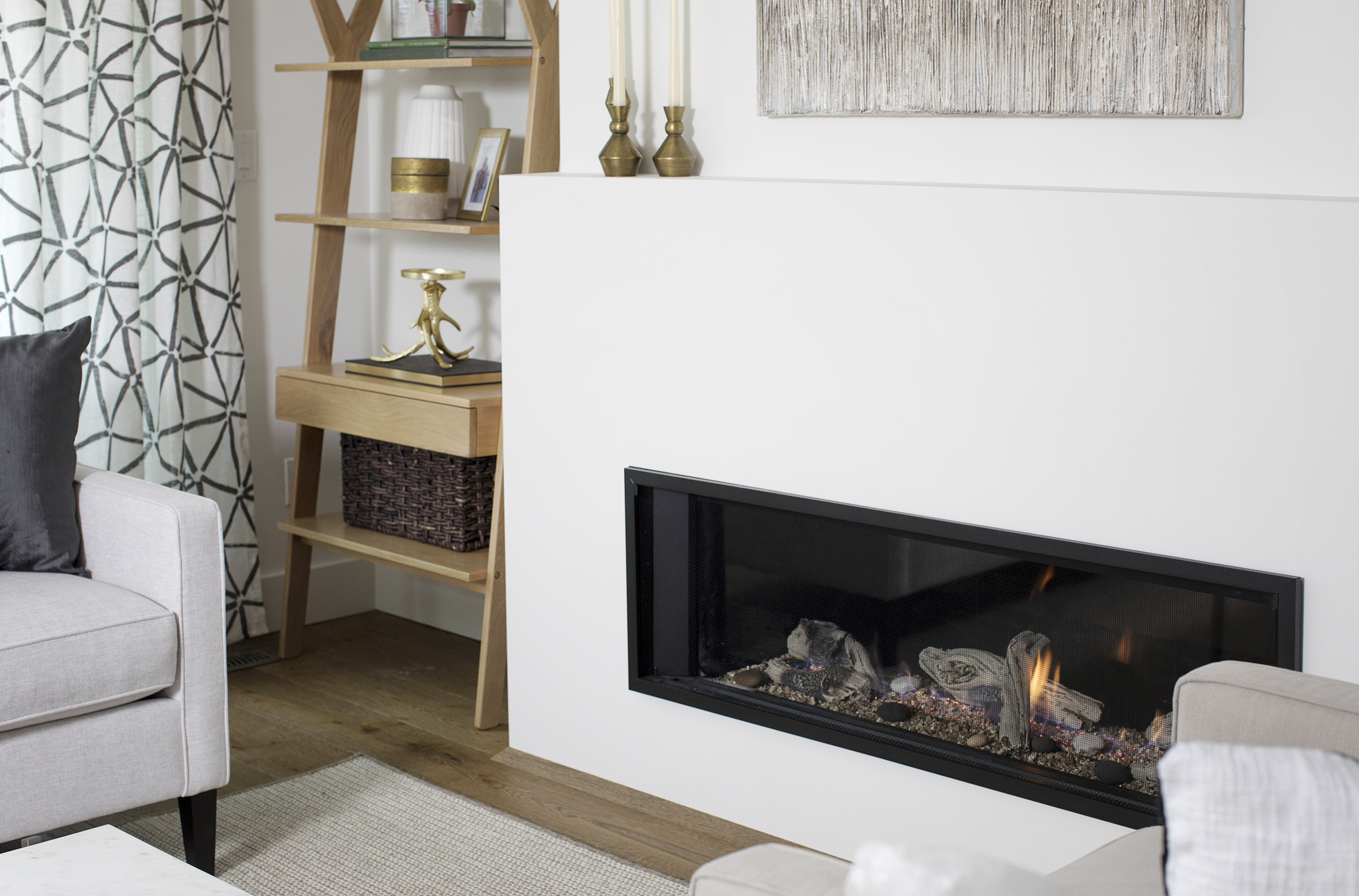
Modern Fireplace
This updated fireplace adds instant warmth to the room thanks to both its pretty look and functionality. Its streamlined design doesn’t take up much space either, yet it still serves as a focal point.
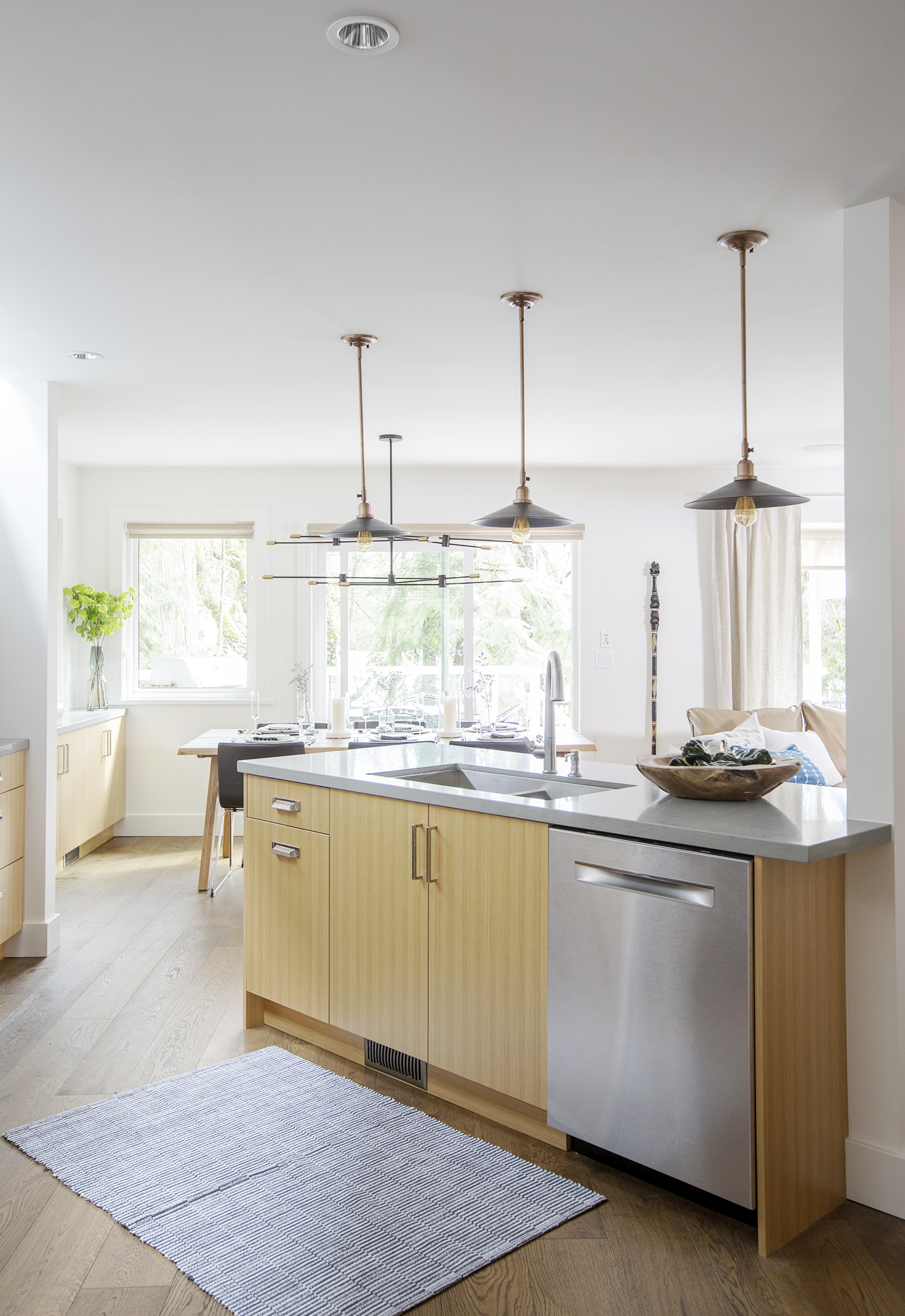
Open-Concept Kitchen
There was nothing Jillian could do about the support beam to the right, but she managed to work around it to give this couple a modern kitchen they’ll want to show off. It all starts with this central island, which overlooks the dining and living rooms.
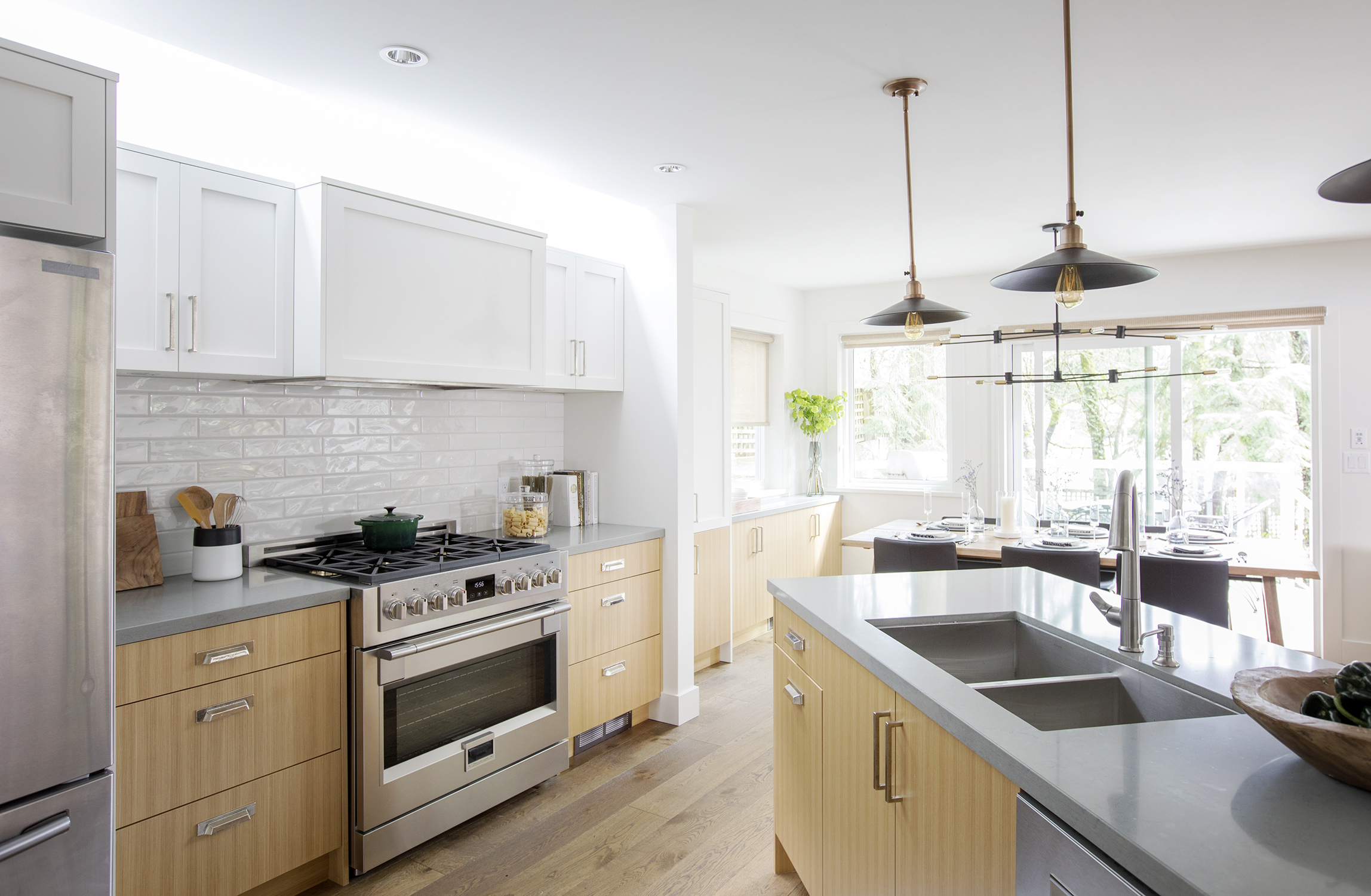
Custom Cabinetry
New upper and lower cabinets add a custom, two-toned effect to the space, lending instant texture and depth. The result is a contemporary yet classic feel that’s warm and inviting.
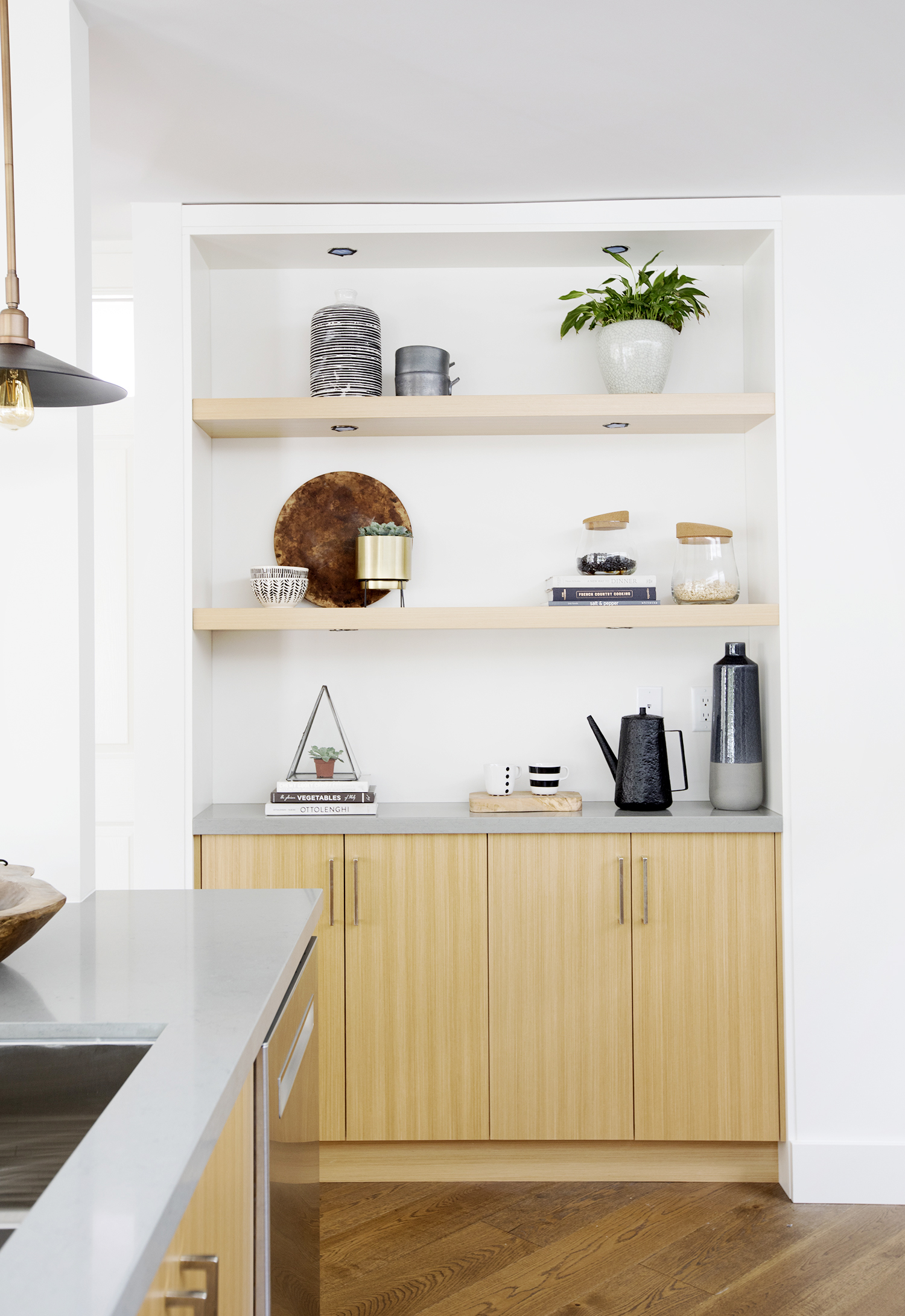
Floating Shelves
We love the look of this serving nook with floating shelves, which happens to feature extra pot lighting underneath. It’s a brilliant way to display cherished cookbooks, jars, photos and other knickknacks that showcase the homeowners’ personalities.
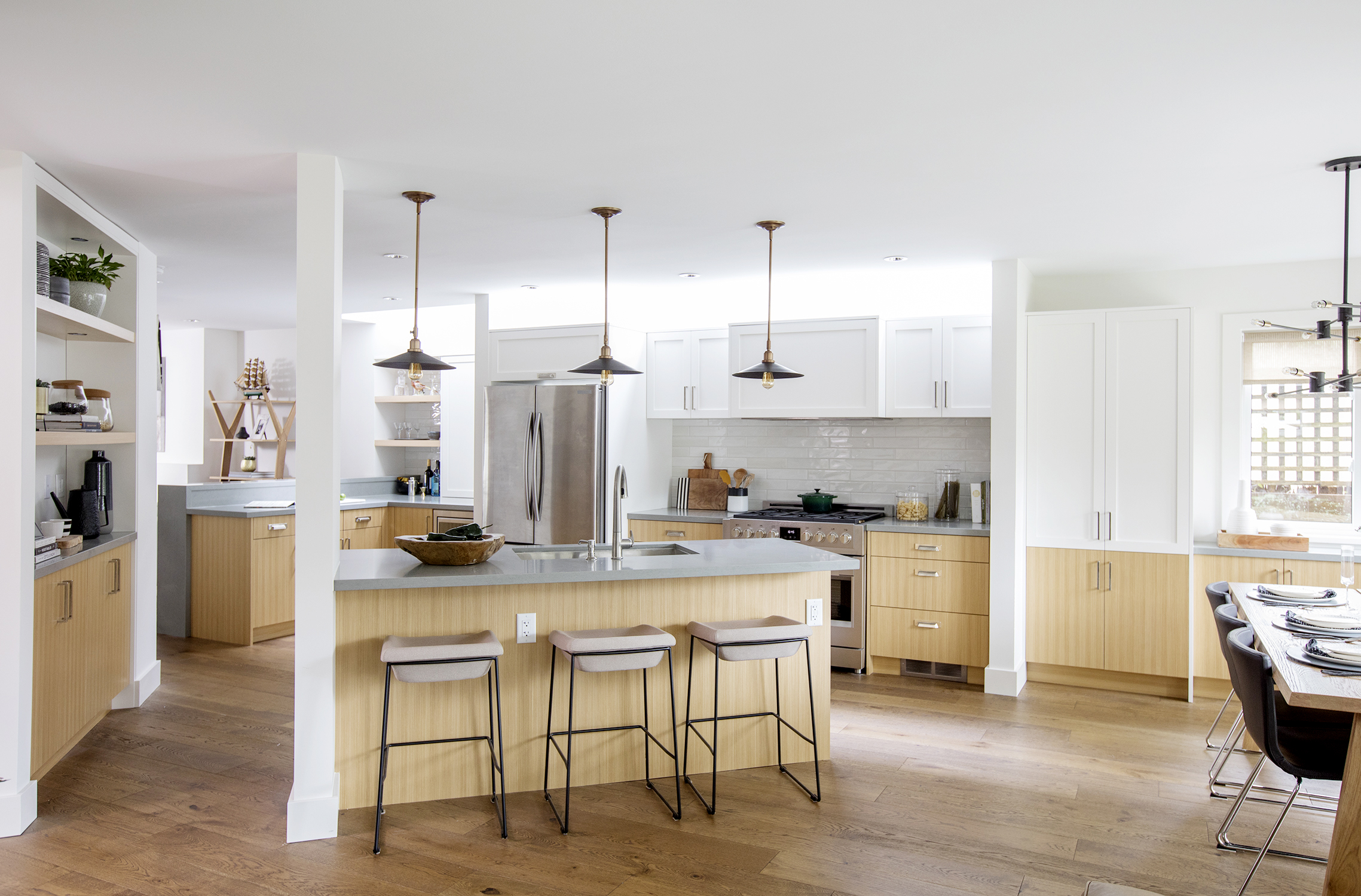
Enlarged Living
From this angle, you get a sense of how open and spacious the kitchen is post-reno. Whether the couple is hosting family or a larger gathering, there will always be enough room to congregate and prepare food at the same time.
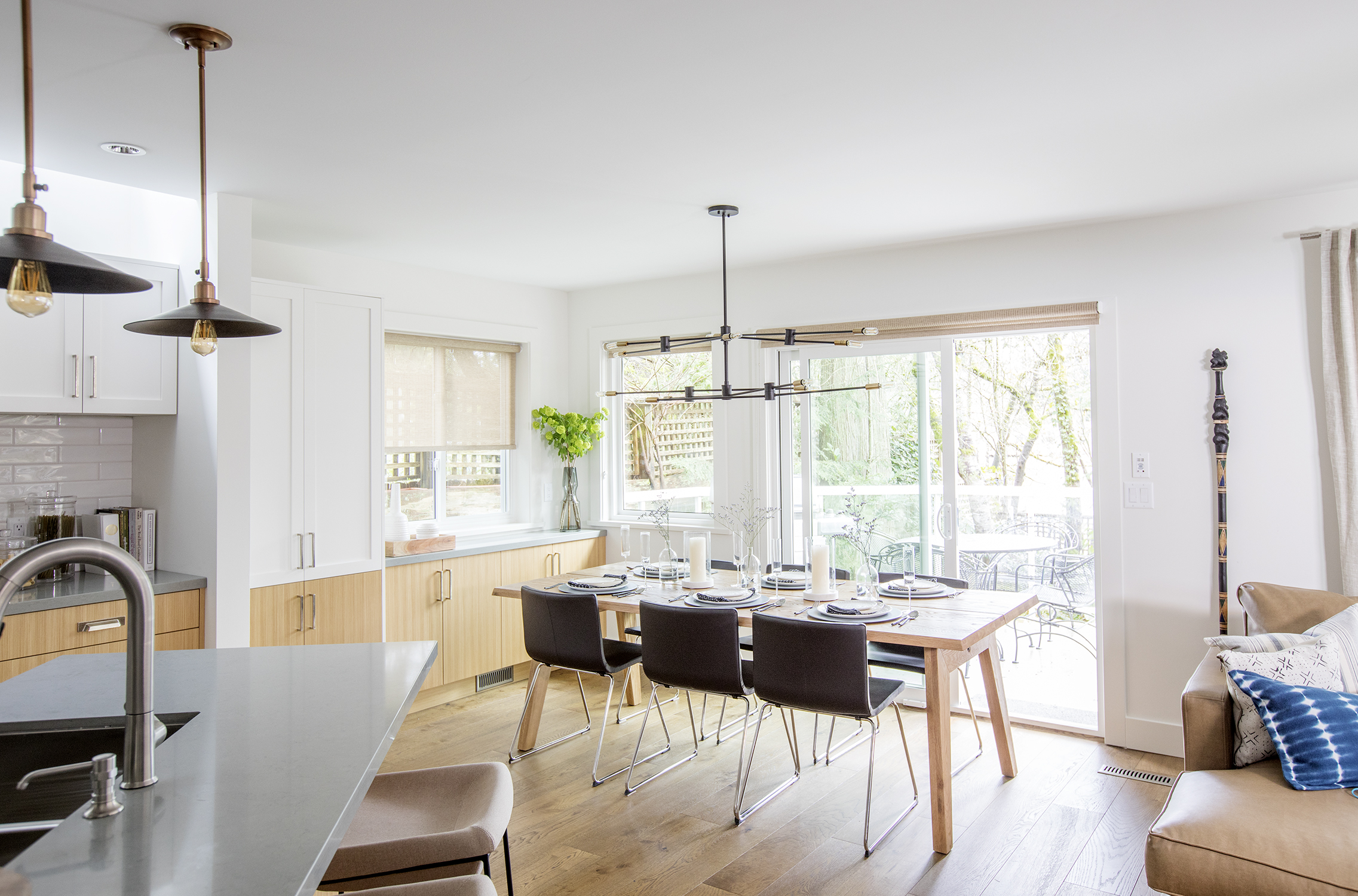
Bright New Dining Room
Here Jillian blew out the original windows to make sure more natural light flooded into the space. Now, the kitchen’s eating area feels that much larger. Custom extended cabinets complete with a pantry add even more storage space, allowing this home to feel streamlined and organized.
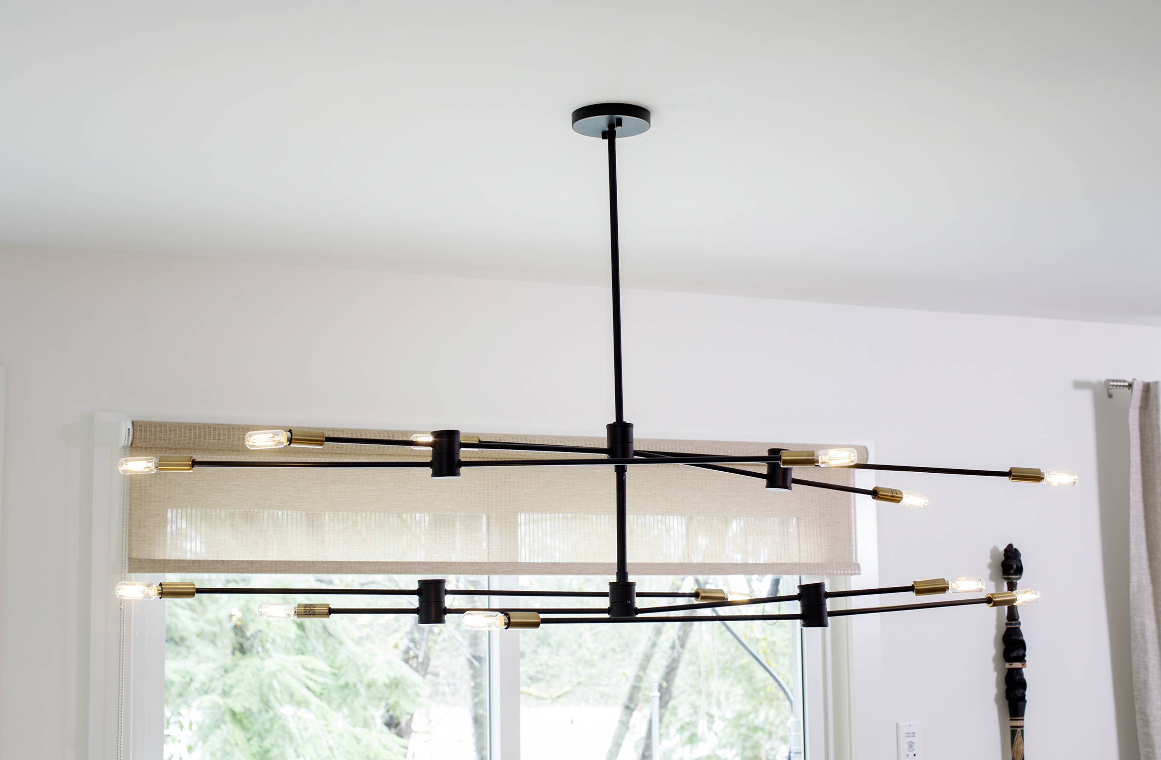
Modern Lighting
This daring light fixture adds a dramatic touch and stands out against the kitchen’s muted palette. It also ties in with the other dark elements in the room, from the dining chairs to the pendant lights above the island. Because every stylish cooking space requires a dazzling showpiece to truly shine.
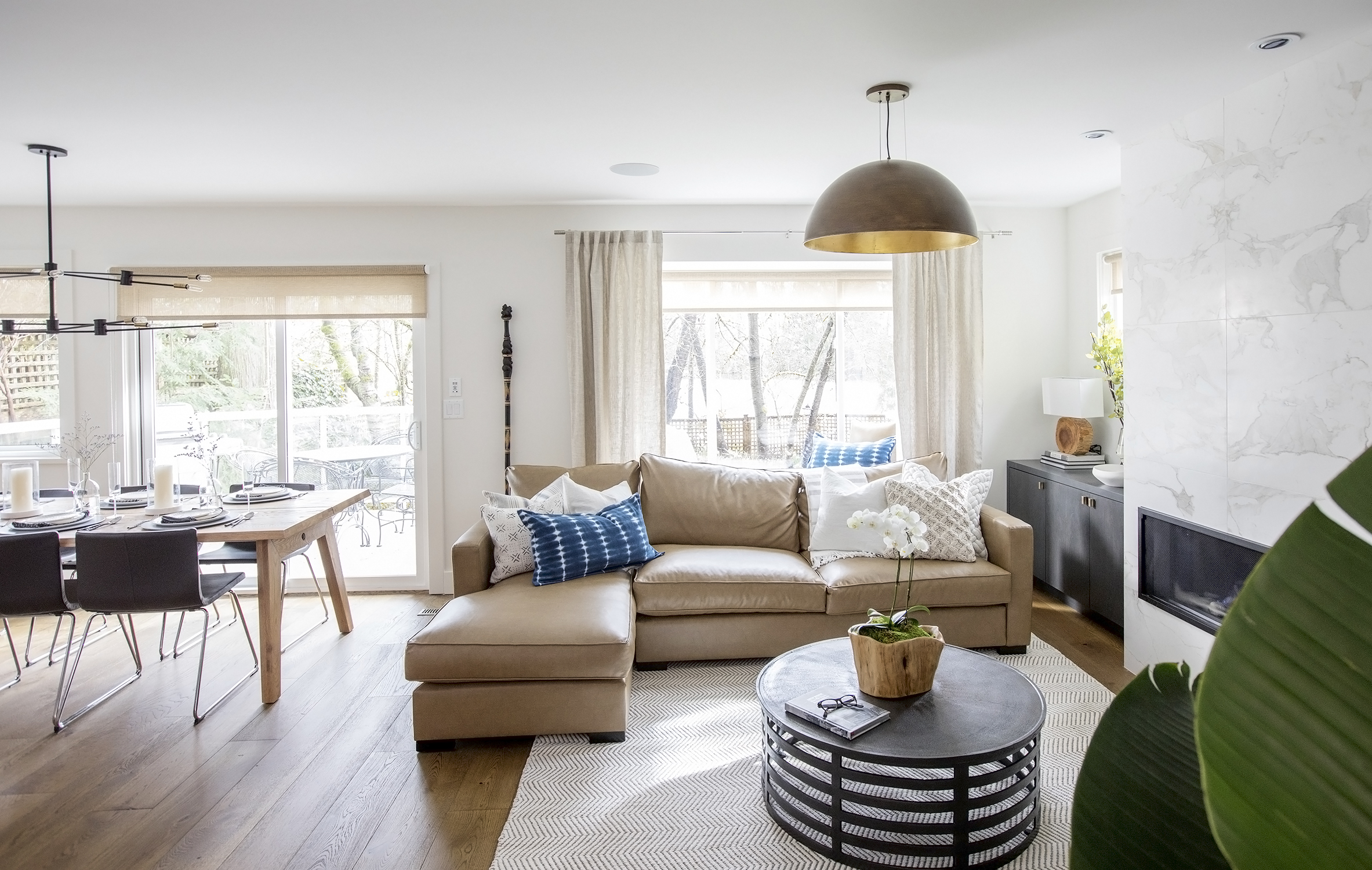
Living Room Nook
On the other side of the kitchen, Jillian designed a living area that’s perfect for unwinding pre- or post-dinner. The large beige sectional and area rug help to define the space, while a unique black coffee table adds instant personality.
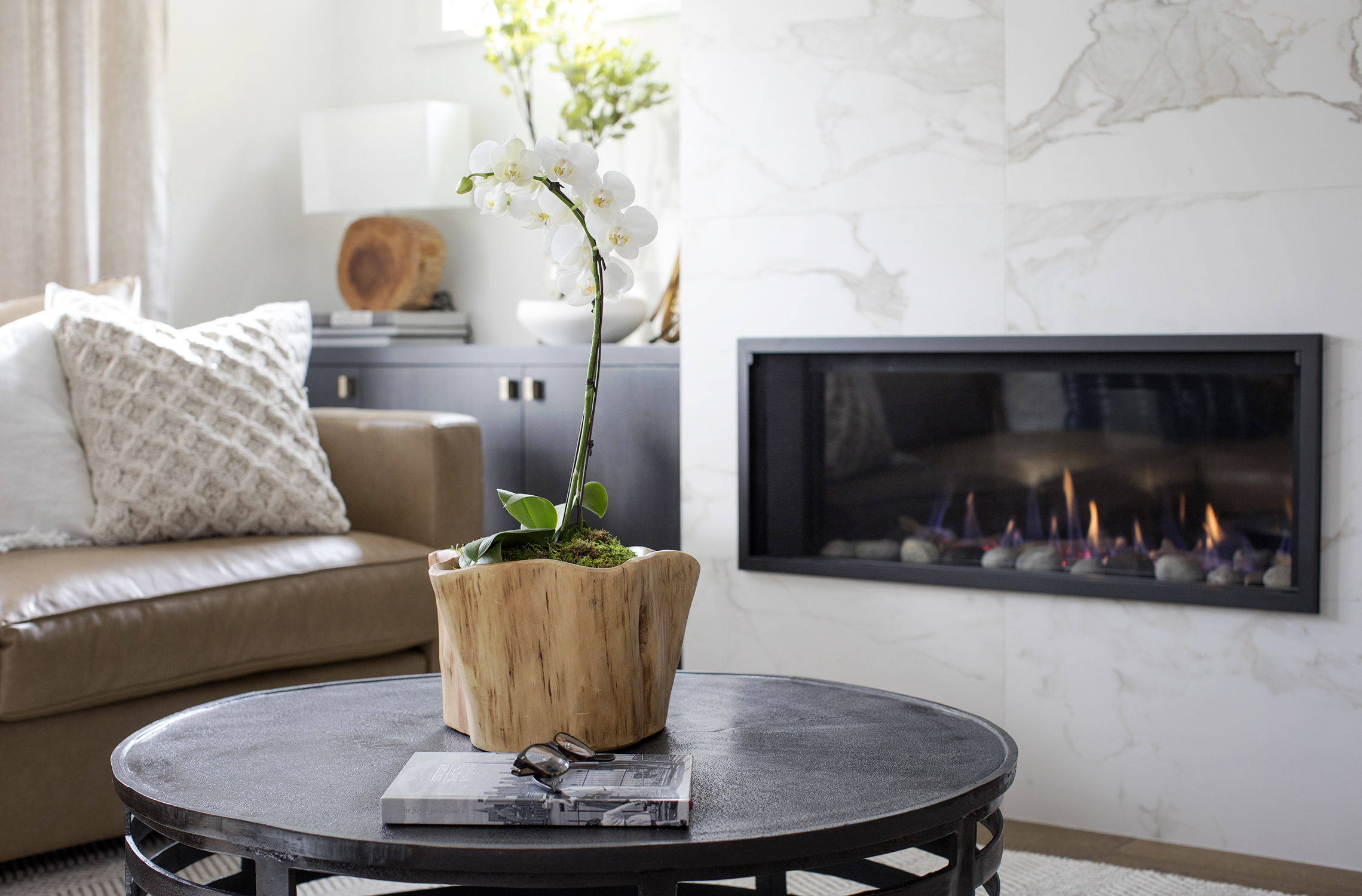
Warm Finishes
The designer also redesigned the home’s second fireplace, adding a faux marble finish that still provides the same luxurious feel as the real thing. Now, homeowners Gail and Mike can warm up by the fire in style during their next soiree or movie night.
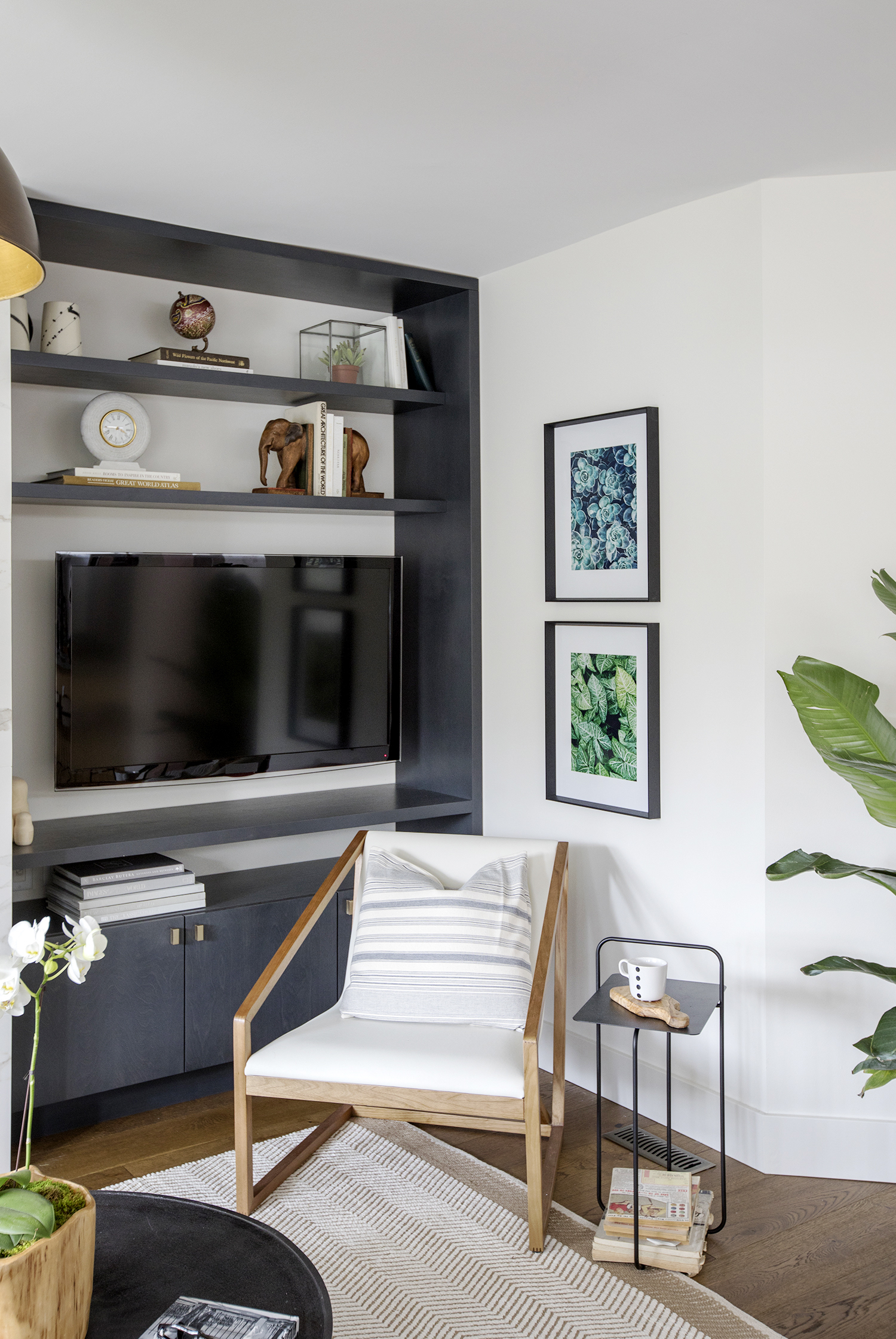
Media Zone
Speaking of movie nights, the homeowners didn’t want the television to be built into the fireplace wall. So Jillian had this large shelving unit installed. To increase function, she mounted the TV onto a swinging rack, so no matter where you’re sitting in the room, it can be adjusted to ensure everyone has a perfect view.
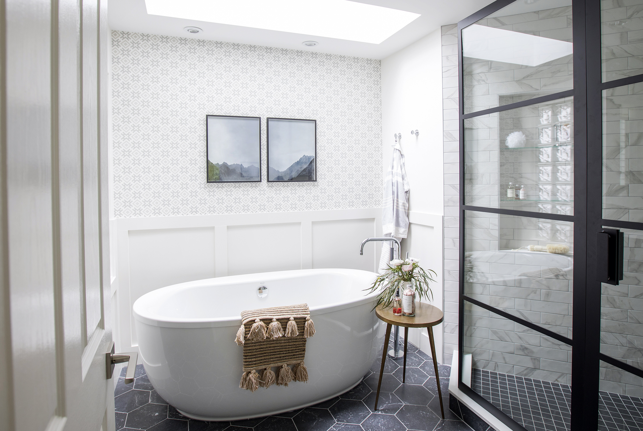
Boutique Luxury
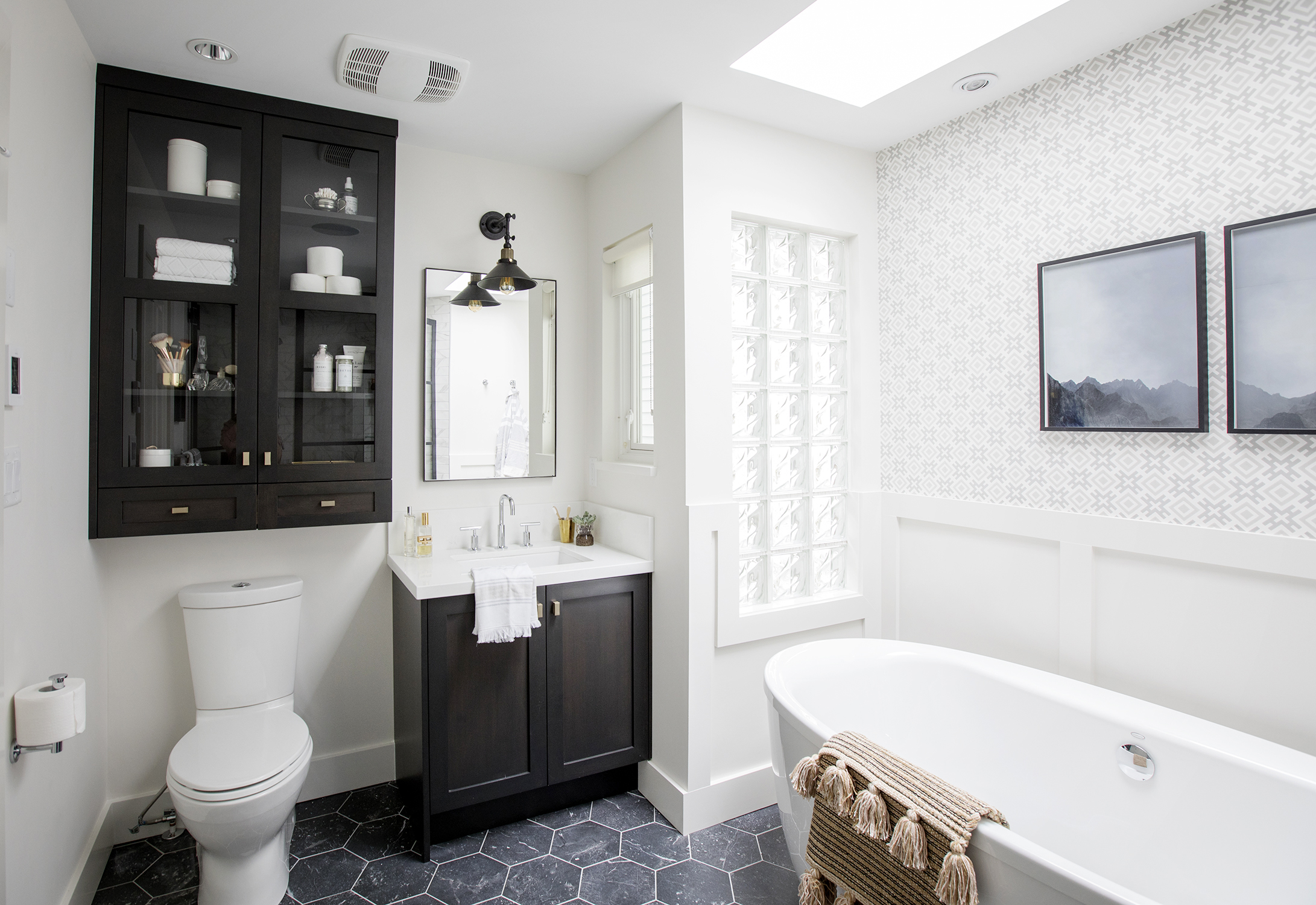
The upstairs ensuite is one of Gail’s favourite rooms in the home, but it was in dire need of a makeover. Jillian had a gorgeous standalone tub installed, which is even more eye-catching thanks to the stylish wainscoting and wallpaper combo – not to mention the bold honeycomb floor tiles. Now this is a space that feels like it belongs in a stylish boutique hotel.
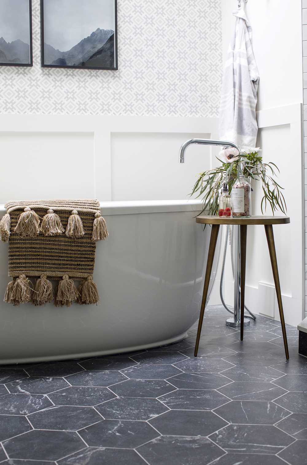
Finishing Details
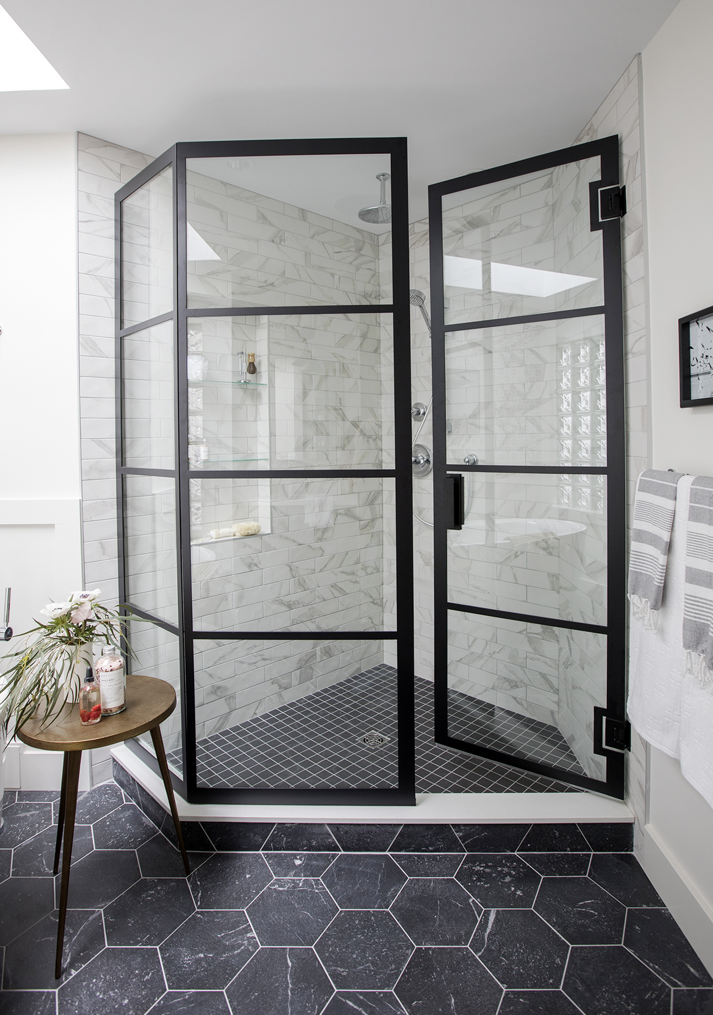
Jillian opted for dramatic honeycomb floor tiles that bring depth to the overall design. Even better? The floors are heated!
Custom Shower
The custom shower’s wrought-iron frame ties in with the honeycomb tiles. The shower floor follows the same dark and dramatic scheme, but features a different pattern to have it feel like a standalone unit that still suits the space.
Happily Ever After
Add in a skylight, a frosted glass window and a large cabinet above the toilet for all of the couple’s storage needs, and we’d say this is the ensuite of anyone’s dreams. It’s no wonder that despite seeing some other gorgeous properties, Gail and Mike decided to love their home in the end.
HGTV your inbox.
By clicking "SIGN UP” you agree to receive emails from HGTV and accept Corus' Terms of Use and Corus' Privacy Policy.


