Though hard to imagine, this waterfront property in Nanaimo, BC used to be builder-basic and dated, with tiny rooms and original ’90s accents – think vinyl sheet flooring, lots of laminate and icky carpeting. That is until its empty-nester owners hired designer Rachelle Gervais of RG Design Studio to make it “simple, light and bright.” The end result? A contemporary-meets-cheerful home that’s in harmony with its idyllic setting. Here’s an inside look.
Front of House
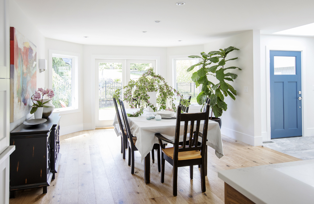
The designer, who worked closely with Westmark Construction to help usher the home into this decade, opted for an open layout. “The owners prefer eating at the kitchen island, so I put the dining room, which they use only occasionally, next to the entry,” she says. “Plus, these spots are interchangeable should they ever wish to switch them up.” The blue front door is a fun and colourful allusion to the home’s waterfront setting.
Compare and Contrast
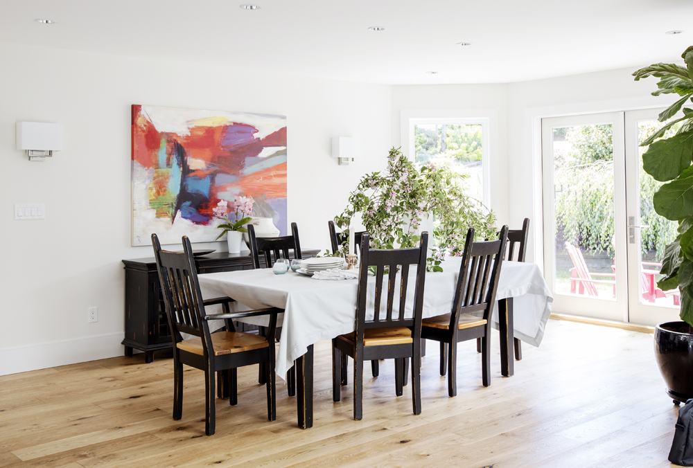
Light-coloured furniture in the dining room just wouldn’t have the same bold effect as these dark pieces. “They belonged to the homeowners before the renovation and I like how they contrast the walls and linen tablecloth,” says Rachelle. This pale backdrop also lets the abstract artwork, which was purchased at a local retailer called Flying Fish, make an impact.
The View From Here
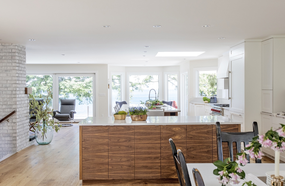
The homeowners’ mandate of light and bright is evident throughout the main floor’s design. “They didn’t want excessive ornamentation or anything that would compete with the view,” says Rachelle. “That’s why there are no pendant lights over the island and there is no chandelier over the dining table.”
Green Living
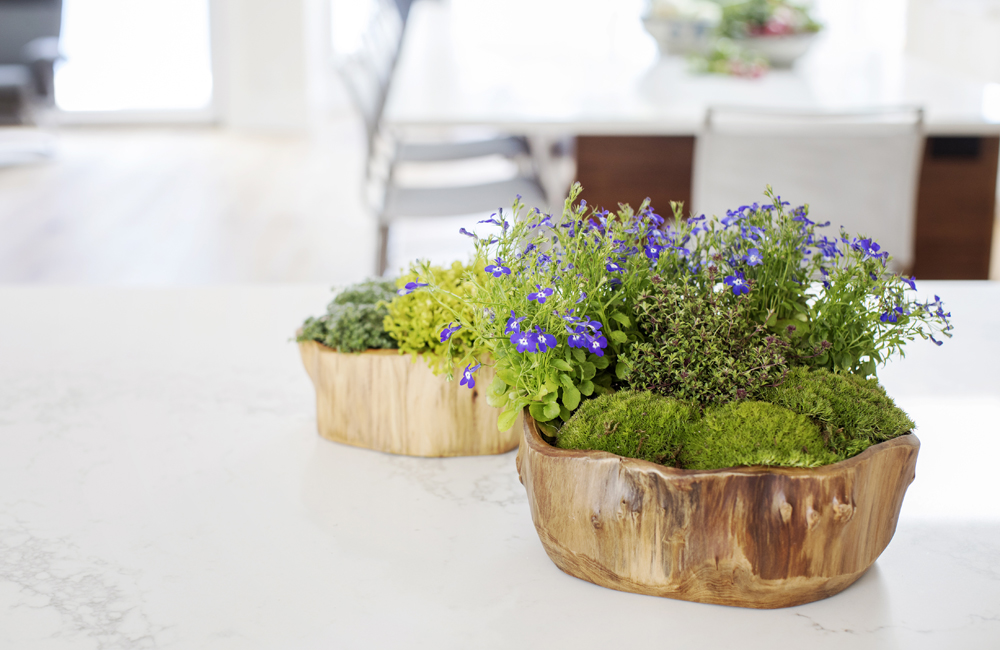
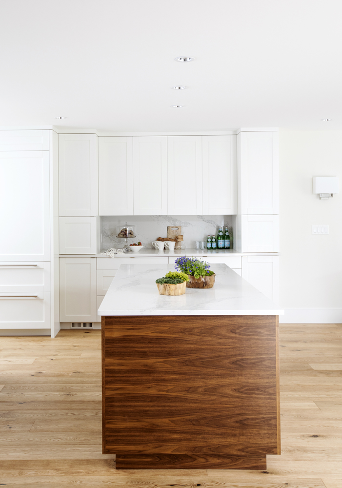
Arrangements of blue nasturtium, creeping thyme and mosses are artfully presented in wooden bowls to layer in a lively natural element.
Baking Power
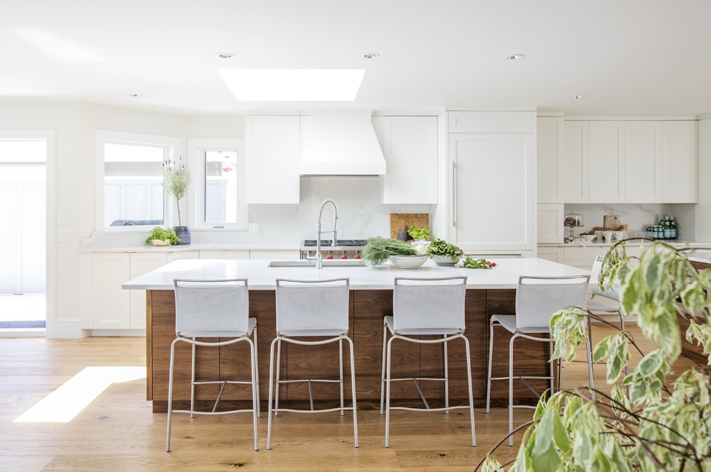
The wife of the household is a baker, so Rachelle designed this island (one of two) with that delicious fact in mind. “Since there’s no sink in it, the island provides a continuous long surface for rolling dough, mixing up ingredients and laying out cooling trays.” Bonus: it can also be used as a stylish buffet for casual entertaining.
Counter Intuitive
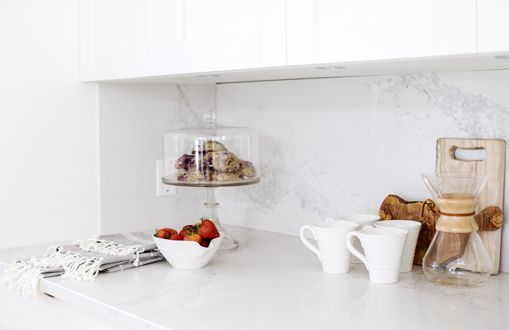
All the kitchen countertops, including the one in this niche, are crafted from Caesarstone in Statuario Maximus. “It looks like marble but is more practical and durable,” says Rachelle. The cupboards beneath the niche are extra deep and fitted with pull-out shelves that neatly store pots, pans and baking trays.
Added Walnuts
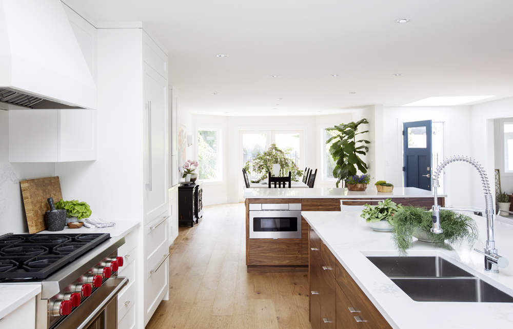
“The homeowners wanted white Shaker-style cabinetry, which was installed along the perimeter wall,” says Rachelle. “I added the walnut cabinets to the bases of the islands to create some contrast, warmth and interest.” The island with the sink stores items that are used every day, while the other island, which features a microwave, houses decorative dishes, vases and cookbooks.
Full Serve
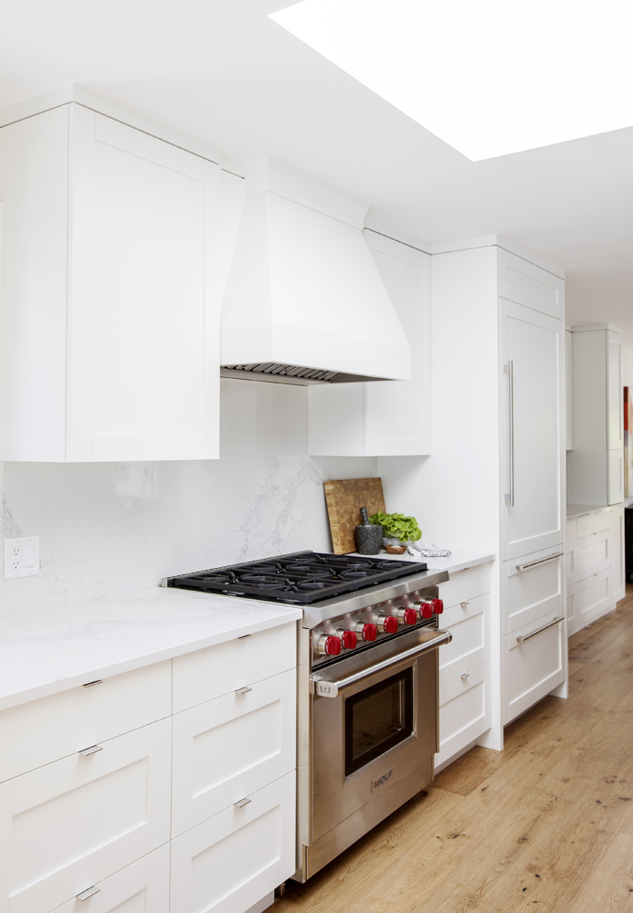
Smart elements, like to-the-ceiling uppers, extra-deep lower cabinets and pantry cupboards with pull-out shelves, reinforce that this kitchen is more than just a pretty face. “It was specifically designed to meet the owners’ storage, cooking and entertaining needs. Every detail was fully thought through.” The aesthetic detail of facing the fridge with a cabinet panel keeps the Wolf range and its signature red knobs a focal point.
Outdoors In
The island’s stools, which the owners purchased in Victoria, are actually made for outdoors – an interesting option to consider when furniture shopping. Rachelle says, “They’re perfect here because they’re lightweight, easy to move and won’t scratch the floors.”
Sam’s Club
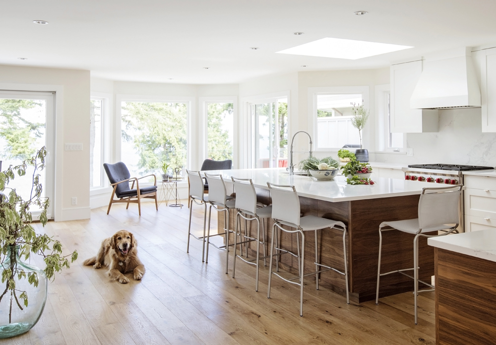
This engineered wide-plank oak flooring does more than fit the style bill. “The owners have two golden retrievers, Sam and Ruby, and they were a main driver when it came to selecting flooring material,” says Rachelle. It seems like Sam, pictured here, approves of the easy-to-maintain choice.
Sea Clearly
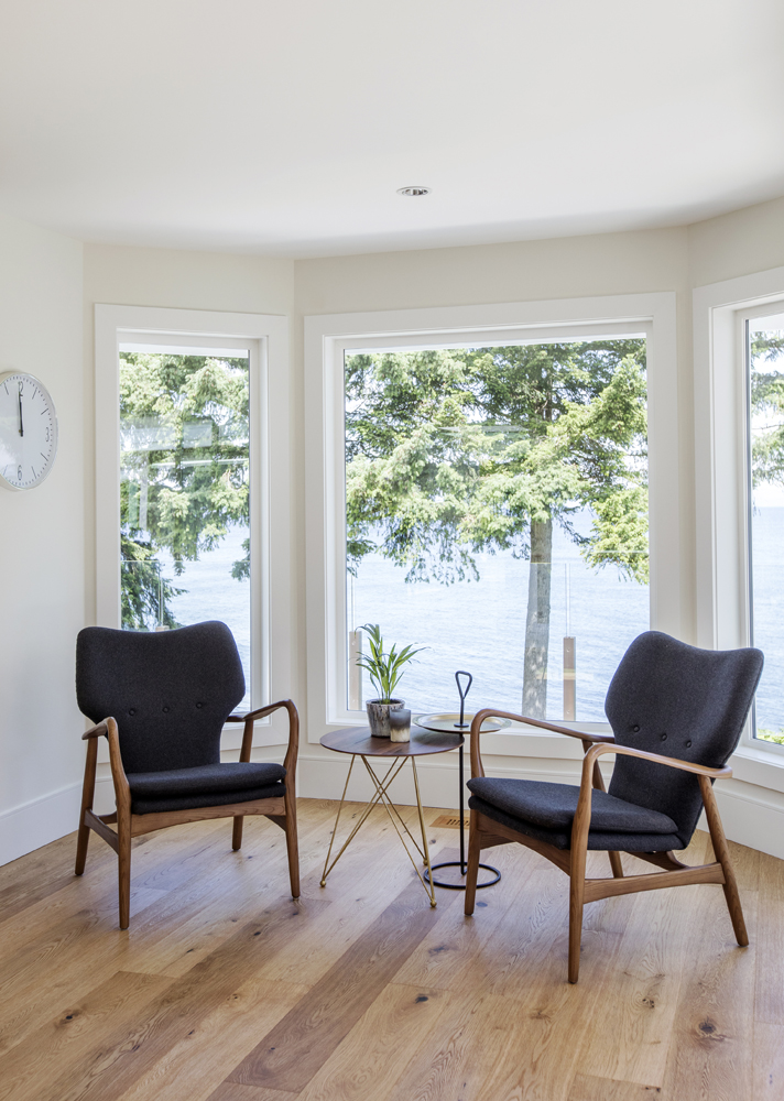
With a vista of coastal mountains across the Strait of Georgia in the Salish Sea, little furnishing was required. Two vintage chairs and open-base side tables let the stunning view speak for itself.
Simple Plan
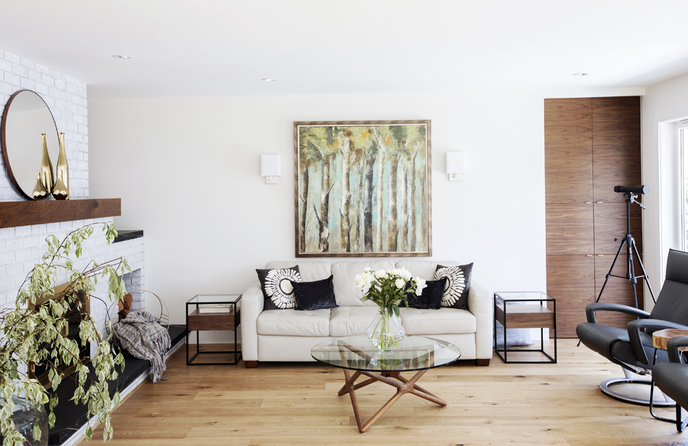
The living area has pared-back style and references its breathtaking coastal location with a mix of warm wood tones, lots of light and nature-inspired artwork (we also love how Rachelle nixed an area rug here in favour of bare floors). While the view out the window never fails to enchant, there is also a telescope for maximizing what’s on offer, including shooting stars.
Round it Out
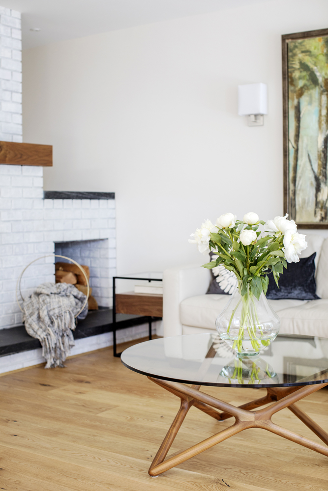
Rachelle chose a round coffee table as a foil to the many straight lines in the living area, particularly those of the fireplace, in front of which this glass-topped beauty sits. The vase and soft accessories, like the blanket (which rests in a round basket) continue the accent curve.
White Cap
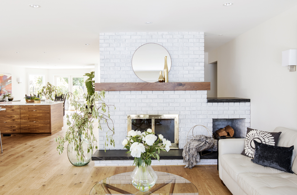
Rachelle gave the wood-burning fireplace an elemental West Coast makeover. “I kept the original brickwork but white-washed it for a coastal aesthetic. Then I added a new walnut mantel and a hearth made from local stone.”
Fire Away
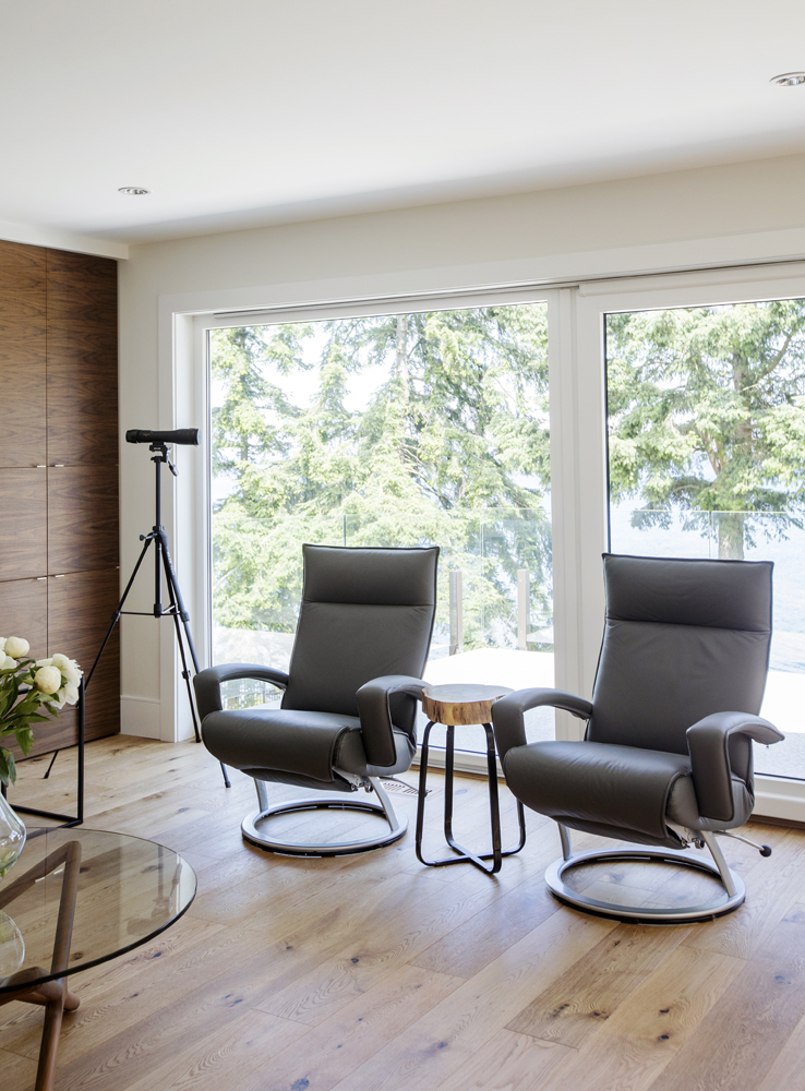
Not your typical fireside seating, these sleek leather perches are an incredibly modern alternative to overstuffed armchairs. The homeowners’ purchased them after falling for their ability to recline and also swivel to easily take in the ocean view.
Not the Custom
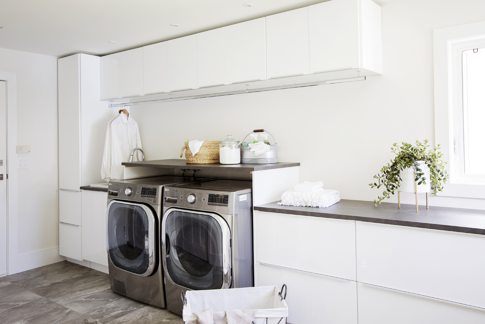
Yes, this snazzy laundry room looks custom-built but no, it’s not. “We were very mindful of the budget in secondary areas, like the laundry room, where we made more economical choices,” says Rachelle. The cabinetry is from a big-box store and the marble-look floor tiles are a-fraction-of-the-cost porcelain.
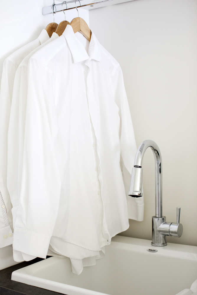
Hanging Out
“A clothing rail maximizes the space beneath the upper cabinets and is a practical solution for hanging laundry,” says Rachelle. The sink reflects the budget-friendly approach to this room. “It’s an inexpensive acrylic fixture that I elevated with a contemporary-style faucet.”
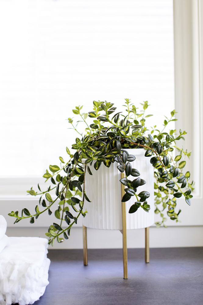
Plant Life
Styling a laundry room with something as simple as a plant makes it feel less utilitarian and more decorated. This potted greenery sits on the handy folding counter in front of a window that boasts a view of the ocean – a nice perk when folding laundry.
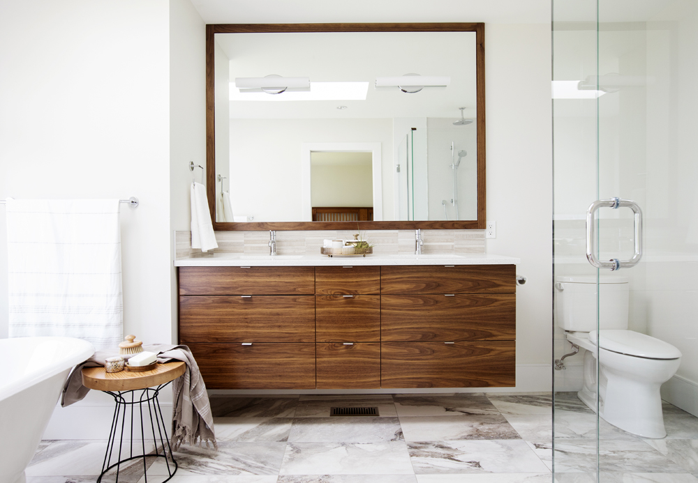
Above Ground
Rachelle gave the master bathroom a master makeover. “I replaced the original plastic laminate-finished vanity with this floating wood style that’s topped with engineered quartz.” A commanding statement piece visually, it’s also a storage superstar. The wood grain is a thoughtful complement to the heavy veining in the porcelain floor tiles.
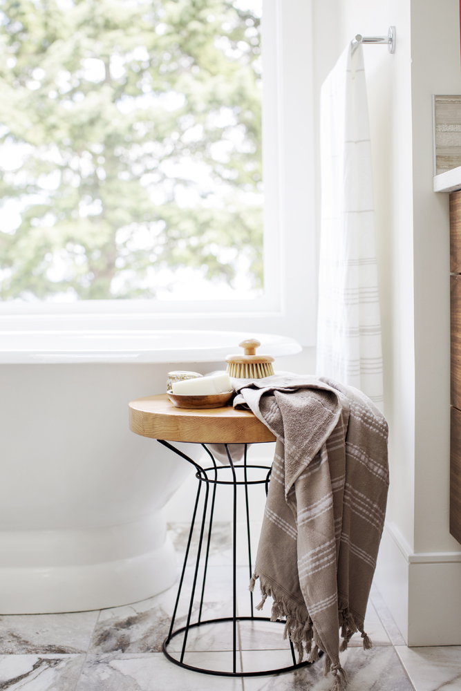
In-Room Amenities
Rachelle indulged every area of the master bath with detail. Here, a simple wood-topped side table signals a natural vibe that speaks to the view, while keeping bath time essentials within easy reach.
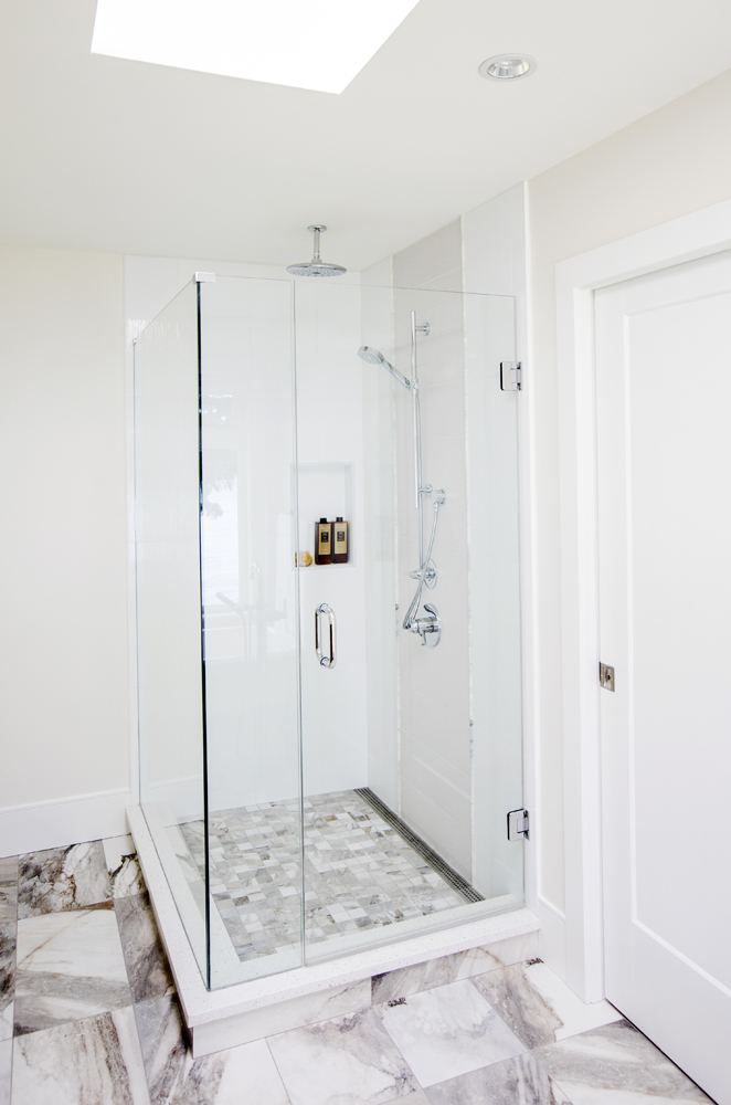
Showered with Style
Rachelle replaced a piddly acrylic shower insert with this custom-made showstopper. We love how its mosaic floor tiles reference the larger porcelain ones. She expertly modernized this luxurious look with sleek finishes, from the linear floor drain to the seamless glass enclosure. The skylight floods the space with natural light and literally lets these elements shine.
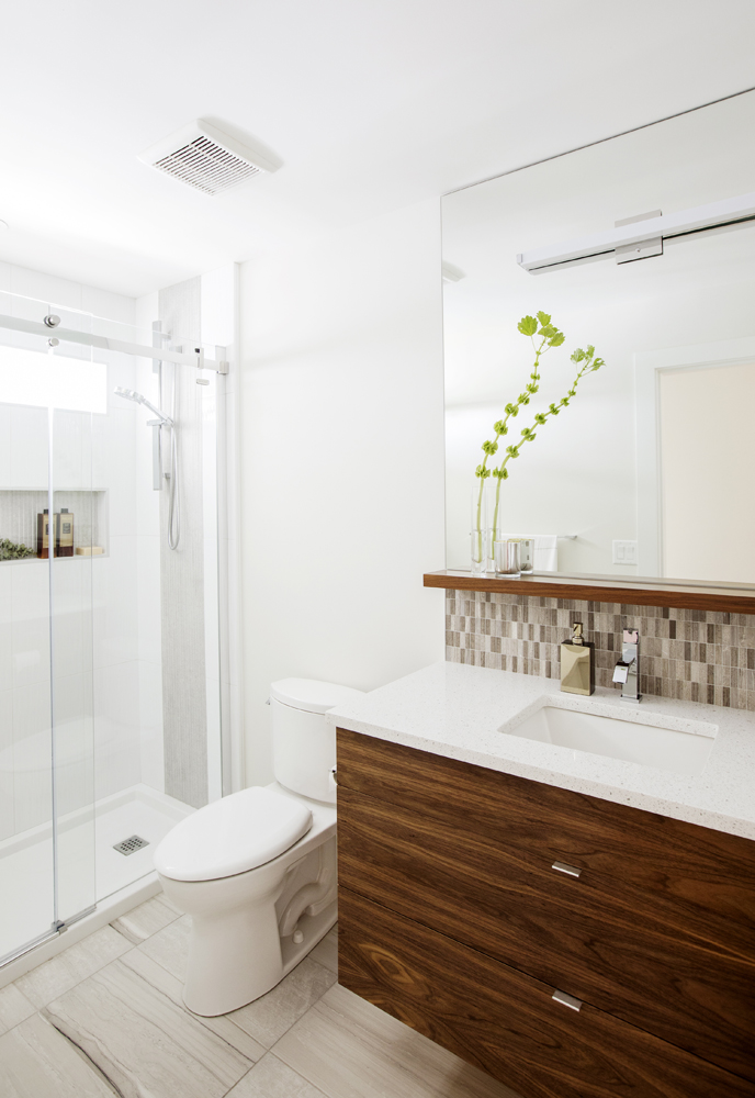
Go Big
“I chose a cantilevered vanity for the guest bathroom to maximize floor space and create the feeling of a larger environment,” says Rachelle. The flat-cut walnut provides warmth and contrast and also adds continuity by referencing the walnut millwork featured in other areas of the home.
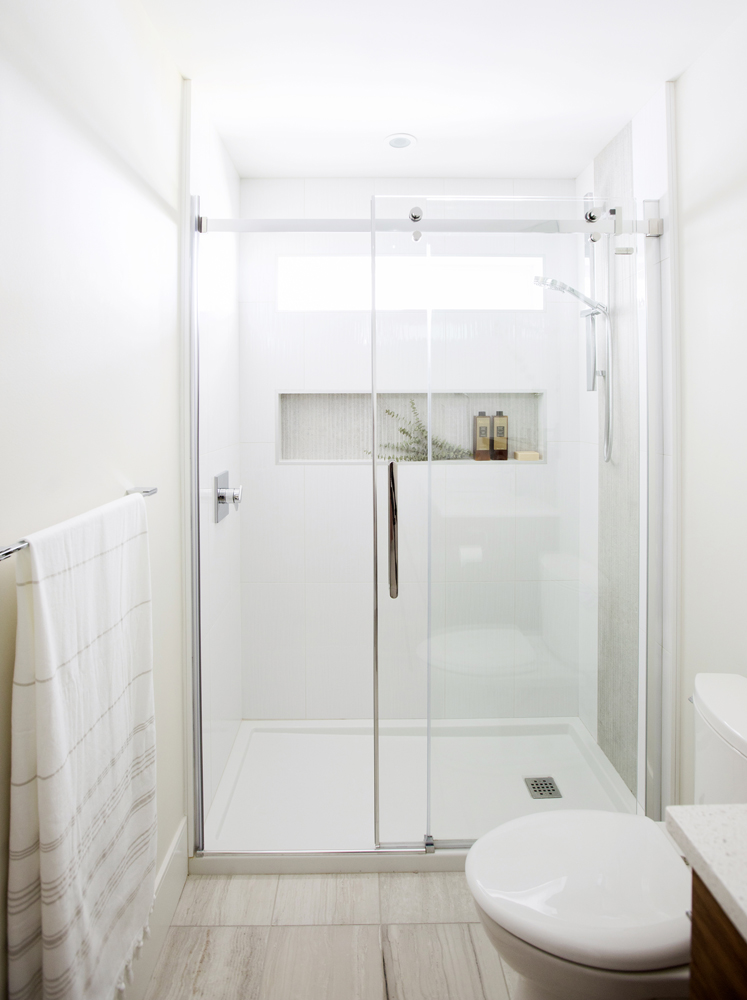
Slide Show
Rachelle extended her space-maximizing savvy to the shower. “A contemporary-style base was installed with a sliding glass-door enclosure,” she says. This effectively eliminates the extra space a swinging door would require. The grey porcelain accent tiles around the shower controls are a new product from Fontile. “They’re heavily textured and help repel soap residue and build-up.”
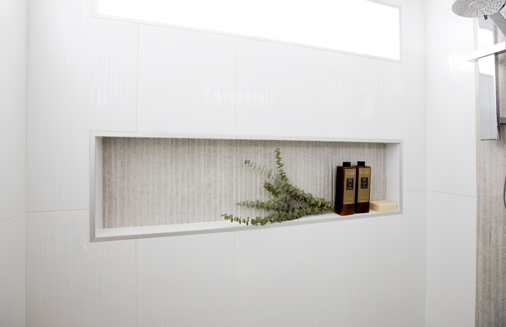
Niche Banding
The same textured accent tiles form the backdrop of the shower niche, which was designed to mirror the dimensions of the window above it. These angles, along with the shape of the mirror and the sink faucet, are intentional. “They have square and geometric forms to contrast the rounded fixtures found in the master ensuite,” says Rachelle.
Another Level
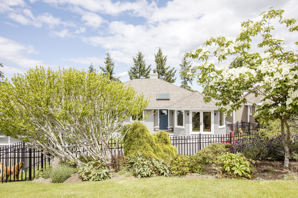
Though it looks like a ranch-style bungalow from the street, this charming home is built on a slope and features two levels. Parcelled in beauty, its picture-postcard curb appeal is only rivalled by its waterfront lot with beach access – a home that offers the best of both worlds.
HGTV your inbox.
By clicking "SIGN UP” you agree to receive emails from HGTV and accept Corus' Terms of Use and Corus' Privacy Policy.


