New homeowners Sarah and Jon were sick of their cramped and outdated kitchen. The cabinets were hideous, the counters were absurdly shallow and the peel-and-press “wood” floors had the homeowners hanging their heads in shame. Their kitchen renovation wishlist rang in at $45,000, but with a $30,000 budget, they needed the professionals to help them see their reno through, without running through their savings. Enter Sabrina Smelko and Sebastian Clovis, hosts of Save My Reno and geniuses when it comes to stretching dollars and saving renovations. See how they totally transformed this kitchen!
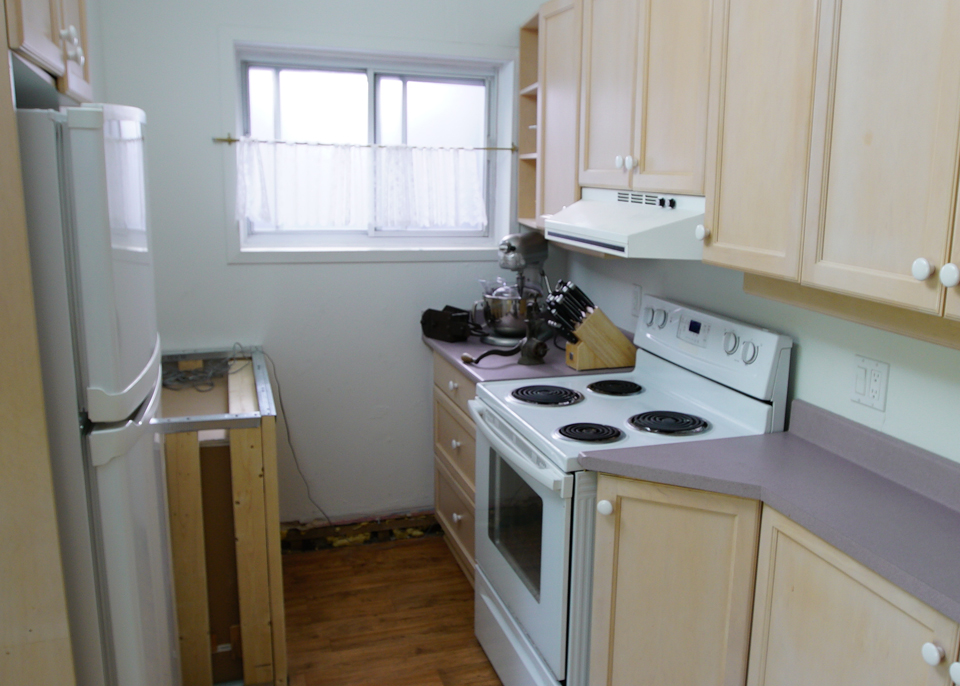
Before: Narrow and Forgettable
Old appliances, cabinets and a peel-and-stick flooring were bad, but the overall layout of this kitchen made everything so, so much worse. You couldn’t open the oven and the fridge at the same time, and with minimal counter space this room was anything but functional.
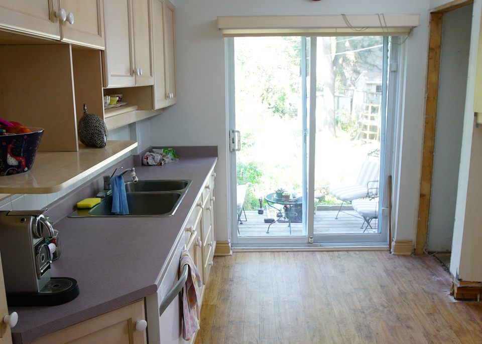
Before: Unfinished Spaces
Not only was the kitchen itself incomplete, but it felt dark despite the large walkout to the deck. Add in awkwardly shaped cabinets at weird heights and you definitely don’t want to spend your extra time here.
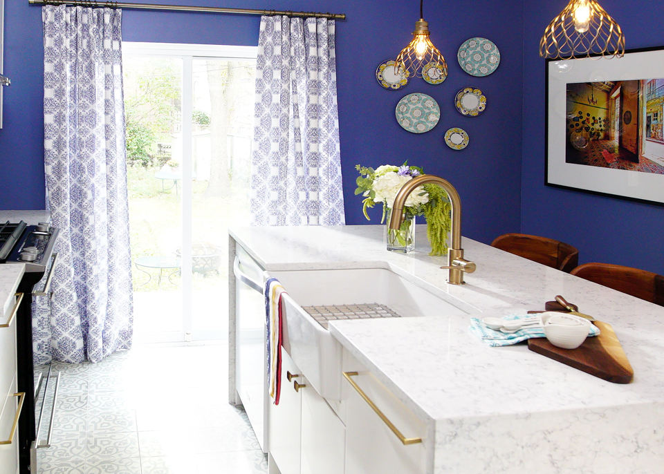
After: Nice and Bright
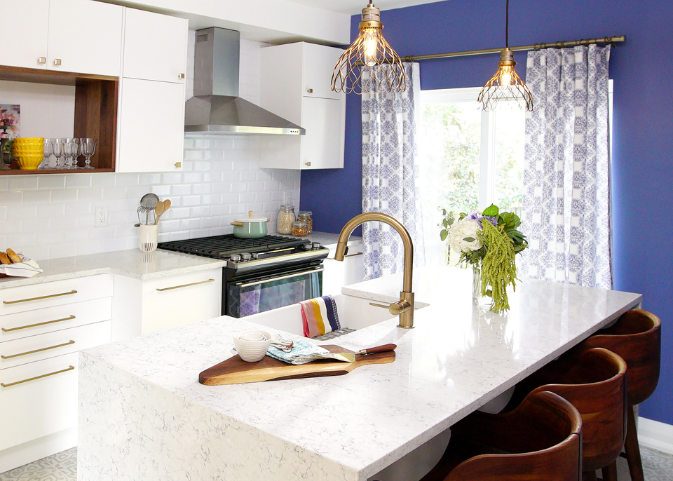
By removing a few key walls Sebastian was able to reconfigure the space and give the homeowners more room. The centre island is a real draw thanks to its waterfall edging and faux marble finish, which of course helps to eat some of those extra costs.
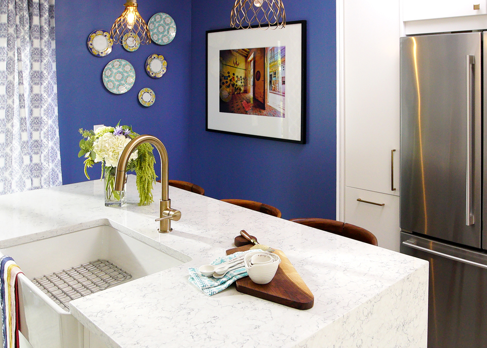
After: A Piece of Art
Sebastian and Sabrina were faced with large bulkheads when they were configuring the cabinets, so they worked with the room to create these surface cabinets beside the fridge to hide them. It was an inexpensive fix for what could have otherwise been a costly problem.
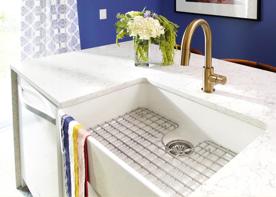
After: A Functioning Island
We love the oversized basin sink built into the island, which adds tons of counter space while also serving as a table. The team made the most of this design by adding storage and appliances below as well, and added an inexpensive but elegant faucet to finish it all off.
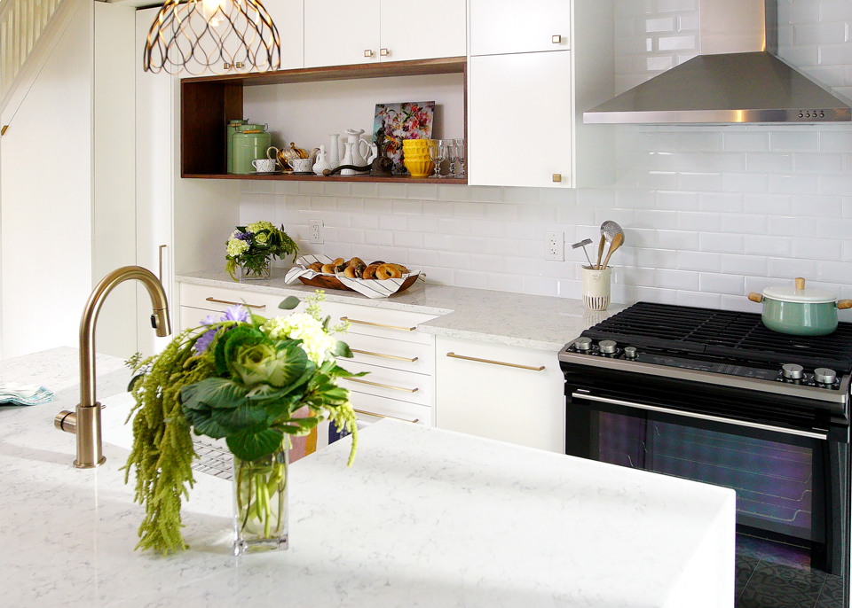
After: New Heights
Sebastian and Sabrina were able to lift the cabinets up in order to create more space below, which means that the homeowners can now actually use some of their small appliances. Meanwhile those pretty gold accents continue via inexpensive light fixtures and the hardware.
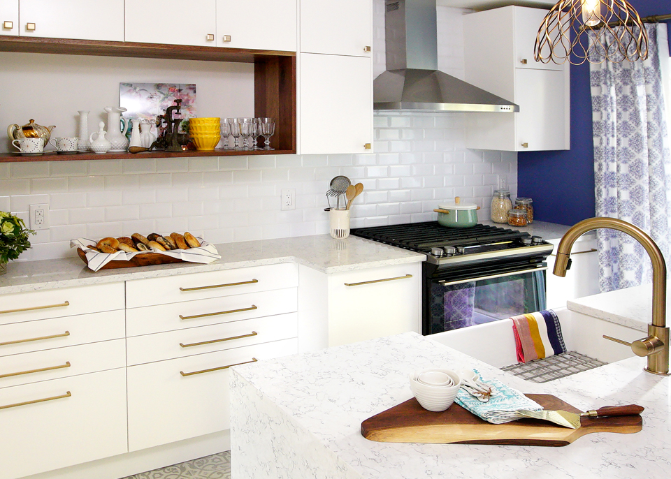
After: Tiling Effect
The bright, white subway backsplash doesn’t just help to bring more light into the space and make it feel open; it’s also an inexpensive option that’s easy to clean.
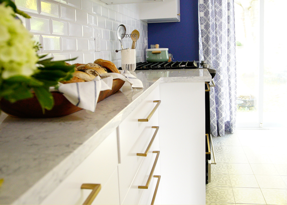
After: Modern Edging
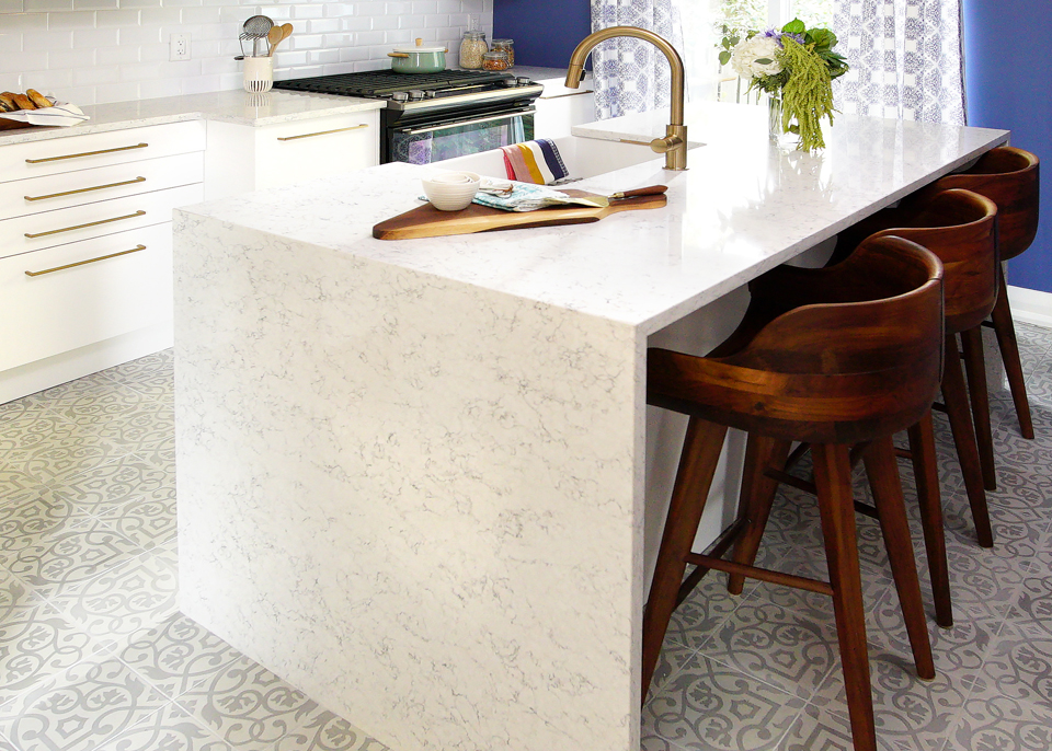
The faux marble countertop continues underneath the cabinets and adds a rich-looking finish for half the price. Meanwhile the hardware feels updated against the overlay cabinets, another inexpensive option that saves big dollars.
After: A Personal Touch
When Sabrina learned that one of the homeowners designed textiles she immediately tasked her with creating a pattern for the curtains. Then they ironed it onto blank material, creating a high-end look for much less than it would have been to buy brand new, fancy curtains.
After: Bargain Hunting
We love these stools, which were heavily discounted thanks to their original varying heights. Sabrina simply sawed off the bottoms to make them all even. Meanwhile the tiling below was also roughly half the price of standard tiles, but it adds a romantic, worldly feel to the space. These are just two more huge savings in a beautiful kitchen reno that feels like it cost tens of thousands more.
HGTV your inbox.
By clicking "SIGN UP” you agree to receive emails from HGTV and accept Corus' Terms of Use and Corus' Privacy Policy.


