Professional organizer and Feng Shui Consultant Sachiko Kiyooka saw what others didn’t in a Montreal apartment that had been languishing on the market for six months. “It had been neglected and needed some TLC,” she says. “But I loved the peaceful location on a beautiful street, the fluid layout, the high ceilings, windows on three sides and the pretty views.” She envisioned a light-filled, minimal and personalized space, and you’ll want to see how she handily created it on a budget. Bonus: check out the video of this inviting space.
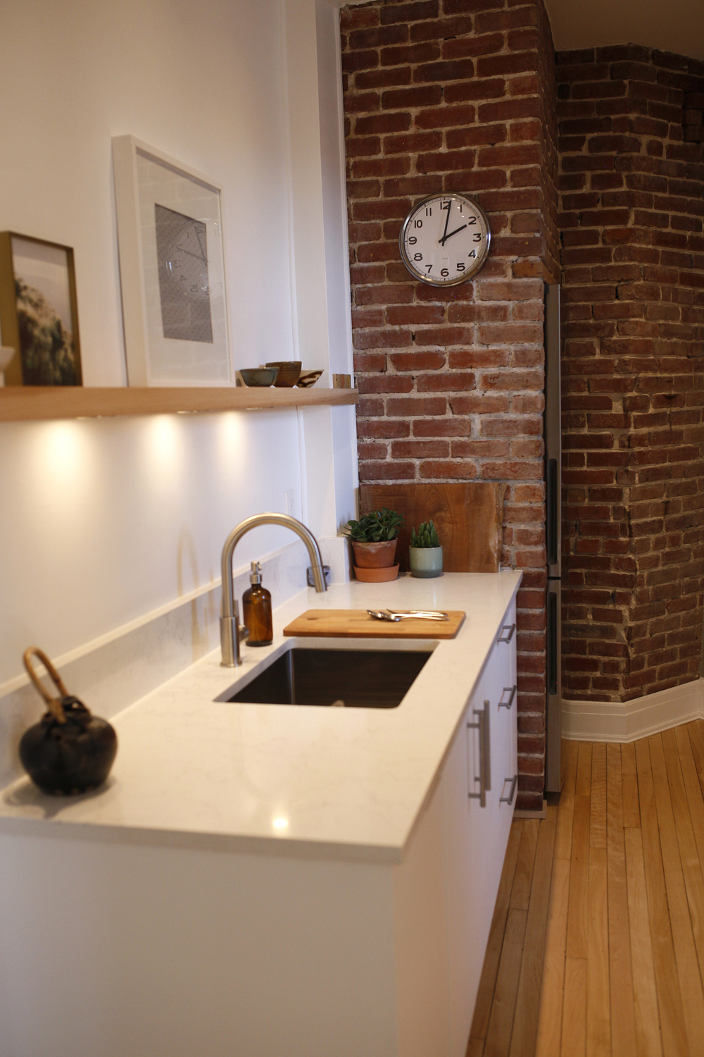
Kitchen Panache
The kitchen’s exposed brick is more than just aesthetically pleasing. “I believe it used to house a dumbwaiter,” says Sachiko. “All the building’s units have this opening in the corner.” It now houses the fridge. She chose hardworking quartz for the countertop and dressed up the space with a floating shelf. “I wanted a simple floating shelf where I could display a few things and change it up all the time. I like that there’s underlighting and in the evening I can have very soft light here.”
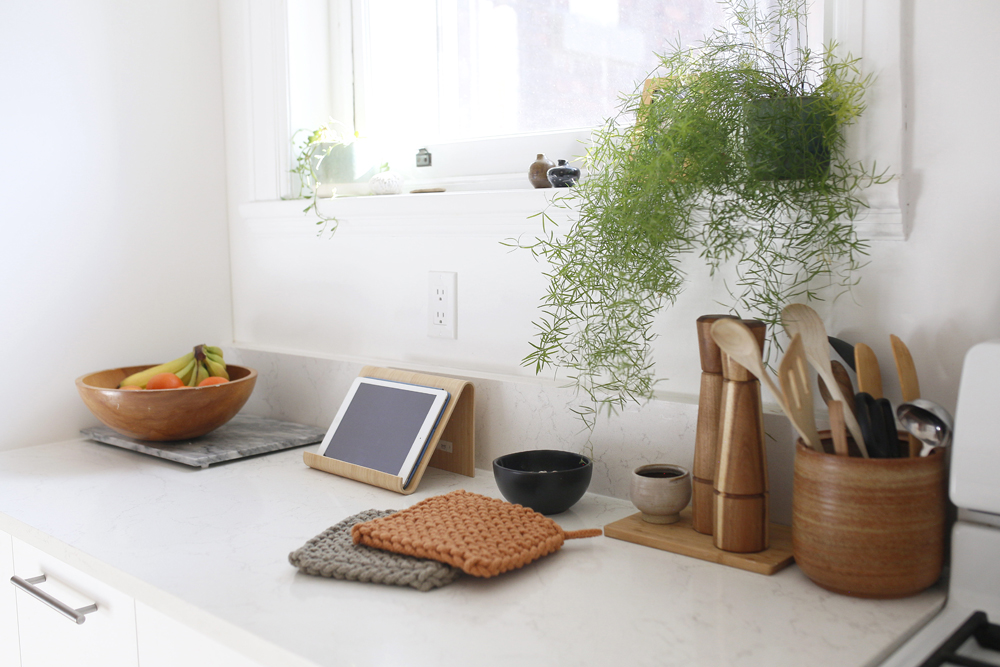
Mix Master
A mix of natural wood accessories and ceramics lend a personal air to an otherwise utilitarian space. “I love my ceramic items – they connect me with my daughter and my dad. My dad studied pottery in Kyoto, Japan for a year and after returning to Canada made ceramics for much of his life. I love that I can use things he made in my daily life and get both aesthetic pleasure and functional use from them.”
Related:Bryan Baeumler’s 10 Simple Kitchen Updates That Cost Less Than $100
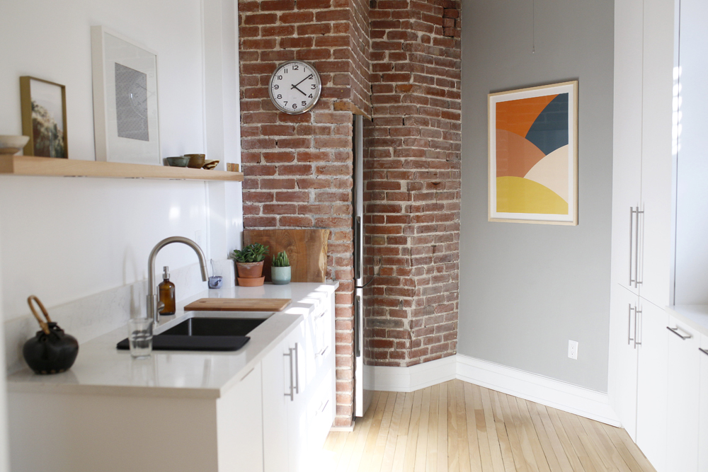
Abstract Expressionism
A colourful piece of abstract art from Society 6 feels dramatic in the kitchen. The natural light here highlights the floors which Sachiko sanded down for a lighter and brighter effect.
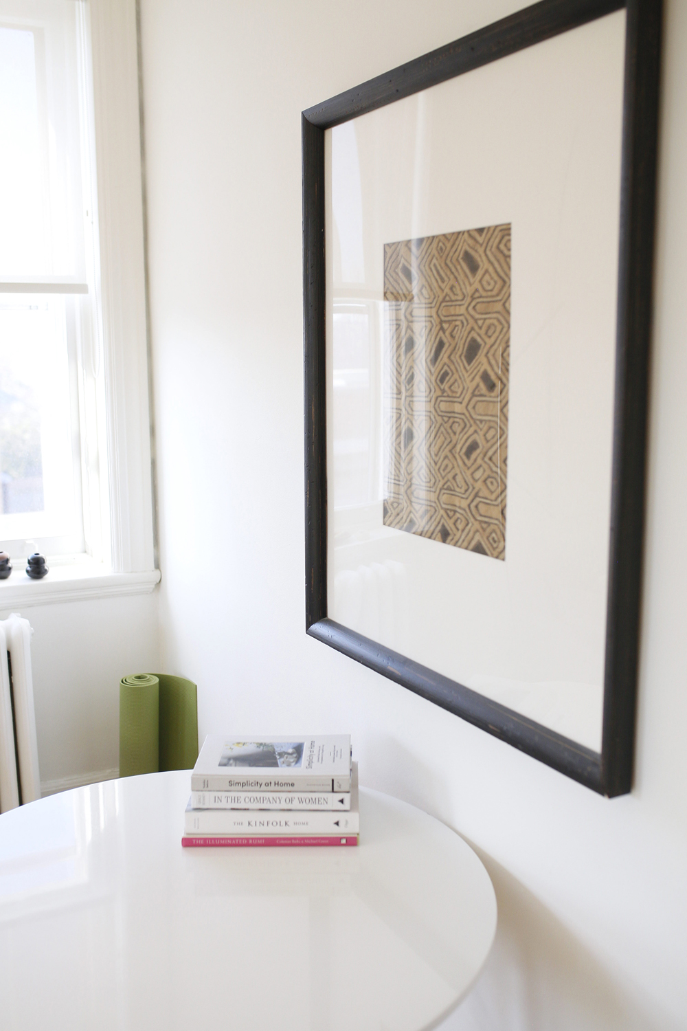
A Fine Weave
All of the artwork in Sachiko’s apartment has personal meaning. This is one of two Kuba cloths (the other is in the dining room) that she bought at London’s Portobello Road Market. Kubas are made in Africa using woven grasses that are cut to resemble velvet.
Related: 12 Ways You Can Organize Your Kitchen Like Marie Kondo
Work From Home
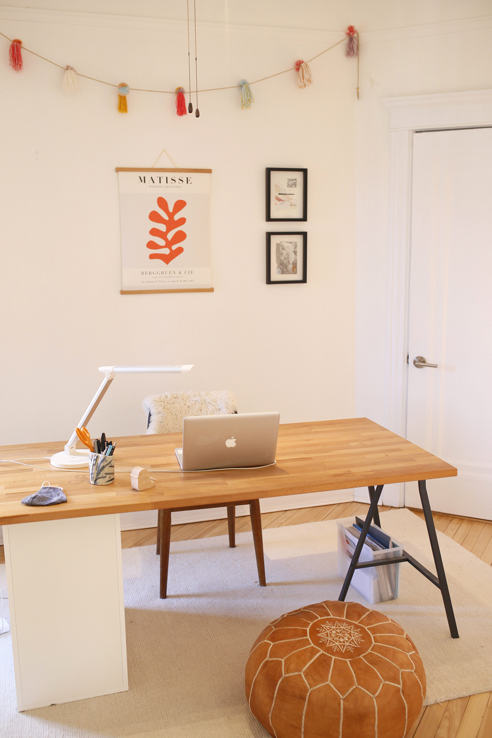
This inviting and cheerful home office is testament to Sachiko’s flair for budget-friendly design. The desk is from IKEA and the chair from her local hardware store. Personal touches layer in warmth: the black frames hold collages that Sachiko made and the whimsical garland is from textile artist, Boho Montreal.
Finishing Touches
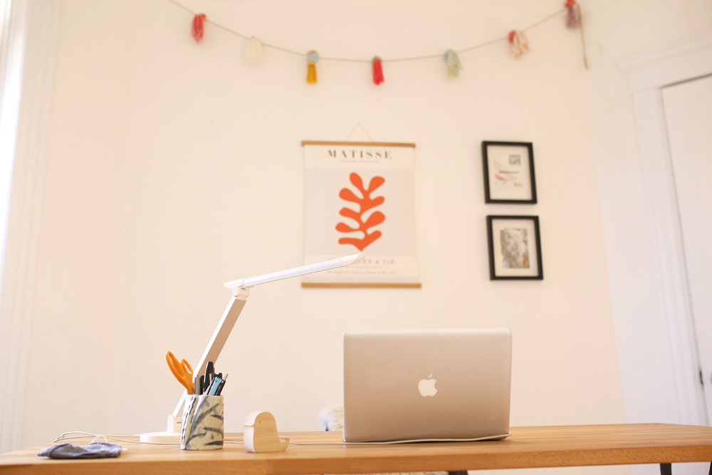
The IKEA desk top is beech butcherblock, a practical work surface that lends further warmth to the workspace. The pen holder is a cup that Sachiko’s daughter made, and the Matisse print was purchased on Etsy.
Related: Is Home Your Happy Place? Here’s How to Organize Your Home to Support Mental Wellness
Home Office
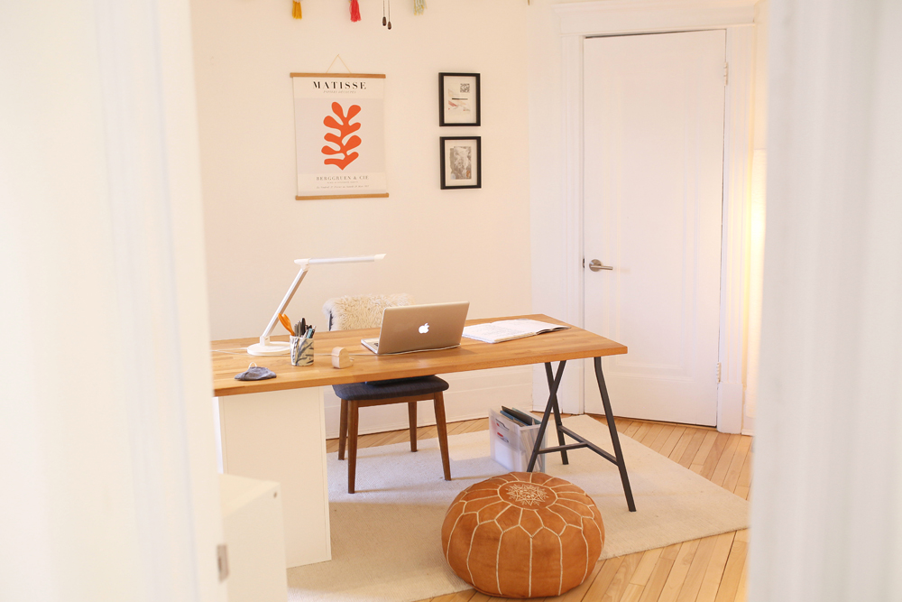
This angle of the home office highlights the new interior door handles chosen for their contemporary, minimalist style. The pouf is pure fun. “I was really into Moroccan poufs way before they became trendy,” says Sachiko. “I ordered this one from a Moroccan homegoods supplier online, but Baba Souk in Montreal has all kinds of beautiful ones.” The rug is from Home Depot.
Related: 14 Insanely Stylish Small Home Office Ideas to Copy
On the Wall
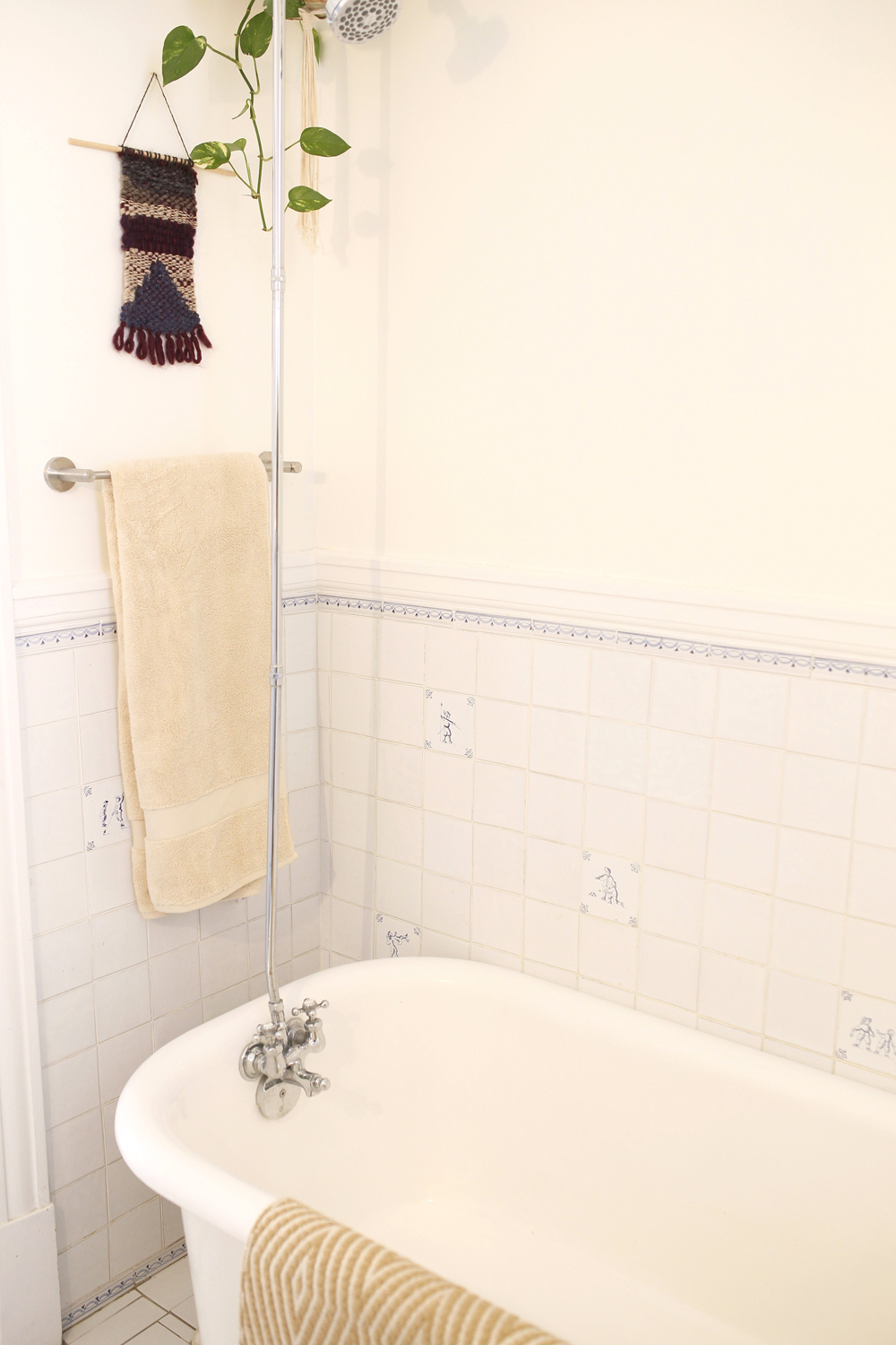
Sachiko echoed the shape of an everyday folded bath towel with an interesting macrame wall hanging made by a friend of her daughter’s. It adds interest to the light space and its nubby texture is a nice foil to the smooth wall tiles. A hanging plant furthers the natural feel.
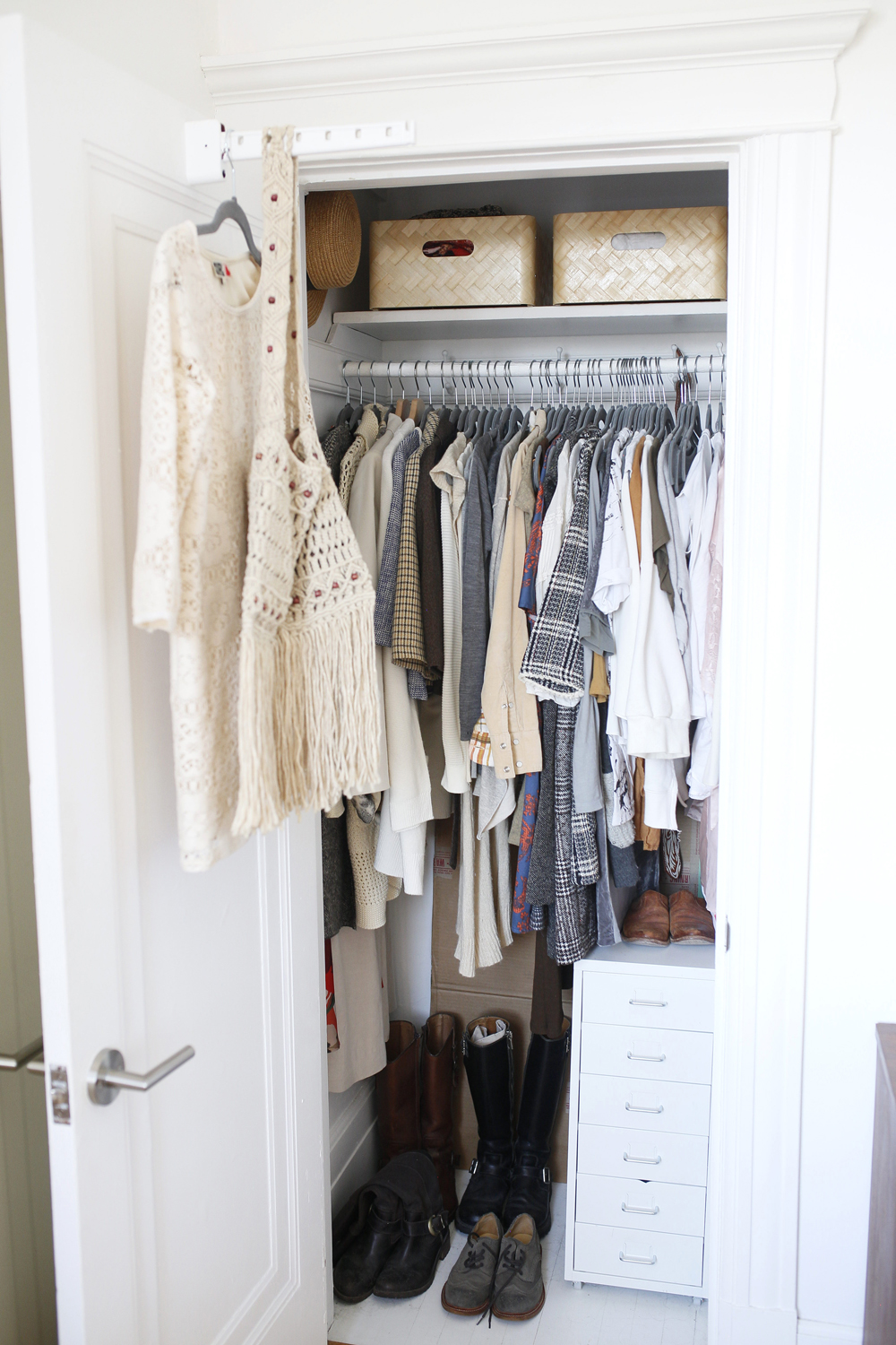
Closet Case
Looking at Sachiko’s closet, it’s pretty easy to guess that she’s a professional organizer. To make the most of her small closet, she added IKEA items: a freestanding white metal drawer unit for smaller items and baskets for more easy-to-access storage. An extended door hook provides even more hanging space.
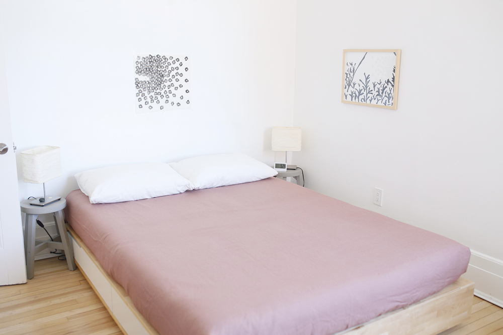
Pretty and Pink
In a world saturated with styled beds, this simple alternative feels wonderfully minimal, yet still warm. The bedding, lamps and stools are all IKEA (the stools, originally wood-tone, were painted grey). The artwork was made Sachiko’s daughter, a Concordia print-making graduate.
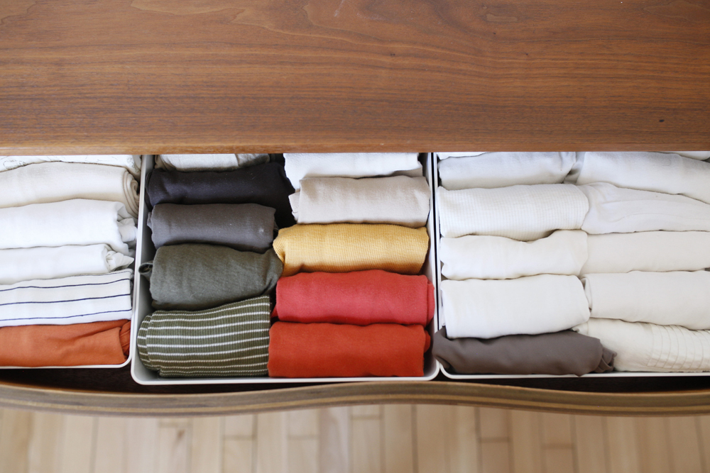
Orderly Fashion
If you’re interested in organizing your space like a pro, steal this look! The “file folding” method is tidy and maximizes drawer space, as seen in this dresser.
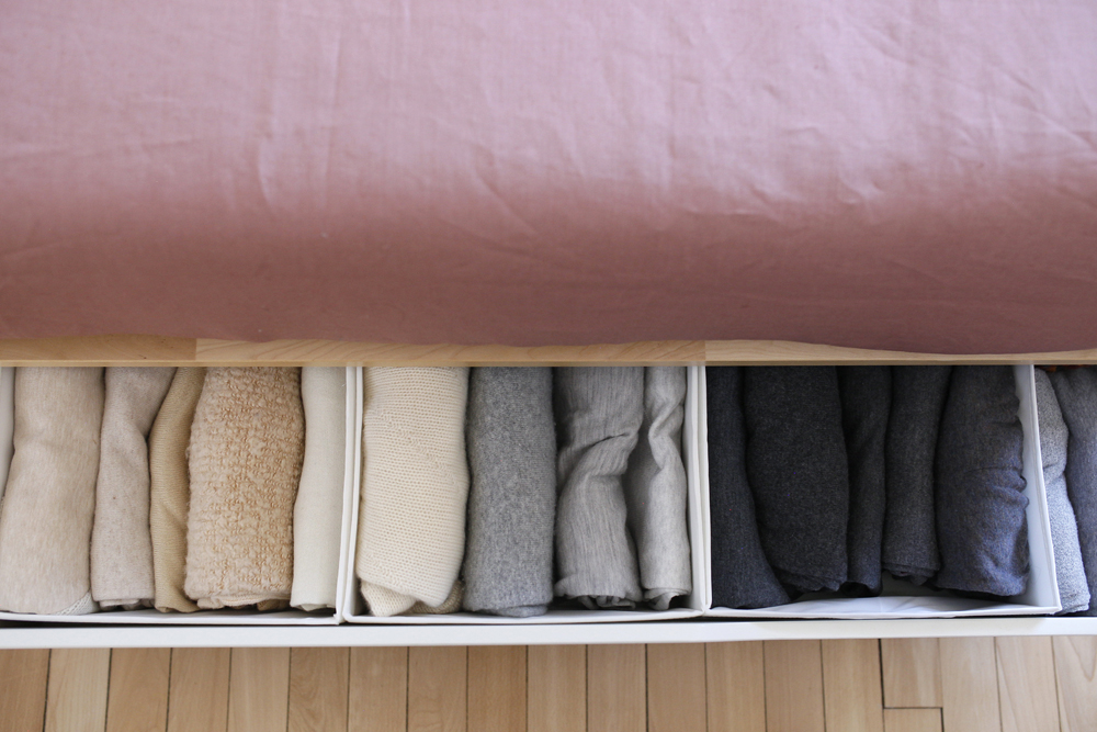
Underneath it All
The file folding continues beneath the bed (a great, otherwise unused, space to maximize) and here Sachiko furthers its efficiency by colour-coding items. “My feng shui tip: if you use under-bed storage, it is super important that what is there is appropriate for a bedroom, and is tidy and uncluttered. The energy from what you have stored under your bed will affect you.”
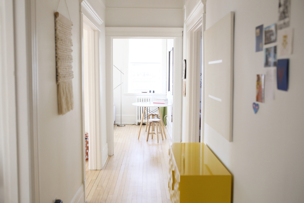
Colour Burst
“The yellow hall cabinet is another find from my local hardware store. I watched it in the display window for a year, and no one bought it. When I saw it went on clearance sale, I snatched it up!”
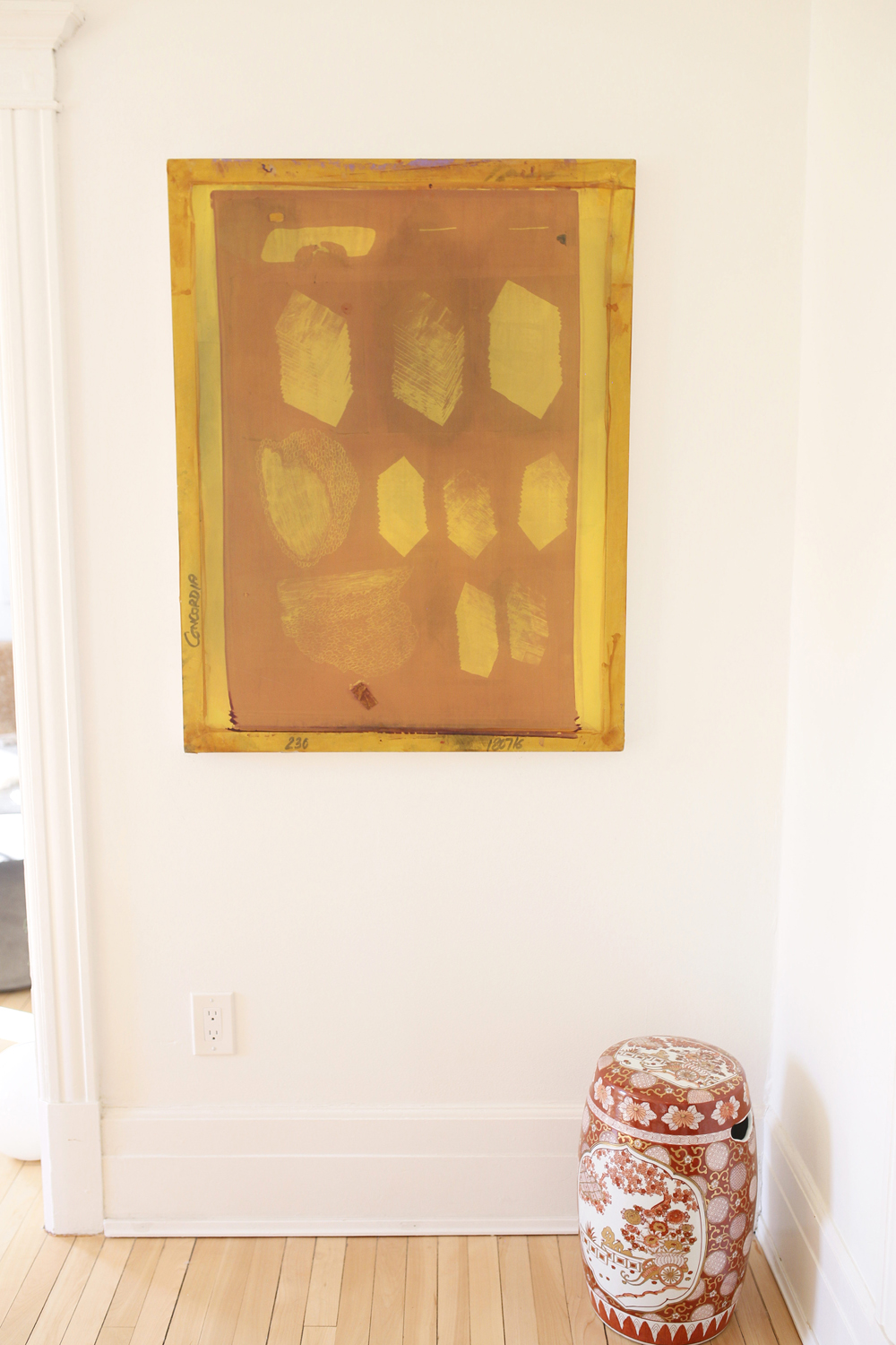
Gold Touch
This art hangs in the dining room and is a piece that Sachiko is particularly proud of. “It was one of my daughter’s working silkscreens when she was attending Fine Arts at Concordia. I liked it so much, I asked her if I could buy it from her to use as art! I bought her a new silkscreen to use for her next project and put this one on my wall. I love it.” The Japanese ceramic stool is a treasured piece that belong to Sachiko’s parents.
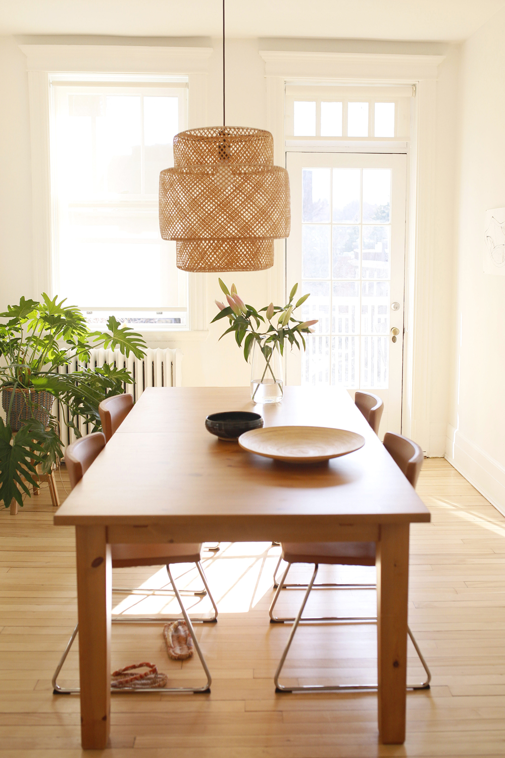
Light and Bright
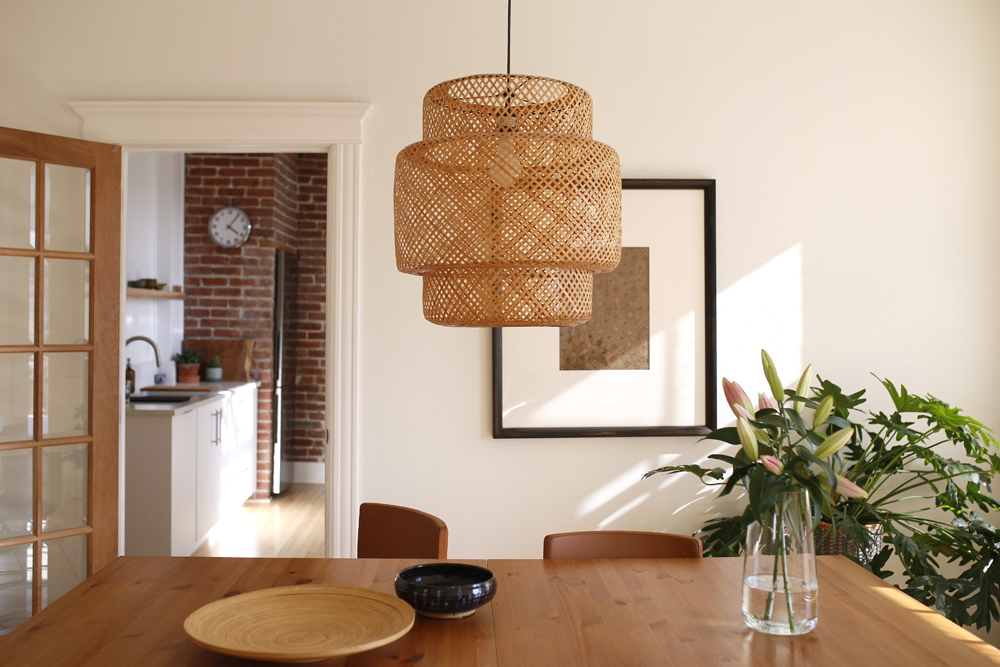
It’s hard to believe that this bright and sunny dining area was once intense lime green. Sachiko painted it, and all the other rooms, Chantilly Lace by Benjamin Moore. The pendant light, which looks like it was custom made for this space, is from IKEA and had hung in her previous apartment.
Related:15 Renovation Ideas That’ll Make a Studio Apartment Look Bigger
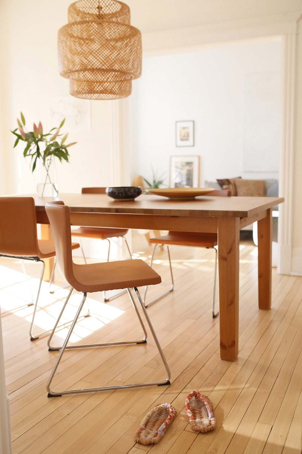
Budget Beauties
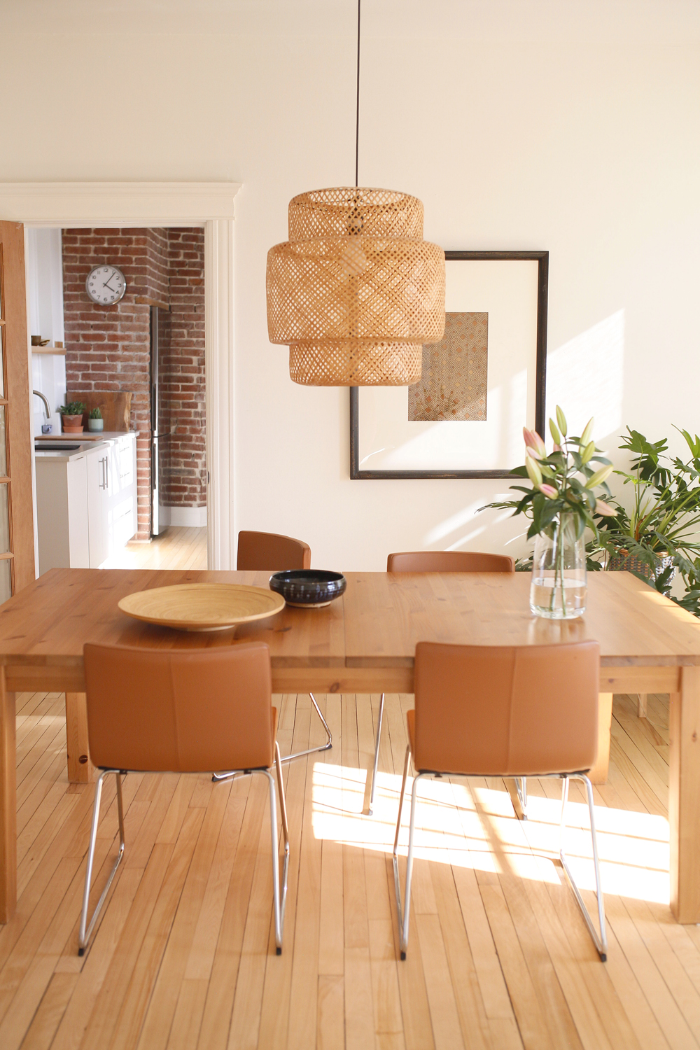
These gorgeous chairs in a rich, old-world caramel hue are actually IKEA finds, as is the chandelier. “You can see, IKEA is a theme in my home,” says Sachiko. “I like to use natural materials and I appreciate their items made from bamboo, metal and wood. This light fixture is such a beautiful timeless design, and came out of the partnership between the designer Ilse Crawford and IKEA, to create products from sustainable materials.”
Go Green
A Monstera plant adds an organic element to the dining room. “It has doubled in size and is very happy in this location! The room looks empty and soulless when I remove it. I just love how plants instantly bring life, organic form and uplifting chi into any room.”
Poetic Licence
The sun-filled dining room expresses Sachiko’s approach to décor. “My space is ever-changing; it evolves with me and expresses how I’m feeling and what matters to me at a given time. I think there’s poetry in our spaces. Haiku is a form of poetry I love and my rooms feel like little haikus to me!”
A Nice Change
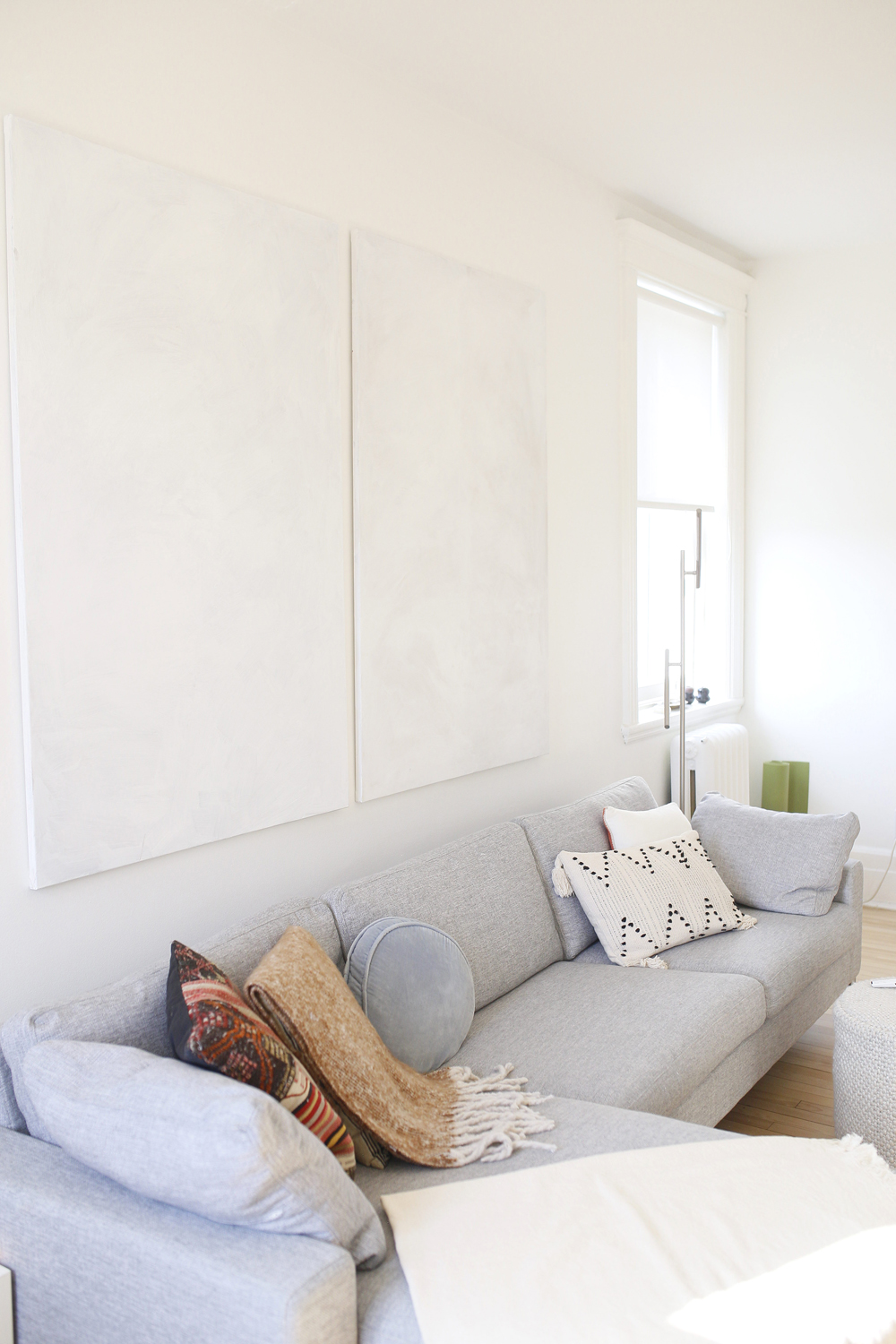
Sachiko feels a huge benefit of her work is being able to be inspired by her clients’ spaces and that inspiration makes her feel less compelled to constantly change her own home – almost! “Yes, I was super into this sectional when I got it, but I already feel something else call me. Next time? Velvet!”
Plant-Based Style
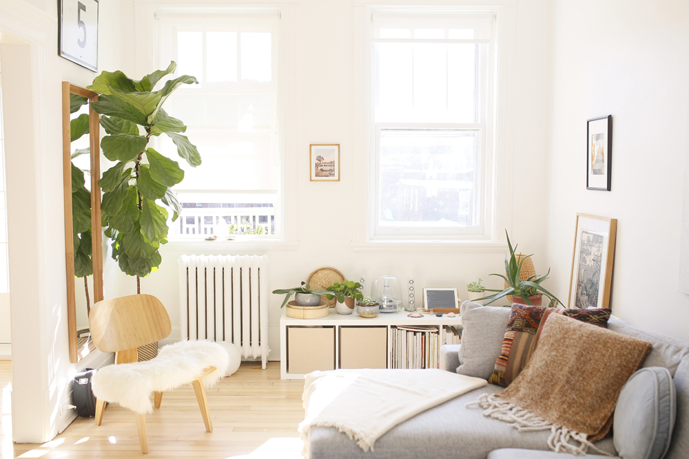
A large paddle-leaf fig tree enlivens the neutral living space, while imparting a soothing sense of calm. Sachiko says, “Little touches, like plants, bring soulfulness into a space.”
Related: 13 Things to Do This Spring for Happier Indoor Houseplants
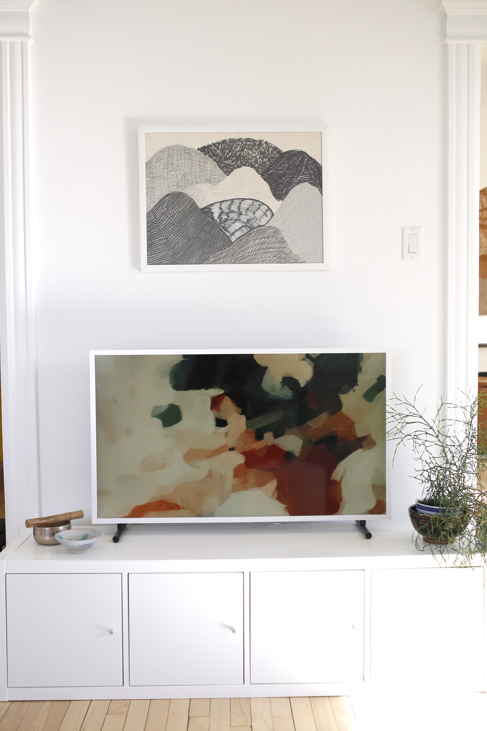
Smart Art
Elena’s black and white artwork holds its own against the Samsung Art TV, a favourite of Sachiko’s. “I love it! I was going to mount it but because the walls are plaster and lathe, I decided to leave them alone. I find it is quite aesthetically pleasing and minimal just on the stand. And I love changing out the artwork whenever I feel like it, which is very often.”
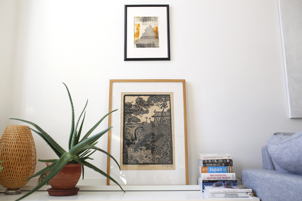
Artist in Residence
This corner of the living room proves that Elena is not the only artist in the family. Sachiko says, “I made the top piece of art in a printmaking workshop.” It hangs above a woodcut-print on craft paper. “This is from Volcanoes National Park in Hawaii, and it’s a piece I adore. It reminds me of a wonderful trip with my girls and their dad, and of the tropical foliage and laid-back feeling which I love there.”
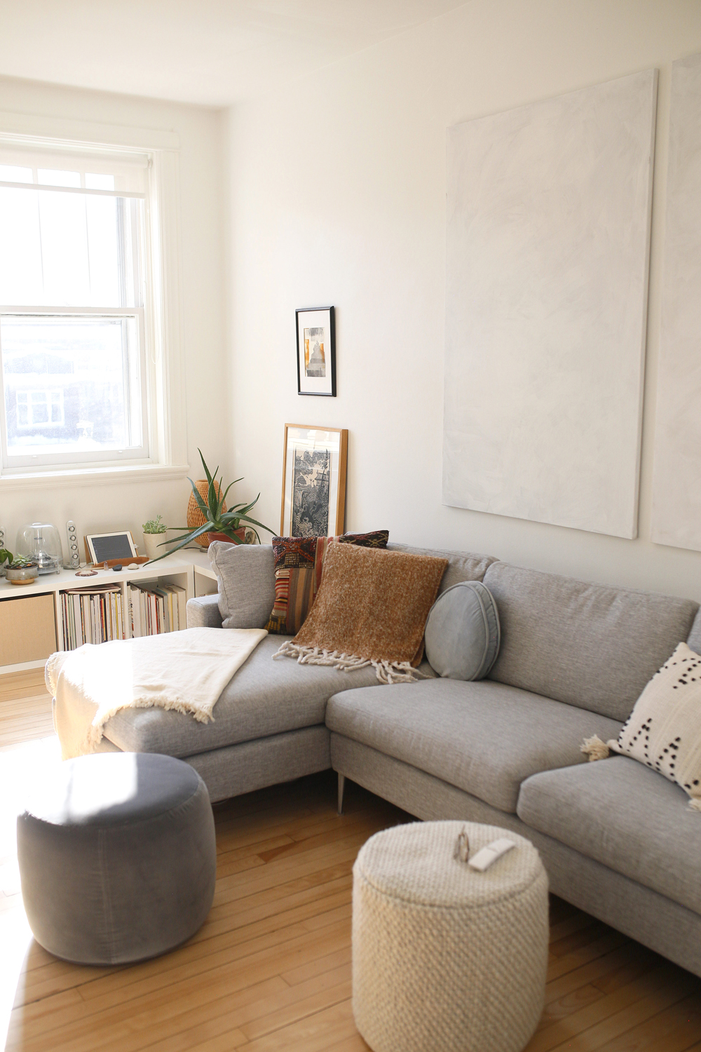
Wallet-Friendly Wow
The minimal, large-scale artwork above the sectional is the result of DIY handiwork. “I wanted something not expensive and big and neutral here.” The smart Nova sectional and textured ottoman are from Article; the blue one is from IKEA.
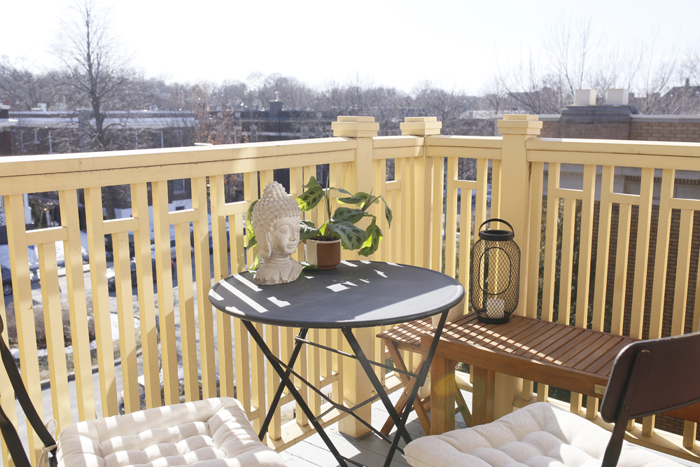
Decked Out Zen
The south-west facing deck features an IKEA table and chairs (originally taupe, now painted with matte black chalk paint), a hardware store bench and thoughtful accessories. “I believe you can create a beautiful, soulful space without great expense, by focusing on larger purchases, a harmonious balance of materials and soulful personal touches. Feng shui is the art of creating an energetically nourishing environment that is just right for you and where you can thrive.”
Related: Summer Staycation: The Coziest Patio Furniture Perfect for Small Spaces
HGTV your inbox.
By clicking "SIGN UP” you agree to receive emails from HGTV and accept Corus' Terms of Use and Corus' Privacy Policy.


