When Kelly and Gene first purchased their ’70s property, they considered it a great place to raise a family and eventually rent out while they travelled the world. But now that they’re back in town and looking to settle into their retirement years, their former dream home suddenly felt in need of massive improvements. With awkward ceilings, wood-panelled walls and a dysfunctional layout, the couple tasked designer Jillian Harris with bringing the abode into this decade. Here’s how she and her Love it or List it Vancouver team transformed the tired space into a contemporary haven.
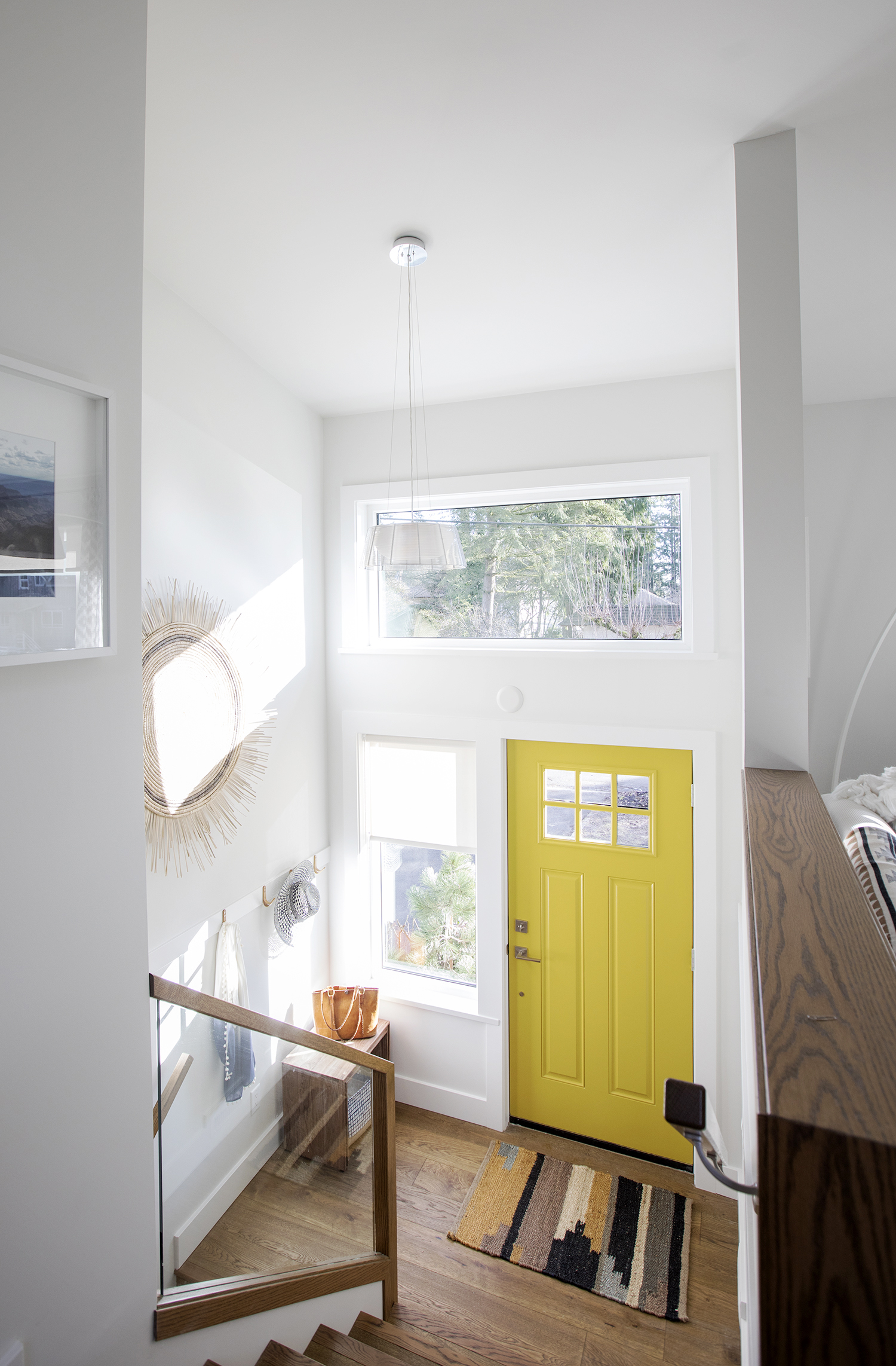
Bright New Welcome
With dated floors and a dim vibe, the home’s original entryway wasn’t exactly something to boast about. But thanks to fresh paint, wire-brushed oak floors and a sunny yellow door, the space gives off a cheerful feel the second you enter.
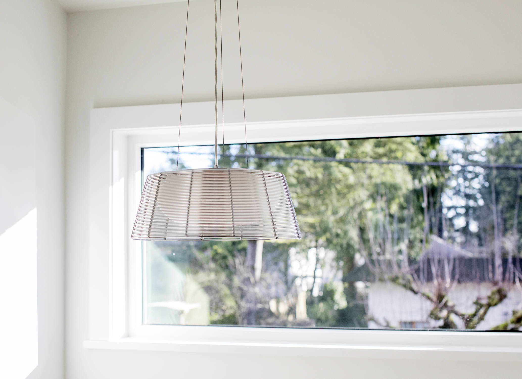
Modern Fixture
The entryway’s high windows allow tons of natural light to spill into the space. We love the addition of this hanging light fixture, which is barely visible from ground level but casts a warm glow in the evenings.
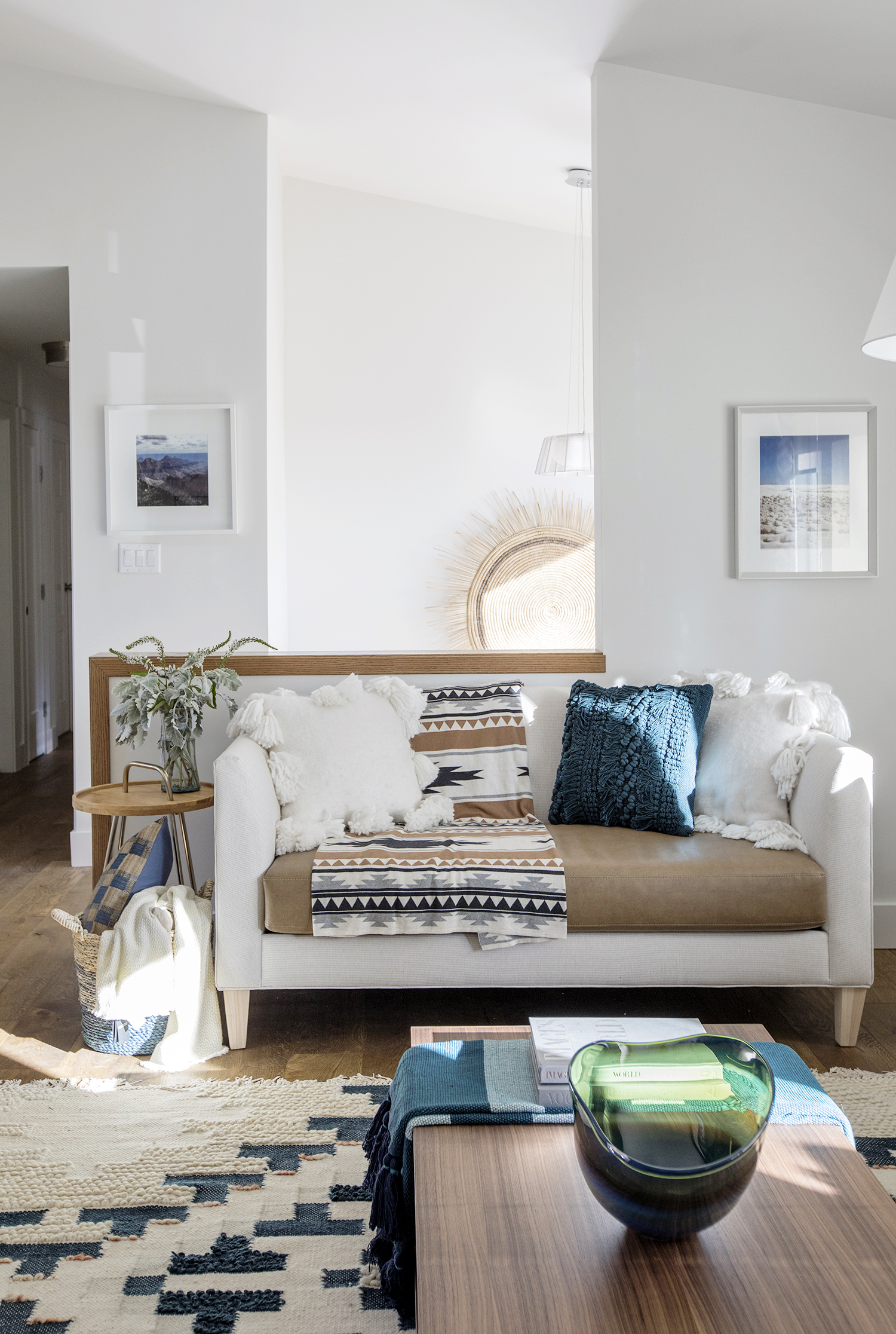
Spacious Transition
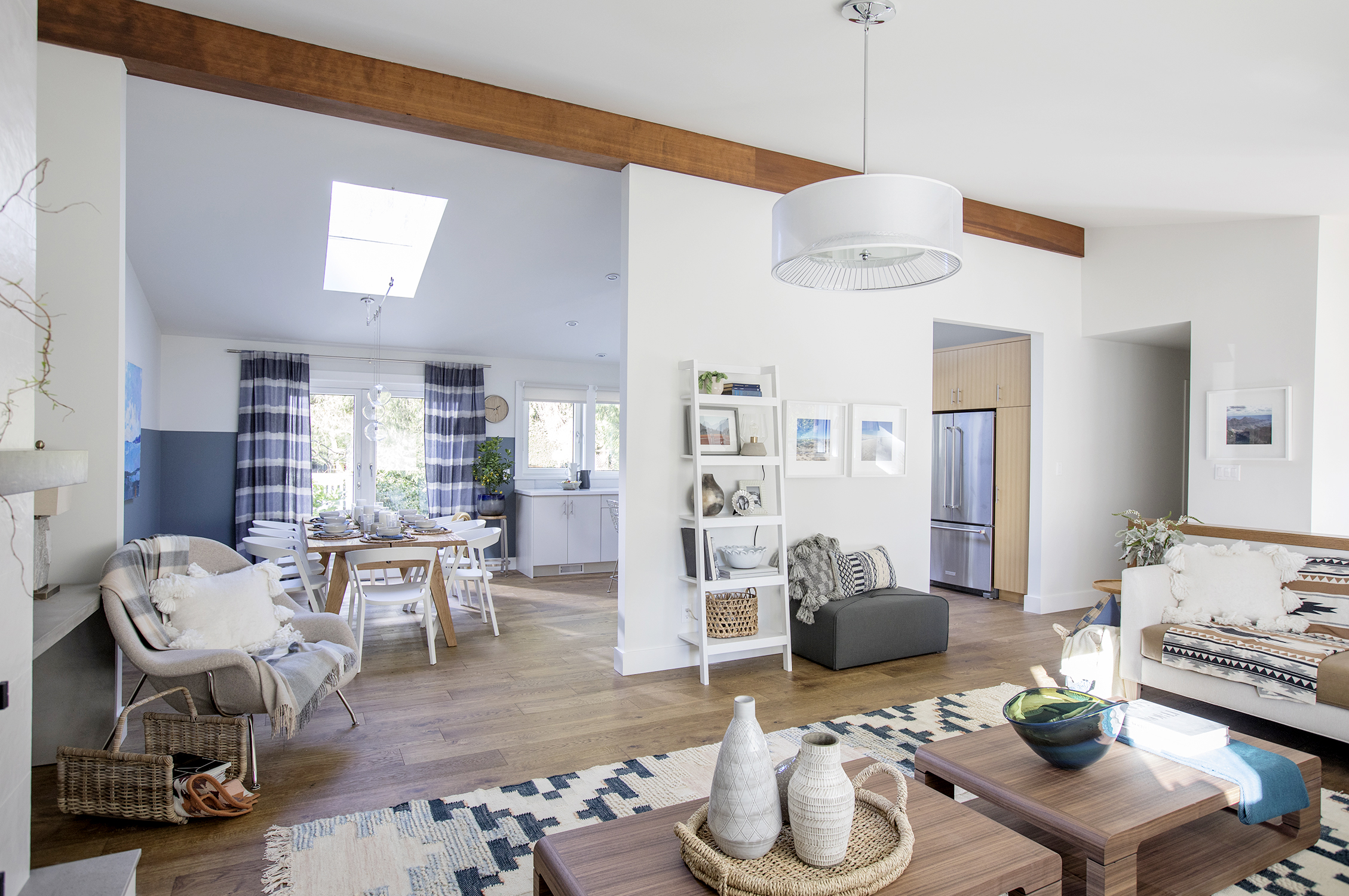
Walk up the stairs and you’ll stumble upon this gorgeous open-concept living room outfitted with textured pieces in soft cream and blue tones along with warm beige furniture. The overall look is contemporary with a cozy, earthy vibe.
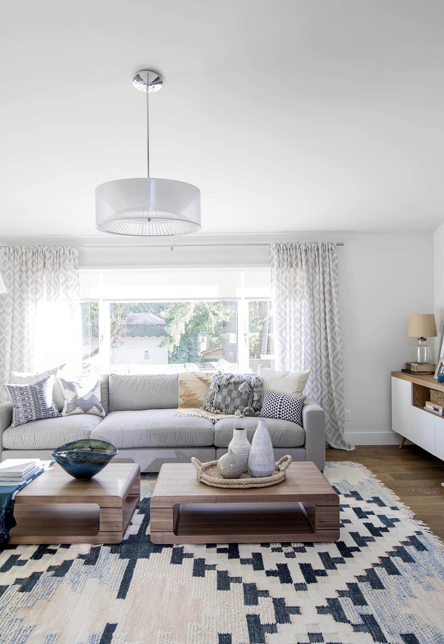
Snug Spot
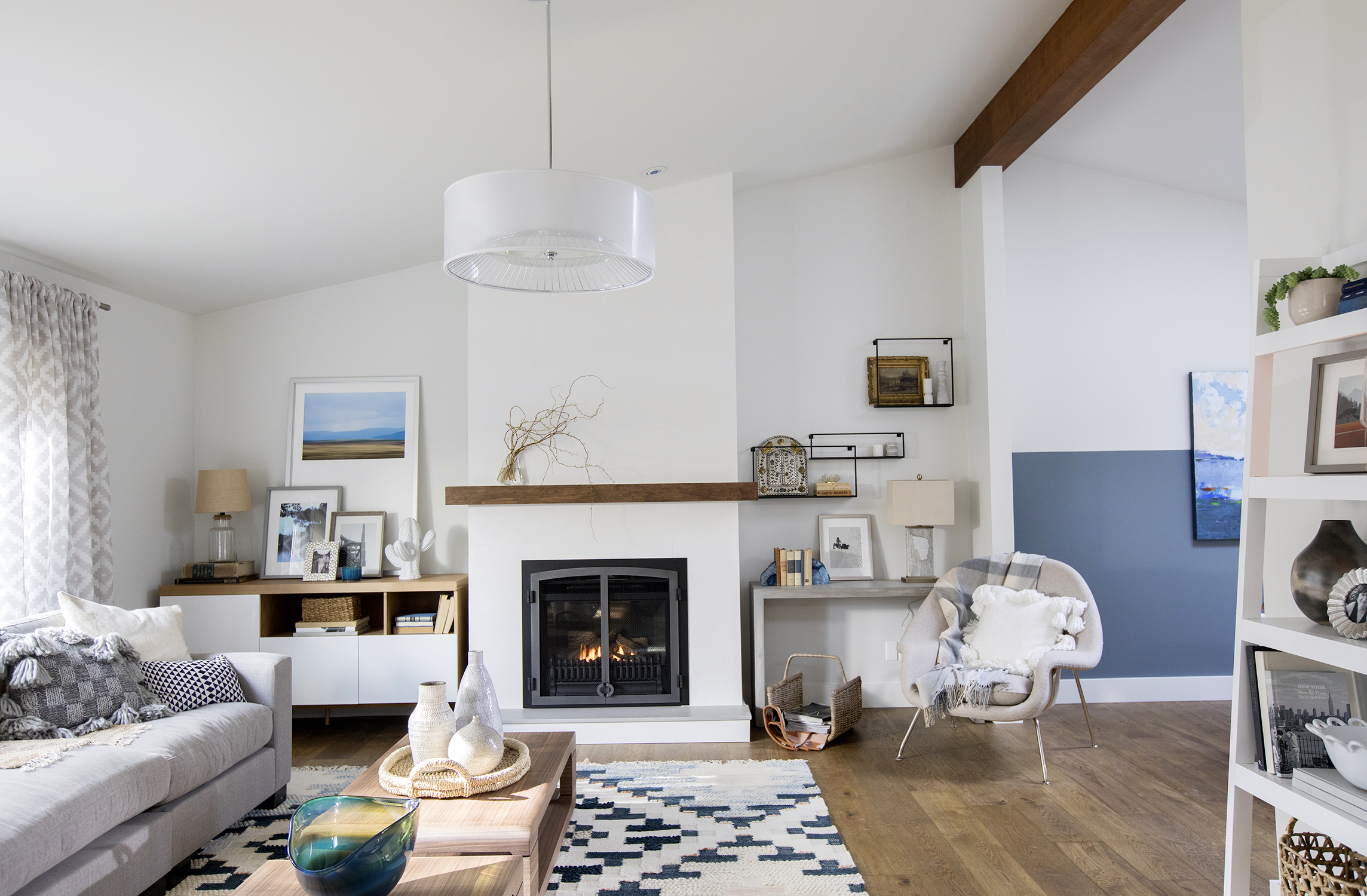
The home’s original wood walls were dragging down the space, making it feel tired and outdated. New walls, fresh paint and a few well-selected furniture pieces convert the area into a living room you’d want to relax in.
Instant Heat
Jillian removed the wood-burning fireplace on the back wall and replaced it with this updated model that heats up with the flick of a switch. The pretty new wood mantel adds a natural touch to the space, while the storage unit to the left allows plenty of extra organizational opportunities.
Elegant Touches
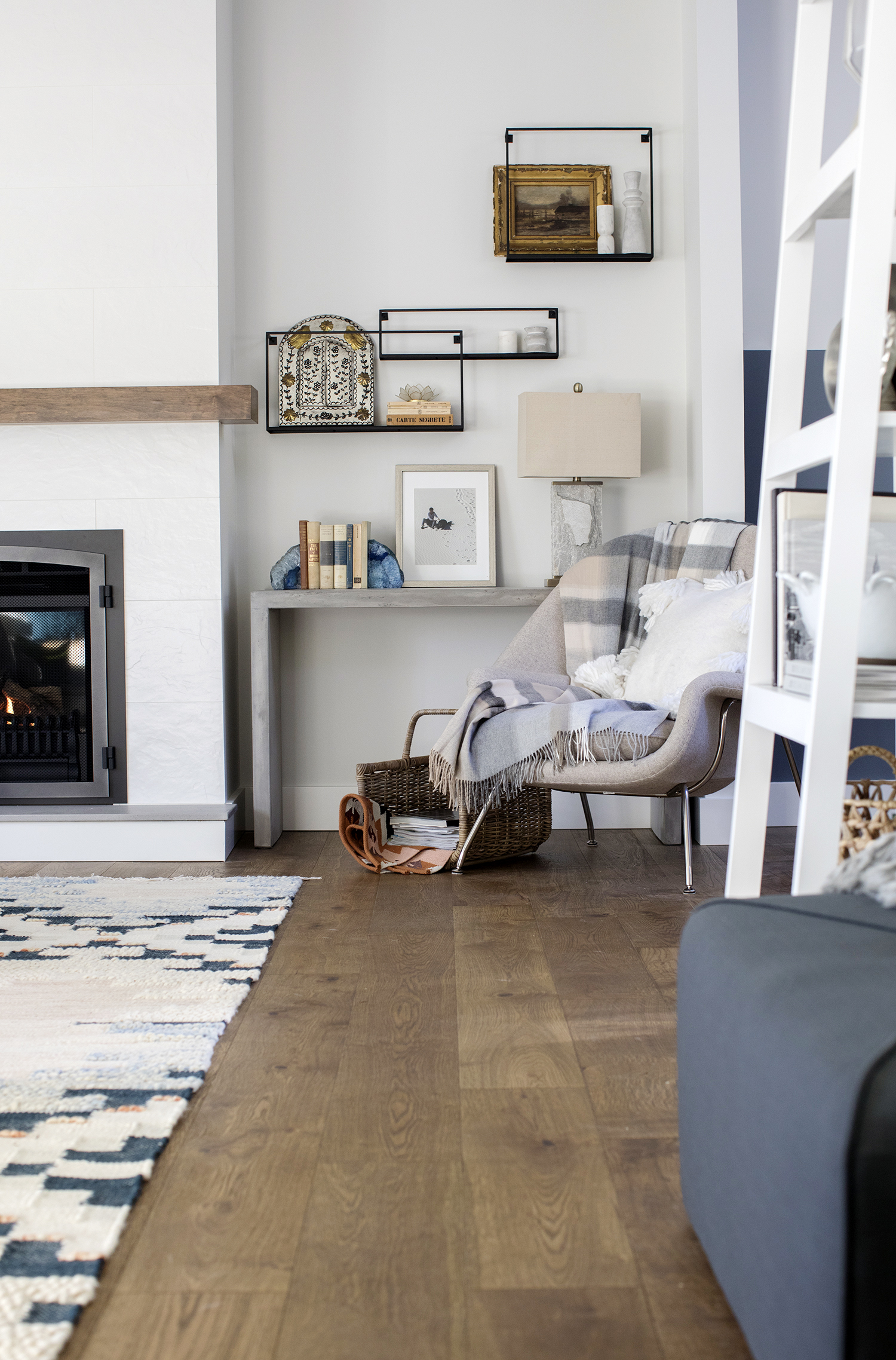
These black-framed shadow boxes are modern and unique, but vintage items placed within create an intriguing contrast. Meanwhile, a sharp concrete console table and modern armchair lend instant design appeal.
Open-Concept Living
Jillian didn’t remove all the walls in this space, and for good reason: With enormous windows in the kitchen, she wanted to give the homeowners more privacy.
Modern Dining Area
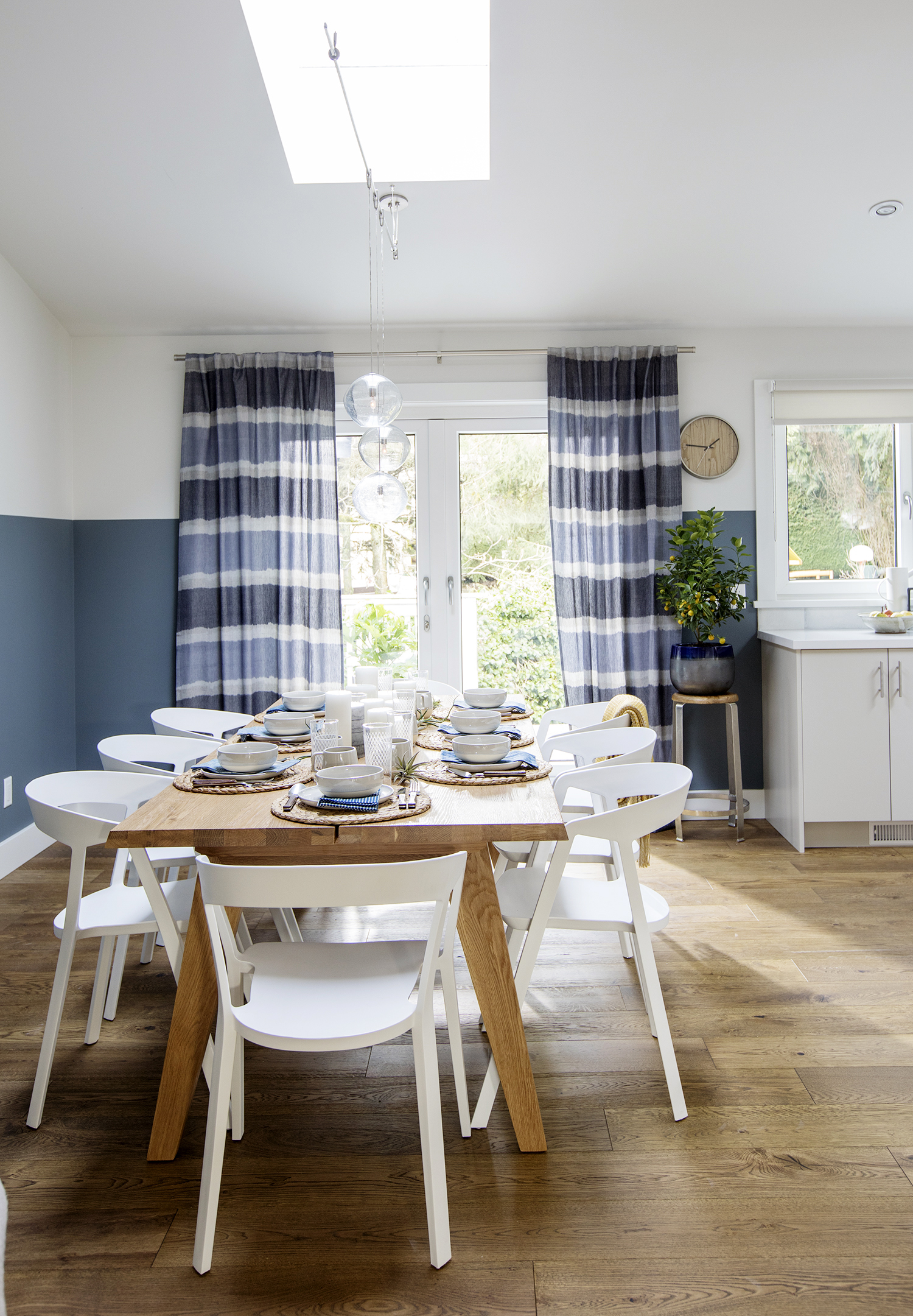
The cream tones and wood elements continue in the dining area. The rustic table is sturdy, stylish and perfect for family get-togethers. The sleek white chairs with curved profiles pop against the wire-brushed flooring, while the two-toned walls and patterned blue drapery add a modern-meets-playful edge.
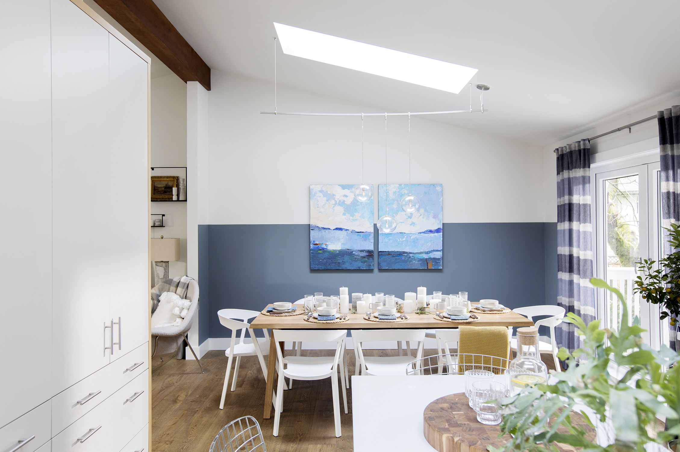
The Perfect Nook
From this angle, contemporary blues pop beautifully against the eating area as the light pours in from above. Meanwhile, French doors leading to the patio naturally extend the indoor space during the warmer months.
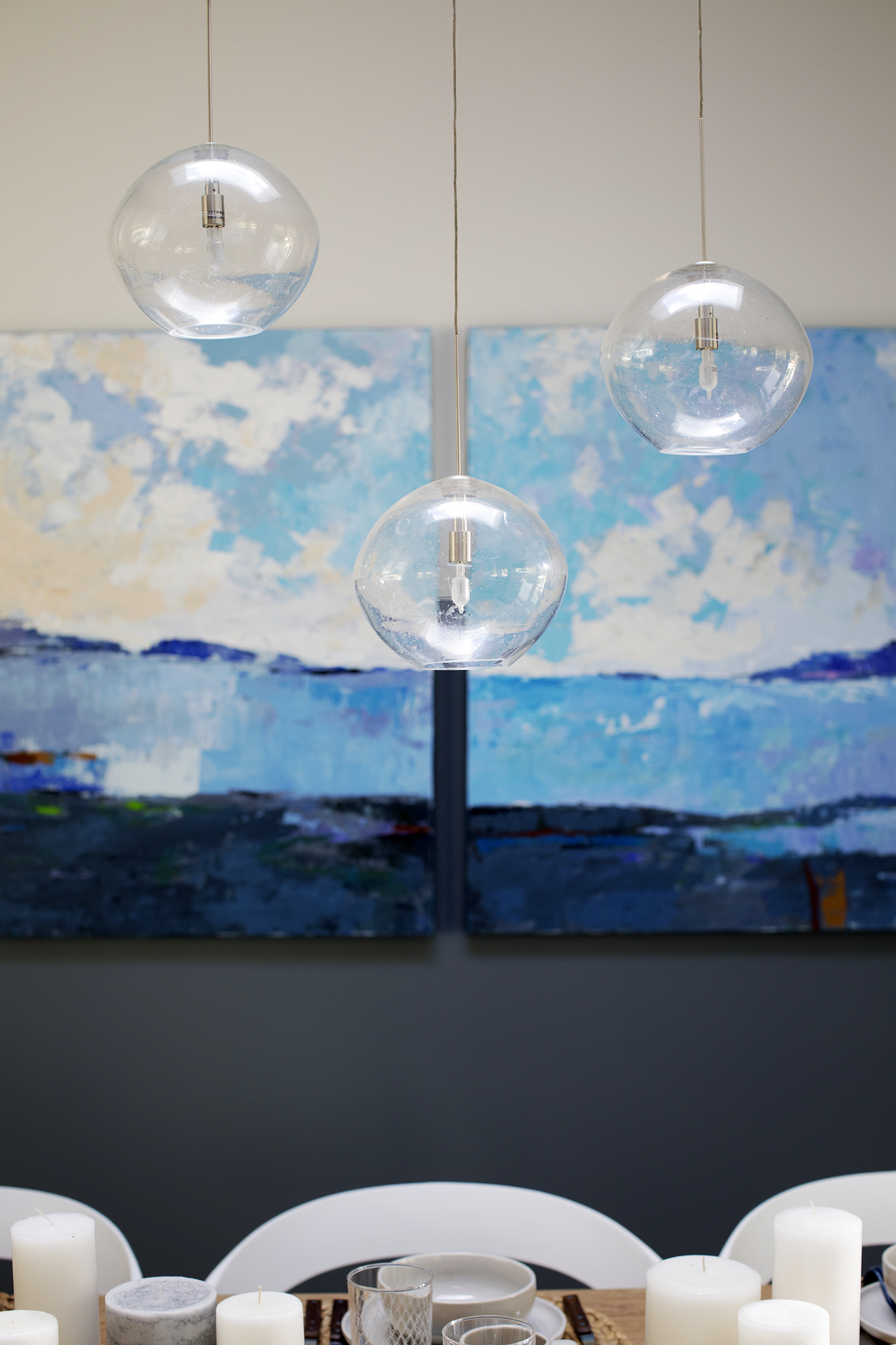
Custom Lighting
With a large skylight overtop the dining area, Kelly never knew how to properly illuminate the space. In order to work around its awkward slanted ceiling, Jillian went custom with a pretty light fixture from a local Vancouver retailer.
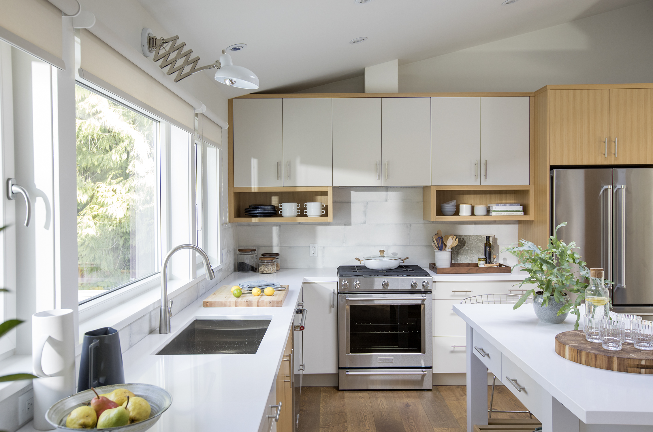
Modern Kitchen
White and wood finishes continue into the kitchen, preserving some of the home’s original charm. New extended countertops and custom cabinets allow for maximum storage space.
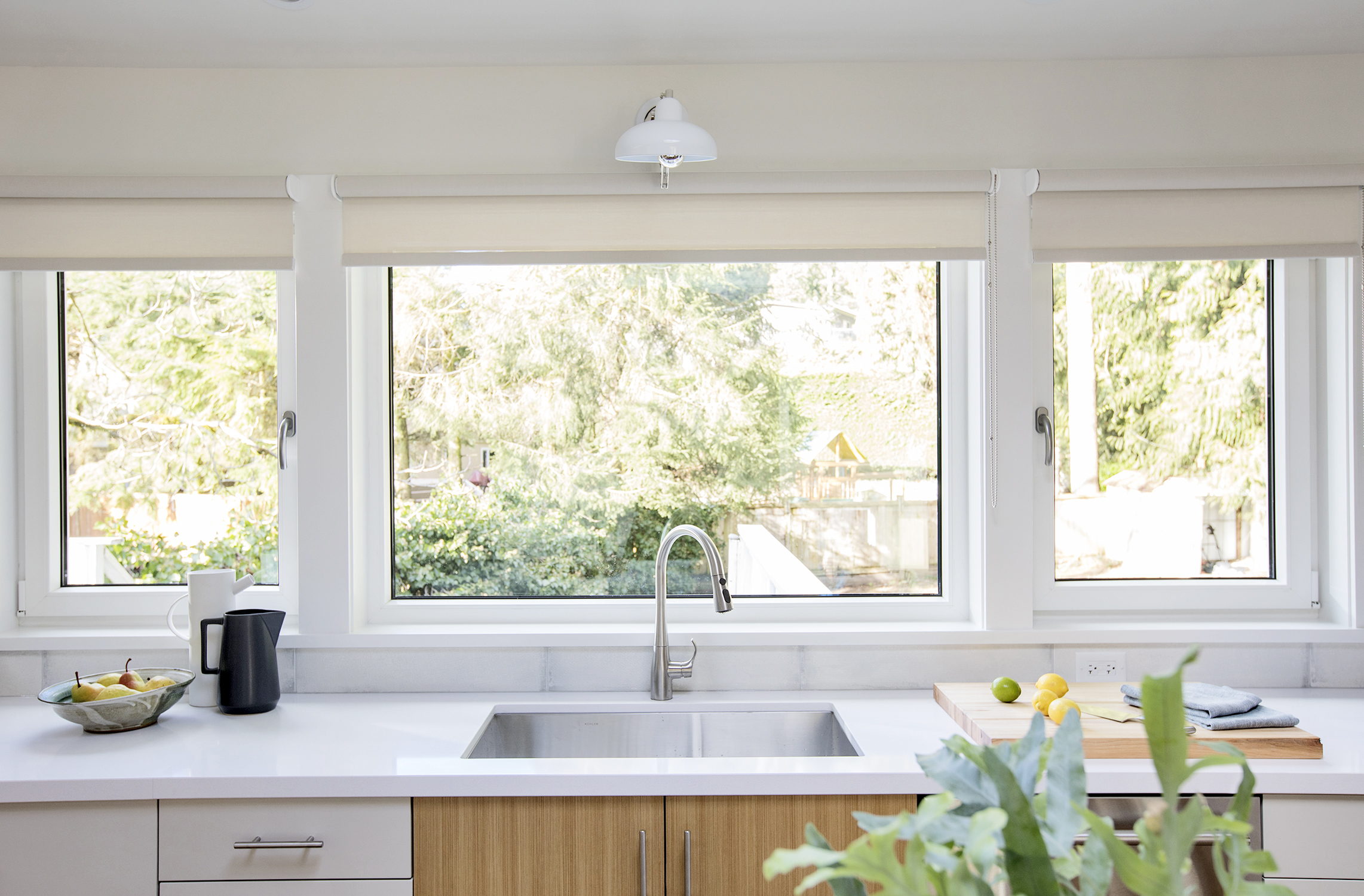
Natural Lighting
Jillian kept the kitchen’s oversized windows to make the space feel even larger. The simple white trim lends a modern feel, while the stainless-steel faucet and hardware keep the look streamlined and pretty.
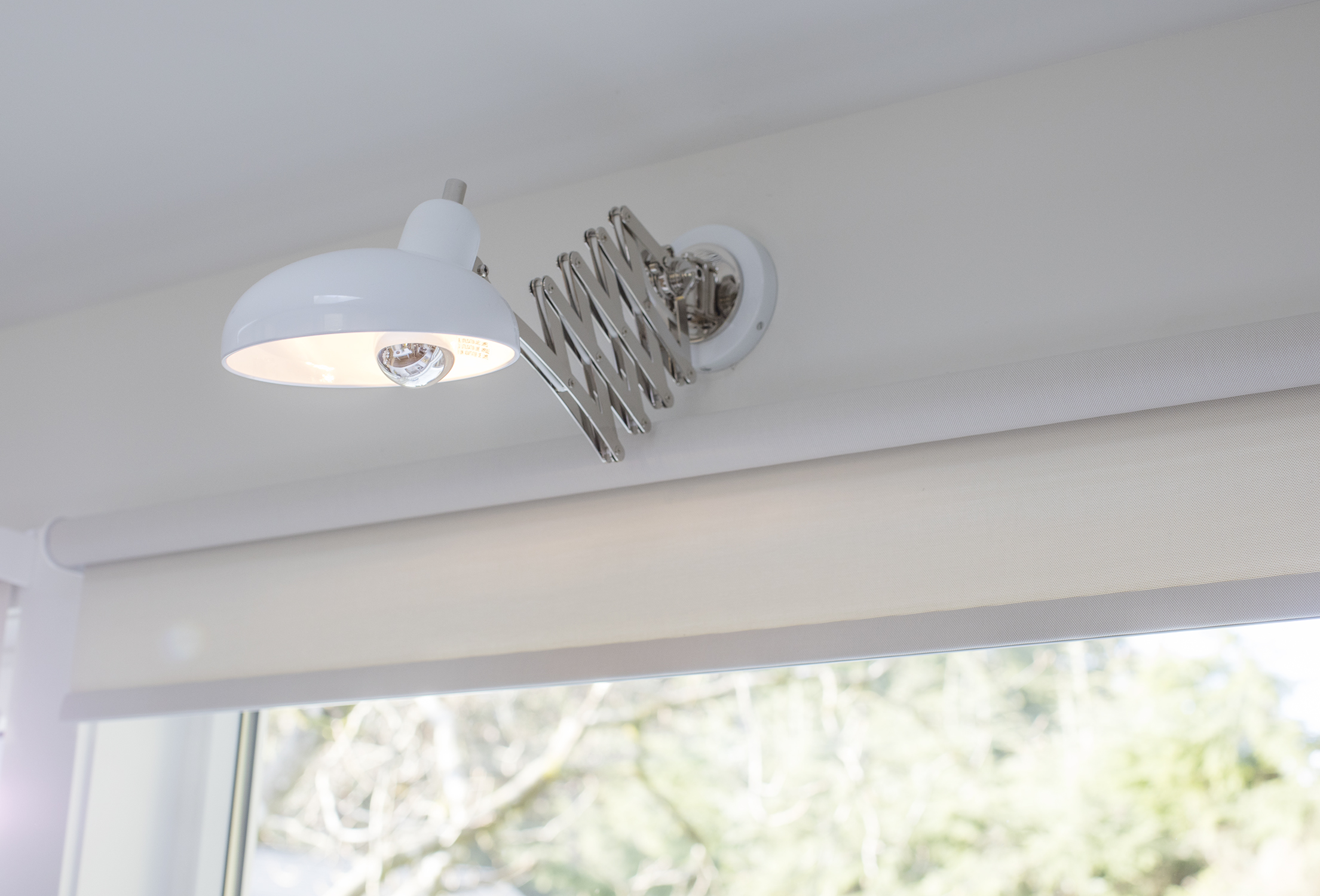
Creative Lighting
We love the use of this extendable wall sconce! It’s the perfect size for above the sink and adds just the right amount of flexible illumination. It also complements the other chrome finishes in the space.
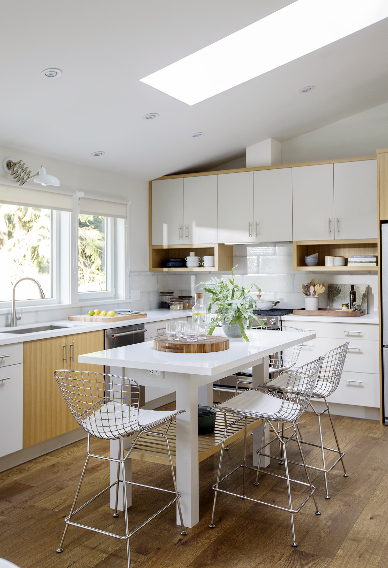
Convenient Island
This small island provides extra seating and another food prep zone. It’s also compact enough to keep with the room’s open-concept flow. The wire-framed chairs add modern appeal, and the shelving below is great for storing oft-used items.
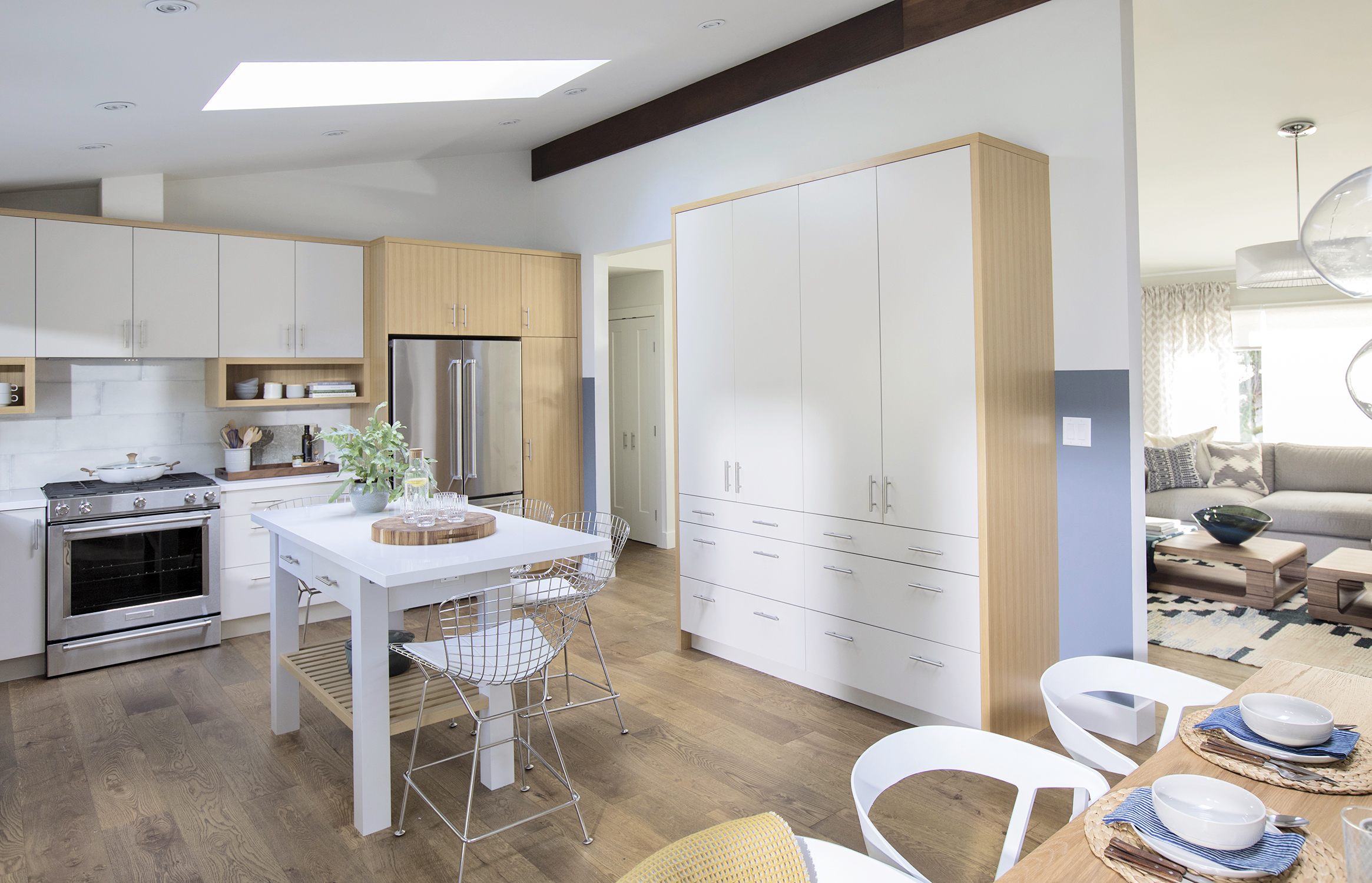
Double Pantry
Kelly and Gene will never run out of storage space thanks to this massive custom pantry. The unit also echoes the look of the custom cabinetry for a more unified aesthetic.
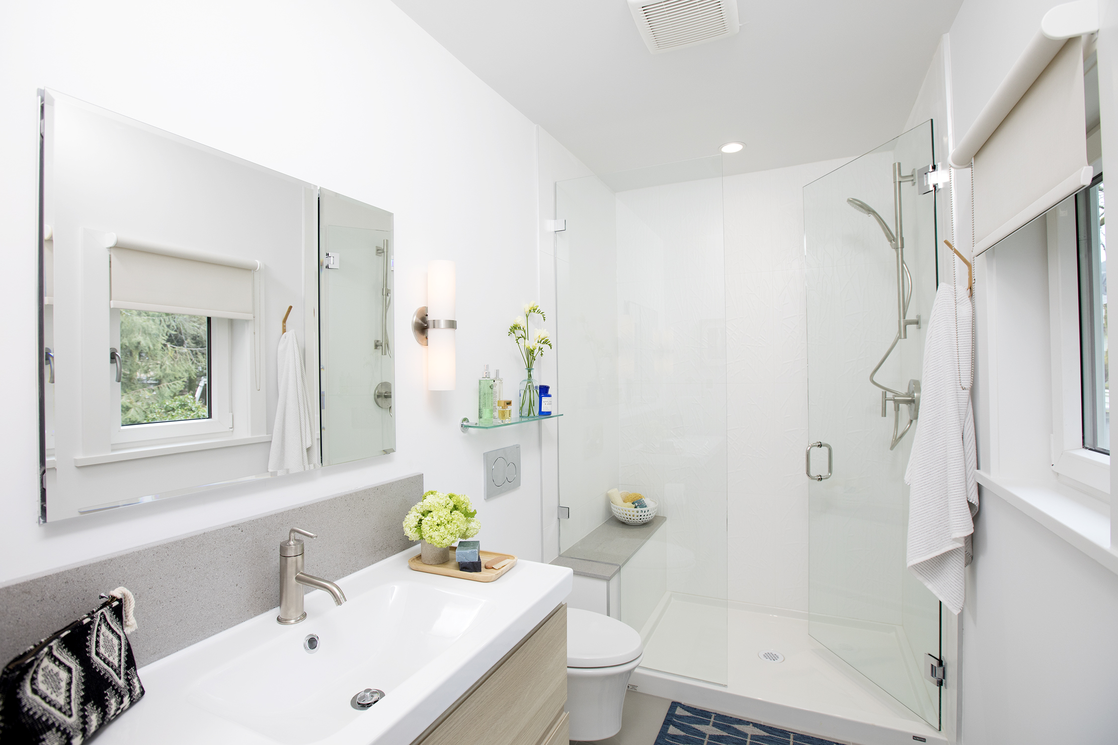
Master Ensuite
Before, an awkward bathroom layout meant zero functionality for these homeowners. But thanks to Jillian’s smart design plan, they wound up with two bathrooms within the same space. This bright master ensuite features a large shower with a spacious vanity that’s perfect for two.
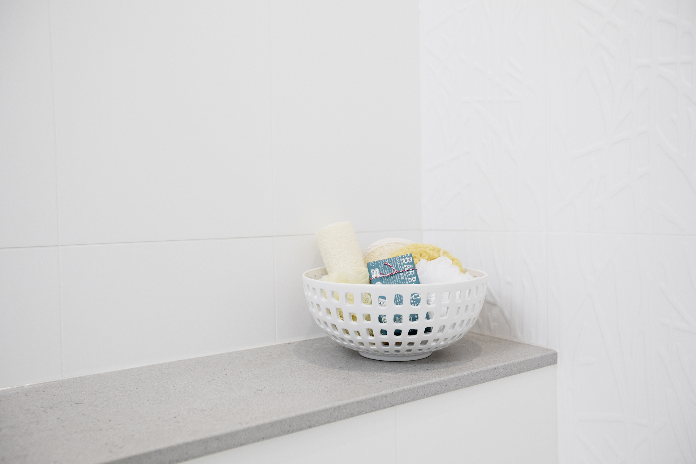
Shower Bench
A built-in shower bench is the ultimate bathroom luxury item, so Jillian made sure to include a small one here. The waterproof basket is the perfect addition to hold extra toiletries and soaps.
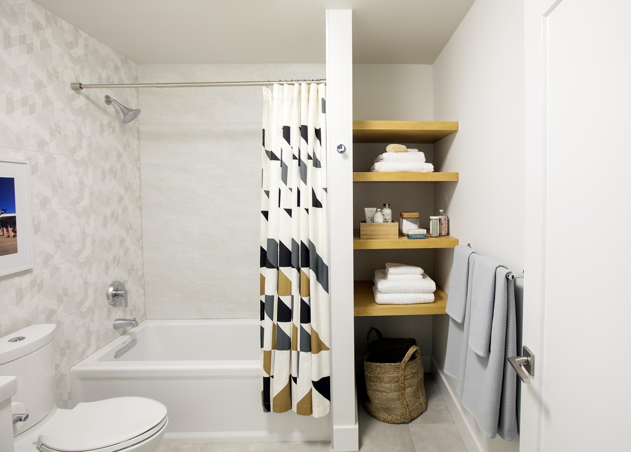
Main Bathroom
The designer also created this three-piece guest bathroom. The large tub is great for adults and children alike, and there’s ample storage space thanks to these built-in floating shelves.
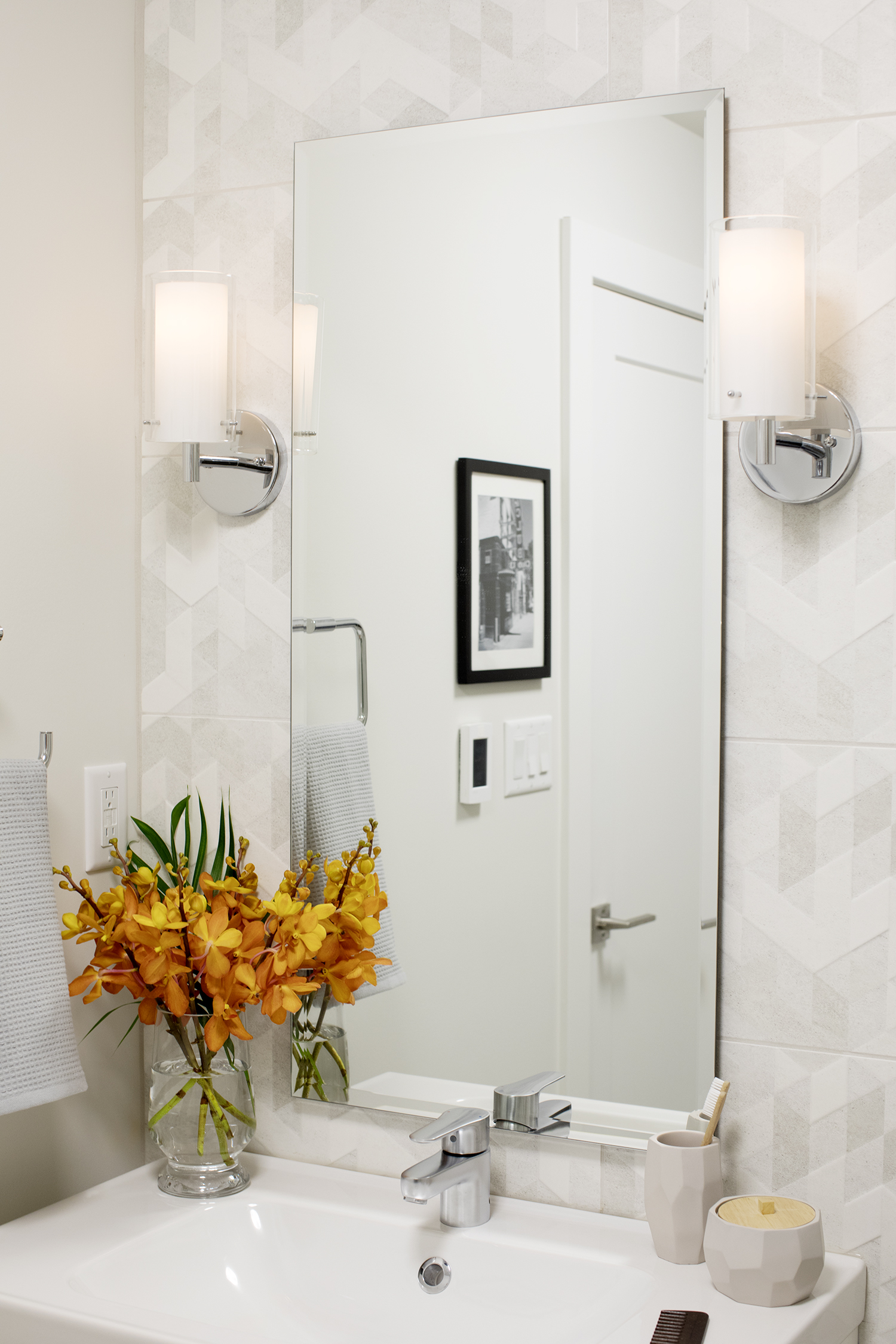
Geometric Tiles
Light grey geometric tiling above the vanity adds instant depth and texture while keeping the room bright. A faceted container and toothbrush holder complement the look.
With so many brilliant updates and a contemporary feel that’s true to the home’s original design, we’re not surprised Gene and Kelly decided to love their home (rather than list it) for the foreseeable future.
HGTV your inbox.
By clicking "SIGN UP” you agree to receive emails from HGTV and accept Corus' Terms of Use and Corus' Privacy Policy.


