Pete has a pretty big sentimental attachment to his vacation home in Whistler — it was the same home his uncle built with his own two hands, after all. But the A-Frame structure felt like more of a bachelor pad than a vacation home for Pete’s wife Judy. With a tiny kitchen, no entertaining space and a dark layout that had her down in the dumps, she was ready to pack up and move on. So the couple called in Dan Vickery and the Love It Or List It Vacation Homes team. Here’s how Dan transformed this tired cottage into a gorgeous and bright living space.
A New Welcome
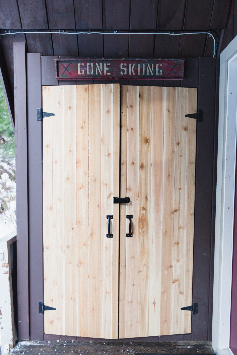
Judy and Pete are an outdoorsy couple, and they had no space to store all of their outdoor equipment. So at the front entrance to the cottage Dan crafted this smart little storage shed for them, where they can safely tuck away all of their bulky belongings.
Functional Storage
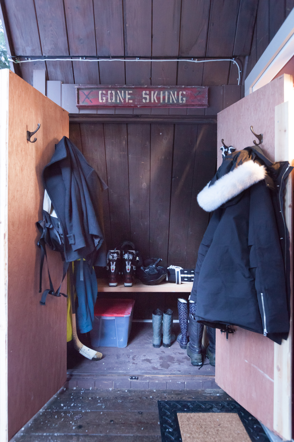
Inside, some simple hooks on the door are great for hanging jackets, ropes and other lightweight equipment, while the small shelf is perfect for stacking boots, snowshoes, skates and any other seasonal items.
Fashionable Living
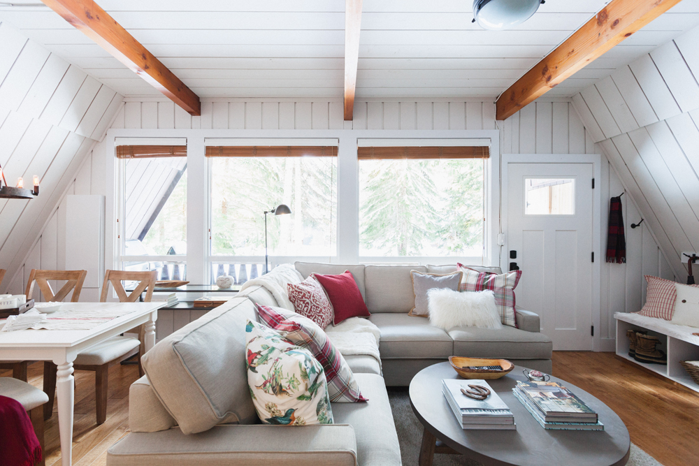
On the inside of the home, the cottage got a complete overhaul thanks to a little creativity. Dan had the walls painted a brilliant white colour that helps to open and freshen up the space, while also highlighting some of the natural wood beams and accents. Below a brand new hardwood floor completely unifies the space.
A Cozy Living Room
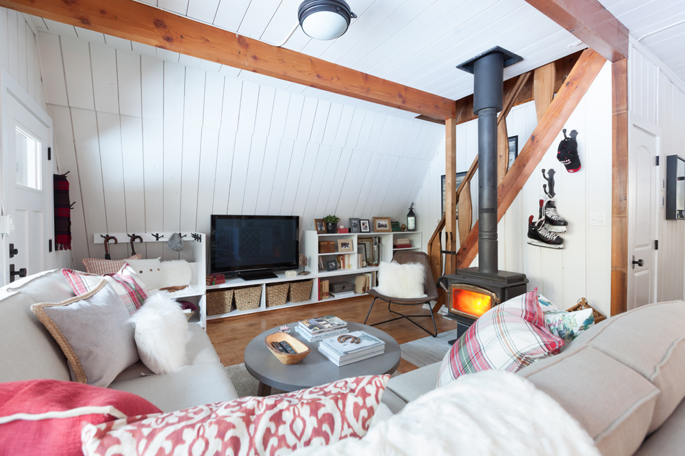
The main goal of this design was to give the couple as much storage as possible. So in the living room Dan had tons of storage built in around the television, giving Pete and Judy a ton of options. It’s a clever little design that takes full advantage of the A-frame’s unique design, making sure there’s absolutely no wasted space.
A Touch of Warmth
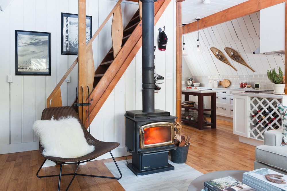
This classic fireplace adds a rustic and warm vibe to the space, but it’s also safe and less hazardous than before thanks to a newly installed (and level) hearth below. A small armchair with a cozy pillow adds even more seating options, while a small bucket with kindling adds design appeal and organization.
A New Sectional
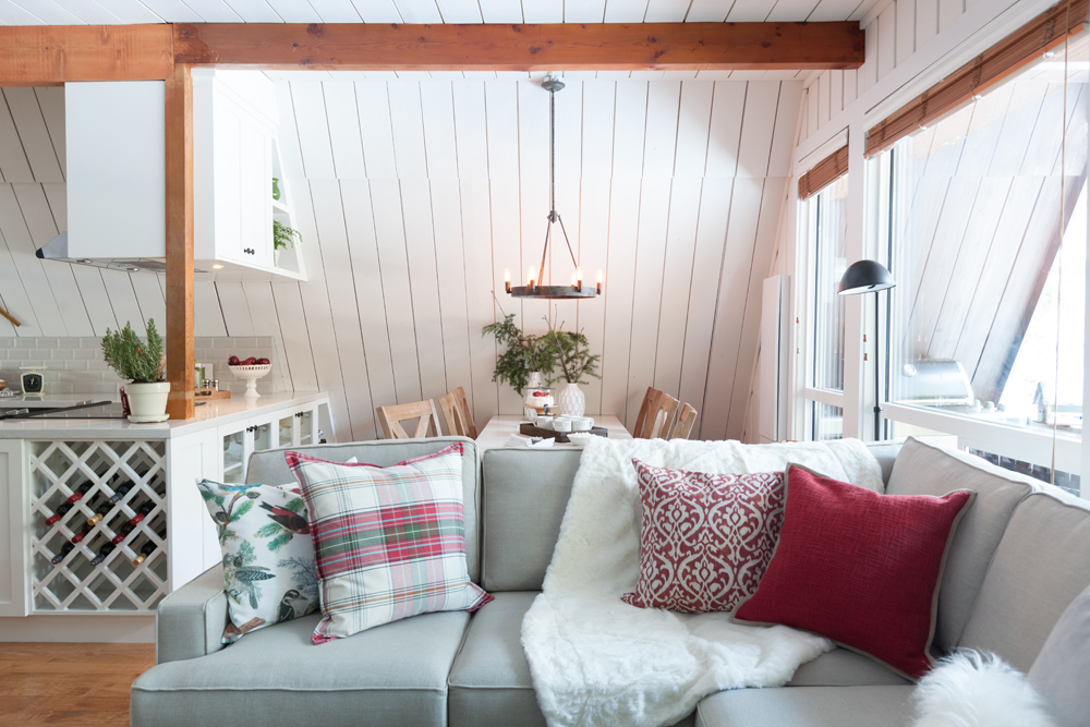
Because Judy and Pete have been known to host up to 20 people at a time, Dan decided to design their living space in a way that was more conducive to larger crowds. That included this new sectional that’s perfect for lounging or hosting. Its softer colour ties into the white paint and trim, but also works with the warm tone of the wood. A few throw pillows in various colours and designs add texture and depth to the space, making it even cozier than before.
An Open Concept Layout
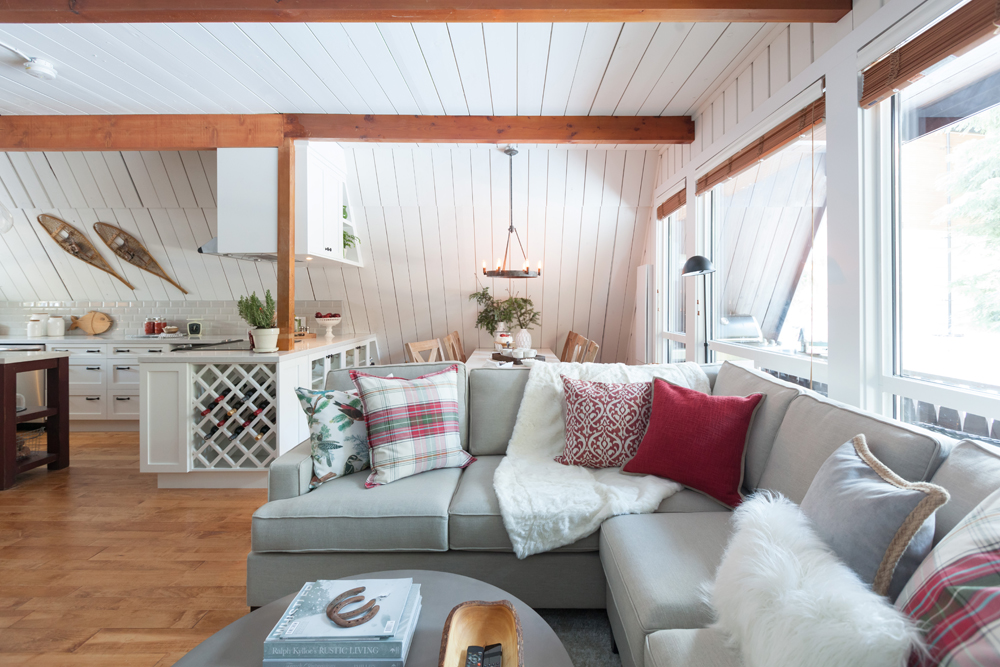
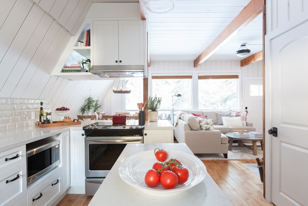
Now the entire main floor space flows together thanks to Dan’s crafty design. From this angle it’s easy to see how the living room flows into the dining room and kitchen, making the small cottage feel open and spacious with minimal effort.
Smart Dining
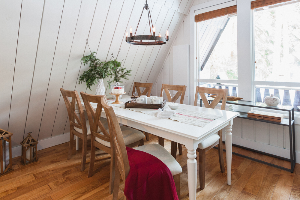
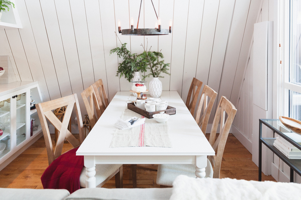
Before, Judy and Pete had a circular dining room table in this narrow space, which closed it off and minimized seating potential. Afterwards, thanks to a great rectangular find by Dan, the dining room easily seats six, maybe seven. Meanwhile a more narrow glass table near the window keeps the area open and uncluttered, and a couple of lanterns on the floor add instant decor.
Simple Contrasts
Like the cottage itself, the dining room set boasts a combination of pretty wood and white finishes, giving the space a modern but cottage-like feel. Some simple furnishings like a serving tray, a couple of vases and a table runner pull it all together, while the rustic light fixture overhead completes the look.
Bonus Storage
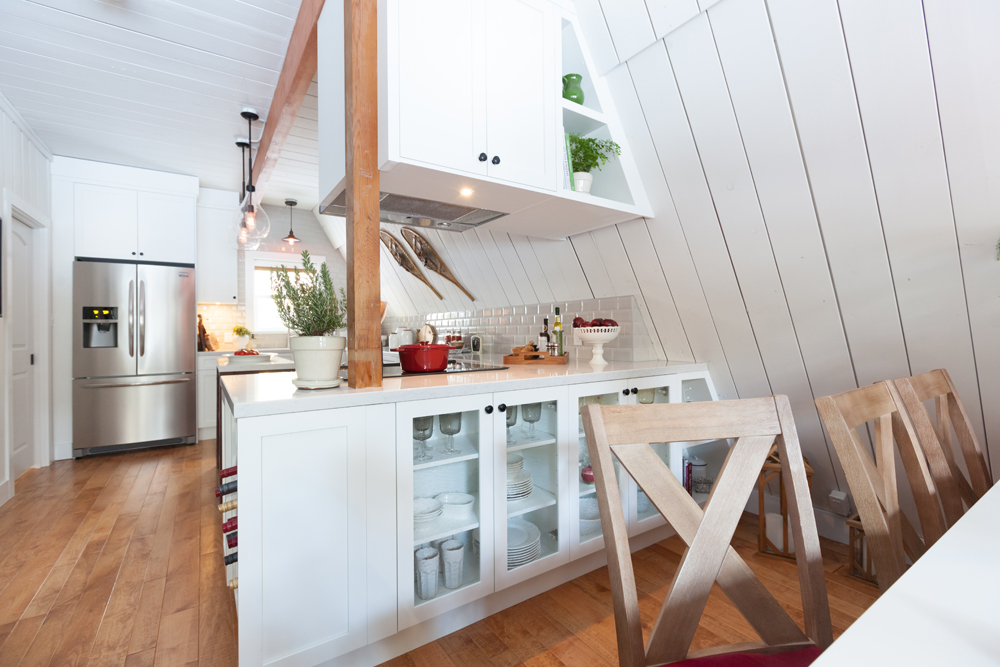
On this side of the dining room Dan added even more storage for serving dishes, plates and glasses, making the most of both sides of the kitchen’s counter. By installing glass doors these pieces are showcased, and the area itself appears slightly more open and flowing.
Maximized Space
From the kitchen itself there’s a clear view to the rest of the main floor, making this a great space for entertaining. Overhead Dan added cabinetry where he could, while brand new stainless steel appliances add an automatic upgrade.
A Pretty Backsplash
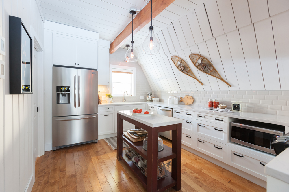
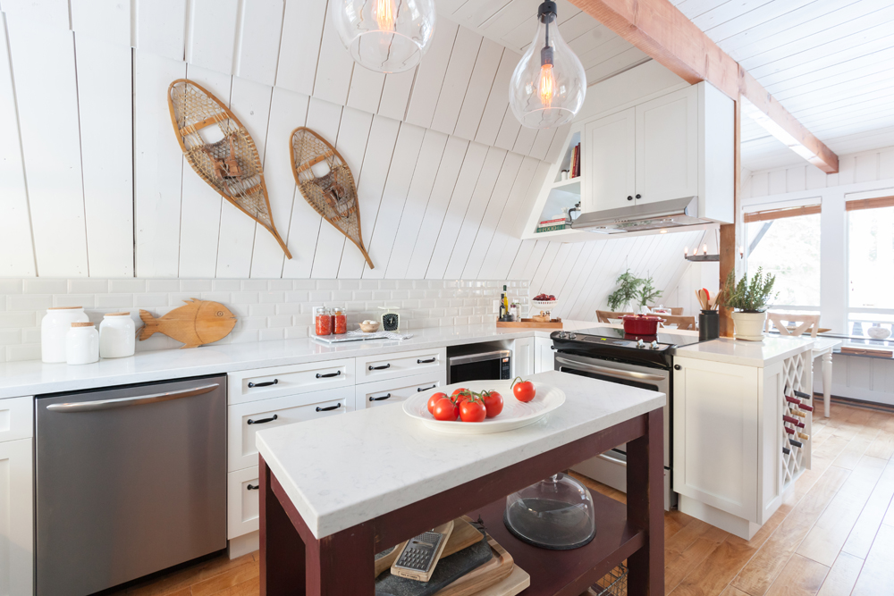
There wasn’t much room for a backsplash, but Dan added a small one consisting of gleaming white subway tiles to really help add definition to the space. Overhead he invoked the couples’ outdoorsy personalities with some vintage snowshoes, giving this kitchen a modern but rustic finish.
Extra Counterspace
This small island in the centre of the kitchen adds more of that wood appeal while giving Pete and Judy extra countertop space to prep and serve at. It also serves as a natural divider to the room when entertaining so that guests down crowd in, and adds bonus storage via the shelving below.
A Small Feature Wall
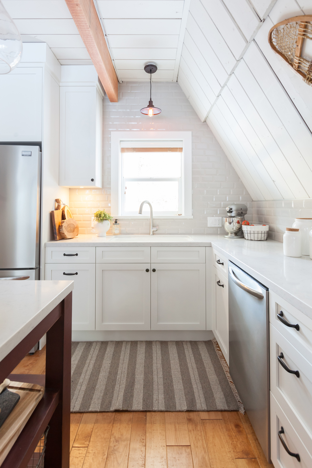
Dan extended the kitchen back in order to elongate the area and give the homeowners more storage, and that included redesigning the sink and transforming it into a bit of a feature wall with extended backsplash. A new overhead fixture adds immediate warmth and bonus lighting, while the window allows natural light to spill through during the day.
A Spa-Like Bathroom
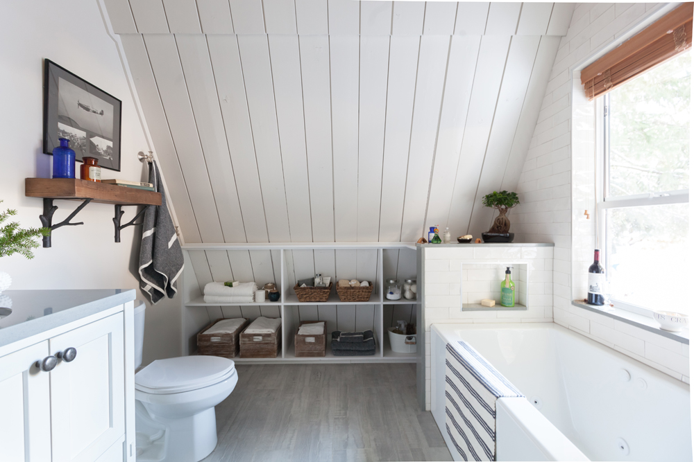
The pretty white finishes continue into the new main floor bathroom, where the floors are replaced with a darker tiling that’s meant to look similar to the hardwood featured elsewhere in the home. Along the wall Dan added even more storage for toiletries and towels, extending the available living space.
A New Vanity
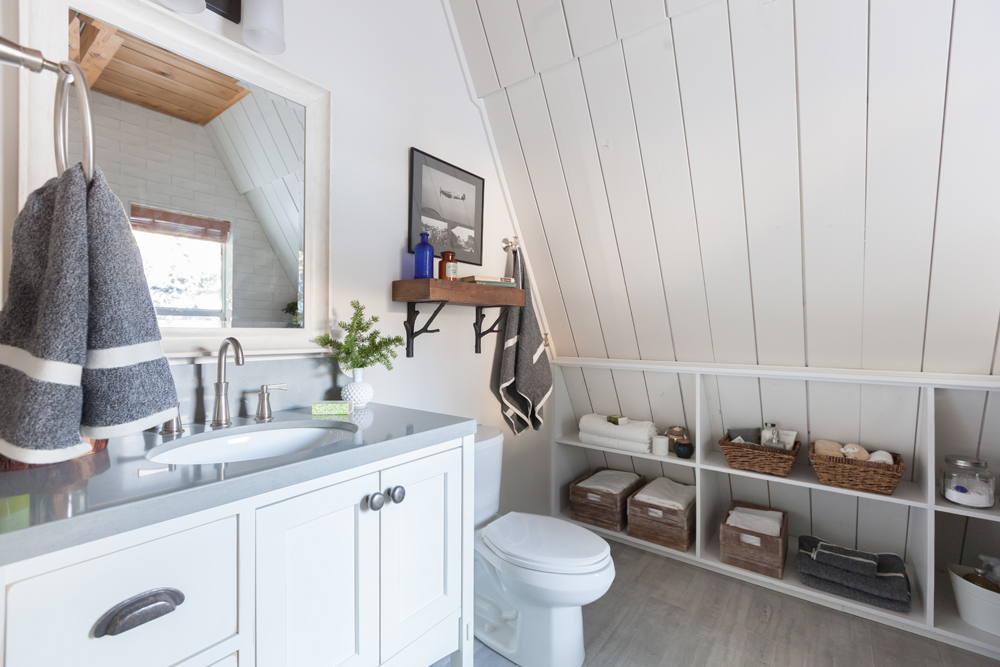
On this side of the bathroom Dan included a large vanity (also with tons of storage) and an extended countertop so that Pete and Judy can both have plenty of room to spread out. Meanwhile a natural wood shelf above the toilet adds design and more of that coveted storage thanks to its wide surface area and pretty branch-inspired brackets.
A Small Oasis
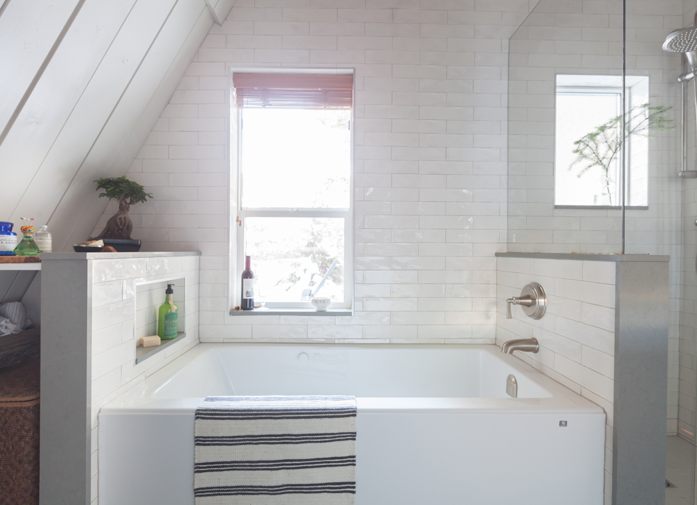
In order to give this bathroom design an even greater spa-like finish Dan installed this oversized standalone soaker tub, incorporating another subway tile finish and some cut-in storage in order to make the space really shine. Beside it a large shower with dual faucets adds even more luxury, while two windows allow lots of natural light to come though and further open up the space.
Stacking Up
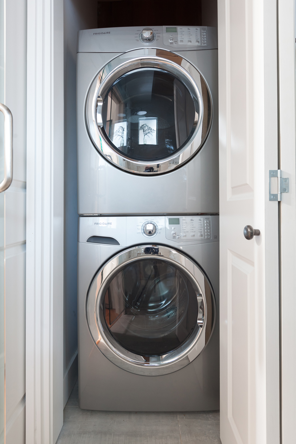
Off to the side of the washroom Dan made sure there was still enough space for the laundry, so he grabbed these new stackable units and created a laundry closet. In the end it was all of the extra storage and smart new upgrades that made Judy change her tune about Pete’s nostalgic cottage, allowing this couple to “love” their space in the end.
HGTV your inbox.
By clicking "SIGN UP” you agree to receive emails from HGTV and accept Corus' Terms of Use and Corus' Privacy Policy.


