Alex and Andy weren’t just looking for a great home to kick off their married lives in; they were looking for an adult sanctuary with plenty of spa-inspired finishes. But with a particular budget and area in mind, they needed Mickey, Sebastian and the Worst to First team’s help in order to make that dream happen. And when Andy revealed mid-reno that Alex was also expecting the couple’s first child, they also needed the guys’ help to craft the perfect nursery — a first for the dream team. Here’s how the guys transformed these bedrooms and bathrooms into some of the most stunning spaces on the block.
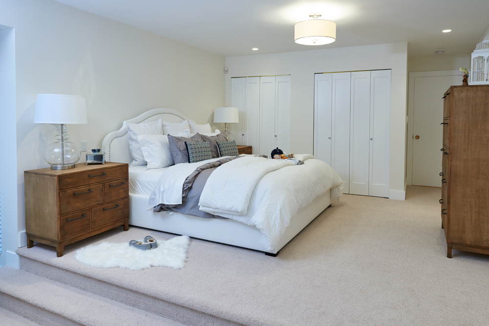
A Masterful Escape
This enlarged master bedroom isn’t just spacious; it also boasts two separate levels thanks to the walk-down into a living room area. Soft greys and natural woods add a rustic finish, while plenty of white features — including an oversized headboard — keep the look open and streamlined.
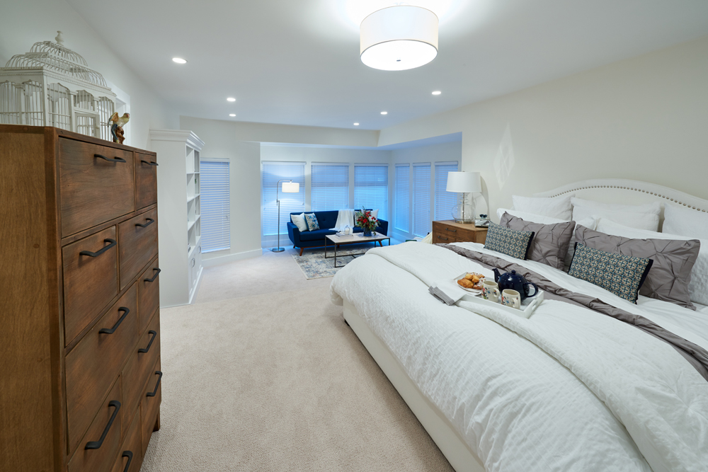
A Bed For a King
The enlarged, king-sized bed feels plush and cozy — a great spot for a couple to unwind in together. A soft duvet adorns the top while plenty of extra toss cushions help to draw the eye and further cozy up the space.
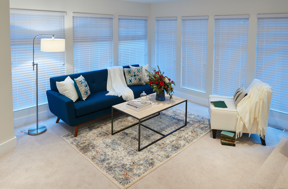
A Modern Seating Area
Mickey and Sebastian made the most out of the living room space below by creating a small sitting area in front of the oversized windows. This relaxing retreat is further enhanced by the brilliant blue of the sofa and a plush armchair; a small area rug in complementary shades and a simple coffee table round out the look.
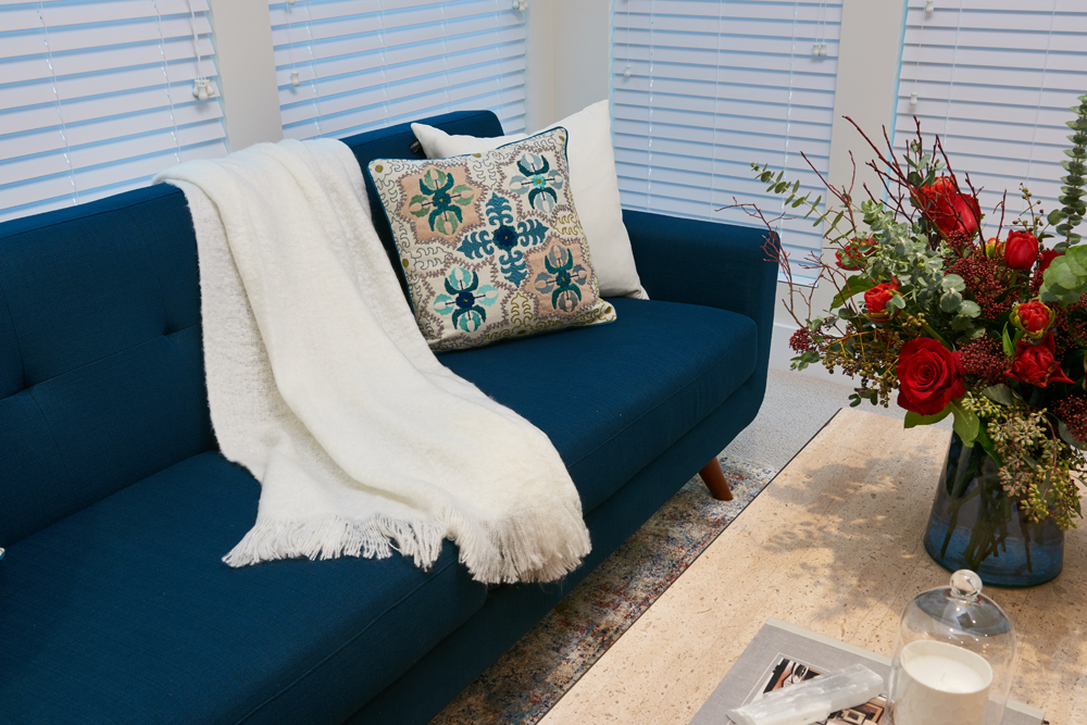
Attention to Detail
In order to completely stage the cozy look the guys added a plush blanket and some toss cushions that also help draw the eye to the area. Meanwhile fresh flowers and a serving tray make this the perfect spot to chill in during the mornings or evenings with a fresh cup of hot coffee or herbal tea.
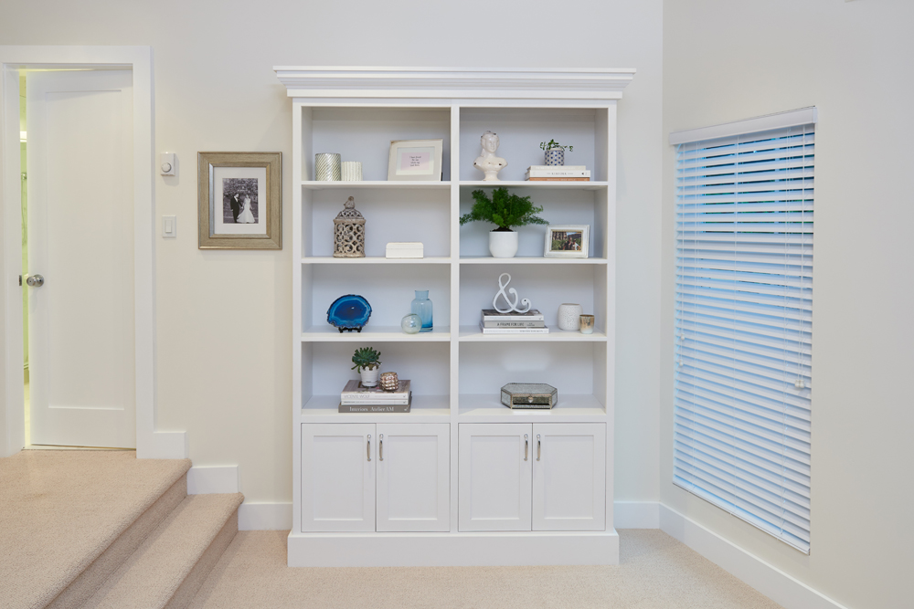
Bonus Storage
This bonus nook helps the area to feel personalized and polished while also helping to streamline the overall design.
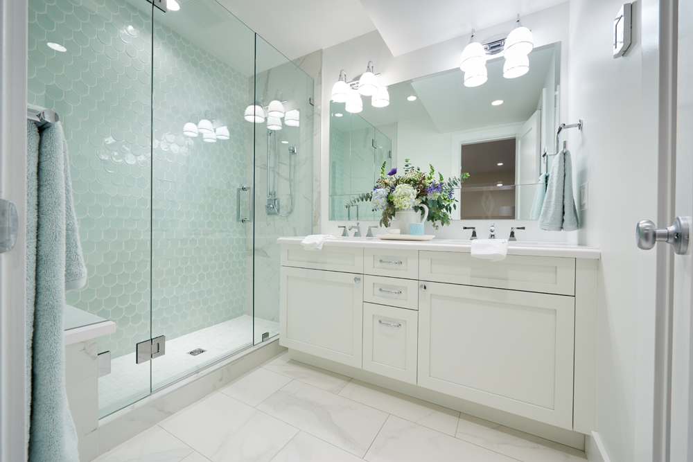
A Spa-Like Retreat
The large master ensuite feels even larger thanks to brilliant white finishes and pretty, water-inspired tiling in the oversized, glass-doored shower. The aqua accents (towels, jars) further enhance the space, pulling it all together into one spa-inspired bathroom.
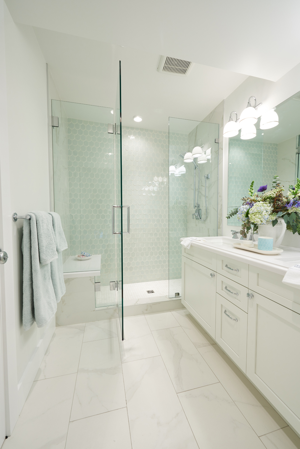
An Enlarged Shower
This shower unit feels clean and open, and is definitely large enough for an entire family to use at once. Inside, multiple shower heads are the height of luxury, while a built-in bench allows users to have a seat while shaving or scrubbing between those toes.
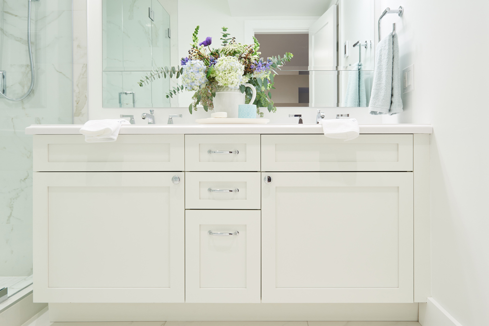
A Double Vanity
This vanity is simple but pretty and functional thanks to its large drawers and cabinets. Above, a double sink allows both Alex and Andy to do their own thing at the same time, making this a perfectly tranquil space for two.
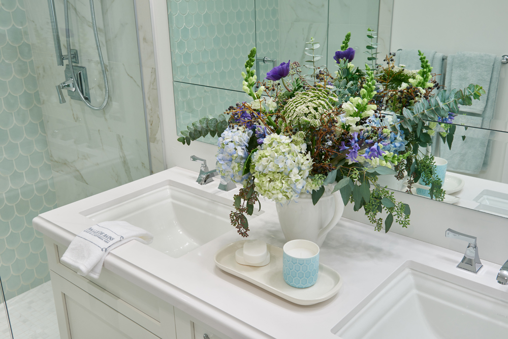
Pretty Accents
Fresh flowers and greenery always liven up a room, especially a bathroom. Meanwhile a small tray with a scented candle and some soap adds a nice staging effect, showcasing the potential of the additional counter space and adding a designer’s touch.
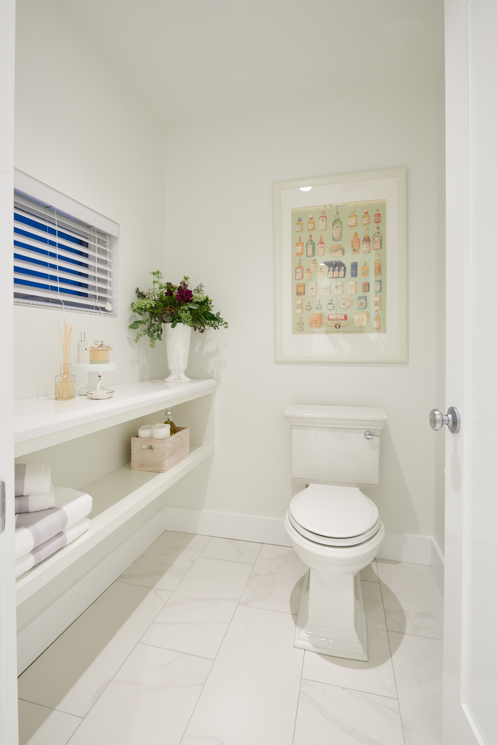
A Separate Water Closet
The ensuite also boasts a toilet, that gets its own room thanks to this built-out water closet with extra storage along the side wall. More fresh flowers, some toiletries and towels showcase the potential of the room while also maximizing space and decor.
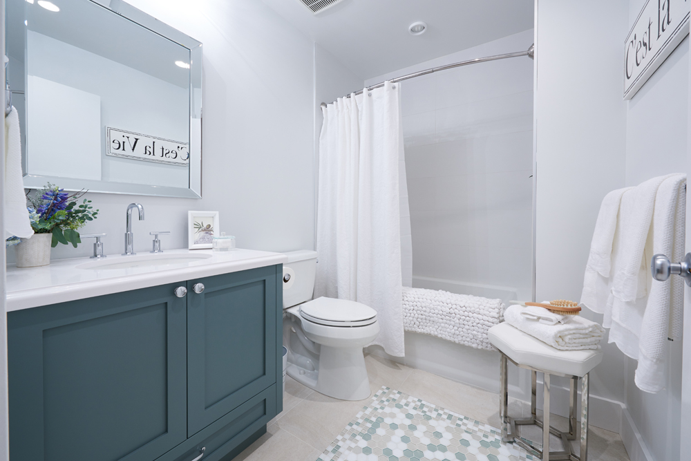
The Main Bathroom
The main bathroom also got a much-needed upgrade, as the guys transformed it into an equally tranquil and spa-like space. The same blues and greys from the rest of the house are featured here, bringing a water-inspired feature into the room. The look is capped off by creams and soft whites that tie the whole look together.
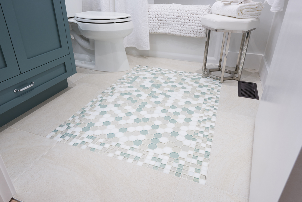
A Show-Stopping Floor
Pretty hex and square tiling become a feature of the floor below, combining to create a real focal point of the space.
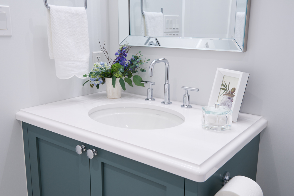
A Simple Vanity
This vanity is small but mighty, with plenty of storage underneath and a pretty blue exterior. Above, upgraded faucets and an enlarged mirror add a modern touch, while a framed print and some fresh flowers give the space that extra welcoming boost.
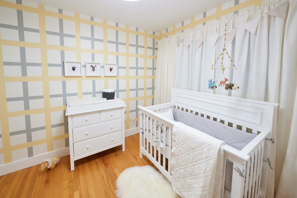
An Extra Addition
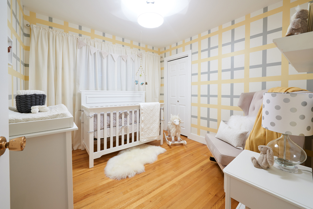
A gender-neutral nursery complete with custom walls to give the area a whimsical but cozy finish. The result is definitely memorable, not to mention stylish.
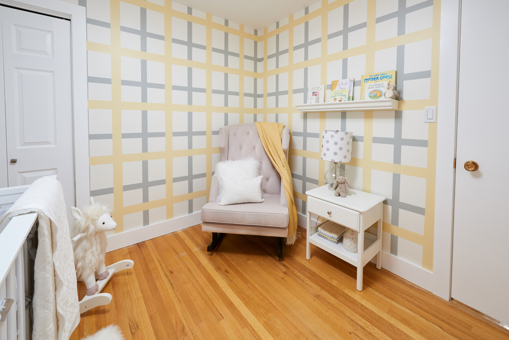
A Comfy Corner
This oversized rocking chair with a tufted back is neutral and helps soften the louder colours on the walls, creating a small nook that’s perfect for feeding and rocking — especially during all of those late nights. New hardwood below is polished and clean, while a small night table and shelf for books add function and design.
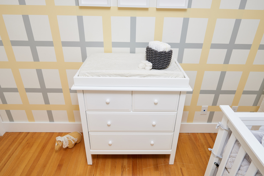
A Convertible Unit
This change table isn’t just pretty (and super key for all of those early morning diaper changes), but it’s also convertible so that it becomes a regular dresser when the baby is older. The pretty white finish is bright and compliments the yellows and greys on the walls, while a soft grey basket atop gives the space a little more storage and easy-access to all of those important items.
A Convertible Crib
This pretty crib also converts to a day bed for when the baby is older, making it a key piece of furniture in the room. It’s also full of design potential thanks to the soft area rug underneath and the curtains above, making this a cozy but cute nursery that any kid (or parent) would love.
Finishing Touches
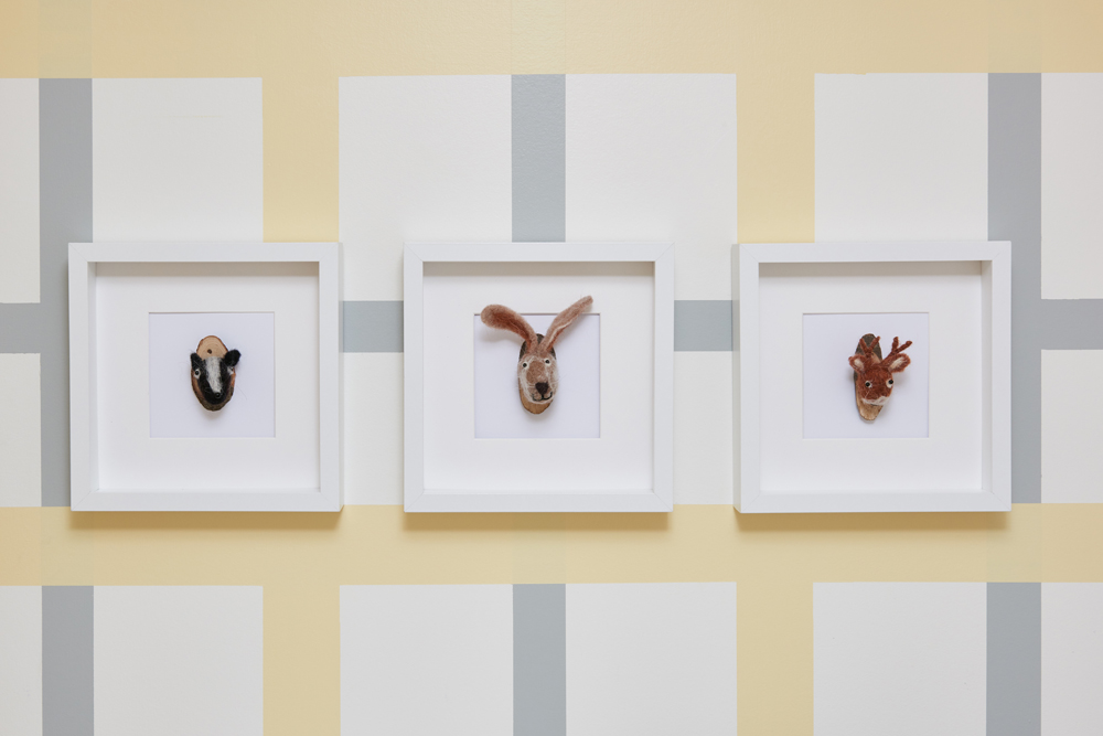
These framed plush animals add a designer’s touch to the finished nursery and complete the space.
HGTV your inbox.
By clicking "SIGN UP” you agree to receive emails from HGTV and accept Corus' Terms of Use and Corus' Privacy Policy.


