There’s a certain style of modern homes that can come across as cold. You know the type: vast empty rooms with floor-to-ceiling windows, exposed concrete ceilings and spare, white walls. When done wrong, the design can seem sterile, not unlike living in a spaceship or a Bond villain’s mansion. Vancouver-based designer Amanda Evans was commissioned to design a West Vancouver home for a family of four that was both contemporary and clutter-free, but still warm. To capture that balance, Amanda turned to natural materials and local designs. The final effect is both cozy and stylish with a distinct West Coast flair.
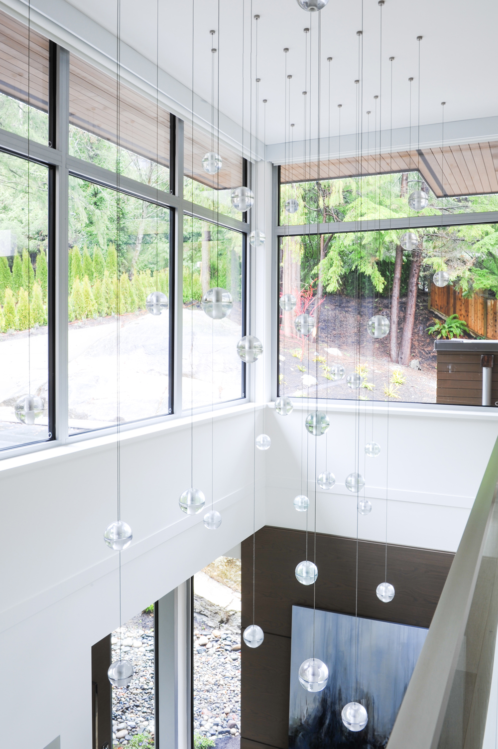
Grand Entrance
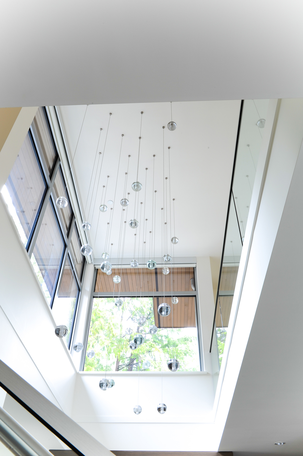
The main entryway to the home is two stories, with a custom made light fixture from Bocci, a local Vancouver designer that the homeowners love. The lights are one of the first things you see when arriving from the driveway.
Related: This Vibrant Vancouver Loft Effortlessly Plays With Colour, Pattern and Style
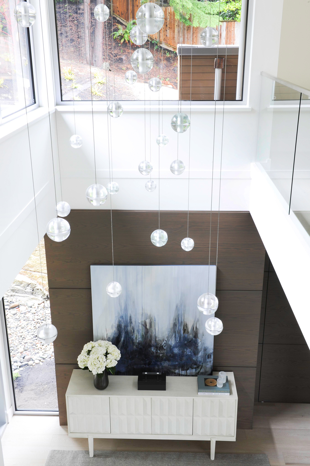
Let There Be Light
Amanda chose this artwork, from Vancouver-based artist Lisa Ochowycz, because she wanted to bring some calming blue tones into the entranceway, while also alluding to the home’s proximity to the ocean. Each bedroom has views of the Pacific.
Related: This Adorable Cozy Cottage Near Ottawa is Peak Canadiana
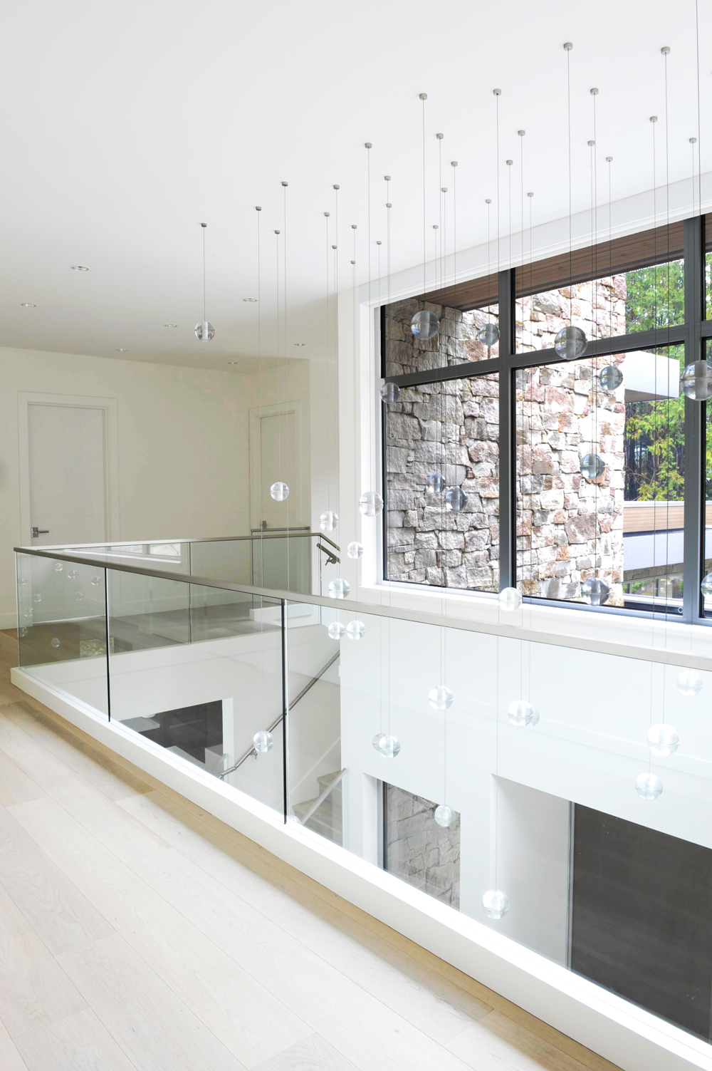
Open Walkway
Here’s a look at the main entrance from upstairs, where glass partitions make the most of the light.
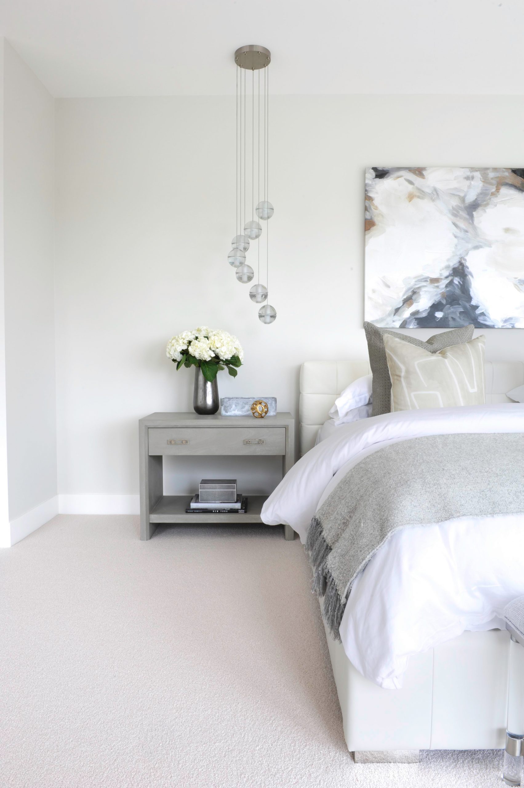
Easy Breezy
The master bedroom‘s aesthetic was meant to be calm and serene. Amanda used a mix of greys and whites to pull it off. The bedside lights are also from Bocci.
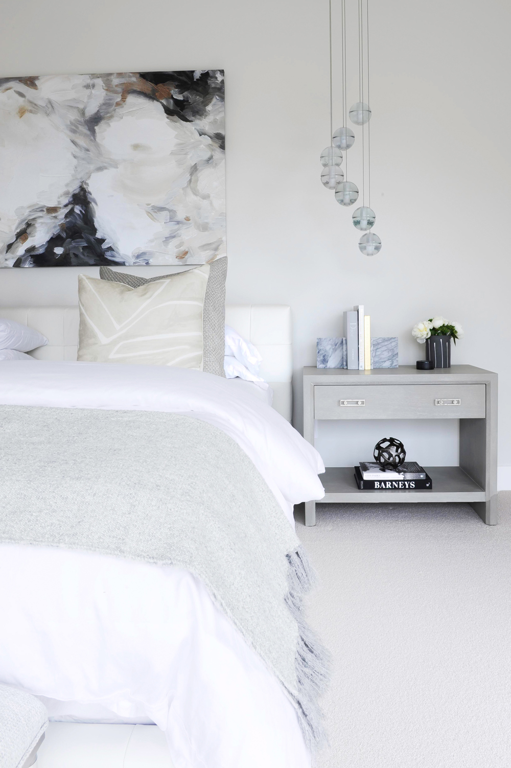
Matchy Matchy
Amanda is big on symmetry and the second bedside table is meant to mirror the one on the left.
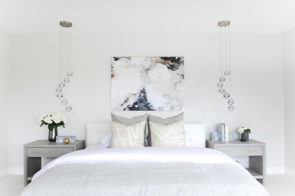
Comfy Cozy
The bedroom’s neutral tones are accented by the artwork above the bed, which is from Minted.
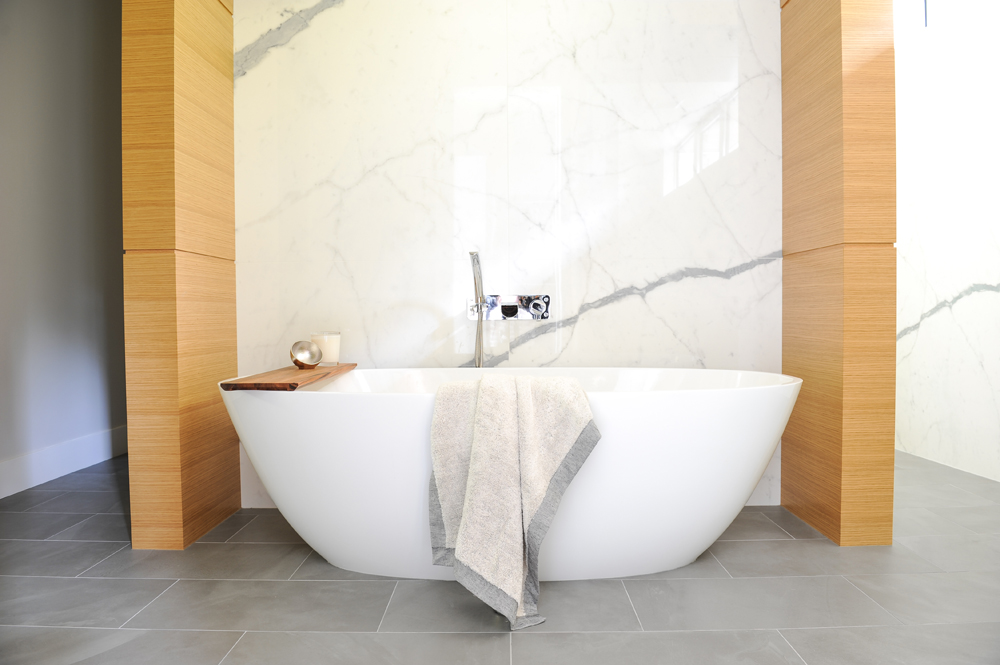
Soak in Style
The deep soaker tub in the master bathroom is framed by a dramatic porcelain slab, which is designed to look like a giant piece of marble. It’s more durable than marble, but also less expensive.
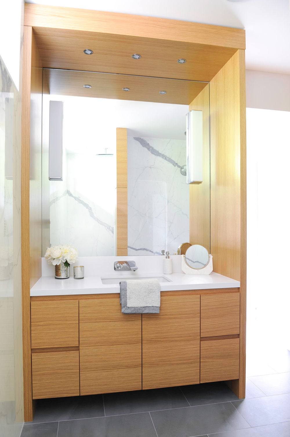
Wood Tones
The dual-vanity is made from rift-cut oak, which shows off the natural grain of the wood and adds that warmth factor Amanda was looking to capture. She opted to keep the counters plain white, so not as to clash with the walls.
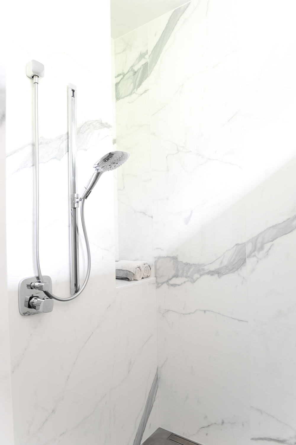
Squeaky Clean
The same porcelain slab was used in the shower, seen here.
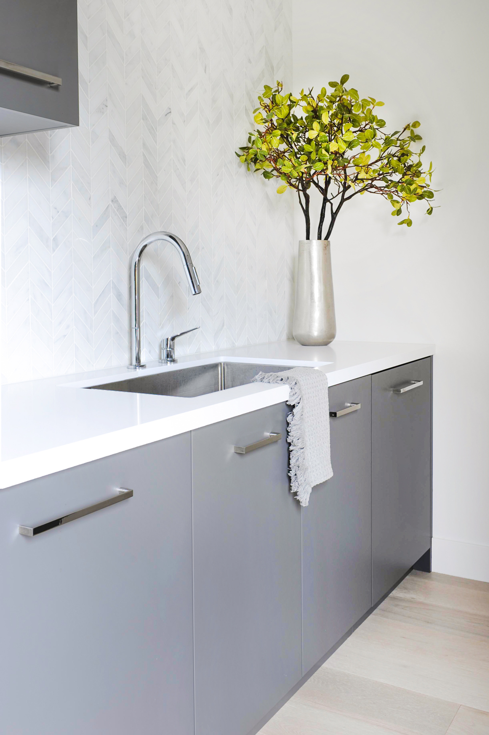
Mix it Up
The mudroom-slash-secondary kitchen offers extra storage space and a backup fridge, which comes in handy when entertaining.
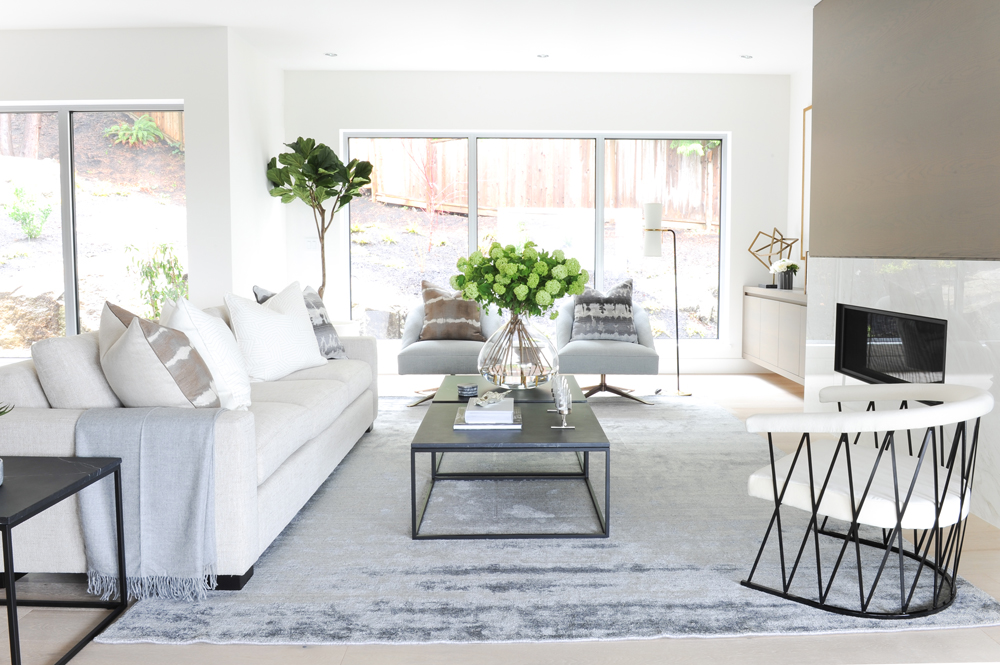
Modern Style
When designing the living room, Amanda was thinking about clean lines and comfort. “We could’ve gone more contemporary, but we wanted to make it approachable,” she said.
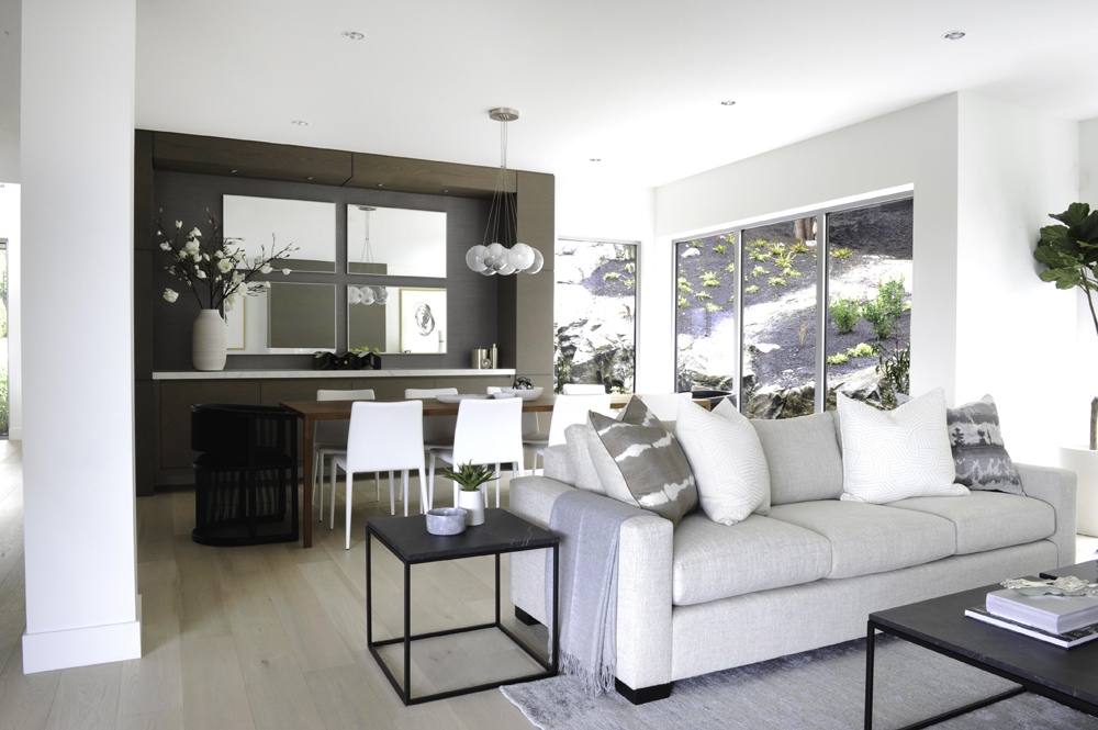
Open-Concept Living
The sofa, seen here, is by American designer Mitchell Gold + Bob Williams.
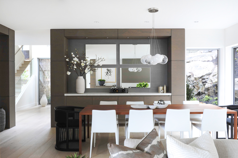
Dinner Time
More Bocci lights are suspended above the dining room table, which is tucked beside a built-in credenza. The black end chairs are from CB2.
Related: 14 Incredible Celebrity Dining Rooms You’ll Want to Have a Feast In
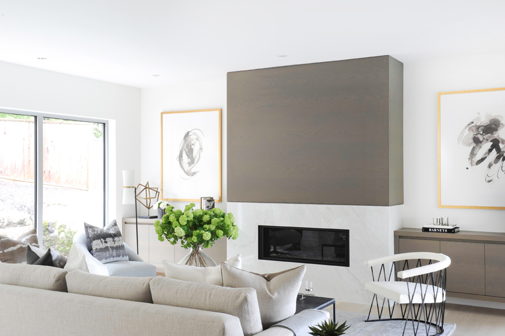
Burn Baby Burn
This gas fireplace is one of two in the home. The mantel is a piece of rift-cut oak, stained in a neutral grey-brown. The bottom section is another piece of marble-esque porcelain. Cabinets on each side of the fireplace help anchor the space. The artwork on the left is from Minted.
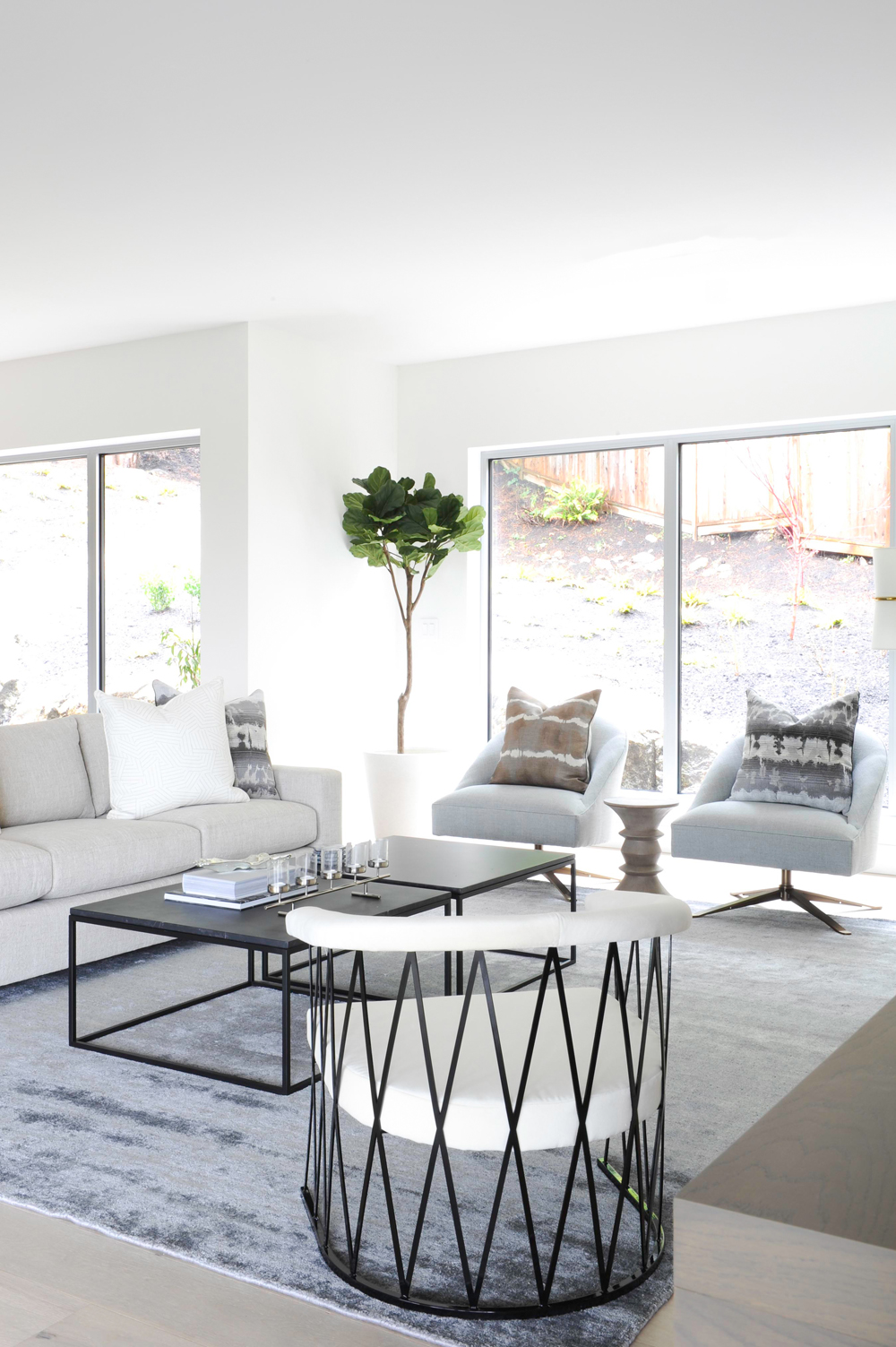
Pop of Green
Geometric accents are aplenty in the living space, thanks to pieces like the swivel chairs from Lee Industries and the black marble coffee table. A fiddle-leaf fig tree adds a touch of greenery to the space. “Because the home is so contemporary – it has very strong, dramatic lines – it’s nice to have that bit of nature and greenery in the home,” Amanda said.
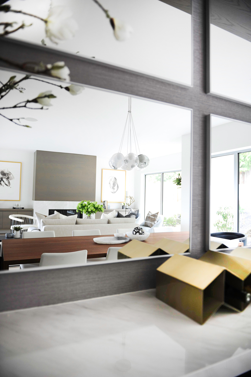
Mirror, Mirror
To maximize the light in the room, Amanda brought in these four mirrors from CB2.
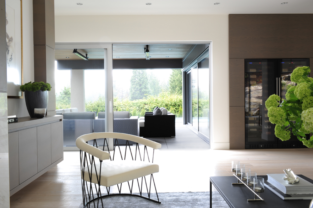
Rain or Shine
Anyone who’s been to Vancouver for more than five minutes in the wintertime knows one thing: it rains, a lot. This covered patio offers a sheltered space to hang out, no matter the weather. The white chair in the foreground is from CB2.
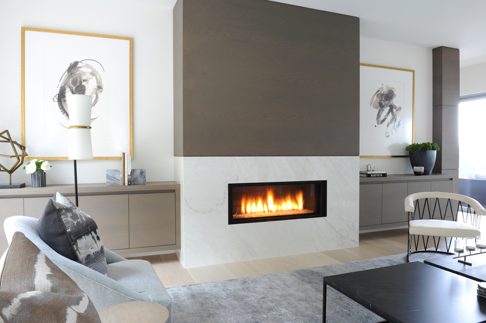
🔥
Here’s another look at the fireplace, this time in action. The area rug is from Mitchell Gold + Bob Williams.
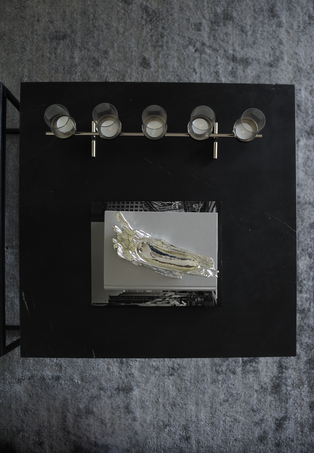
Grounding the Space
If you were a lost bird or a roving poltergeist, this is what the black marble coffee table would look like from above. The candles are from Crate & Barrel. Amanda styled the coffee table with books, to help add texture and volume to the space.
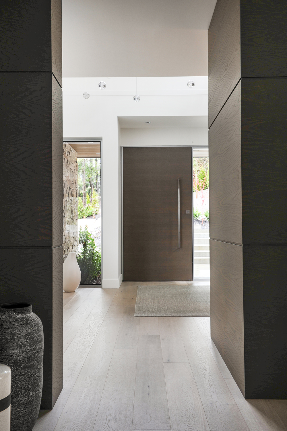
Grand Beginnings
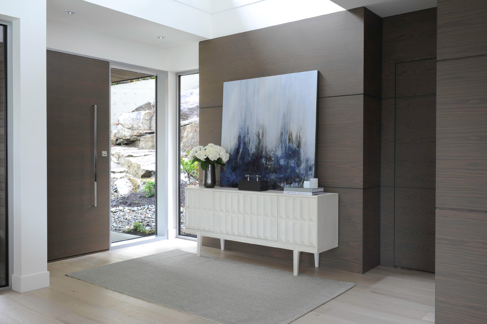
The front door is eight-feet tall and is tucked beside floor-to-ceiling windows, which help bring in the sunlight, even on dreary days.
Mix and Match
This side piece is another Mitchell Gold + Bob Williams find and Amanda was drawn to the raised geometric pattern on the front.
Space Between
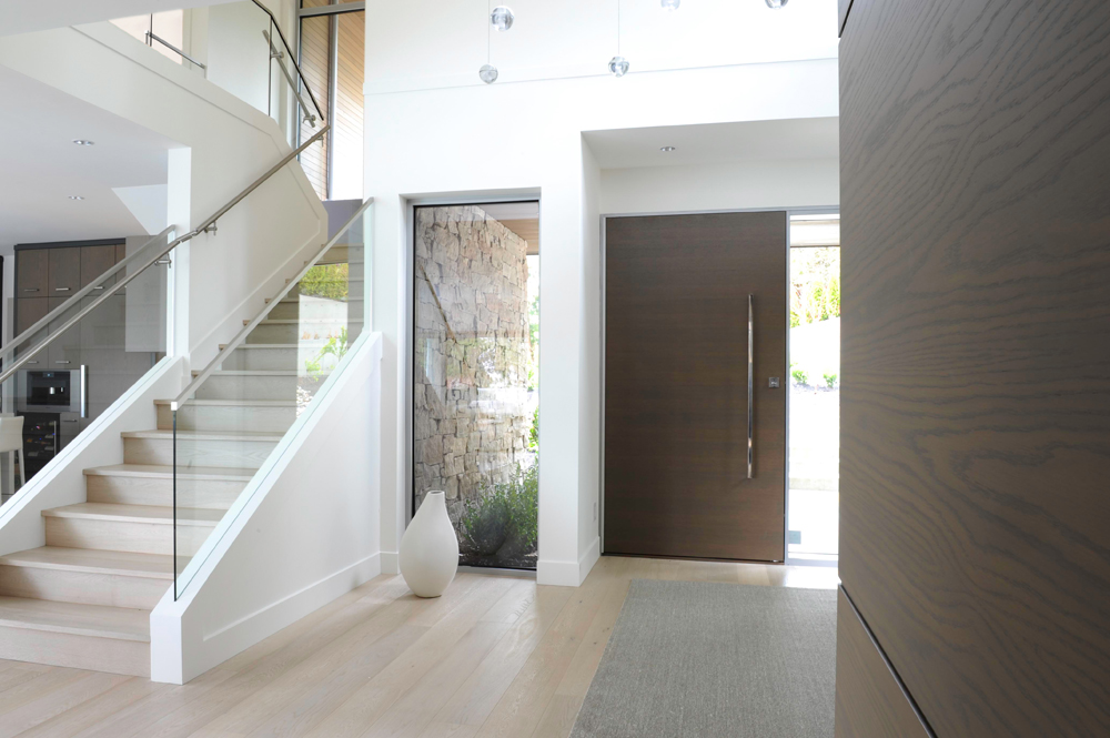
Here’s a wider look at the front hallway, which is distinctly clutter-free.
Drop Drop
And this is what those Bocci lights look like, when seen from below.
Family Time
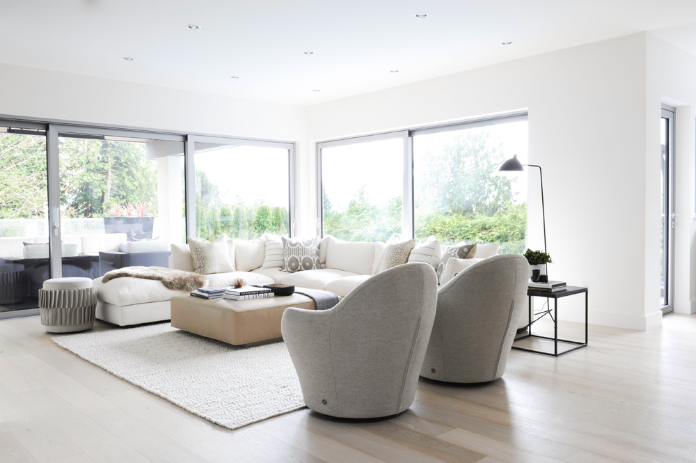
The family room is one of the most casual spaces in the home, but Amanda still wanted it to come across as chic and sophisticated. She pulled it off by mixing different neutral tones of various textures.
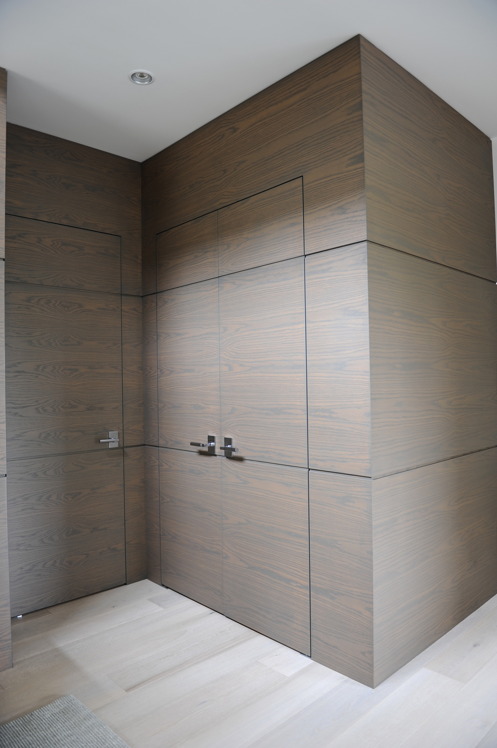
Seamless Design
These doors are practically invisible, thanks to this seamless design approach. The wood panelling is another approach Amanda took to help boost the warmth factor.
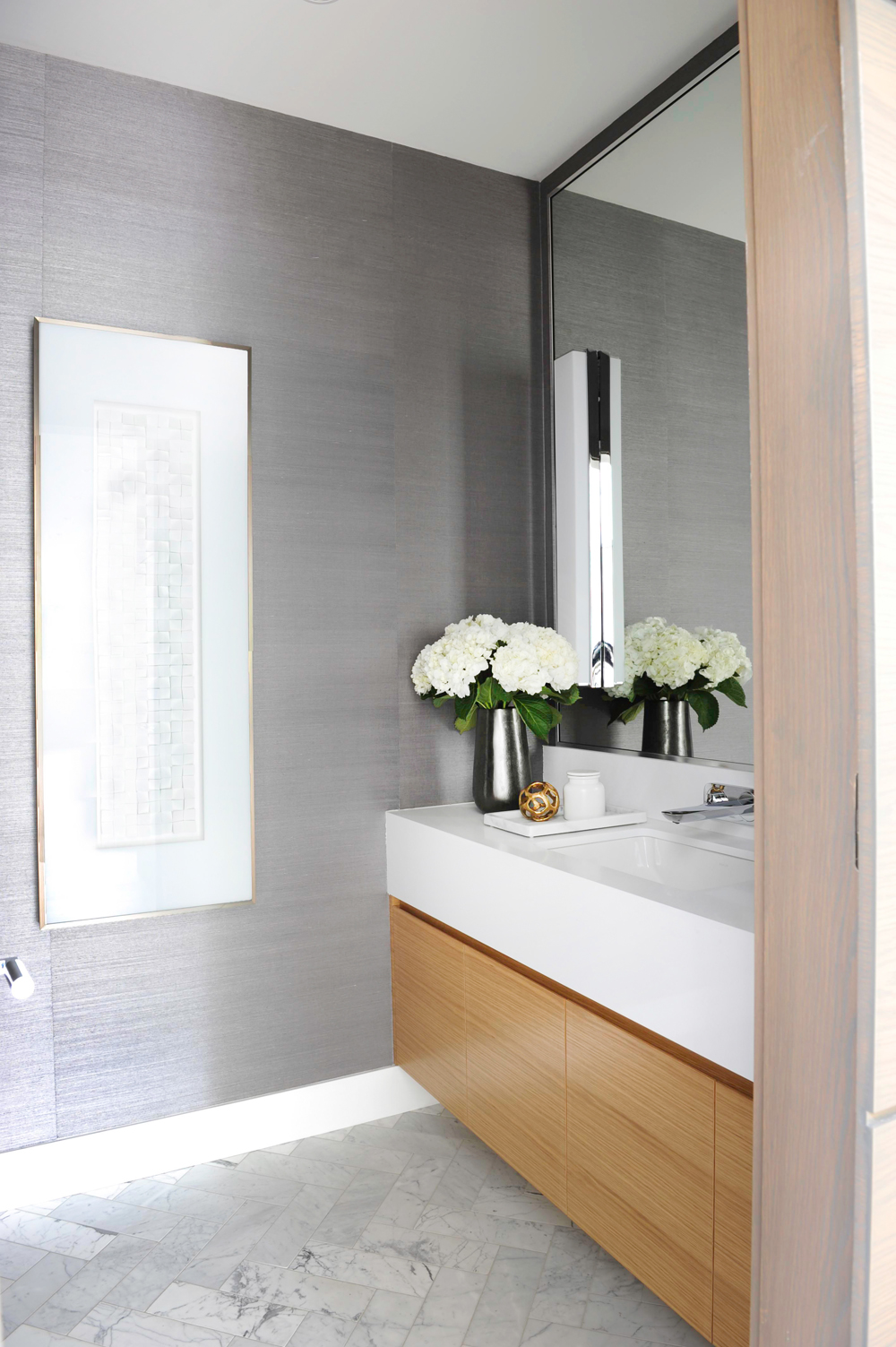
Shiny Things
The powder room is one of the most dramatic rooms in the home thanks to a metallic wallpaper that Amanda chose, which strikes a much darker tone. The cabinets here are also rift-cut oak.
Related: This Entire Toronto Apartment Was Furnished and Decorated for Less Than $2,500
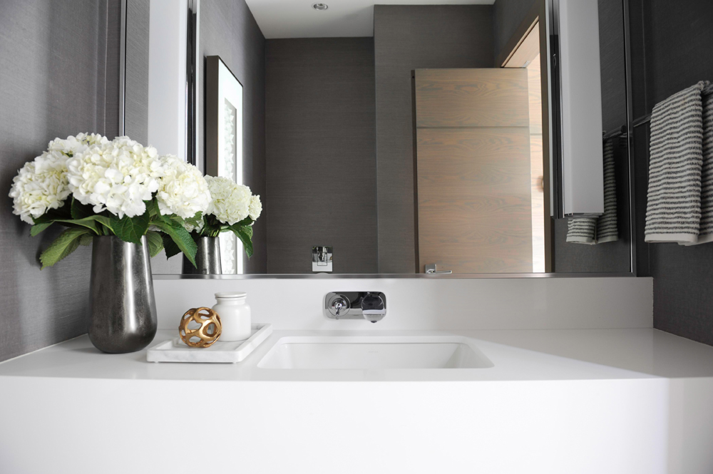
Small but Mighty
The countertop has a thick, eight-inch apron that gives it a bit of gravitas, even in the small space. The wall-to-wall, counter-to-ceiling mirror also helps make the space seem larger than it is.
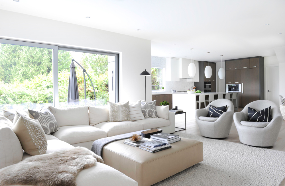
Fashion and Function
The homeowners brought this sectional sofa with them from their last home and Amanda paired it with a set of complimentary swivel chairs in light grey fabric. The taupe vinyl ottoman offers both comfort and durability.
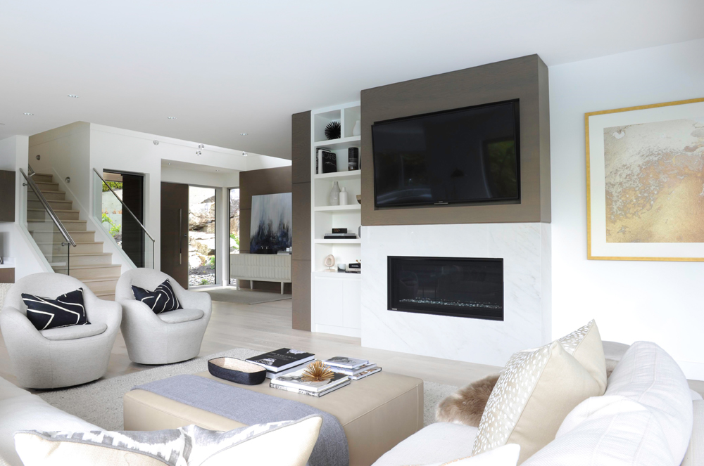
Fireside Hangout
Here is the second gas fireplace in the home, this time with a television. This space can comfortably host about 50 people, Amanda estimates.
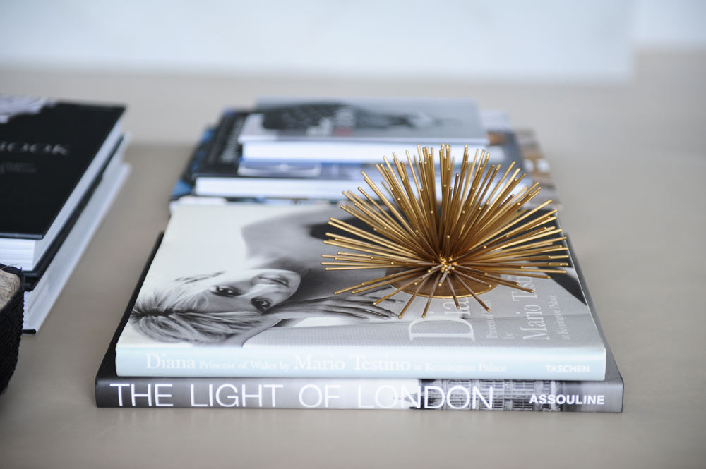
Under the Sea
This funky sea-urchiny thing, from CB2, adds a bit of style to the space. It is tucked atop a few books that showcase the homeowners’ shared love of fashion and design.
Related: This Eco-Conscious Montreal Home Definitely Isn’t Afraid of Colour
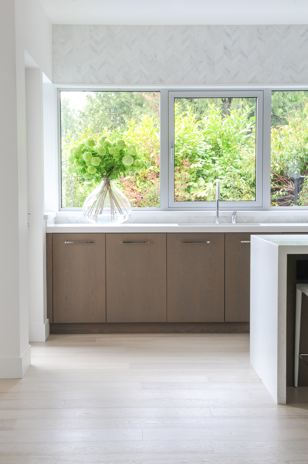
Keeping it Green
The kitchen, see here, is connected to the living space. The owners opted to go with a wall of windows rather than cabinets since they already have plenty of storage in the mudroom-slash-backup kitchen.
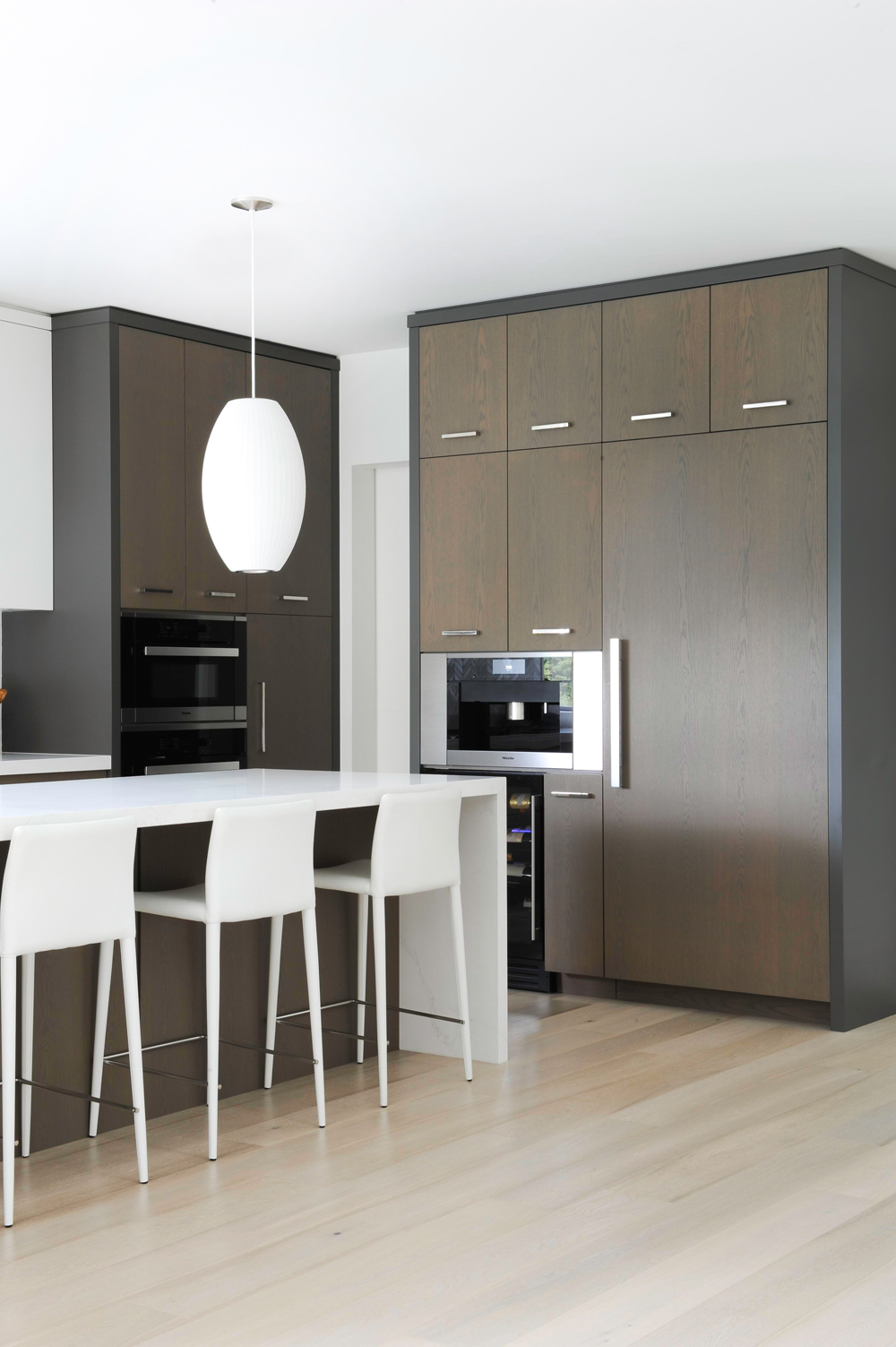
Balancing Act
The kitchen is quite long and Amanda chose to contrast the wood cabinetry with grey gables around the perimeter to add both depth and contrast.
HGTV your inbox.
By clicking "SIGN UP” you agree to receive emails from HGTV and accept Corus' Terms of Use and Corus' Privacy Policy.


